Client spotlight: Silverline Creation, Goa Our
Eviation Marketing
Client spotlight: Silverline Creation, Goa
Our first showcase as we shift focus to the work behind the brand.
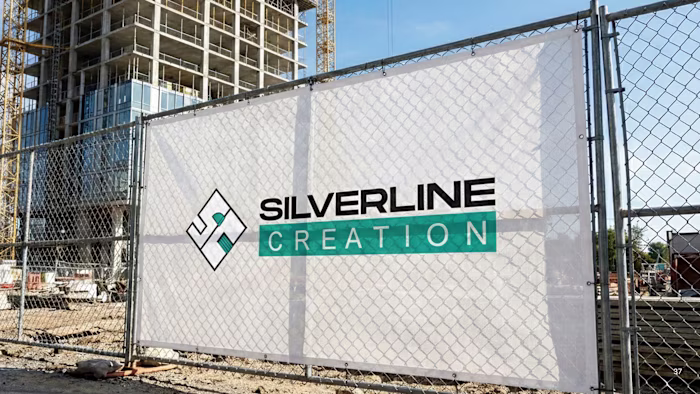
Silverline Creation came to us at an early stage—with a strong name, a personal story, and a vision rooted in construction. What they needed was a brand identity that truly reflected where they were headed.
The original logo held emotional value, built around the founders’ initials. But as the brand grew, it no longer aligned with the industry, scale, or positioning they were stepping into.
So we rethought the identity from the ground up.
The new mark draws directly from construction fundamentals—floor plans, stair structures, door curves—woven together with the initials S & C, creating a logo that feels intentional, architectural, and unmistakably relevant.
Paired with a refined colour palette and a cohesive visual system, the identity translated seamlessly across digital and on-ground collaterals—and most importantly, felt right to the client.
View the complete project on our Behance profile: https://www.behance.net/gallery/243586791/Silverline-Creation-Branding-Visual-Identity
Silverline Creation × Eviation
Designed to last.
Like this project
Posted May 9, 2026
Client spotlight: Silverline Creation, Goa Our first showcase as we shift focus to the work behind the brand. Silverline Creation came to us at an early stag...