TactileGlass CSS Framework Development

Kenneth Lamb


TactileGlass
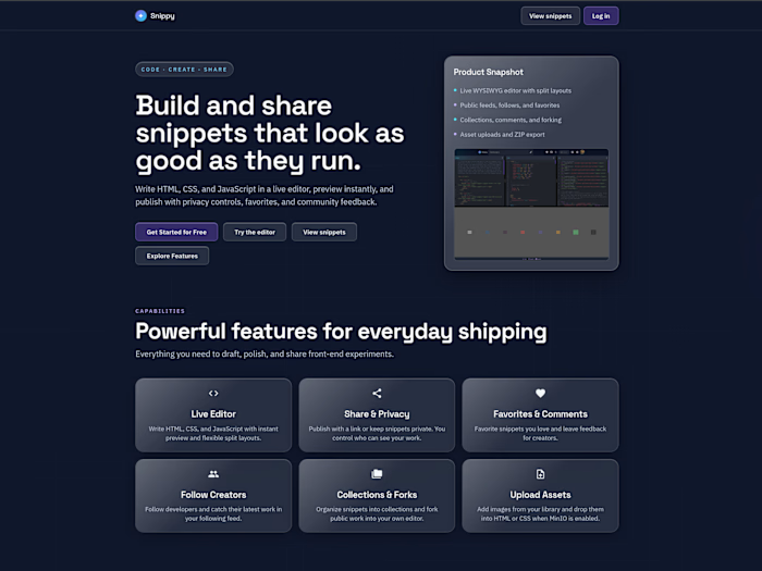
A utility-first and component-based CSS framework that unites neumorphism, glassmorphism, and a hybrid of both — aligned with Bootstrap 5.3-style layout, forms, helpers, and utilities, while staying CSS-only (no JS runtime required for components).
Components are generic (
tg-btn, tg-card, tg-nav, tg-sidebar). Materials are separate classes (tg-neu, tg-glass, tg-hybrid) driven by CSS tokens. Bootstrap-style modifiers and utilities (btn-sm, btn-primary, d-flex, p-4, justify-content-between, theme-dark) stack on top.Version: 0.3.0
npm:
tactileglass-cssLicense: MIT
Install
Bundler:
HTML:
Sass entry if you compile it yourself:
Class language
Two core layers, then modifiers:
Layer Examples Role Component
tg-btn, tg-card, tg-dropdown, tg-nav, tg-sidebar Skeleton — layout, type, radius, behavior Style tg-neu, tg-glass, tg-glass-frosted, tg-hybrid, tg-neu-reverse Token-driven surface paint Modifiers + utilities btn-sm, btn-icon, btn-primary, p-4, bg-white, border-none Same names on every style Pick one style per node. Do not mix
tg-neu with tg-glass on the same element. Compound parts such as .nav-links inherit depth from the parent — do not put inset classes on the links.Styles
neu — raised or sunken clay (
tg-neu, tg-neu-reverse, tg-neu-surface, tg-neu-inset). Tokens: --tg-neu-shadow-drop, --tg-neu-shadow-inset.glass — acrylic pane (
tg-glass). Showcase frost: tg-glass-frosted (blur + inset glow + edge sheen). Tokens: --tg-glass-bg, --tg-glass-blur, --tg-glass-shadow, --tg-glass-menu-blur.hybrid — glass fill inside a tactile shadow. Token:
--tg-hybrid-bg plus neu shadows.Prefer style classes on any element.
morph-* mirrors the same matrix with !important for overrides. --clr-* / --glass-* stay aliases of --tg-*.What’s included
Bootstrap-inspired coverage, organized the same way as the Sass tree:
Area Highlights Layout Breakpoints,
container / container-*, flex .row / .col-*, gutters, CSS grid tracks, z-index Content Reboot, typography, images, figures, tables Forms Form control, select, checks / switches, range, input group, floating labels, layout, validation Helpers Clearfix, color-bg, colored links, focus ring, ratio, stacks, stretched link, text truncation / line-clamp, VR, visually hidden Utilities Flex, spacing, display, text (lh-*), sizing, overflow, position, colors, borders, shadows, morph, opacity, visibility, object-fit, interactions Components Alerts, badges, breadcrumb, buttons / button group / btn-icon, cards, close, dropdowns, list group, navbar, navs & tabs, pagination, placeholders (shimmer), progress, sidebar, spinners, theme toggleMenus use
tg-dropdown (<details> + .dropdown-menu) — CSS-only, no select-based menu control.Dark mode
Add
theme-dark to <html> (or any subtree) to invert canvas, ink, glass, and neu shadows. theme-light forces a light island inside a dark page. data-theme="dark" / data-theme="light" work the same way.The docs site toggle is a
theme-toggle on a tg-btn btn-icon. Persist the choice on document.documentElement.Customize
Public API is
--tg-{name} from the light map in src/scss/base/_themes.scss, plus structural tokens in _tokens.scss. Dark only patches ink, canvas, shadows, and glass/hybrid fills — pastels inherit. Recolor after the stylesheet loads — no Sass fork required.Keep the matching
*-rgb channel in sync. --tg-body-color is page ink. --tg-dark is the always-dark fill for btn-dark. --spacing (default 0.25rem) drives p-*, m-*, gap-*, and g-*.Override groups:
Group Examples Brand / semantic
--tg-primary, --tg-success, --tg-warning, --tg-danger, --tg-dark Body / ink --tg-body-color, --tg-body-bg, --tg-link-color, --tg-secondary-color Emphasis / subtle --tg-primary-text-emphasis, --tg-primary-bg-subtle, --tg-primary-border-subtle Glass / hybrid / neu --tg-glass-bg, --tg-glass-blur, --tg-glass-menu-blur, --tg-glass-shadow, --tg-hybrid-bg, --tg-neu-shadow-drop Border / radius / shadow / focus --tg-border-color, --radius-md, --tg-box-shadow, --tg-focus-ring-color Type / spacing / breakpoints --font-sans, --spacing, --tg-breakpoint-mdFull catalog: docs
customize.html. Color utilities are fill-only and ink-only: bg-primary, text-body. Compose a solid chip as bg-primary text-white. Beat a material border with border-none or shadow-none.Layout
container is a centered shell that grows with the viewport (540 / 720 / 960 / 1140 / 1320). Start later with container-sm through container-xxl. container-fluid stays full width with the same gutters.Layout is mobile-first with Bootstrap infixes. Use flex rows (
.row, .col-md-6) or CSS grid tracks (.grid, .grid-md-3, .grid-12). Gutters: g-3, gx-4, gy-2. Display: d-none d-md-flex. Flex: flex-column, justify-content-between, align-items-center. Utility names follow Bootstrap 5.3 (not Tailwind colon prefixes like md:p-4).Navbars collapse with a CSS-only
<details class="nav-collapse nav-expand-md"> that holds only the hamburger. Put .nav-links as a sibling under .tg-nav. Keep theme-toggle in .nav-end on the top row. From 768px up the links stay in a row and the hamburger hides. Depth (tg-neu-reverse, tg-neu-surface, tg-neu-inset) lives on the tg-nav parent — not on .nav-links.Sidebars use
tg-sidebar with the same material classes. Docs use a full-height neu inset nav that scrolls independently of the main column.Docs site
The GitHub Pages site lives in
docs/ at the repo root. GitHub Actions compiles the Sass on every push to main and deploys it — you do not commit tactileglass.css.Page What it is
index.html Thin redirect → docs.html (so / works on Pages) docs.html Getting started — install, tokens, contribute customize.html CSS variable overrides and live theme demos layout.html Breakpoints, containers, flex row, CSS grid, gutters content.html Reboot, typography, images, tables, figures forms.html Form controls, validation, floating labels components.html Component gallery (alerts → spinners) helpers.html Clearfix, stacks, ratio, stretched-link, a11y helpers animations.html Motion utilities (fade, slide, pop, shimmer, durations) utilities.html Spacing, color, flex, shadows, morphDocs chrome highlights:
Split-scroll shell — locked sidebar, scrolling main; neu shadows preserved with scrollport gutters
Topnav — logo (TG mark + title on desktop; mark only, centered on mobile), theme / npm / GitHub as
tg-btn btn-iconMobile drawer — CSS checkbox overlay from the left
Sidebar active state — syncs to URL hash, click, and scroll
Brand assets —
docs/logo/ (SVG mark + lockup); icons in docs/icons/ (Bootstrap Icons subset + npm mark)After the first push of
.github/workflows/pages.yml, set Settings → Pages → Source to GitHub Actions. The live site is:Scripts
Script Purpose
npm run sass:build Compile dist/tactileglass.css and copy into docs/ npm run sass:watch Rebuild docs CSS on Sass changes npm run serve Vite docs server (opens /docs.html) npm run build Compile + minify npm run dev Watch + servedist/ and docs/tactileglass.css are gitignored. Run sass:build (or dev) after a clone. CI builds the CSS for GitHub Pages. The published npm package includes dist and src/scss.Source layout
Keep class names unambiguous: component, then material, then modifiers, then utilities.
License
MIT © 2026 Kenneth Lamb
Like this project
Posted Sep 27, 2026
Developed TactileGlass CSS framework integrating neumorphism and glassmorphism.
Likes
0
Views
1