YourMove.ai · Profile Poet Redesign for Increased Conversion
YourMove.ai, an AI app built on ChatGPT, has a profile generator which is underutilized by its users. This case study is a UI overhaul and an end-to-end redesign that starts with user research and ends with new features which lead to user activation and paid subscription conversion.

Final Solution
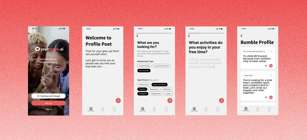
Creating a flow which gradually progresses users through the profile generation experience and gives them the autonomy to customize their outputs at the end
The first feature introduced is sequenced questions and answers which baby steps users through the flow.
The second feature introduced is the ability to refresh individual answers to dating question prompts on the results page until satisfactory.
The third feature introduced is the ability to toggle different dating questions to generate answers on the results page that the user thinks is a good fit.
Impact
We launched the redesign on Product Hunt and saw an increase in user activation, user re-engagement, and conversion to paid subscription

Launch Results:
3x user activation
2x re-engagement of users coming back to product
1.5x conversion into paid subscription
10% increase in monthly recurring revenue
149 Upvotes, 3 reviews on Product Hunt
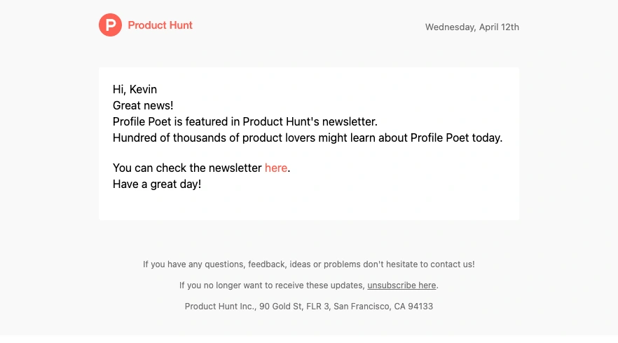
Featured in Product Hunt’s Weekly Newsletter
Problem
Users who have used Profile Poet see a lot of value in the tool, but most users have never tried it
When looking at YourMove.ai’s metadata, we see that users leverage the other suite of features, but rarely use the Profile Poet.
The founding team created a profile generation feature as an introductory flow to show users the value of their offerings and to lead to more recurring revenue, but very few people had used it or given it a try.
Of the users who have clicked on it, many do not make it to the end and few ever come back to use the product again.
Profile Poet is not discoverable because you have to scroll to the bottom of the landing page to see it
Describing yourself by filling in many fields is clunky and the UI lacks visual polish
There is no way to adjust your profile generations without starting over from the beginning
Research
By looking at metadata and conducting user interviews, we determined that the AI logic of Profile Poet worked, but the experience had three user pains
Lack of discoverability of the tool
By looking at Hotjar metadata, we could see that only 8% of users made it to the bottom of the landing page to see a button to create an AI profile.
High friction in filling out prompts
In our user interviews, we synthesized that people like the logic and answer outputs the profile generation provides, but thought the experience getting there was clunky and not visually polished. Our metadata confirms that 55% of people dropoff before making it to the profile results.
Lack of flexibility in customizing outputs
In our user interviews, we got repeated feedback that users wished to be able to customize their outputs on the results page without having to start the flow over from the beginning. Our metadata confirms that only 6% of users ever try to create a profile from the start.
Design Goals
Increase discoverability, reduce friction in providing inputs, and increase flexibility of outputs so users experience more value in YourMove.ai’s total offering
Our hypothesis is that if users try out Profile Poet, they’ll be more compelled to try out other features like Openers or Replies which will lead to more user activation, higher conversion rate, and higher monthly recurring revenue.
DALL-E description: AI bot generating US dollars
Team Constraint
YourMove.ai is built using a no-code platform which limits the capabilities of what we can engineer
As a philosophy, I leaned into simple visual ideations and focused more on getting alignment with our overall user flow and the things that we could control for.
The flip side benefit of this was that we could quickly ship product to test our new designs.
DALL-E description: AI bot who was handcuffed but is now sprinting
Competitive Intelligence
Since use of YourMove.ai is meant to complement dating apps, I studied existing mental models we could leverage. I also looked at AI messaging apps for additional inspiration
Ideation
Since profile creation is the first thing a user does when downloading a dating app, I started by imagining Profile Poet to be at the beginning of the YourMove.ai user journey
The question the co-founders and I grounded on was:
How might Profile Creator be the main source that helps onboard and direct users into our other products?
After sketching and showing the concepts to the co-founders, there was interest in further exploring these ideations:
Toolbar
A footer navigation bar which makes it clear to users of all of YourMove.ai’s distinctive offerings including Profile Poet.
Sequenced Questions
Questions one at a time to baby step users into the experience and a progress bar for visual indication.
Native Help Tips
Visual intercepts which help educate users on ways to get better value out of the tool.
Output Customization
A way to refresh results or change questions until you find a response that you want for your dating profile.
Lo-fi Wireframing
Since growing venue is top of mind, lo-fi wireframes explored different flows to introduce our freemium model to minimize user dropoff
Although our intuition told us to keep monetization at the end once the user had already committed effort to working through the experience, we challenged ourselves to ideate and find out if there was a better flow for the user.
After our explorations, we came to a consensus that it would still be better keeping the monetization frames at the end of the user flow.
Validation
Co-founders loved the wireframe so much that they switched this redesign to their top priority for the month
We decided that we would test the redesign live by shipping it ASAP and tracking usage and Hotjar feedback after doing an email blast to current users.
I spent the next week putting together a hi-fi prototype.
DALL-E description: Excited AI bot ready to go
Visual Design
Since AI is controversial, my visual design focused on minimalism and trying to position this as a friendly and trustworthy product
We heard in our user interviews that people were inherently using YourMove.ai as a dating coach rather than a dystopian AI product replacing all human connection so we leaned into that ethos for our brand redesign.
I pushed to redesign our UI to being light, airy, and fun compared to the dark, sultry, secretive vibe of the landing page.
Solution
Ease users into providing inputs and give them full flexibility to edit and customize their final outputs
The bottom navigational toolbar helps introduce user to app possibilities and creates flow between products.
Sequencing questions lightens cognitive load with progressive disclosure into our experience.
Refreshing answers and changing questions gives users flexibility into customizing their outputs to fit their own voice.
Plan of Action
In the spirit of moving quickly, I suggested to the team that we shelve some other features we had in our prototype for later
Priority 1
Sequenced Questions
Priority 1
Card View, Question Refresh, Question Chang
Priority 1
Updated Monetization Flow
We determined that the following features could come on to add value later on:
Toolbar
This would require high engineering lift to create on our no code app and we can wait after validating that users want to use the new UI and Profile Poet redesign.
Native Help Tips
Higher engineering lift and if the redesign works as intended, users might not need as many tips.
Post-Launch Iterations
We redesigned the Change Question affordance since we noticed users weren’t clicking the toggle button
We saw a 12x uptick in users trying Profile Poet after relaunching, but noticed in Hotjar metadata that they were not clicking the Change Question icon.
We went back to the drawing board and shipped a dropdown menu to give a clear signal to users which solved our problem.
Learnings
It seems counterintuitive, but more frames and clicks might be better in some cases
As designers, we aim to cut away any friction possible, but adding frames to throttle user inputs can strategically benefit user experiences.
Design for the ideal, and then see what’s in the art of the possible
Additionally, I advocate for staying as aligned and collaborative with your Eng and Data Science team as possible for builds like this because their feedback and understanding the lift required will really shape what’s actually possible to build.
AI is here to stay, so it’s our choice to find ways to leverage it rather than fight it
Most of the users interviewed told us that they pay for YourMove.ai subscriptions because they like the outputs, but still manually edit responses before using them. AI helps inspire them, but does not completely replace the human touch yet.
The same can be said about the AI tools popping out that can create entire UI layouts or company logos. As designers, it’s easy to feel intimidated that we might be phased out of a job. My take is that we must learn to leverage these tools, but trust our experience and eye for beauty to enhance those outputs so that we can really make something truly delightful.
Like this project
Posted Jun 15, 2023
YourMove.ai · Profile Poet Redesign for Increased Conversion YourMove.ai, an AI app built on ChatGPT, has a profile generator which is underutilized by its...
Likes
0
Views
49
Tags


