Formfit | Brand identity
taya designss
The brief: Form fit is a new Pilates studio opening in Sydney. We want to take a unique approach with the overall feel of our studio. Pilates is often associated with muted, organic colour palettes, and an almost exclusive feel. However, we want to stray from this trend. We want our studio to feel welcoming to all, with a clean and simple, but fun aesthetic, because self-care should be accessible to all.
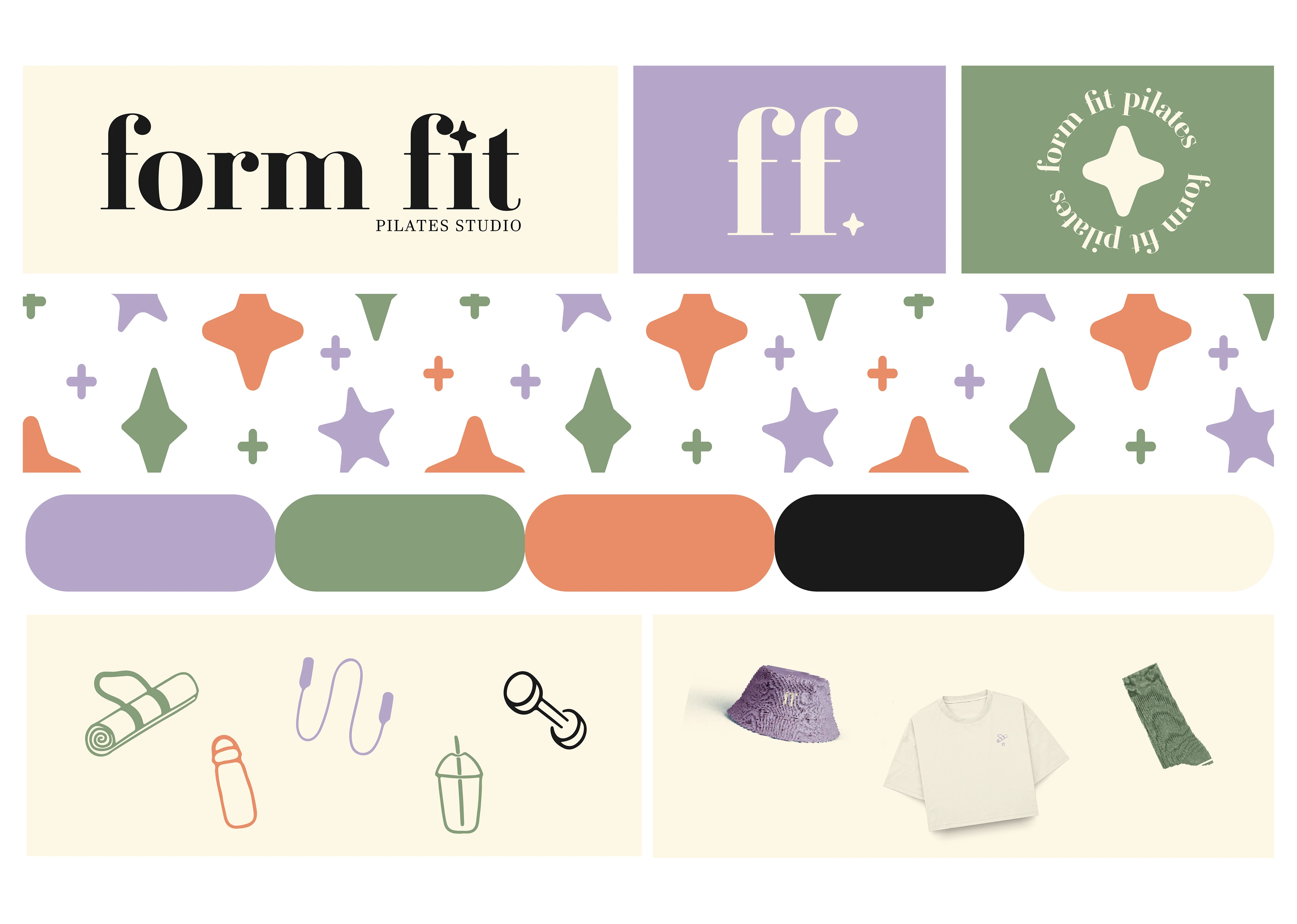
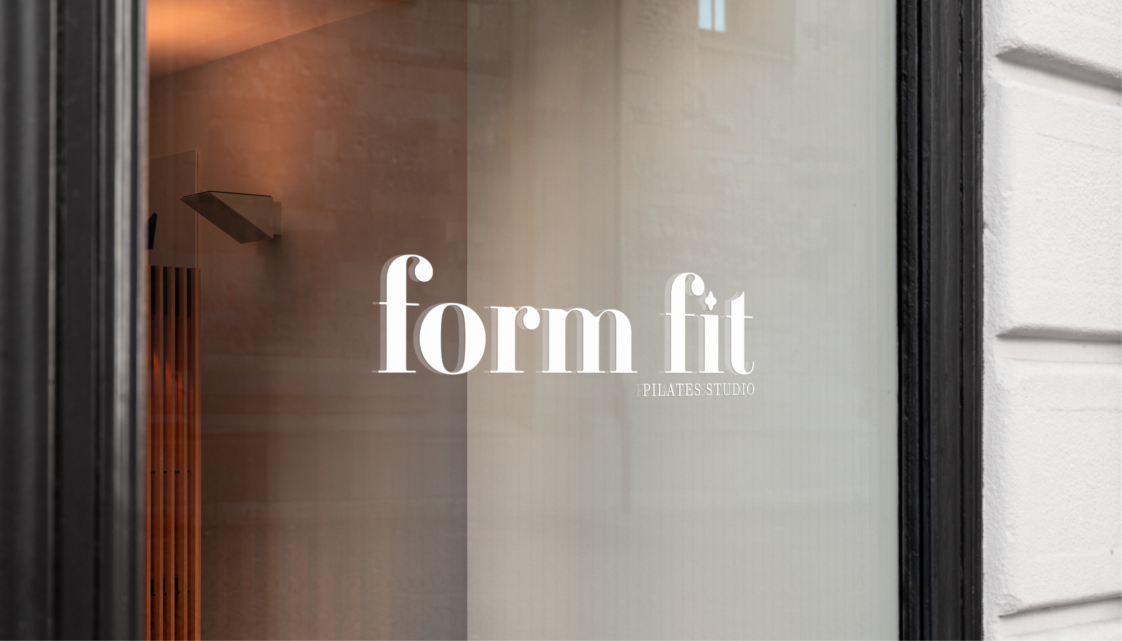
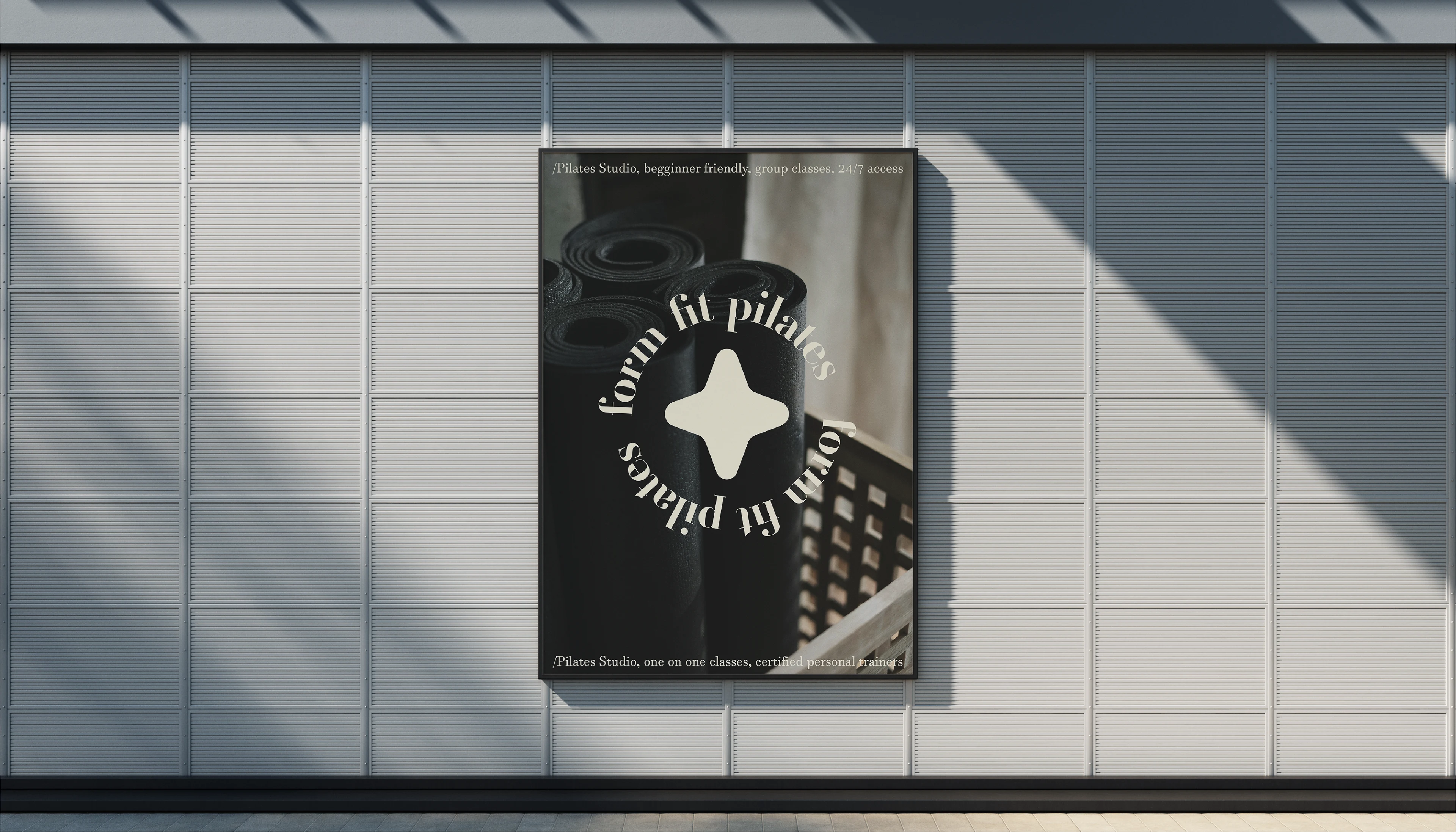
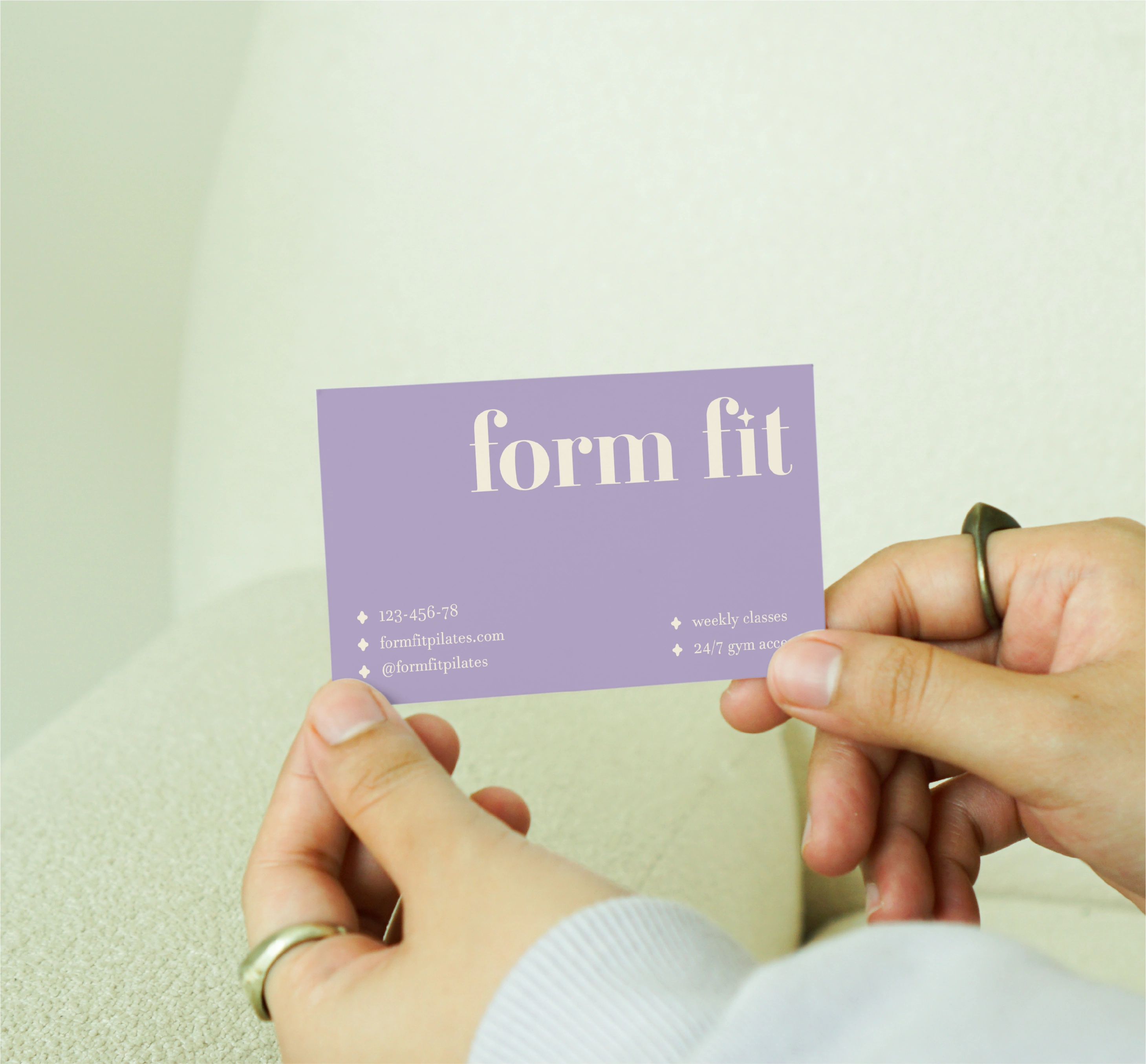
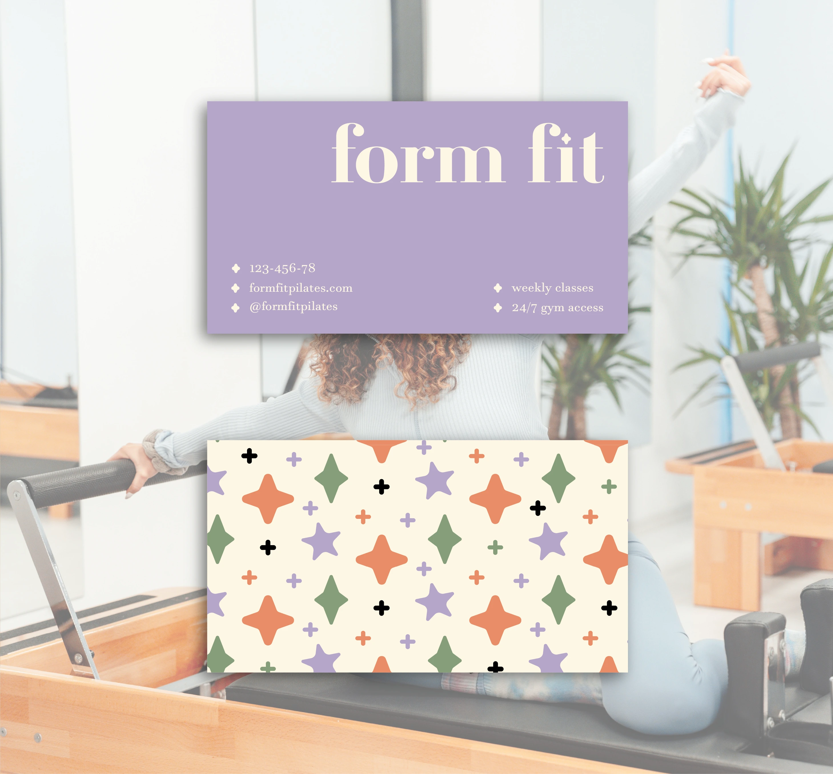
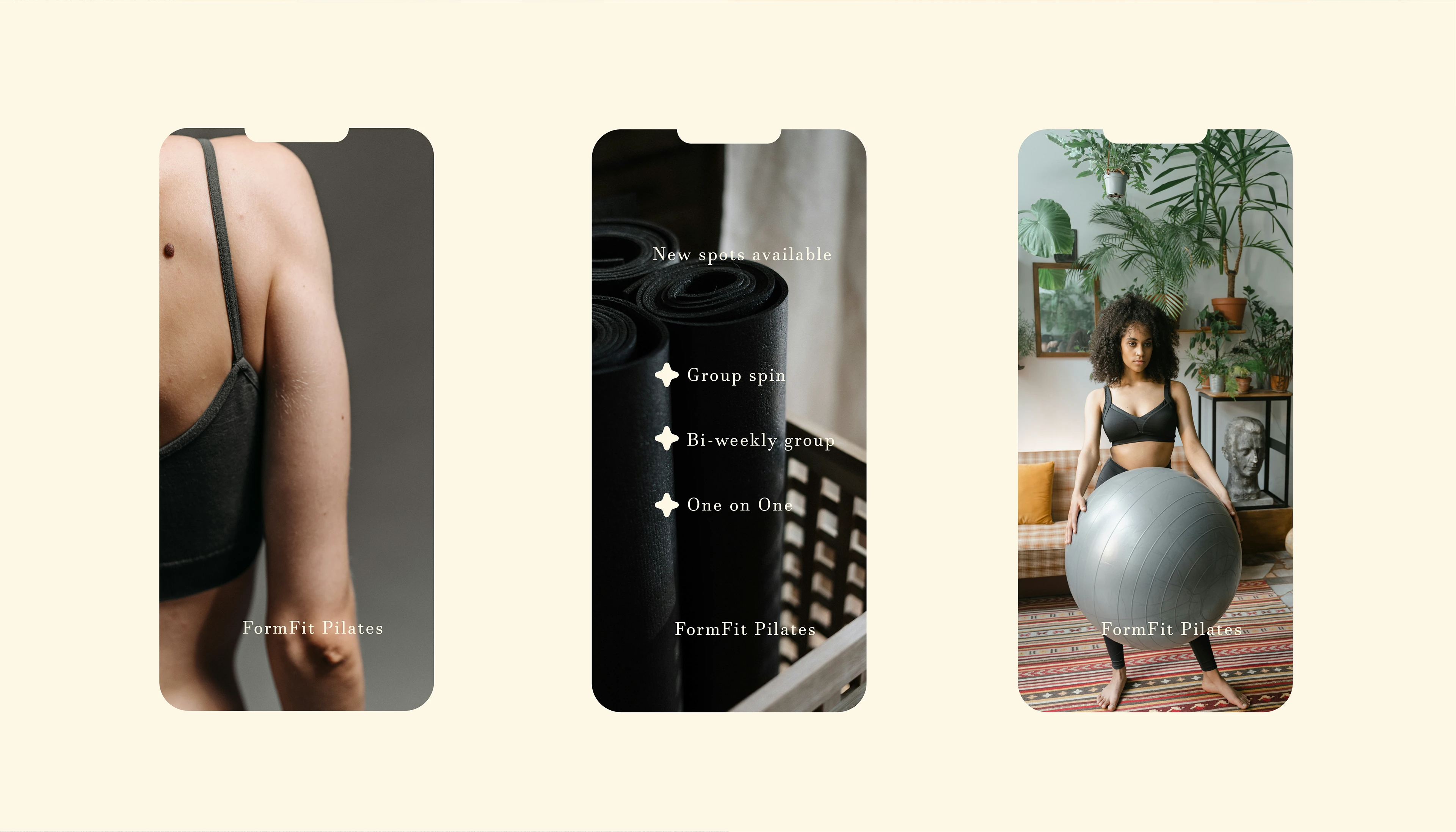
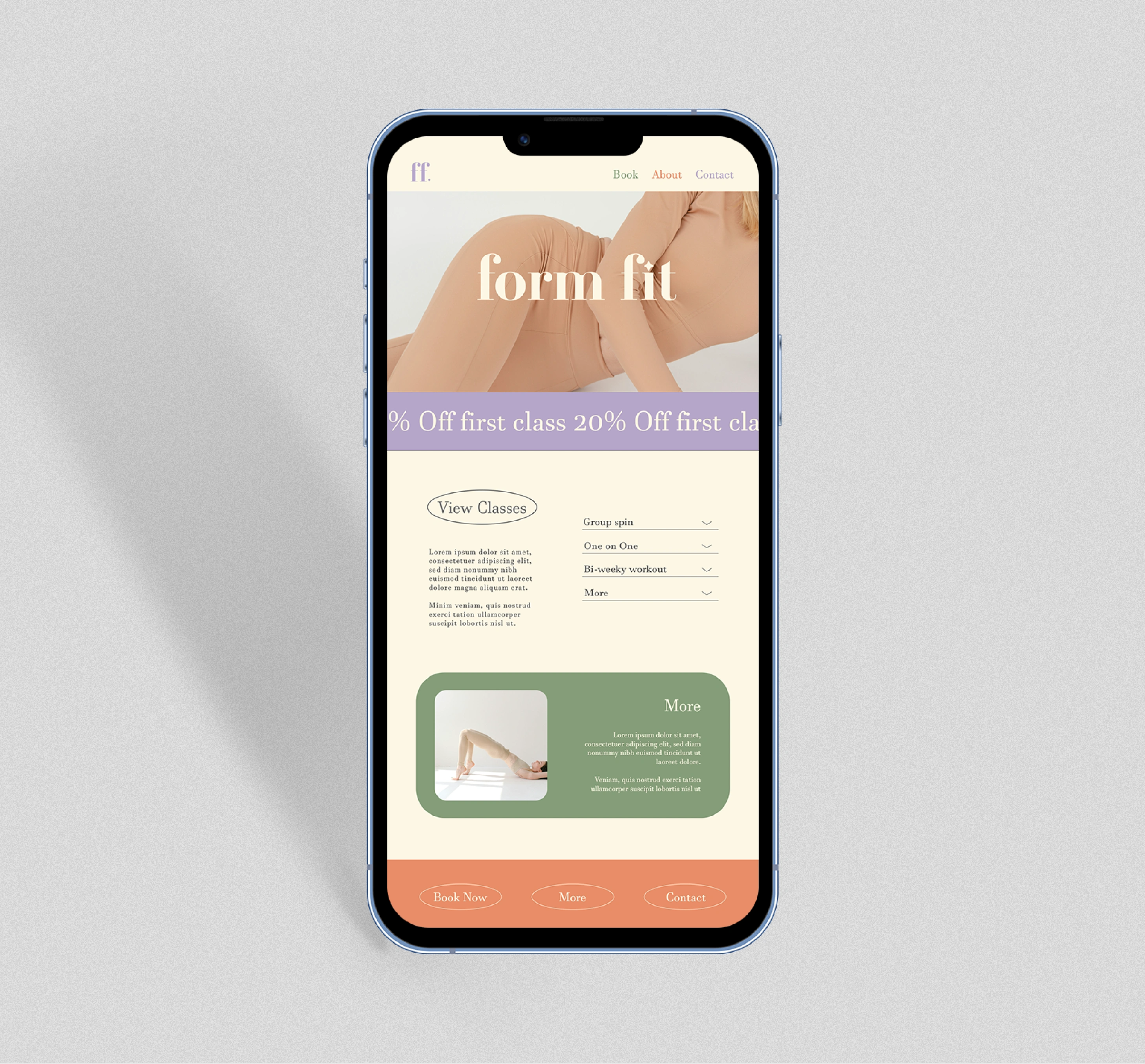
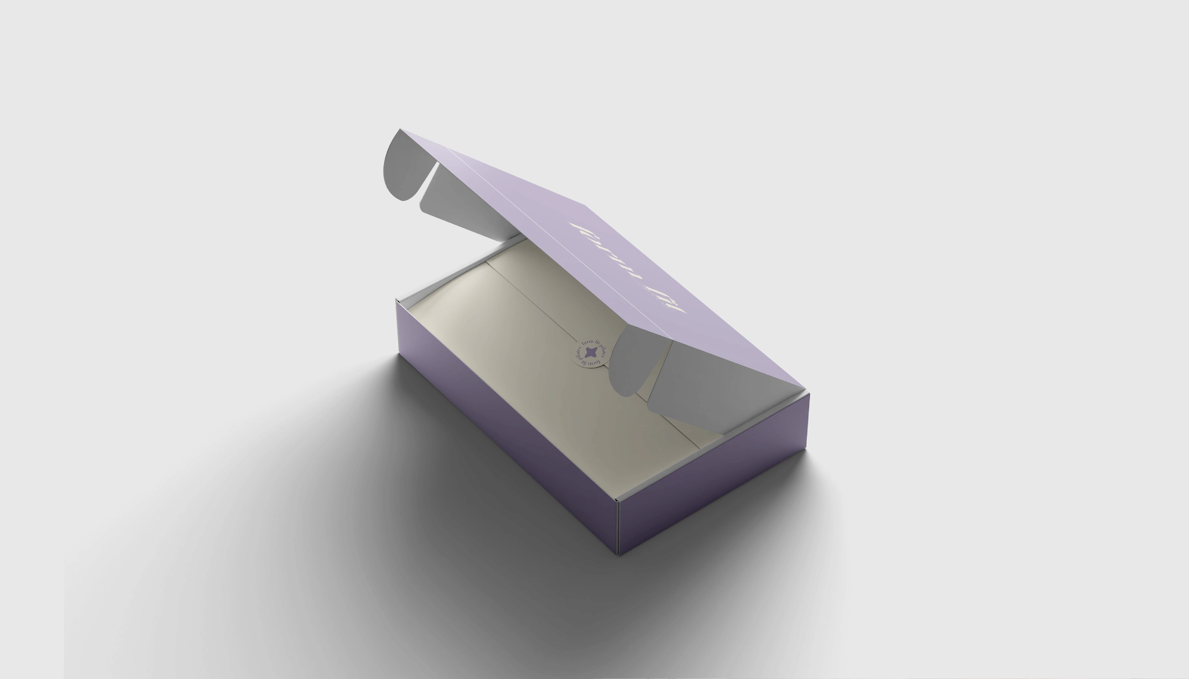
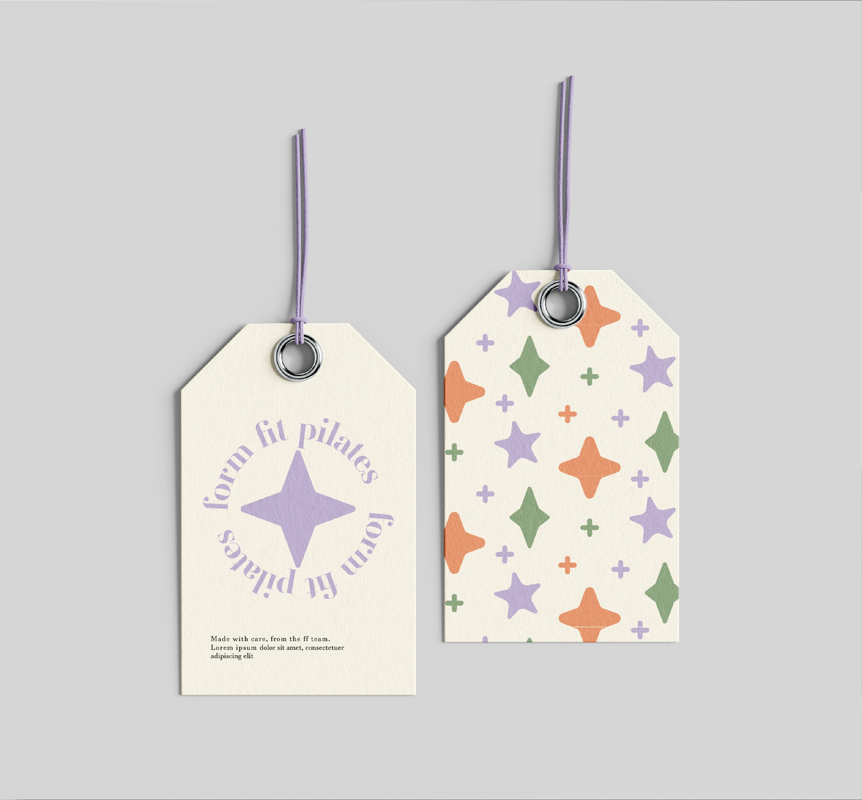
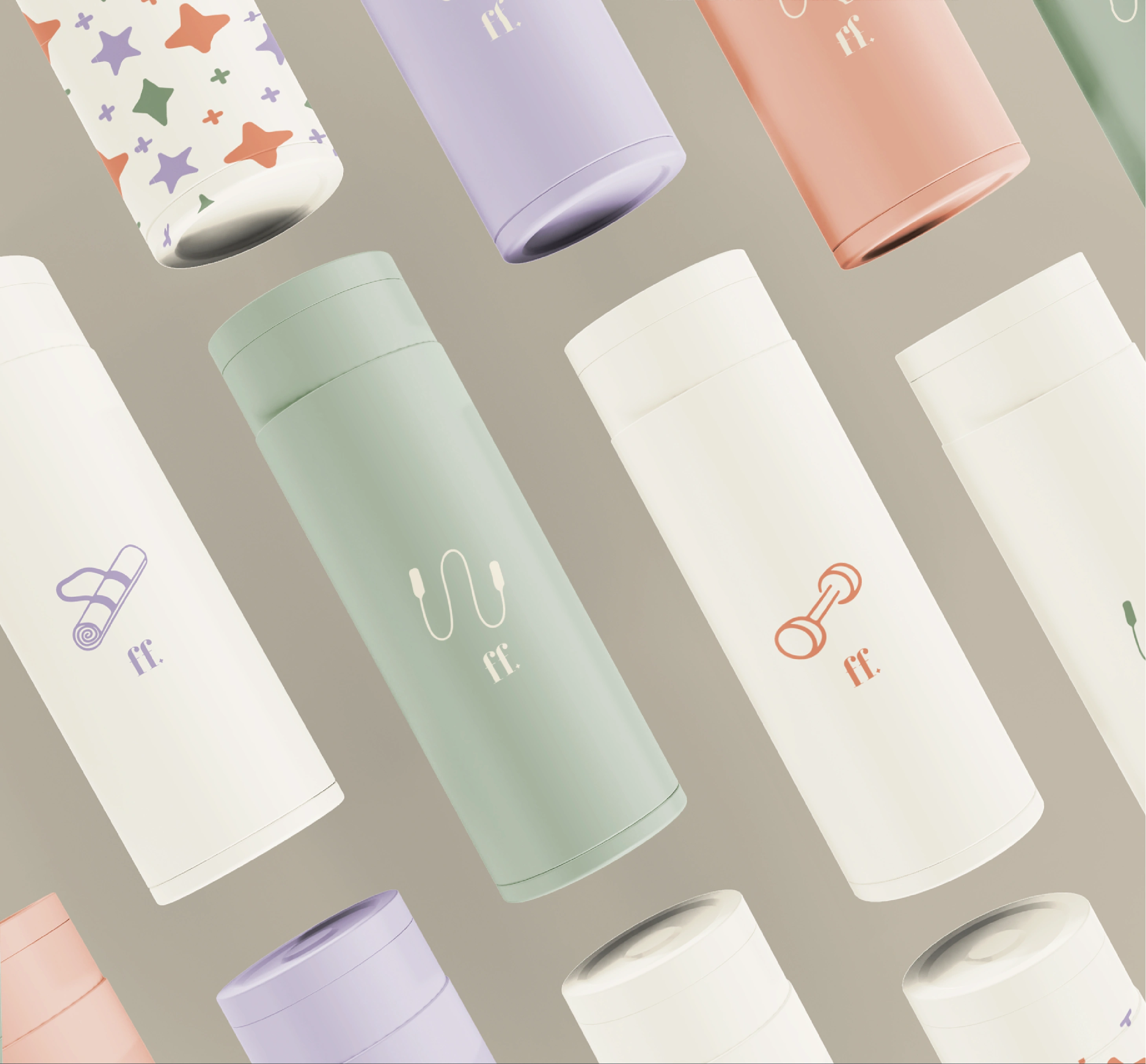
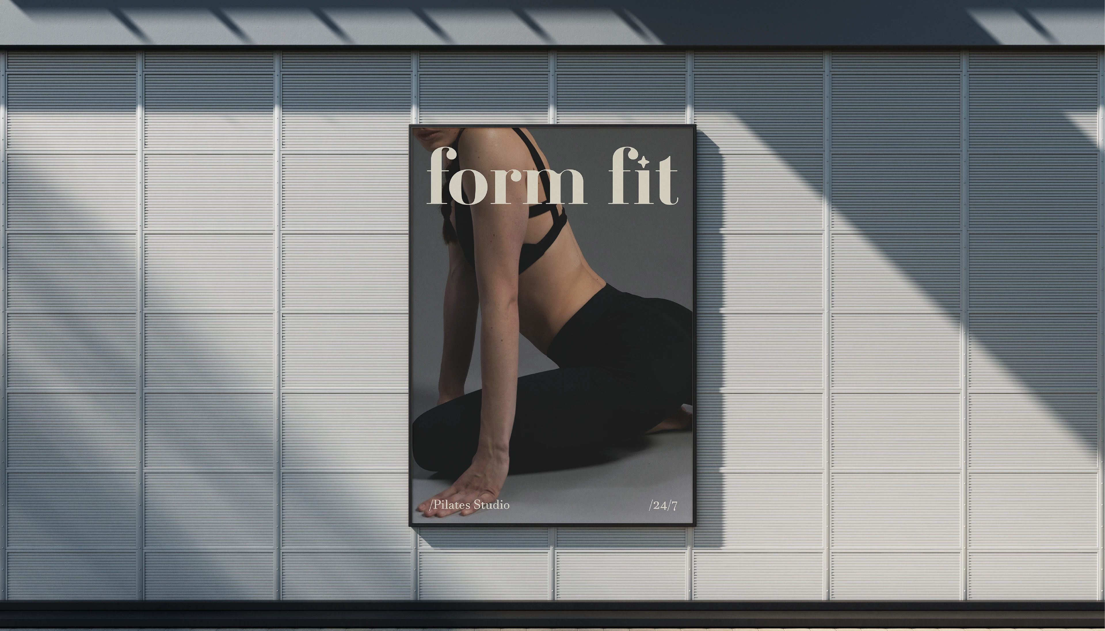
Solution: I paired fun pastel colours with serif fonts for the logo, to give a clean but welcoming feel. I also incorporated a sparkle/star into the logo to represent self care. I then paired this with simplistic, hand drawn illustrations, giving a clean, but welcoming look. Overall giving the brand a bold, but minimal image.

Like this project
Posted Oct 25, 2024
Formfit takes a unique, welcoming approach to Pilates. To represent their inclusive brand values I designed a colorful, hand drawn, and friendly brand identity.
Likes
1
Views
11
Timeline
Jan 6, 2025 - Jan 13, 2025