KAYA: Brand Identity & Packaging for a Modern Ayurvedic Soap

Aryan Parte


I wanted to build a brand that captures the feeling of a mother's homemade soap in the language of modern luxury. So I created KAYA, a conceptual premium Ayurvedic soap brand, and designed its identity, a four-flavour packaging system and brand applications.
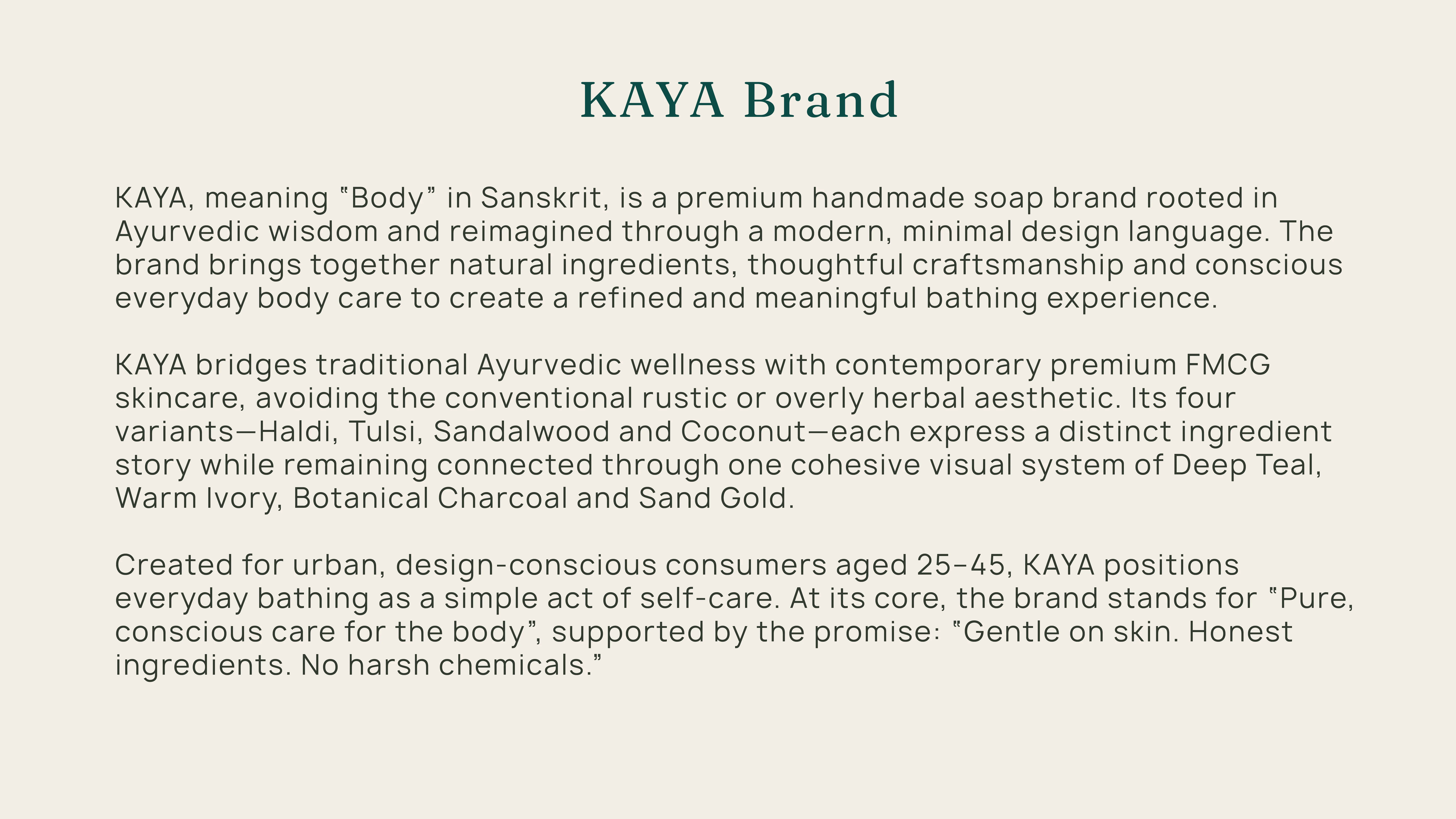
KAYA means "body" in Sanskrit. Pure, conscious care for the body, rooted in Ayurveda.

Gentle on skin. Honest ingredients. No harsh chemicals.

THE CHALLENGE & MARKET OPPORTUNITY
The gap.
The brief identifies three concerns with many contemporary soaps: formulations that feel overly chemical, more emphasis on fragrance than on skin care, and products that can feel artificial or harsh for daily use. These are the brief's observations about market perception, not claims about any specific product.
Premium natural skincare answers some of this, but it often feels distant from the warmth and familiarity of traditional, homemade soap.
The design tension.
The brand had to hold together four things that usually pull apart:
Ayurvedic authenticity and contemporary luxury
Emotional familiarity and premium restraint
Natural roots and a modern, design-led presence
A distinct identity in a category that leans heavily on generic herbal imagery (leaves, kraft textures, rustic script)
The design opportunity.
How can a traditional Ayurvedic soap brand feel contemporary, premium and emotionally familiar without losing its natural roots?
The identity needed to be a bridge. It had to speak to heritage through ingredients and symbolism, and to modern expectations through clarity, craft and composure.
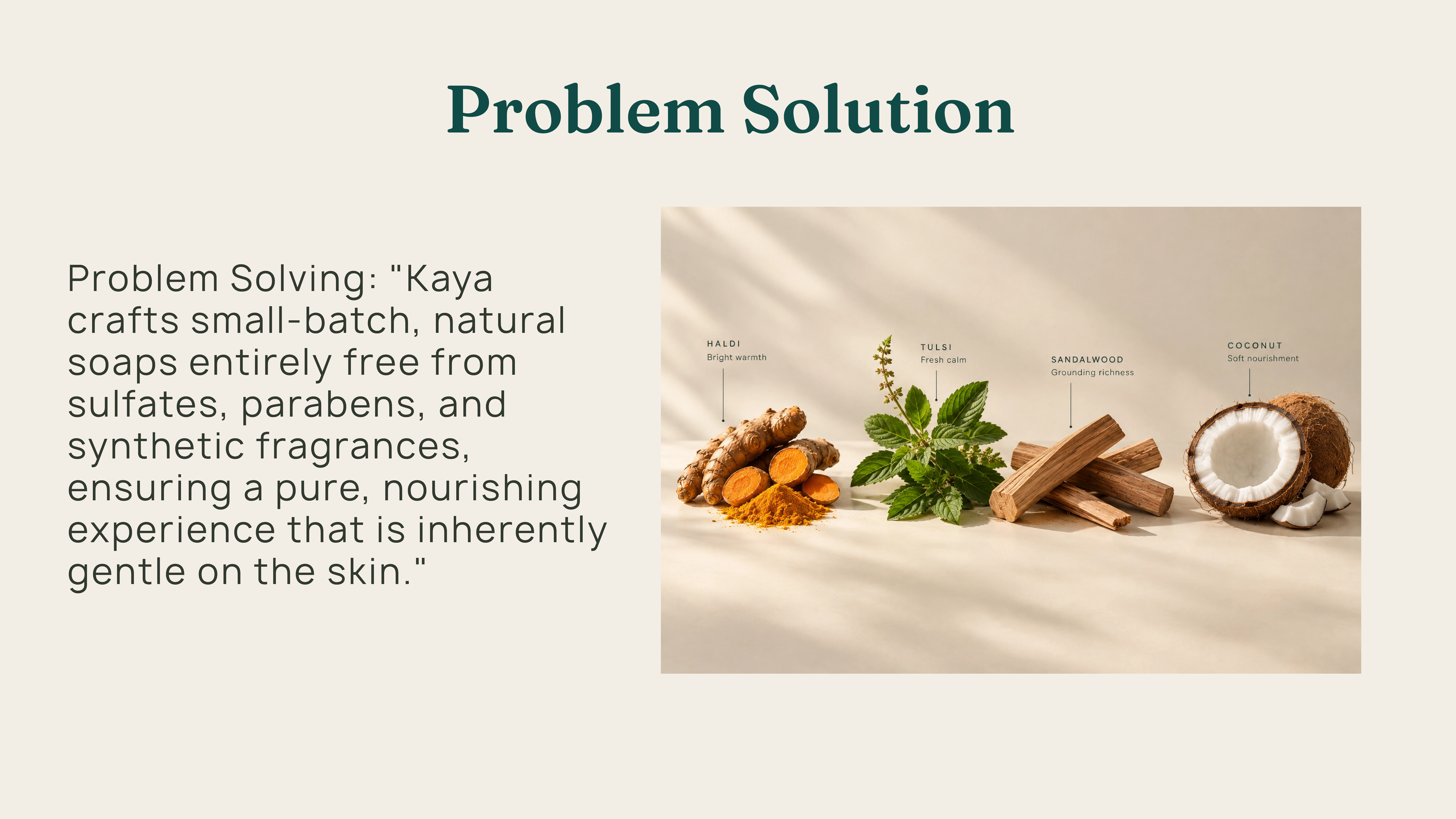
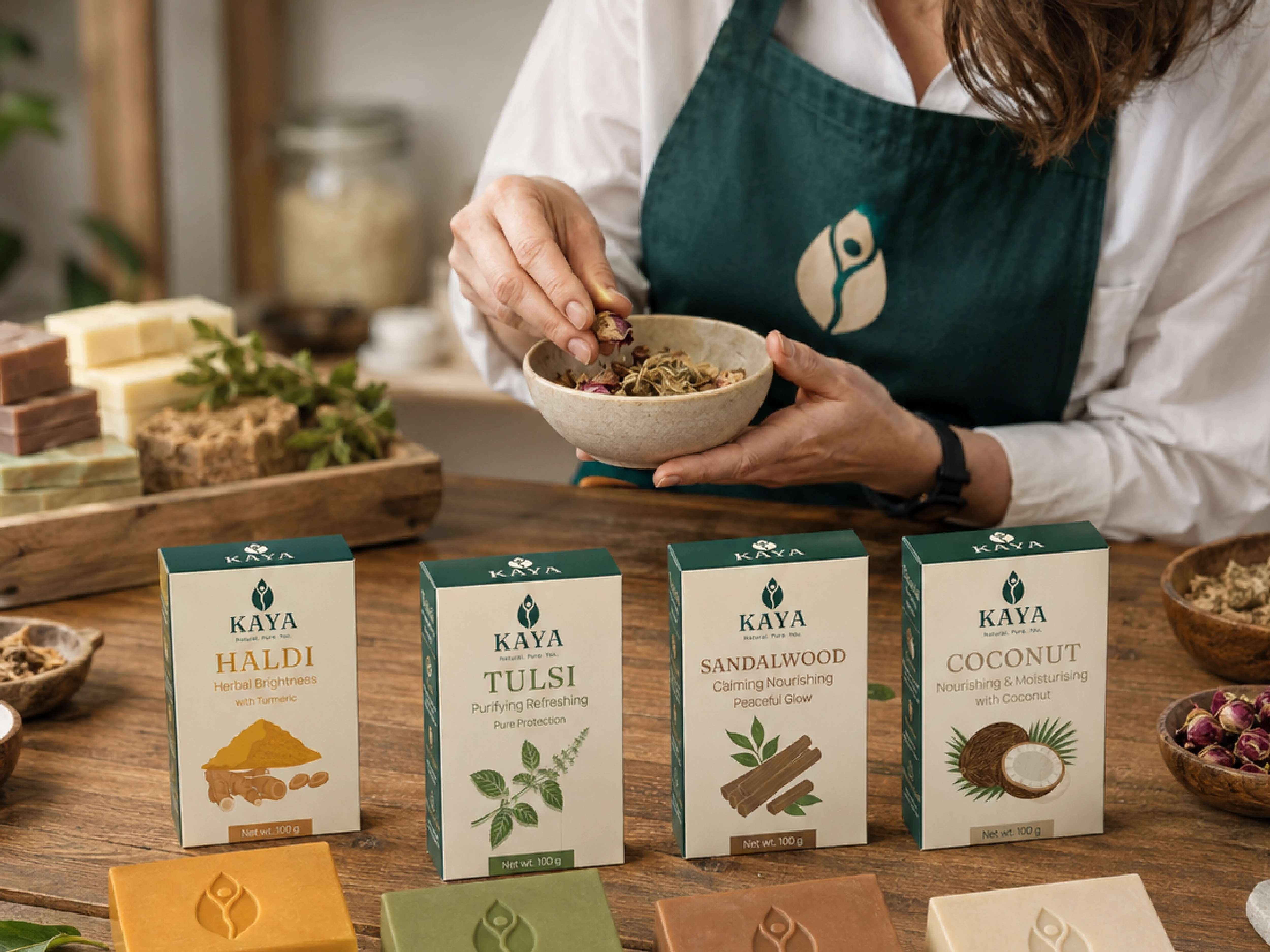
The feeling of a familiar soap.
Today's premium skincare buyer can afford almost anything. What they miss is the feeling of the soap from their mother's hands: warm, trusted, unpretentious. KAYA is designed to bring that feeling into a refined, contemporary form.
The range.
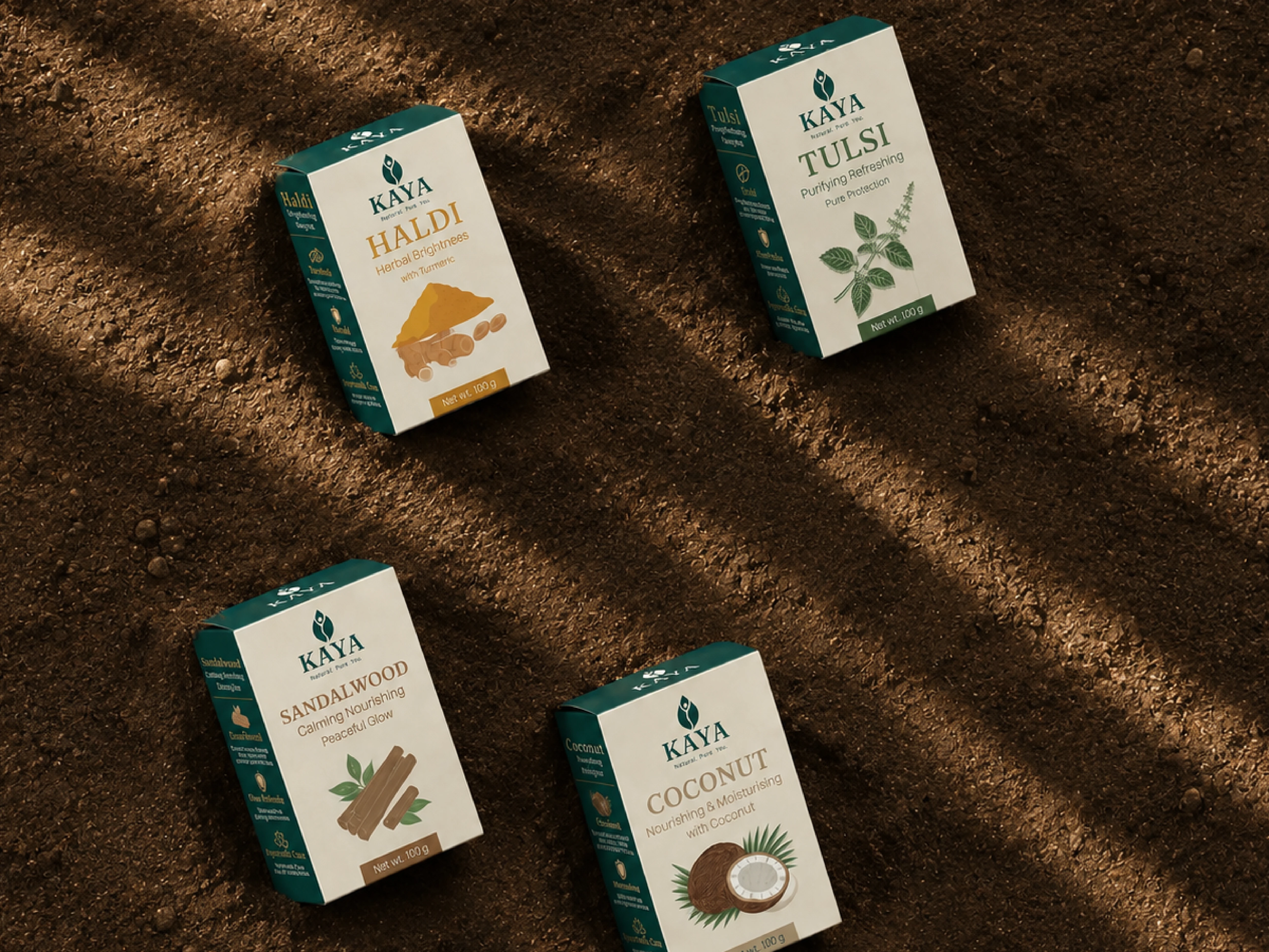
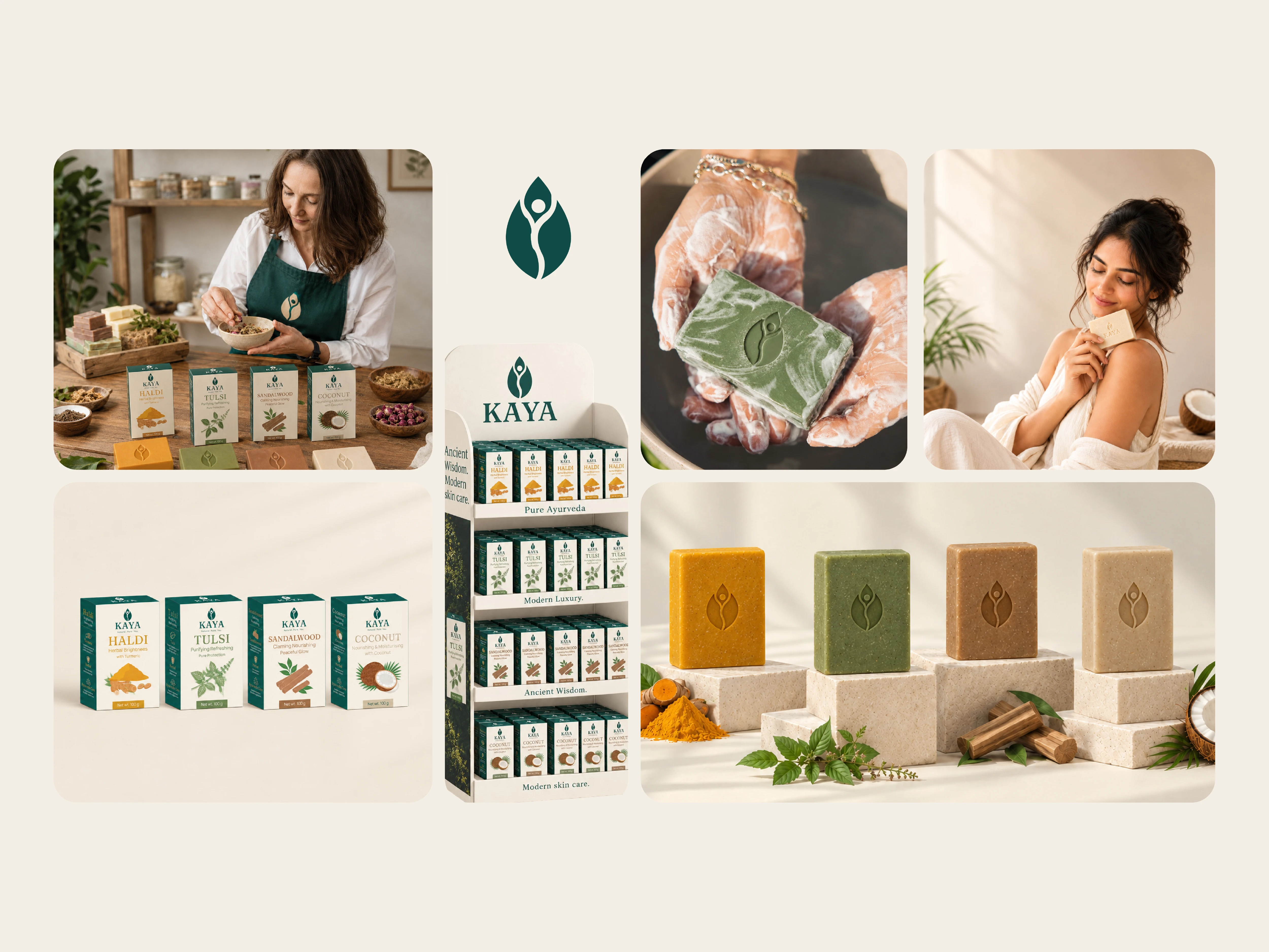
Four handmade bars, each built around a single ingredient:
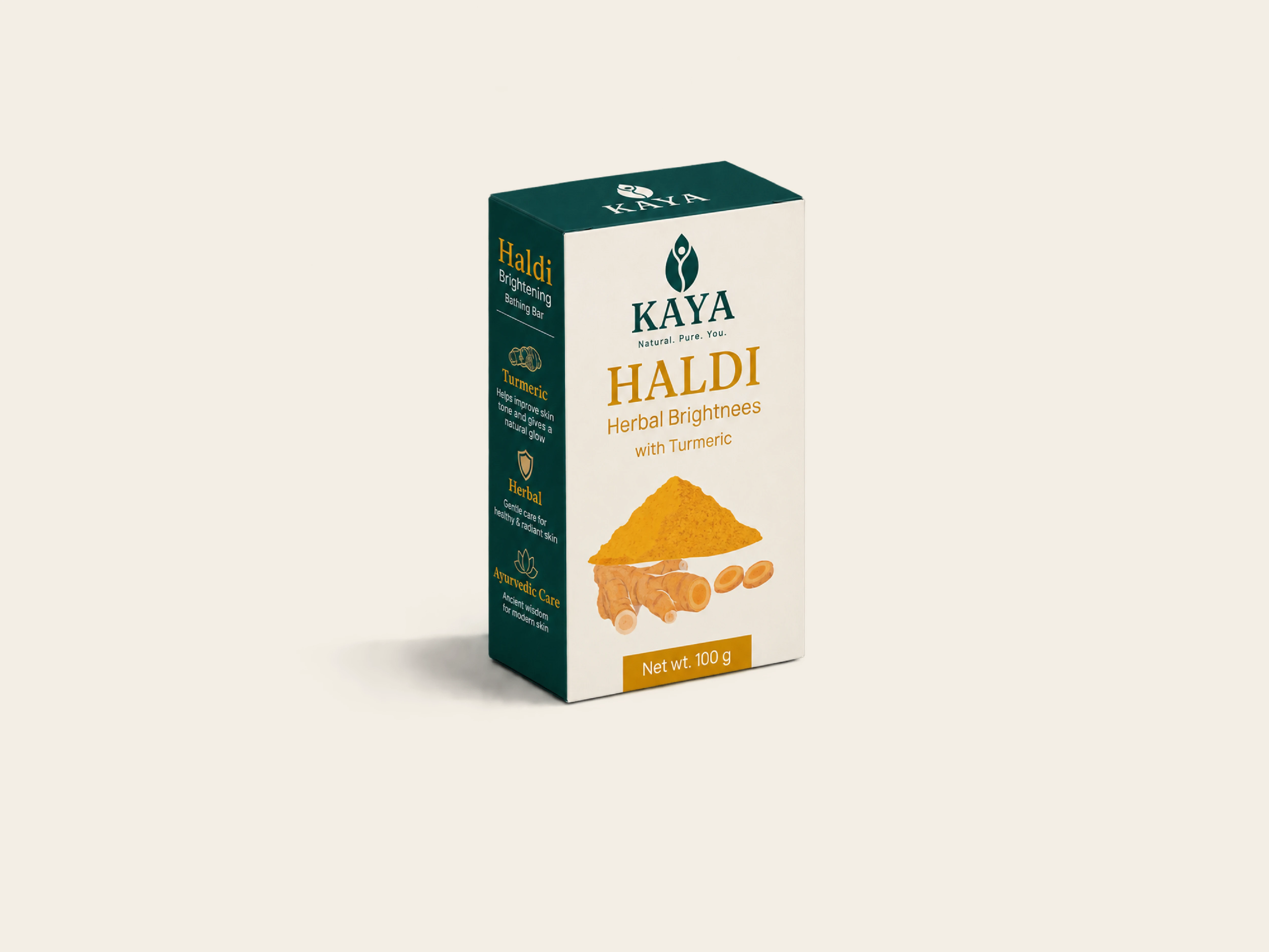
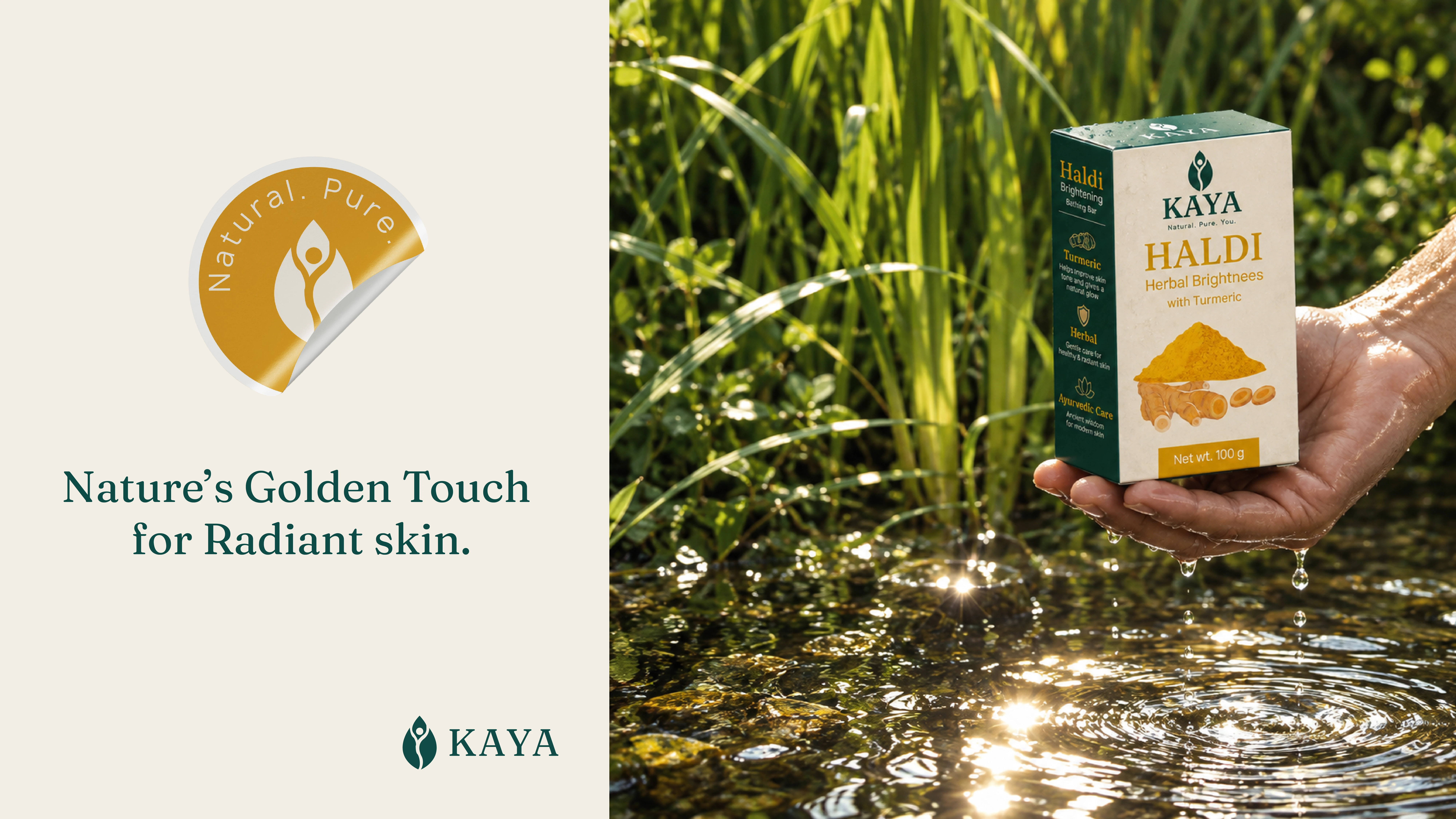
Haldi: herbal brightness with turmeric
Tulsi: calming freshness with holy basil
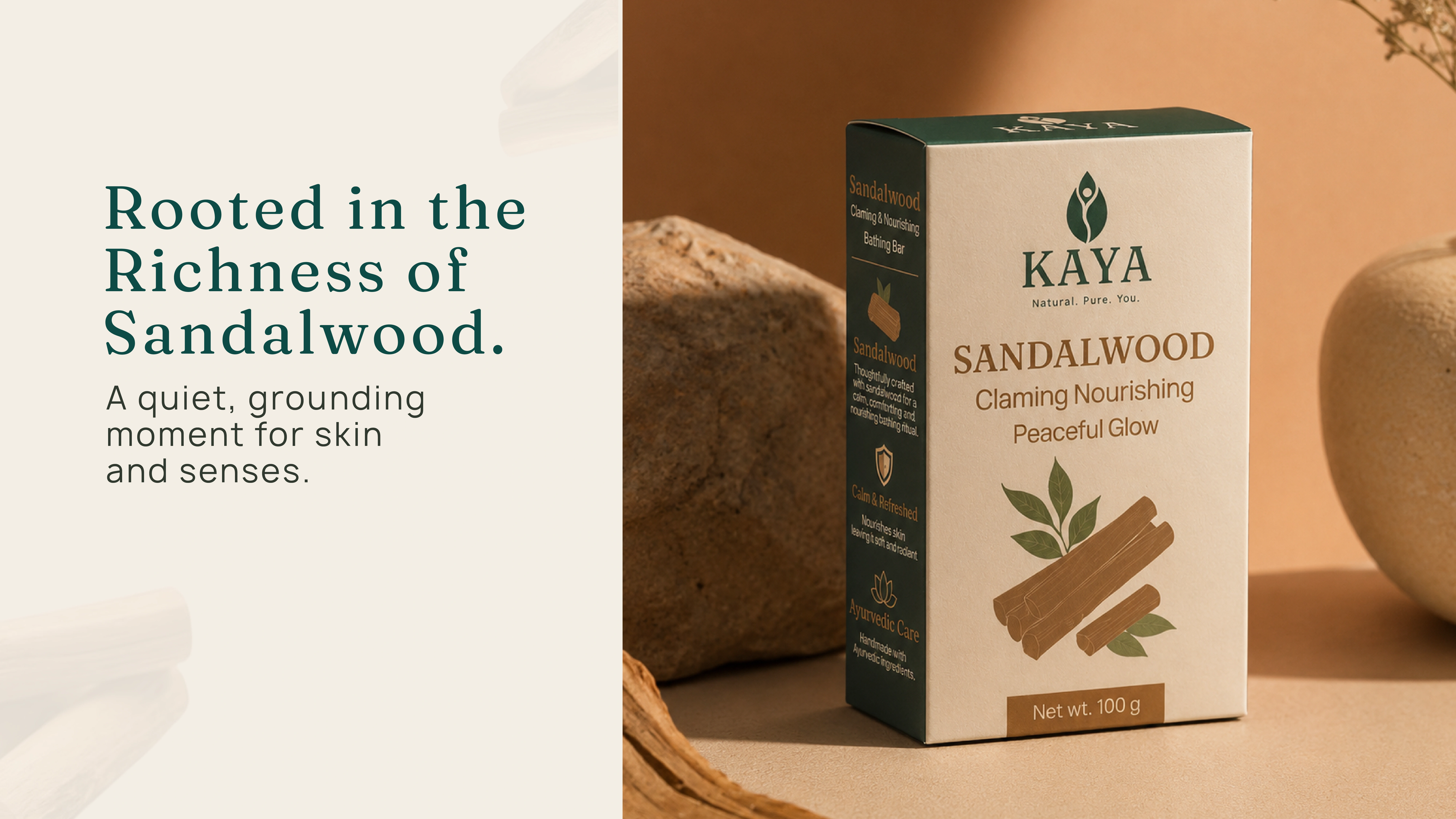
Sandalwood: warm, grounding care
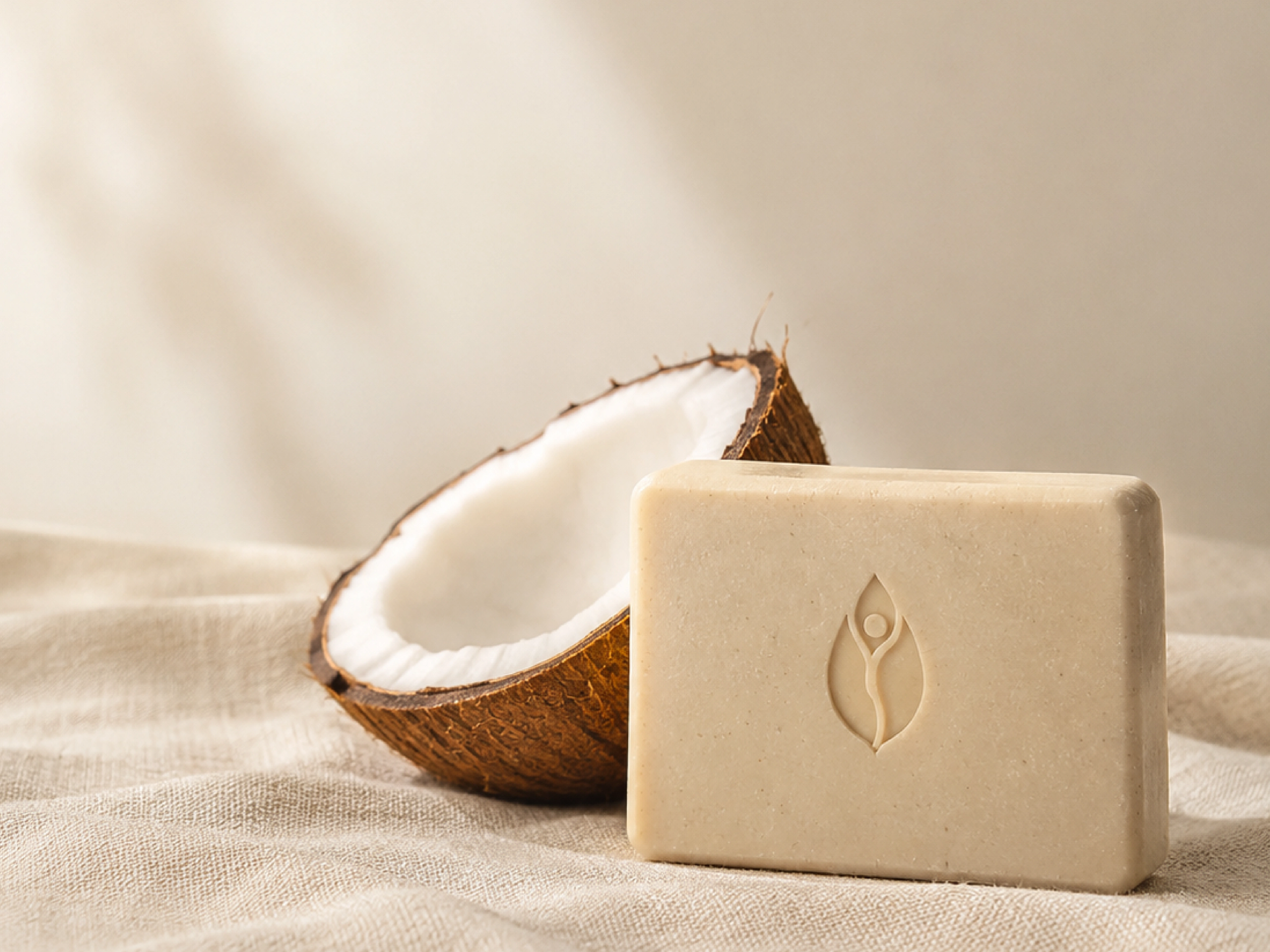
Coconut: soft, nourishing comfort
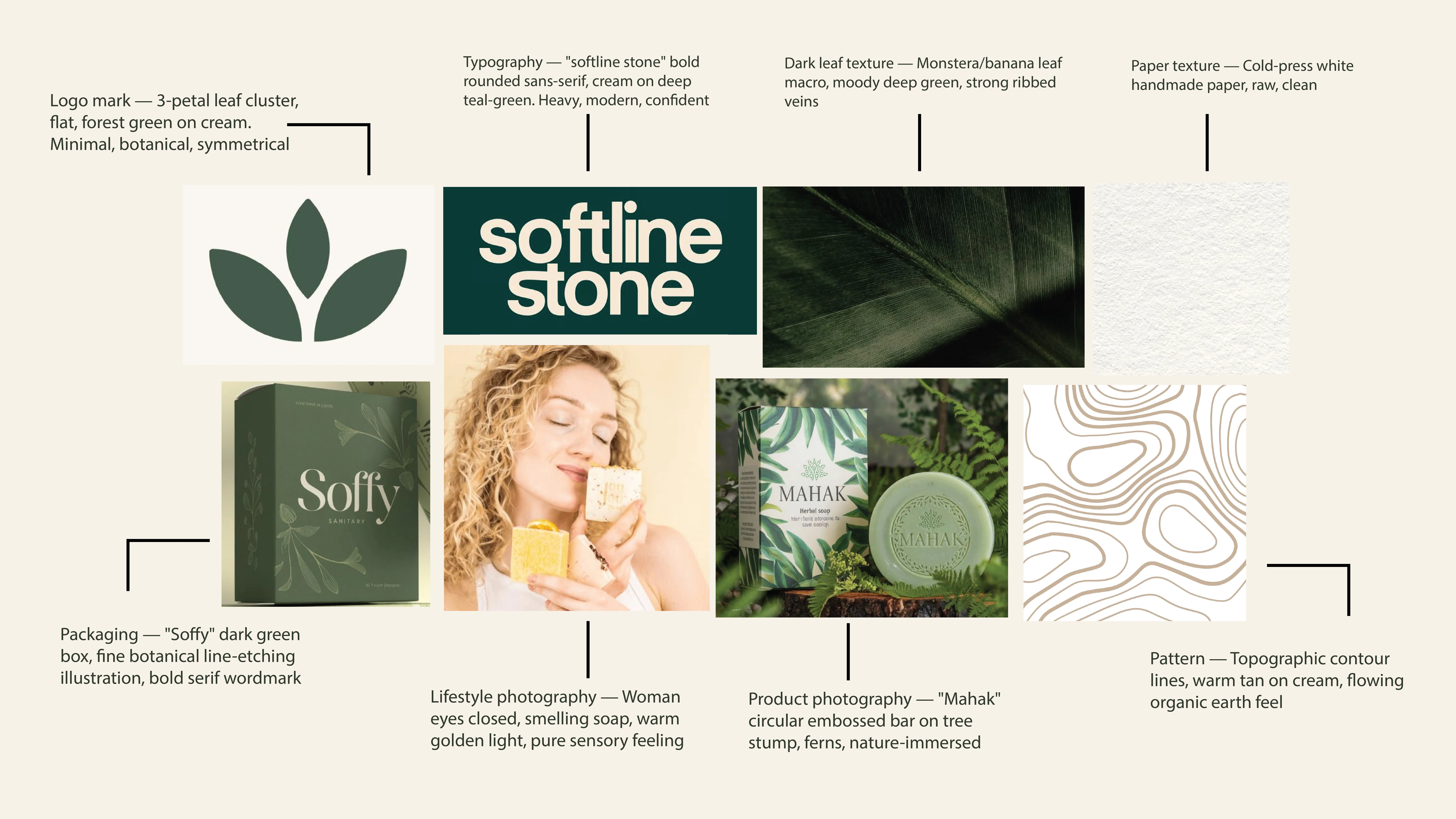
Mood board
The KAYA mood board establishes a modern, organic and quietly luxurious visual world, combining natural botanical textures with refined editorial design. The overall mood is calm, earthy, tactile and premium, using deep greens, warm cream, soft tan and natural paper textures to create a grounded connection with Ayurveda and nature.
The visual language leans toward minimal botanical forms, subtle line illustrations, organic contour patterns, handmade paper textures and nature-led product photography. Photography feels warm and sensory, with soft golden light, rich greenery and close-up natural materials, while packaging and typography remain clean, confident and
contemporary.
For KAYA, this direction translates into Modern Ayurveda rather than traditional herbal aesthetics—natural without looking rustic, premium without feeling clinical, and minimal without feeling cold. The mood should communicate “rooted in nature, thoughtfully crafted, made for everyday rituals.”
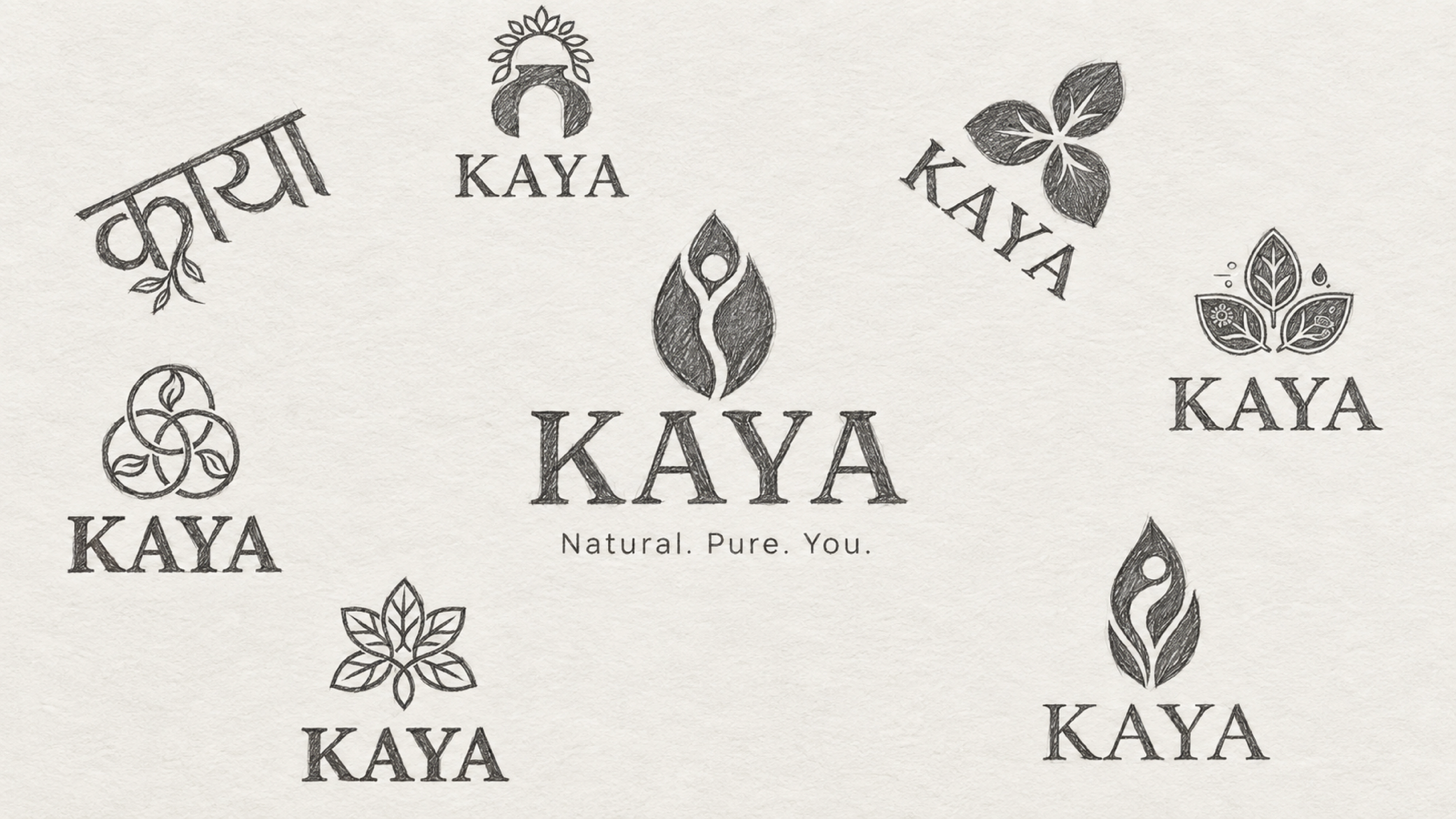
Early symbol explorations. Each direction was tested for simplicity, balance and how well it held beside the wordmark.
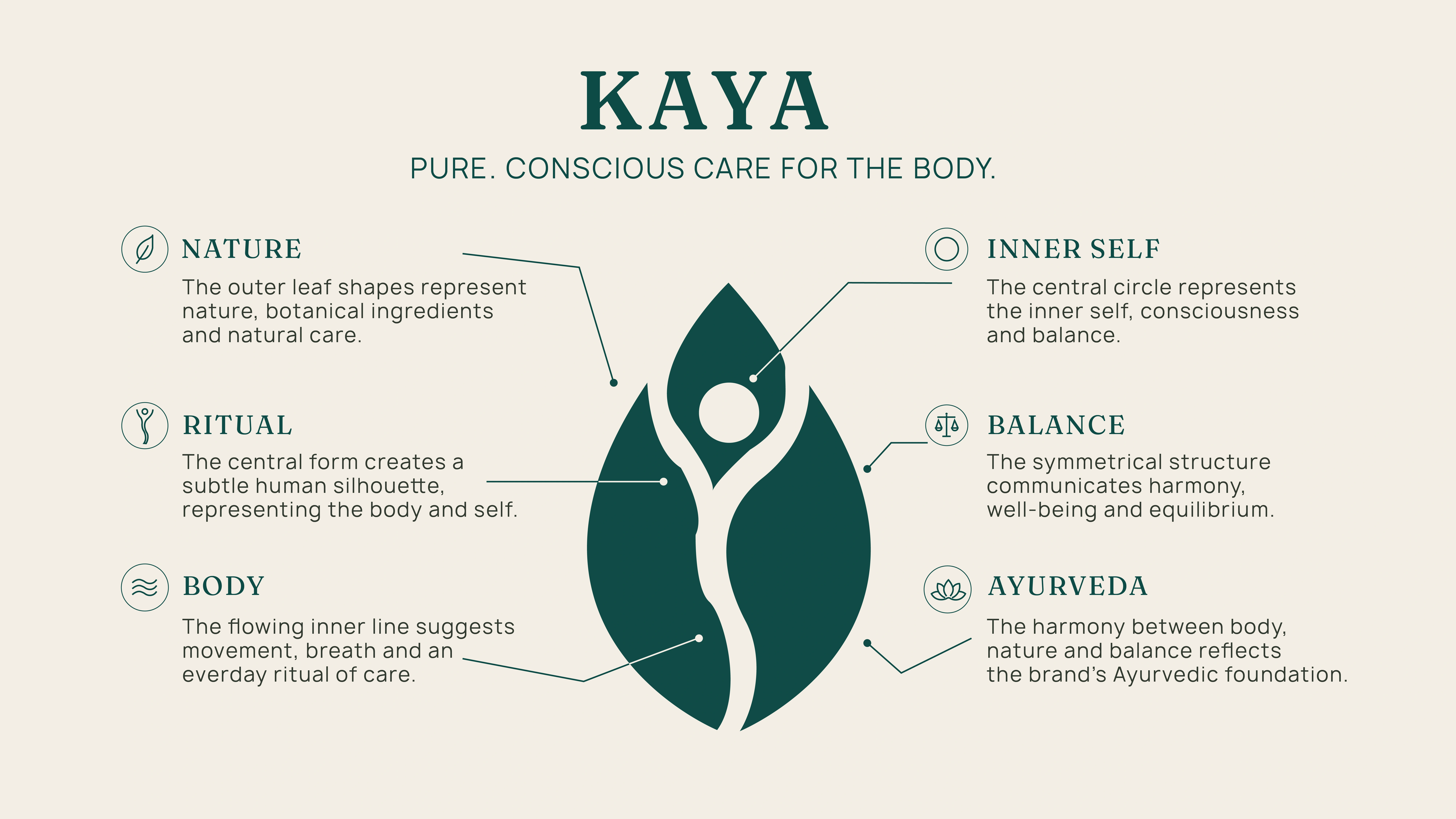
Logo Concept
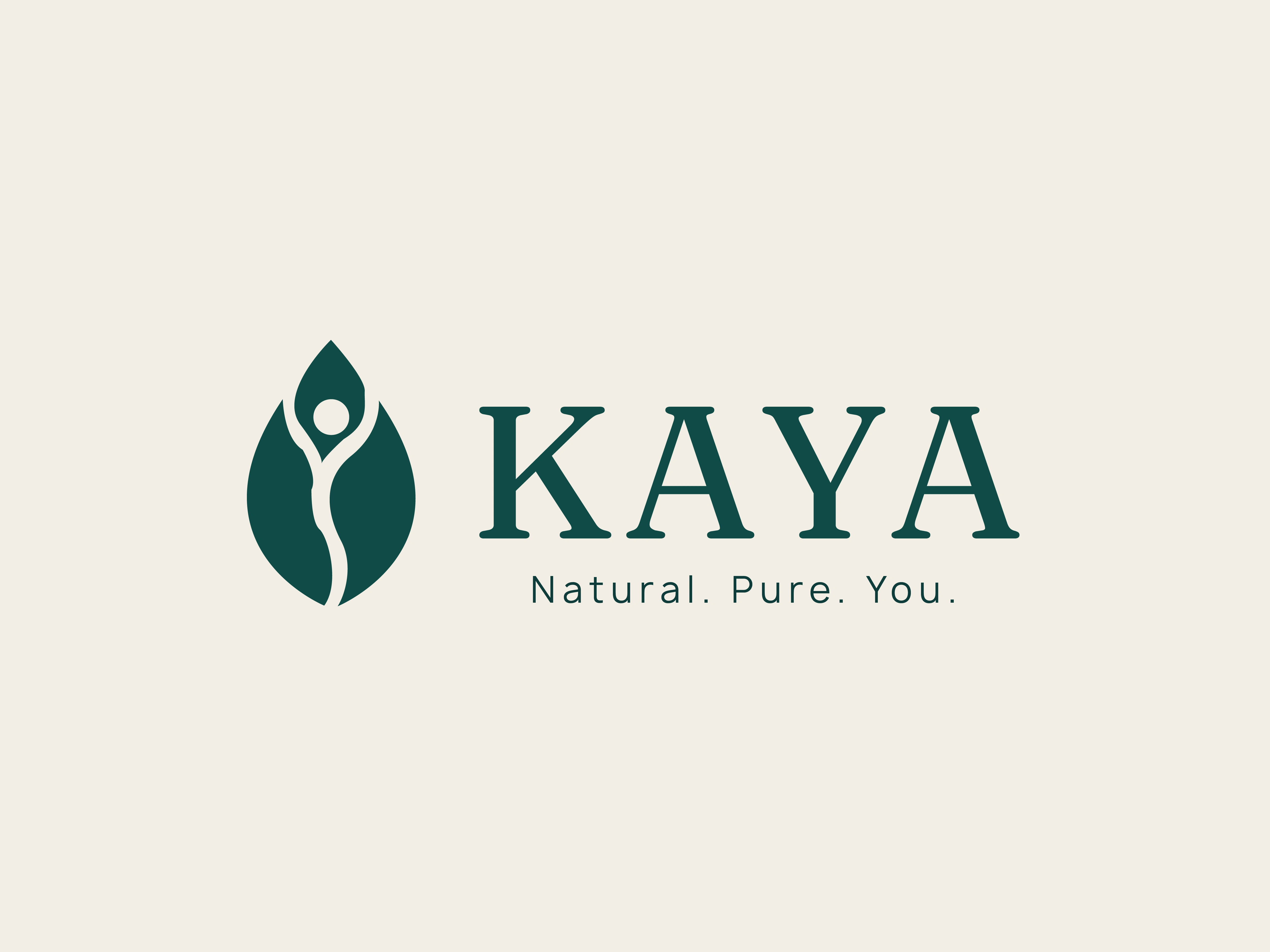
The KAYA symbol is designed as a minimal, organic representation of the body in balance with nature. The outer form combines two leaf-like shapes to represent nature, botanical care and growth, while the central negative-space form creates a subtle human / body silhouette, directly connecting with the meaning of KAYA - "Body"
Core Concept
BODY-The central organic form reflects the human body and self.
NATURE The surrounding leaf shapes represent botanical ingredients and natural care.
BALANCE The symmetrical structure communicates harmony and equilibrium.
AYURVEDA The relationship between body nature and balance reflects the brand's
Ayurvedic foundation.
RITUAL- The flowing inner form suggests a continuous, mindful everyday care ritual, CONSCIOUS CARE The open negative space keeps the symbol feeling calm, intentionat and modern.
Logo Personality
Minimal, Organic, Balanced, Refined Calm, Timeless
Colour scheme
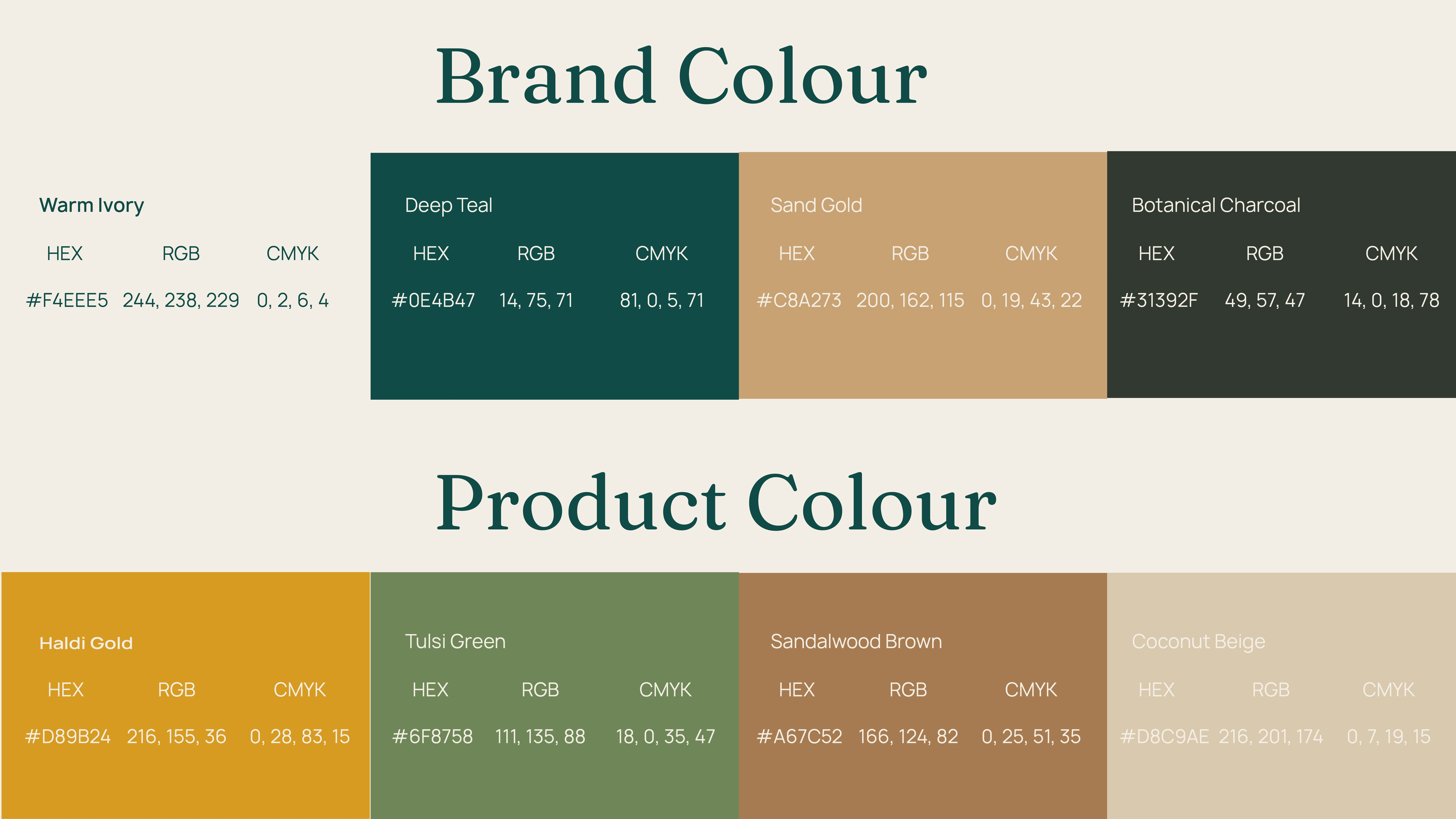
Colour Palette
Colour Hex Role
Deep Teal
#0F4B47 Depth, nature, trust; the brand's anchor
Warm Ivory #F4EEE5 Softness, purity, the feel of handmade paper
Botanical Charcoal #31392F Grounded text colour, warmer than black
Sand Gold #C8A273 Quiet luxury; used sparingly for detail
Product Palette
Colour Hex Role
Haldi Gold (
#D89B24) Turmeric warmth; marks the Haldi variant with vitality and glow
Tulsi Green (#6F8758) Botanical calm; marks the Tulsi variant with freshness
Sandalwood Brown (#A67C52) Grounded warmth; marks the Sandalwood variant with an earthy, enveloping feel.
Coconut Beige (#D8C9AE) Soft neutral; marks the Coconut variant with gentleness and comfortcomfort. Together they communicate nature without literal green, warmth without sweetness, and sophistication without coldness.
Core and variant colours. The four core colours stay constant across every product, which keeps the brand recognisable. Each variant adds its own accent, so the range can be told apart at a glance without breaking family consistency.
Typography
Typography gives KAYA its voice. Two typefaces share the work: one carries emotion, the other carries clarity.
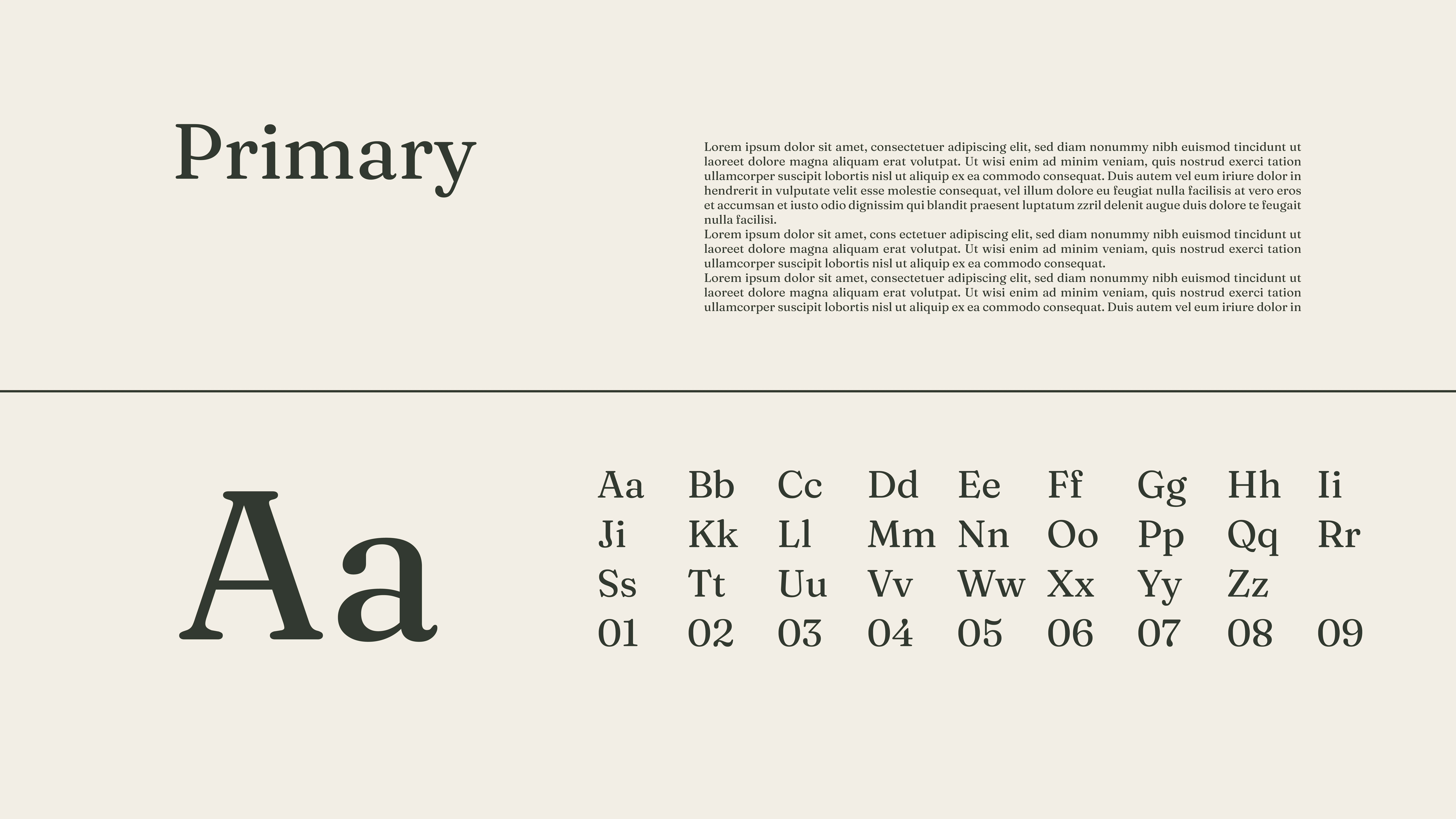
Fraunces Regular (wordmark). A soft, characterful serif with warmth and a slightly organic rhythm. It gives KAYA a human, crafted voice that recalls handmade goods without feeling rustic.
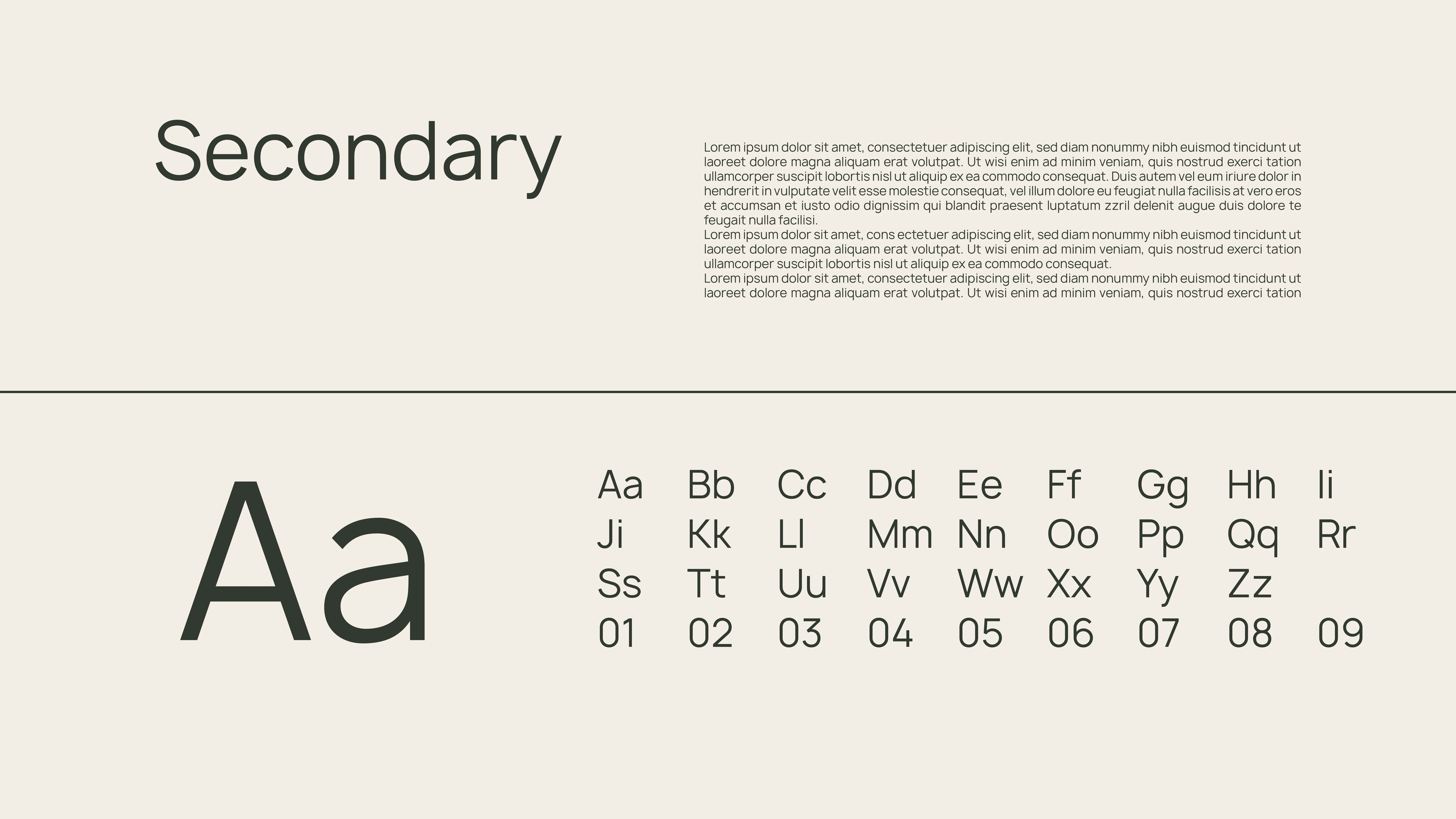
Manrope Regular (supporting). A clean, open sans-serif used for product names, ingredients and practical information. It keeps everything readable and modern.
The expressive wordmark carries emotion, and Manrope carries clarity. Elegance sits at the top of the hierarchy and legibility beneath it, which gives the system both luxury and ease.
Packaging
The packaging should feel like handing someone something considered: simple on the surface, with care in the details.
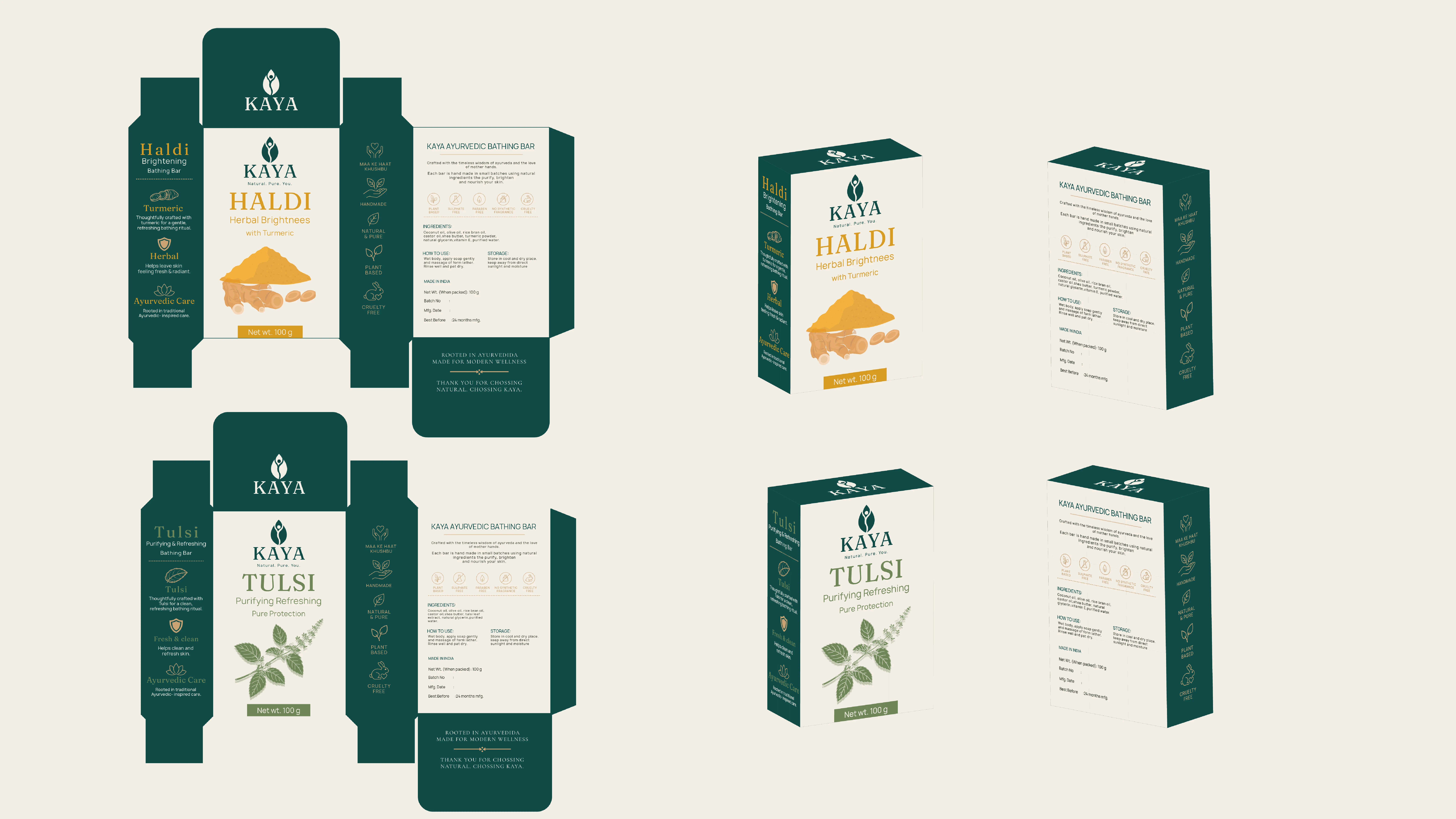
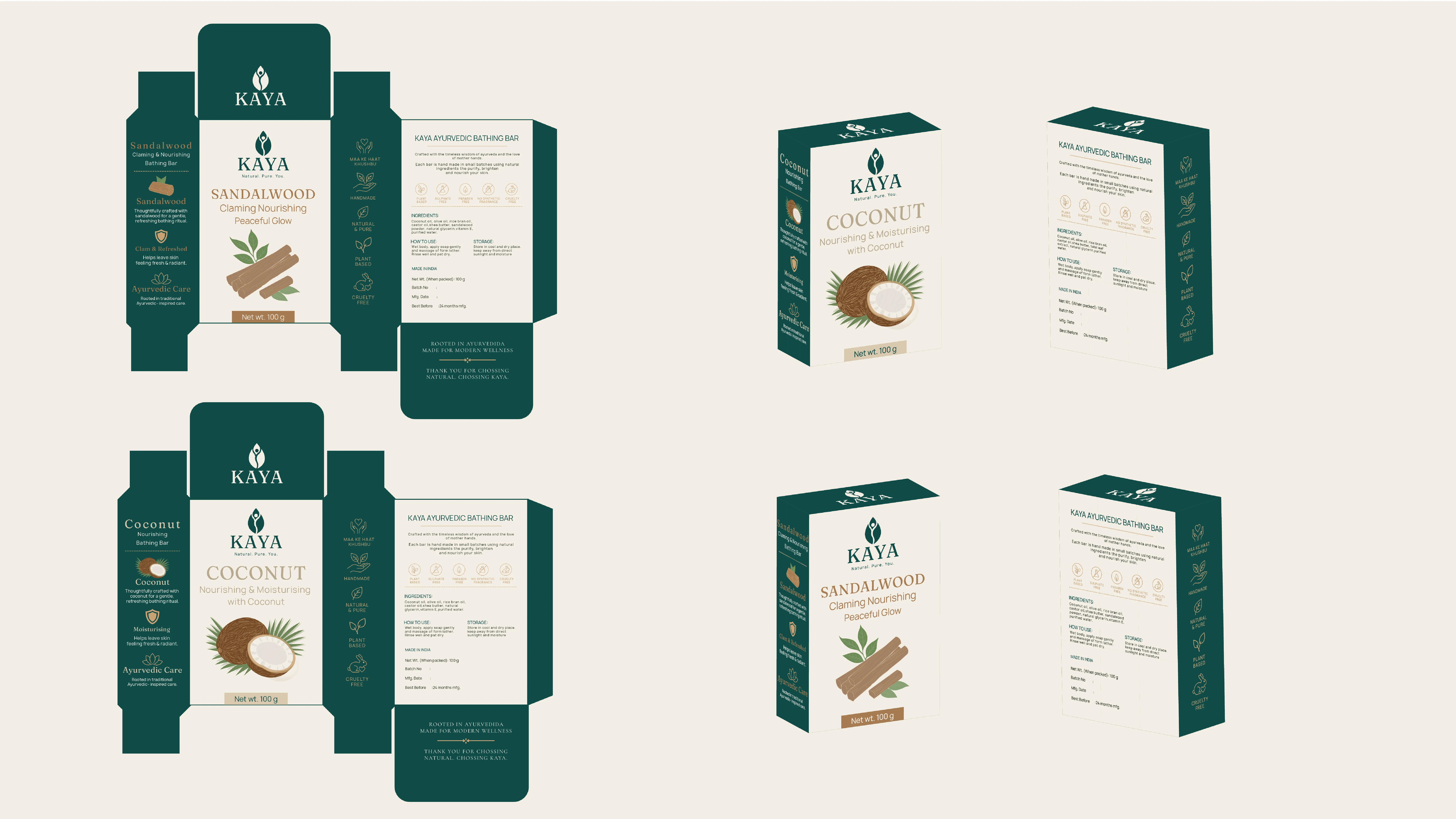
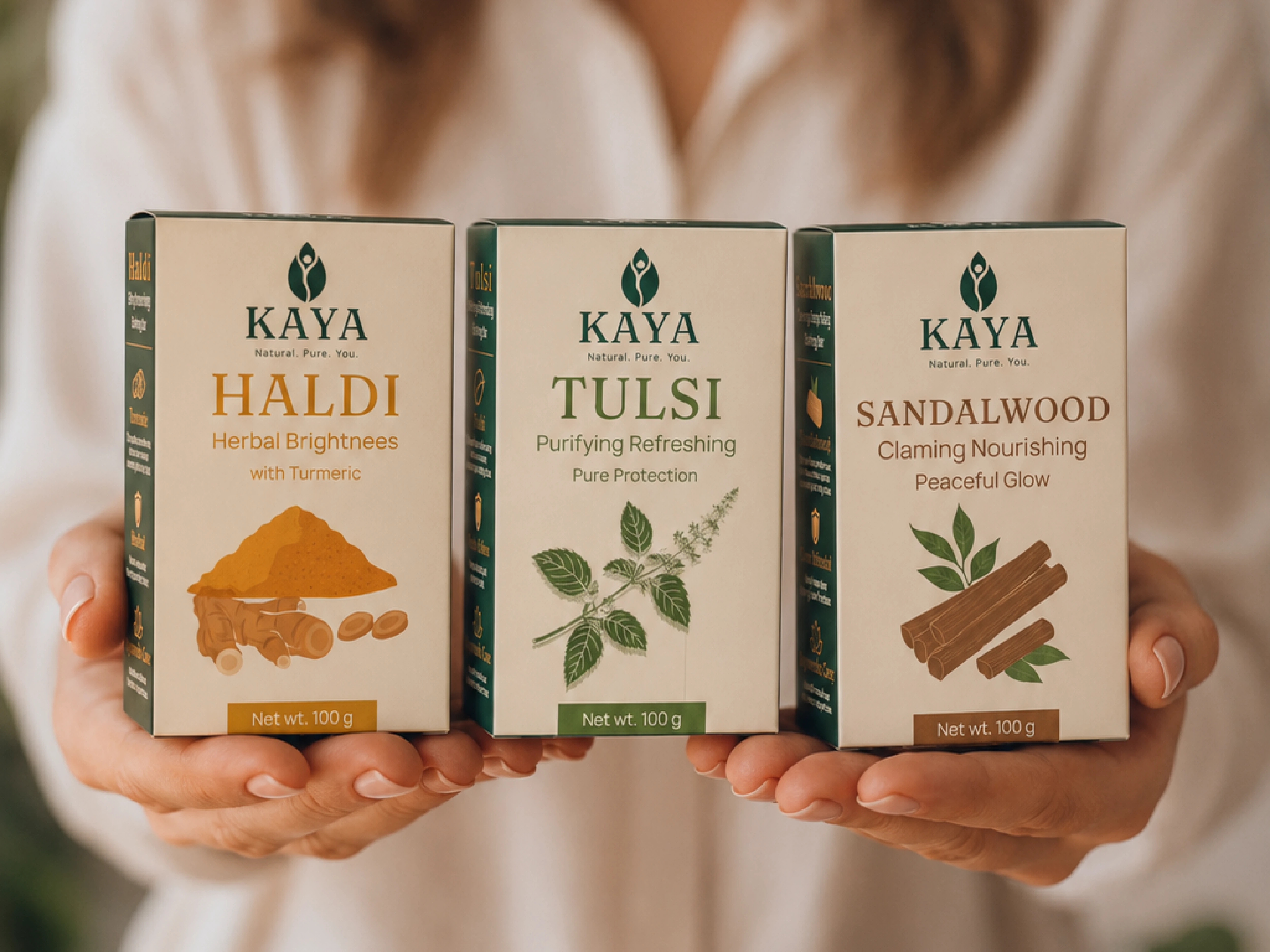
One template, four variants. The system covers the front, side, back and top panels.
If one dieline shows two variants and the other shows the other two, say so: Variants 01 and 02 and Variants 03 and 04.
On every pack, the order of reading is the KAYA logo, then the variant name, then the ingredient illustration, then supporting information. Every variant shares the same layout, grid, logo position and typographic scale. Only the accent colour, ingredient illustration and name change.
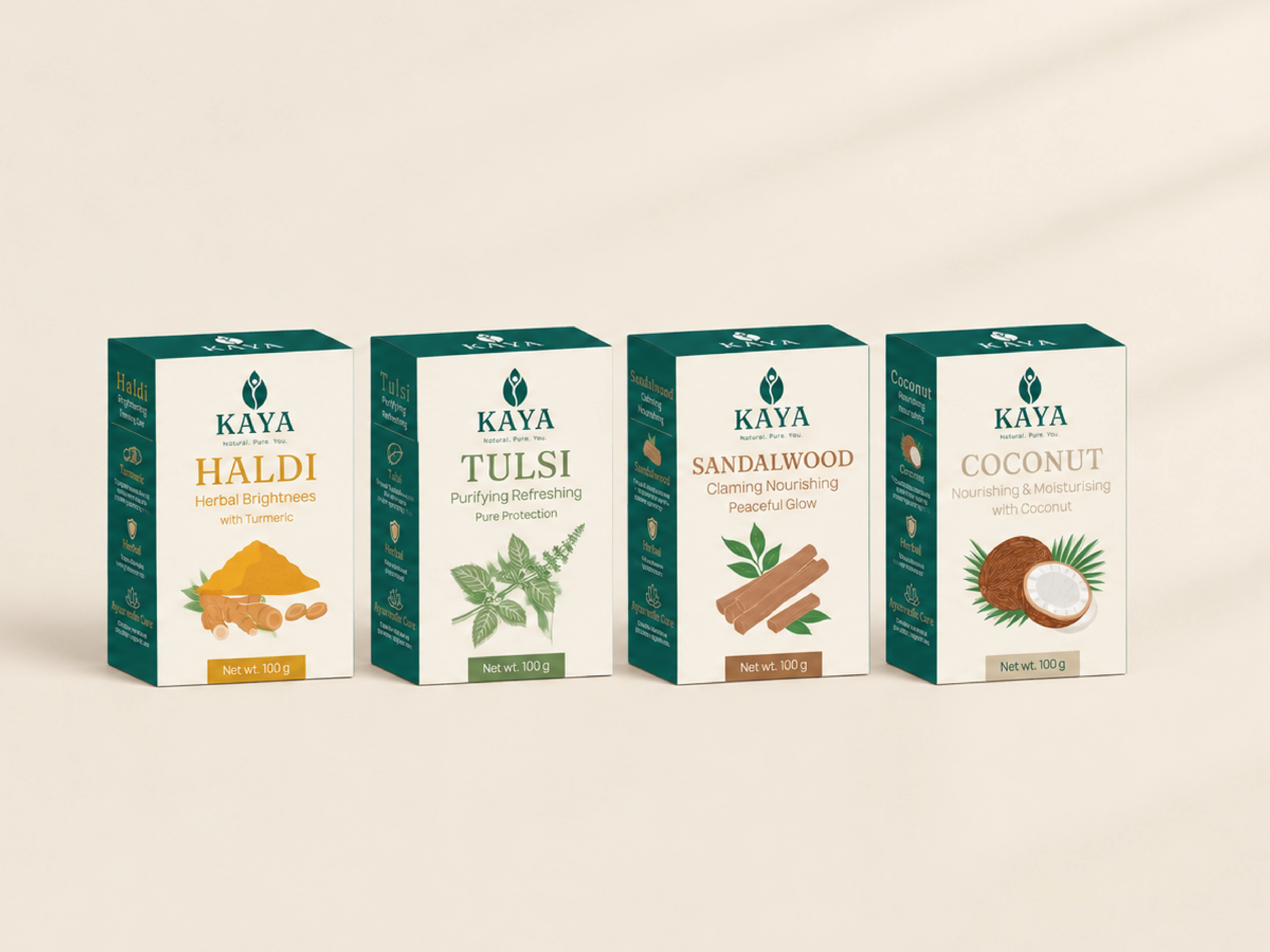
Colour as recognition. Variant colours act as quiet wayfinding, so a customer can identify their soap by colour and illustration before reading a word.
Practical information is present but ordered and unobtrusive, so the design stays calm.
Through material, layout and restraint, the packaging turns Calm, Pure and Refined into something you can hold.
Brand applications
One identity across paper, packaging and screen. The same teal, ivory and gold keep every touchpoint unmistakably KAYA.
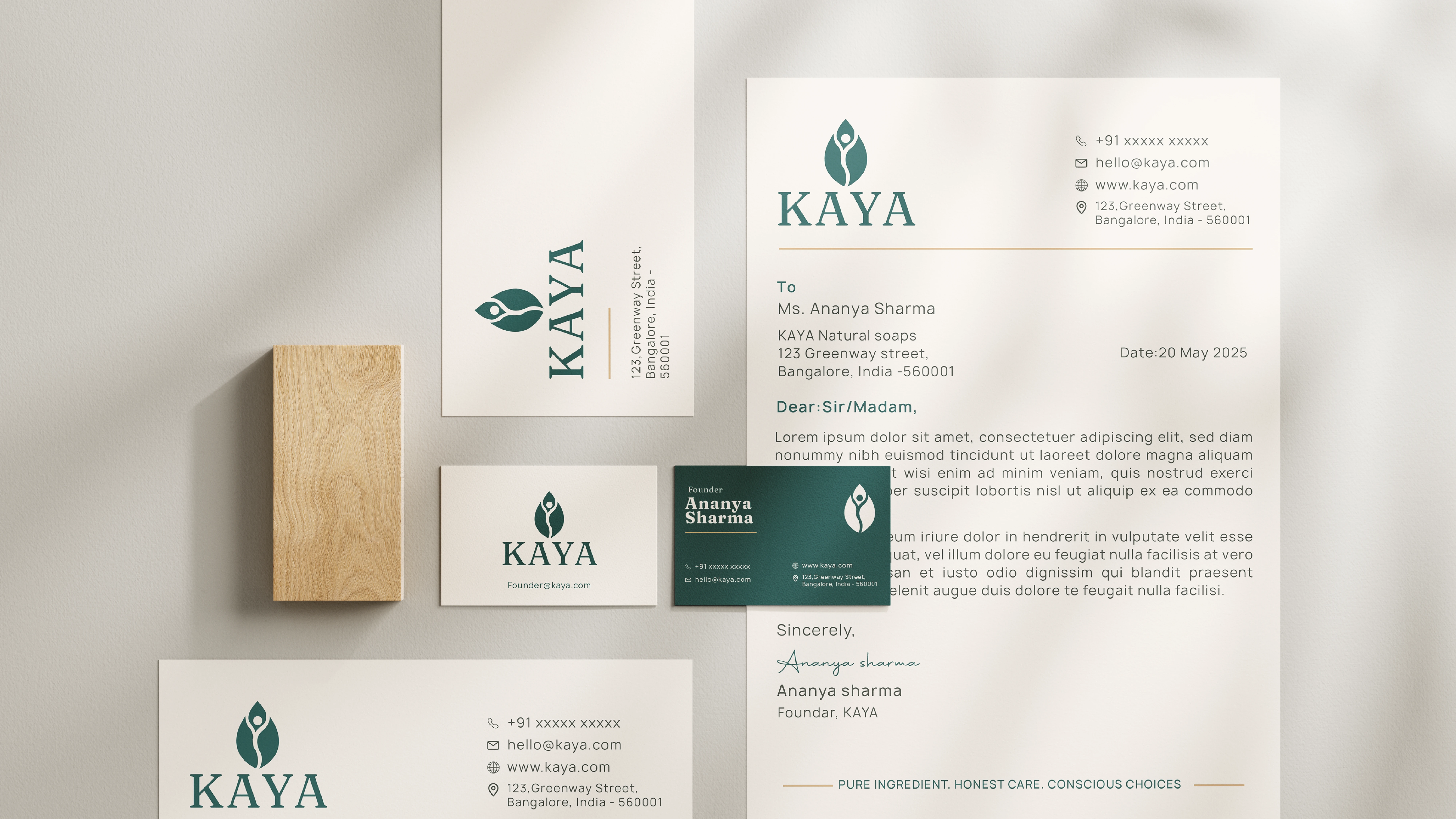
Letterhead, envelope and business card in Warm Ivory, with the logo in Deep Teal and a fine Sand Gold rule. The letterhead closes on the line "Pure ingredient. Honest care. Conscious choices."

The symbol alone on ivory is enough to hold its own on a phone screen.
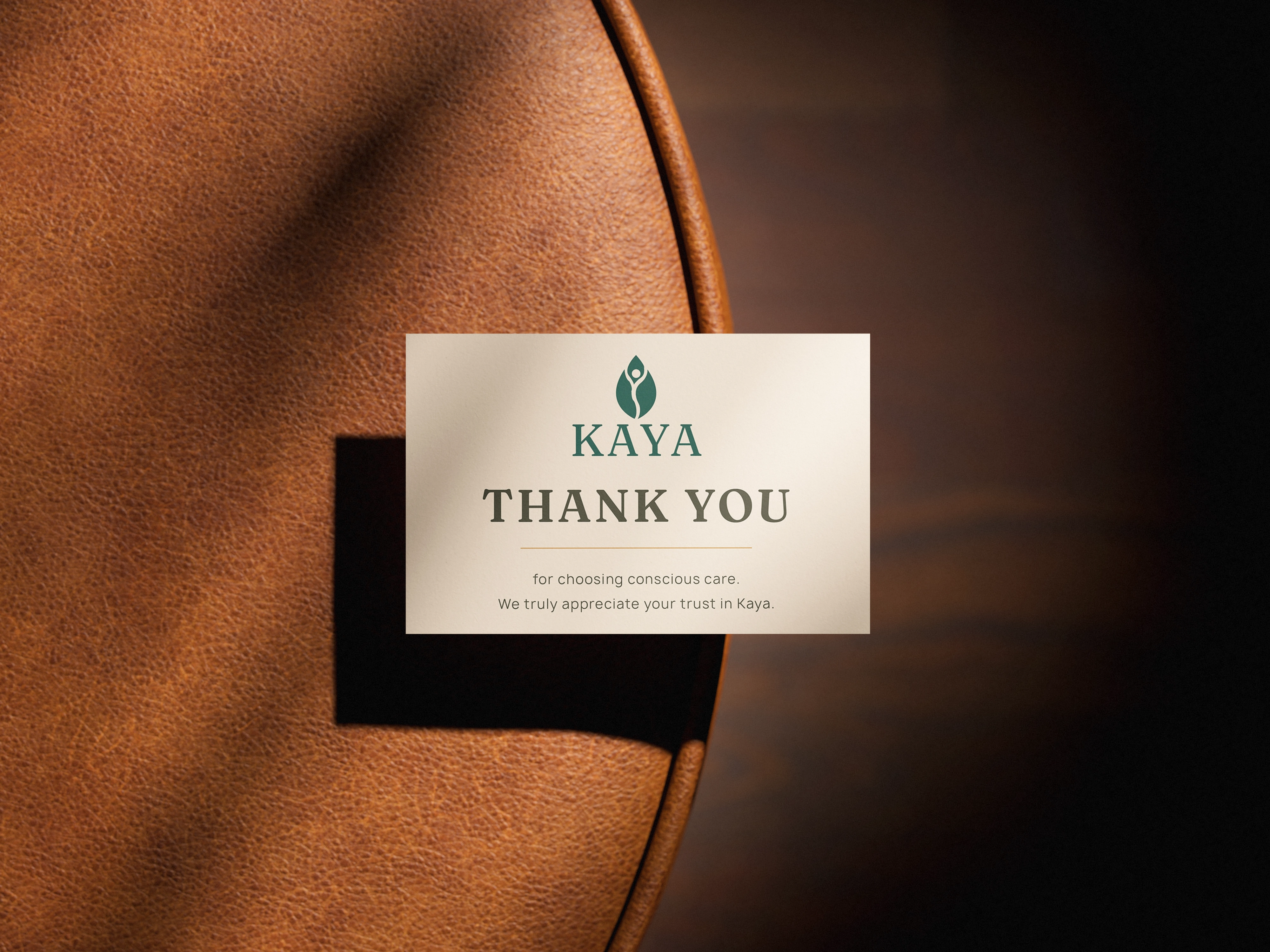
A small note that says "for choosing conscious care." It carries the brand's warmth into the unboxing.
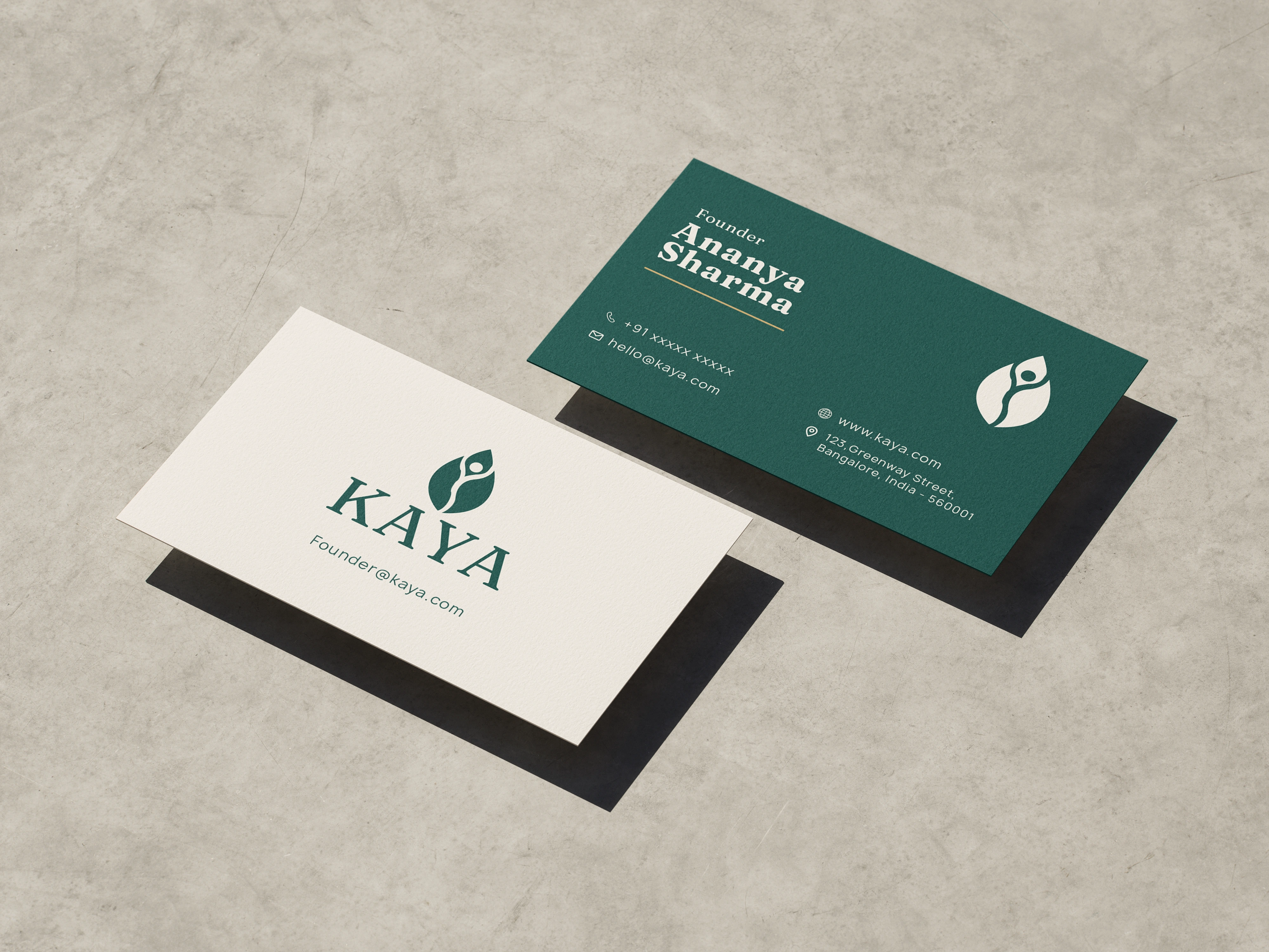
Ivory front, Deep Teal reverse. The symbol sits alone in ivory on the teal side.
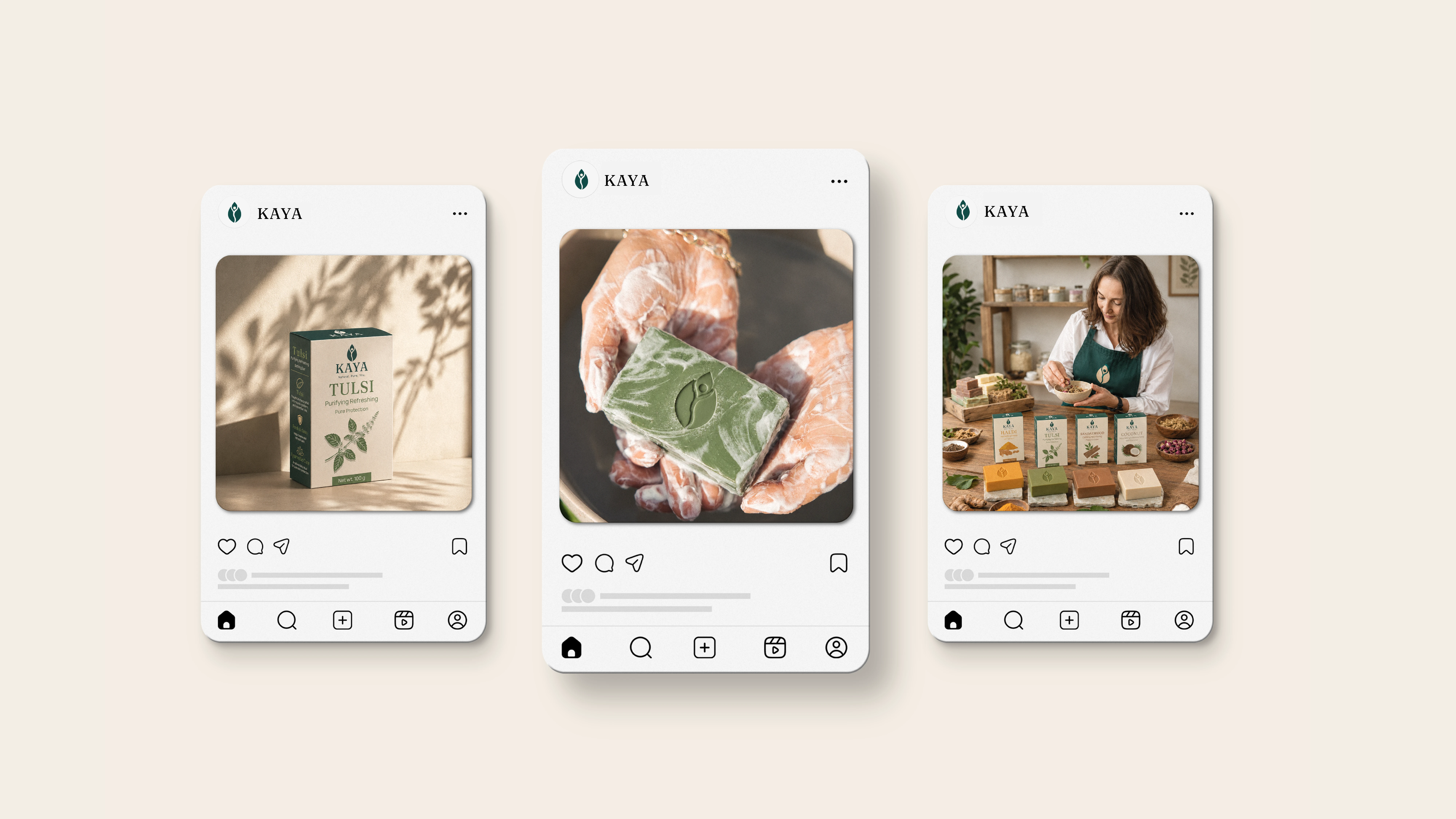
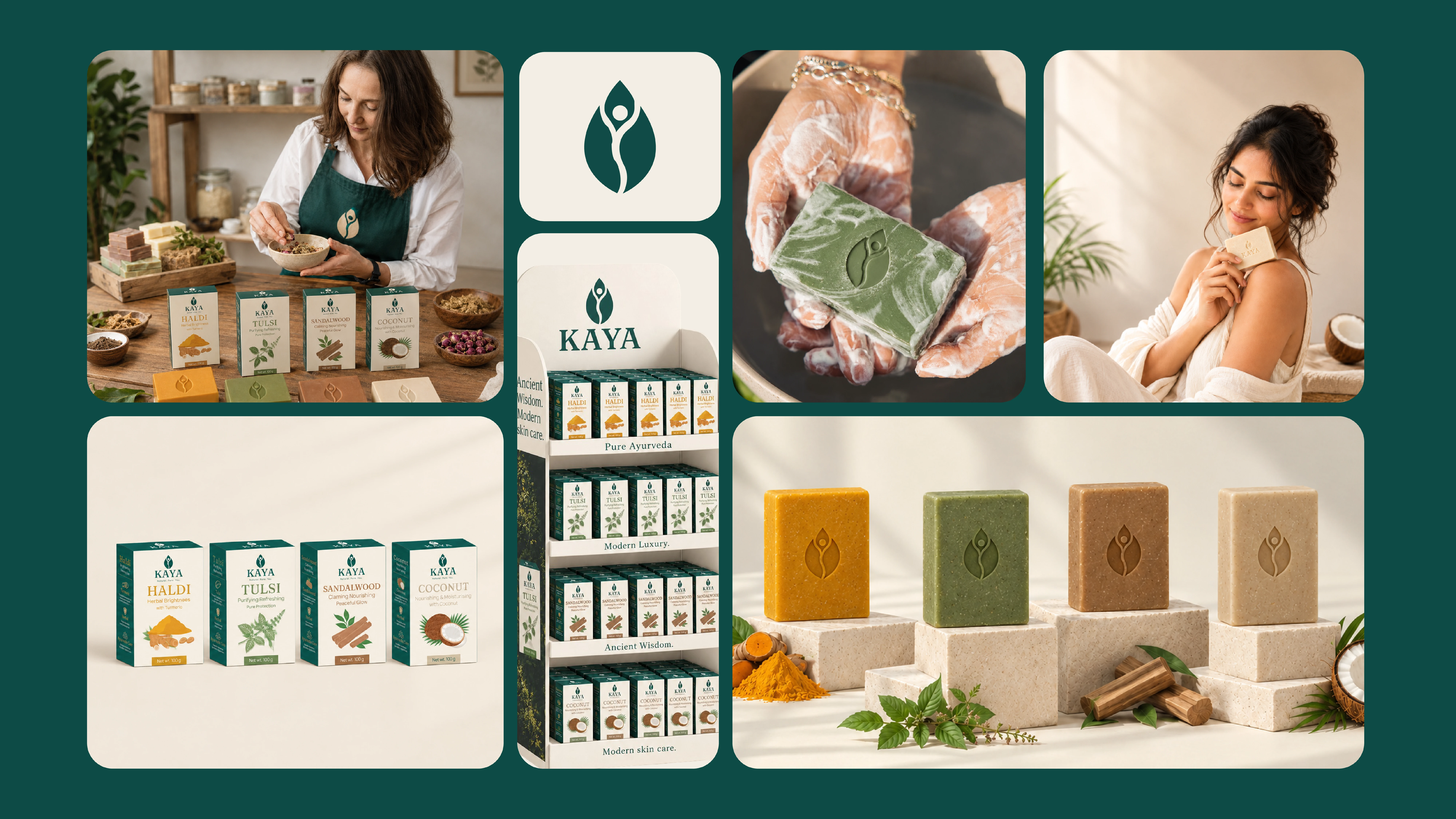
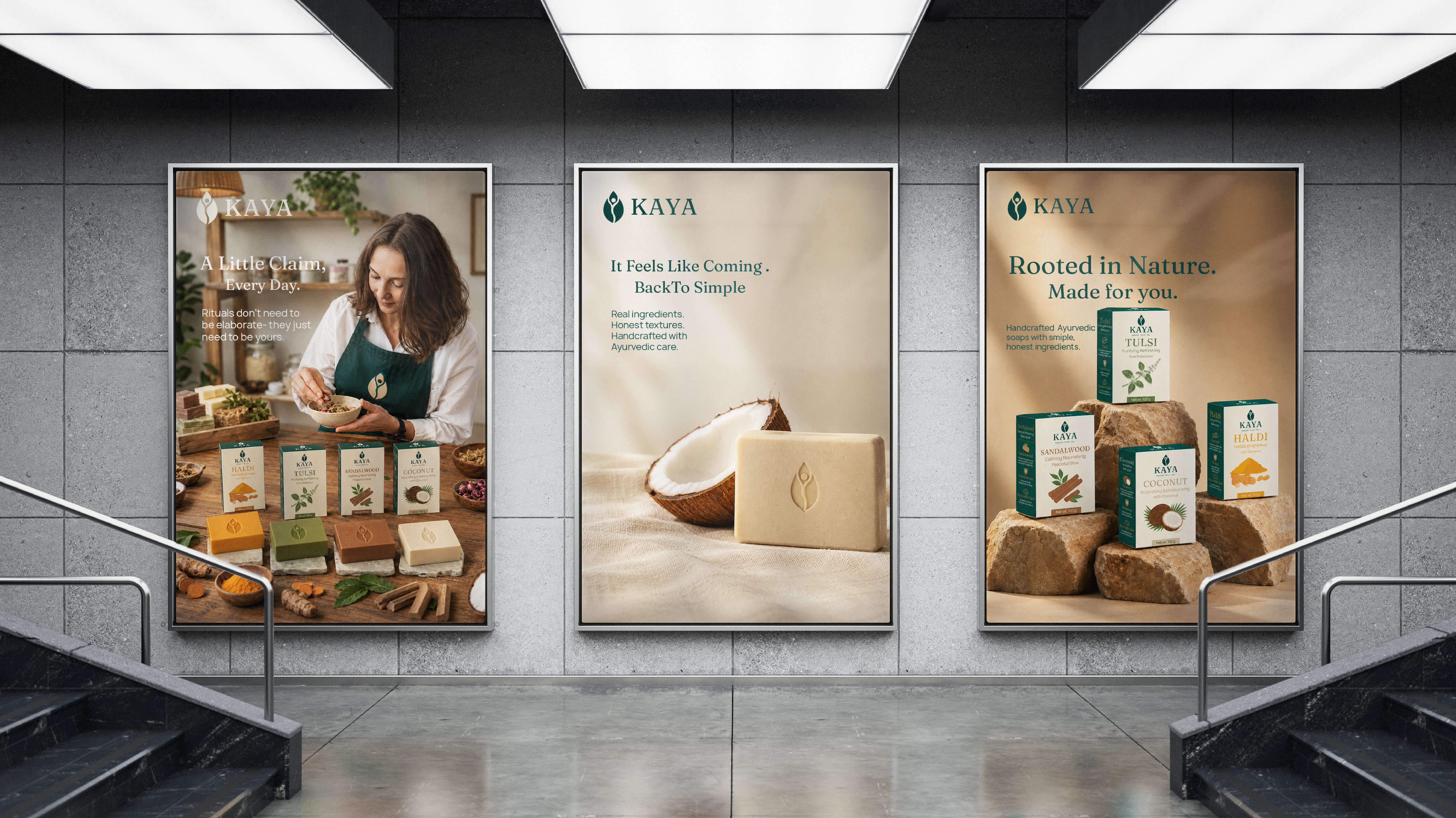
Product, ritual and craft in one feed: the Tulsi pack, a lather shot with the embossed bar, and the maker with the full range.
Every touchpoint, unmistakably KAYA.
Final results
A complete conceptual identity: logo, packaging, stationery and digital touchpoints, all built on one calm visual language.
The KAYA range" so it doesn't repeat the hero label
Like this project
Posted Oct 1, 2026
KAYA is a conceptual brand identity and packaging system for a premium Ayurvedic soap, pairing botanical heritage with quiet, editorial minimalism.