Logo Design and Brand Identity - Solara Co
Facundo Giménez

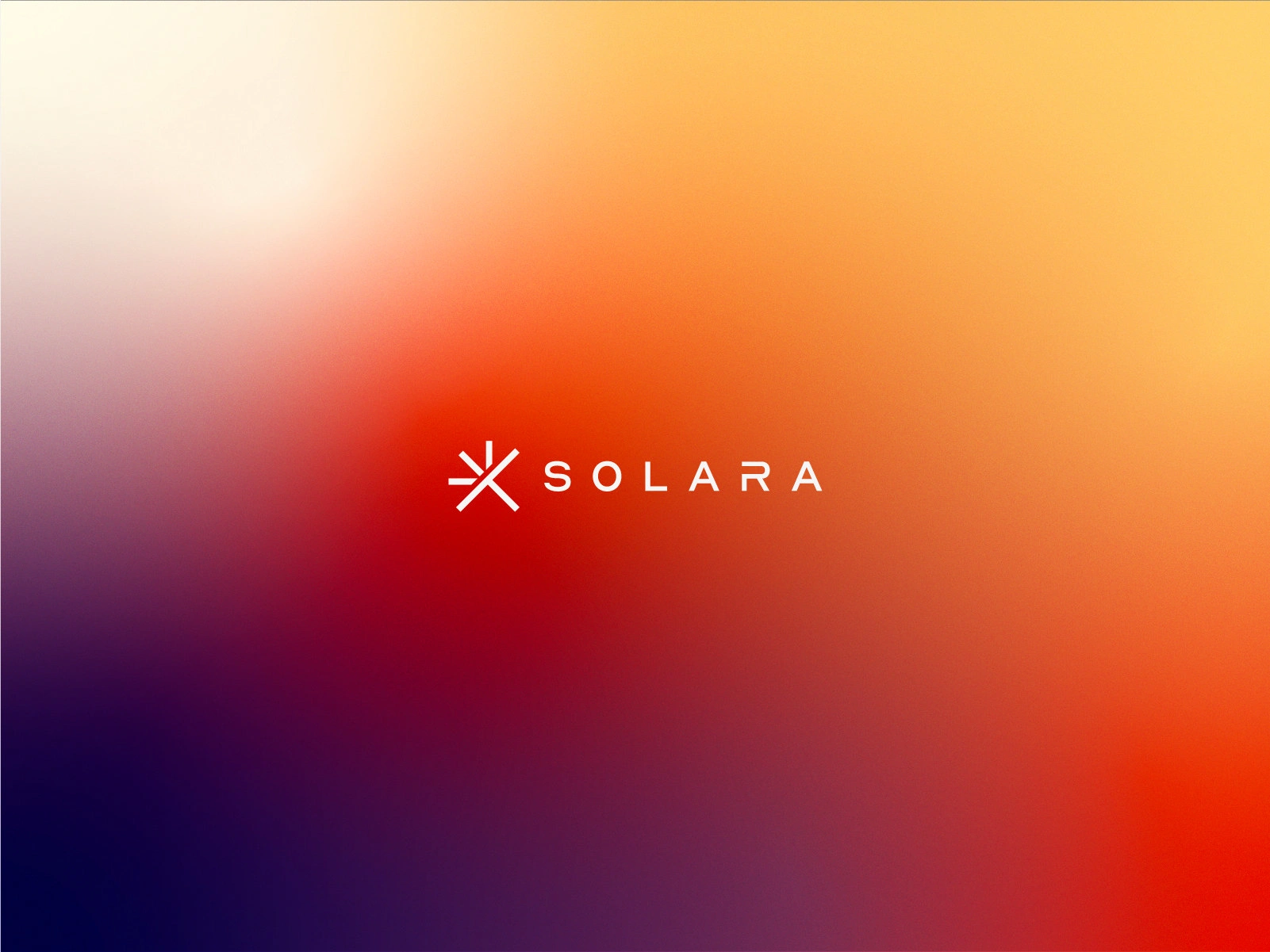
This abstract symbol, inspired by the concept of expanding energy, blends simplicity with dynamism. The warm gradient adds a sense of movement and innovation, while its geometric structure ensures versatility across formats.
The Solara identity is reinforced with a modern, clean wordmark that balances technical precision with approachability. The gradient background amplifies the brand’s message of transformation and warmth in the solar energy space.
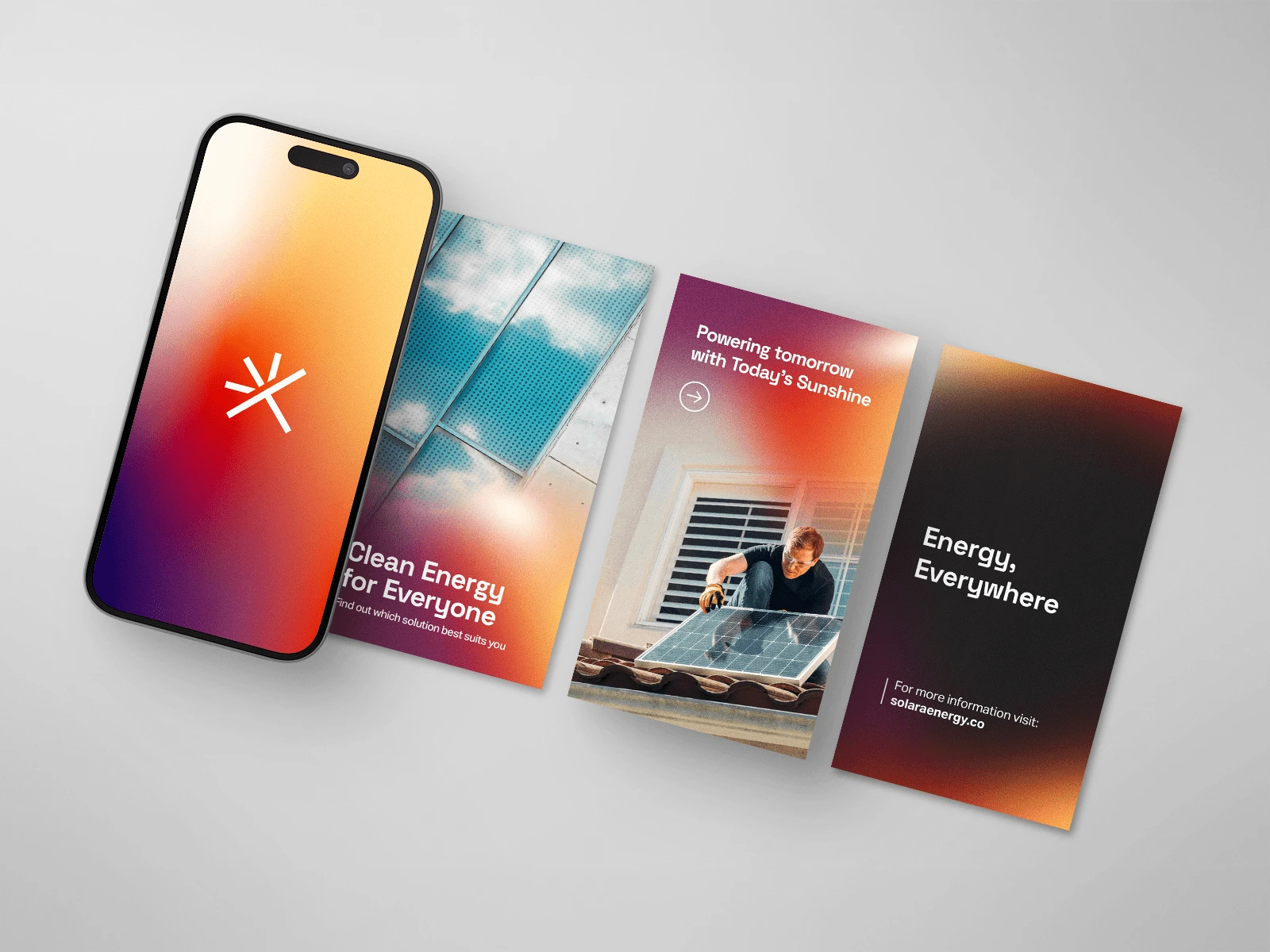
These mockups demonstrate how the brand identity flexes across digital platforms. Clear messaging and strong visual consistency help build trust and engagement in a competitive market like renewable energy.
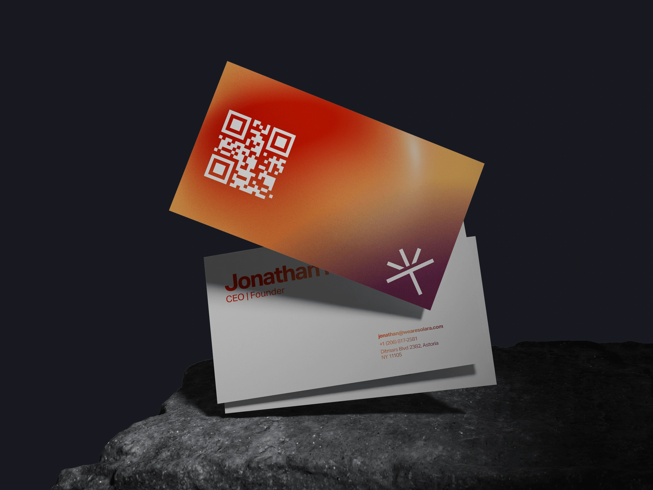
The business cards offer a sleek and memorable experience, combining minimalist layout with functional QR codes. The brand gradient adds bold character, tying together professionalism and visual impact.
Like this project
Posted Apr 10, 2025
For this project, I've designed a sleek, modern logo that captured the essence of renewable energy. We've achieved an impactful look, with a minimalist vibe.
Likes
38
Views
218