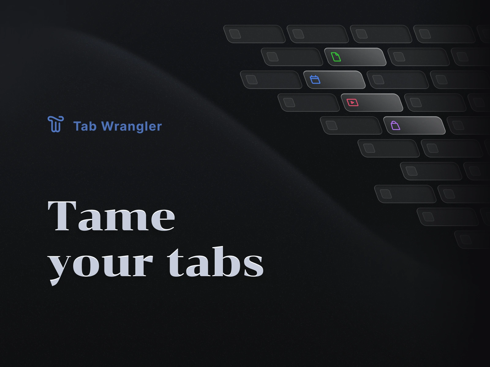
Tab Wrangler
Rob Struble
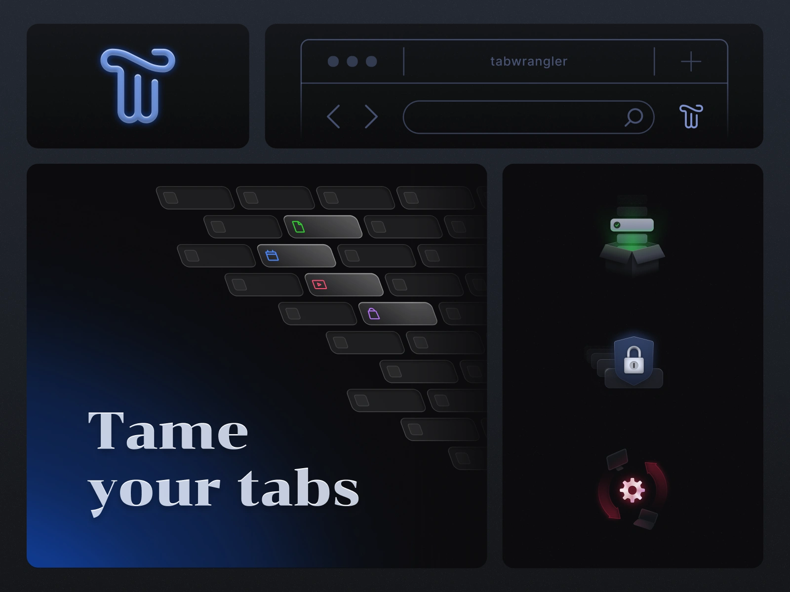
Tab Wrangler is a browser extension for Chrome and Firefox that helps users manage their tabs. They needed a new logo that would also function as their browser extension icon. The marketing materials also needed an update to better showcase what the extension does, and give Tab Wrangler a more contemporary and tech forward presence.
Wrangling the Logo
Designing a logo that also functions as a browser extension icon comes with additional constraints. It needs to be legible in a browser toolbar, accommodate additional visual information (such as status indicators), and still have enough character to be distinctive. They leaned toward a stylized "T" or "TW" for the logo, and a dark color palette for the design of the marketing imagery.
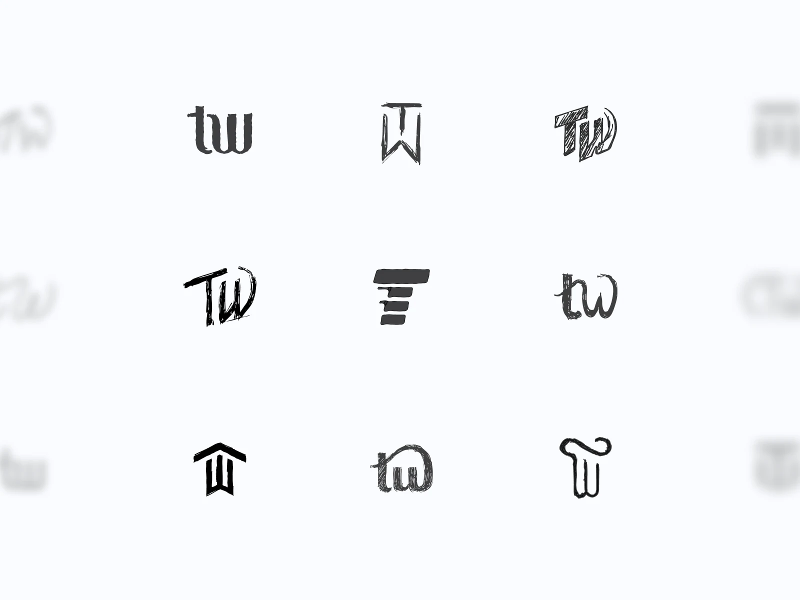
I started with sketches exploring a number of directions: letterforms blending with abstract symbols, geometric shapes, and some references to the "wrangler" theme.
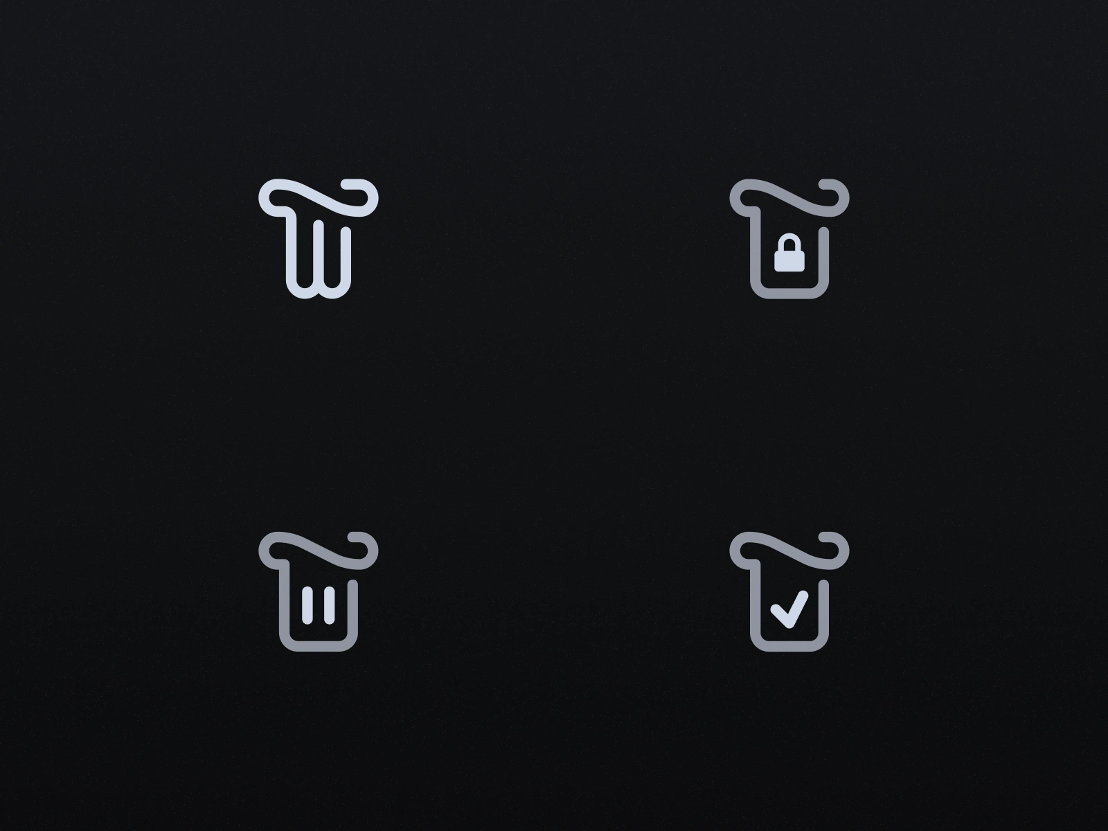
The final logo leaned into the "wrangler" theme, with a subtle lasso or hat curve around the top to form a "T". It had personality and a conceptual hook that wasn't in the original brief, but felt like a natural fit once it emerged. Simple enough for legibility at small sizes, flexible enough to accommodate status indicators, and distinctive in a way that referenced the product's name without being overly literal.
The status indicator system extends the logo's functionality. Small icons appear consistently positioned to communicate tab states at a glance, allowing it to adapt to different states while always remaining recognizable as Tab Wrangler in a user's crowded browser toolbar.
Illustrating the Features
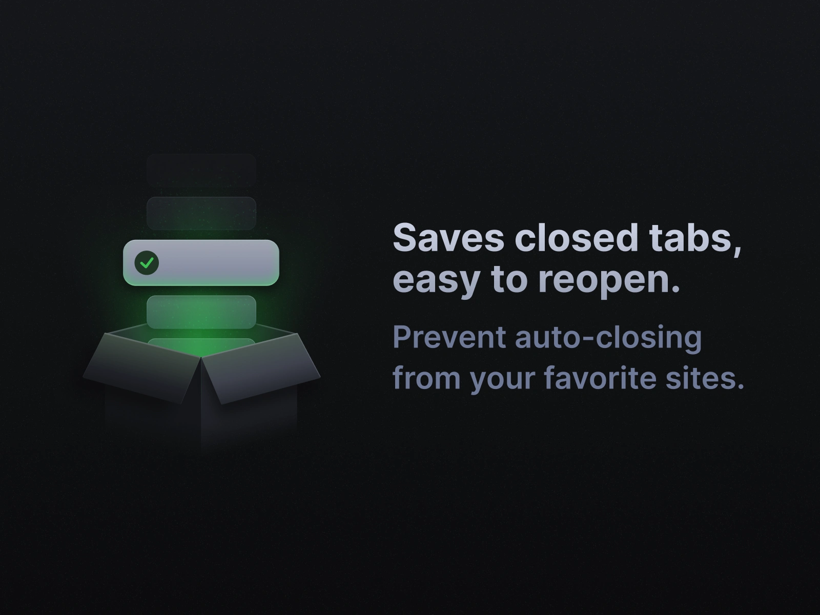
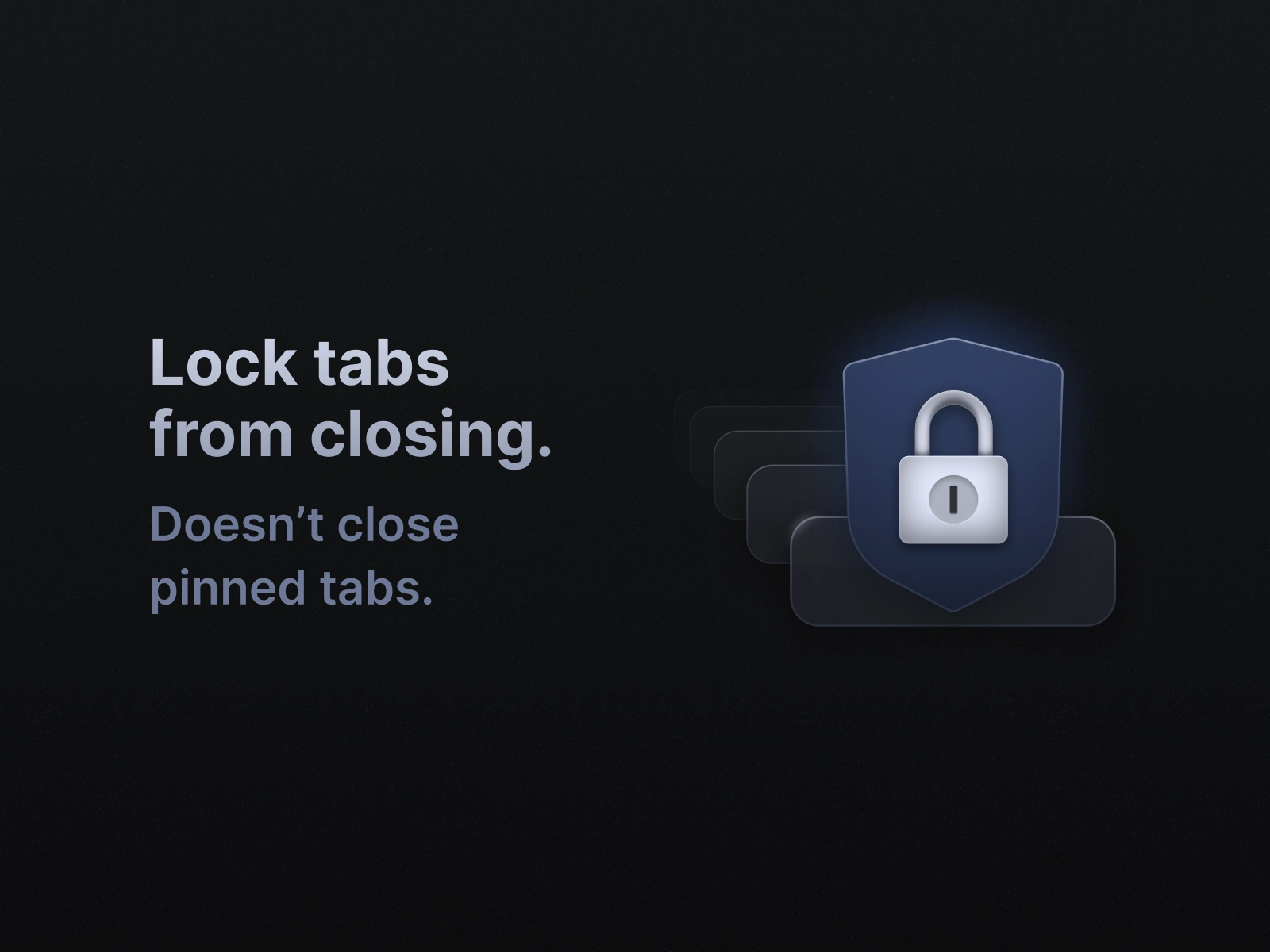
Tab Wrangler's existing marketing images used screenshots of the extension interface. For the refresh, I initially used updated versions of those screenshots to incorporate the new visual identity and create more cohesive compositions.
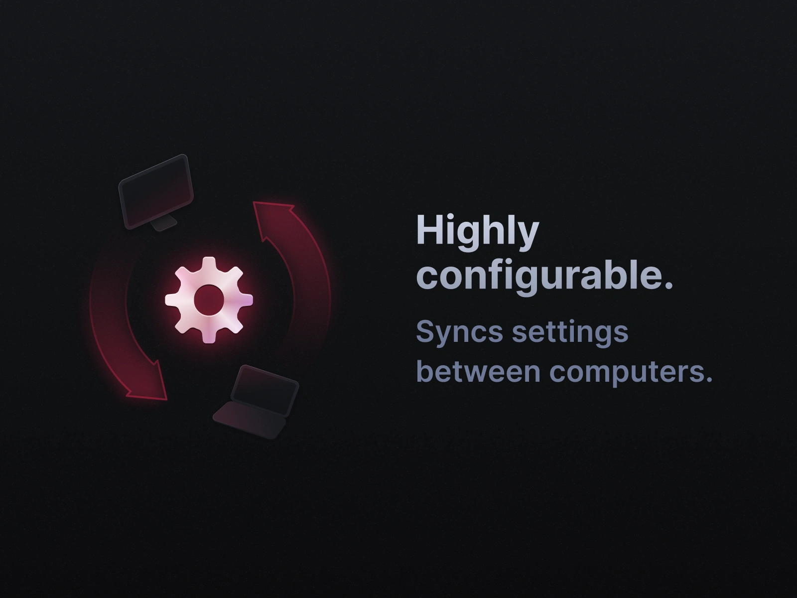
But screenshots require users to parse a lot of visual information to understand what they're looking at. I experimented with creating custom illustrations for Tab Wrangler's key features, illustrations that maintained the same clean, contemporary aesthetic. The illustrated approach made the features easier to understand at a glance and gave the marketing materials more visual interest.
Like this project
Posted Nov 24, 2025
Redesign the visual identity of a browser extension.
Likes
0
Views
6