Flyer Design: A Visual Feast in Catering
Nina Klein
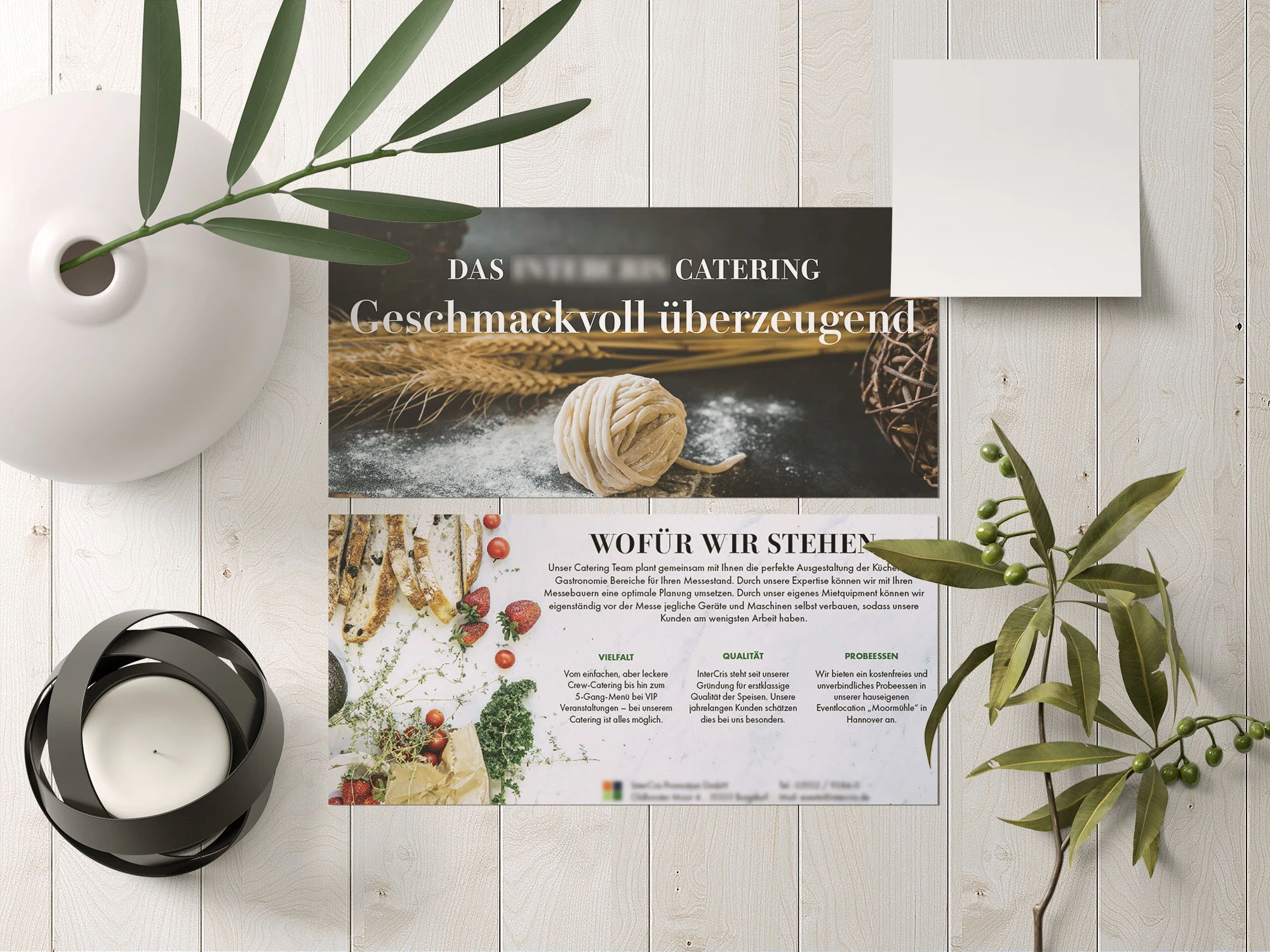
For this project, I dived into the dynamic world of catering, crafting a flyer that would whet the appetite of potential customers. The journey began with a color palette, taken directly from the company logo, infusing the design with consistency and brand identity.
The focus was not just to relay information but to deliver an experience. The choice of clean, easy-to-read typography and strategic placement of text catered to an effortless reading journey.
The real challenge? Balancing creativity with clarity - ensuring the flyer was visually engaging without overshadowing the vital details. I believe the final design strikes this balance, serving up a visually appetizing invitation to a memorable culinary experience.
Like this project
Posted Aug 30, 2023
Graphic Design,Adobe Illustrator