Angry Birds 2 - UX/UI Design

Taylor Rodriguez
UX Designer
Gamer
UI Designer
Adobe Illustrator
Adobe Photoshop
Adobe XD
Rovio Entertainment Corporation
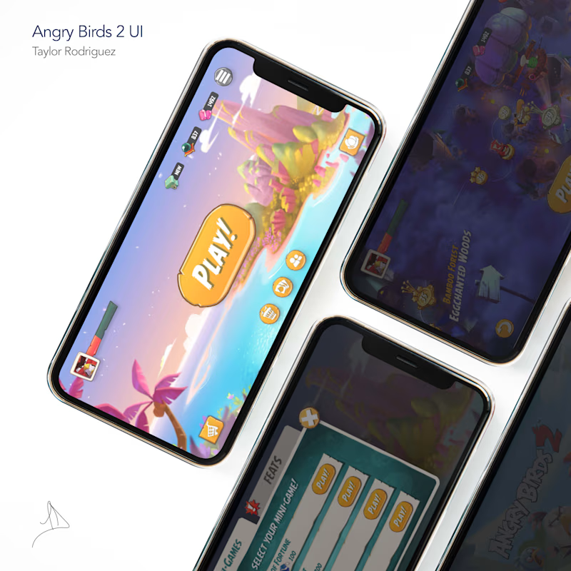
Refreshing the UI of mobile game giant, Angry Birds 2
OVERVIEW
Name: Taylor Rodriguez
Role: UX Research, UI + Interaction Design, Icon Artist
Project Duration: 12 Weeks, Dec '22 - Mar '23
PROBLEM & HYPOTHOSIS
Since January 2018, Angry Birds 2 has seen a consistent decline in monthly active users.
This may be due to the following:
• Frequent transactional pop-ups
• Lack of intuitive features
• Overwhelming main menu
• Distracting animations
• Frustrating gameplay mechanics
*view statistical graphs here
SOLUTION
A simplified, user-friendly main menu as well as secondary menus that would increase play session times, overall player retention, and as a result-increase exposure to necessary advertisements from company partners, generating more revenue for Rovio Entertainment.
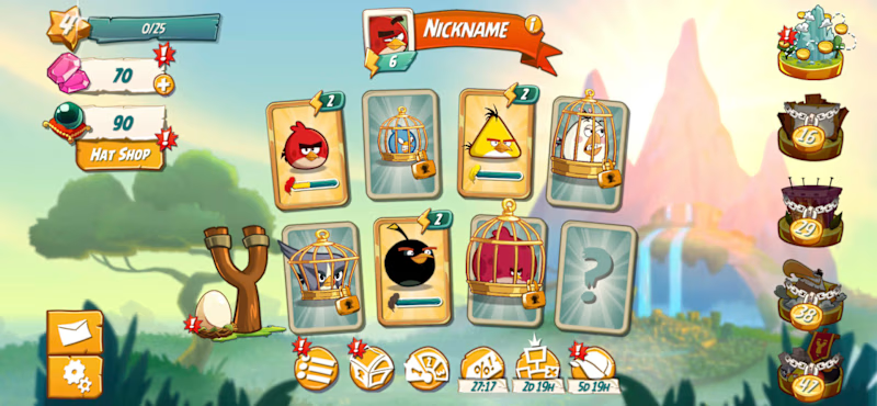
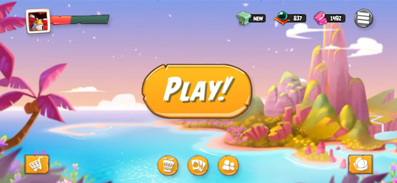
Main Menu - Before & After
Old/current Angry Birds 2 main menu ↓
Refreshed/new main menu ↓
KEY FOCUS
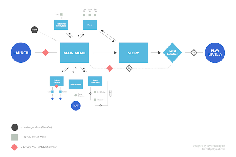
• Making the main mission the primary focus
Details: Users had trouble navigating the main menu to find the main story. We will reintroduce from Angry Birds 1 the main "PLAY!" button that sits front and center of the user's mobile device. This will allow them to immediately hop into a game without frustration of wondering where the levels are. Currently, the main mission button sits in the top right corner of the screen without text to properly identify what the destination of that button is.
• Remove distracting alert notifications
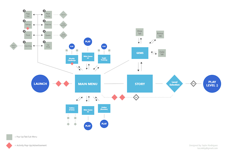
Details: Currently, a red exclamation point bounces up and down in a continuous animation to grab the user's attention to a particular menu that needs attention. Traditionally, this is acceptable to most users but with several buttons/sections being directly on the homepage, upon loading the game for the first time in the day, it's very overwhelming seeing a dozen animations happening all at once.
• Increasing whitespace and improving overall hierarchy
Details: By consolidating several buttons and animations, this will increase whitespace between said items and decrease player anxiety, encouraging them to stay on the platform longer. Also, we will be improving overall button hierarchy to aid in the user flow and potentially increase playtime due to this change.
Before & After
Old/current user flow experience ↓
Refreshed/new user flow experience ↓
RESEARCH & DISCOVERIES
Surveys were sent to gather player feedback after one week of use. Feedback was gathered amongst gamers from the following categories: casual gamers, devoted gamers, and competitive gamers. After initial surveys were reviewed, 1 on 1 interviews were conducted to gather additional feedback.
• 0% of participants were interested with in-game purchases or upgrades
• 83% of participants noted that they had to learn particular aspects of the game by trial and error
• 66.7% favored free to play mobile games that included in-game ads, but would not continue to play AB2 after study concluded
Casual Gamer Feedback
"Prefer older Angry Bird games"
"Would recommend game to friends and family"
Devoted Gamer Feedback
"Reduction of pop-ups would be my only change"
"Text bubbles were difficult to read"
Competitive Gamer Feedback
"Wouldn't mind spending $21-$30 on ad-free mobile game"
"Felt rewarded for my efforts"
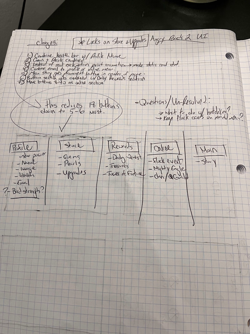
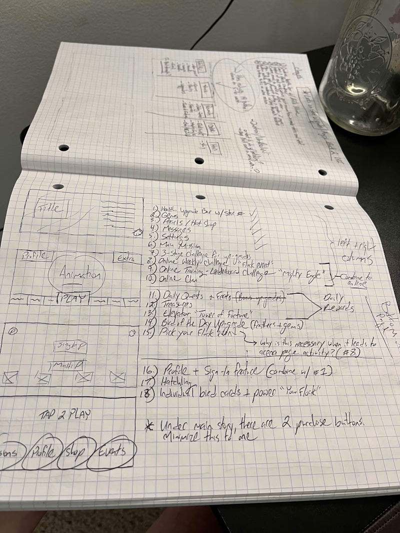
*learn more about our research process by clicking here
RESULTS & CONCLUSION
In gaming, unless a usable prototype is available for gamers to experience and get their hands on, which requires the help of programmers, gathering reliable data to compare interfaces is unreliable. However, with the user surveys and follow up interviews collected, we learned...
• Majority of participants approved the concepts we created with the casual gamer demographic taking the larger percentage of that vote
• Bringing back the original "PLAY" button on the main menu brought positive feedback since players were familiar with the layout from Angry Birds 1
• Out of the 66.7% of players surveyed that said they would not continue playing AB2, the majority said the interface changes proposed would cause them to rethink deleting the app
Overall, with the data that was collected by gamers, I still hold my original hypothesis that this would create higher player retention, total playtime, and increased ad revenue for Rovio.
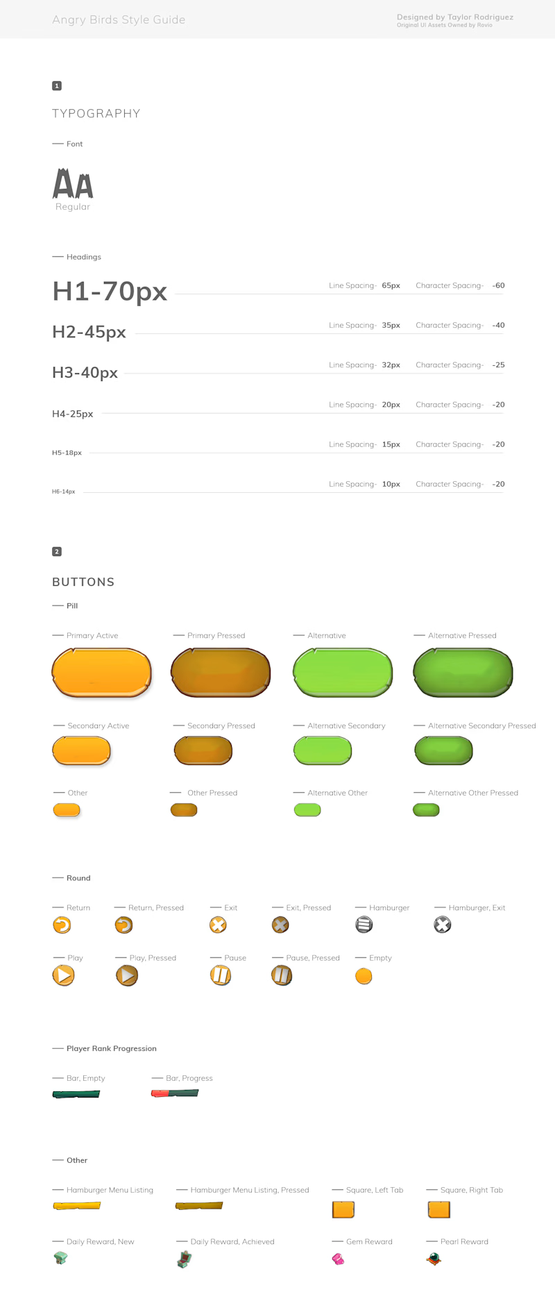
THANK YOU TO ROVIO
THANK YOU to the team over at Rovio for creating such a fun and entertaining game. The designers are full of talent and at the end of the day, we have no idea what guidelines they were given to create the Angry Birds 2 game. All we can do is ask questions, make helpful suggestions and enjoy the heck out of the games that get developed. No game is perfect and the overall game creation process, as rewarding as it is, can be truly stressful; so lets make it a habit to applaud developers and designers in the game industry more often!
Full Case Study + Style Guide + Prototypes: CLICK HERE
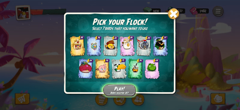
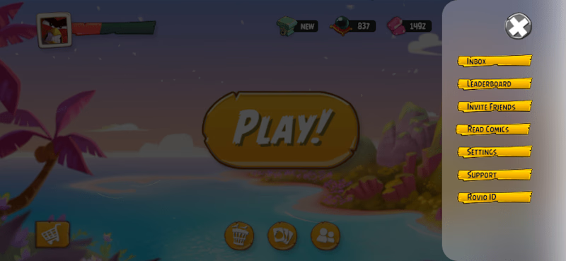
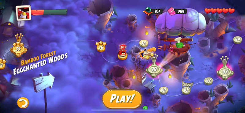
Additional UI Screen Designs
Taylor Rodriguez
Marketing & Creative Director
16+ years of helping business owners scale into profitable organizations.


