Logo Design for Gary Beckman Counseling
Sonia Huang
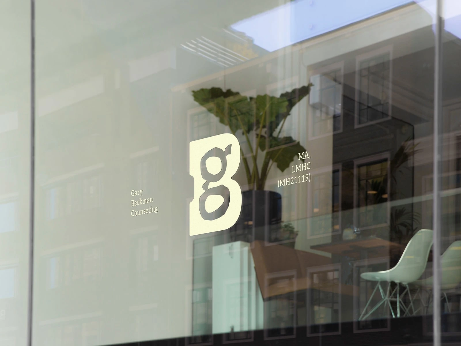
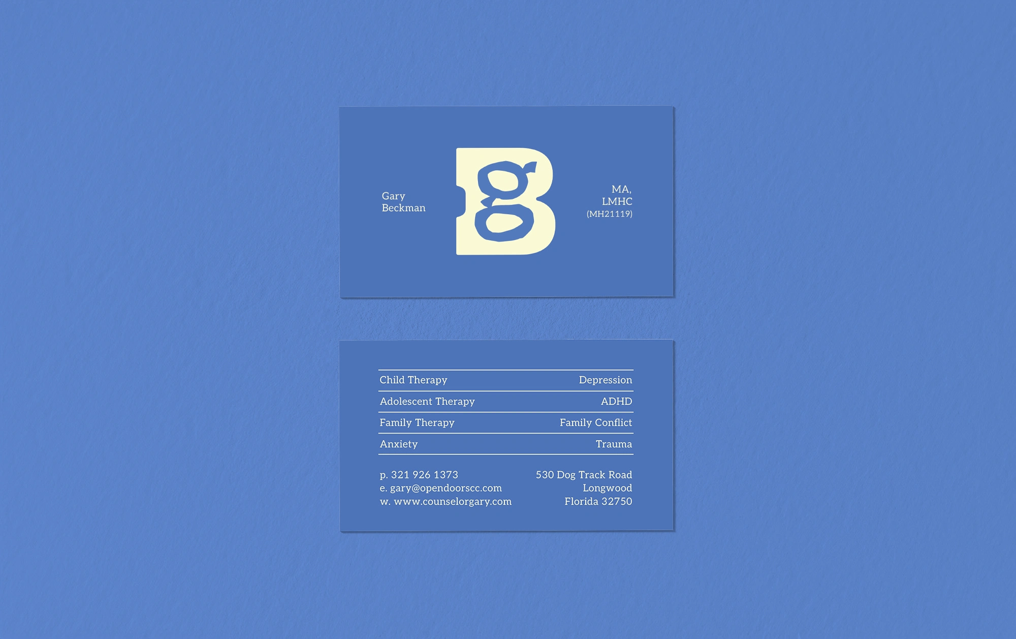
Gary Beckman is a counselor with over two decades of experience guiding children, teens, and adults. He sought a logo that profoundly reflects his dedication to helping individuals navigate their emotions and foster stronger relationships.
The resulting logo, in its simplicity and contrast, emphasizes themes of guidance and support. Its design features a bold, strong 'B' that provides a foundational, structured presence. This contrasts sensitively with the more natural, unrefined form of the 'g,' evoking a sense of humanity and its inherent imperfections, capturing the core essence of Gary's empathetic approach.
Like this project
Posted Mar 14, 2026
A visual identity that reflects Gary's counseling approach, highlighting themes of guidance and support.