Lumen UI/UX Design for AI-powered Landing Page
Ettouzany Abdelkader
Lumen – AI Research Assistant
Building trust and clarity for an AI-powered decision engine.
Role: Lead UI/UX Designer
Timeline: 2 Weeks
Tools: Figma, Midjourney, Photoshop
The Goal: Design a high-converting landing page for "Lumen," a B2B SaaS tool that helps teams turn messy research into clear decisions.
The Challenge (The Problem)
AI tools often feel cold, complex, and overwhelming. The challenge was to create an interface that felt sophisticated but also human and approachable. We needed to organize complex feature sets into a layout that a user could understand in under 5 seconds.
Key Obstacles:
Communicating "Abstract AI" concepts without being confusing.
Differentiating the brand in a crowded "Dark Mode SaaS" market.
Guiding the user smoothly from "Curiosity" to "Purchase" (Pricing).
The Visual Strategy (The "Why")
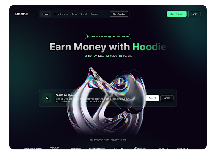
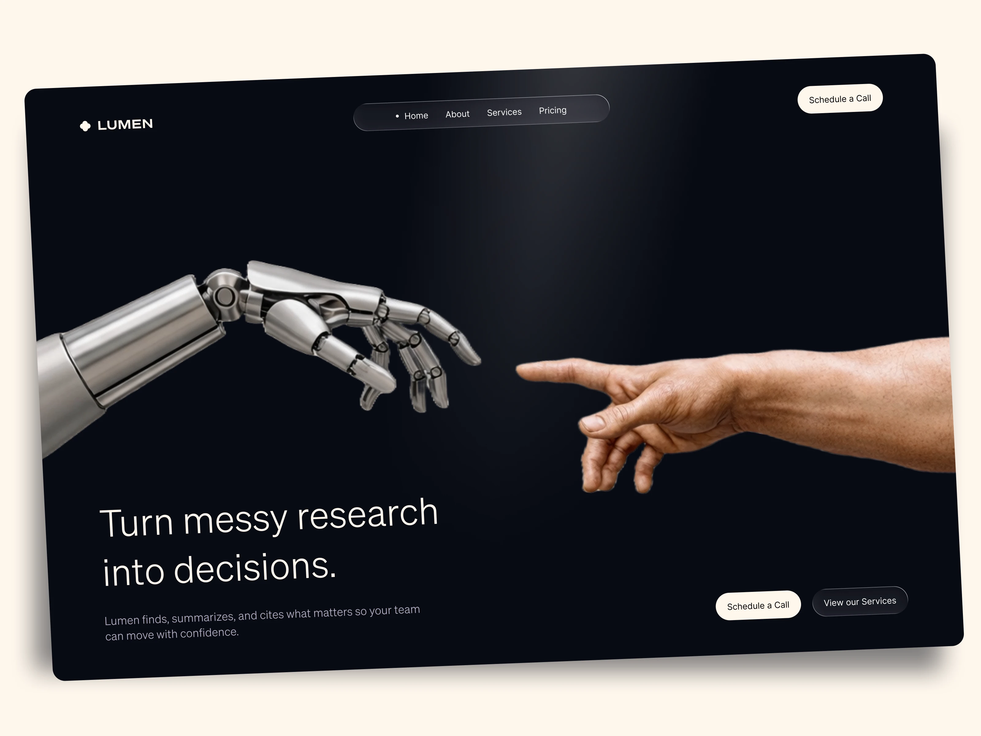
A. The "Creation of Adam" Metaphor
For the hero section, I chose a visual of a robotic hand reaching for a human hand. This wasn't just decoration; it visually communicates the core value proposition: AI assisting human intelligence, not replacing it. This creates an emotional hook instantly.
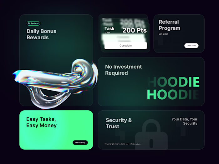
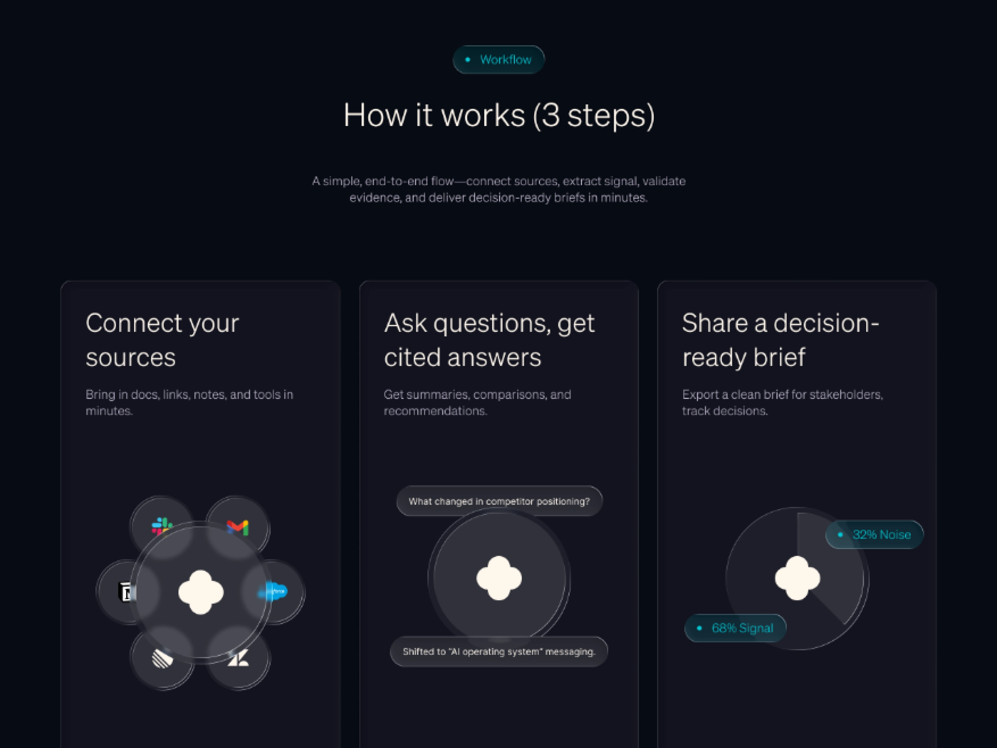
B. The "Bento Box" Grid
To handle the 'How it works' section, I utilized a modular grid layout (Bento style). This allowed me to break down the 3-step process into bite-sized, digestible cards. This reduces cognitive load and keeps the user scrolling.
C. Premium Dark Mode
I opted for a deep charcoal/black palette (#070A12) rather than pure black. This reduces eye strain and allows the neon accent gradients to pop, guiding the user's eye specifically to the Call-to-Action buttons and key metrics.
Design Highlights
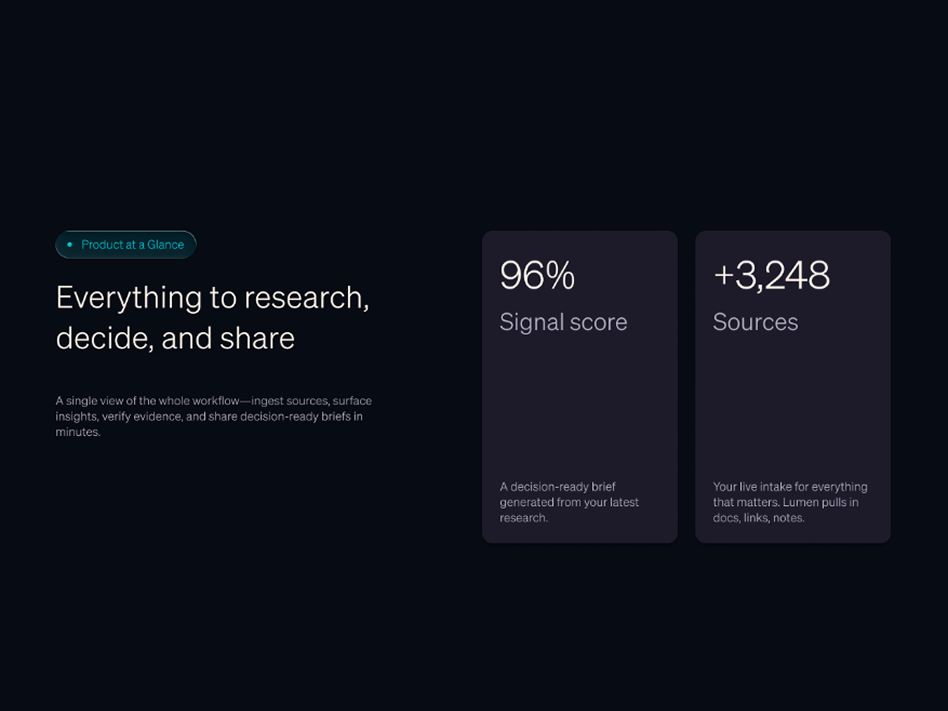
Social Proof: Placed immediately after the hero section ('96% Signed soon'). This establishes credibility before asking the user to commit to reading more.
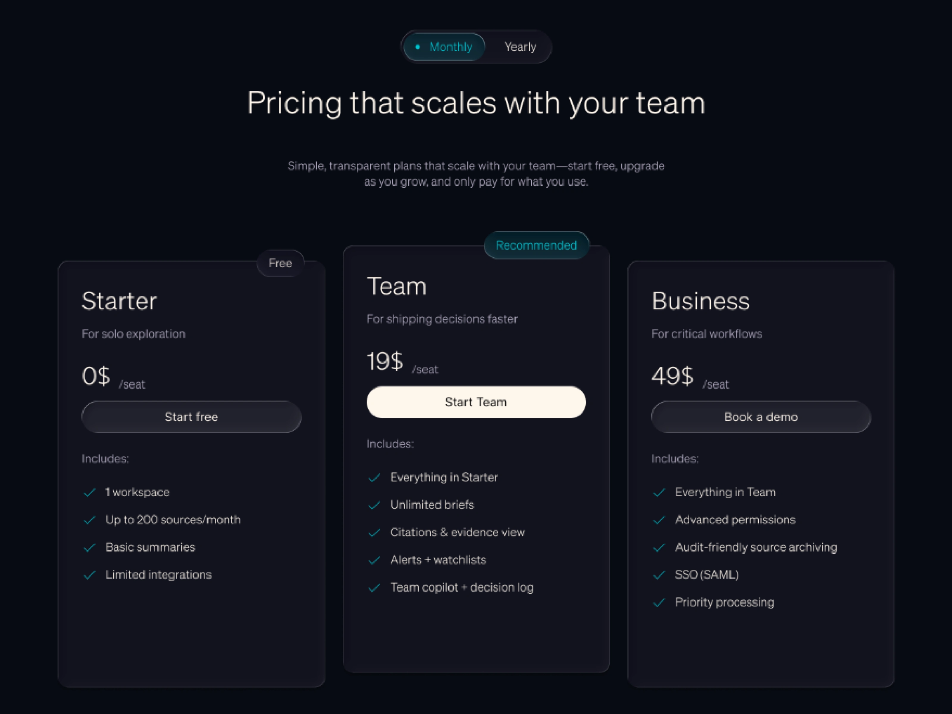
Pricing Hierarchy: I designed the 'Team' card to be visually distinct (shifted to be slightly above + button color) to subtly nudge users toward the highest-value tier.

The Outcome
The final design resulted in a seamless narrative flow. The high-contrast hierarchy ensures the primary CTA is never missed. The layout is fully scalable, allowing the startup to add more features or testimonials without breaking the design system.
Like this project
Posted Feb 5, 2026
Designed a high-converting landing page to enhance Lumen's clarity and user appeal.
Likes
2
Views
2