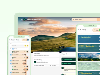
Improving retention for work-life balance tracking app
OurBalance faced difficulty in user growth due to apparent difficulties in onboarding. My redesign of the onboarding turned things around and tripled user retention.
Problem statement
OurBalance is a mobile app designed to help users track and improve their work-life balance by providing automatic readings of their daily activity. The app relies on device location and motion data to provide accurate estimates of the user's behaviors.
Soon after the initial product launch, we discovered that over 75% of users were dropping out during the onboarding, severely impacting the retention rate.

Yikes - only 25% of users were finishing the onboarding.
Something needed to change, fast!
Goal & my role
I was tasked with identifying the usability and design issues that might be causing users to drop off and to create a more engaging and intuitive onboarding experience that would encourage users to stick around.
My key responsibilities were in-app behavior data analysis, user research and product design. The other stakeholders were the product owner and lead developer.
Product design
User interviewing
Front end development
In-app behavior tracking
Wireframing
Prototyping
Users
The main target audience of OurBalance is 30-40 year-old smartphone users who struggle with work-life balance and are looking to improve their well-being. They are often cautious about their privacy and value their time as a scarce resource. The app was designed to cater to a wide audience, including knowledge workers, grad & post-grad students, and career parents.

Research & synthesis
I first reviewed the app's existing system for tracking in-app activity, which provided some basic data on how users were interacting with the app. I refined this system to identify the specific stages of the user journey where users were dropping off.
To get a more complete picture of why this was happening, I also conducted user interviews with a sample of potential app users to identify any pain points or areas of confusion that were contributing to low engagement. The combination of quantitative and qualitative data helped me convince the rest of the team on the best route to take.

In-app user activity: where are users dropping off?

User interviews: why are they dropping off?
After analyzing and synthesizing the research data, I gained three important insights:
Location data prompt leads drop off rates: The quantitative data showed that the vast majority of users that dropped off did so when prompted for location data access.
App value is unclear: The participants did not have a clear understanding of what the benefits of the app were even after completing the whole onboarding. This was likely due to the copy focusing on app features.
Many concerns about location data access: Most participants considered their location data valuable and sensitive, so they were reluctant to give access this data. More surprisingly, participants also connected location data usage to higher battery usage, which is not the case in this context. Furthermore, the process of providing data access was frustrating for most participants.
Process
Based on the research findings, I felt we could make big improvements with relatively small redesigns to the onboarding structure:
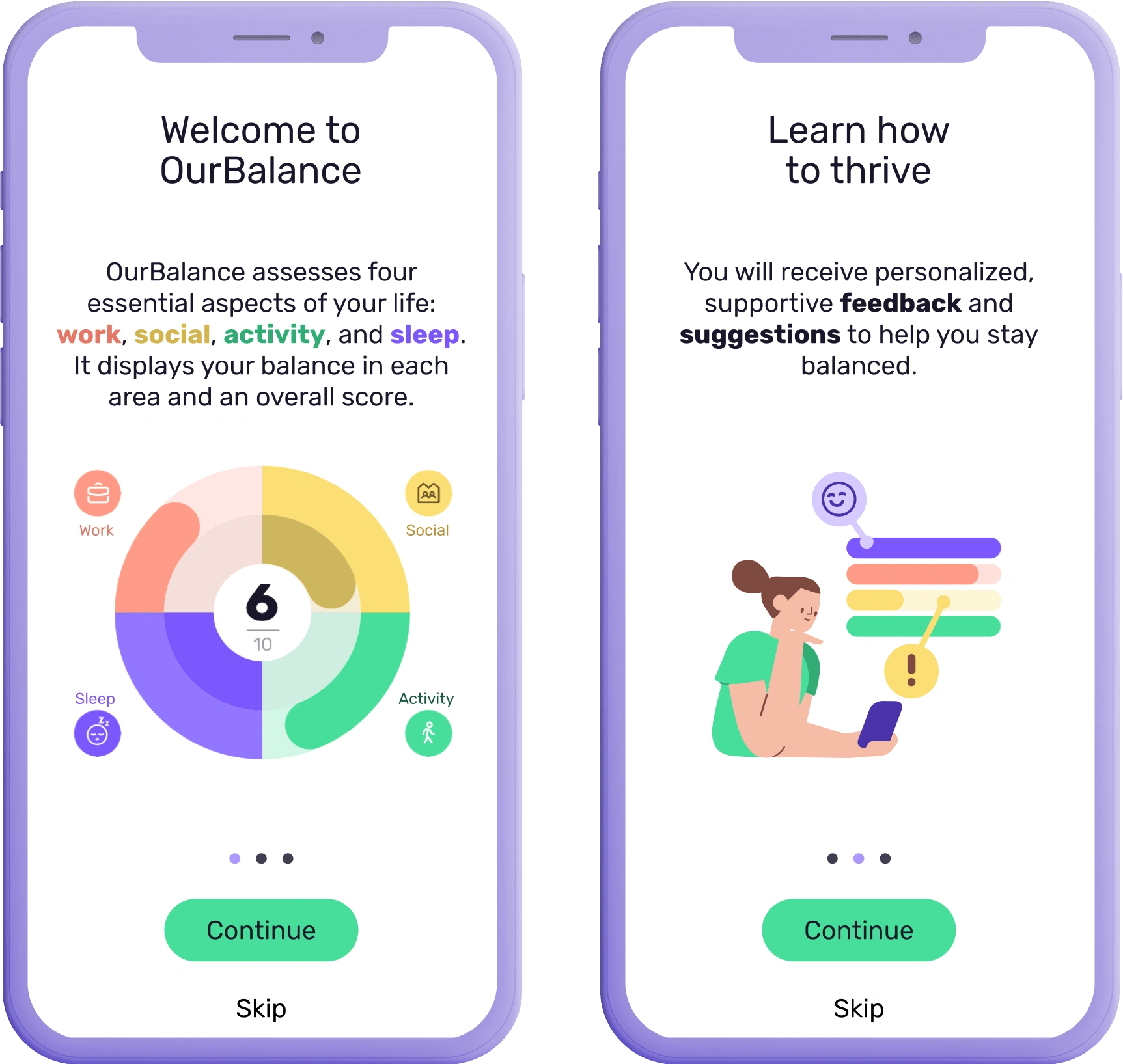
Clarify benefits: Change the copy and imagery to focus on the benefits of the app, motivating users to provide access to something they value.
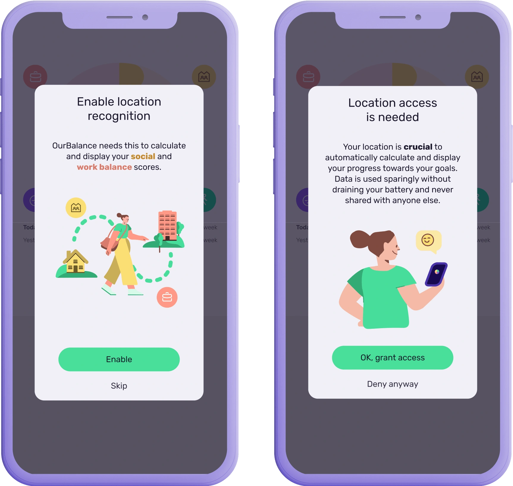
Remove barriers: Alleviate privacy and battery life concerns by clarifying what the data is used for and what the effects are. This will help users make an informed decision.
Simplify consent process: Make allowing data location access as easy as possible. This will minimize frustration and ensure that more users complete the action successfully.
Initially, we discussed a more robust overhaul of the onboarding that would help us improve the first time use experience beyond solving this immediate problem. However, after careful consideration, we opted for a simpler redesign that allowed us to directly compare dropoff data before and after the update, as the fundamental steps would remain consistent.
Once the general course was set, I collaborated with the lead developer to map out the high level flows and information architecture on various versions of iOS and Android, and then I sketched out wireframes and prototypes.
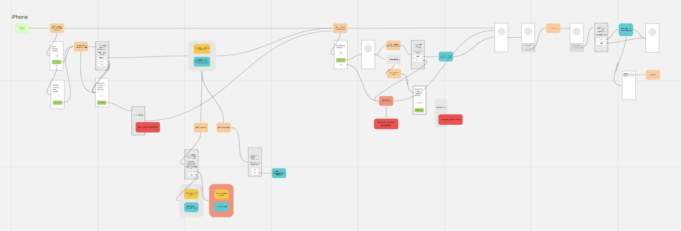
Rough flows and information architecture for iOS devices.
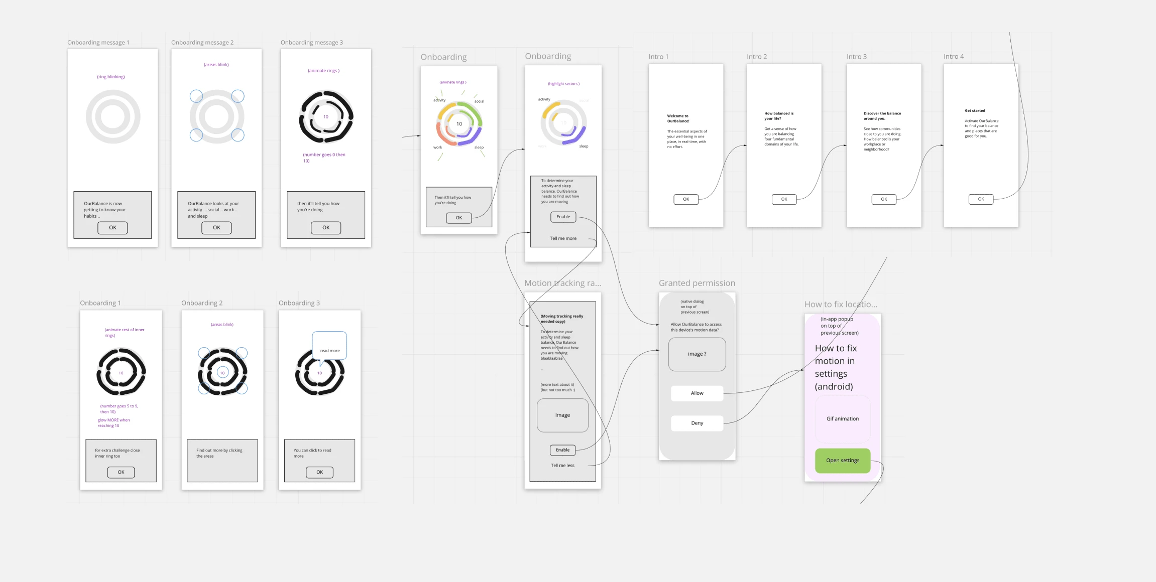
In progress wireframes.
We proceeded to develop several iterations of prototypes and conducted user validation sessions to identify any significant issues or oversights.
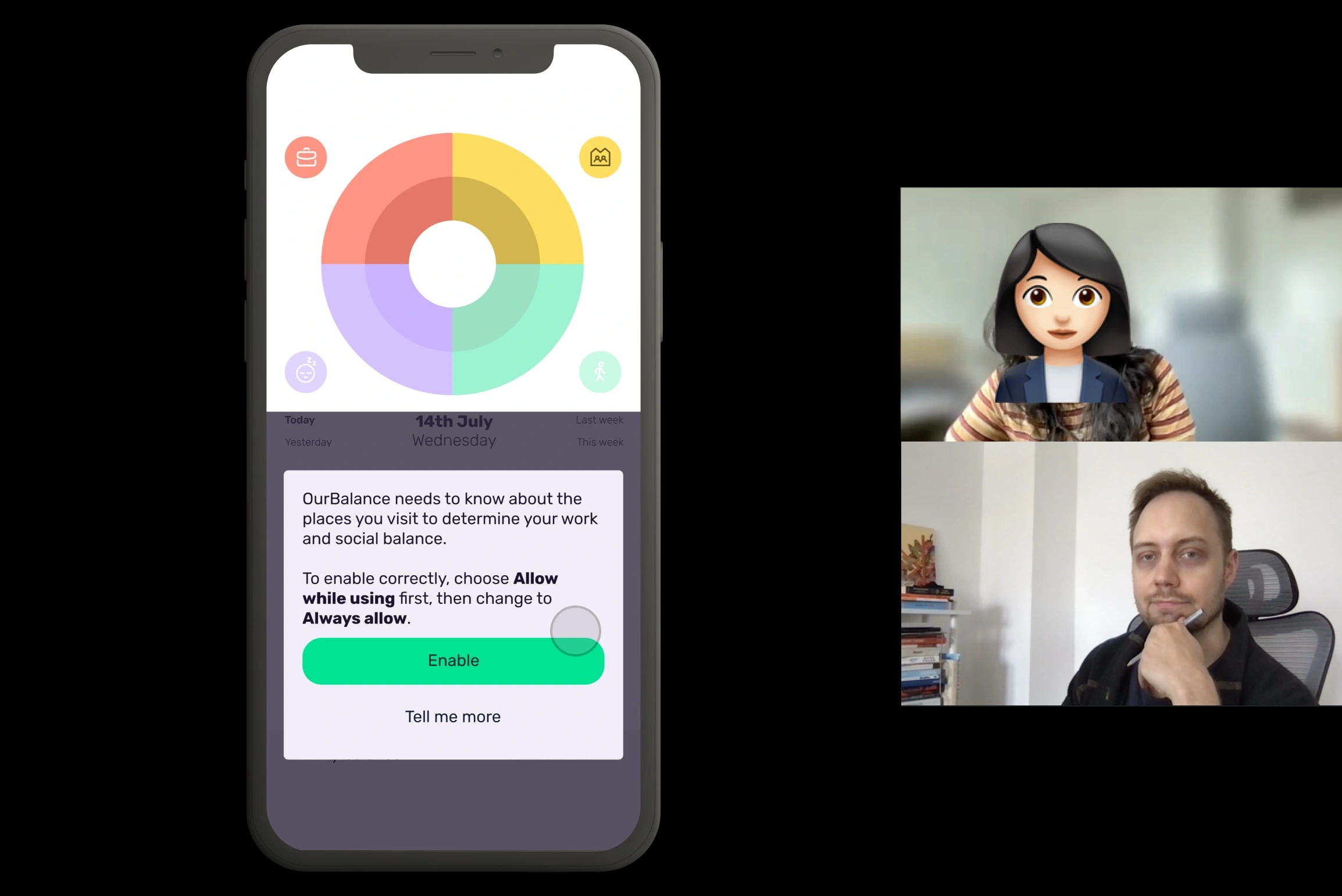
Screen capture of a remote user validation session.
Solution highlights
In the end, two key features of the solution drove the positive outcome.
Clarified app value
I added steps and copy that make the app value clearer up front before we ask for location permissions. This helped users get an idea of what they were getting in return for allowing access to their data.
Lowered barrier to allow data access
I also added clearer explanations of how the user's data would be used and clarified the steps for allowing access to the required data. This made it easier for users to make a decision and take action.
Outcome
Increased user engagement
The redesign of the onboarding process led to a significant improvement in user engagement. The ratio of completed onboardings tripled to 75%, indicating that more users were successfully navigating the onboarding experience and continuing to use the app. This increased engagement positively influenced the app's retention rate and user satisfaction.
Improved user perception and trust
By clarifying the app's value up front and providing clearer explanations of how user data would be used, the project helped alleviate user concerns and build trust. Users had a better understanding of the benefits they would receive in return for sharing their location data. This positively influenced user willingness to grant location permissions, resulting in a smoother user experience.

Now that looks better!
Like this project
Posted Jul 3, 2023
OurBalance faced difficulty in user growth due to difficulties in onboarding. My redesign of the onboarding turned things around and tripled user retention.


