Japanese Language Learning Mobile App UI Design

Cansaas Agency

Overview
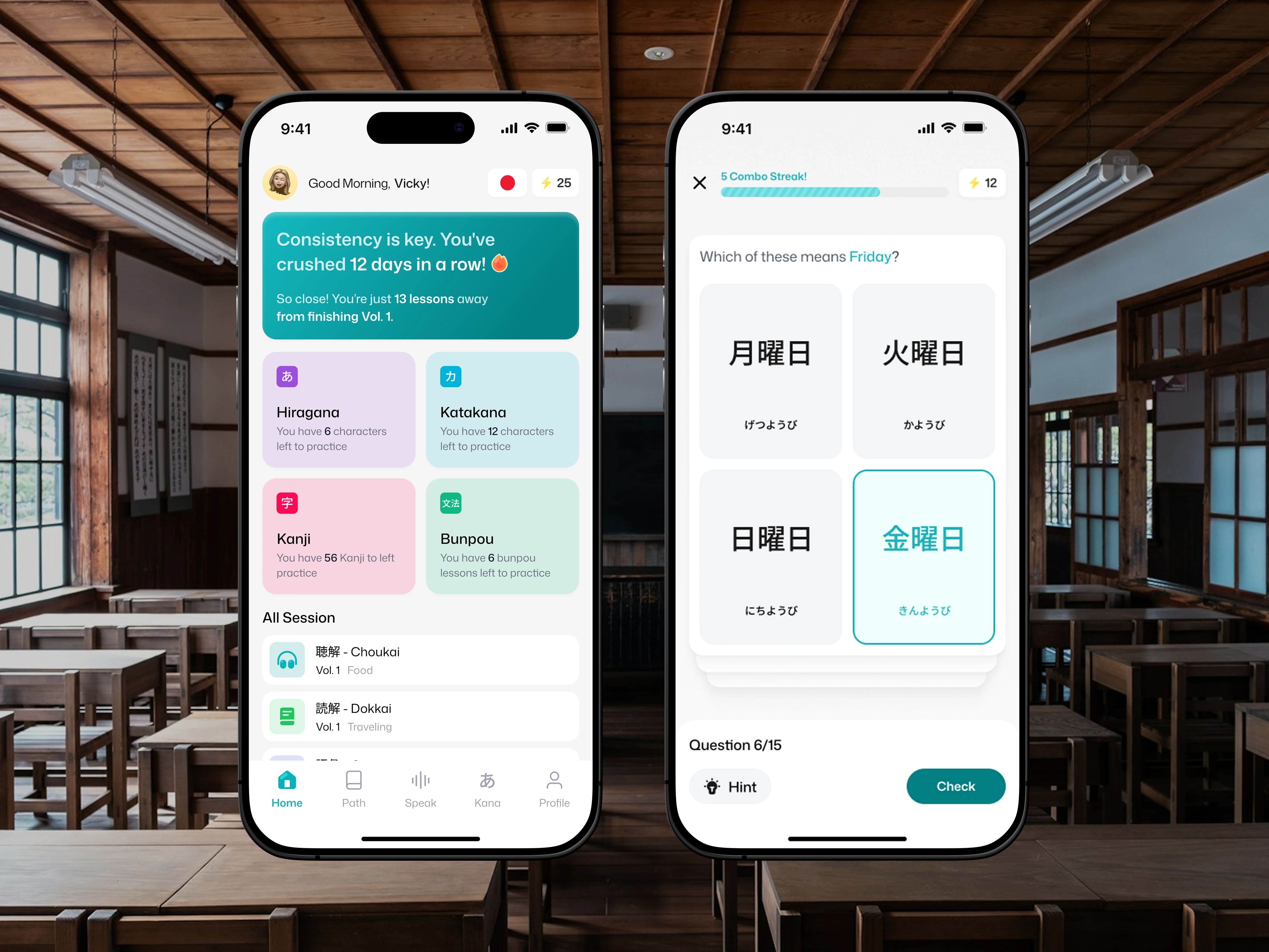
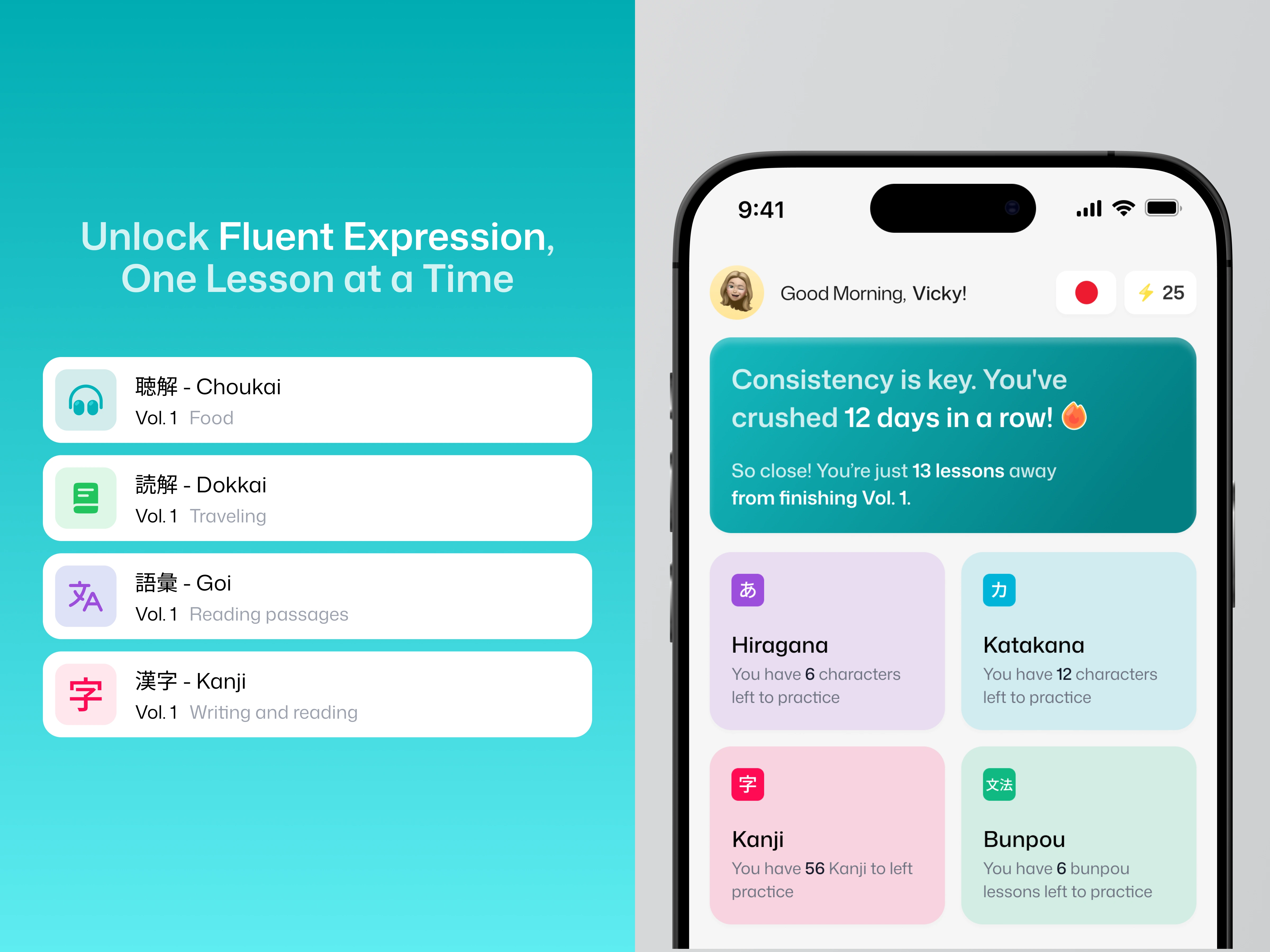
This Japanese language learning mobile app is designed to make daily practice feel simple, friendly, and consistent. The app combines Hiragana, Katakana, Kanji, Bunpou, vocabulary quizzes, speaking practice, progress tracking, and combo streaks into one clean mobile learning experience. With a calm visual style and structured lesson flow, the design helps users stay motivated while improving their Japanese step by step.
The Challenge
Learning Japanese can feel overwhelming because users need to practice different skills at once, from reading characters and memorizing vocabulary to understanding grammar and improving pronunciation. The challenge was to create a mobile education app interface that feels approachable, organized, and motivating without making the learning journey look too complex or heavy.
Design Approach
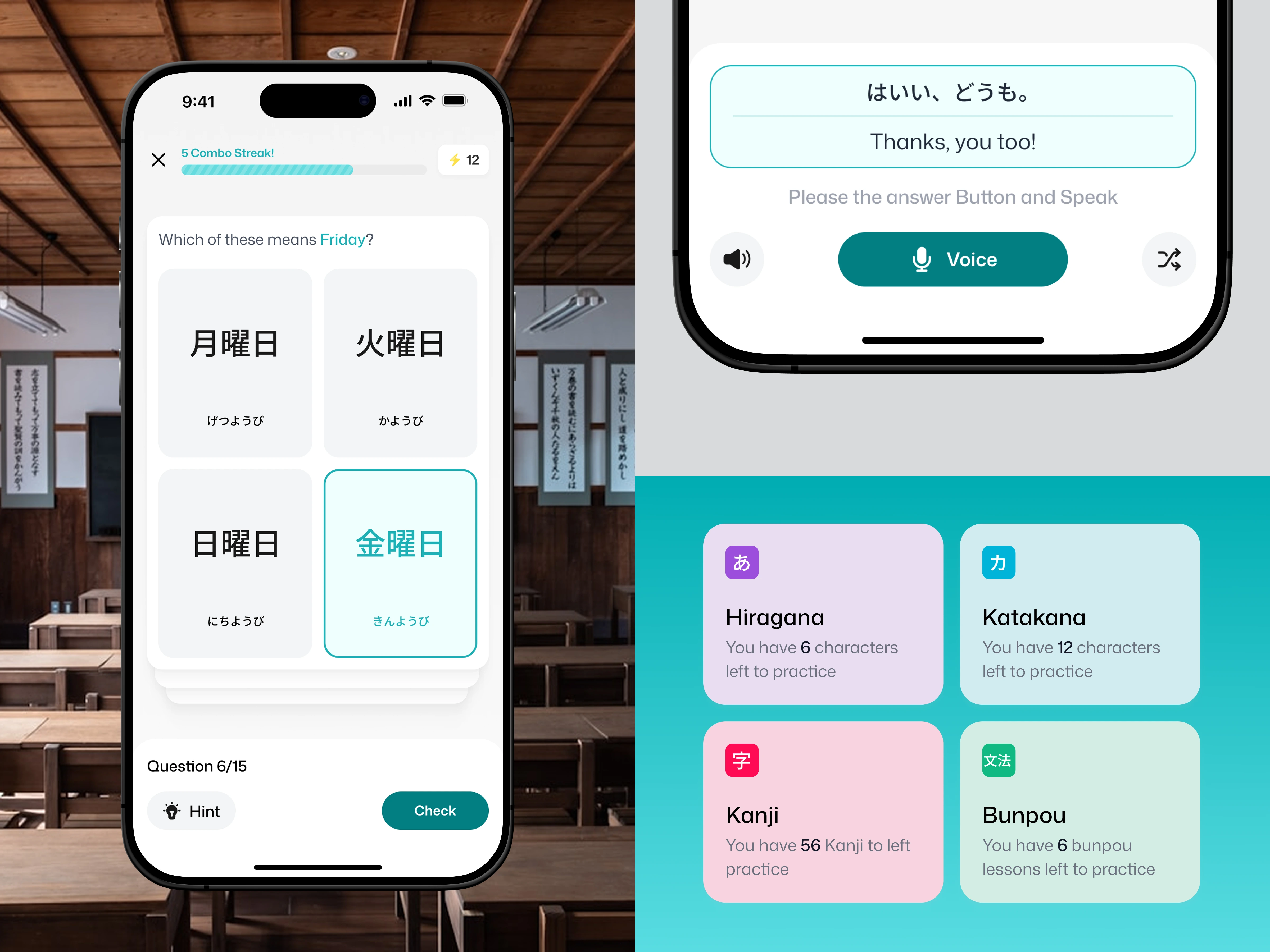
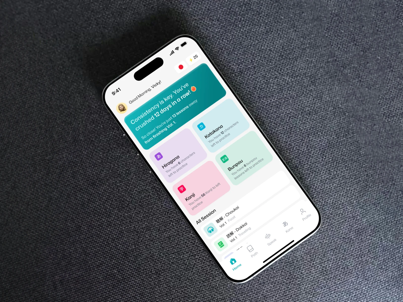
The interface uses a clean layout, soft pastel cards, rounded components, and calm teal accents to create a friendly learning environment. Each section is designed to guide users naturally, starting from daily progress and lesson categories to interactive quizzes and speaking exercises. The goal was to make Japanese practice feel lighter, more focused, and easier to continue every day.
Key Features
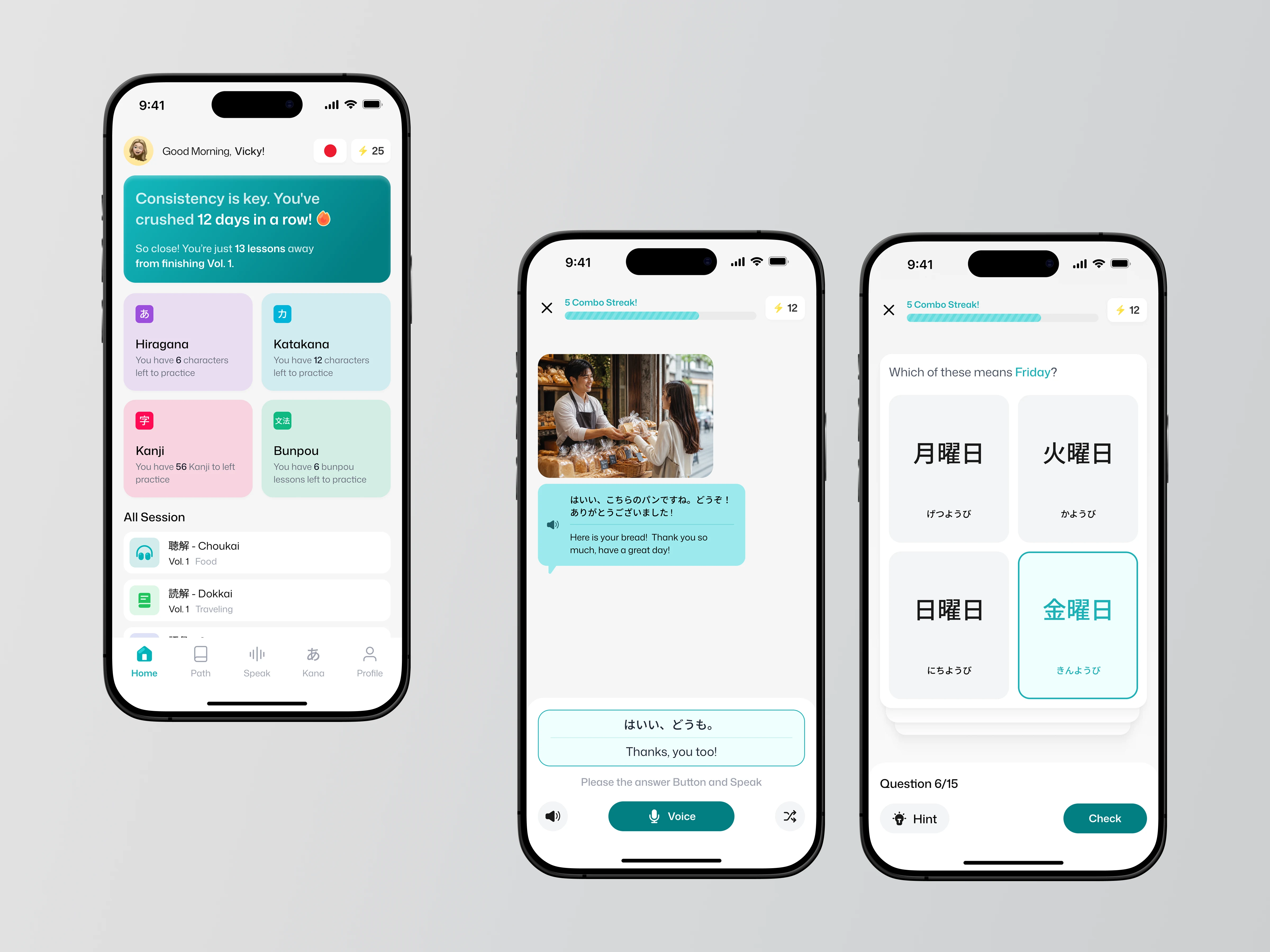
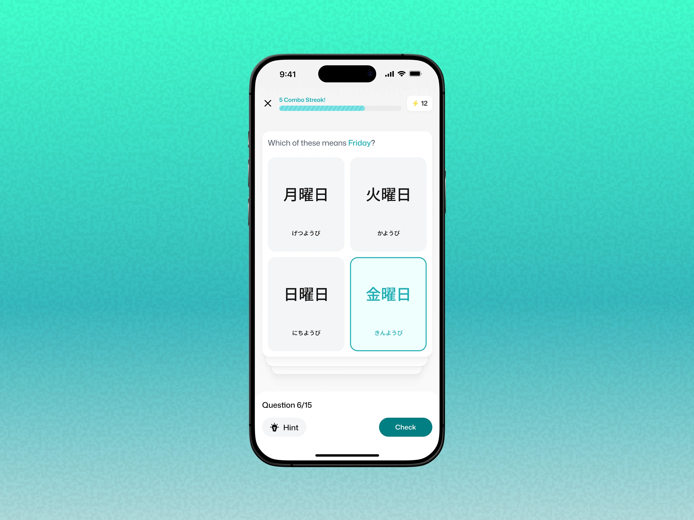
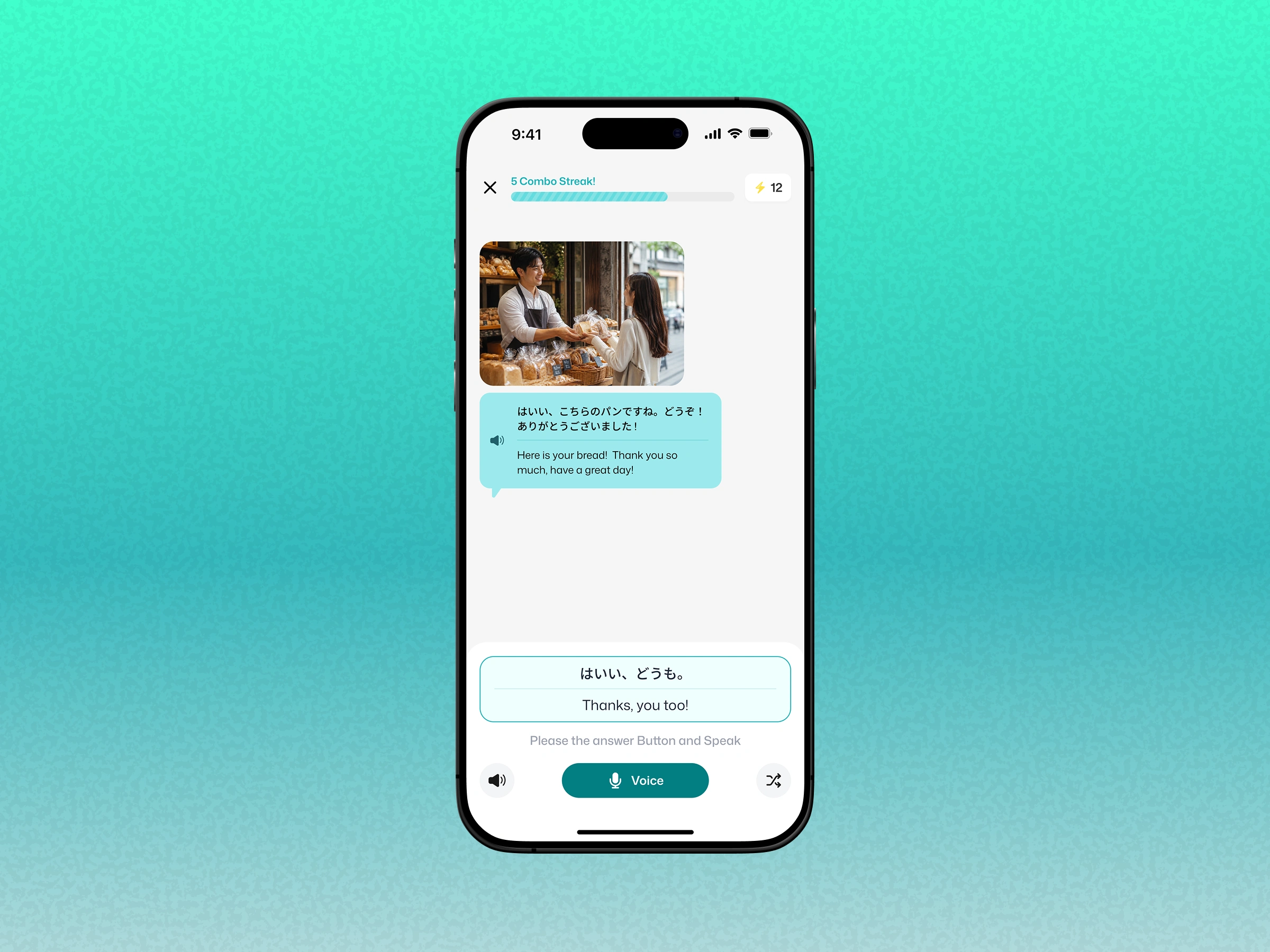
The app includes a learning home dashboard, Hiragana and Katakana practice cards, Kanji and Bunpou modules, listening and reading sessions, vocabulary quizzes, speaking practice, voice input, combo streak progress, energy points, hint buttons, and clear call-to-action buttons. These features support a gamified learning experience while keeping the UI clean and easy to navigate.
User Experience
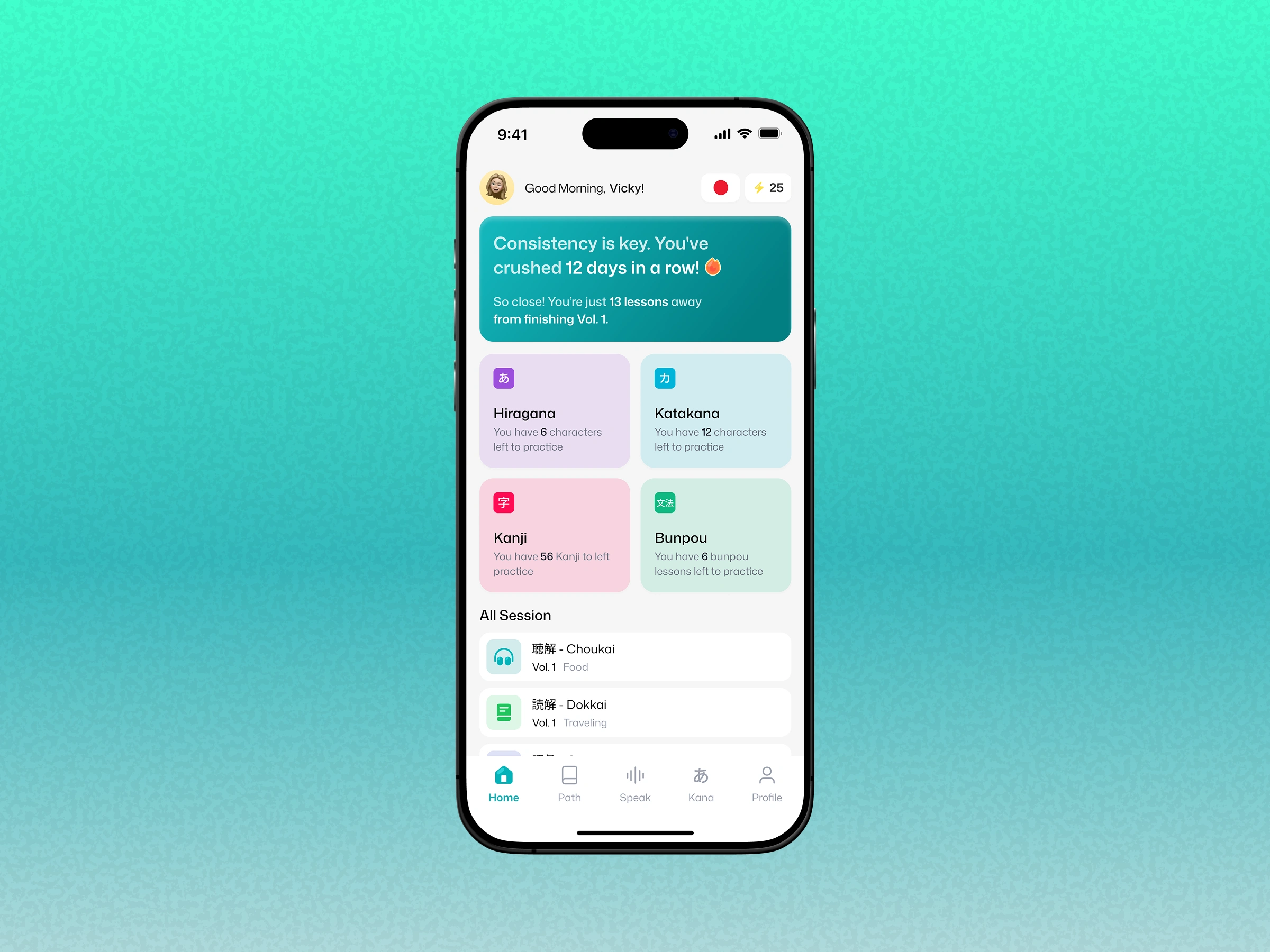
The UX focuses on clarity, habit-building, and low-friction learning. Users can quickly understand their progress, choose a lesson, answer quiz questions, or practice speaking without unnecessary steps. Visual feedback such as selected answer states, progress bars, streak indicators, and active buttons helps users feel more engaged and confident throughout the learning flow.
Visual Style
The visual direction is soft, minimal, and modern. Pastel colors make each learning category feel distinct, while teal accents create consistency across progress indicators, selected states, and primary buttons. The combination of white space, friendly typography, rounded cards, and mobile-first spacing gives the app a lightweight and polished education app design.
Result
The final design delivers a clean and engaging Japanese learning app UI that supports daily practice, interactive quizzes, speaking improvement, and consistent progress tracking. It turns language learning into a more approachable mobile experience, making Japanese practice feel less overwhelming and easier to build into a daily habit.
Like this project
Posted Jul 15, 2026
Designed a user-friendly UI for a Japanese language learning app.
Likes
1
Views
0