Forma - Precision, Balance and the Space Between
Luka Mihajlovic
Forma - Precision, Balance and the Space Between
Framing the Challenge
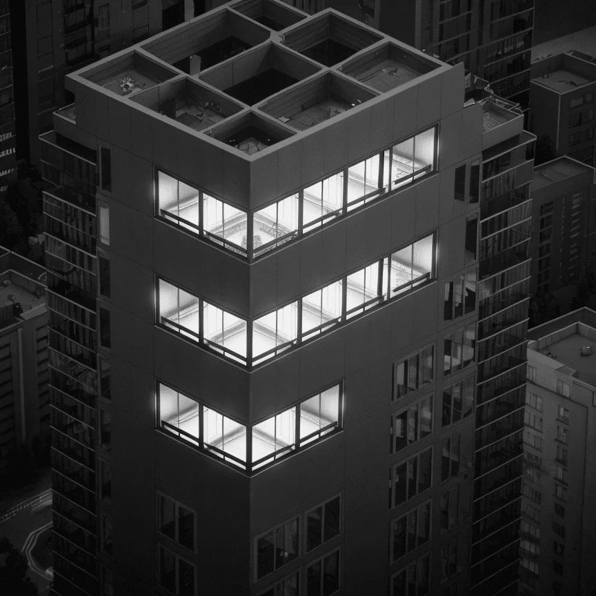
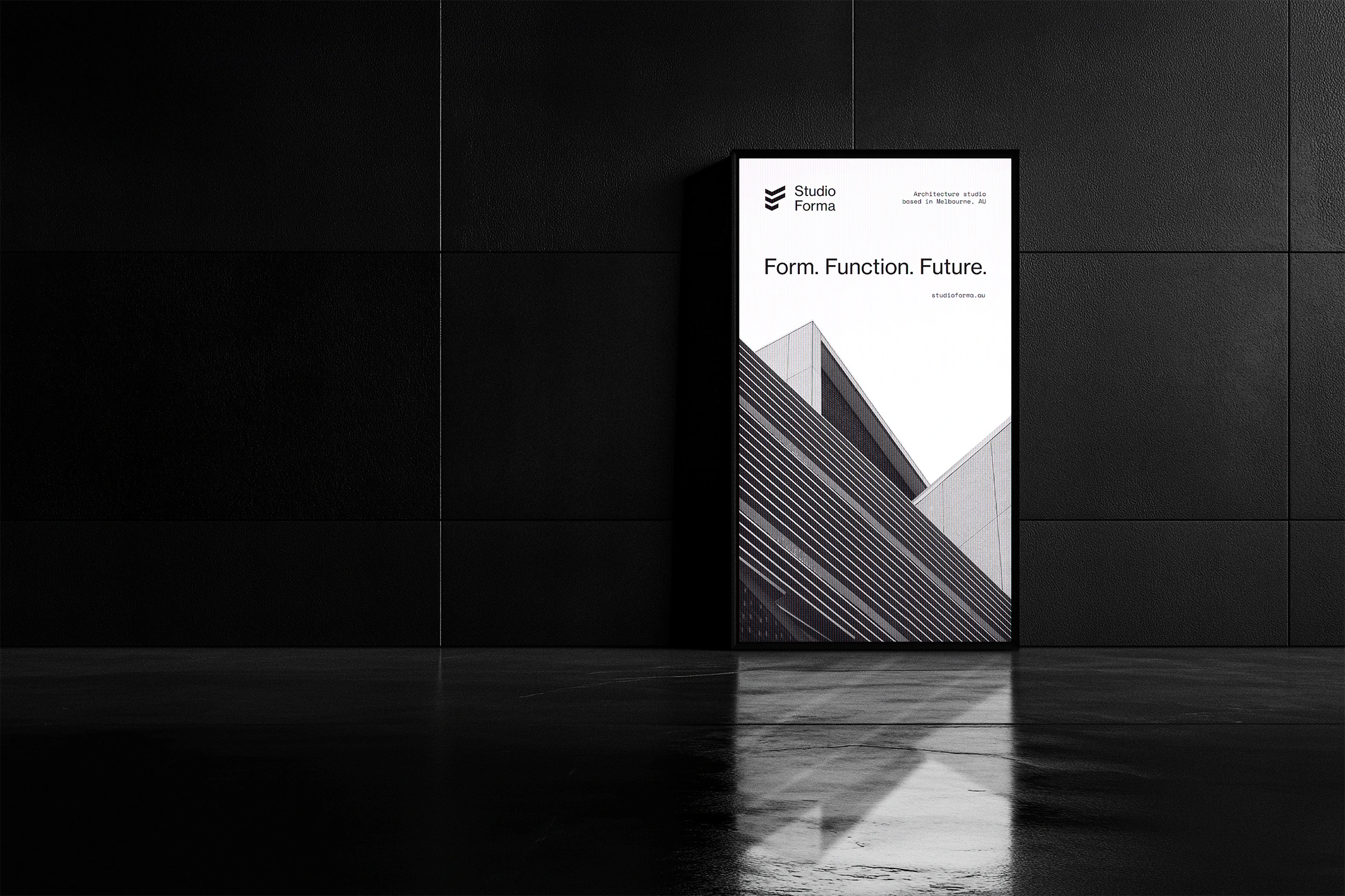
Forma was envisioned as more than just an architecture studio — it was built as a design philosophy. Rooted in Milan and drawing from European modernist traditions, the studio needed a visual identity that reflected its values: precision, restraint, and enduring structure. Our goal was to define a brand language that felt timeless, architectural, and unapologetically clear.
Services Provided:
Brand Strategy
Visual Identity Design
Typography System
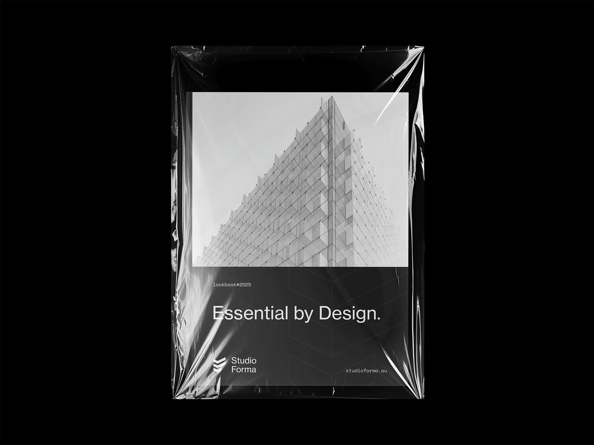
Stationary & Collateral
Website Layout Design
Building the System
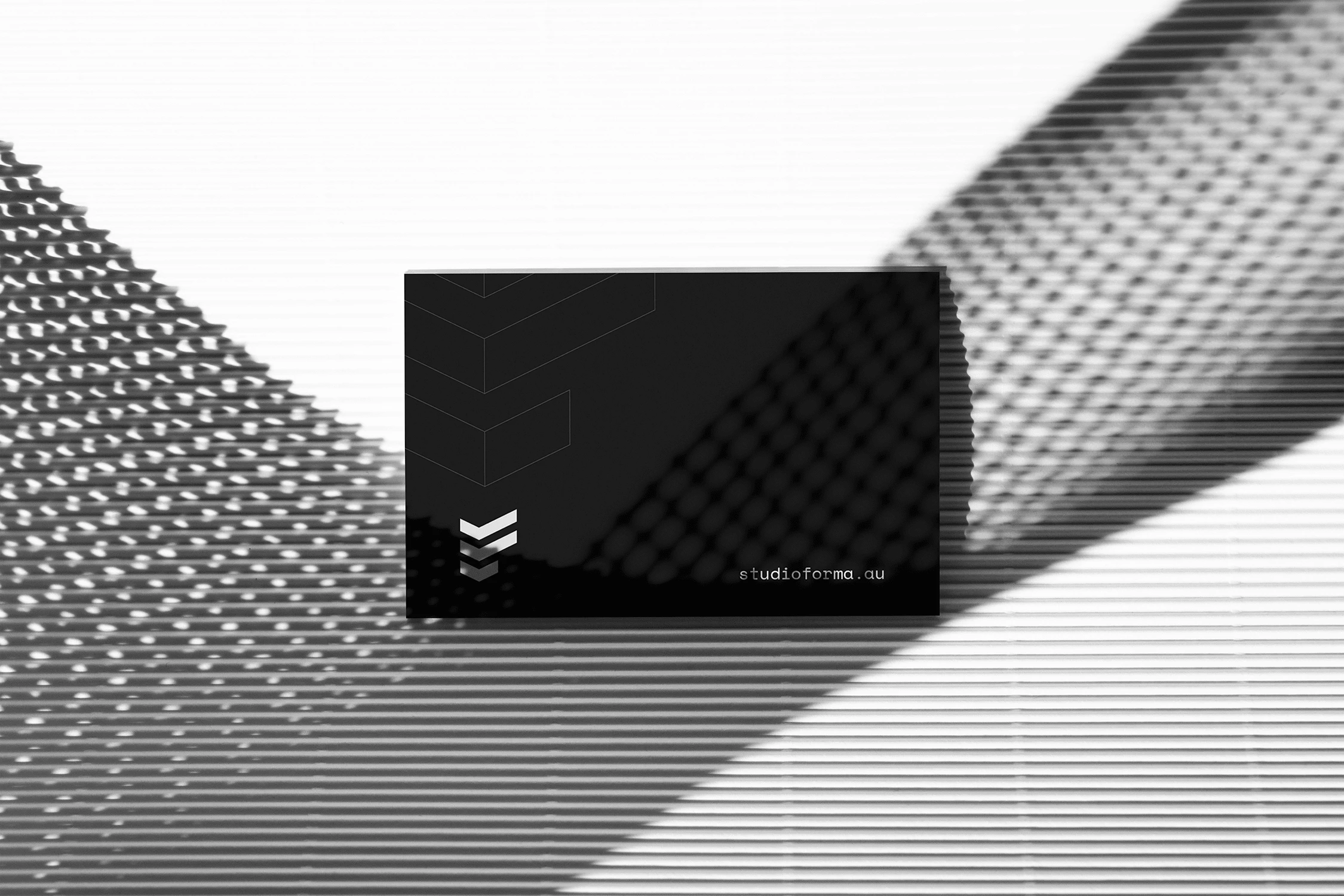
Every element of Forma’s identity is reduced to its purest function. The layout, typography, and visual system are driven by structure—not decoration. Inspired by modernist architecture, we embraced repetition, grid balance, and tension through space, allowing the brand to breathe with quiet confidence. It’s not about what we added, but what we intentionally left out.
Perfecting the Blueprint
Working closely with Forma’s founders, we honed every aspect of the identity — from logo geometry to layout rhythm to typographic pacing. This was a process of fine-tuning, where structure and clarity were always the guideposts. The result is a brand system that mirrors Forma’s design philosophy: disciplined, enduring, and built with purpose.
Like this project
Posted Apr 17, 2025
A minimalist brand identity for an architecture studio where structure, clarity, and space do the talking.