Camden Co. - Classic meets Current
Luka Mihajlovic

Camden Co. - Classic meets Current
Framing the Challenge
Camden Co. set out to create a fashion label that merges uptown polish with downtown edge. The challenge was to create a visual identity that felt elevated and current — something that could sit alongside heritage fashion houses but speak in its own confident voice. The goal: clean, fashion-forward design with just the right amount of heat.
Services Provided:
Brand Strategy
Visual Identity Design
Typography System
Stationary & Collateral
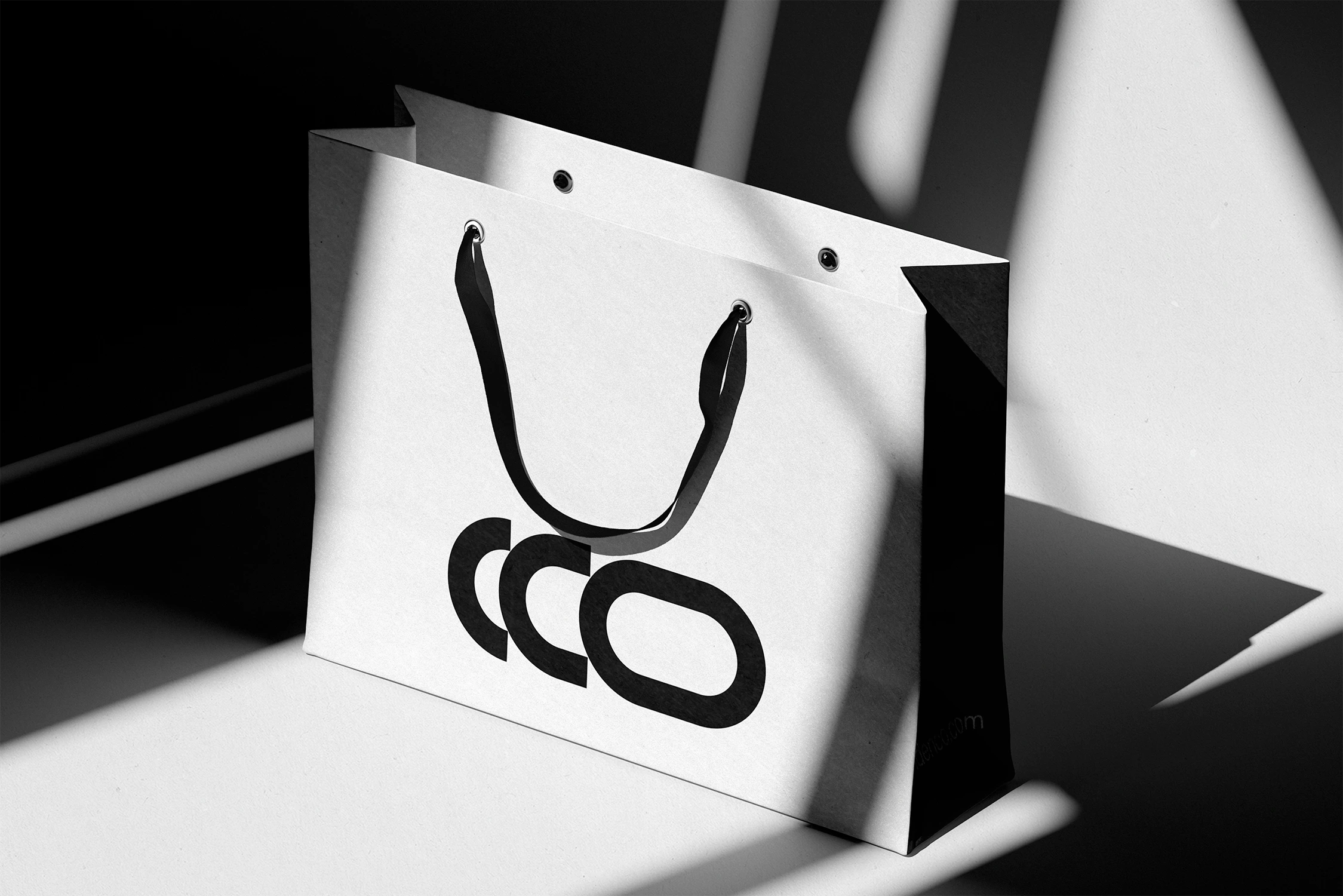
Packaging Design
Content Strategy

Building the System
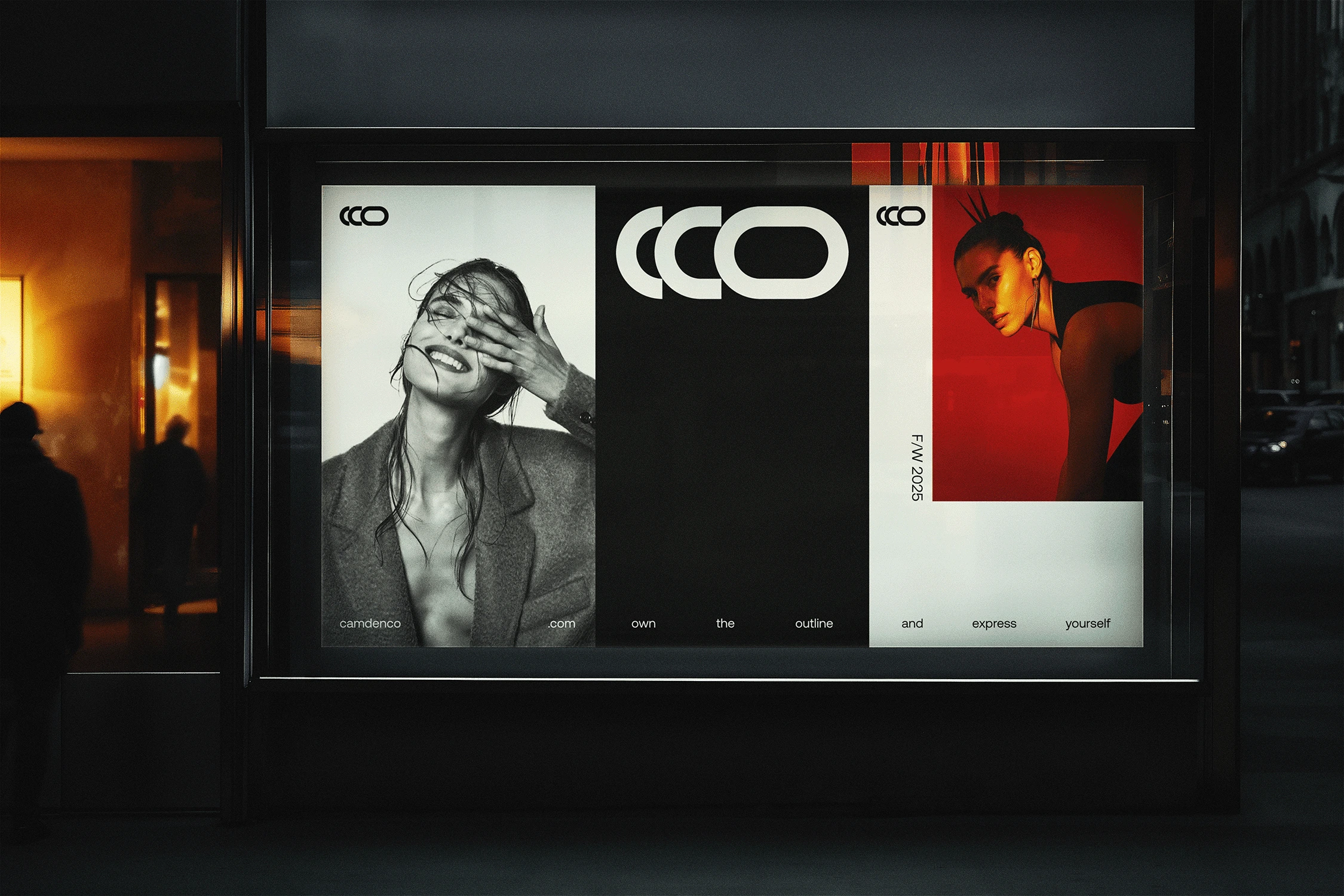
We built the identity around contrast — black and white foundations, accented with a bold, signature orange. Typography is expressive but structured, referencing the world of fashion editorial design. The layout system plays with space, balance, and pace, creating a rhythm that feels both high-end and in motion.
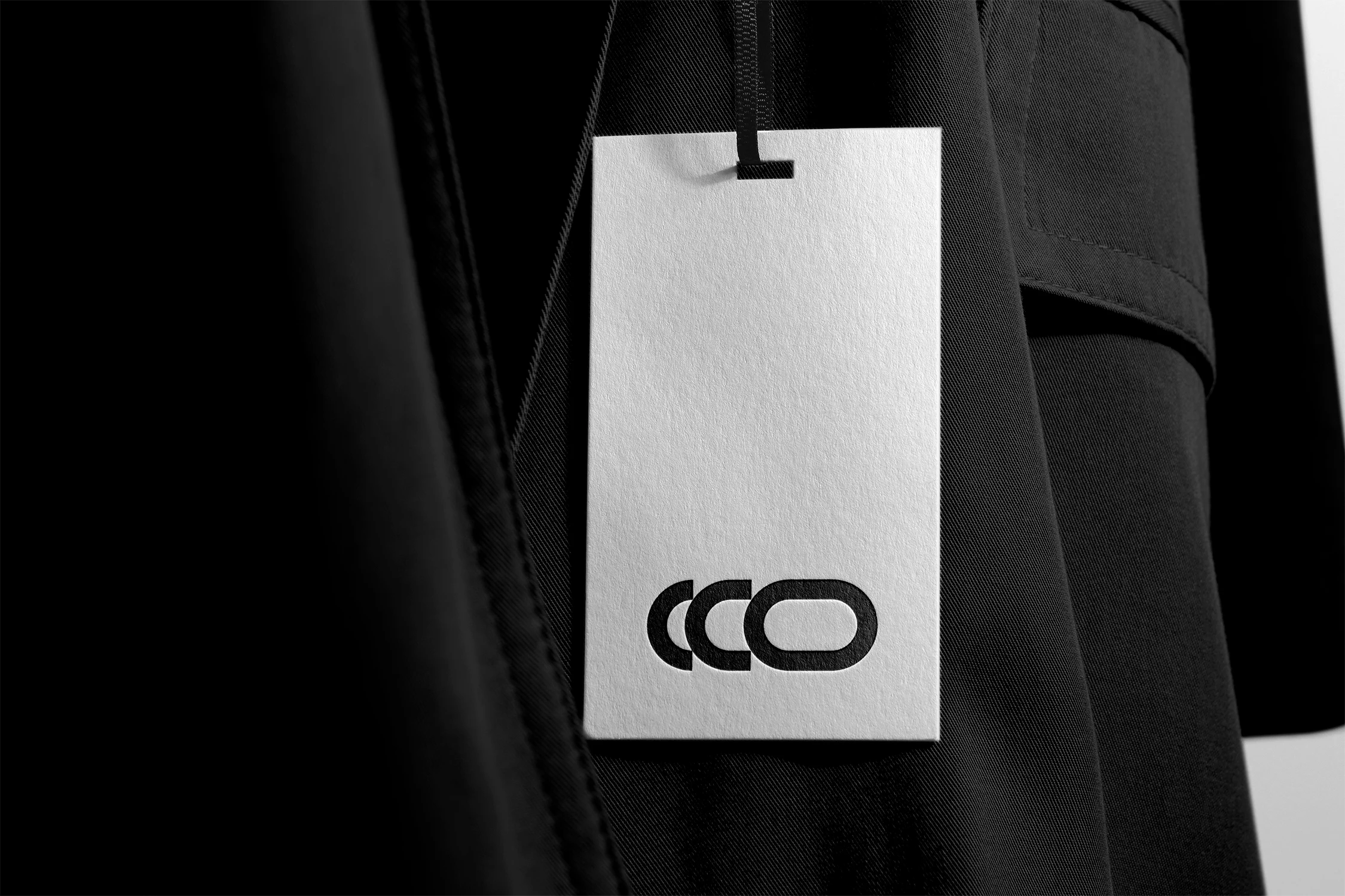
Perfecting the Blueprint
From logo marks to product tags and campaign templates, every asset was built for flexibility and impact. We made sure the system could scale — from printed lookbooks to street posters and digital ads. The result is a brand that captures Camden’s attitude: bold, refined, and made to be seen.
Like this project
Posted Apr 17, 2025
Designed a bold, refined identity for fashion’s new standard.