Clarity-Driven Portfolio Website Design
Shater Tsavsar
Verified
A streamlined portfolio website built for clarity, confidence, and conversion.
The goal of this project was to design a portfolio experience that feels instantly trustworthy. The client needed a site that presents their work in a structured, digestible way, without unnecessary visual noise. I approached the design with a “clarity first” mindset, stripping the interface down to essential elements while still making the experience feel refined and intentional.
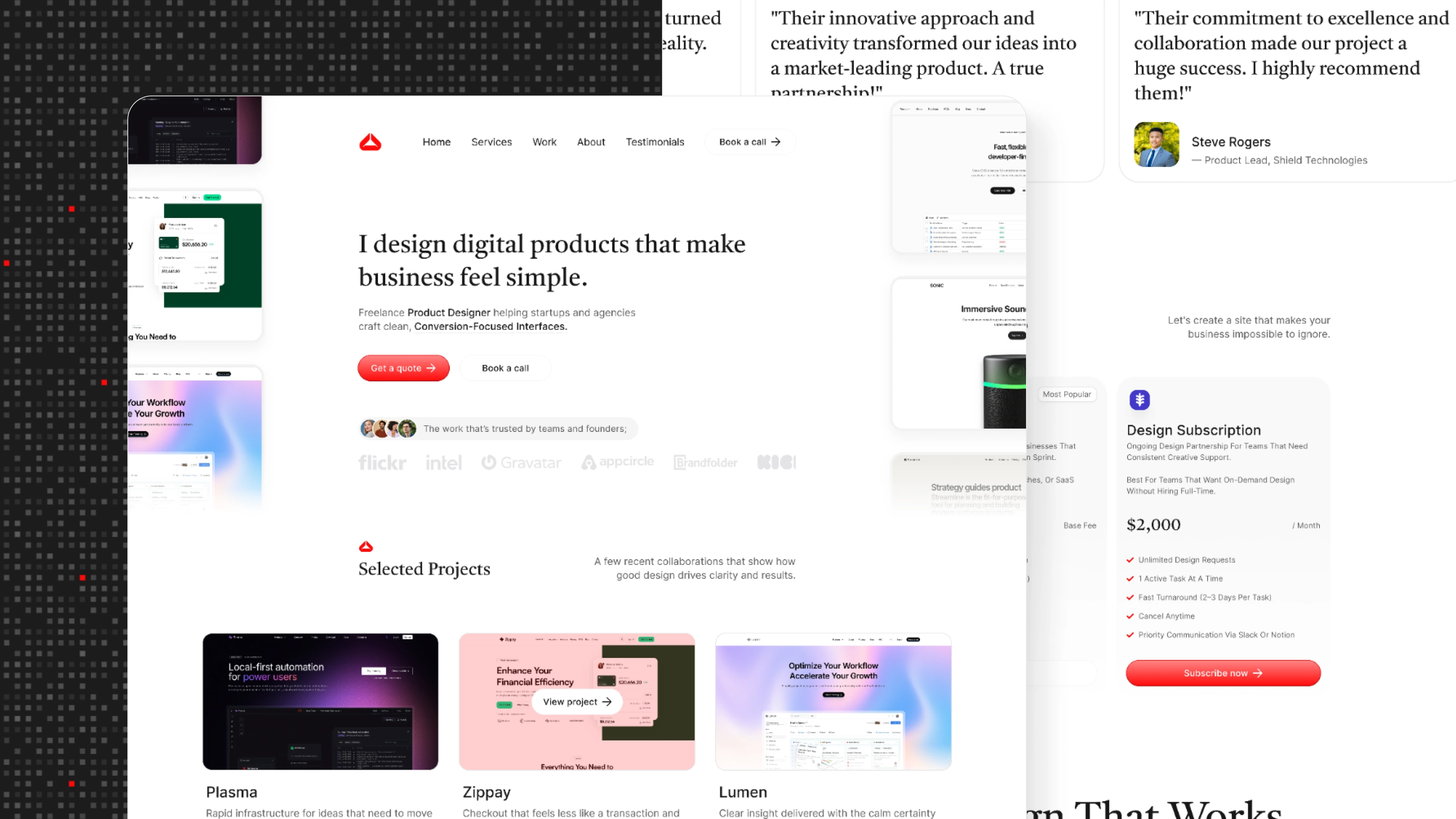
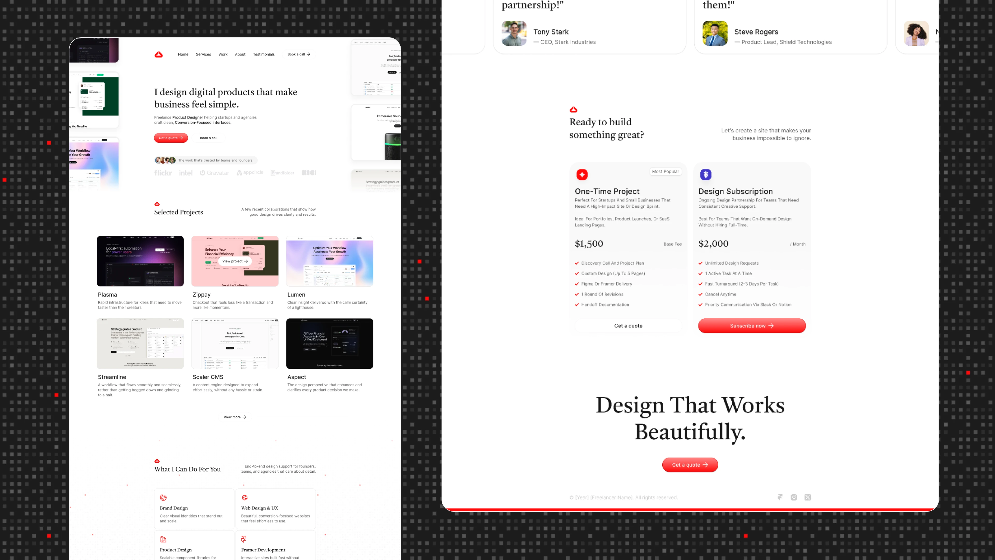
The site balances generous white space, a neutral color palette, and a consistent rhythm across headings, body text, and imagery. Each section of the site is purpose-built to help visitors quickly understand the client’s background, values, services, and projects. Rather than relying on heavy visuals, the design uses subtle cues to guide the user through the narrative — clean grids, focused typography, and deliberate spacing.
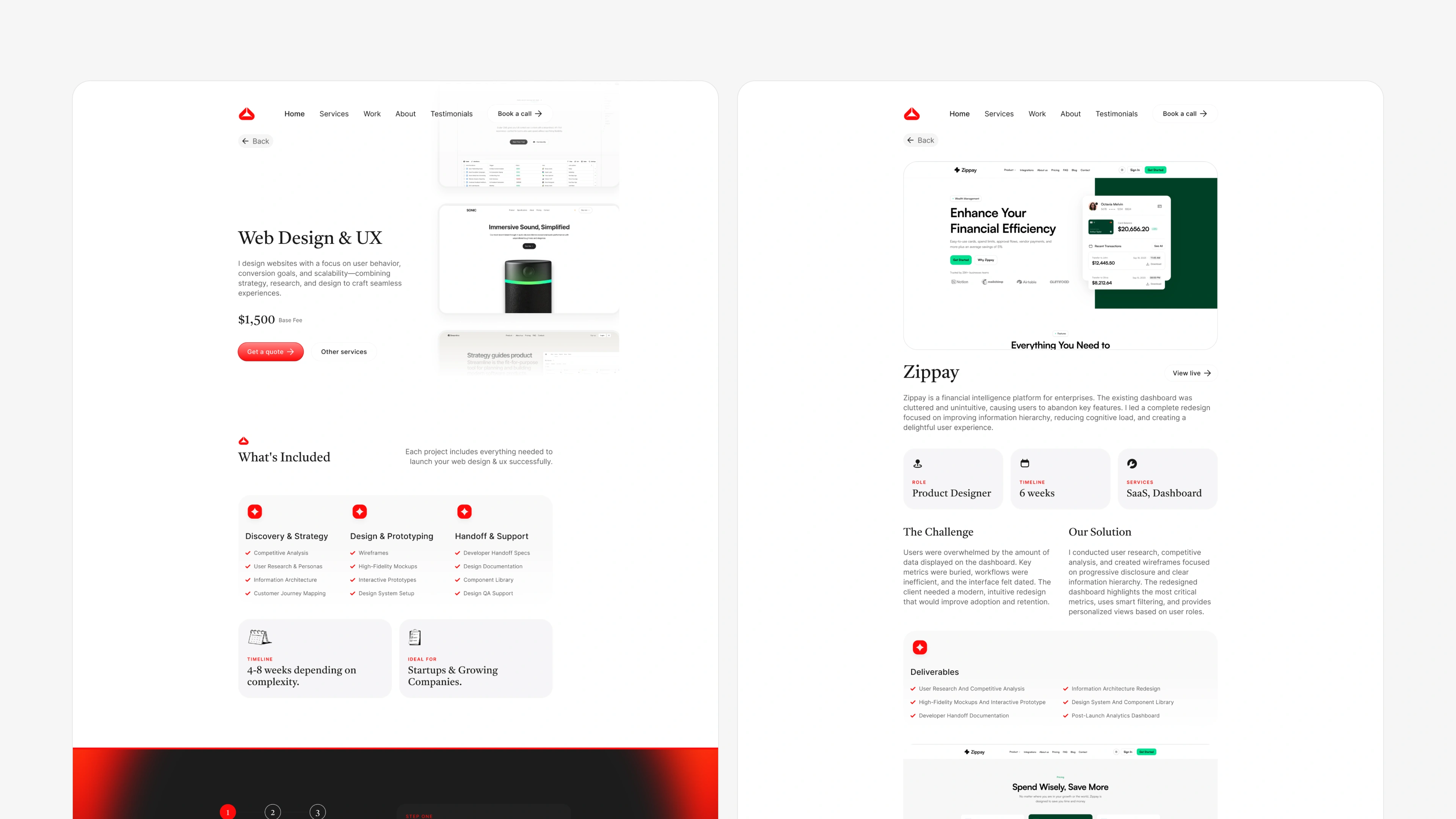
Approach
My approach began with defining the client’s communication priorities. What do we want visitors to understand in the first ten seconds? Which parts of the story need emphasis, and which can remain simple? Answering these questions helped me shape the information hierarchy early on.
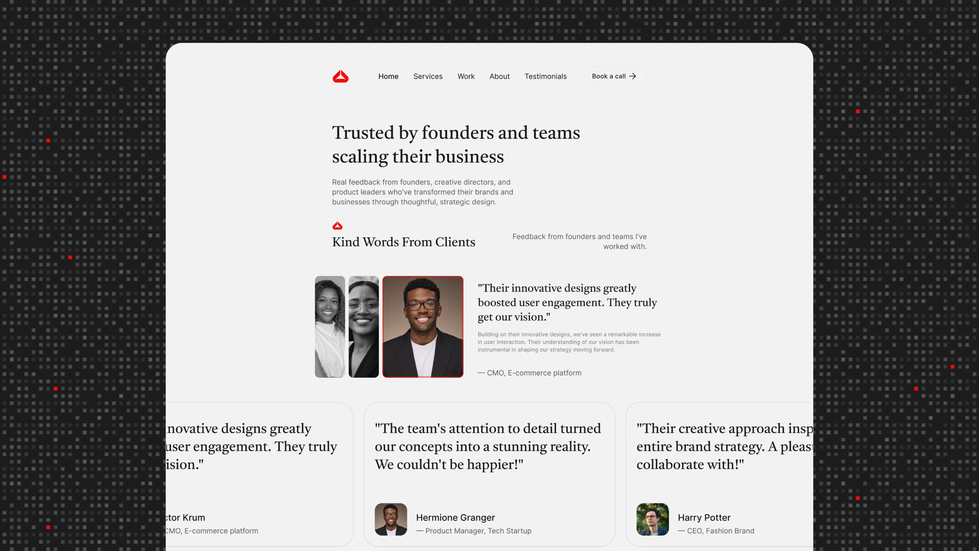
From there, I explored layouts that minimized cognitive load. I experimented with spacing, scaling, and grouping to find a flow that feels natural and consistent across different pages. The testimonials section is designed to feel human and credible without overwhelming the page. The “About” and “Experience” areas were streamlined to present the client’s journey clearly, using card-based layouts and structured text to break long content into digestible pieces.
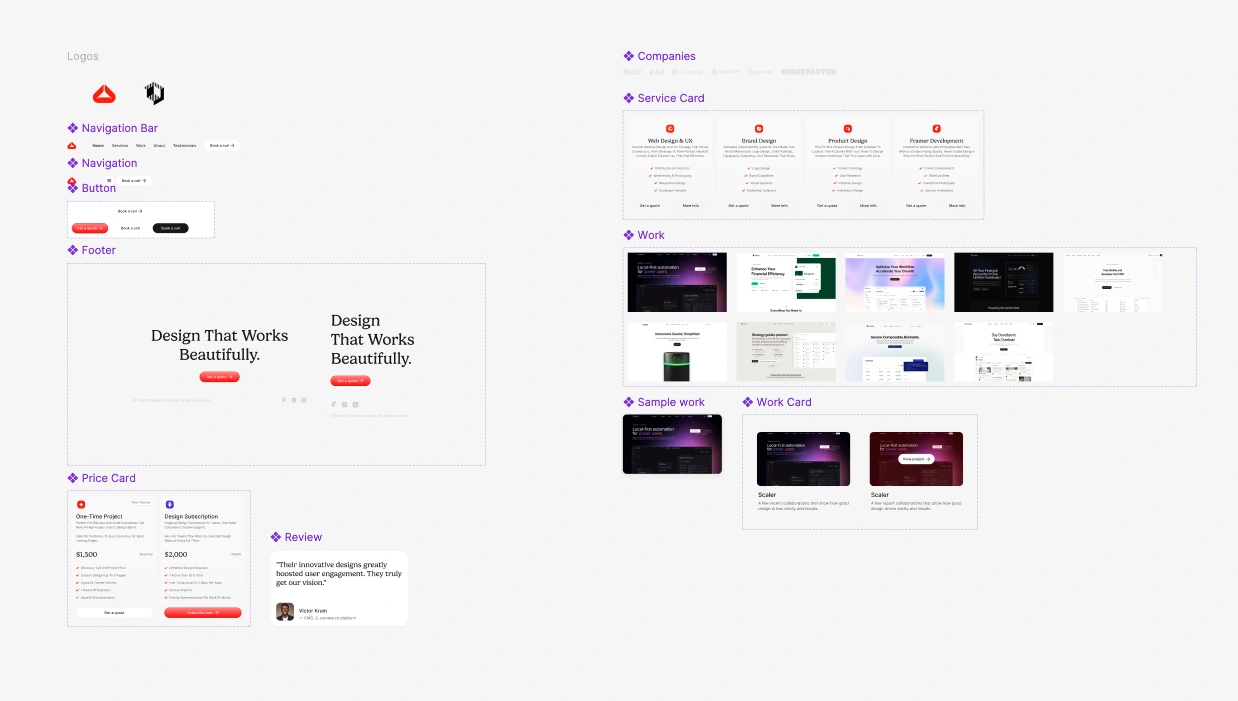
I also built a foundational design system behind the scenes. This included typography rules, spacing patterns, grid behavior, and reusable components. Doing this ensured every page — from the services breakdown to the case study layouts — feels unified and easy to extend in the future.
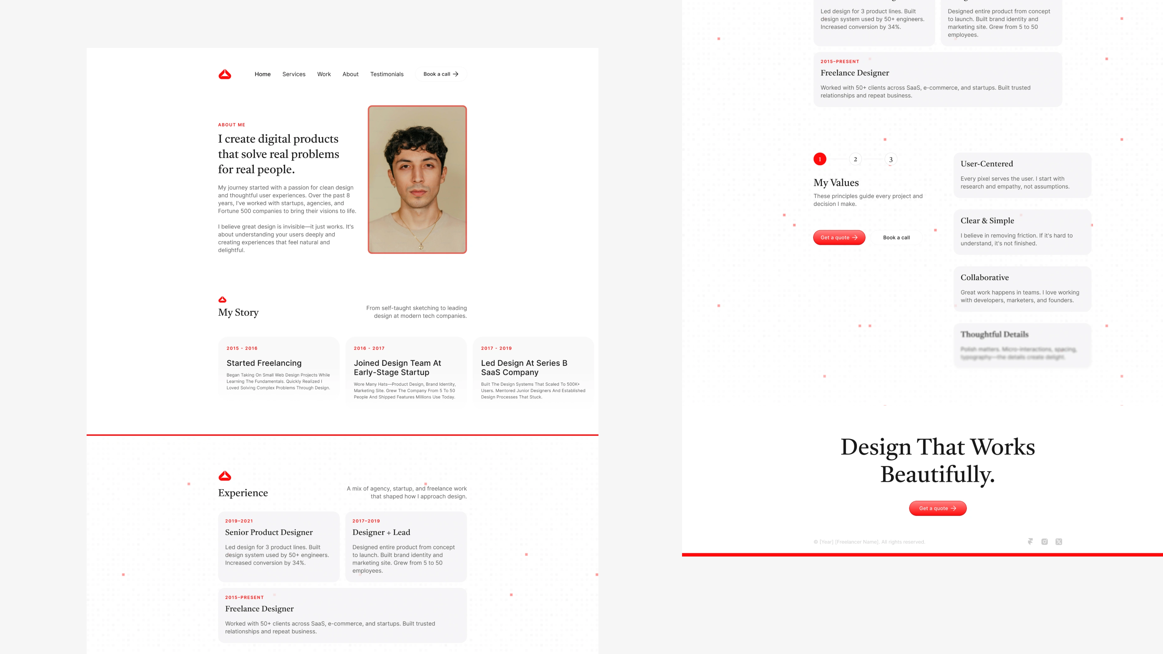
Throughout the process, the priority was always simplicity with purpose. Nothing extra, nothing ornamental. Just a clear, confident representation of the client’s work and personality.
Like this project
Posted Dec 1, 2025
A clean, modern portfolio site built for clarity and focus, using simple layouts and thoughtful details to showcase the client’s work in a clear, confident way.
Likes
4
Views
88
Timeline
Nov 6, 2025 - Nov 27, 2025