Fintech SaaS | UI Design + Custom Illustration + Framer

Anush N
Web Developer
UI Designer
Framer Developer
Figma
Framer
JavaScript
Case Study: Paypulse Landing Page
Work In progress (live)
About Paypulse
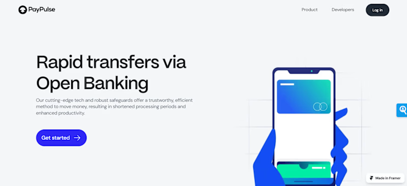
Paypulse is transforming financial transactions with its innovative Open Banking solutions. Our technology facilitates rapid transfers while ensuring top-tier security and reliability. By minimizing processing times and maximizing efficiency, Paypulse enhances productivity and trust in financial operations.
Project Scope
The project for the Paypulse landing page includes the following stages:
1. UX Research:
- Objective: To understand user needs, behaviors, and pain points related to financial transactions and Open Banking solutions.
- Process: Conducting user interviews, surveys, and competitive analysis to gather insights.
- Outcome: Identifying key user personas and defining user journey maps to inform design decisions.
2. Wireframing:
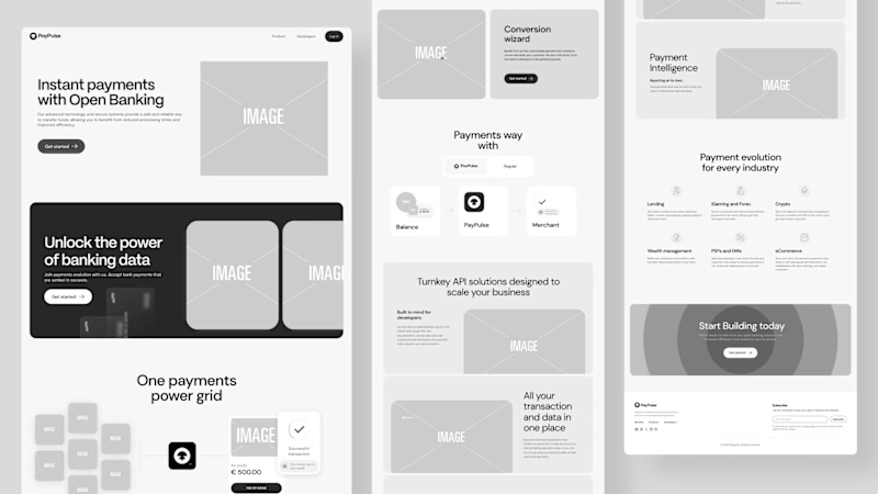
- Objective: To create a structural blueprint of the landing page.
- Process: Developing low-fidelity wireframes that outline the layout, content placement, and navigational flow.
- Outcome: Establishing a clear structure for the page, focusing on user experience and content hierarchy.
3. UI Design:
- Objective: To design a visually appealing and functional user interface that reflects Paypulse’s brand identity.
- Process: Crafting high-fidelity mockups based on the wireframes, incorporating branding elements, typography, and color schemes.
- Outcome: A polished design that communicates the benefits of Paypulse effectively and engages users.
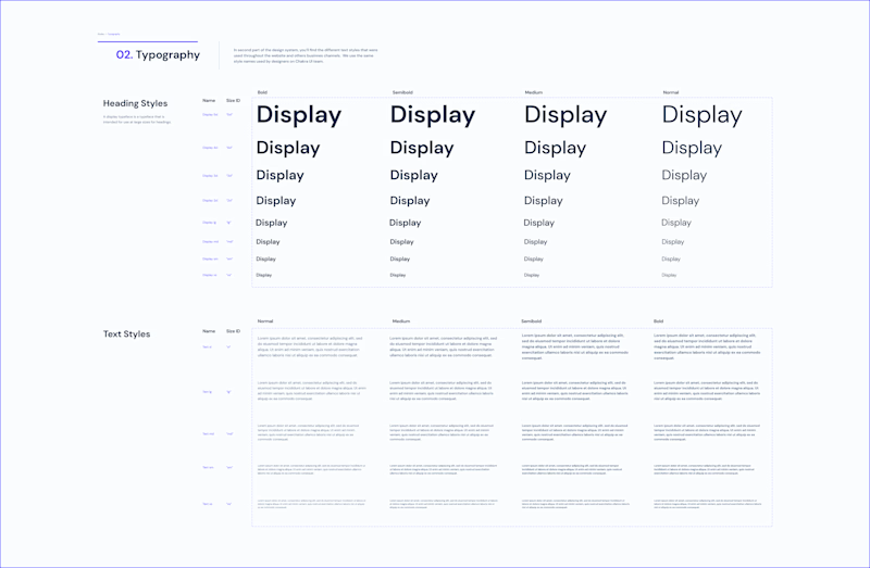
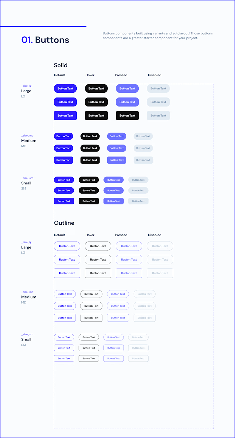
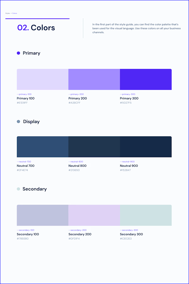
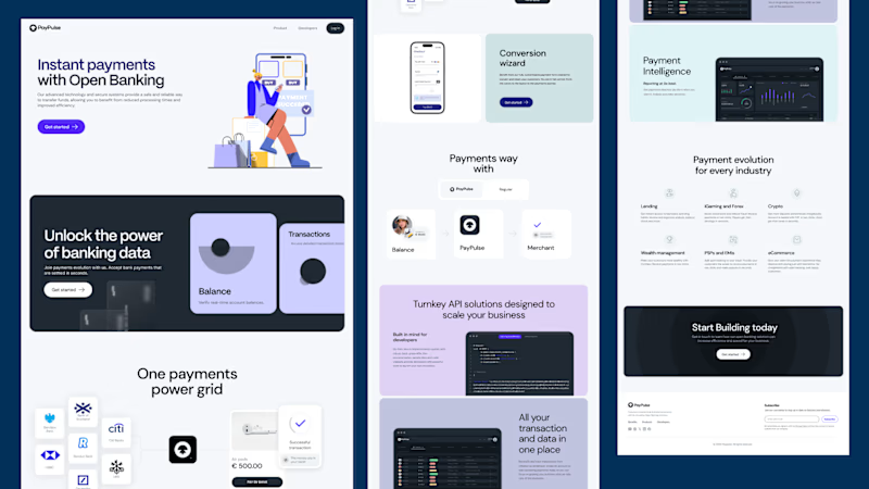
4. Framer Development:
- Objective: To bring the UI design to life with interactive and dynamic elements using Framer.
- Process: Implementing the design in Framer, integrating micro-interactions and animations to enhance the user experience.
- Outcome: A fully functional landing page that is responsive and visually engaging, offering smooth interactions and transitions.
Current Progress
- Framer Development: We are actively working on the Framer development phase. Key tasks include:
- Micro-Interactions: Adding subtle animations and interactive elements to provide visual feedback and enhance user engagement. This includes hover effects, button animations, and dynamic content displays.
- Animations: Implementing animations to make the page more dynamic and visually appealing. This involves transitions between sections, loading animations, and interactive elements that respond to user actions.
Key Features in Development
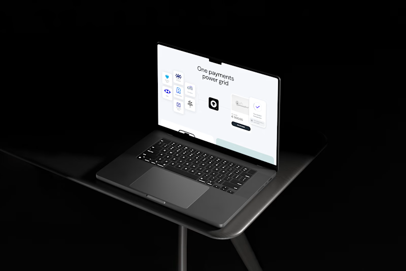
- Rapid Transfers Highlight: A prominent section showcasing Paypulse’s quick transaction capabilities, aimed at capturing user attention and demonstrating the product's core advantage.
- Robust Safeguards: Highlighting the security measures and protocols that ensure safe transactions, building trust and credibility with users.
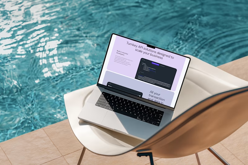
- User-Friendly Interface: Designing an intuitive layout that guides users through the page, making it easy to understand the benefits and features of Paypulse.
- Responsive Design: Ensuring the landing page is optimized for various devices and screen sizes, providing a consistent experience across all platforms.

Next Steps
- Finalizing Framer Development: Completing the integration of all design elements and interactive features. This includes finalizing micro-interactions, animations, SEO optimisation and ensuring that all functionality works as intended.
- Testing: Conducting comprehensive testing to ensure the landing page performs optimally on different devices and browsers. This involves usability testing, performance checks, and fixing any identified issues.
- Launch Preparation: Preparing for the official launch of the landing page. This includes making any necessary adjustments based on feedback from testing and finalizing content and design elements.


