Case study: Getting confused about what to watch? My UX study i…
Case study: Getting confused about what to watch? My UX study is here to your rescue!

·
Published in
·
18 min read
·
May 18, 2021
Disclaimer- This UX study is aimed to solve your confusion for what to watch on OTT platforms such as Netflix, Amazon Prime Video, Hulu and other such platforms. Happy reading!
Oh hello there! I am happy that we met again. Earlier, you read my first Design Thinking project (which I am grateful by the way 😁), through which I introduced myself to this realm of design. This time, I have something different for you, which is bigger and better this time. A UX Research Mini Project!
Say What?
Introduction
Recently, I was allotted a project which had deep roots to what we call as research and by performing this, I had to solve a business problem and design a solution. My mentor said this was a Research Mini Project, but I thought it was no less than a major capstone project which I did in my college days.😂
Let me now quickly take you to the problem statement which was allotted to me.
The Business Problem Statement:
With the Pandemic and the Lockdown, there has been an increase in audience watching shows and movies on OTT platforms. People tend to get very confused with the large number of options available. An OTT app wants to make it easier for people to decide what to watch.
Hmm, sounds interesting🙃. People getting confused on OTT. Now, you must be driving your brain and getting ideas and most of you might agree that this is a very common problem. (I am also with you, by the way😅)
Now in order to understand what is going on, I had to break the statement so as to get this clear. As per my understanding, I got the below:
People get confused about what to watch- movies or TV series or something else.
There are so many options to choose from, people are not able to decide.
Until now, you might have understood, what I have to solve.😎 If you didn’t just chill, no worries! Just stay with me:)
Now, we know what pain the statement was carrying. So, it is time to know the 5Ws- Who, What, When, Where and Why.
Yes, my friends you read that right! We are going to investigate where the pain lies in the statement. Get ready for a mini adventure😆.
After investigating the statement, I found these burning questions below and tried to answer them, of course, some of the answers were of my perspective.
Well, you see, I tried to answer almost everything🤔, but some questions still remain and while answering these, new curiosities came up.
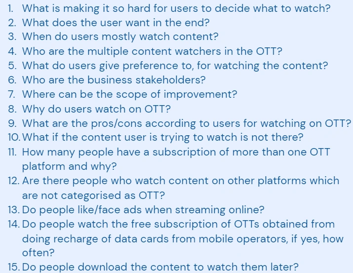
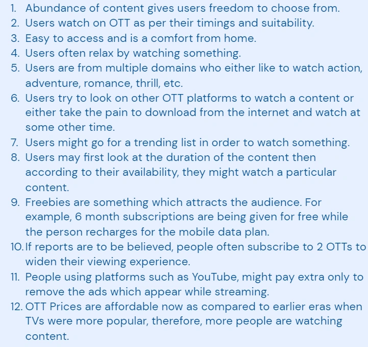
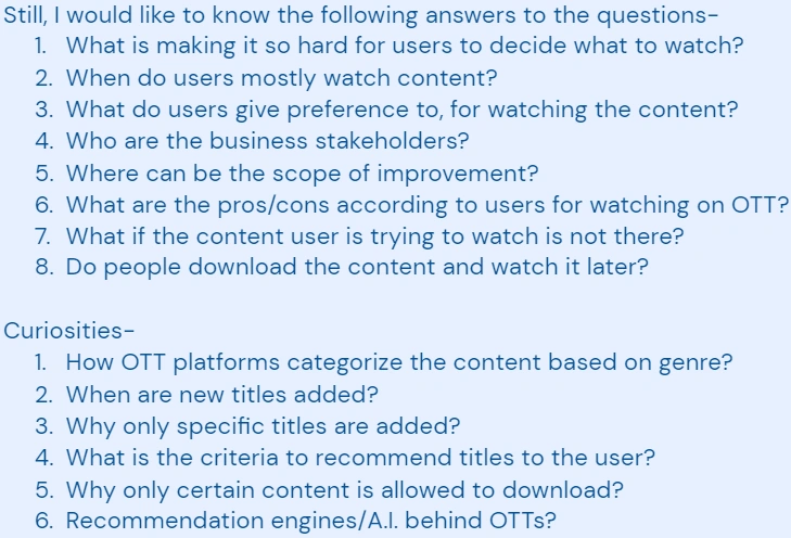
Hmm, you might have gotten bored for the last 5 minutes I guess😂. But, trust me, it was a vital step to follow. Well, the boring part is over. We know the pain of our statement, now it is time to take a little step towards research.
Important thing is- “I AM NOT THE USER”
Road to research
As per the protocols, I will explain what research is in simple terms.
Research is an activity done to gather knowledge prior to starting a project. It can be described in two forms:
Primary Research, which is gathering real-time information from people through interviews, surveys, etc 🧾✉📋.
Secondary Research, which is gathering recorded or available information through mediums such as books, internet, etc 📙📚📓.
These are the types of research which I have to do, in order to gather information and then derive a solution for the problem.
But, before this we need a research statement for our purpose.
Luckily, I had the research problem given to me by my mentor😁. Now, I had to simply rephrase the statement as per my understanding.
The Research Problem Statement:
Making the decision of what to watch on an OTT platform has become very confusing for the audience. As a UX designer you first want to understand the behavior of people trying to choose what they want to watch and the different factors that influence the decision. Plan a research to identify the behavioral patterns to help the business cater to users in an efficient way.
The Research Problem Statement Rephrased:
As a UX designer, I have to plan a research in order to understand the behavior of the users- how they decide what to watch and what not to. Also to understand how they get confused and how I can help the businesses in solving this problem.
There we go, we now have our very first research statement✌!
Now folks, we know the what, the why and how to solve. It is time for a long adventure now. Fasten your seatbelts!
Well, we are not sailing on a sea or an ocean like the gif depicts😅, but you know, we are going to sail in the world of unknown.
Chapter-1 : Time for some Research
Yes, amigos, I am going to do my research.
Secondary research
You are familiar with this term, right? Now, we have to conduct a secondary research in order to gather information which is already there in the world right now. Relax, we just have to sit on our chairs and use the internet to find all the data. Sounds simple right!😁
By the way, this form of research is nothing but another word for desk research.😂
Anyways, it is important for us to conduct because of the following reasons:
It is a very basic and easiest step to collect information.
It can be done in your own available time. (Well, you have a deadline also, so you can’t keep on searching😅.)
More the time devoted to researching, the more are the chances of getting a variable amount of data in reference to the problem statement.
Also, desk research helps to find what already has been accomplished in the field of the problem we are looking for and we might encounter solutions which may have solved some part of the problem, thereby, widening our perspective to understand the problem more clearly and in identifying the root cause of the problem.
So, I did my research and found some interesting insights, have a look.
According to this report:
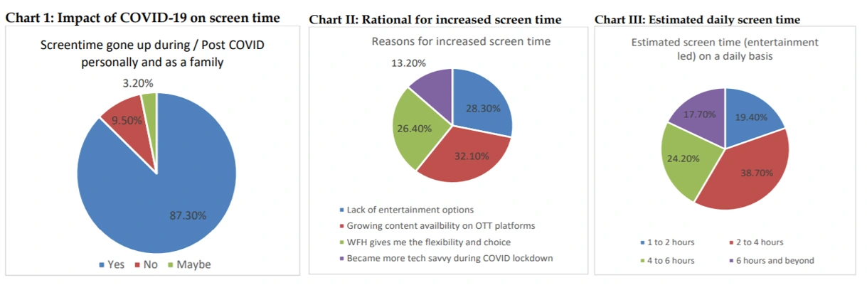
https://www.amity.edu/gwalior/jccc/pdf/dec_28.pdf
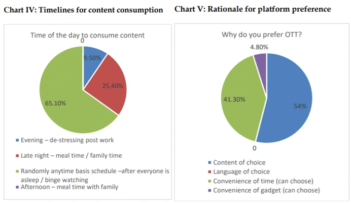
And here is another one:
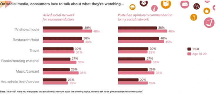
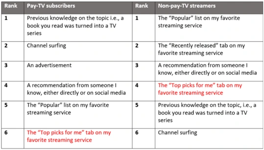
After getting the above information, I understood what type of people are there using OTT platforms, along with their viewing behavior. Furthermore, it was now easy to define my user group.
Voila, we did the desk research!😎 Now, using the above insights, lets build the target group of users, which is below by the way🤣.
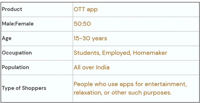
With this, I know whom to target. Now the question is, where are the users? Now, it is time to take on the role of a HR Manager. Yes, you heard me, I am going to become a Human Resource Manager for a while.
Primary Research
Another familiar term, right?
As per my role, I have to recruit people for a job, which has a CTC of 0😂. But wait, I am solving their problem, so they are not going empty handed😁.
So, I made a user recruitment form and passed on to people. After waiting for a couple of days, I had my responses. Below are some insights from the form:
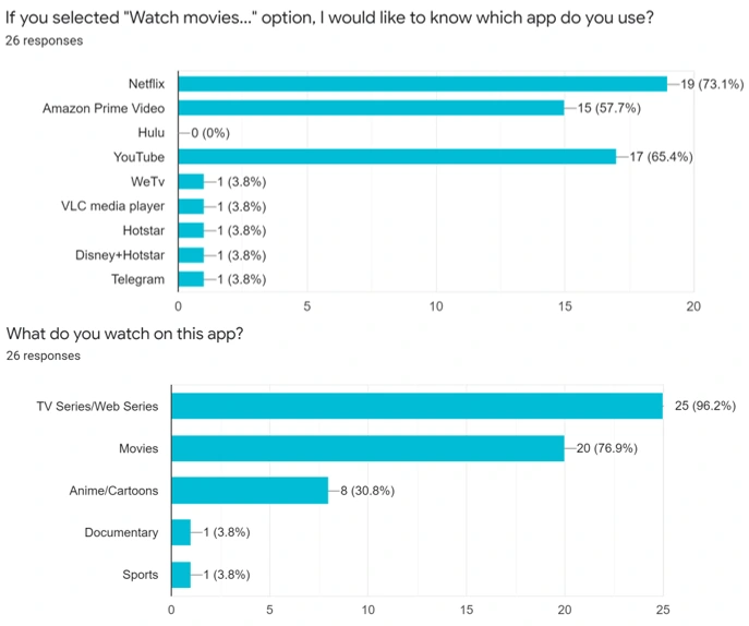
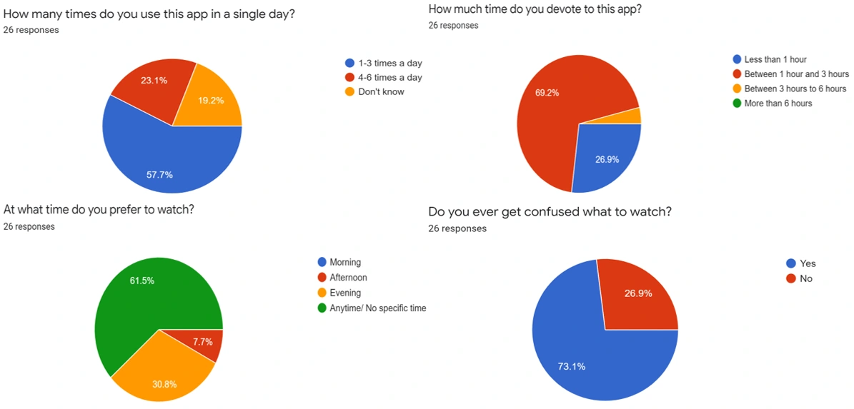
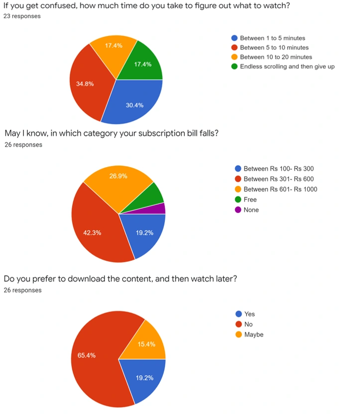
There were some people who endlessly scroll and then give up.
Now as part of my primary research, we had our respondents, it was time to recruit them for the job. After selecting the candidates, I went on to interview them.

Photo by
on
No, I didn’t get the chance to interview like the above two🙄. due to the ongoing pandemic. But, I had the power of the zoom😆. I had set-up for a 1v1 call and gathered their insights which are listed below:
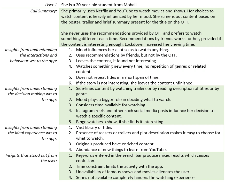
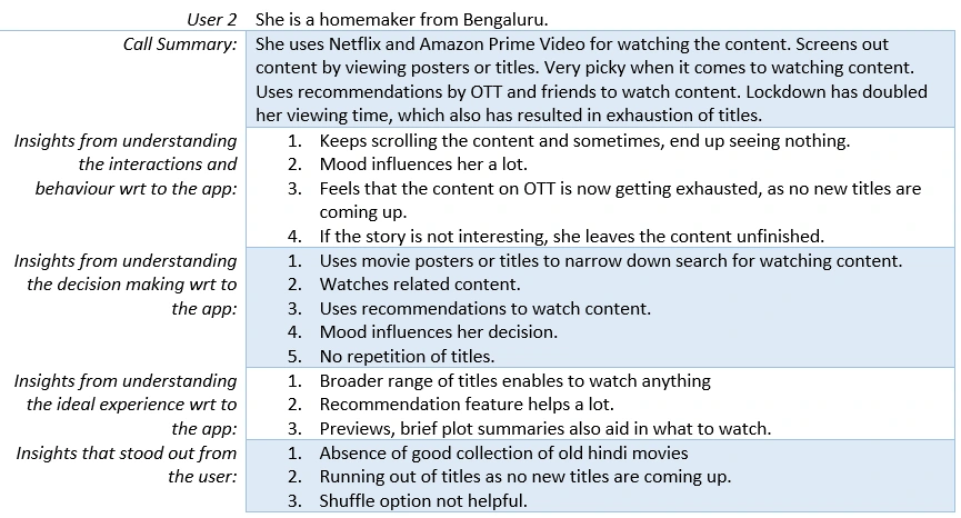
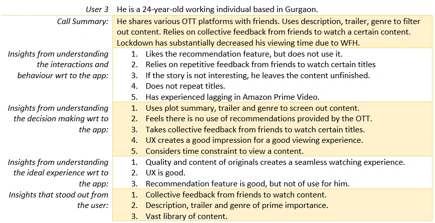
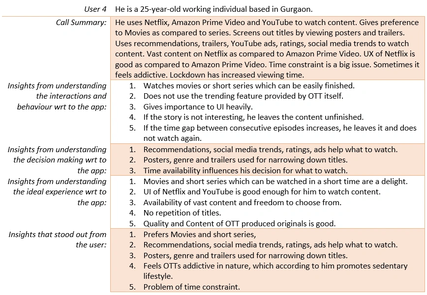
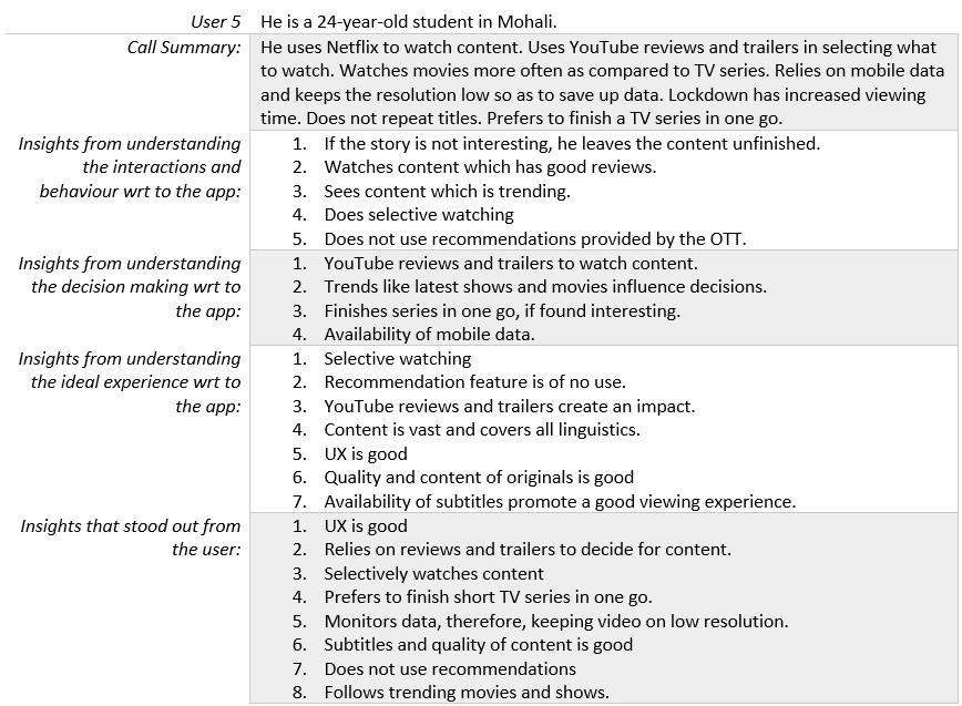
Voila, Primary research and Secondary research done!✌
Congratulations, we completed Chapter-1 of our research project😊. Now we have insights and real-time data from users. With this, we can successfully progress to Chapter-2.
Chapter-2 : Analyze data
Yes, we are going to analyze data and draw maps and some other useful interpretations. So, without further ado, lets go!
The very first step is to see some patterns which we saw in the interviewed users. After carefully analyzing them, I segregated them into groups.
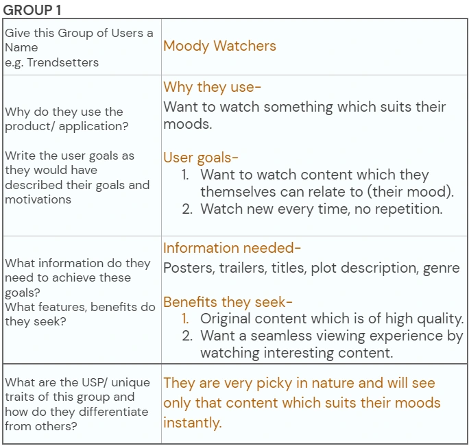
User Groups
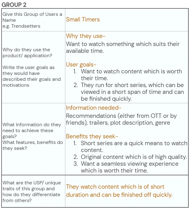
User Groups
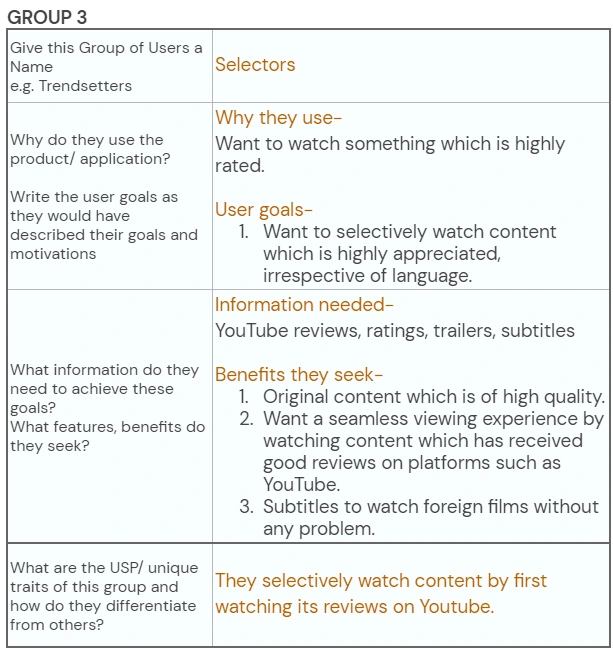
You must be wondering for why I did this. Well, its simple. These are segregated group of people drawn from those 5 users we interviewed earlier. The advantage is that these have a unique personality and character traits. Also, these represent all those masses with which they share these traits. Now, we have identified them, lets say these 3 groups are 3 different individuals.
In order to understand them better, we need to draw an empathy map.
I know that. There are a lot of new things coming in your way. I was there too. But trust me, you will understand them, when I will explain them to you.🙃
Empathy Map
Empathy mapping is a method to visually represent your findings based on research conducted on users. Right now, this is what you only need to know to survive with me.😅 Lets move forward. Rest for sure, when you see those, you will understand.
After further analysis of these people, I made empathy maps for all of them. Take a look below.
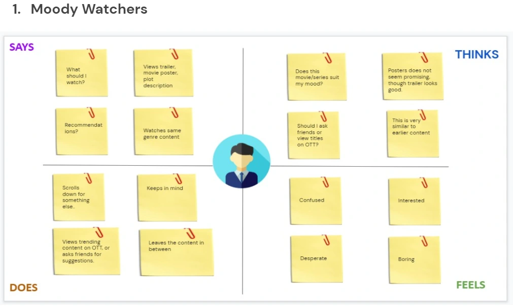
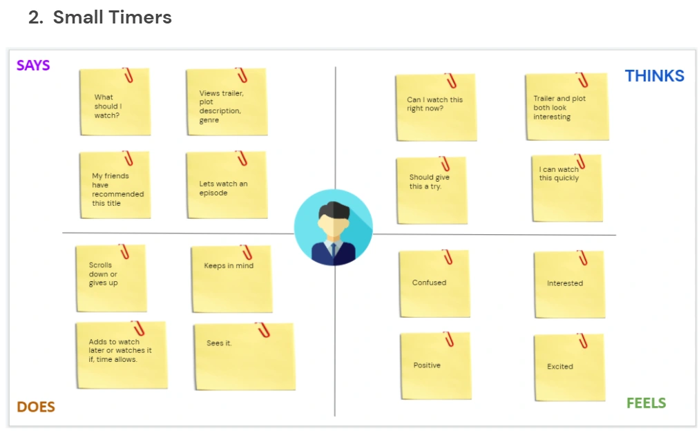
Empathy maps
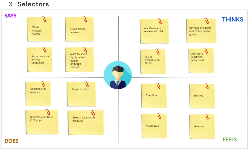
See for yourselves, it isn't so bad after all, right? These are a way to communicate to other peers about what users think, what they say, what they feel and how in the end, they react.
So this was part-1 of data analysis.
Now we have empathized with the user, now it was time to create personalities out of these groups, which can be done by making user personas.
Hold on, hold on. I know I used another technical term here😂. But this is also a simple term.
User Persona
It is a real description of a target user created from the research conducted for our problem statement. There you go. Rest assured, when you see these descriptions, you will understand.
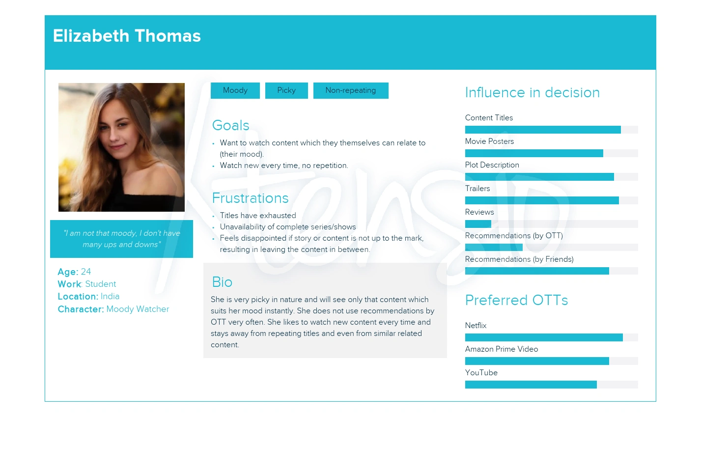
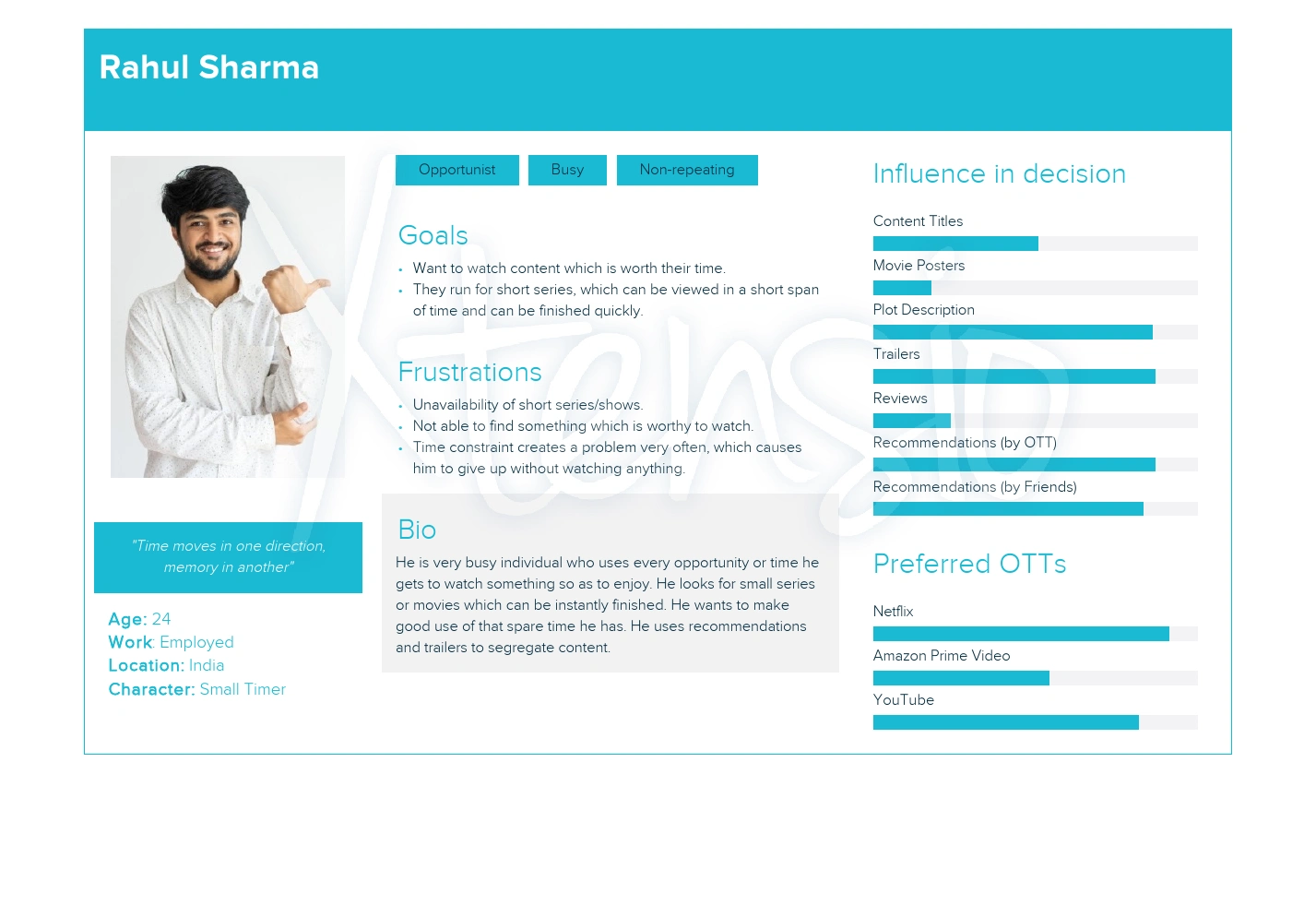
User Personas
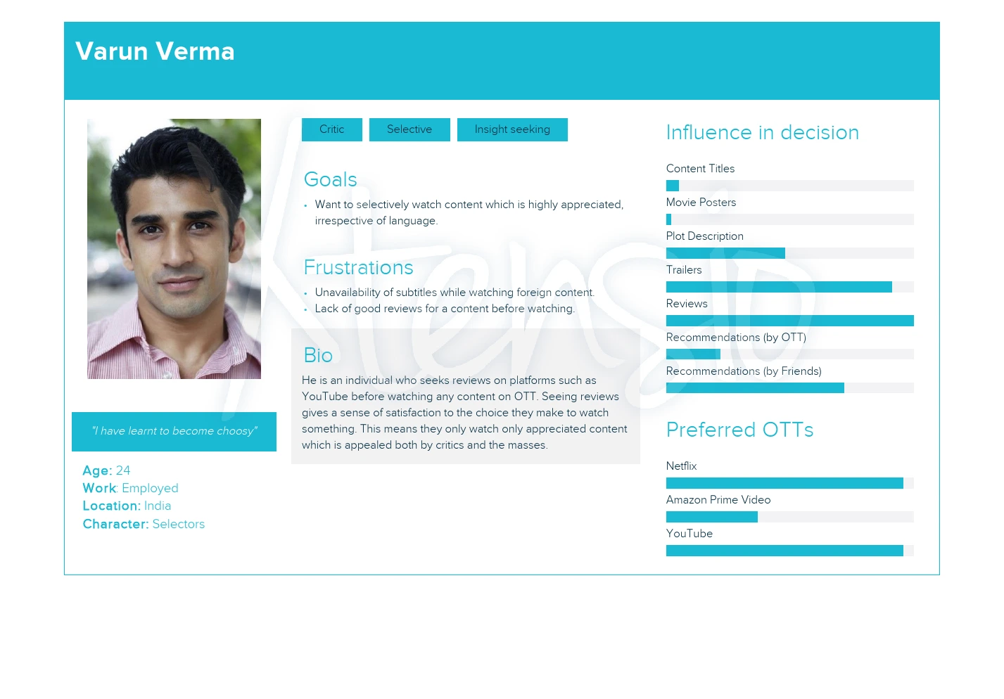
Now, see for yourself. These are just representations of the groups we identified and I converted them into personalities.
So this was part-2 of data analysis.
We have done both the parts now and through this, we only have one task to do. That is identify the challenges and frustrations of the user. Sounds simple, right? Take a look below.
Challenges and frustrations:
Time constraint makes it very difficult to watch anything.
While they watch a title, the content is slowly getting exhausted.
Users refrain from watching anything due to poor ratings.
It’s difficult to find content which is not related to earlier titles.
Users get disappointed if content is not up to the mark.
It’s difficult to find something of instant likeness.
What if content which is reviewed on YouTube is not present in any OTT platform?
Users have to first search for reviews, then view it on OTT.
These were some of the challenges which I could come up with. Now, the next and final step is to convert these challenges into some useful questions called “How Might We” questions.
Yes that's it. 😊 We now just need to rephrase the above questions. But, for my satisfaction, let me explain what HMW is.
How Might We (HMW) Questions
HMW is a method to rewrite a problem statement after conducting the research. This method adds insights to the original problem statement, insights being the data collected so far from the research.
Also, these should not contain solution and these should not be too broad and too narrow.
You know what this means now, lets rephrase some challenges and frustrations faced by the users.
HMWs:
How might we bring users with content which is of short duration?
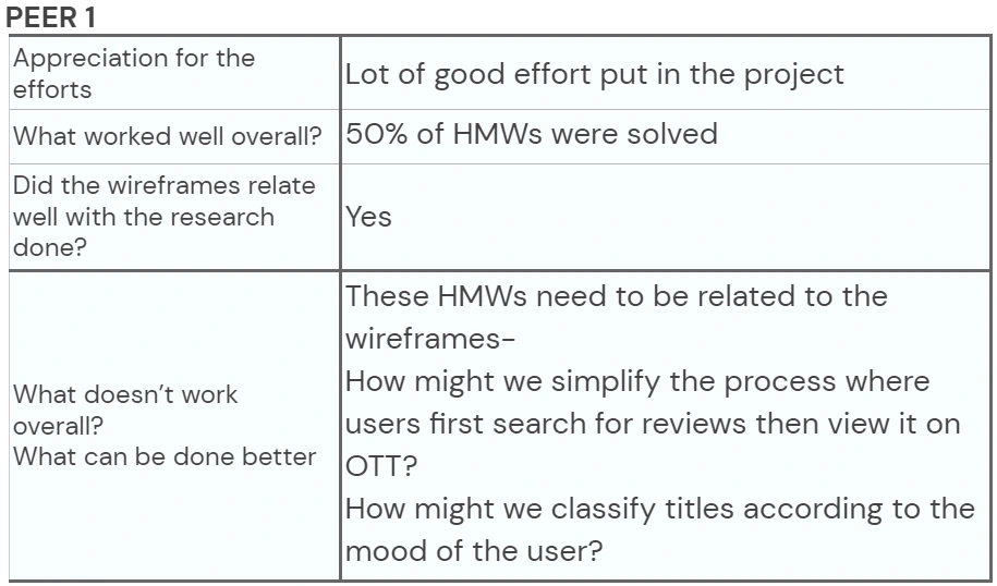
How might we simplify the process where users first search for reviews then view it on OTT?
How might we classify titles according to the mood of the user?
How might we keep the seen titles aside on OTT, so that they don’t come in front of the user?
These are the questions which I could come up with so far. Furthermore, these are now the questions which we will answer by designing. Yes, you heard that right, now we are done analyzing.
So this was part-3 of data analysis.
Hooray! 😁We are done with Chapter- 2. All research done, all the analyzing done. Now, we will head to Chapter-3.
Chapter-3 : Design
This is the most exciting chapter, in this we will design for our users and the base will be the HMW questions which we formulated earlier.
At first, we need to prepare some outlines and sketches, also called wireframes.
Hmm, kind of yes, we will prepare outlines for our final design. Below is my first wireframe👇.
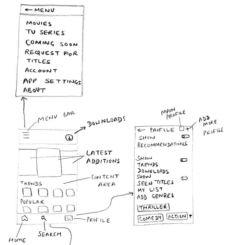
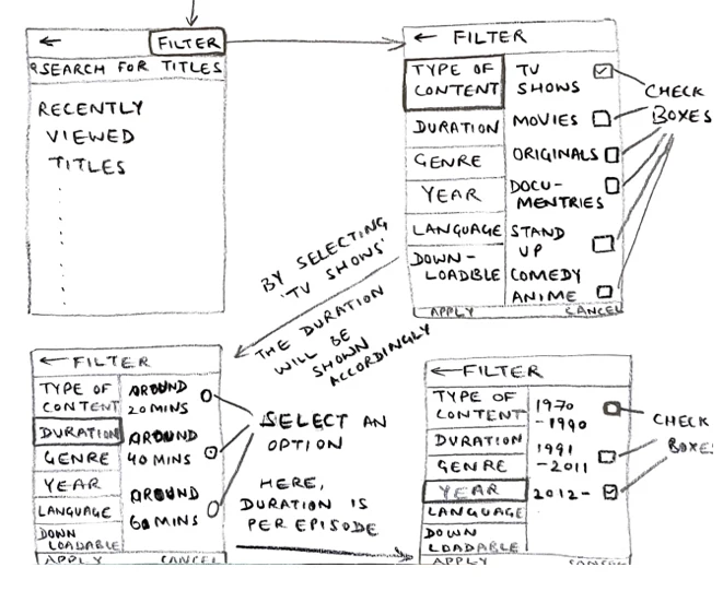
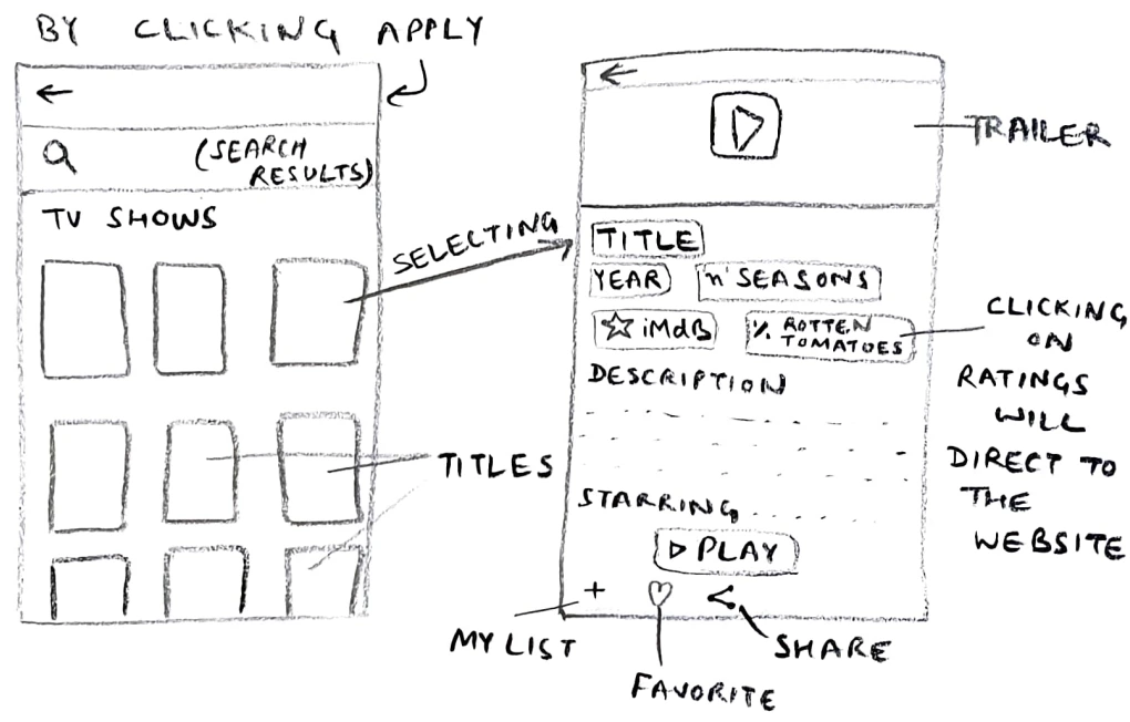
This was my initial approach to solve the problem. But before, I could go on with this, I had to discuss with my fellow peers for their feedback and opinion. Below is the summarized form of what they said.
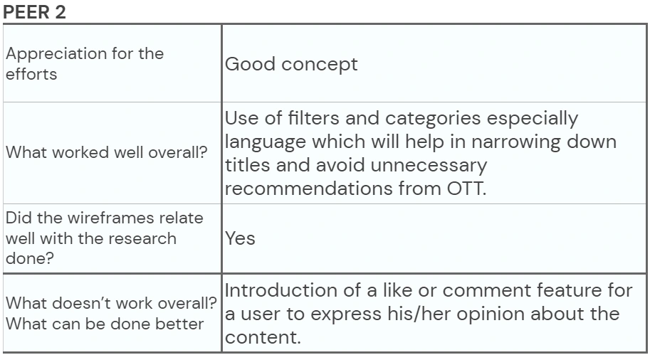
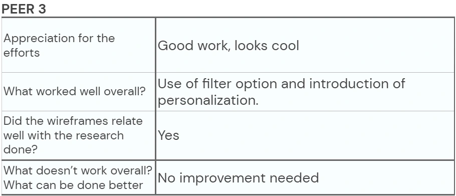
After getting their feedbacks, I modified my existing wireframe. Below is the latest one👇.
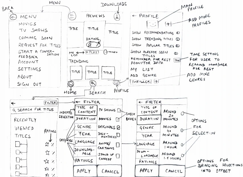
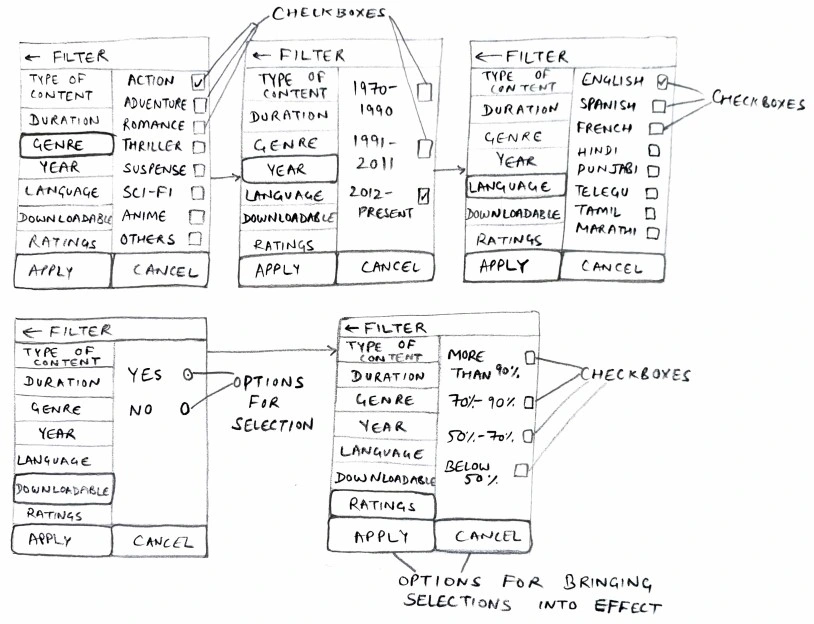
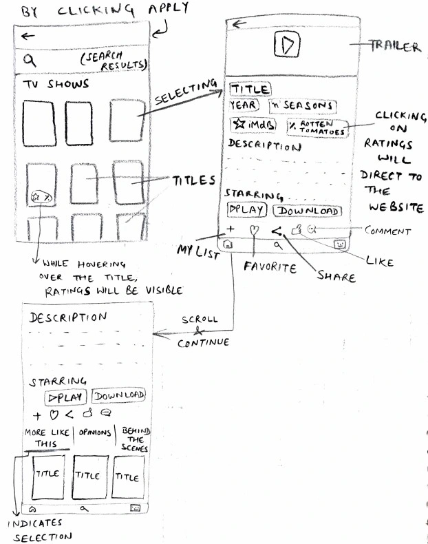
Now, this is my final wireframe. Seems neat and clear from the last one, right?😎 With this, we have now a green signal to jump into the area of designing.
Well, kind of yes. I kept my wireframes in front of me and gave them life by designing screens on Figma. After building all the screens and framework, I am delighted to show you my first very design from Figma.
Have a look below✌.
👇The center screen is the main screen of the app which facilitates titles which are trending and new additions to the OTT, along with the ratings. On the top-left corner is the “menu” button and on the top-right corner is the “downloads” button. Just like this, on the bottom-left corner is the “home” button and on the bottom-right corner is the “profile” button. Also, this screen facilitates a “search” button on the bottom-center of the screen.
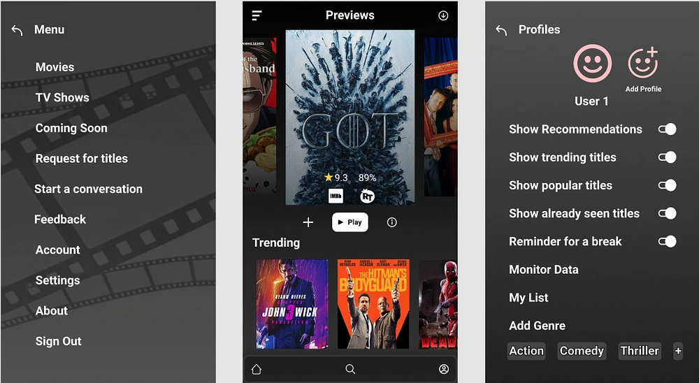
This is the main screen facilitating titles and previews. By clicking on left-top corner, you will find menu, clicking on which you will be directed to the left of the main screen. By clicking on right-bottom corner, you will find profile, clicking on which you will be directed to the right of the main screen.
☝Here, the profile will aid you to customize your OTT experience as per your choice. So, I am directly handing the power of customization to the user itself, so that they can decide what type of content they want to watch in the beginning itself. Users can create multiple profiles as per their need.
Also, by giving options to turn on/off the recommendations, trending titles or other such popular shows, the users could avoid the unnecessary recommendations by the OTT.
Moreover, the “monitor data” option is for all those who want to track the data usage and sometimes, face difficulty in deciding if they should watch or not, due to less availability of data.
Furthermore, users will be reminded to take a break, see how concerned I am of their well-being.😊
For this example, I have already set the preferences to Action, Comedy and thriller.
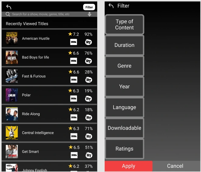
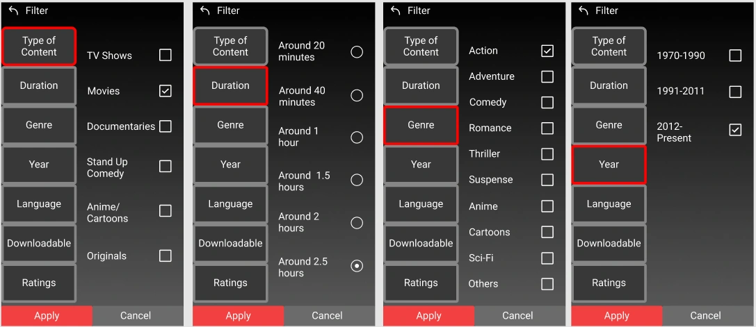
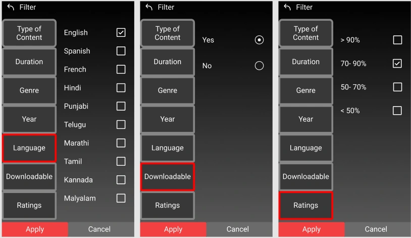
The extreme left screen is the search screen which facilitates a filter option. By clicking on the filter option, we arrive at the filter screen. Proceeding the 2nd screen are the filter screens showing different categories selected and along with them the option which they have. For this example, I had already selected some options to get a final result.
☝Here, the main highlight of this is the introduction of filter option which has multiple categories, where user can fill in and get the desired results.
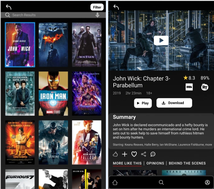
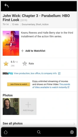
On the left side, these are some search results which will be displayed if you use the filter. On arriving on the results, I selected the very first title. On its selection, the middle screen appeared with all the information. By clicking on IMDb, you will be redirected to the right sided screen, depicting all the information related to the film.
☝These are the final screens, where, you can see the ratings, see opinions of people for what they have to say and also have a peek on behind the scenes. Furthermore, I have added a comment option, so that users can express their opinions on the title too. Also, you can rate and add movies to your list. Furthermore, by clicking on the ratings, you will be directed towards the website, here the website appears on the right screen where you can view the ratings by the critics regarding the movie.
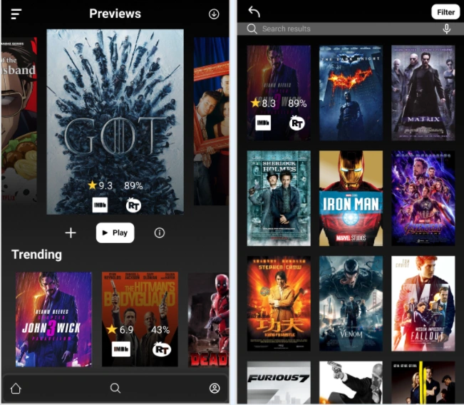
☝Another feature of the app is, if you hover over the titles, you will be able to clearly see the ratings which are associated with the title. The ratings are of “IMDb” and “Rotten Tomatoes”.
Note- This is for informative purpose only, no connection is there between this app and the rating websites.
Voila, we have our first UX design based on OTT!😎
Now, there is only one thing which is left. Its time for us to get feedbacks from our users!
Chapter-4 : Testing and feedback
No no, we are not going to blow or separate anything like this here🤣.We are simply going to setup a call with them, present them with my prototype and ask their feedback.
Also, to actually know, how much the users liked my idea, I asked them to rate my prototype on a scale of 1 to 5, 1 being the worst idea and 5 being the best idea.
Below is the summarized form of what they had to say to me (I mean my prototype😅).
User 1
She liked the overall concept of avoiding recommendations and trending titles by OTT. The filter option gives an added advantage to narrow down titles which she only wants to see, regardless of the titles which appear on screen when you want to watch.
Liked the idea of customization.
Rating -4/5
User 2
She really liked the overall concept. The use of filters in the OTT eases the process of searching, especially the language and year category. Now, she can search for movies with ease and view content as per her mood.
The best part is that the design solved her problems effectively and efficiently.
Rating -5/5
User 3
He liked the concept, especially the filter option to ease out the search of titles. The duration filter definitely helps in decreasing the stress to see titles as per the convenience.
Rating- 4/5
User 4
He really liked the concept, especially the filter option having the duration category. This duration filter really eliminates the pain to search for content, given the availability of time.
Furthermore, aesthetics and clean UI is a plus. Also, the provision of an option which suggested the user to have a break is very good.
Rating- 4.5/5
User 5
He liked the concept overall. Especially the ratings which makes the selection easy.
Liked the idea of hovering over titles to review ratings and also the link to the authentic rating websites which is provided on the screen concerning the title.
Rating -3.5/5
There we go✌. We have successfully tested our prototype and got feedbacks too.
Issues addressed by users:
Some users found it difficult to understand some icons and what they were meant for.
Some said, if I were to dislike the content, how will I do?
Genre option feels redundant.
Download and profile icons should be swapped.
A user didn't understand where to view the trailer.
We now know where the shortcomings are. Therefore, I went back to my workspace have to update my prototype. Below are the before and after screens of the design, along with some new additions to the existing prototype.
👇In the below before and after screens, I have named the “my list” and “info” icons for better readability for the user.
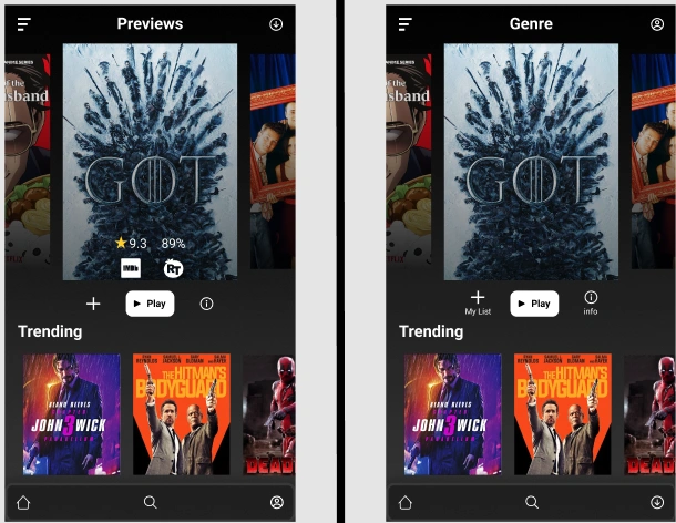
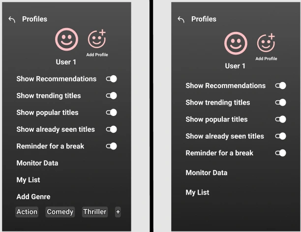
The left of the thick line is the before screens and the right of the thick line is the after screens
☝In the above before and after screens, the downloads icon and profile icon were swapped, so that the user is able to access the downloads button with ease. Also, the users felt downloads are more usable than profile icons.
Filter Screen
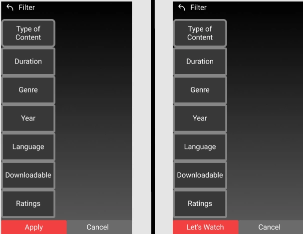
The left of the thick line is the before screens and the right of the thick line is the after screens.
☝Here, I made a change to make the filter option more interactive. By changing, “Apply” button to “Let’s Watch” Button, I intend to make the interface a conversational one. It will be like the interface is talking to the user for watching the content.
Main Screen
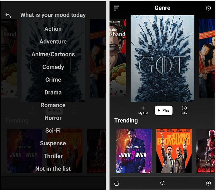
☝In addition, I removed the genre option from the profile screen, and moved it in the main screen, where it replaced the previews headline. Moreover, this move was to create an interactive genre screen which facilitates different categories of Movies/TV shows, one can watch. On the left side, you can see the genre screen appear with all the categories, with title “What is your moody today”.
Search Selection Screen
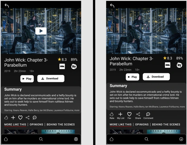
The left of the thick line is the before screens and the right of the thick line is the after screens.
☝Here, I have named the icons below the summary card. This was done to enhance readability of the user, so that they can understand and use it better. Also, new additions to this screen were made which are below.
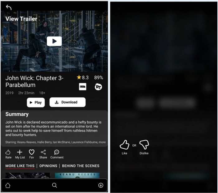
Screen with trailer and likability feature.
☝Now this, is the final additions which are made to the prototype. Here, If the user hovers over the trailer area, the user can easily see that screen interacts with the user to view the trailer. Also, to provide likability feature to the user, I devised another screen to simply accommodate the “like” and “dislike” button, so that the users can rate the titles. Now they simply have to press the “rate” button and the likability screen will appear prompting the user to take action.
Ratings from website Screen
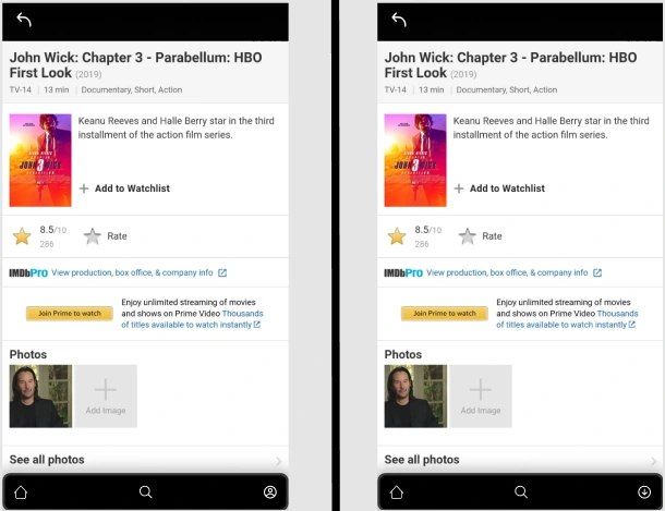
The left of the thick line is the before screens and the right of the thick line is the after screens.
☝These screens are for comparison of the swap for download icon and the profile icon. Rest of the features remain same.
Yes, folks. We are now back from our adventure. It was a long and rough journey, but nevertheless, we made it and triumphed like a true champion.
Conclusion
Congratulations for making it this far with me✨😊. I know, you must all have got tired now. Lets finish this up with some key takeaways which I gained through this project.
Key learnings:
I learned a lot this time especially in the research areas. Now, I know how to conduct a research and what are the do’s and don’ts which needs to be taken care of.
This was a whole new project for me, when it comes to analyzing data to bring out personalities and identifying user groups so as to proceed further.
How to frame How Might We questions to gather more information from the challenges and frustrations of the user.
How to construct wireframes, which also should be neat and clean.
How to prepare and design screens from wireframes.
How to relate all those screens so as to produce a meaningful experience.
How to stay calm and not get intertwined with all the information gathered.
Trust your first instincts, most of the time, you will find these are the most valuable and usable ideas.
With this project, I also came to know how to combine different perspective of users and use that information to design solution to the problem which at the end will improve user’s experience.
And with the above paragraph, I rest my voyage with you guys. I hope you had a good read. Thank you for your patience and your time. Sayonara, folks😁.
Like this project
Posted Dec 11, 2023
Easing decisions behind watching content on OTT
Likes
0
Views
7


