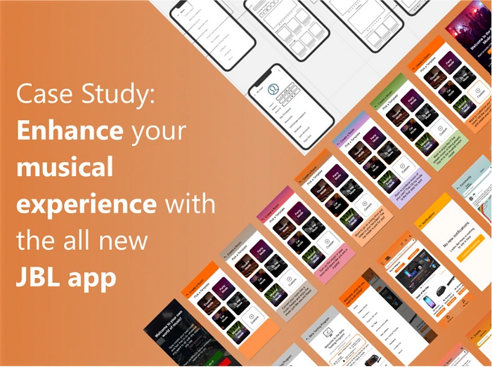
Case study: Enhance your musical experience with the all-new JB…
Oh hello there amigos. Hope you all are testing negative and staying positive😎. I am happy to meet you all again and I have something mega for you this time!
So from my last Jugaad-a-thon story, you might know, I was working on a project🙂.
Never mind😂. So, I have my last (but not the least) case study for you!
Yes, one last time😉. This story is written like a limited series, consisting of many episodes, so reading this will be like watching an episode of F.R.I.E.N.D.S (not comparing it though😂). Happy Reading!
🎥Episode 0: Prologue
Welcome to the introductory episode! So, after doing 2 major projects at GrowthSchool, I have kind of reached an end-of-the-line.
Well, only one last major project was left as per my UX Mastery Program and I picked up my problem statement and started a so loooong journey (Well, it was a culmination of my learnings and the previous projects).
Now, lets see the problem statement.
Problem Statement
Audiophiles love investing in their equipment to get the best sound quality — from speakers, amps, to other systems. JBL is one of the renowned brands among audiophiles. However, our app is not used as often as people purchase 1–2 products every year on average. Make an end to end new JBL app to be content-first, giving audiophiles a reason to open the app at least once a week and also offer smart-speaker and other JBL specific features.
Hmm, sounds interesting, right? I was also like him🤣. So, in short we have to kind of work for JBL and make a whole new app.
So, why this problem statement?
When I read this problem statement, I believed I have some knowledge which might help me to understand the user better.
Also, I found this to be a very new and a different domain of problem as compared to other statements, therefore, it sparked an interest and gradually, I took my chances to solve it.
So, amigos are you with me on this?
So, lets breakdown this problem statement into subproblems and understand their nature using 5Ws. Now with me, think what people might want?
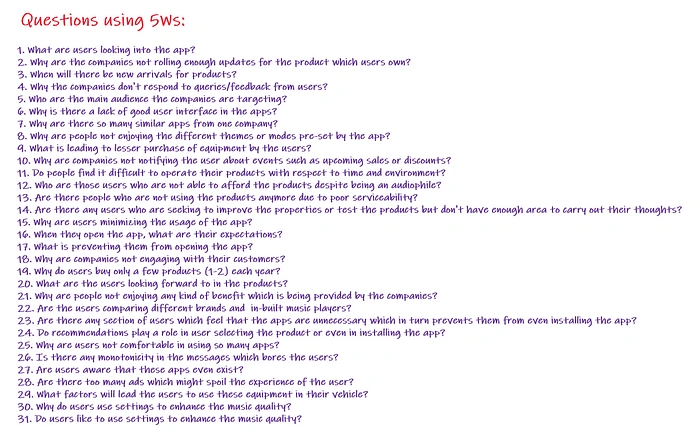
Questions through 5Ws
Now, we have a full-fledged list of problems we can look into. Well, we can’t solve all of them at once😂. So, I scoped them down for you!
Areas of consideration
1. When will there be new arrivals for products?
2. Why are there so many similar apps from one company?
3. Why are people not enjoying the different themes or modes pre-set by the app?
4. Why are companies not notifying the user about events such as upcoming sales or discounts?
5. Do people find it difficult to operate their products with respect to time and environment?
6. Are there any users who are seeking to improve the properties or test the products but don’t have enough area to carry out their thoughts?
7. Is there any monotonicity in the messages which bores the users?
Now, these are some of the areas we will work on from here on.
So, lets see you in the first episode✌.
🎥Episode-1 : Build Up the stage!
Welcome to the 1st episode, let’s setup a stage which will work as our basis to solve the problem😎.
Part-1: Assumptions
Before, we move on, first we need to list our assumptions with respect to the user and the product/business. So, I went ahead and made some statements for you! Have a look👇
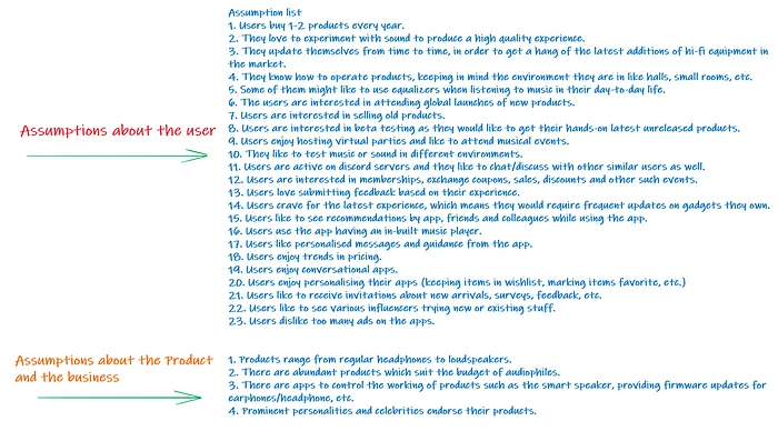
Assumptions
Now, that we have formulated some assumptions, lets brainstorm and come up with some ideas, first individually and then in a group.
Part-2: Individual Brainstorming
I did some individual brainstorming and came up with a bunch of unique ideas. I call this as Iteration 1😎.
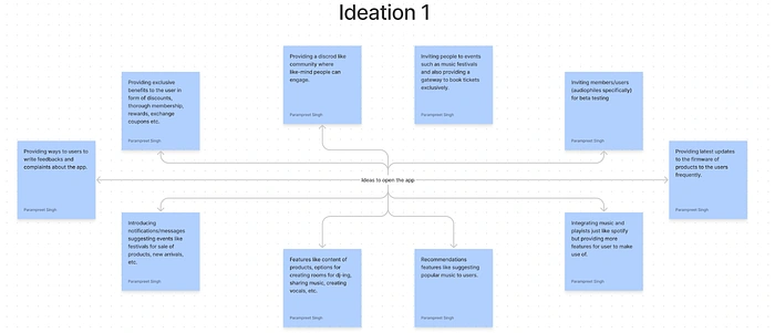
Iteration 1: Individual Brainstorming
Hmm, we have some ideas to get on with. Now then, it is time that I rendezvous with my peers and have their suggestions on this matter.
Well, not like this, but over discord😅.
Part-3: Group Brainstorming
I contacted my peers, setup a group call and they had a look into the Iteration 1 and suggested some changes.
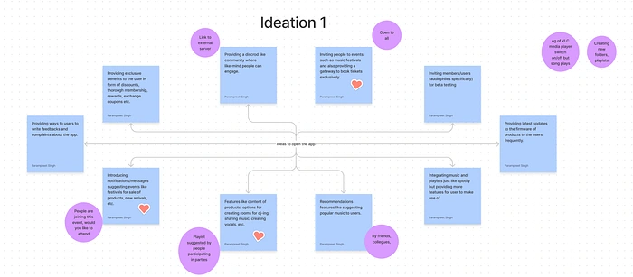
Iteration 1: Changes suggested after group brainstorming
Wait, hang on😅, let me present you the final iteration of ideas.
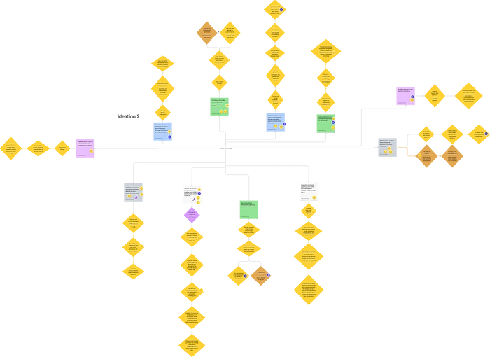
Iteration 2: Culmination of Brainstorming of Ideas
Looks fantastic, right? So, to summarize, I came up with these below ideas to sway the user to use the app👇.
Idea 1: Invite user for product launch
Idea 2: Provide latest updates
Idea 3: Provide a way where users can submit the complaints
Idea 4: Invite members for beta testing
Idea 5: Provide exclusive benefits to the user
Idea 6: Provide a discord server for engagement
Idea 7: Inviting people to events and provide exclusive booking of tickets
Idea 8: Introducing notifications suggesting sales, new arrivals, etc
Idea 9: Recommendations by others and the app
Idea 10: Integrating music players
Idea 11: Creating rooms for dj-ing, testing, etc
Bravo, we have so many ideas to ponder on 😂 and with this, we are one step closer to building our hypothesis statements.
You remember hypothesis statements, right? If not, no worries, here is a fresher for you!
Hypothesis is a statement which is made based on the information we have (that can be through research or assumptions).
Okay😅, if you got it. Well, moving on, I created the hypothesis statements along with their assumptions. Again, have a look👇.
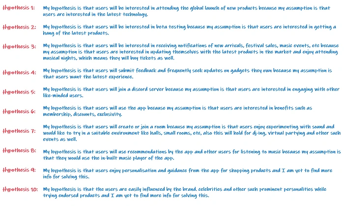
Hypothesis Statements
Voila, we have setup the stage.
Together we journey to the second episode✌.
🎥Episode-2 : Gather intel!
Welcome to the 2nd episode, let’s gather some information and identify our users😎.
Hmm, there is going to be a lot of information to gather. Just follow my lead!🧐
Part-1: Secondary Research📕📗📘
You got it, right? We will first do some desk research and gather information which is already there in the world. Now, lets sit on our chairs and use the power of internet to find the data!😁
Hmm, like this I gathered some intel on our potential users. Let me share this with you. Have a look👇.
Here are some insights from the desk research👇.
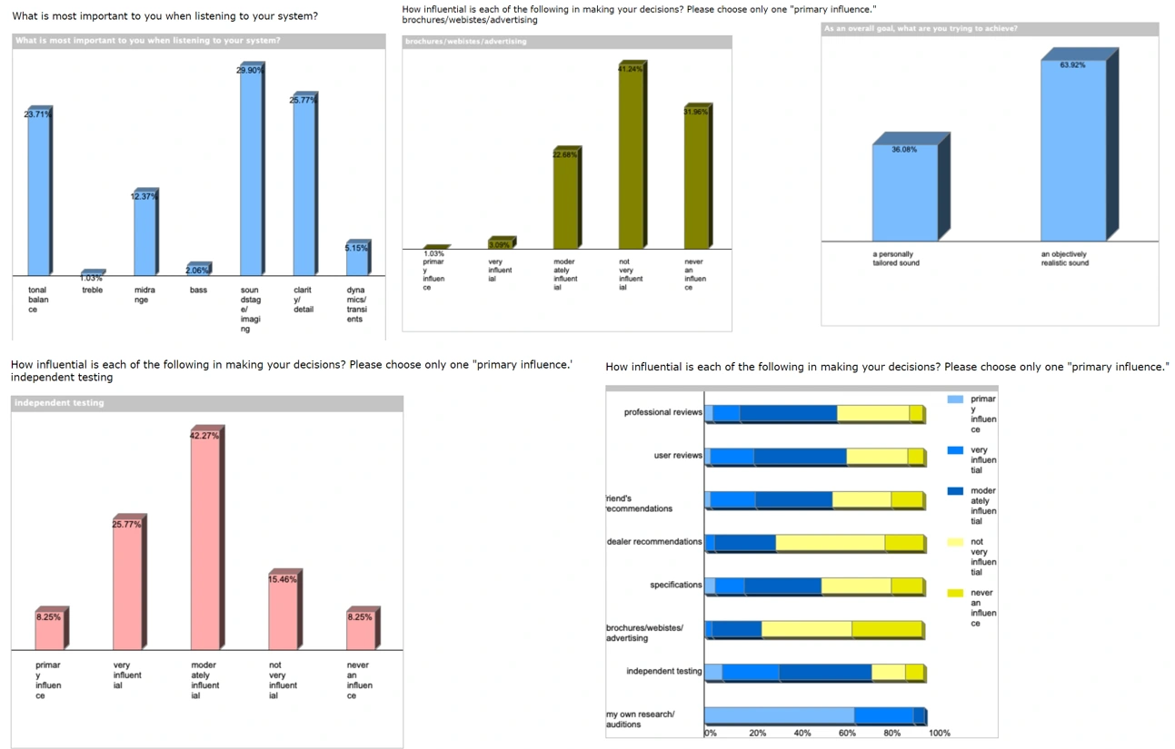
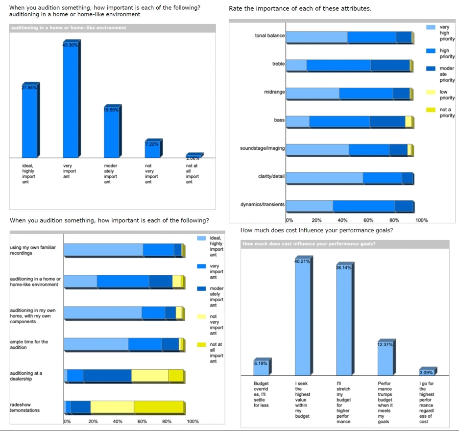
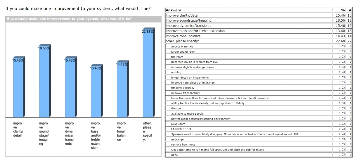
Insights from desk research. Courtesy-
From the above desk research, I got to know so much about the audiophiles and got a fair idea whom should we target(Also, we found some evidence too which supported our hypothesis statements)😎. So, moving on, I present you our target user group!
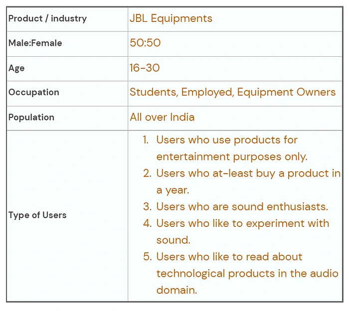
Target User Group
Now, we know who are our users. So, lets hop in to the role of HR and recruit some users for interviews😁!
Part-2: Primary Research
Another familiar term, right? Now, I am an HR and yet again, as per my role, I have to recruit people for a job, which has a CTC of 0😂
But first, lets send out a recruitment (screener) form, which I have already done (thank me later😊), here are some insights from that👇
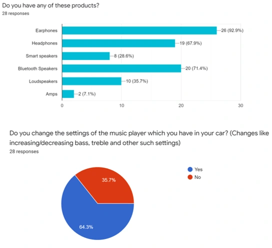
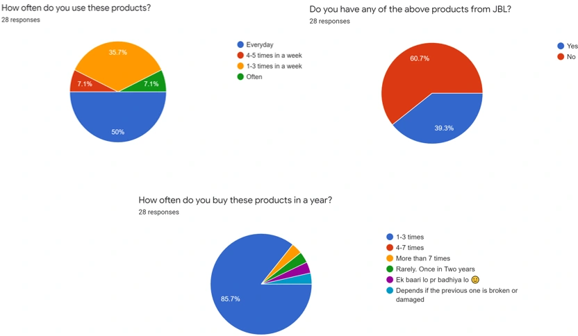
Insights from User Screener Form
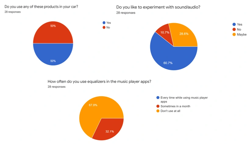
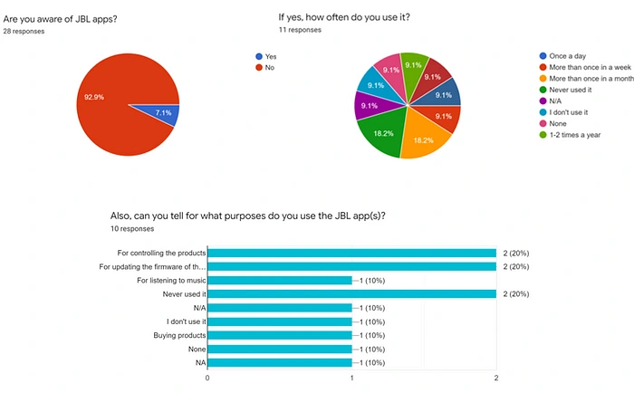
Insights from User Screener Form
There were a very small percentage of users who knew about the existence of JBL apps😢.
Now, after carefully checking the responses🧐, I was finally able to select my potential candidates for interviews. I had set-up for a 1v1 call and gathered their insights from the questions I prepared.
Well, the interviews didn’t end in that way😂. Anyways, here are the summarized insights from 5 users. Have a look👇
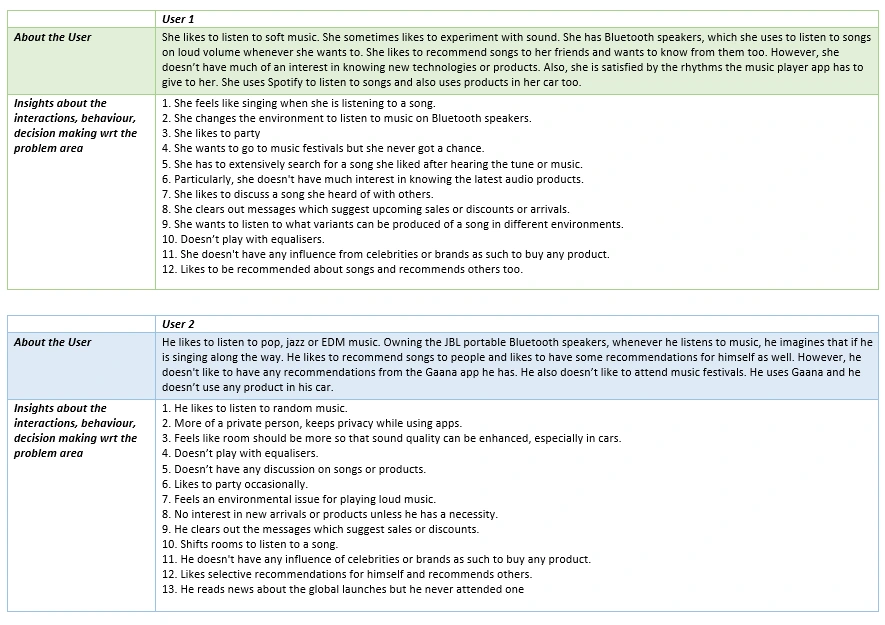
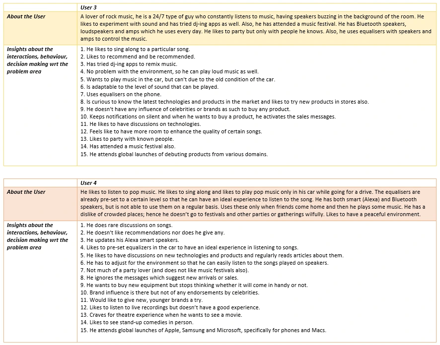
Insights from User Interviews
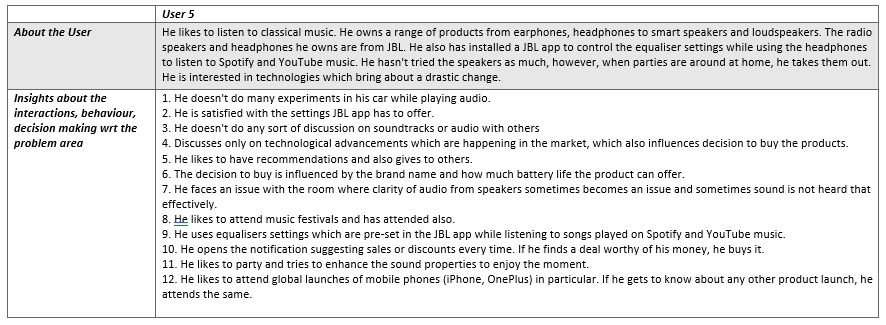
Insights from User Interviews
So amigos, we have finally concluded our episode to gather intel from secondary research and as well as primary research😎. Also, now I can leave my HR role😂.
Lets venture towards third episode✌.
🎥Episode-3 : Examine!
Welcome to the 3rd episode, so far, we only managed to have some information on our users. But, it is a little disorganized, so we are going to sort out and then analyze the data😎.
That’s right, we are going to examine our intel now🧐.
Part-1: Affinity Mapping
Oh yeah, I haven’t used this term before. So, let me define this for you.
In simple words, an affinity map represents an organized form of information which we gathered from our intel. Sounds cool?
So, at this stage, we are going to group our information and name them. At first, lets organize the information as per the insights from the users. Have a look below👇.
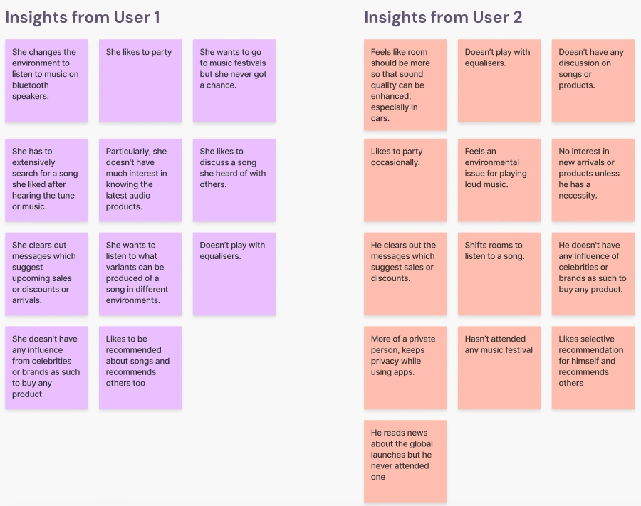
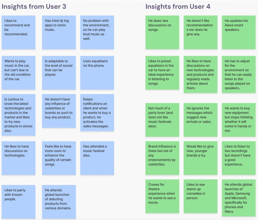
Grouped insights from User Interviews
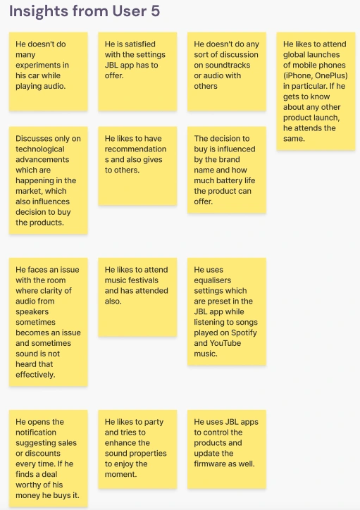
Seems colorful, right?😉 Now that, we have grouped the insights, we can carefully select every sticky note and group them under a theme.
Below is the 1st iteration I did👇.
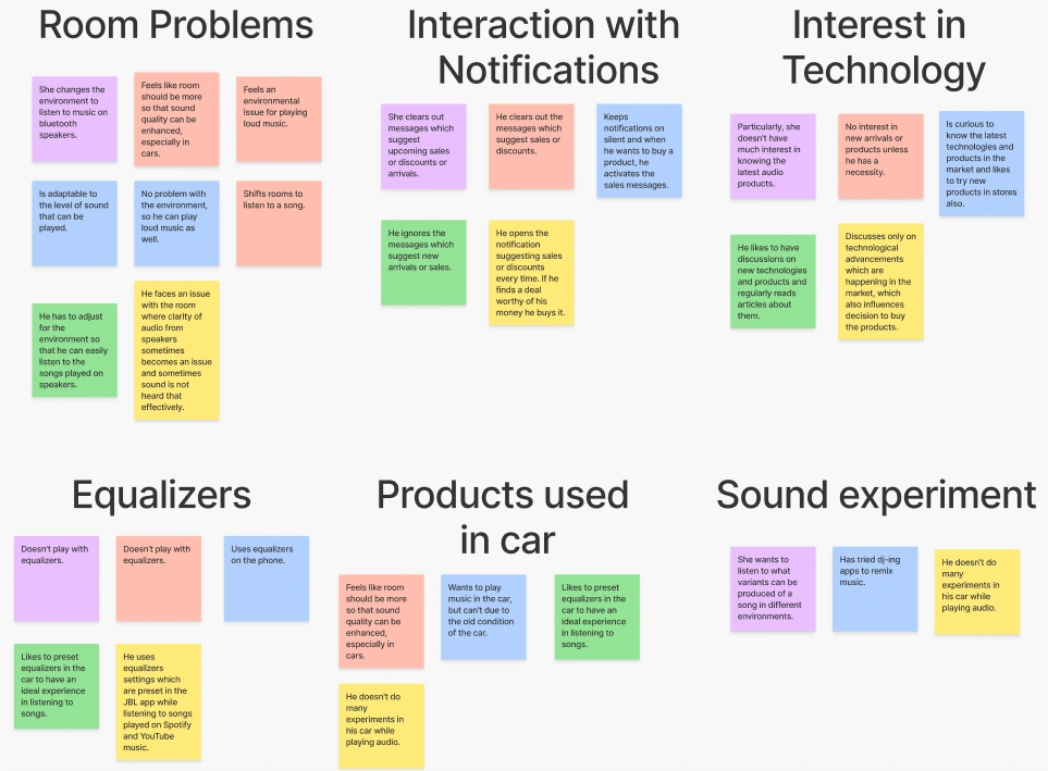
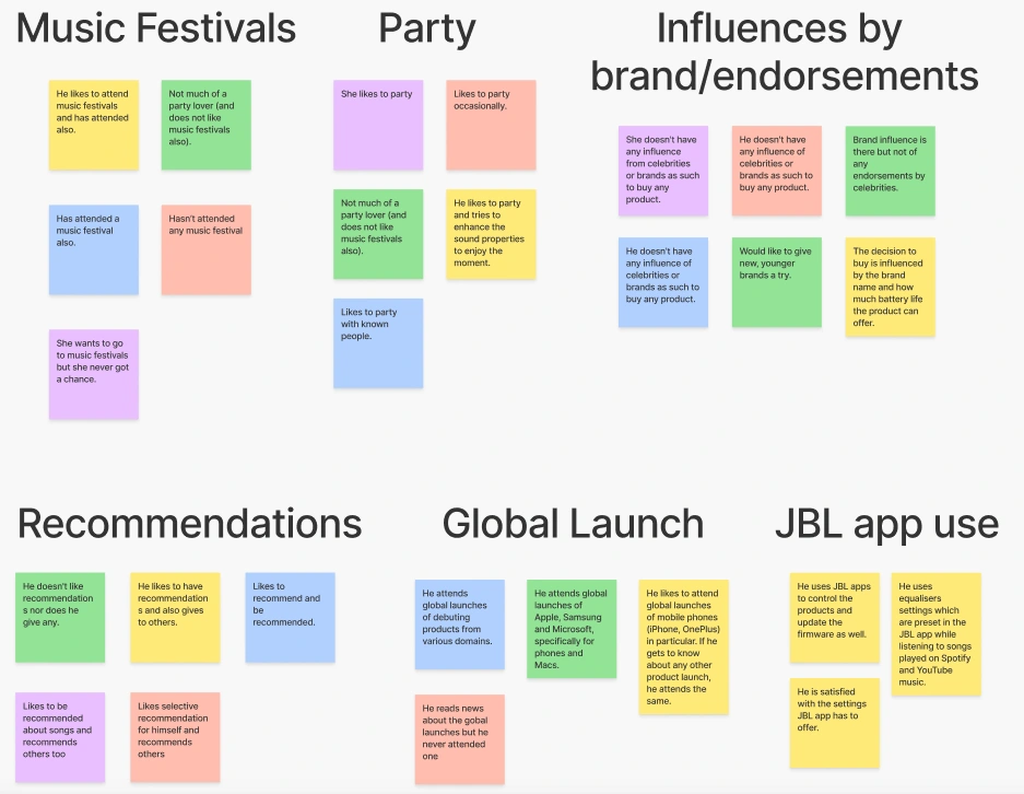
Affinity Mapping: Iteration 1
Now that we have the 1st iteration, it’s time to narrow it down and identify common areas which can be clubbed and after which , we shall arrive at the 2nd Iteration👇.
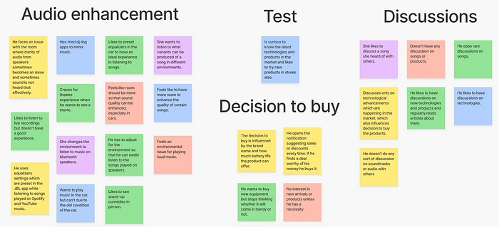
Affinity Mapping: Iteration 2
After carefully examining the above iterations and the insights, I found that there was still some scope of improvement. Therefore, I did another iteration. (this is the final one😂, you will shortly realize the advantage behind this.)
Below is the 3rd and final iteration👇.
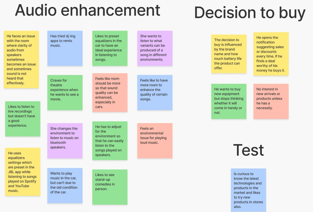
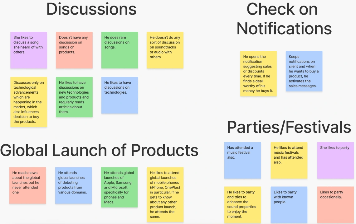
Final Affinity Mapping: Iteration 3
Part-2: User Groups
Now, we have a clear path to persuade and let me tell you the advantage behind all this😀. The benefit of this exercise is that we can now identify our User Groups (sounds familiar, right?) easily from the emerging patterns and behaviors we organized so far.
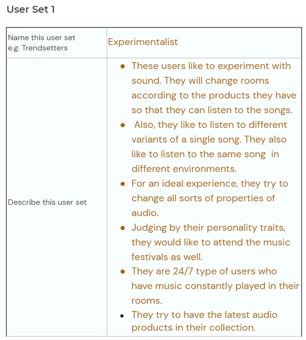
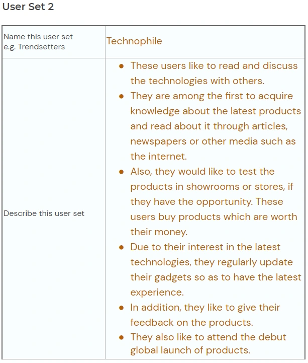
User Groups : The Experimentalist & a Technophile
From the information, I saw these as an emerging potential user groups which fits our cause. Yet again, these are segregated group of people drawn from those 5 users we interviewed earlier having unique personality and character traits.
Also, these represent all those masses with which they share these traits. Now that we have identified them, lets say these 2 groups are 2 different individuals.
That’s right, this is going parallel with my case study I wrote earlier😂. So, from this very DEJA VU of yours, you might know, what is coming next?
Part-3: Empathy Mapping
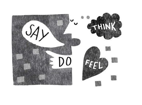
That’s right! We are going to build empathy maps for our user groups. I took the liberty and made them🤗.
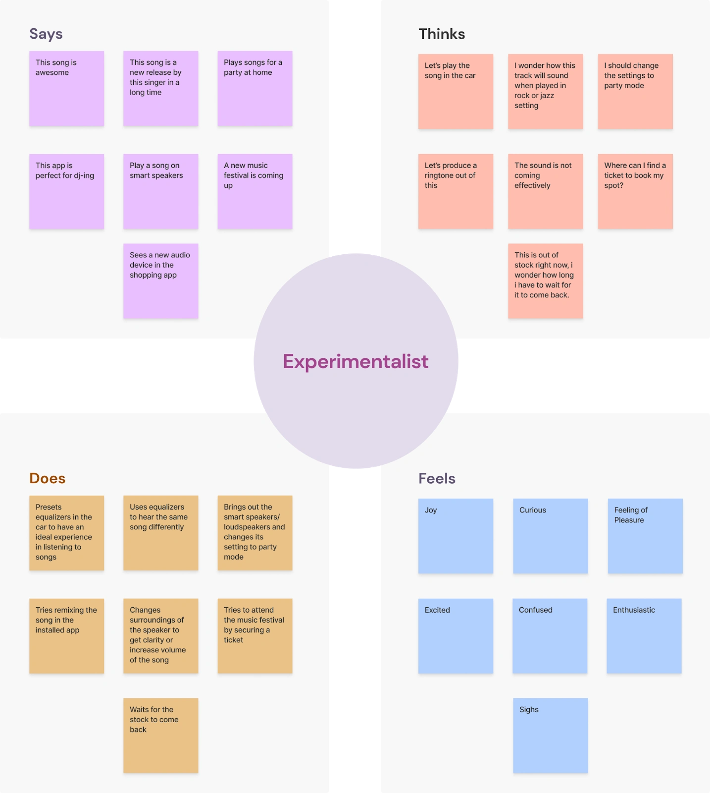
Empathy Maps
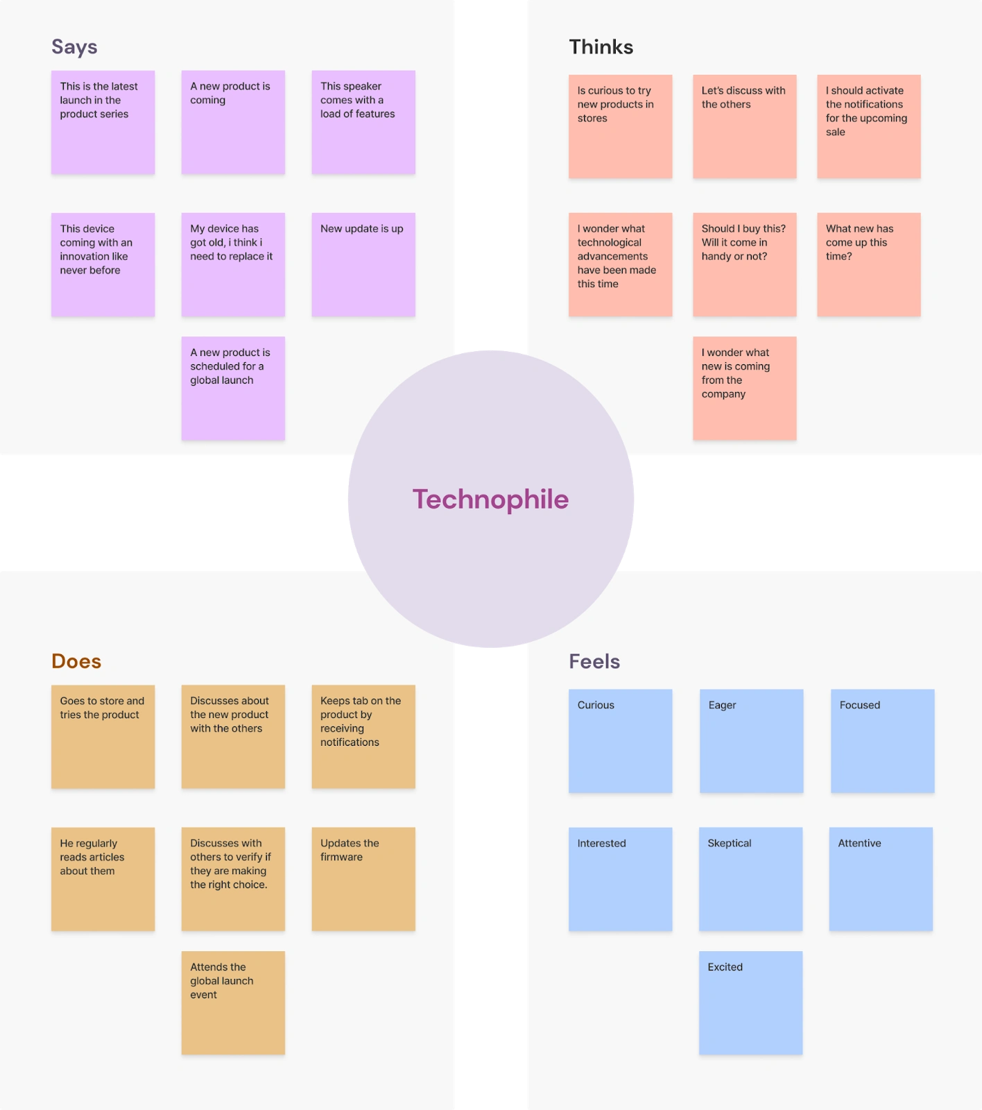
Empathy Maps
Doesn’t it seem nice, fresh and clean😎? Now that we have empathy maps ready, you might now know, what we are going to do next.
Part-4: User Personas
Again, you guessed it right! We are going to build user personas for our user groups and yet again, I took the liberty and made them🤗.
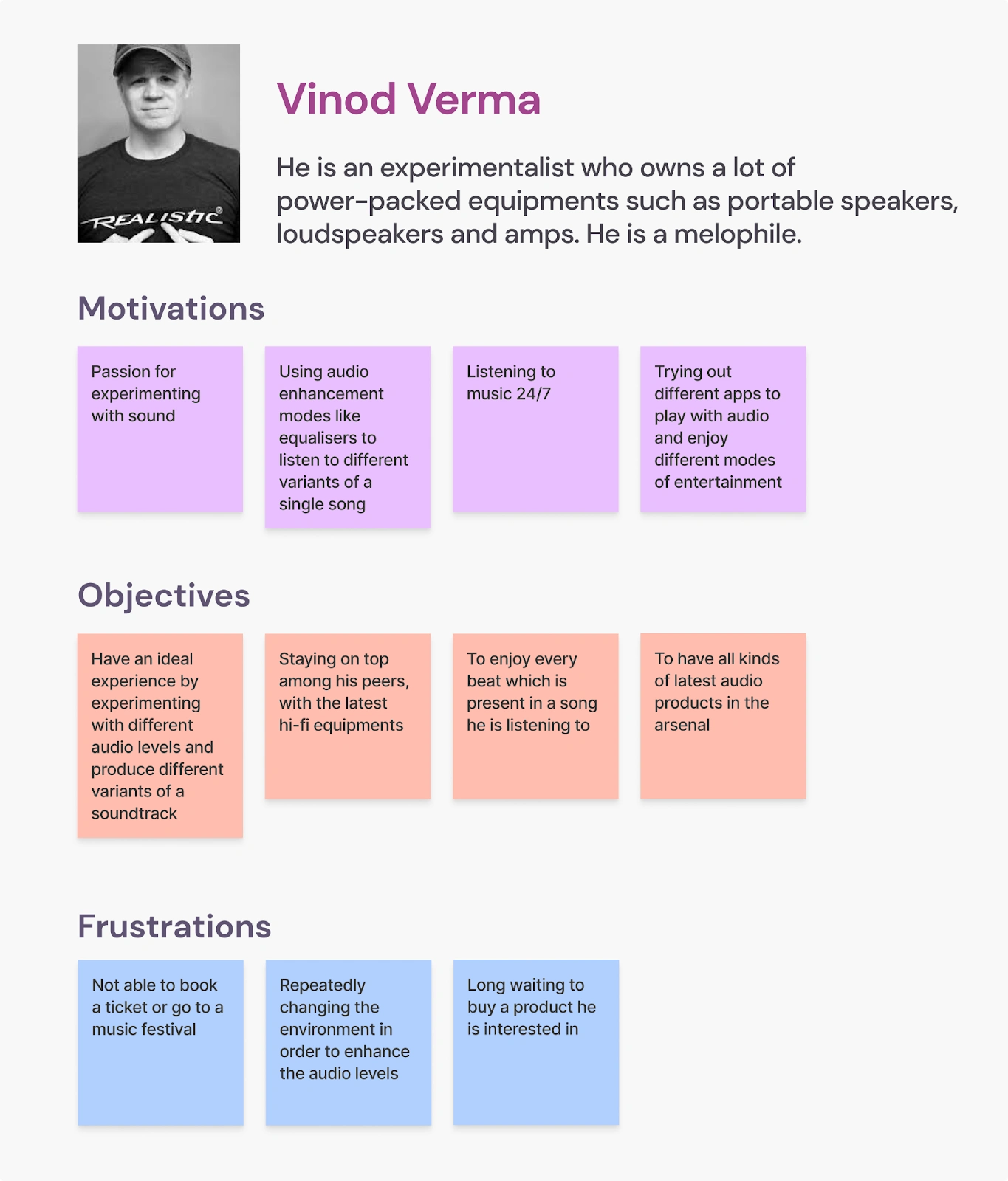
User Personas
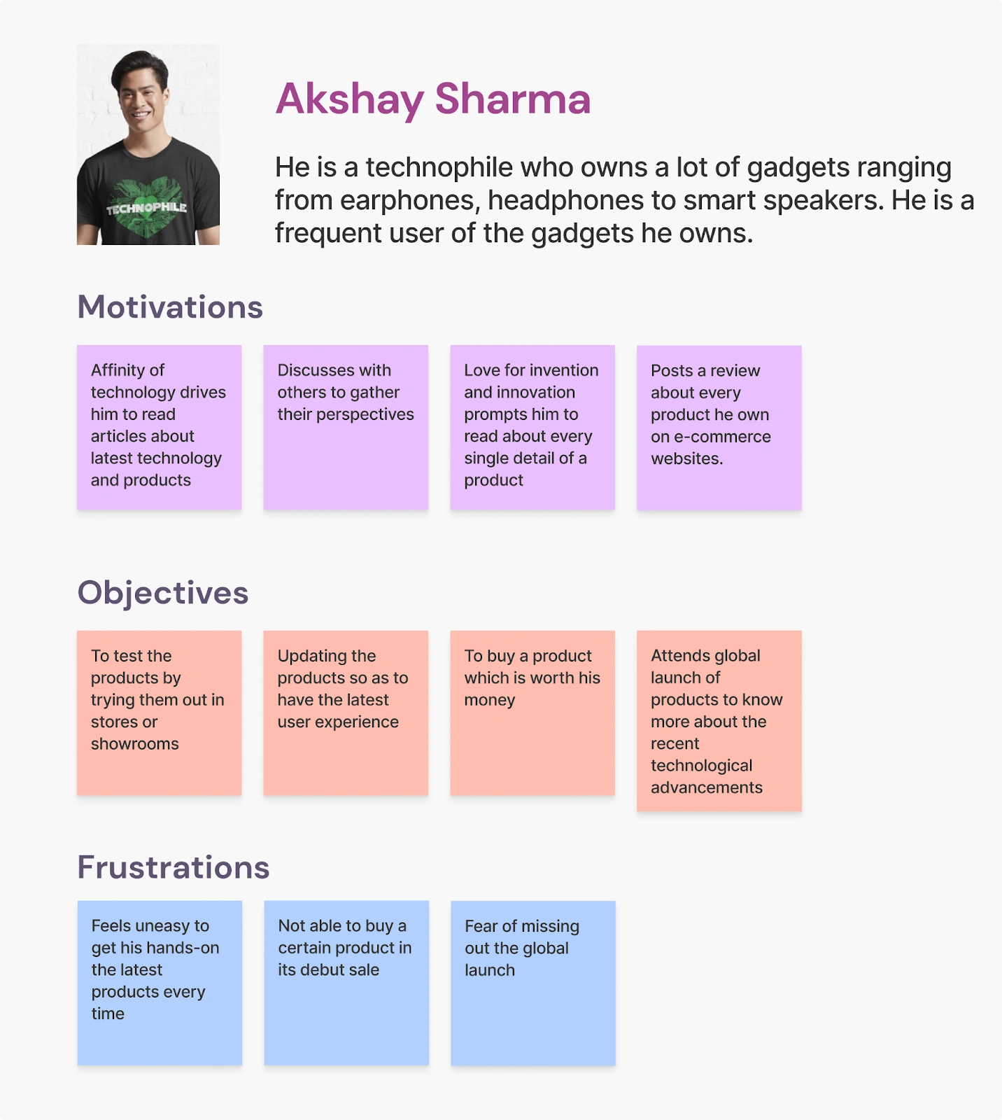
User Personas
Again, seems nice, fresh and clean- right😀?
Voila, we now have our user groups, which means we definitely know for whom we are solving the problem😎.
So, without further a do, lets go to the fourth episode✌.
🎥Episode-4 : Draft the solution!
Welcome to the 4th episode. In this episode, we are going to draft the blueprints of our solution😎.
But before, we go ahead there is something I need to share with you.
Part-1: Validating Hypothesis
Yeah, you read it right. We need to first see, how much truth our hypothesis statements hold. In regard to this, I am sorry to say that almost all our hypothesis statements…
… were right🤣! There were 3 statements which were half-validated. But never mind the details.
Lets proceed ahead.
Part-2: Scoping down
It was now time to narrow the number of hypothesis statements we constructed😪, so that we can concentrate fully on the ones which really needed to be solved. So, the statements which finally made the cut were:
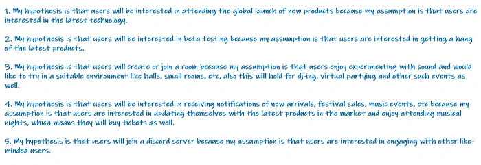
Final Hypothesis Statements
We have the final statements and now, it is time to formulate some HMWs (another familiar term, right?)
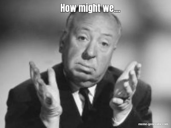
Part-3: How Might We Questions (HMWs)
Yeah, like the above mister😂, how might we? But what exactly? So, based on the statements we earlier deemed as important, it was necessary to reframe our existing problem statement and only way I could think of was HMWs.
Below are the HMWs I prepared👇

HMWs
And to your surprise, now these are the questions we will focus on and work towards, in order to provide a solution. So, without further a do, lets move on to the wireframing part🙂.
Part-4: Wireframing
This will be the most exciting part of this episode and yes, we are going to construct a skeleton of the solution that we are going to provide😂.
Based on the HMWs drafted earlier, I prepared a pencil-paper wireframe to represent the idea behind the solution. Have a look below👇
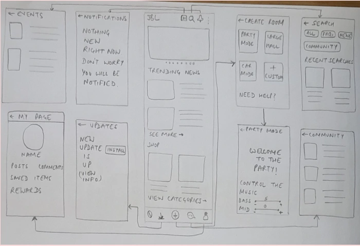
Pencil-Paper Wireframe
Well, I know it is like a rough amateurs' approach (which I am by the way😅) and not much proud of, but it’s not important here.
The important thing is you get the gist of what I am going to do ahead😎.
So, based on this wireframe, I constructed my first low-fidelity digital wireframe! (Fasten your seatbelts, many are going to come)
Have a look at the 1st Iteration👇
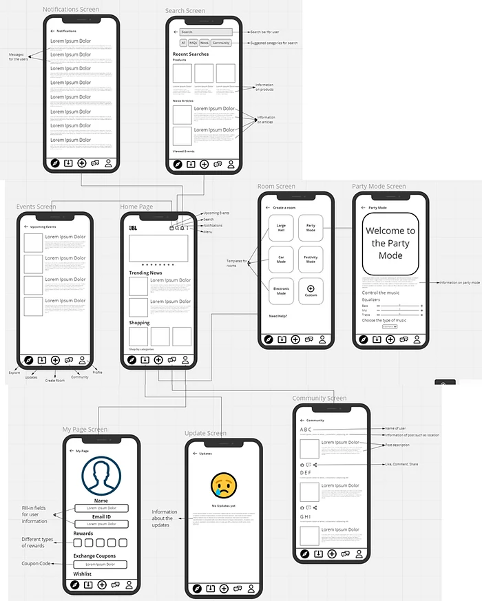
Iteration 1
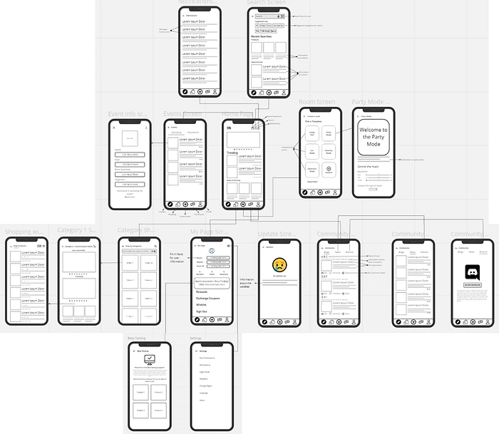
☝Iteration 1: In this iteration, I made a home page. From the home page, the user can access a number of options.
1. Explore- This is for easier navigation to the home page, if the user is on a different page, they can simply click on this and arrive at the homepage. Initially, this page was meant to show trending news and for shopping products. (I know you didn’t like the idea😂)
2. Updates- The user can easily access updates regrading the app (Not important right now😢)
3. Create a Room- This feature is meant to give users an option to try music in different environments and even produce their own by picking out certain templates which were provided on the screen. (Sounds exciting, right?😎)
4. Community- This option is for user to stay updated with latest blogs and news related to JBL. The user can like, share or comment as per their wish. (Engaging? you tell me!)
5. My page- This is meant to provide Profile based options to the user.
6. Search- This screen is for the user to search anything on the app.
7. Notifications- This option is for the user to see the notifications/messages they receive.
8. Events- This screen is meant to present users with events like music festivals or global launch, etc.
These were the salient features of Iteration 1.
Well, you are right, there was nothing much in this iteration😅. So, I went ahead and did another iteration. Have a look👇
Iteration 2
☝Iteration 2: In this iteration, I went ahead and explained what happens when the user will click on the screens.
1. This time, I refined the events, community and my page screens.
2. Now the user can easily navigate through blogs, news, upcoming or past events and even join a discord community.
3. Changed the “Updates” icon to “Shopping” icon
4. Also, the option of Beta Testing Program was added.
5. In addition, how the shopping experience will become, if they navigate through the screens and how well an event can be seen on the screen.
Still, I was not satisfied so I did another one😅. Here is the 3rd Iteration👇
Iteration 3
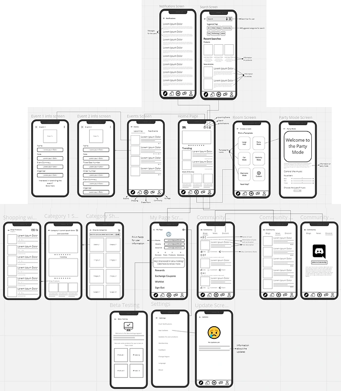
☝Iteration 3: You can call this an extended version of Iteration 2. This was more refined than the previous one and had only fewer cosmetic changes😅.
1. The events provided for the user were now different. One screen is for simply viewing the event and the other is for the user to see their booked event, both these screens will define the experience of the user.
2. Settings were linked to the My Page and user could now easily access to app updates.
Now that we have prepared our final iteration, it was time for some rendezvous with my fellow peers🙃.
Na, I didn’t yell at them😂
Part-5: Peer feedback and modification
I setup a group call with my fellow amigos and got their feedback. Below is the summarized form of what they said to me👇

Peer Feedback
After thanking my peer amigos for their feedback😎, I modified my wireframe and made it as my final iteration.
Have a look below👇
Iteration 4 (Final)
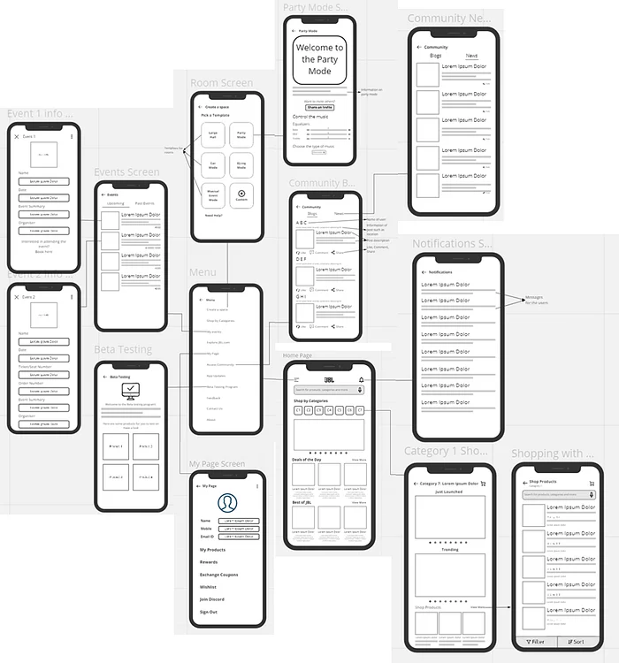
☝Iteration 4: In this, I refined the screens even further. Major changes:
1. Menu- I introduced menu icon to clear away the clutter which was present in the homepage. Now user will only see shopping related items on the home page. All the options such as “my events”, “my page”, “community”, “beta testing program” and “create a room” were placed inside the menu.
2. Community- This screen was now distinguished into two parts- Blogs and News rather than the earlier three.
3. Beta Testing Program- Now, this was easily accessible through the “menu” icon
4. Homepage- To improve the shopping experience, the homepage was cleared out of unnecessary items and category shopping was introduced to give a clear sense of products available for shopping to the user.
5. Create a Space- This was renamed from “Create a room” for better understanding what the term means (Still, it didn’t clear anything, I will explain later😂)
6. Discord- Now the “My page” had the option of joining discord, if the user wants to join, they can easily do that from there.
With this, our fourth episode concludes here😎. Now it is time to proceed to the finale ✌!
🎥Episode-5 : Rise of the Prototype!
Welcome to the finale! Now let’s make a prototype taking the final low-fidelity UI screens as are basis😎. Let the journey begin!
Yeah, our screens will become lively just like them😂.
Part-1: High-fidelity UI Screens
Now lets start with our 1st Iteration. Have a look below👇
Iteration 1
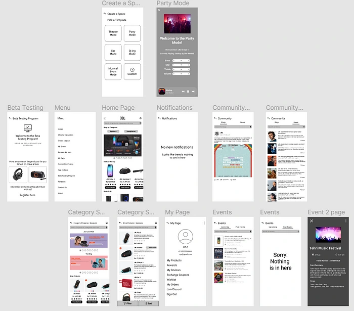
The main features have been explained below👇
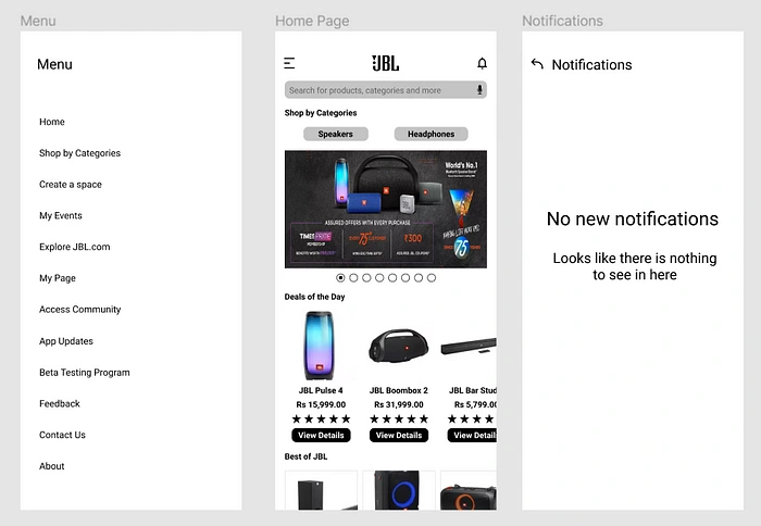
Menu (Left), Homepage (Center) & Notifications (Right)
☝Home Page and Menu- Now, that you have arrived on the Home Page, you can see there are various deals which are being offered to the user and if they click on the menu button on the top-left, they will see a menu screen appearing.
If they click on “Create a Space”, this is what they will see👇.
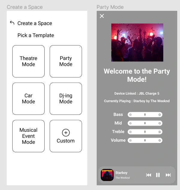
Create a Space (left) & Party mode screen (right)
☝Create a Space- “Create a Space” (left) aims to provide more freedom to users by giving them more controls and they can freely make their own (virtual) room and play music as per the environment they like the best.
For starters, I have provided some templates for the user to look into.
For instance, if the user selects the “party mode” template, a respective screen shall appear. This screen will display which song is being played and on which device. Also, some basic controls regarding sound are given so that user can easily turn up or turn down the properties of the sound (from the song).
My events- Now, if they select “my events” option, the respective screen will appear👇
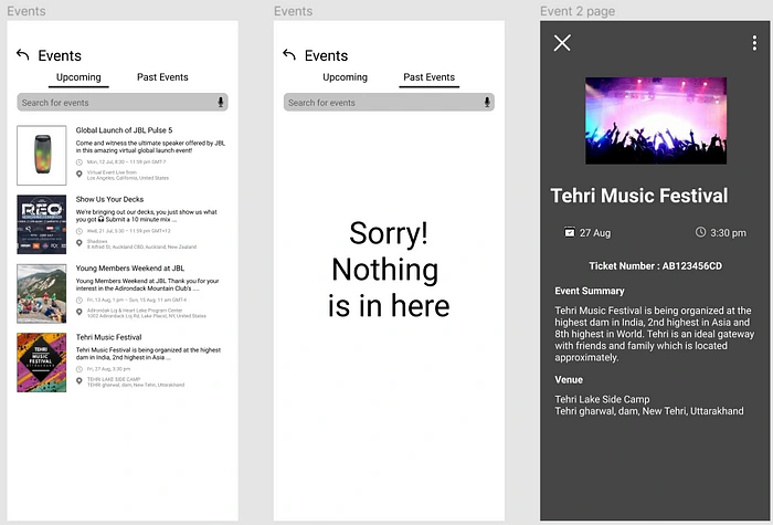
Events (left, center) & Event details (Right)
☝In the above screens, the user can easily access the upcoming and past events. For supporting my viewpoint further, another screen was added which shows the user the details about a music festival which will be happening in a few days.
Shopping- If the user selects the “speakers ”under the “shop by category”, they will be redirected to the shopping screen👇.
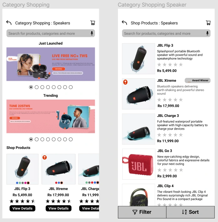
Category Shopping (Left) & Products (Right)
☝From the above screens, the user can browse the products like, what is trending or what has been launched, etc. and by clicking on shop products, the user will be redirected to another screen which shows those products.
Beta testing Program- User can access this through the menu icon. If the user is interested in doing some beta testing, the user can simply register their interest in the program. Have a look👇
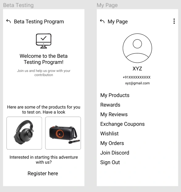
My Page (Left) & Beta testing Program (Right)
☝My Page- This is the profile page of the user, where they can see their list of products (which the own), any reviews they have posted regarding a product, their favorite-marked products will be in Wishlist, if they want to exchange their old gadgets with something new, they can apply for an exchange coupon and even join discord. All this from here.✌
Now that you know about this iteration, you might be wondering all this is Black & White😢. Allow me to show you the colored version of this (also known as Iteration 2)🤗.
Apart from the cosmetic changes, I have added some more screens to support the design and logic of the app. Have a look👇
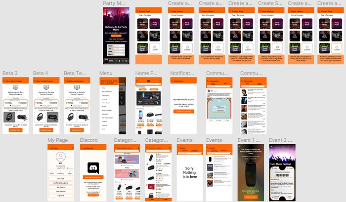
Iteration 2
Now the app looks colorful and appealing, isn’t it?🙂 Let me show you step by step breakdown of the cosmetic changes and the extra screens which I have added.
👇Create a space- The screens have been given a makeover and whenever the user hovers over a mode, relevant information will be displayed.

Create a Space screens (2nd screen is the main one) along with the information about each mode.
👇Events- If the user selects the 1st (Global Launch) and the 4th (Music Festival) event, their respective screens will appear. Also, the user will be shown an “attending” label, in case they are attending one.
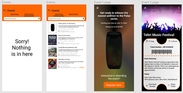
Events screen- The 1st (Global Launch) and the 4th (Music Festival) events have been represented by their respective screens.
Global Launch (Event 1)- If the user wants to attend, they can register their interest and get notified for every information.
Music Festival (Event 2)- If they are attending one, they can download or share their ticket with others.
Looks funky, right😜?
👇Beta Testing Program- The users can register their interest and when they hover over the products, they can easily see which has been selected. Also, the user can now see, how they are going to be rewarded, if they take part in it.
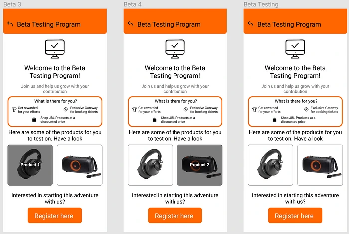
Beta Testing Program
Does this feature interest you😮?
👇Homepage, Notifications & Menu- These screens were simplified and given the same makeover as the others.
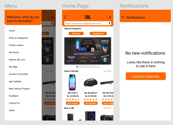
Menu (Left), Homepage (Center) & Notifications (Right)
If they user sees empty notifications, they can hit “continue exploring”, and they will be redirected to the homepage.
On the other hand, on the homepage, apart from theme setting, view more option was added.
The menu page was now made like an integrated part of homepage and was made such that it appeals to the user and simultaneously has all the options.
Community- Only the regular makeover, not much👇
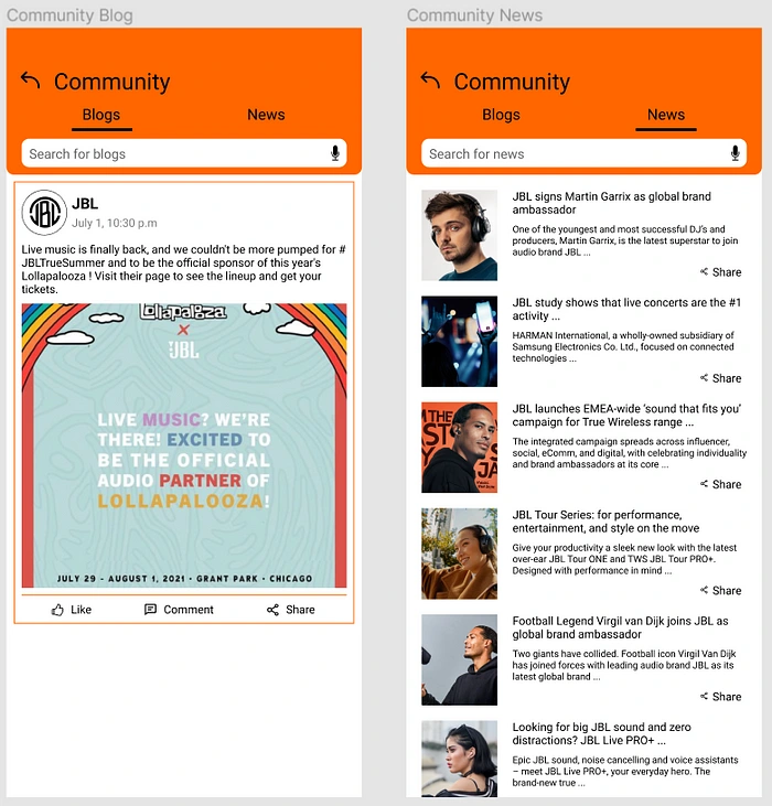
Community Blogs & News
Ready to stay updated😉?
Shopping- Apart from the regular makeover, “view more” was added to the category shopping page (left screen) which when clicked, will redirect the user to the shopping of product page (right screen)👇.
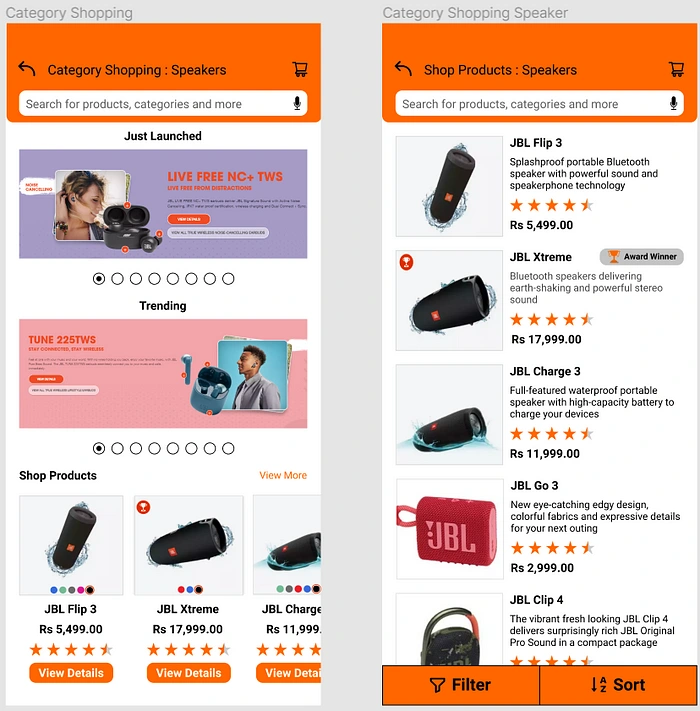
Category shopping page(left screen) & Shopping of product page (right screen)
Interested in shopping🙂?
My Page- Apart from the makeover, a new “Join Discord” screen was added, showing the user the option to join or invite others👇.
My Page & Join Discord
Now, you know about the Iteration 2 also. So, it is time to move further😄.
I know, I know, it is too much information😂, but hang on just a little bit more. Lets evaluate our prototype!
Part-2: Heuristic Evaluation
Yeah, yeah, it is a new term, you would not have heard of it earlier😅. So, let me explain this for you.
In simple terms, a heuristic evaluation is an inspection method to identify potential usability problems in the design using Jackob Neilson’s 10 Heuristic principles (which you will know in the upcoming story).
So, doing this before the usability testing will help us identify many common errors and rectifying it will save us some time.
For now, you need to know only this much. With me?
Nice🙂. So, I did my part and here are my findings👇

Heuristic Evaluation based on Principles 1–4

Heuristic Evaluation based on Principles 5–8
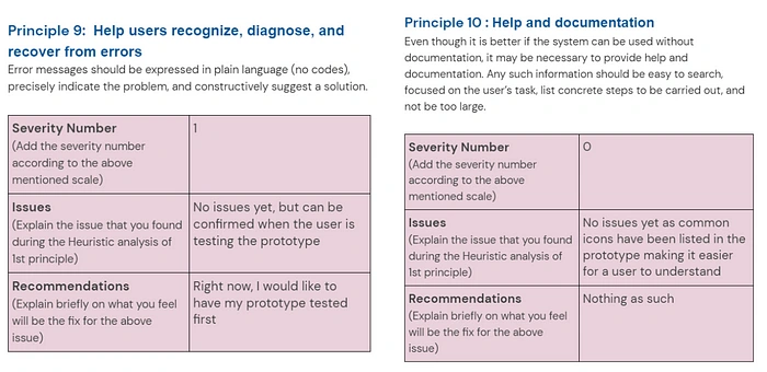
Heuristic Evaluation based on Principles 9&10
So, after doing this exercise, I discovered that the maximum severity level as per my understanding was 2, which means “Minor usability problem: fixing this should be given low priority”
Learning this, I decided lets get our prototype tested first and hence, I didn’t make any change to it. Its now time to get our solution tested by our users😎!
Actually after conducting the usability testing, I realized that some errors could have been prevented😅 in the evaluation part itself. Well, never mind, moving on.
Part-3: Usability Testing
Now, it was time to get our prototype tested from the users. But before doing this, we need to prepare some tasks for the user and some questions to understand their experience better.
I have already done that, have a look below👇

User Tasks

Questions for understanding the experience of the user
Now that we are fully prepared, lets set out to test our solution😎✌.
Yeah, finally, the day has come😂. So, we are simply going to setup a call with them, present them with my prototype and ask politely for their feedback.
So, during our conversation with these 3 users (2 were not available😶), I was able to show them our prototype. They did the aforementioned tasks successfully and I was able to get their experienced feedback.
Here is the summarized form of the feedback I received from them. Have a look👇
User 1
Screens are good in design. Events, beta testing program and party mode creates a link and seems interesting and creates a good first time impression.
User 2
Simplistic design of app and easily understandable. Aesthetics look good and appropriate information is there on the screens.
Party mode is interesting and would like to try it. Can shop JBL specific products on the app and see the latest information regarding JBL through the community. Also, easily join the discord without having to find the servers.
User 3
Overall a good design. Navigation to other pages was smooth. Overall, experience in using the app was good and had every necessary information in place.
Now I can stay updated with the news and what’s happening with respect to JBL. Sufficient and relevant information is there to easily use the app and shop the products.
There we go, now that we have gained some insights, it was time to address their issues regarding the current solution✌.
So, on asking them, I got these concerns/suggestions (Of course, they are summarized below👇)
1. There is a repetitiveness in using the menu bar to access all the options. (Okay, I feel you😅)
2. Addition of a music player to the app will be a delight. (Will be an icing on the cake😜)
3. The theme of the app feels repetitive (seeing the same color everywhere). (Repetitive, eh?😢)
Hmm, fair enough, so after hearing the problems, I decided to act on it🤔.
Indeed😎
Part-4: Update the Prototype
Now, we know where the problems remains, so lets update our prototype✌! After doing some thinking, I again did some cosmetic changes and also, introduced some additions. Have a look below👇
Final Iteration- Updated Prototype
Seems colorful and aesthetically appealing, right? (Repetitive theme solved✅)
Now, let me quickly take you through the before and after screens, along with the newest screens.
Homepage & Menu
Menu & Homepage
There are cosmetic changes to the screens. Apart from this, menu screen has been refined. On the Homepage, there are three changes-
A navigation bar has been added for the user to switch between shopping and music, so that the user can easily do both. Listen to music and do the shopping. (Music Player added✅)
The deals have been redefined by adding a timer and a saving price text has been added, so as to make it more interesting.
Also, the user can now access community and my events from the homepage itself, thus reducing some amount of redundancy in navigating the menu. (Repetitivenessin menu navigation solved ✅)
Create a Room
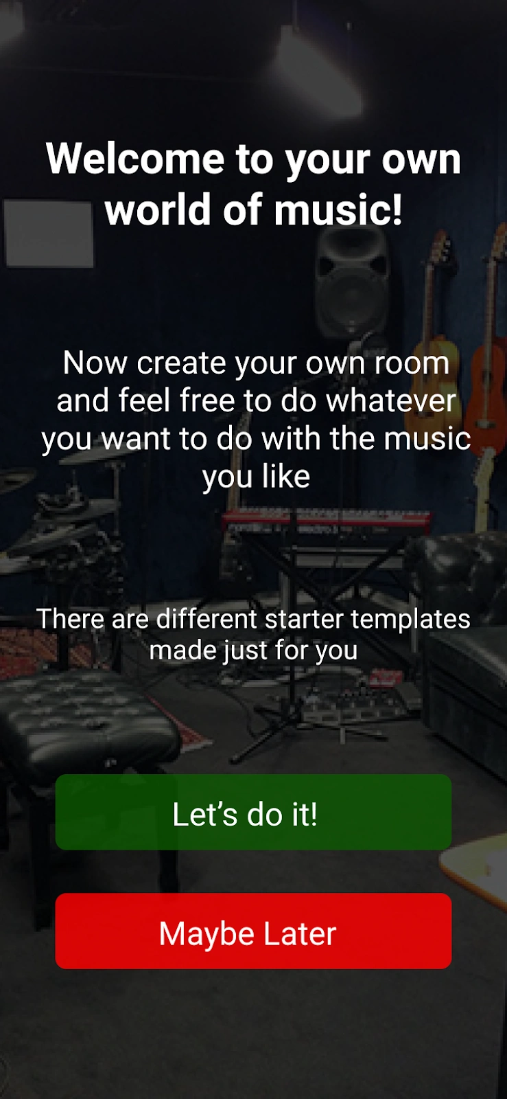
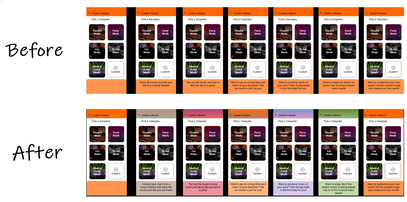
Introductory Screen (Left) & Comparison of Before/After Create a Room screens.
To facilitate easy understanding of this feature, I added a screen to explain what create a room means so the user can proceed accordingly. If they click on “Lets do it”, they will be taken to the Create a room (after) screens, else if they click on “maybe later”, they will be taken back to the home page.
Beta Testing Program
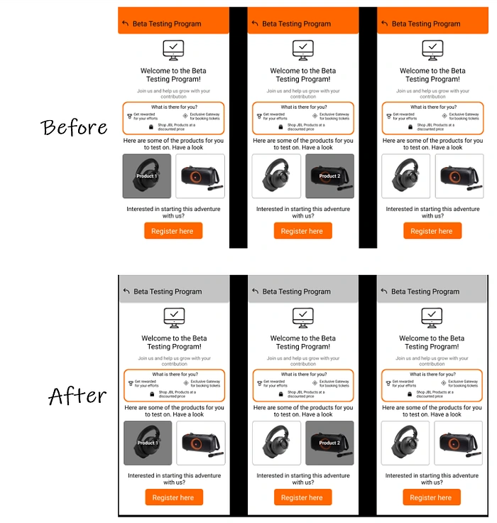
Before & After Beta Testing Program screens
Minor color change, that’s all.
My Events, Notifications, My Page & Discord
Before & After My Events, Notifications, My Page & Discord
Again, minor color change in all the screens, that’s all.
Community & Shopping
Before & After Community & Shopping
Again, minor color change in all the screens, that’s all.
Music Player
Music Player
A new screen called “Music Player” was added for the user based on feedback. This was done so that the user can enjoy music and do shopping. Also, to enhance the usability of the app. (Music Player added✅)
Here is an animation of the solution we prepared. Happy watching!
Now that we have updated the prototype, it was time to rest this episode🙂.
🎥Episode-6 : Epilogue
So amigos
I know, you must have gotten tired by now. Well, there is not much for me to say now. However, I would like to share some points.
Future Scope
There were many areas which were left untouched. Few things which I would like to add to the existing solution will be-
Personalized messages/notifications for user to attend events or participate in community.
Reward based experience or loyalty points to keep the audience engaged.
More freedom over controls of equalizers to enhance music experience of the user.
Inclusion of multiple different environments so as to enjoy different versions of the same song.
Membership like features for users.
Well these are my thoughts to make the app even better.
Conclusion
Congratulations for making it this far with me✨😊. Lets finish this up with some key learnings which I gained through this project.
I learned a lot about how to iterate on ideas and what can be done better to improve through group brainstorming sessions.
This was a whole new project for me, when it comes to the domain of the problem. This was a worthy problem statement and I feel good that I was able to solve it at last. I even learned a lot about the audiophiles itself.
Analyzing different sets of data to bring out personalities and identifying user groups had improved a lot through affinity mapping.
How to construct low-fidelity digital wireframes and how to efficiently iterate on them.
How to prepare and design screens from wireframes.
How to relate all those screens so as to produce a meaningful and logical experience.
How to stay calm and not get anxious with all the information gathered.
How to remove errors before hand, through heuristic evaluation.
And lastly, trusting your first instincts, which most of the time finds you the most suitable and usable ideas.
At last, I would like to thank my mentor Anudeep Ayyagari 😄for mentoring and guiding me through online webinars and through his constant support & GrowthSchool team for providing me such a spectacular opportunity to commence my UX career🙂.
Also, I would like to thank JBL for their products and pictures😂.
Well now, we conclude our last (but not the least) case study with you. It was such an amazing loooong journey.
Thank you for reading this far. I hope you enjoyed my series of case studies.
Thank you for your patience and your time. See you again, folks😁.
Like this project
Posted Dec 11, 2023
Enhance your musical experience with JBL app
Likes
0
Views
4

