Bussole | Rebranding
Client: Bussole | Deliverables: Naming, Brand Identity, Visual Identity, Assets and UI.
Overview
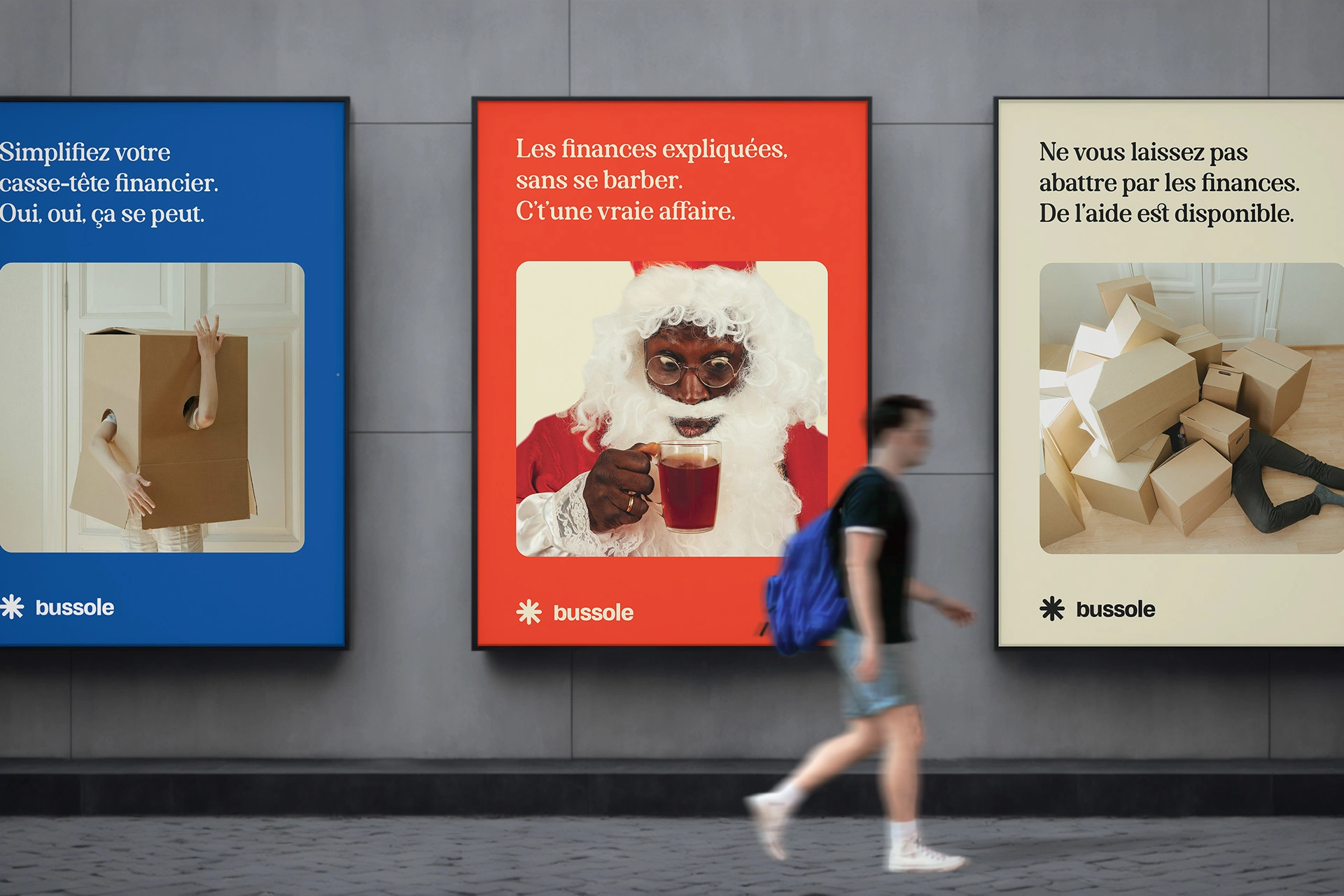
Bussole, a startup focused on financial literacy for immigrants aged 25-45 in Canada, reconnected with me to refine their visual identity as they prepare to launch. Their mission is to guide newcomers on their financial journey with a playful yet professional brand.
Challenge
Transition Bussole's brand from a travel agency concept to a trusted financial literacy resource, ensuring the visual identity remains simple, accessible, and approachable. See the previous branding I made for them when they were a travel agency here.
Solution
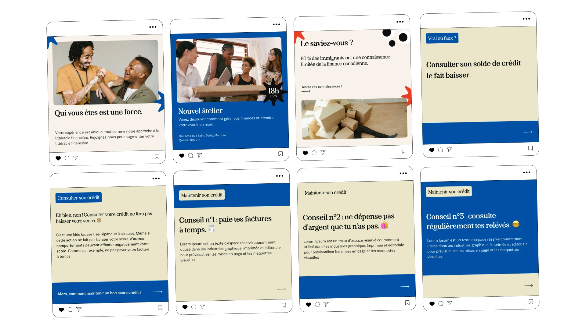
Developed a fresh visual identity that blends playful with professional, using a unique color palette and an overall interesting identity. This new identity positions Bussole as a welcoming and authoritative guide for financial literacy.
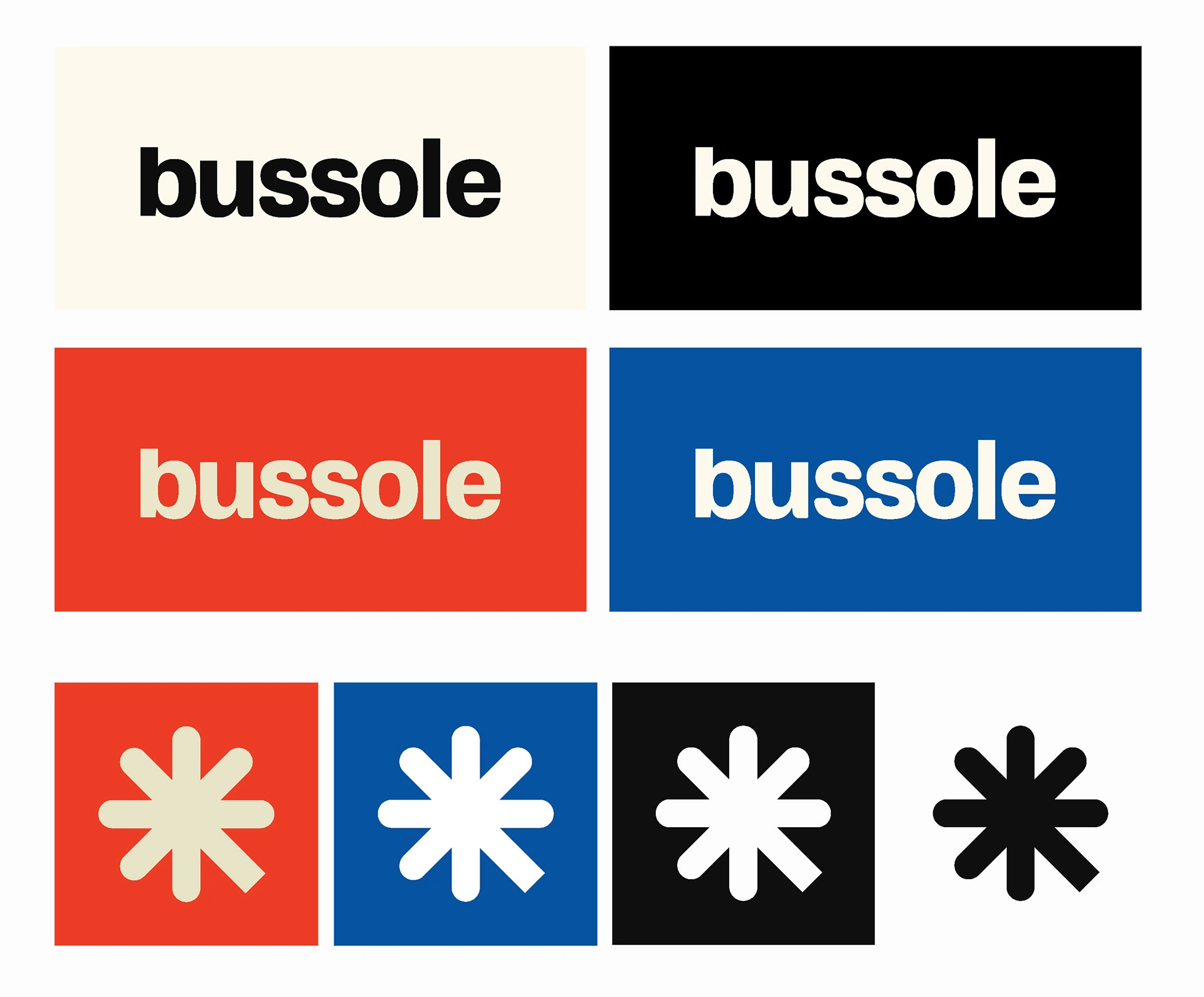
A story behind the logo

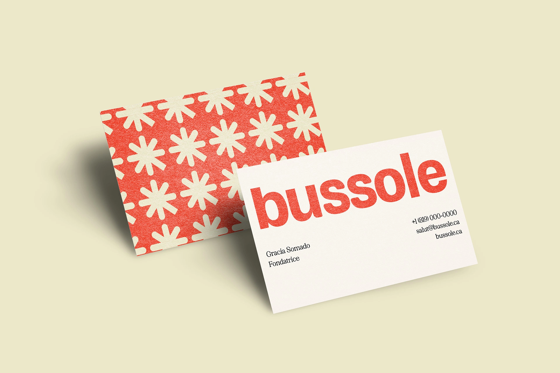
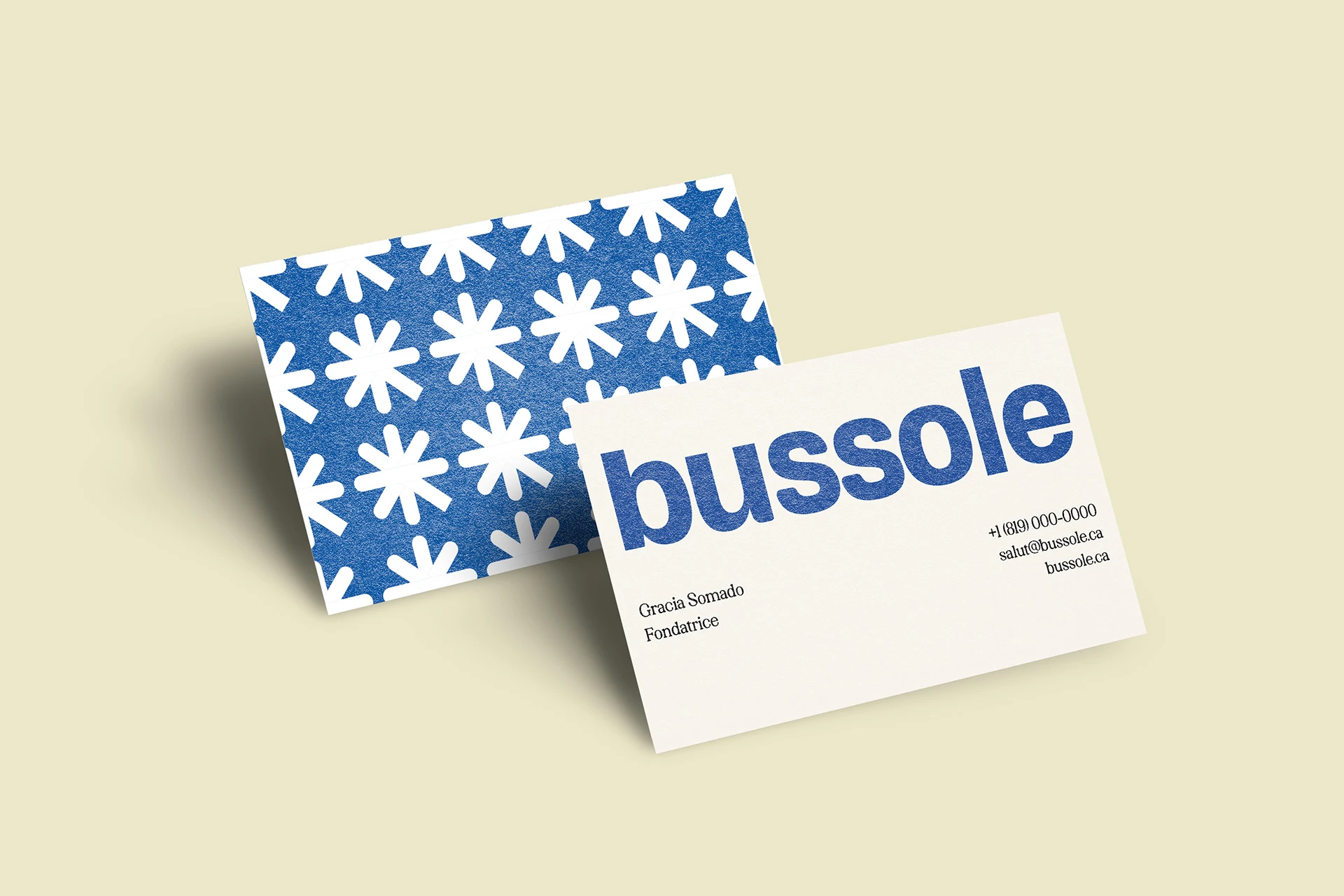
I believe that a logo with a meaningful concept is more powerful. I was involved in the naming process for Bussole, which is homonymous to the noun "boussole" in French, meaning "compass," guiding newcomers to financial literacy.
Sensible colors that defy financial language.
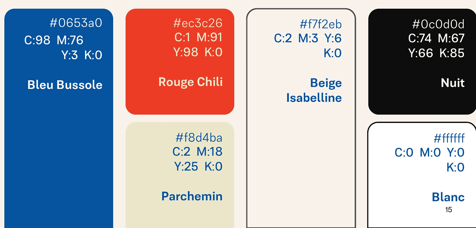
The color choice is intentionally different from typical financial designs. It makes Bussole more approachable. We chose this blue after iterations as it easily translates well on both print and digital medium, plus blue inspires trust. The red chili is an stretched reference to the canadian flag and adds vitality to the brand. The creme colors enable a neutral look while preventing boredom. Finally, instead of a pure black, we chose a night color to afect depth.


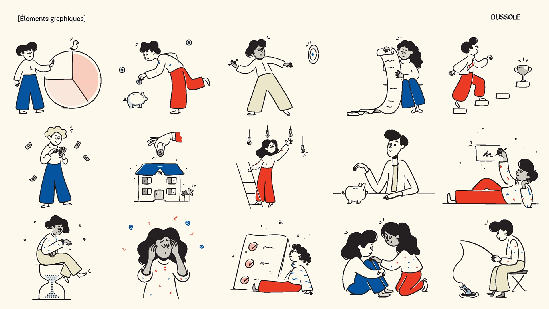
credit illustrations: Mary Amato

You may also like
Like this project
Posted Dec 15, 2024
Bussole, a Canadian startup, needed a fresh brand to shift from travel to financial literacy, blending playful and professional visual identity.
Likes
0
Views
25

