Table Component Accordion
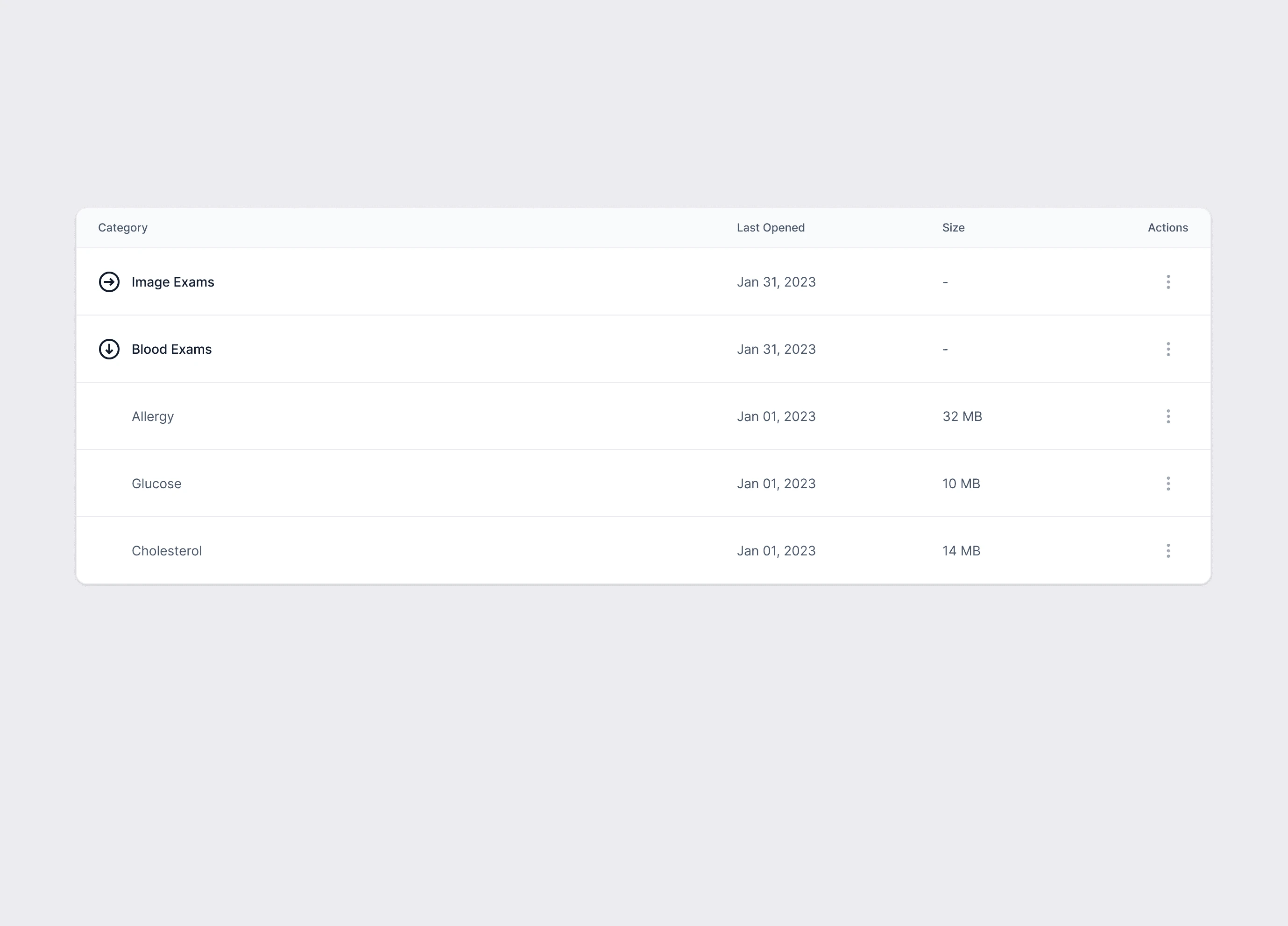
Table Component Accordion
Designing an accordion component? Here are some user-friendly tips to consider.
Prioritize clarity and simplicity.
Ensure that each section has a clear, concise label so users can easily grasp what's hidden inside.
Maintain consistency by using uniform icons or symbols to indicate the expand and collapse actions for a cohesive visual style.
Pay attention to accessibility. It's essential that your accordion component is navigable using both mouse and keyboard inputs, adhering to web accessibility guidelines.
Implement subtle animations to provide users with a clear visual cue when they expand or collapse content.
Like this project
Posted Mar 24, 2025
Expandable table interface for medical records that balances information density with visual clarity through thoughtful micro-interactions.
Likes
0
Views
7


