Sibarita Gourmet | Branding
Chus Margallo
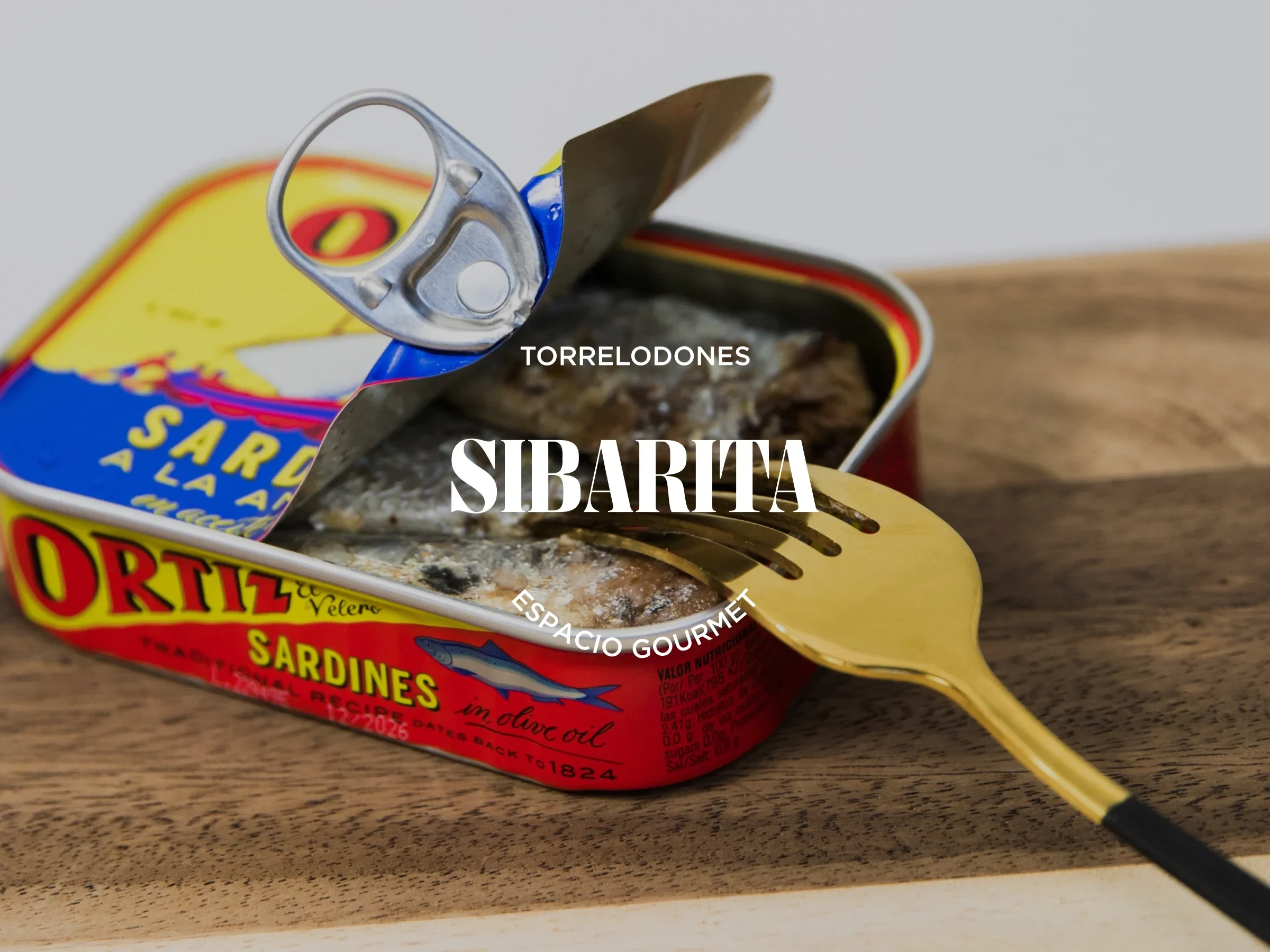
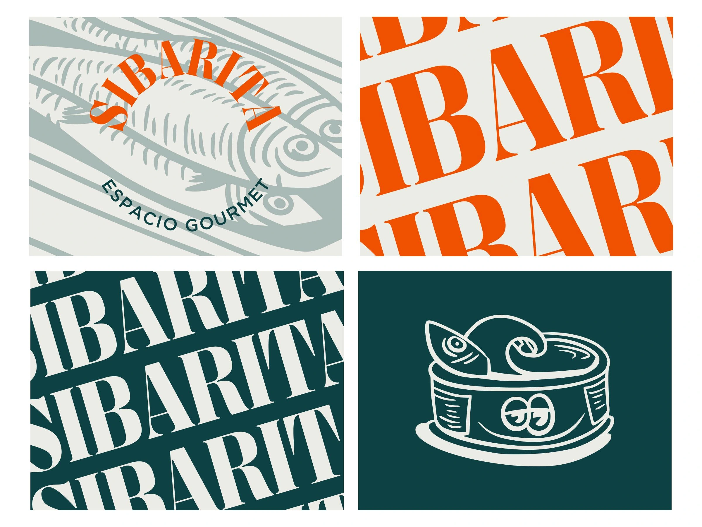
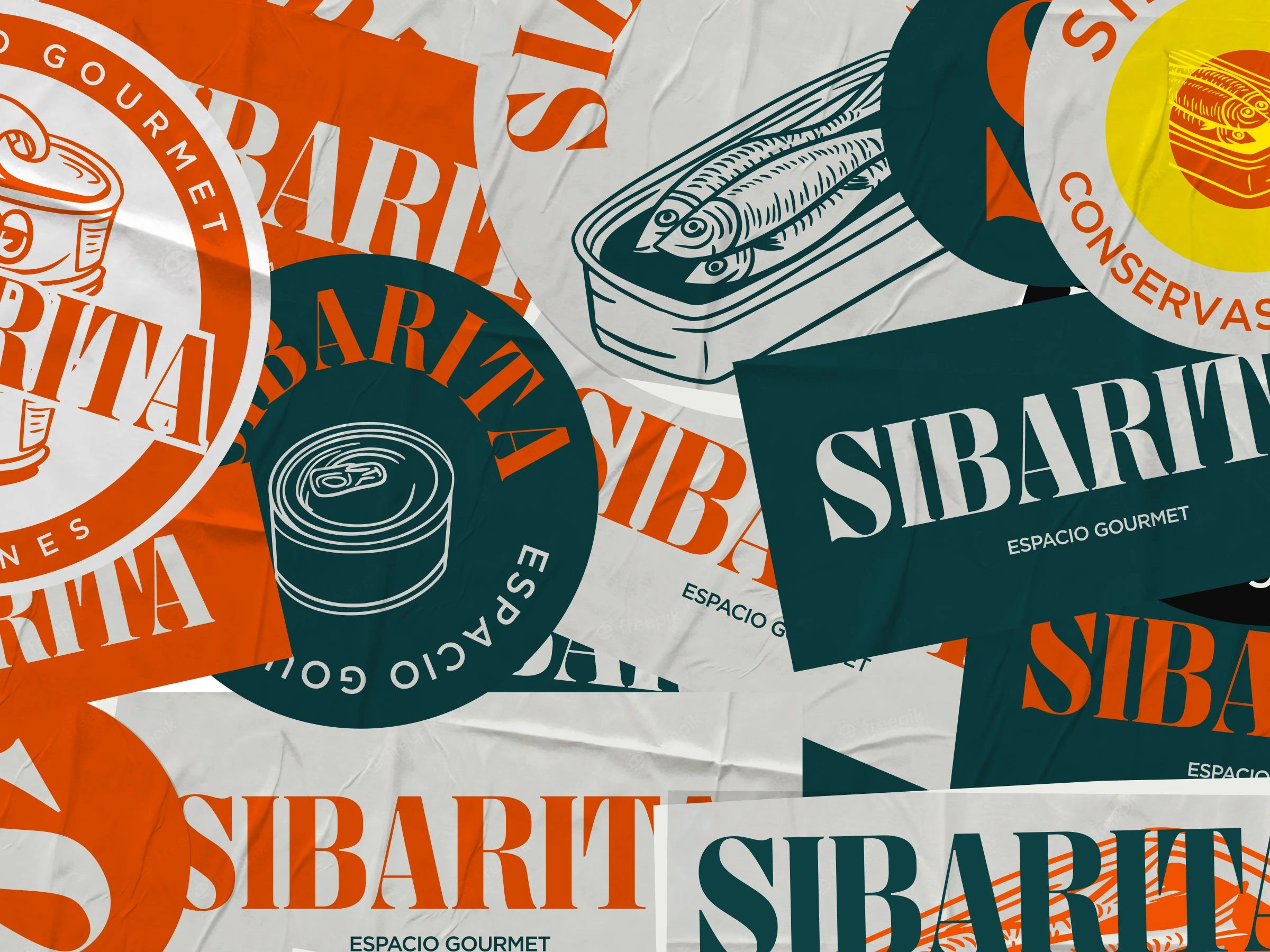
Logo mark for Sibarita Espacio Gourmet
Inspired by the classics
We've created a branding kit that combines a vintage palette of colours, an elegant logo created with Didone and a handmade illustration character that brings a bit of a playful character.
The branding system is quite extensive including several applications for digital and print environments, tone and voice and design strategy, among other topics.
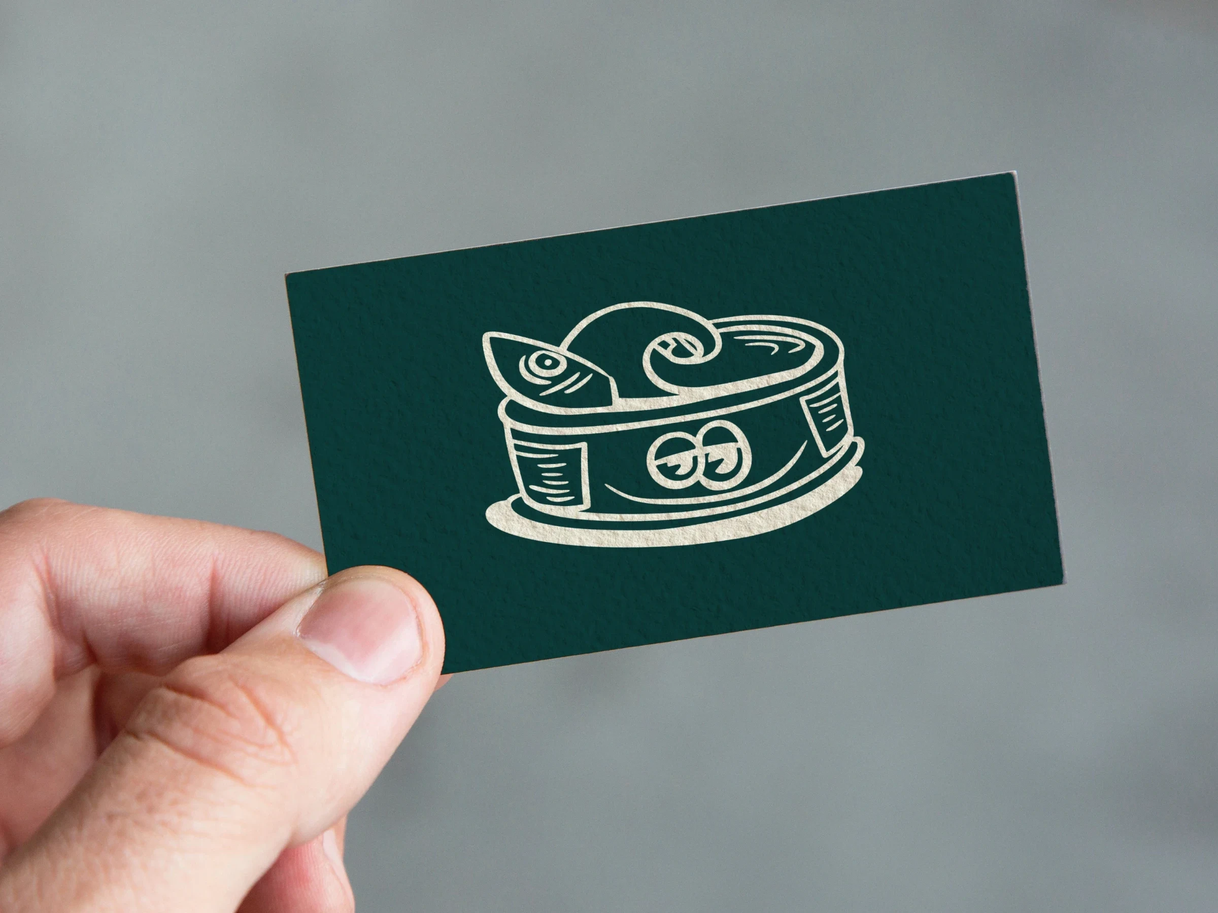
Business card
We created a group of stacked food cans mascots. This little fellas appeared in specific moments of the brand system to keep the brand light and funny, like the t-shirt, the business cards or the stickers.
We wanted to create a very consistent experience and keep the Sibarita guys to make a lot of different type of content at the same time. To do so it was key to keep the colour limited and distinctive.
Patterns
In every project is crucial to keep a consistent and continuous dialogue between the clients and the designer, but when a new brand, like Sibarita this is must.
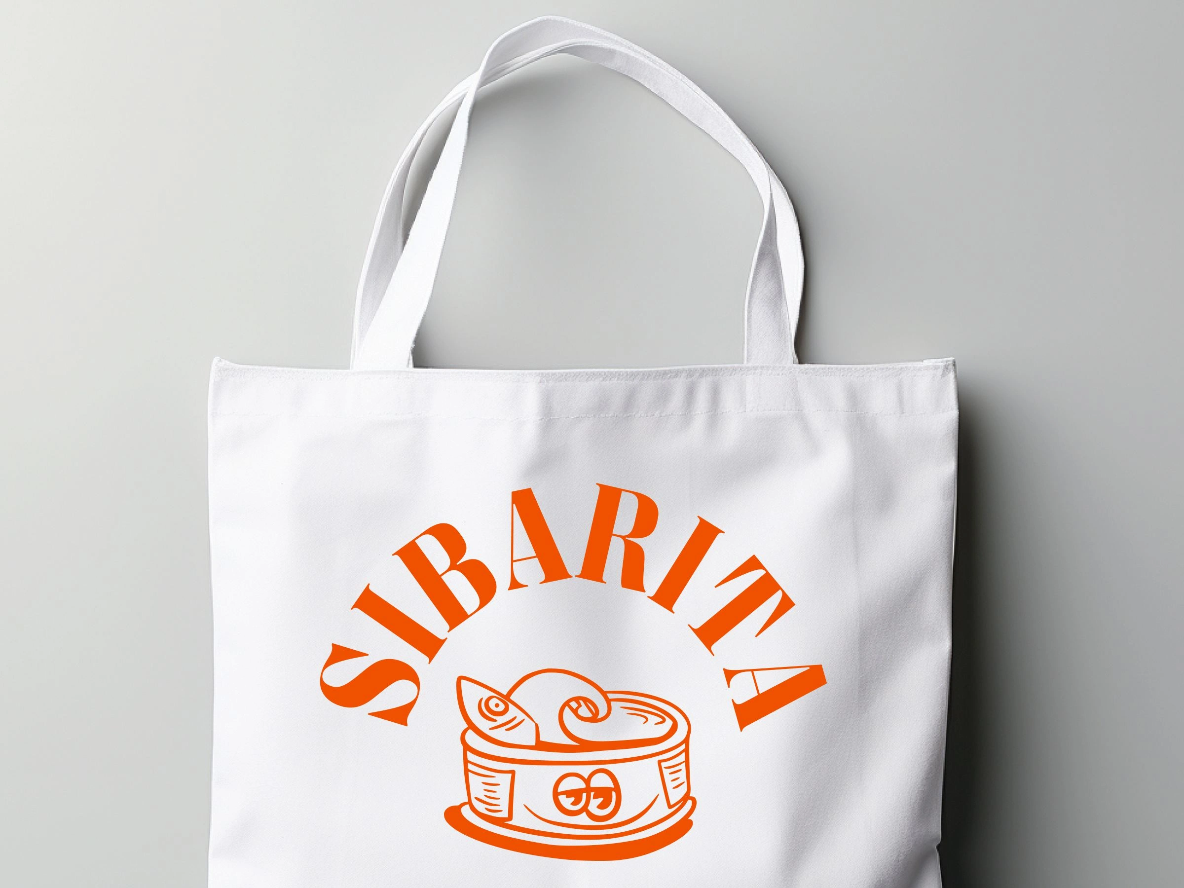
Tote bag
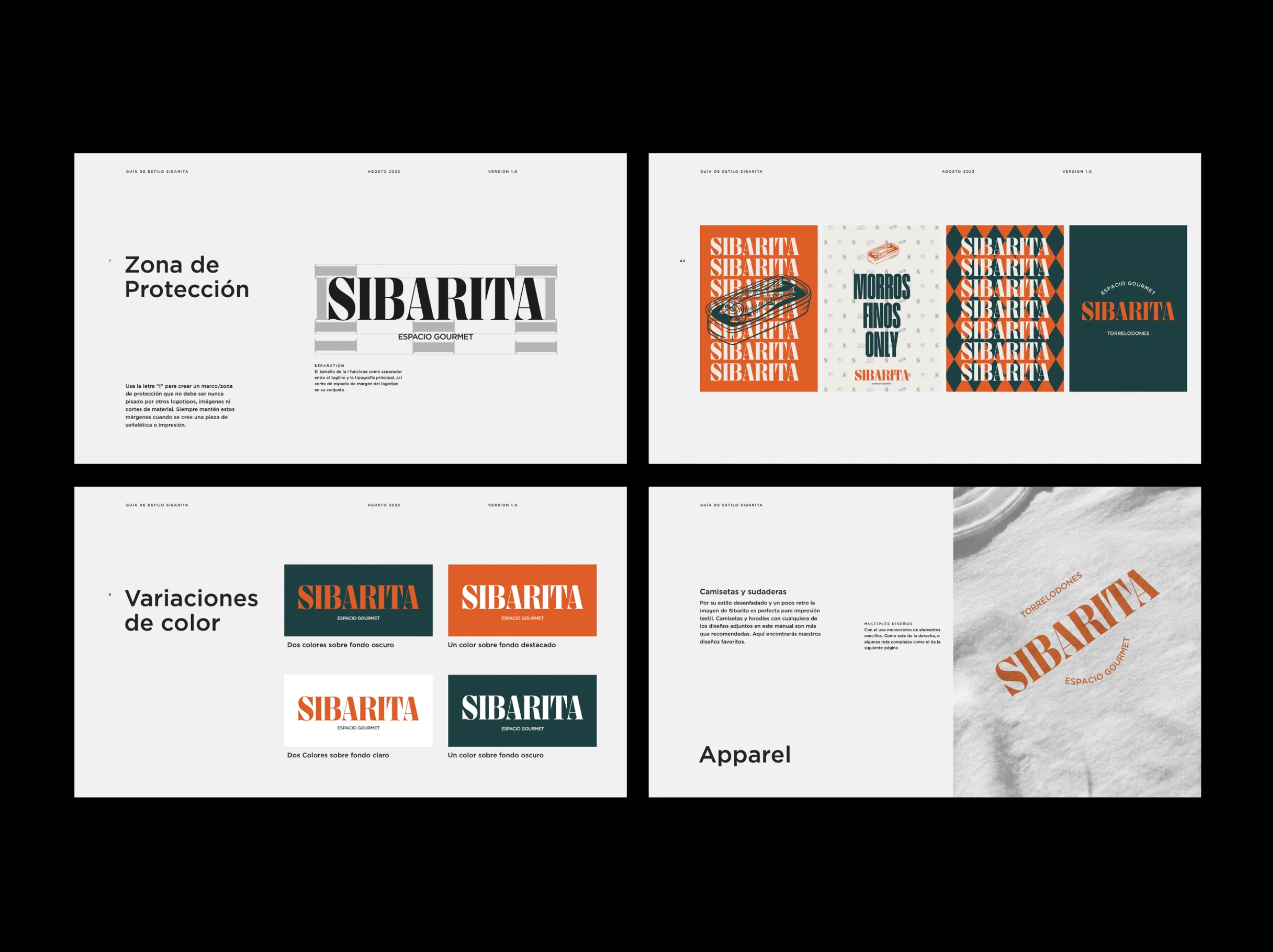
Style guide
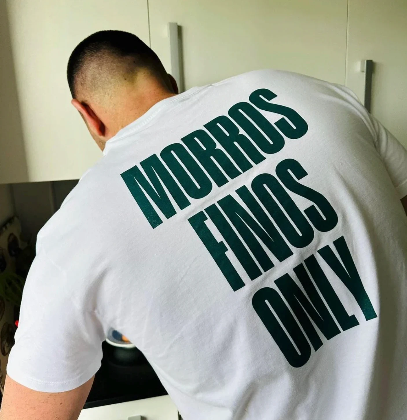
Employees t-shirt
Stickers
The Branding Kit includes along with the 70 pages manual, a set of folders with ready-to-print files and a ton of photographies and shareable content. Also it's interesting to mention we thought about making a low cost production (monochrome prints, stickers…) allowing them to start to work on the campaigns in the very early days of Sibarita.
Like this project
Posted Sep 6, 2024
Branding Strategy and graphic design for a Gourmet foodies shop