Captain Crunch Kids' Cereal Branding Project

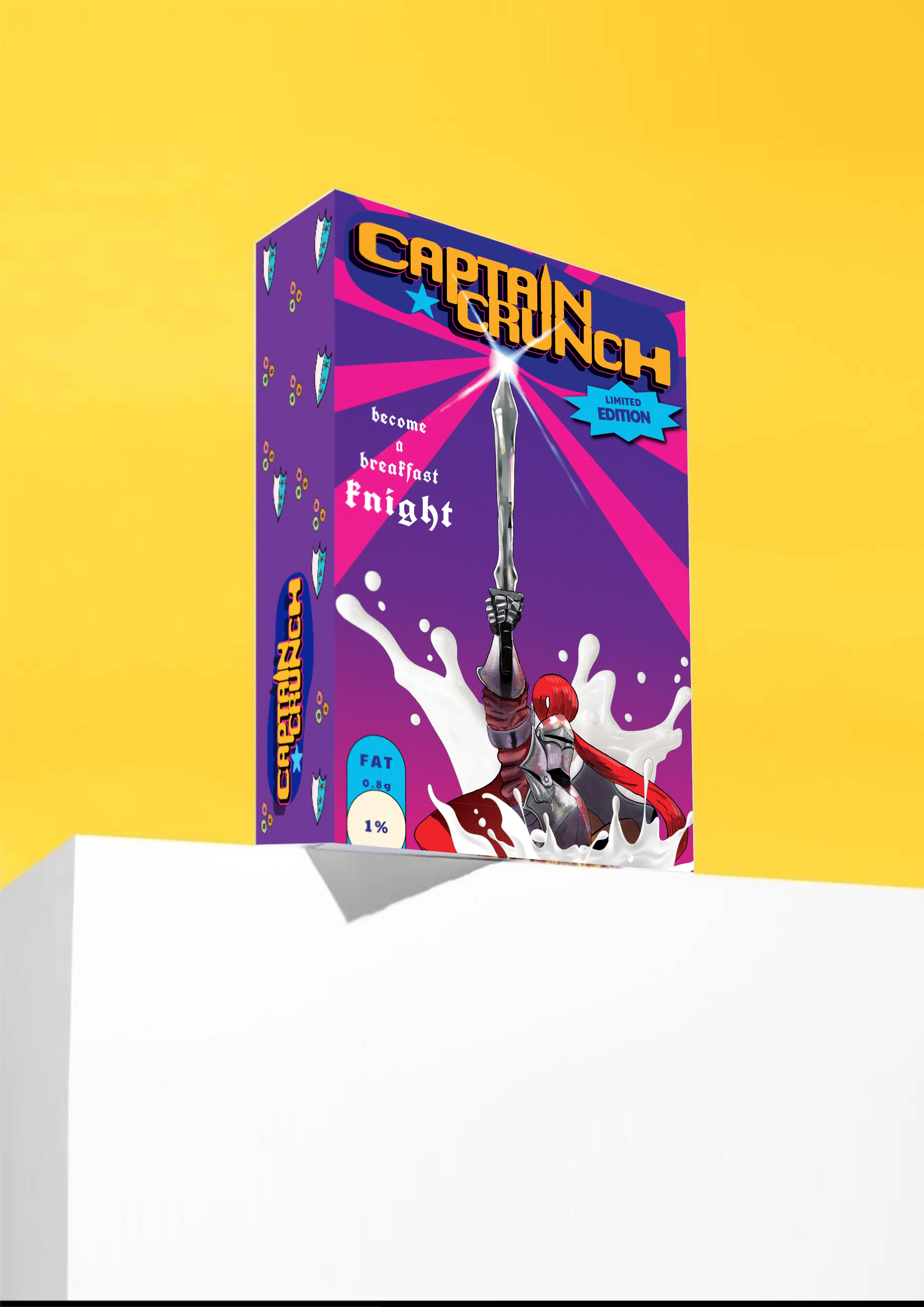
Captain crunch: this is a concept project for a kids cereal brand.
Brand identity, mascot illustration, and packaging for a limited-edition kids' cereal. Concept project.
The cereal aisle is loud, and most kids' boxes rely on the same red and yellow, crowded layouts, and high-action characters. I set out to design a cereal that stands out in three seconds, gives kids a character they remember, and gives parents a box that feels clear and trustworthy.
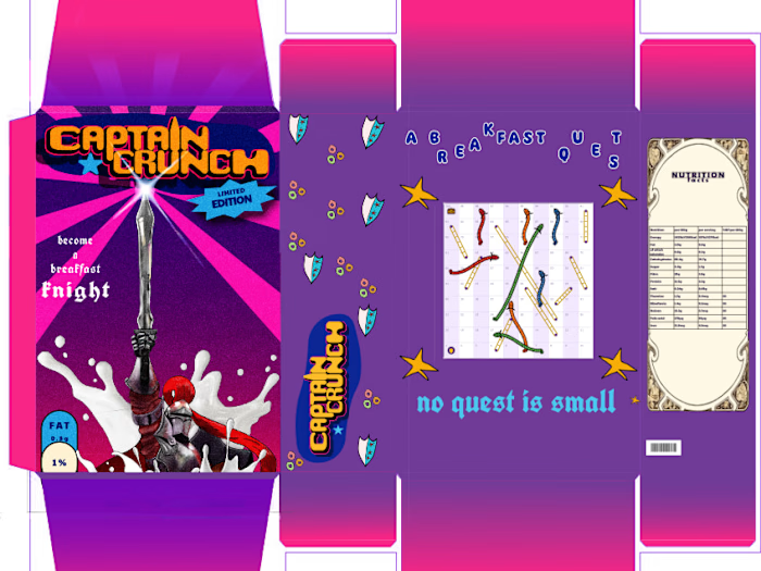
The idea is breakfast as a quest. Captain Crunch is a small, brave, slightly clumsy knight whose only mission is reaching the bowl, armed with a sword and a shield that doubles as the brand badge. I built the identity around a royal purple base to break from the usual cereal-aisle palette, with gold and a chunky, rounded wordmark.
The back of the box is a knights-and-dragons board game in the style of snakes and ladders, ending at a treasure chest, so the packaging becomes something kids play with at the table.
Deliverables: mascot, logo, palette, typography, box packaging, and a back-panel game.
Tools: Affinity
1 like · 1 view · Nov 8, 2026
Developed brand identity, mascot, and packaging for kids' cereal.
Timeline
Oct 1, 2026 - Nov 8, 2026