Five core pages and a site system for a security integrator

Vincent L. Anderson


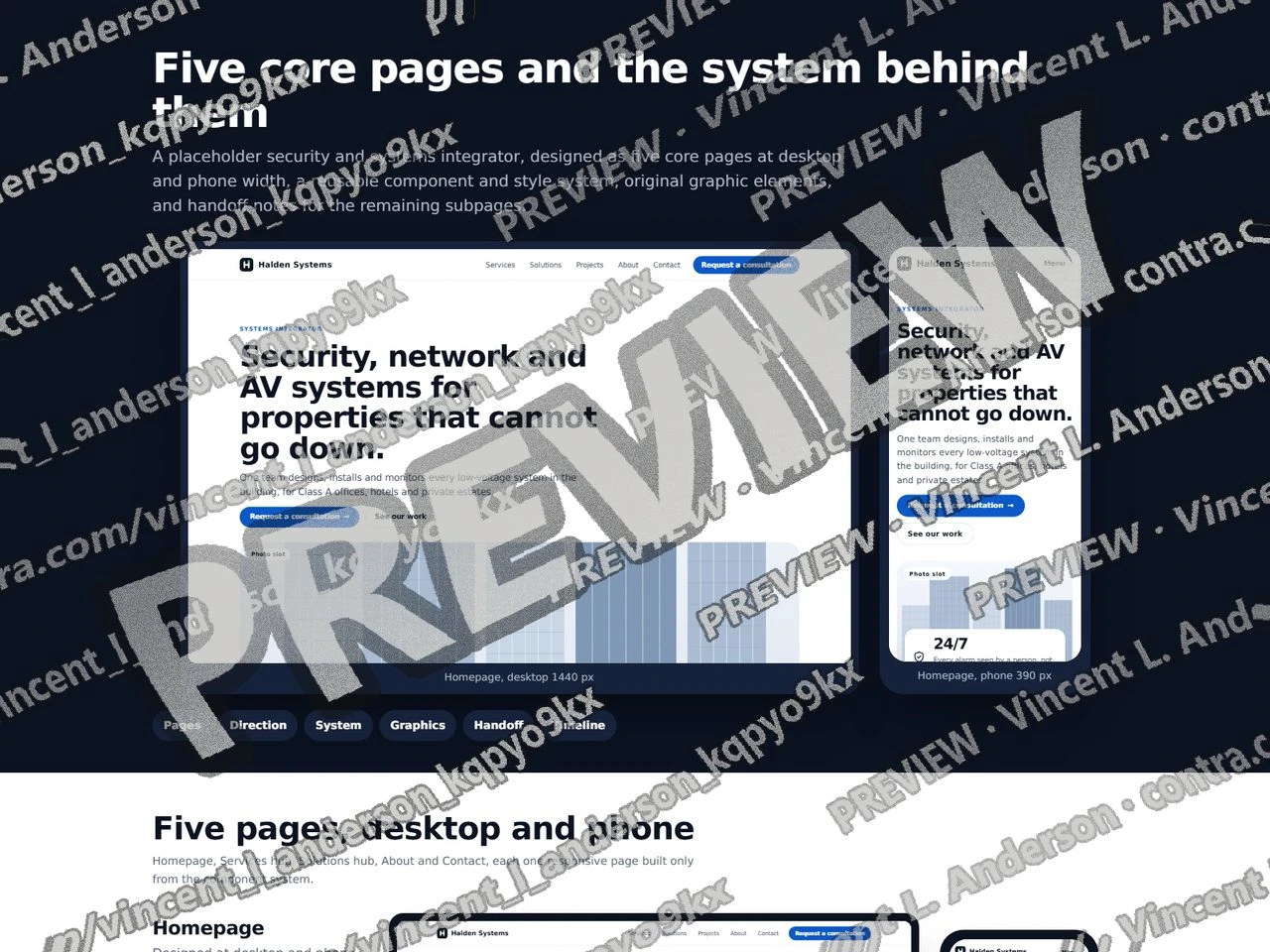
A demo built for a specific brief. Not client work: the material shown is sample data, so what is on display is the mechanism.
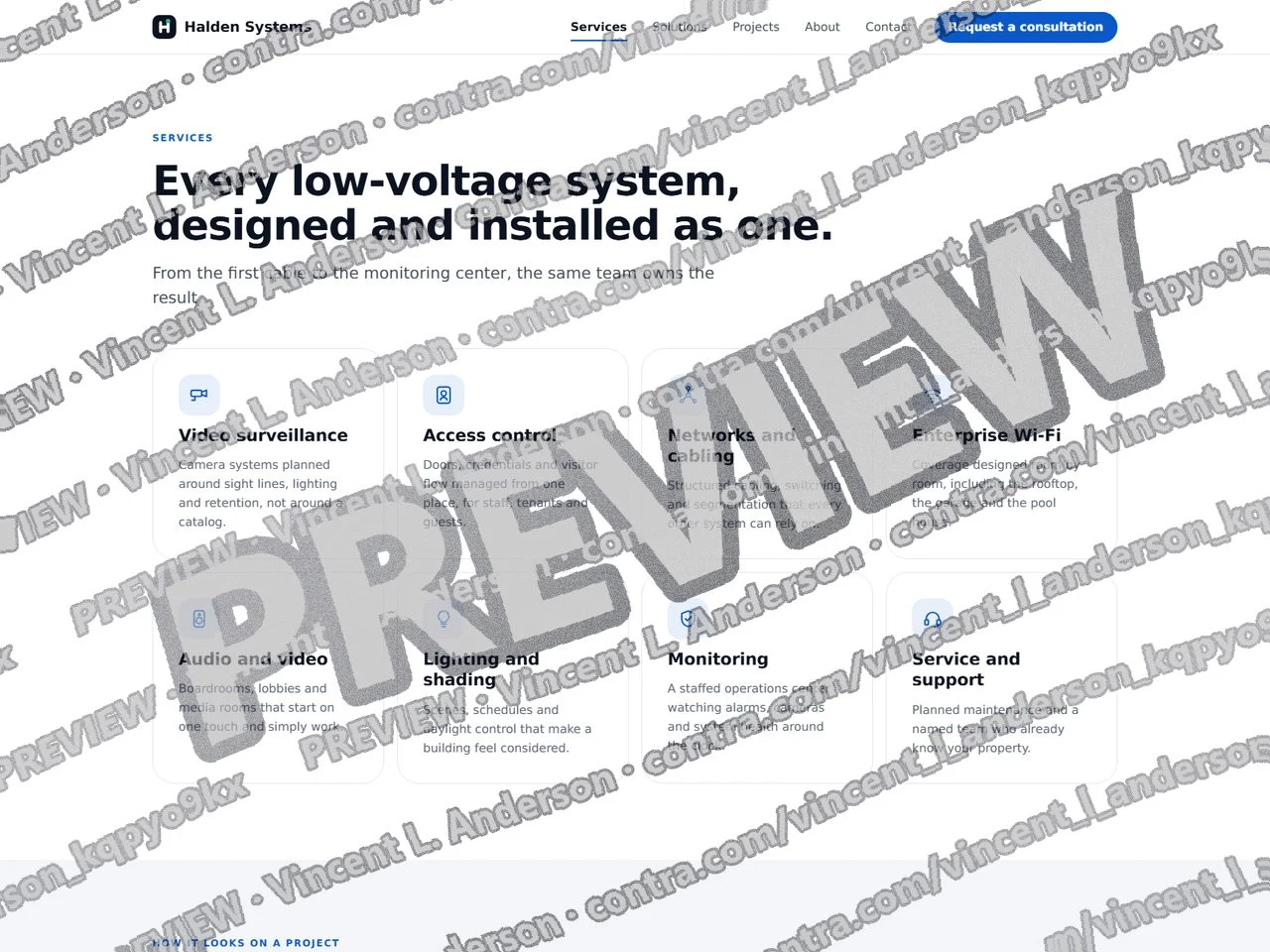
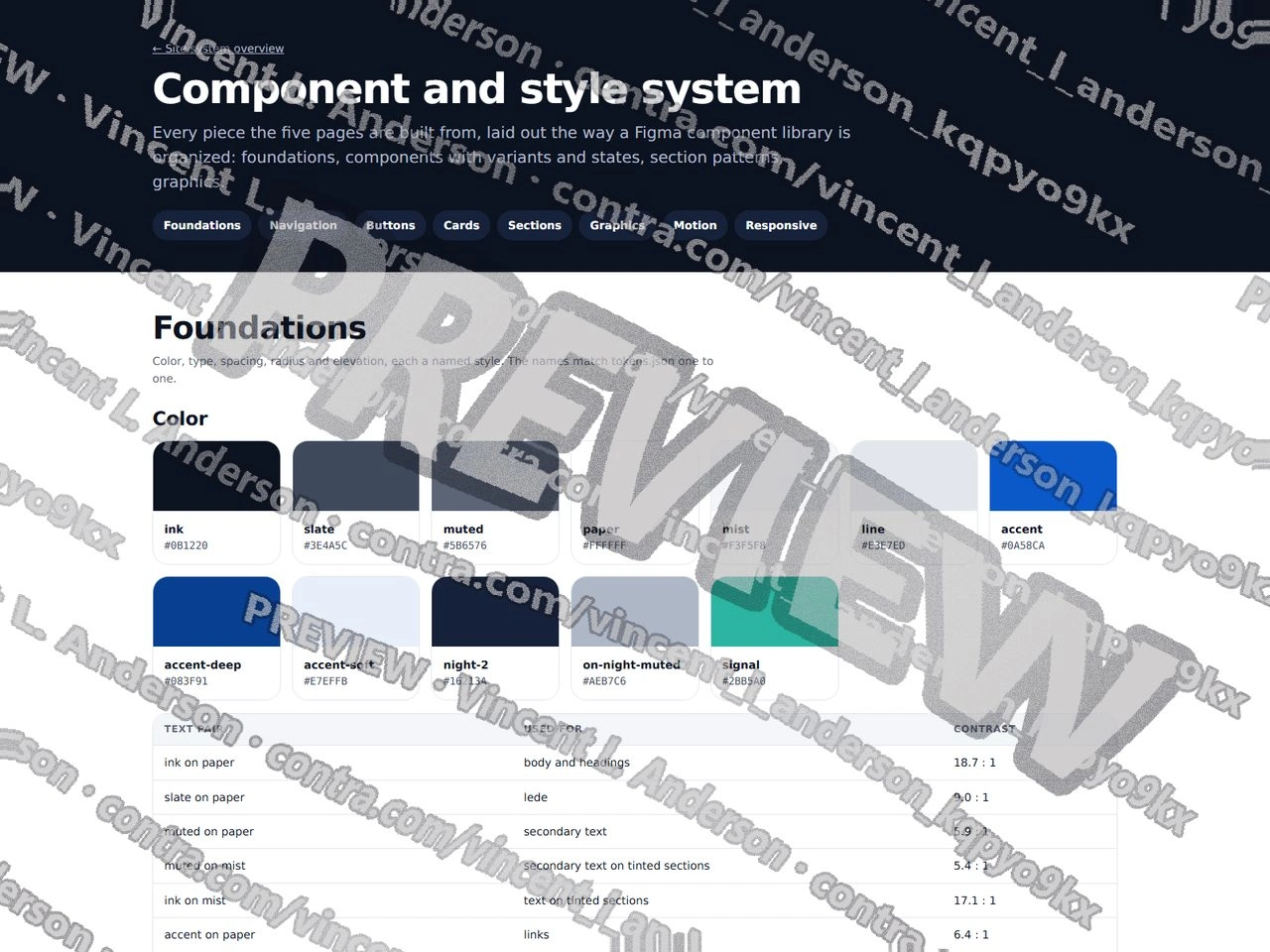
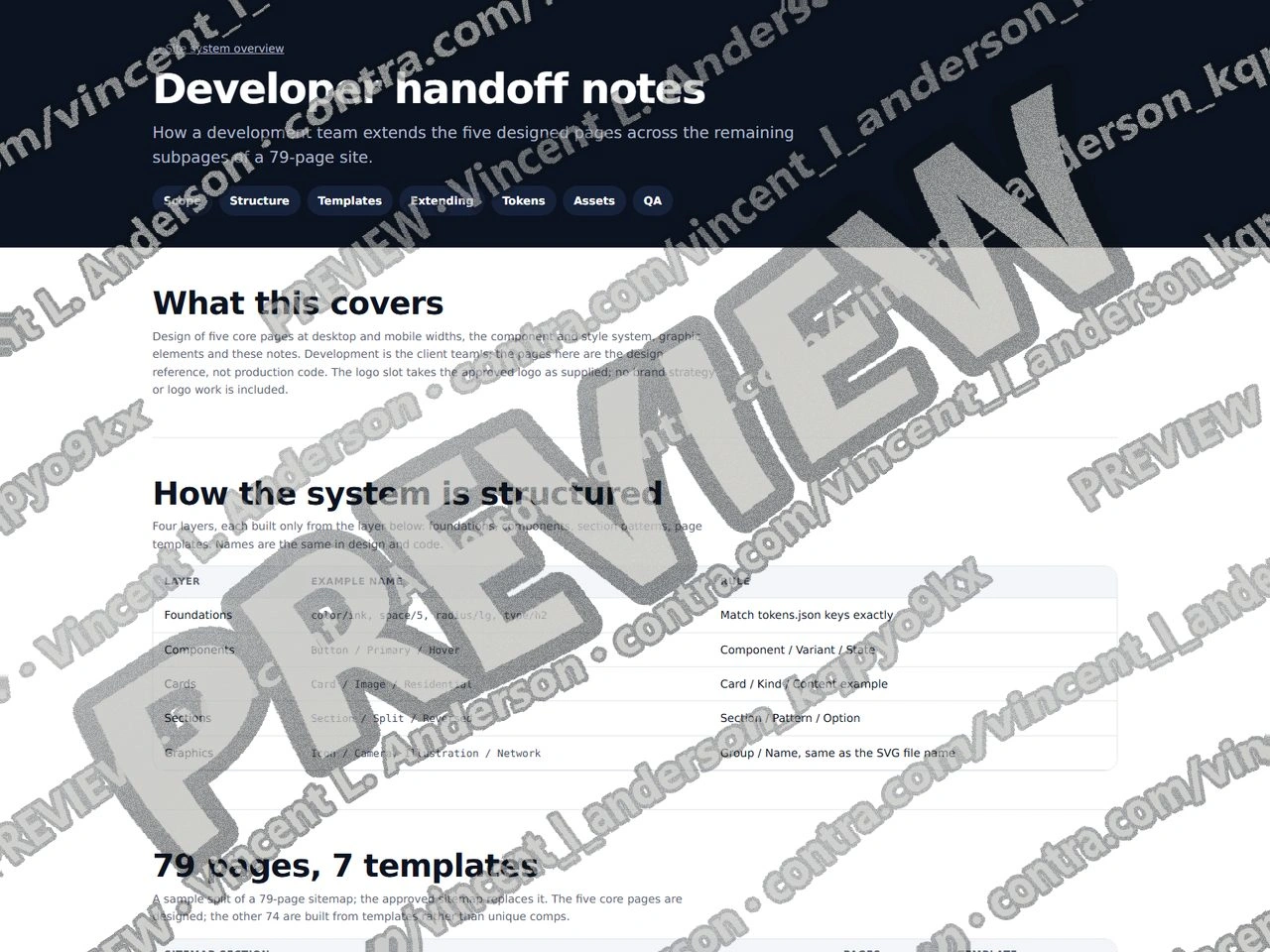
I built five core pages for Halden Systems, a fictional security and systems integrator: Homepage, Services hub, Solutions hub, About and Contact, each designed at 1440 px desktop and 390 px phone width. Every page is assembled from one component and style system laid out like a Figma component library: 12 colors with 15 checked text pairs (lowest 5.4:1), 9 type styles, 10 spacing steps, 5 radii, 4 button variants in 4 states, navigation for both widths, 7 card kinds, 9 section patterns, restrained hover and motion concepts, and responsive behavior notes. Inside cards and sections sit 23 original graphic elements (12 icons, 2 diagrams, 4 service illustrations, 3 stat treatments, 2 branded compositions), each also an editable SVG, plus 6 photo slots framed for client photography. Developer handoff notes cover naming, a proposed 79-page sitemap mapped onto 7 templates, steps to build a new subpage, tokens and a QA list. Copy and figures are illustrative.
Five core pages and a site system for a security integrator 1
Five core pages and a site system for a security integrator 2
Five core pages and a site system for a security integrator 3
Like this project
Posted Sep 23, 2026
Homepage, Services hub, Solutions hub, About and Contact for a fictional security integrator at desktop and phone width, built from one component library with original card graphics and developer handoff notes for a 79-page sitemap.
Likes
0
Views
1