Fluxo Landing Page Design
Ifeoluwa Adegbulugbe
The Brand
FLUXO is a San Francisco-based AI-powered workflow automation platform built for high-velocity teams who refuse to waste time on busywork. Founded by former product managers tired of spending 60% of their day copying data between tools, Fluxo makes enterprise-grade automation accessible to non-technical teams through intelligent AI suggestions and a visual no-code builder. With 500+ integrations, SOC 2 certification, and a mission to eliminate repetitive work, Fluxo stands apart through its human-first approach: technology that adapts to how teams actually work, not the other way around.
My Design Impact
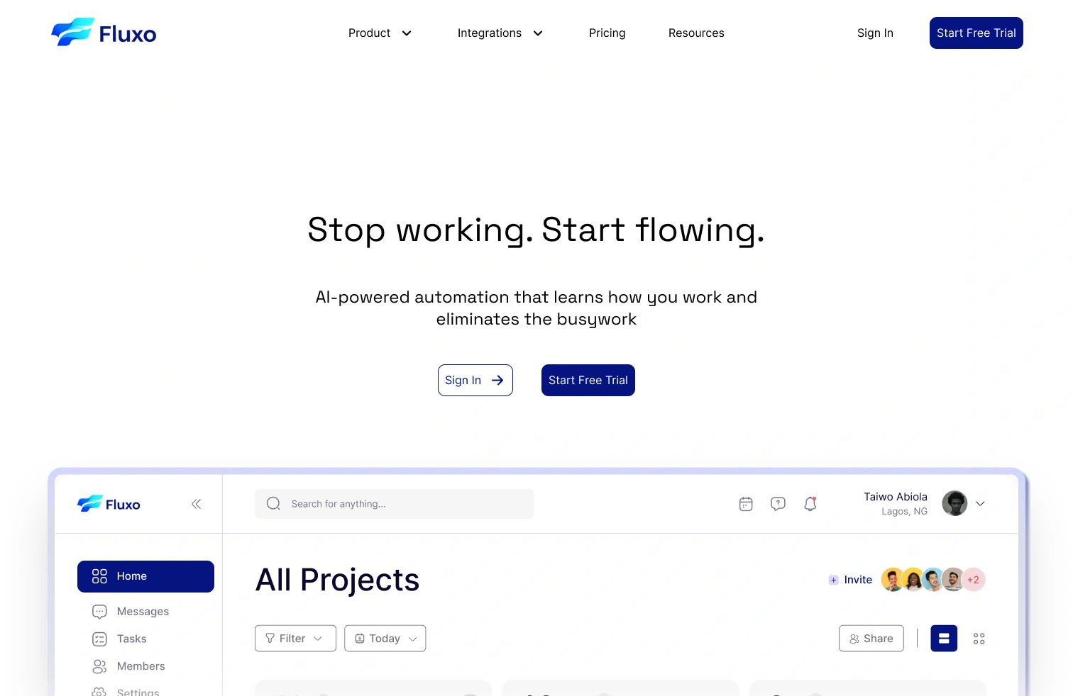
I'm currently designing FLUXO's landing page experience, starting with a hero section that balances bold messaging with product clarity. The hero features a clean, minimalist approach with the headline "Stop working. Start flowing." in large, confident typography that immediately communicates the core value proposition. I kept the headline to exactly 32 characters (including spaces and punctuation) to maintain visual impact while ensuring readability across all devices. Below the headline, I crafted a concise subheadline that explains the product in plain language: "AI-powered automation that learns how you work and eliminates the busywork." This subheadline stays within optimal length for scanning while delivering clear product understanding without jargon. I designed dual CTAs with "Sign In" as a secondary ghost button with an arrow icon for returning users, and "Start Free Trial" as the primary action in deep navy blue, creating clear hierarchy and reducing decision friction. The layout uses generous whitespace and center alignment to create focus and breathing room, letting the message land without distraction or visual competition. Below the fold, I integrated a large product screenshot showcasing the actual Fluxo interface with a subtle glassmorphic border treatment and elevated shadow that adds depth and premium feel without overdoing effects. The screenshot displays a clean dashboard with "All Projects" as the main view, collaborative features like color-coded team member avatars with a "+2" indicator, and intuitive left-sidebar navigation including Home, Messages, Tasks, Members, and Settings, giving visitors an immediate understanding of the product's organization and team-centric features. The interface preview shows real, functional UI elements like filter dropdowns, "Today" date selectors, "Share" buttons, and a compact grid icon menu, making the product feel tangible, production-ready, and immediately usable rather than conceptual or vaporware. My navigation design uses a clean horizontal layout with subtle dropdown indicators on "Product" and "Integrations," keeping the header minimal while suggesting content depth. The right side of the nav features "Sign In" in simple text and "Start Free Trial" in a rounded navy button, maintaining CTA consistency between header and hero. The Fluxo logo uses a modern layered gradient icon (vibrant blue to cyan creating a flowing wave effect) paired with clean sans-serif wordmark, establishing strong brand identity and the "flow" concept without overwhelming the minimal aesthetic.
Currently Delivered: Hero section design with bold 32-character headline, 88-character benefit-driven subheadline, strategic dual CTAs, generous whitespace, and large in-context product preview that builds immediate trust through UI transparency and real feature visibility. Full landing page coming soon.
Like this project
Posted Nov 5, 2025
I'm currently designing FLUXO's landing page experience, starting with a hero section that balances bold messaging with product clarity.
Likes
1
Views
9
Timeline
Nov 3, 2025 - Nov 3, 2025