WHY MELBS?
Why Melbourne was an initiative by Enterprise Victoria
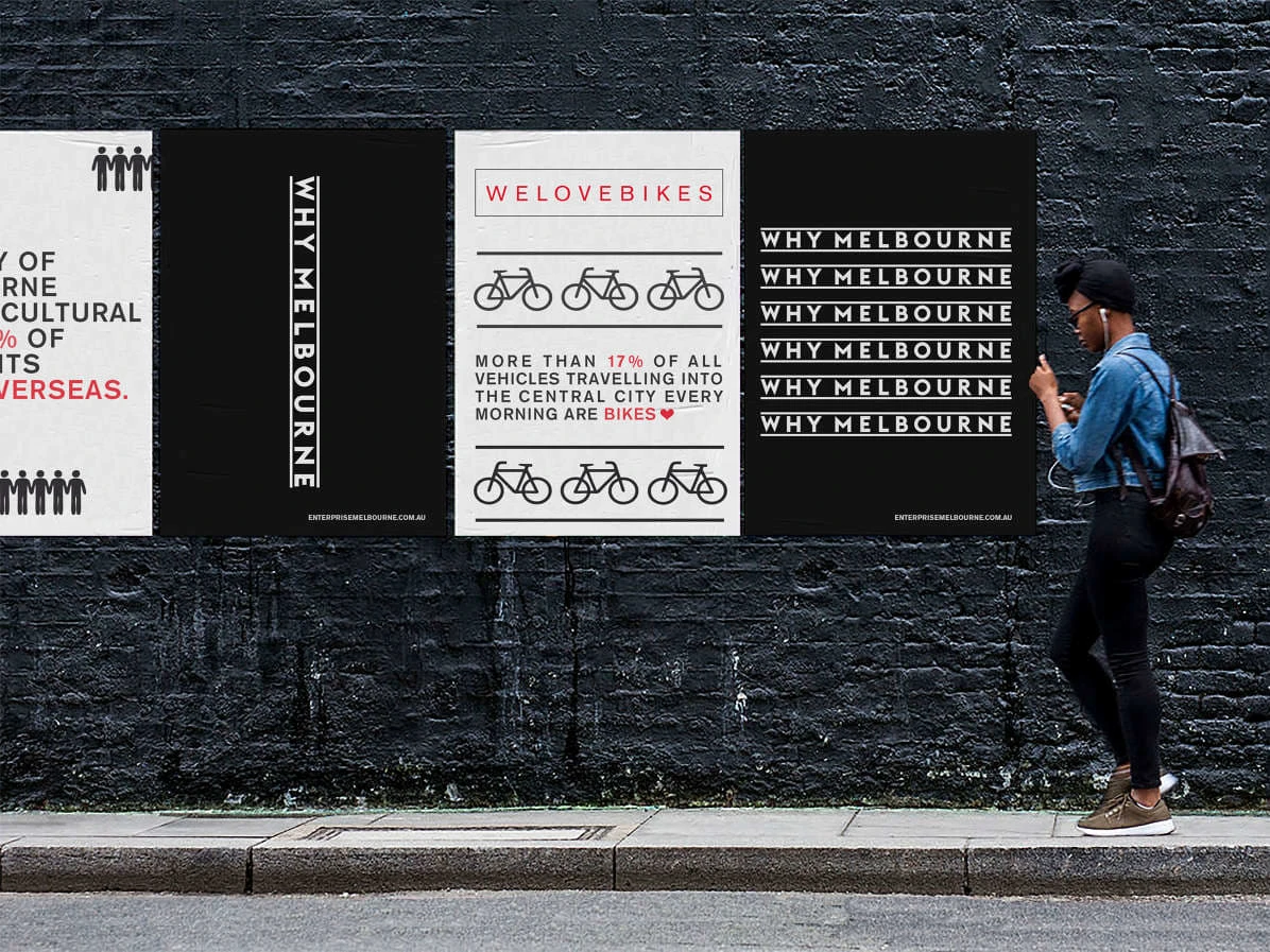
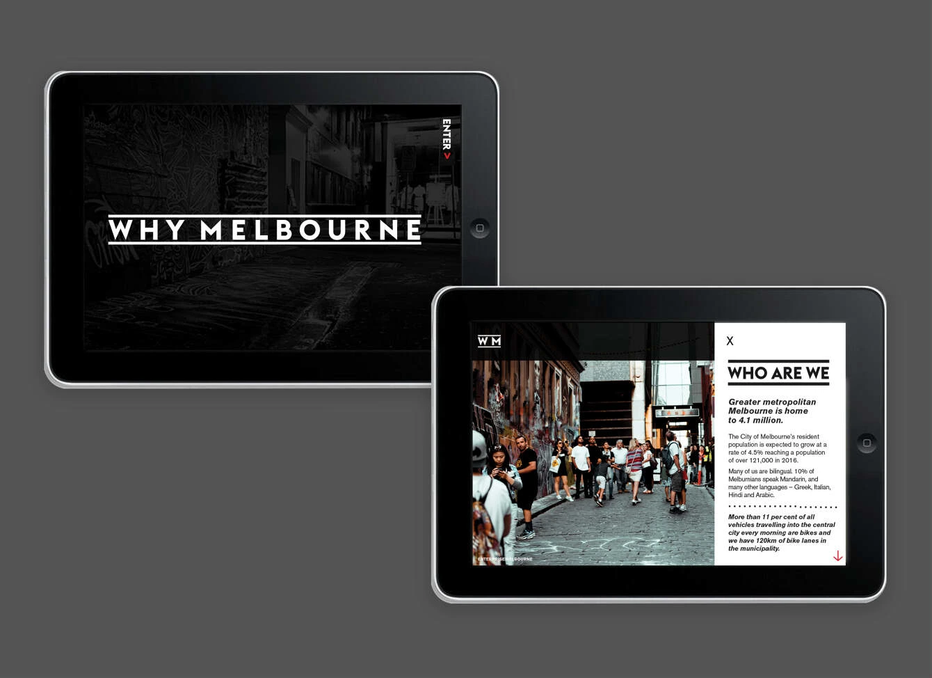
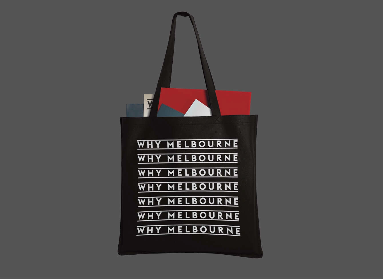
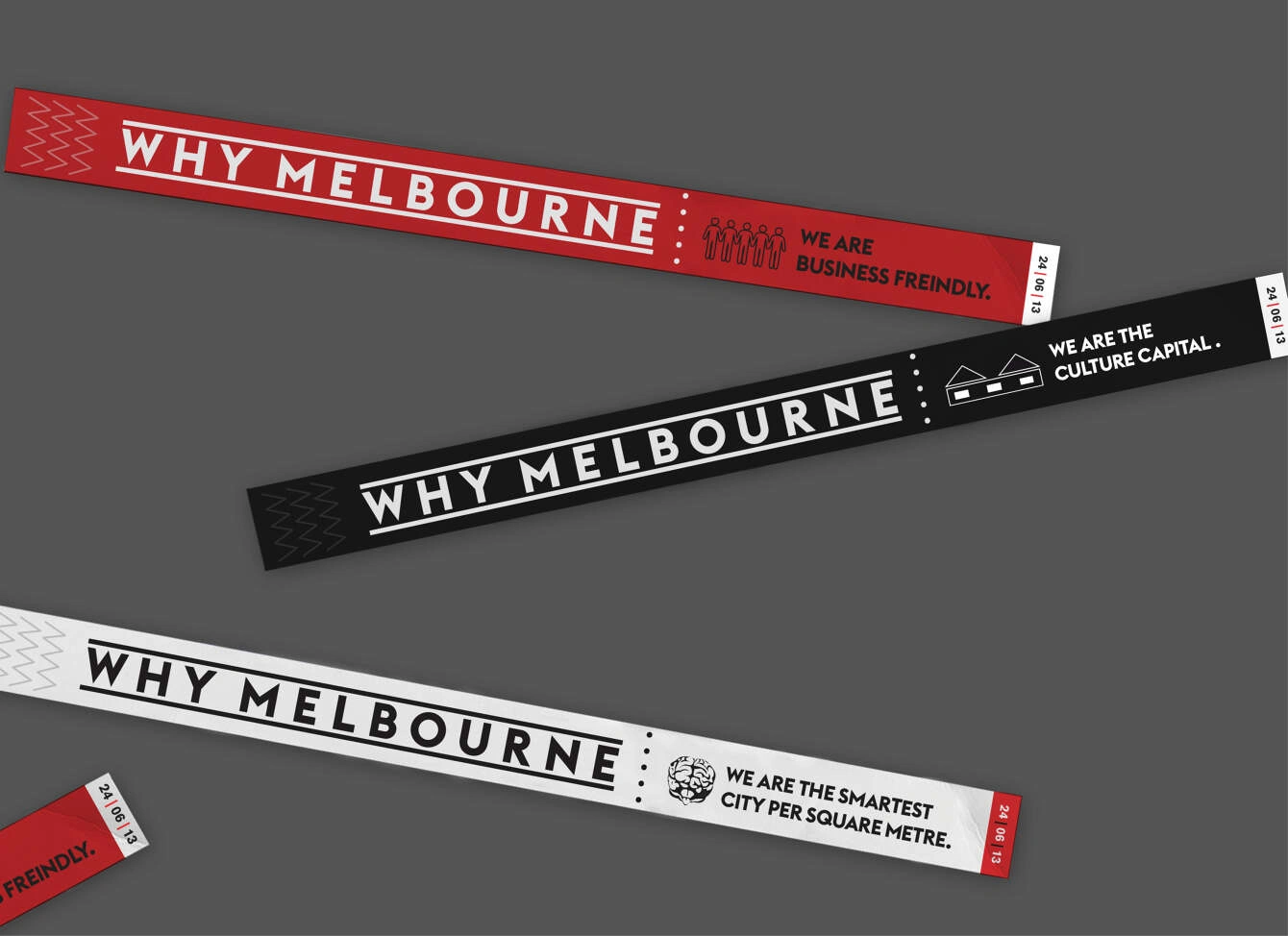
to get people to go and visit this culturally diverse city. A simple wordmark was created which used two thick graphic lines on either side of it. These two elements represented the many laneways that the city was known for.
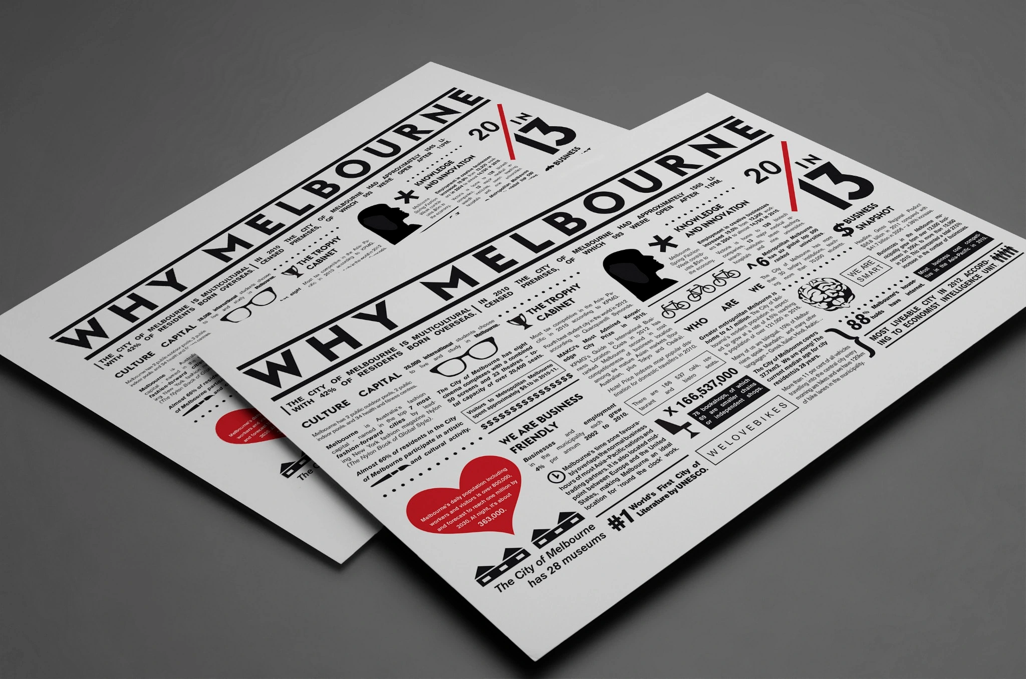
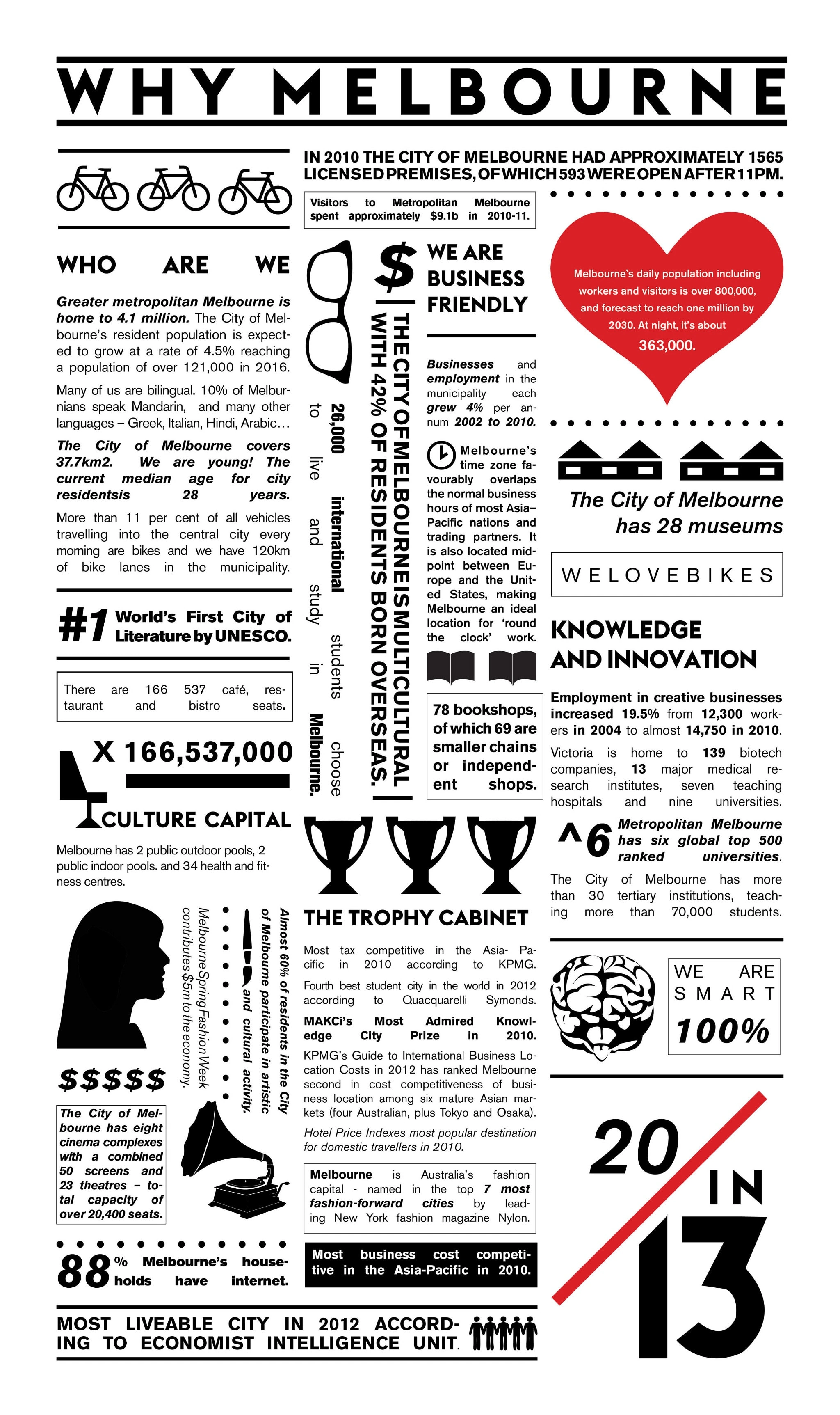
Some collateral for the event was designed and based on a newspaper layout due to a large number of facts and information that needed to be displayed. Two modern Swiss fonts were implemented throughout the design to give the brand’s design language a more contemporary look and feel.
Credits
Published in Design Annual (Brand Section)
Like this project
Posted Mar 8, 2022
Why Melbourne was an initiative by Enterprise Victoria to get people to go and visit this culturally diverse city.


