Printivo Platform Redesign
Mudia Imasuen
The Context
Launched in 2014, Printivo pioneered the web-to-print industry in Nigeria, empowering thousands of SMEs and individuals to create custom merchandise and stationery with ease.
The Challenge
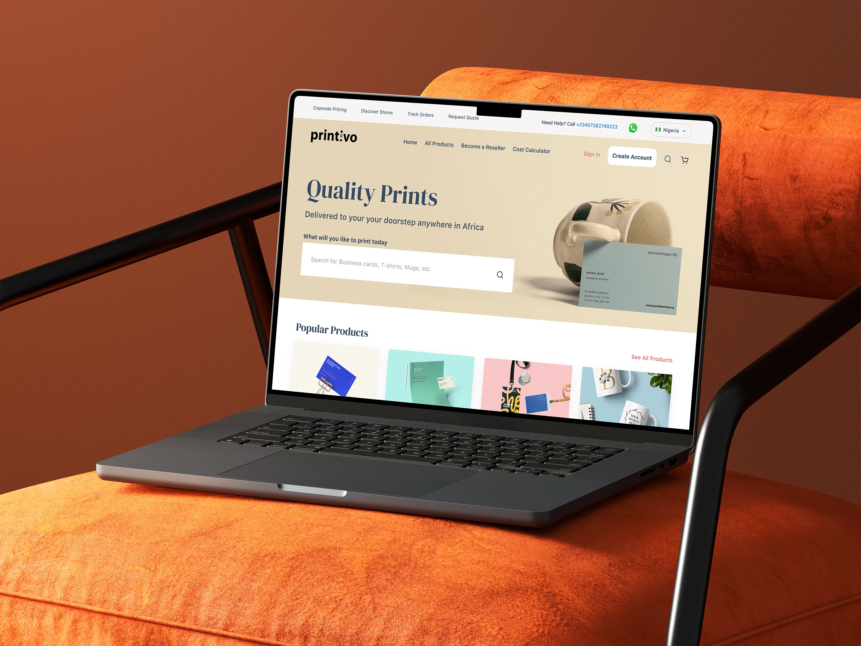
While the platform had successfully served over 25,000 customers, user feedback and analytics revealed friction points in the digital journey. As the market matured, the need to evolve from a "functional" tool to a "seamless" experience became critical.
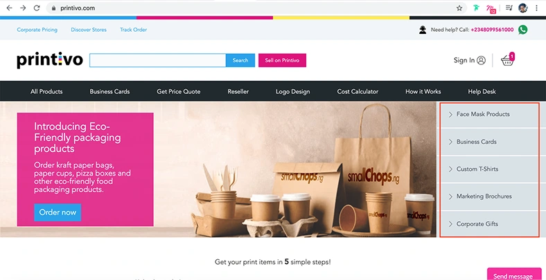
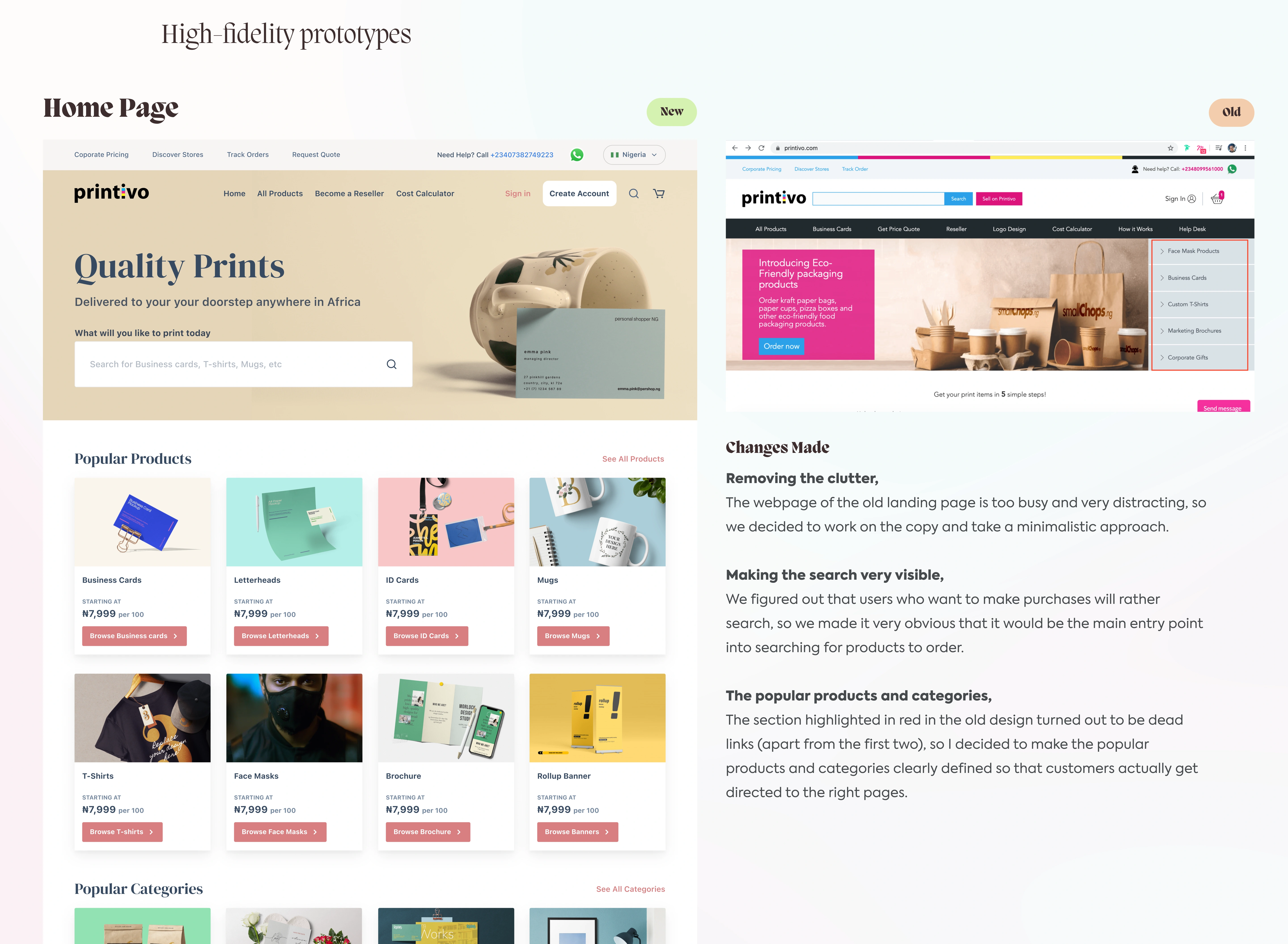
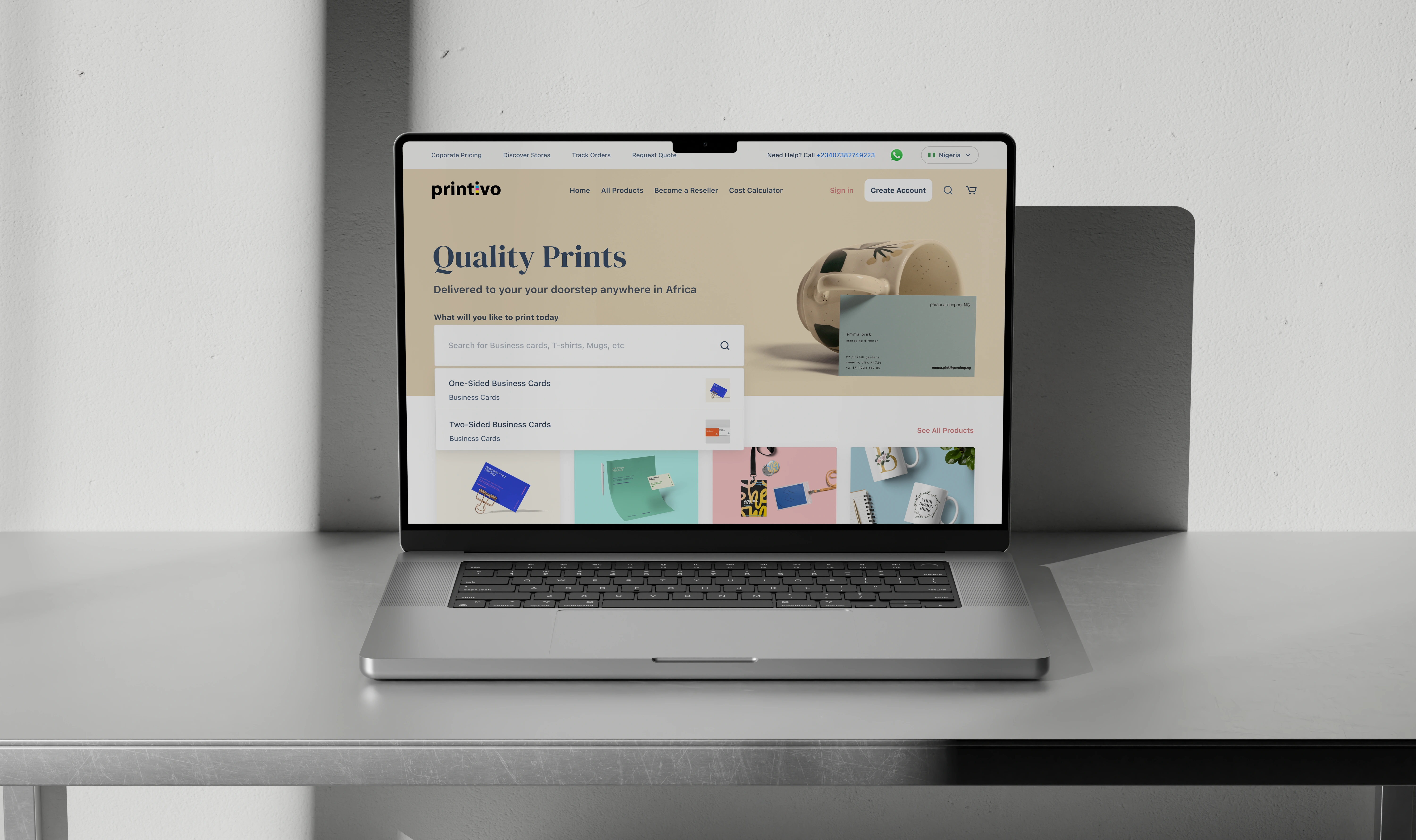
Old website design that was purely functional
My Role
I was tasked with redesigning the digital experience to boost conversion rates for new users while increasing retention for the platform's loyal customer base. Essentially, by focusing on usability and intuitive design, I worked to streamline the ordering process, ensuring that the platform wasn't just accessible, but delightful for both first-time visitors and power users.
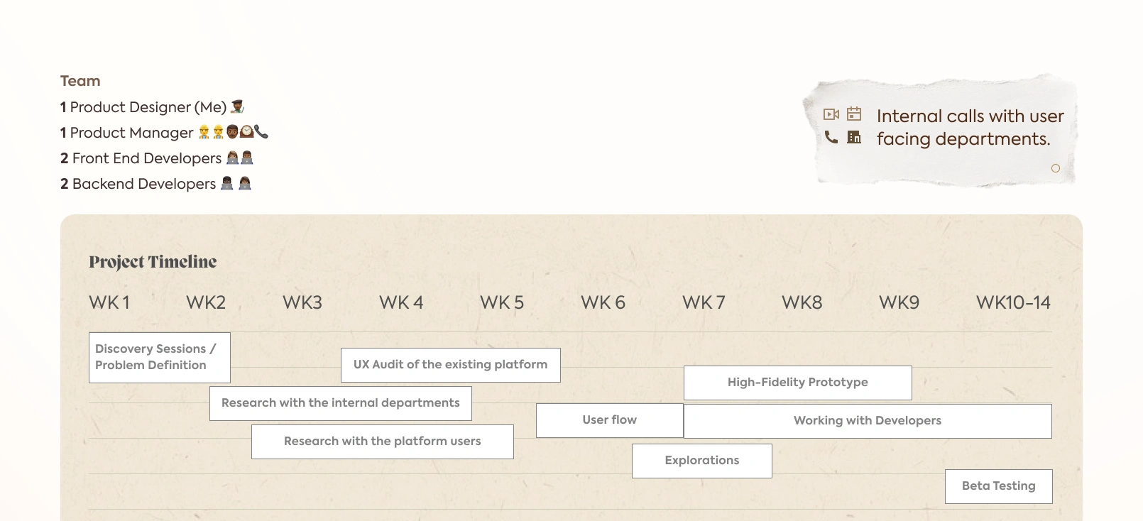
Project Timeline
Research & Methodology
Leading the design on this 14-week project, I worked alongside a Product Manager and a team of four developers. My goal wasn't just to "redesign" the UI, but to understand why users were bypassing the platform's core features.
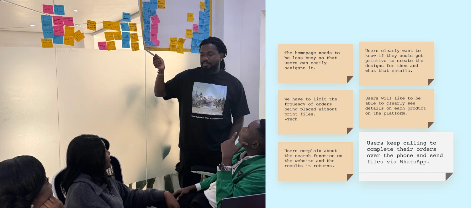
I started by "following the noise." I spoke with the Customer Care and Tech teams to identify where the system was breaking down. Simultaneously, I reached out to frequent customers and Twitter volunteers to observe real-world usage.
Research
Uncovering the "WhatsApp Loophole"
The most critical insight came from triangulating data between Customer Care and our users. We found that the website was failing to build trust.
The Problem: Users felt the product details were confusing and didn't trust the site to handle their custom designs.
The Workaround: Instead of checking out online, users would use the site to "window shop," then call support and finish the transaction manually via WhatsApp.
This discovery became the cornerstone of our redesign: we needed to stop users from needing a workaround and give them the confidence to complete their orders digitally.
Redesigning Search for Discoverability
Research showed that users often struggled to find products, leading to support calls. To solve this, I overhauled the search experience to be proactive rather than reactive.
Search
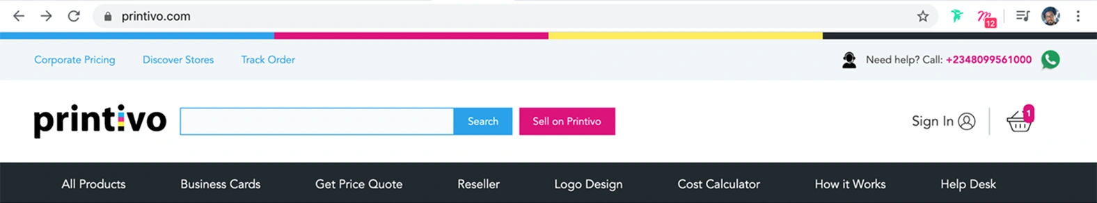
Old "Search" functionality
Predictive Search: Replaced the static input with a dynamic suggestion engine, reducing cognitive load and preventing 'zero result' errors caused by typos.
Categorized Output: Designed a tabulated results page that separates 'Products' from 'Categories,' ensuring users don't get lost in a long, unorganized list.
Fail-Safe Design: Created a friendly empty state for unsuccessful searches that guides users back to the homepage or encourages them to call support, reducing bounce rates.
Instead of a dead end, the new 'No Results' page acts as a safety net. It offers a friendly message and a customer care number, acknowledging the user's frustration and offering an immediate offline solution, that way it is up to the business to fullfil that special order thereby giving it a chance to retain the customer for a lifetime.
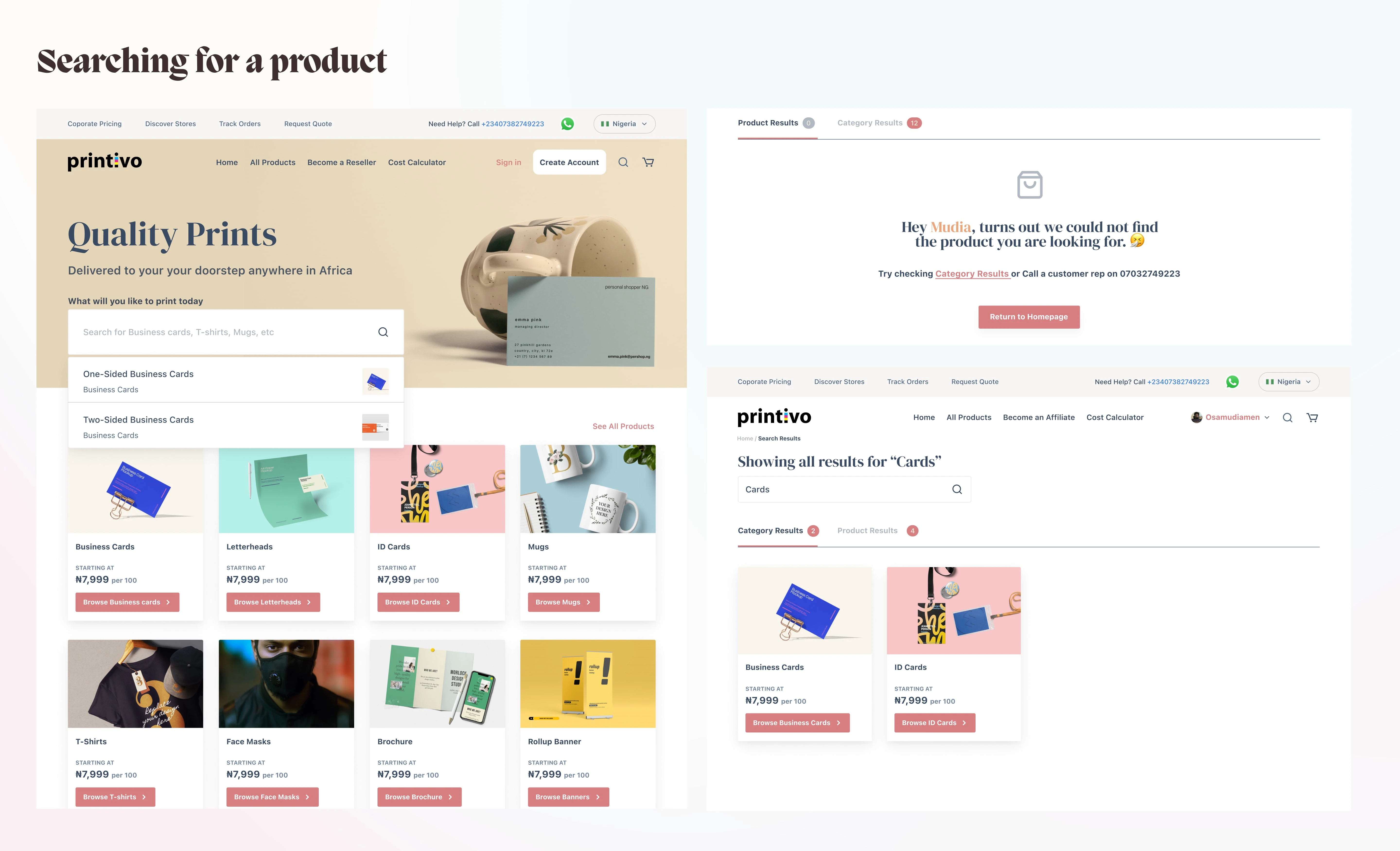
The "Search" functionality
Revamping the Product Catalog
The legacy design presented products in a grid that felt cluttered and hard to read. I shifted to a structured layout that leverages typography to differentiate between the product name, starting price, and key features. This makes the browsing experience feel like a curated menu rather than a raw database.
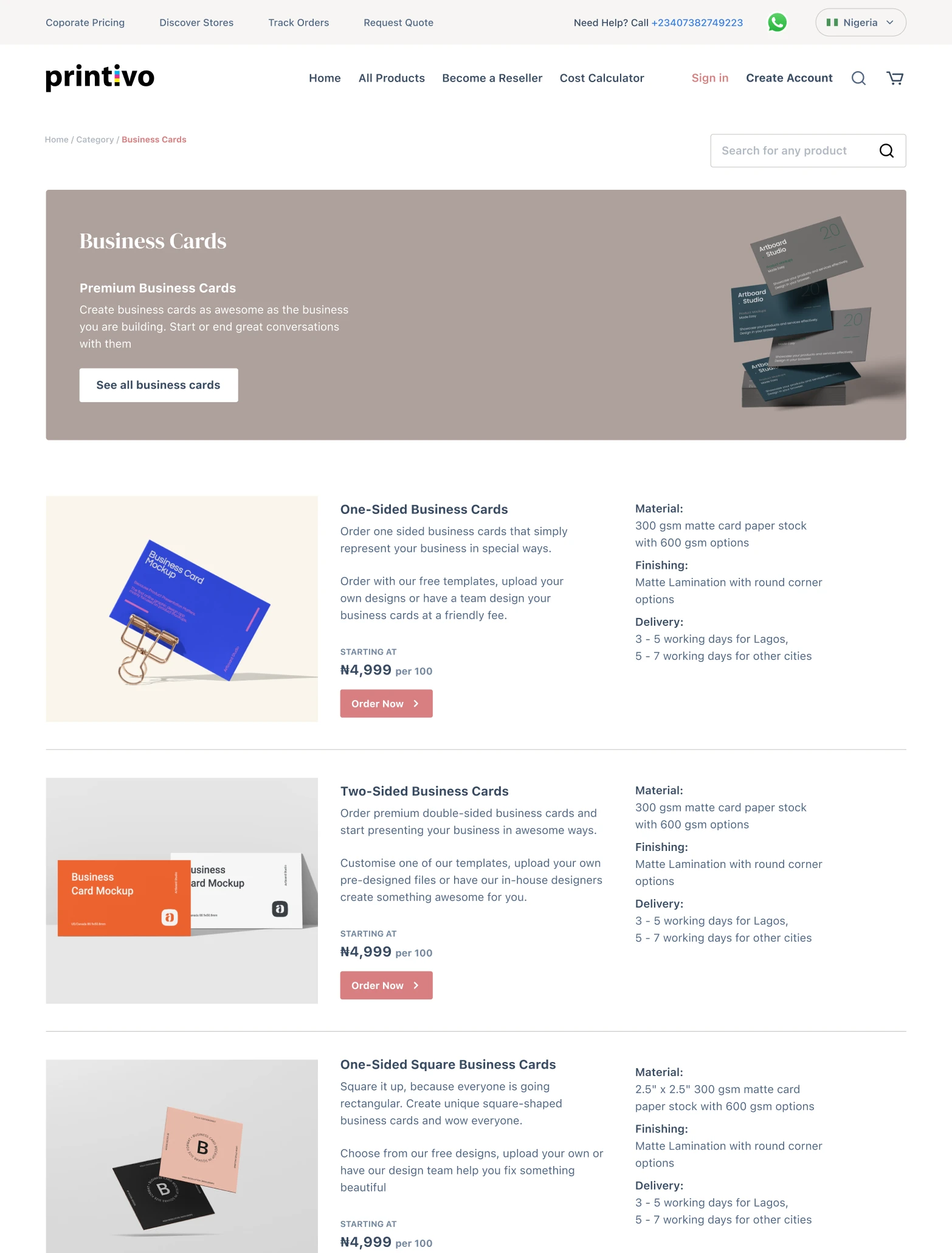
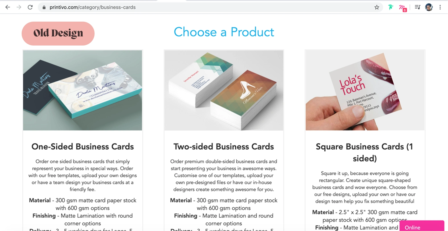
Old Product Category
Contextual Product Details
Users shouldn't have to guess what they are buying. I added a dedicated description section to every product page, giving users a second chance to verify specs, such as paper thickness and finishing options, right before the place their order.
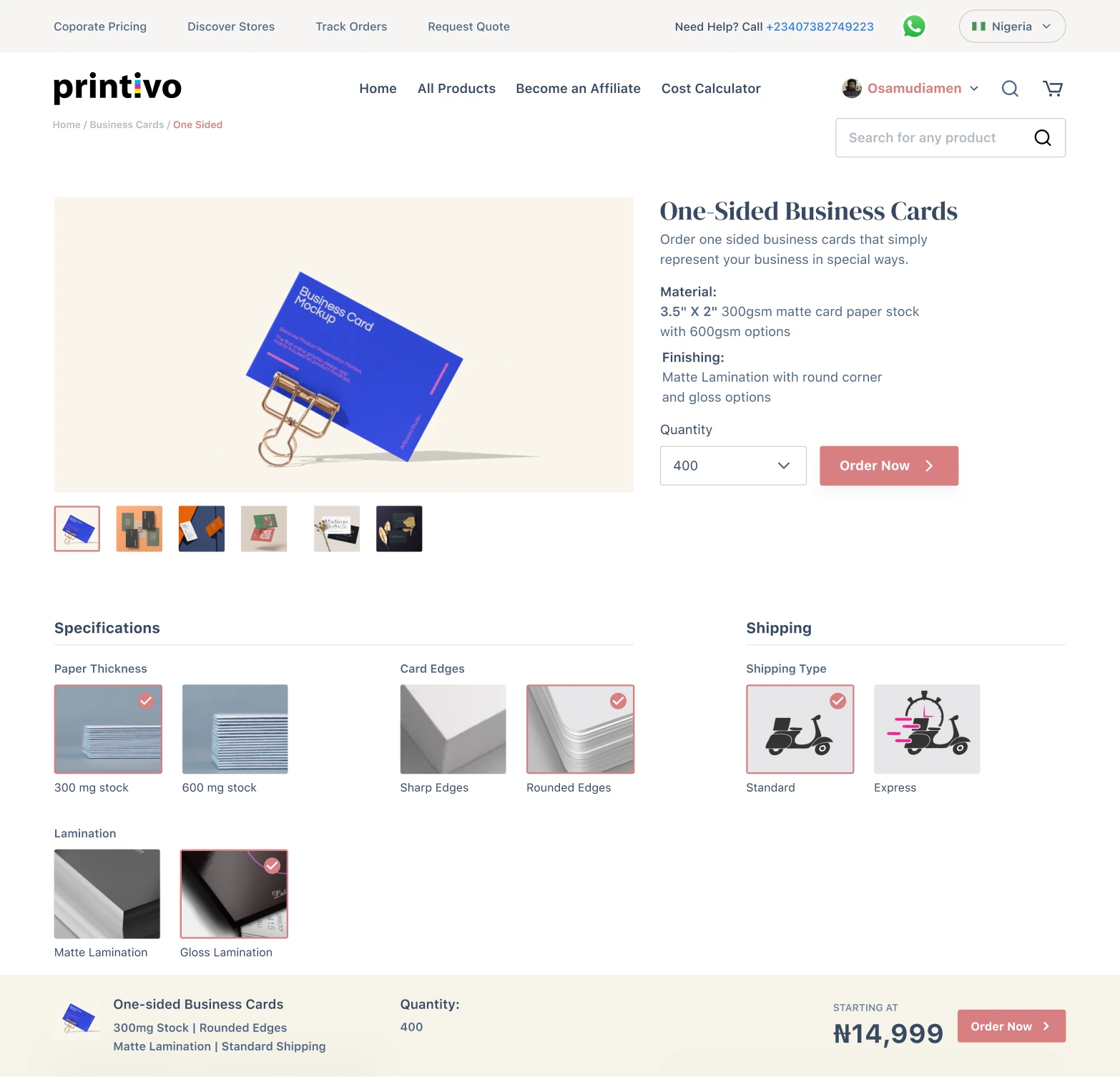
Granular product specs selection
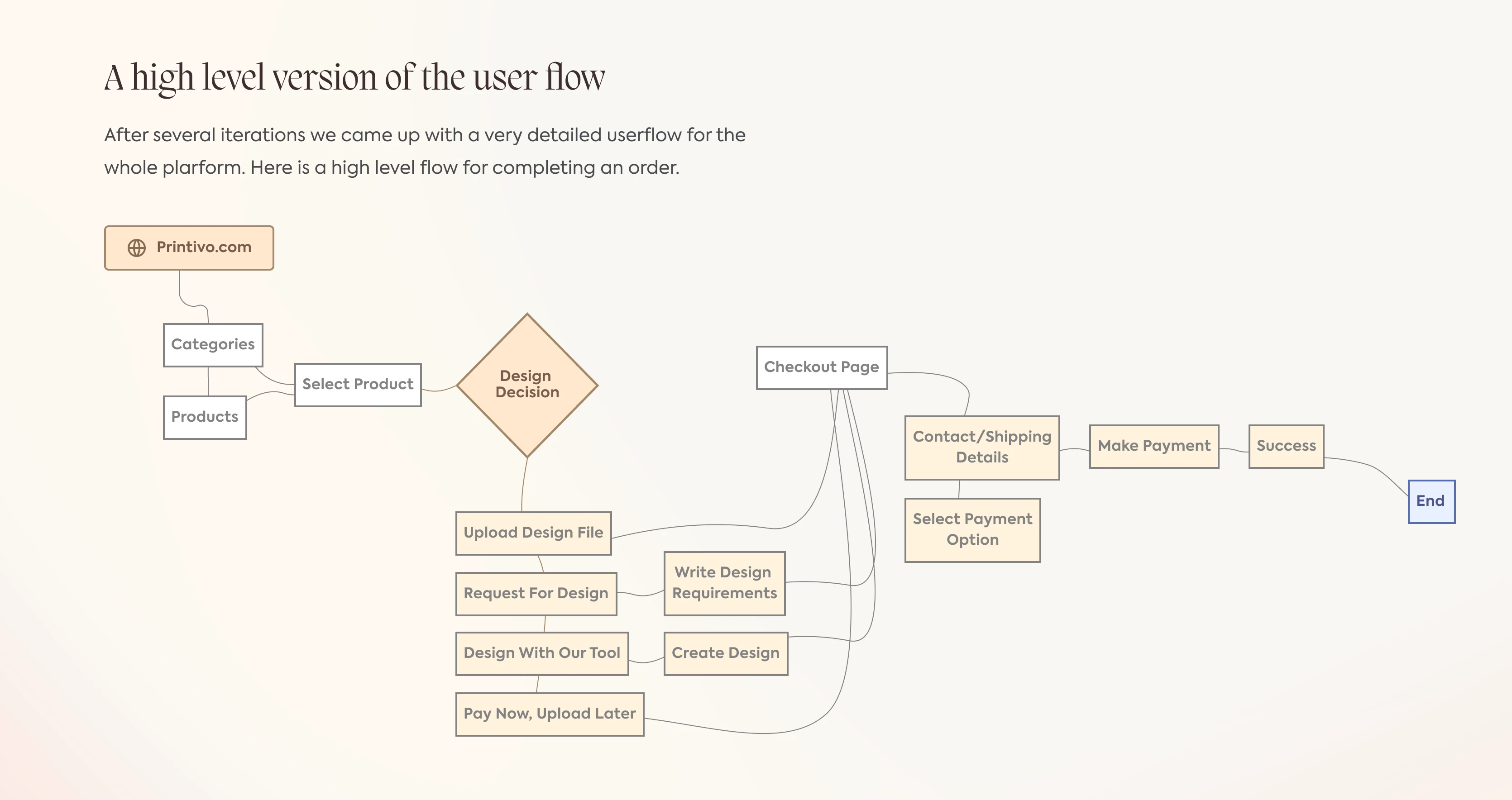
Removing the "Modal Trap"
The old 'Order Now' modal was a friction point; it was easy to dismiss accidentally and cramped for mobile users. I unbundled this process into a full-page selection step. This not only minimized blank request errors but also made the choice between 'Uploading a File' vs. 'Using the Editor' much clearer.
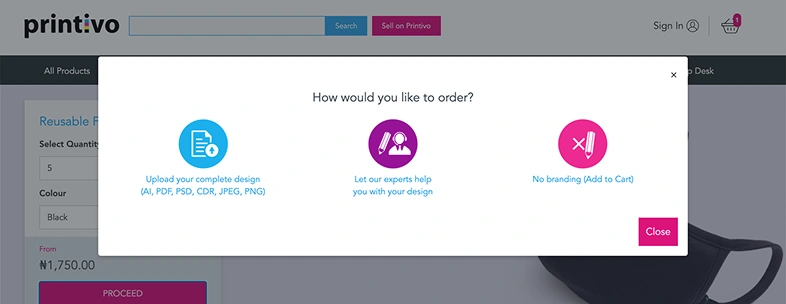
The old Modal Trap
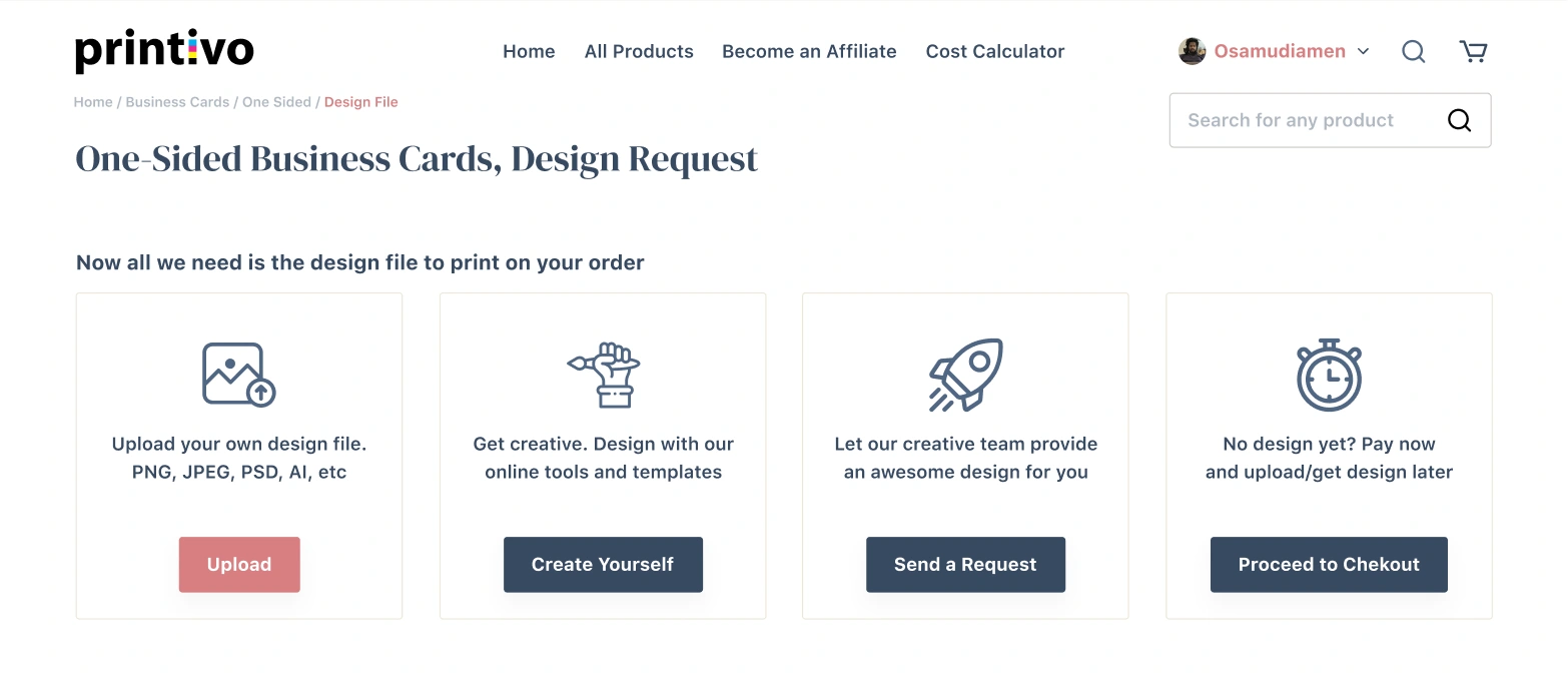
The Redesign
By ditching the modal, we treated the 'Design Decision' as a primary step in the user journey, not just an afterthought.
Design System & Developer Handoff
To bridge the gap between design and engineering, I didn't wait until the end of the project to hand over assets. Instead, I collaborated with the development team to build a modular design system parallel to the high-fidelity design phase.
By defining core components, such as input fields with comprehensive states (default, focused, error, success) and standardized button hierarchies, we created a 'source of truth.' This documentation allowed the developers to start building the frontend framework early, significantly reducing the feedback loop and accelerating the final build time.
Style Guide Basics
The Impact
The redesign delivered immediate, measurable results. By solving the usability issues that forced users off-platform, we successfully retained traffic that was previously lost. Post-launch analytics revealed a massive drop in bounce rate, plummeting to 10.72%, while average session duration increased by over 2 minutes.
Key Outcomes:
User Growth: Average monthly users grew by 80%.
Acquisition: New user sign-ups increased by 60.08%.
Retention: Bounce rate drastically reduced from ~80% to 10.72%.
Conclusion
Venturing into the Web-to-Print space for the first time was a unique challenge. This project reinforced that the best design solutions come from stepping away from the screen and talking to the people on the front lines, customer support and the users themselves. By aligning business goals with user needs, we didn't just make the site look better; we made it work better."
Like this project
Posted Jan 14, 2026
Revamped Printivo’s UX to streamline the path to purchase, significantly enhancing both user conversion and customer loyalty.
Likes
0
Views
1
Timeline
Aug 4, 2020 - Nov 12, 2020
Clients
Printivo