Built with Framer
Bellori | Restaurant Branding & Website Design

Zoe P.

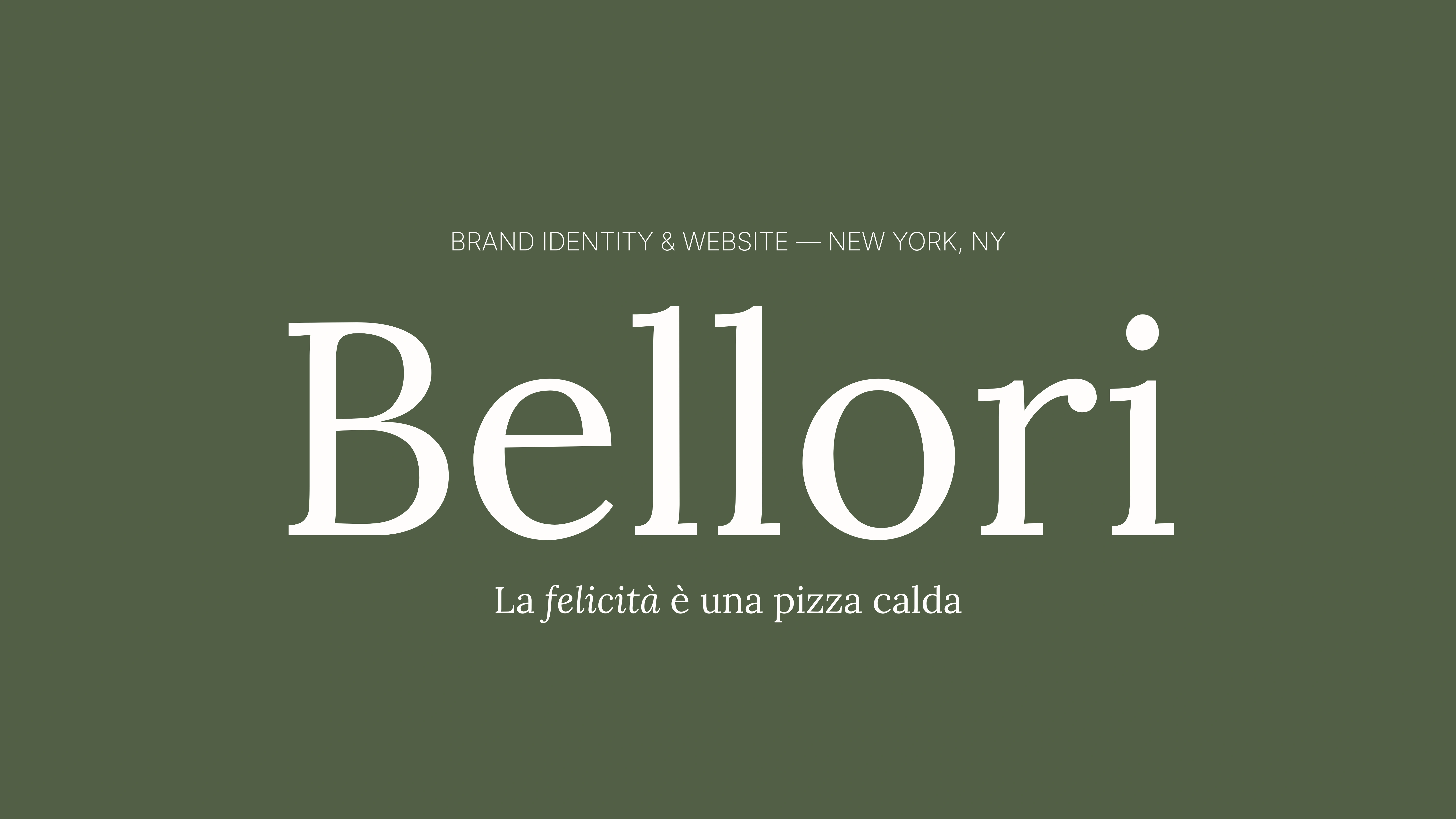
Role: Brand & Web Designer | Platform:Framer | Scope: Identity & Website
01 - Overview
A brand-new pizzeria, built on a decades-old family story.
Bellori is the family's own surname, and the name of the olive grove they've kept for generations. The brief: build the entire identity from zero, then carry it into a website that feels like the dining room itself.
02 - The Brief
Traditional, yet cozy. Elegant, not fussy.
✕What they rejected: "costume-Italian" visuals.
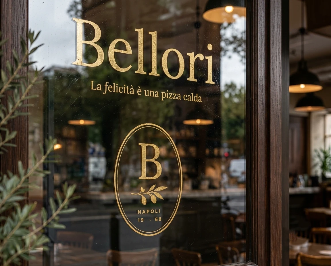
✓What they wanted: A mark that felt like a family seal, something that could've existed decades before the restaurant did.
✓The real constraint: The identity had to carry the family's story, not just "a pizza brand."
03 - Research & Inspiration
From pizza branding to family heraldry.
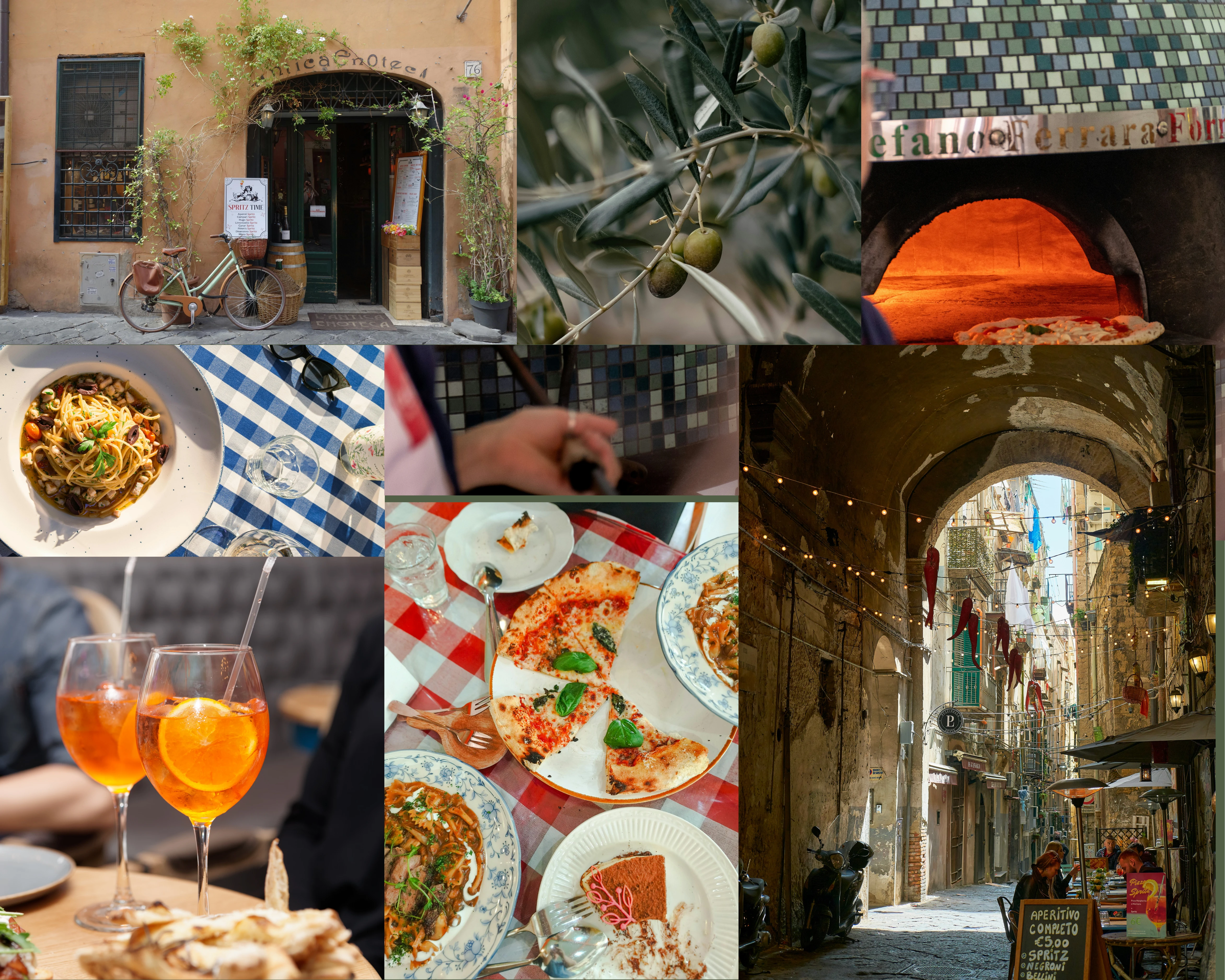
The moodboard moved towards wax seals, monograms, and hand-painted Neapolitan trattoria signage. The olive branch tied the mark directly to the family's actual grove.
04 - Brand Identity
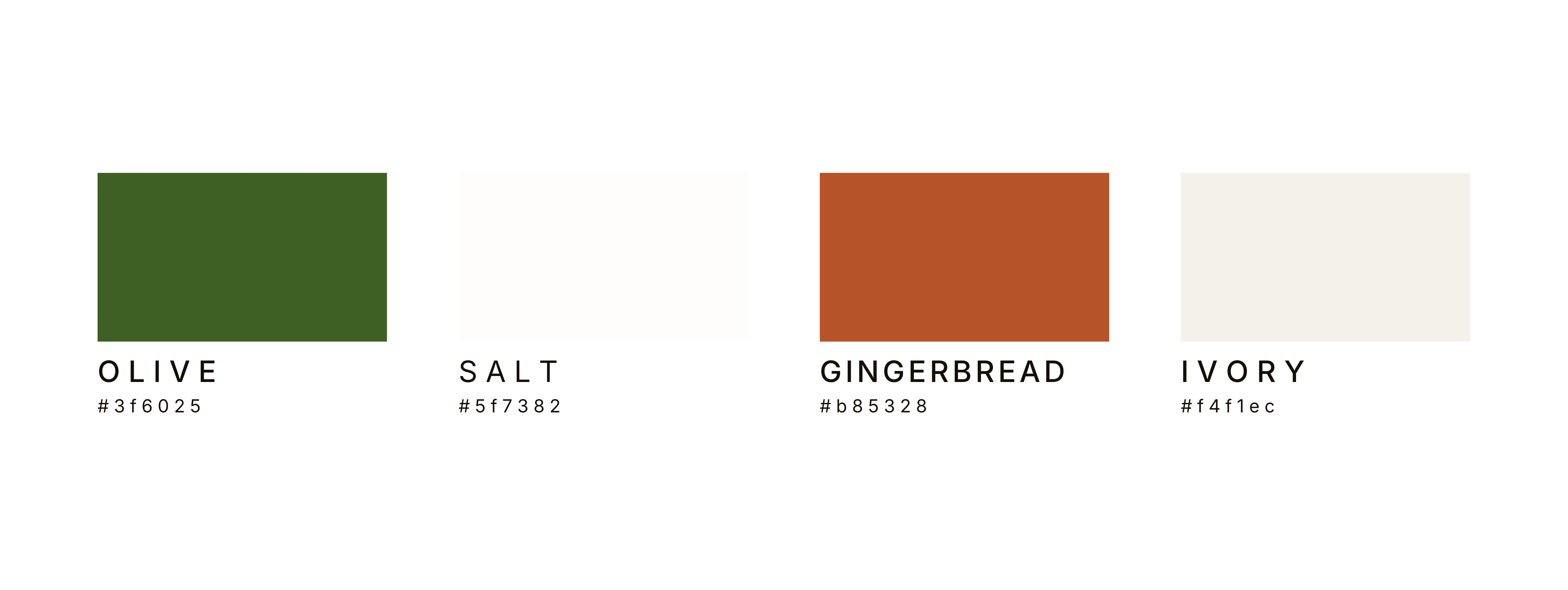
The mark, the palette, the type system.
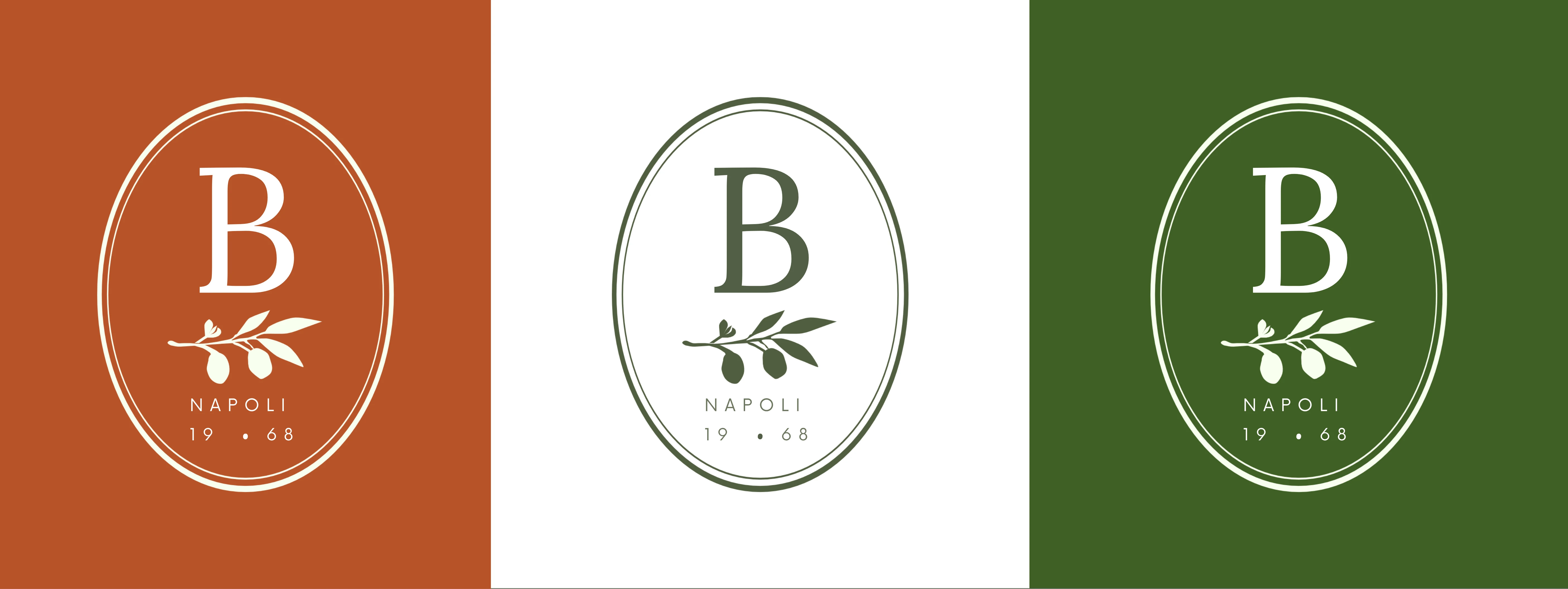
The oval badge reads as a seal of approval before it reads as a logo. Three color variants keep the mark usable across signage, print, and social.

05 - Website
The identity, translated into a scroll.
Like this project
Posted Jun 20, 2026
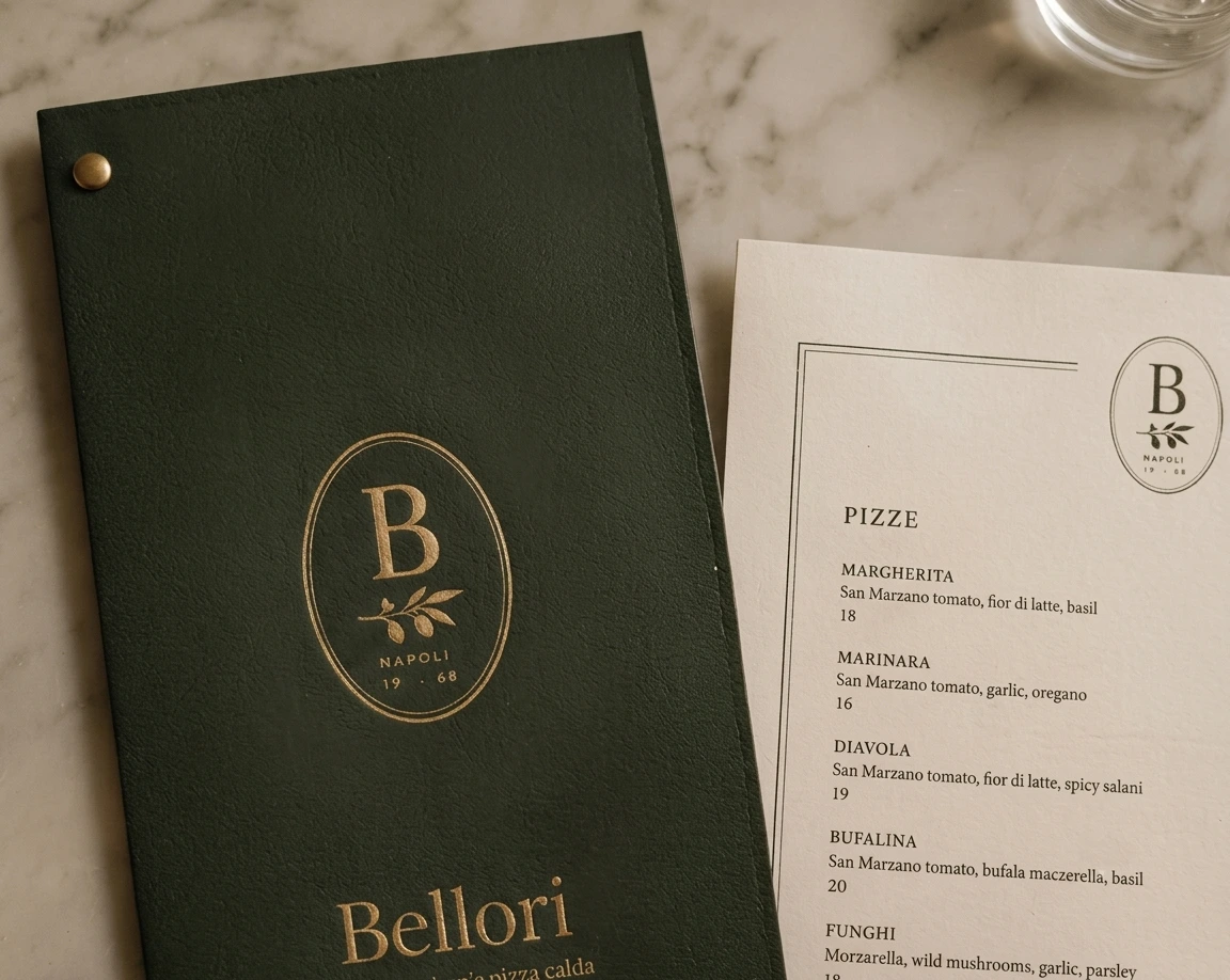
The goal was to capture that high-end culinary narrative without sacrificing conversion metrics. It merges editorial layouts with immersive visual storytelling.
Likes
1
Views
23
Timeline
Mar 4, 2026 - Mar 25, 2026