Safeli
Overview
For my DECO3200 (Interactive Product Design Studio) capstone project, we developed a digital solution to empower women to confidently and safely commute around Sydney.
My Role
Research - For discovery research, I conducted online ethnography and interviews and led the qualitative data analysis phase.
UX/UI Design - Contributed to ideating and iterating our design concepts through sketching and prototyping. I worked closely with developing our conceptual outcomes and fleshing out the user flow, while supporting with prototyping and and UI refinements.
Usability Testing - I was responsible for planning how our usability testing sessions would run, and contributed to conducting a portion of these.
Project Background
At first glance, Sydney is generally regarded as a safe city to get around in, for locals and tourists alike. Yet when we we take a deeper look at the commuting experience from the perspective of women and girls in Sydney, extensive and often unheard recounts of negative experiences and safety concerns surface.
Through our rigorous research process, we found that most women often feel unsafe but don't have a way to confidently and effectively navigate this, reinforcing feelings of vulnerability. We wanted to change this by equipping women with the ability to take charge of their own safety at every step of their journey.
While policy makers and urban planners would play a crucial role in creating infrastructural changes that improve public safety on a wider scale, we wanted to empower women and girls in the here and now.
Our Solution: Safeli
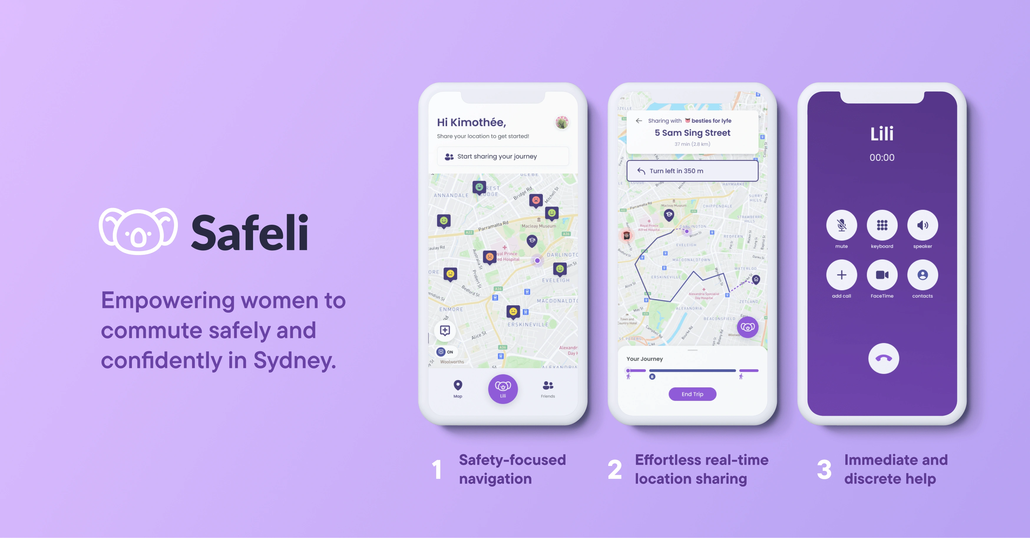
Safeli is digital mobile solution that empowers women with the tools and information to commute safely and confidently around Sydney.
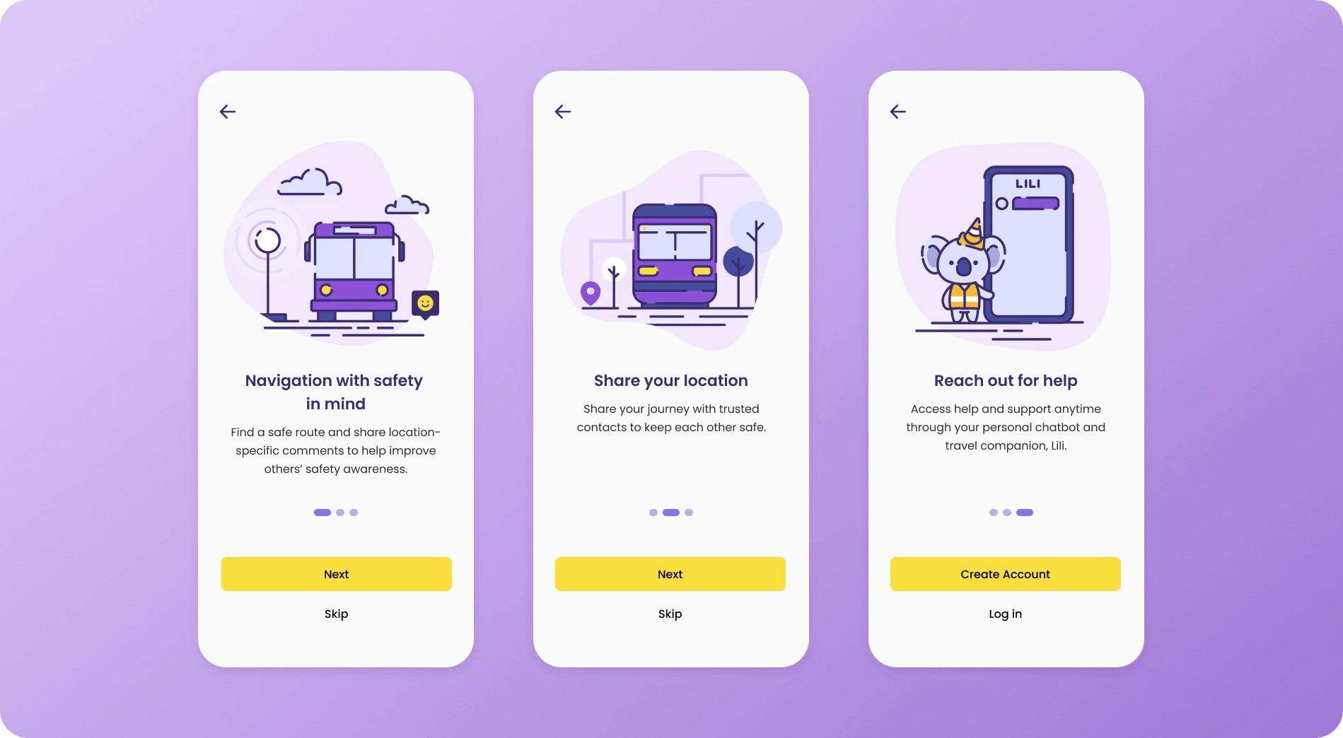
It integrates crowd-sourced data into the navigation experience to spread public safety awareness and utilises this to recommend safe routes for users. Real-time location sharing with trusted contacts is automatically streamlined into the commuting process, enabling supportive social interactions. Finally, users can conveniently access discrete methods for seeking help at any point in their journey through our helpful AI chatbot.
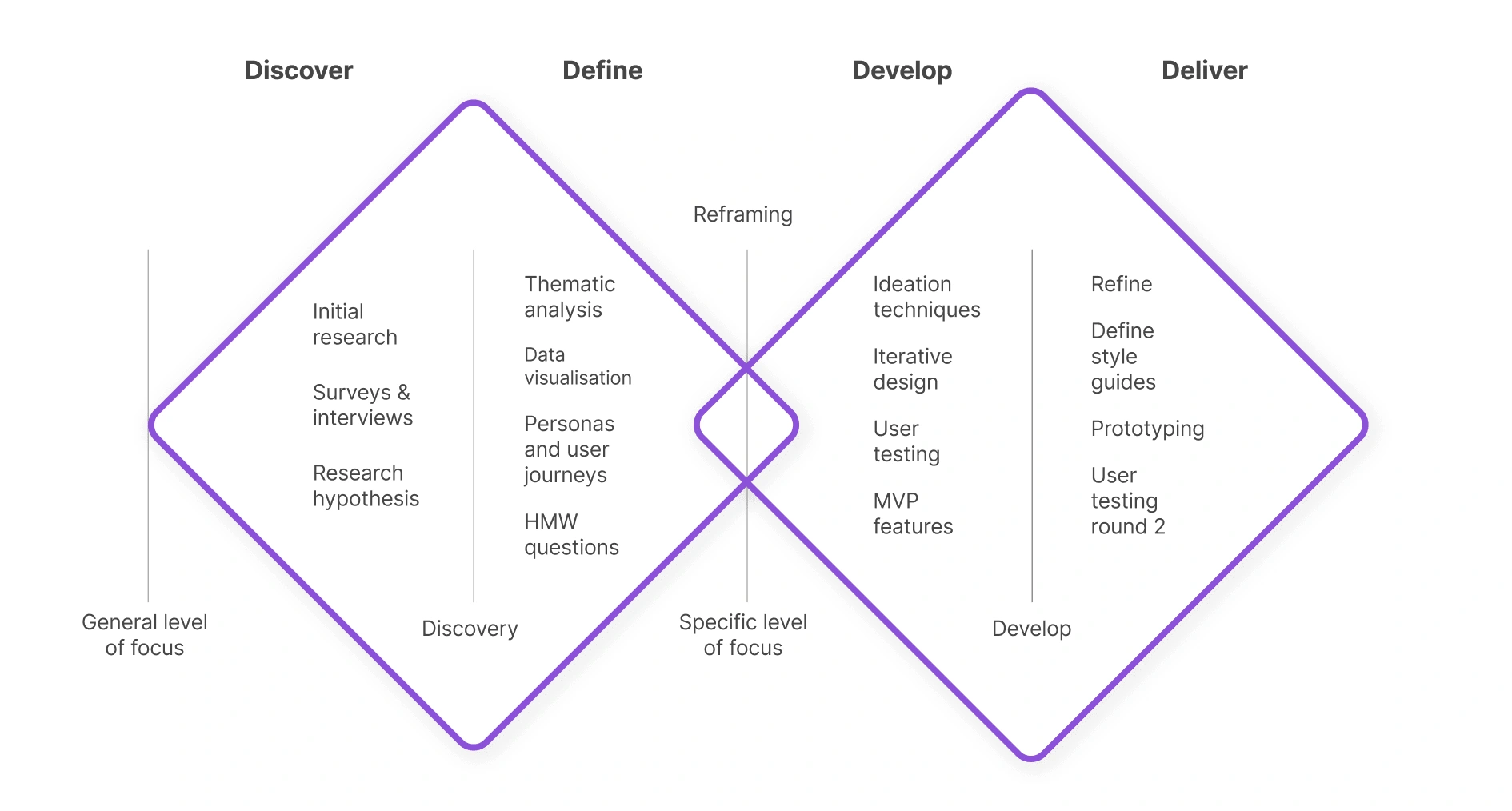
A snapshot of our design process
We followed an iterative design process structured into the stages of Discover, Define, Develop and Deliver. We began with an exploration of the chosen problem space, before reframing our problem based on core research insights. In our ideation phase, we combined our strongest concepts to be taken forward. This idea was developed through several iterations of prototyping and user testing before reaching the final solution.
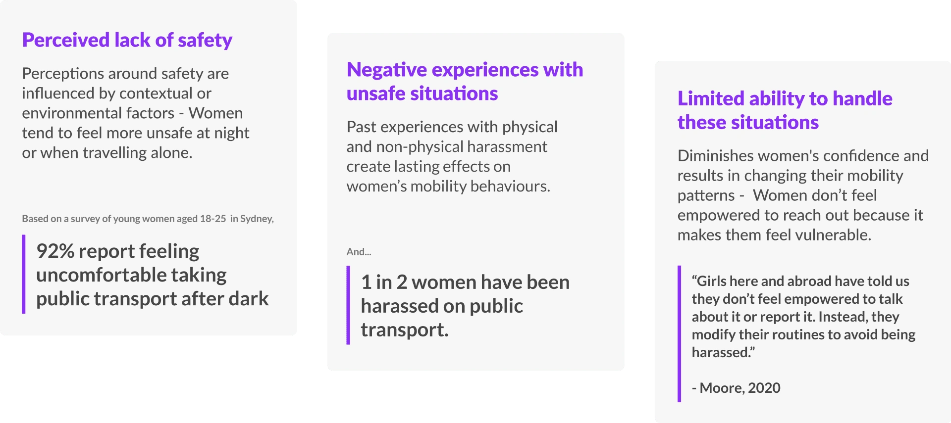
Breaking down the problem area through background research
We looked extensively at relevant statistics, news articles, and research case studies to navigate this broad problem space. Based on these preliminary findings, we broke down the issue into three key aspects to be further explored in primary research:
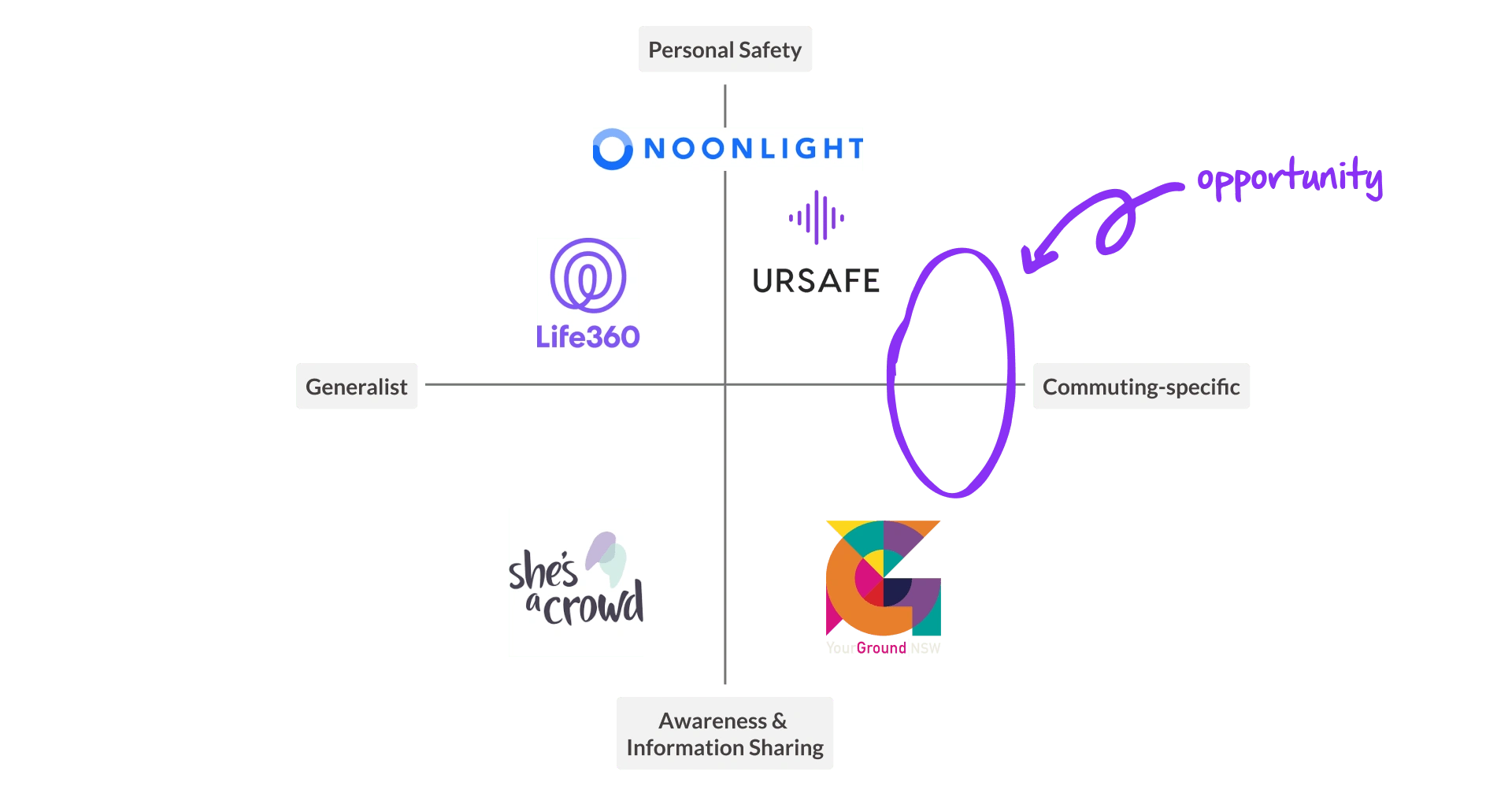
Identifying a gap in the market
Our competitor research revealed that existing solutions in the market are predominantly either 1) general personal safety tools or 2) platforms for sharing experiences and raising awareness at a high-level.
We found a gap in the market for a platform that is tailored specifically to the commuting experience, that integrates well into women's existing travel routines. There was an opportunity for a solution that bridges the utility of personal safety apps with collective public safety awareness.
User Research - A deep dive into the untold stories
We conducted primary research to holistically investigate women's experiences of commuting in Sydney, with a focus on understanding their behaviours, pain points and needs around safety. We drew up a research plan with the following research objectives and used a triangulation of 3 primary research methods.
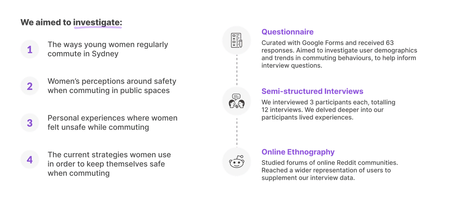
What came out of this was a cascade of often unspoken stories surrounding young women's lived experiences of feeling unsafe during their commute. As a group, we used Thematic Analysis to draw out rich and nuanced insights from our qualitative research.

Reframing the problem from a lens of vulnerability to empowerment
Across our research, it was found that women tended to perceive themselves from a position of vulnerability while commuting in public spaces. This was due to negative past experiences and a limited ability to effectively prevent and handle unsafe situations, leading many participants to feel “helpless” in the face of danger.
We realised that this same problem framing of women being 'vulnerable' and needing support was one that we had originally adopted, limiting our solution space. In order to overcome this perception barrier, we reframed it into one that placed women in a position of strength and focused on empowering women to be confident in moving out and about.
How might we empower women with the tools to confidently make informed decisions about their own safety while commuting in their day-to-day?
Ideation - How can we best integrate safety directly within the commuting journey?
Based on the market gap, we needed to focus on ideating solutions that integrate into our users existing commuting behaviours, without the need to go out of their way. We wanted to ensure safety was built in to every step of their journey.
To ensure we considered all bases, we created a mind-map around the key themes as a springboard for our concept generation.
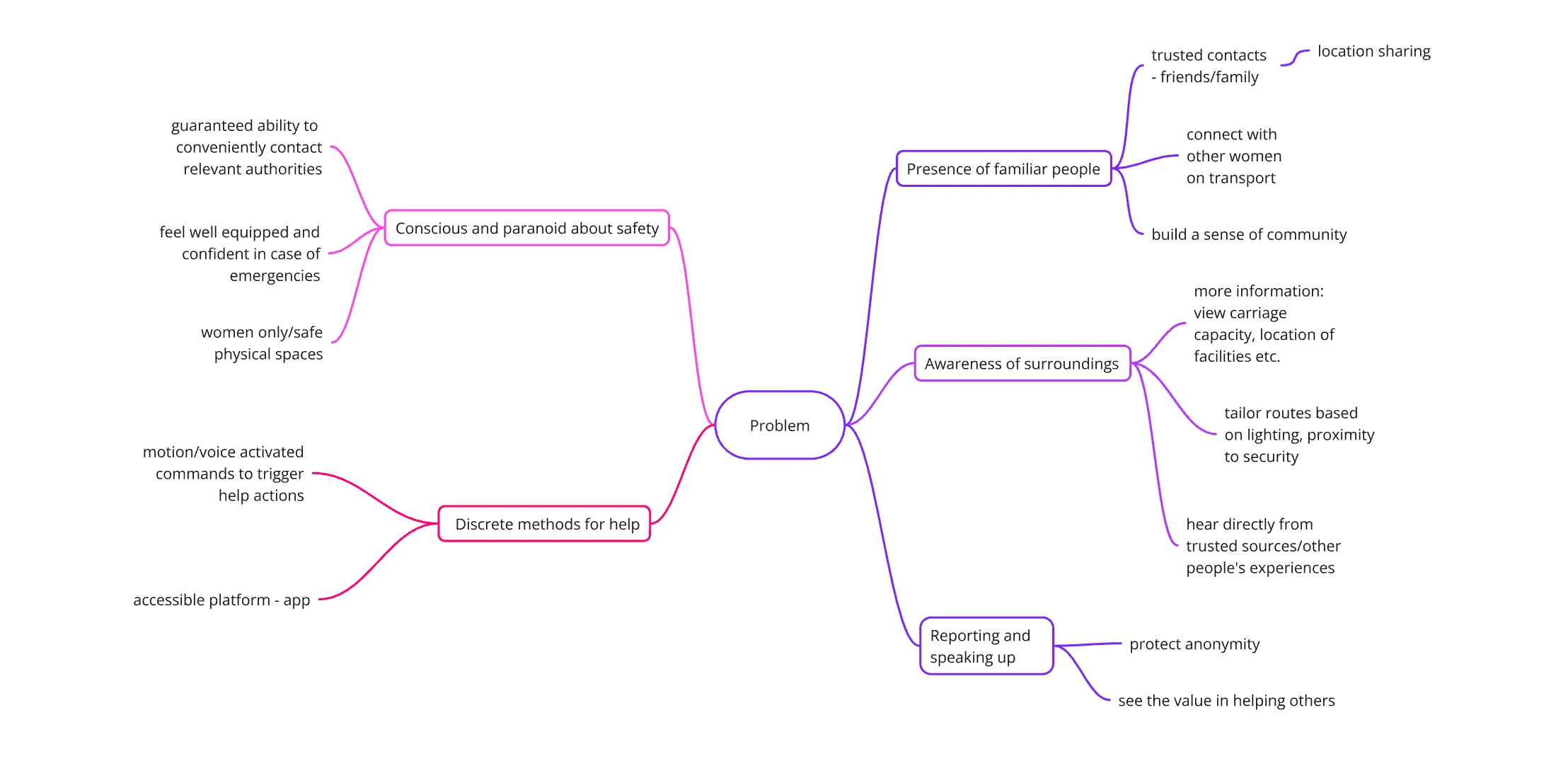
From here, our team conducted a two-hour rapid brainstorming session where we collectively came up with various initial concepts. Sketches and storyboards were created to illustrate our most promising concept, from which our final solution was derived.
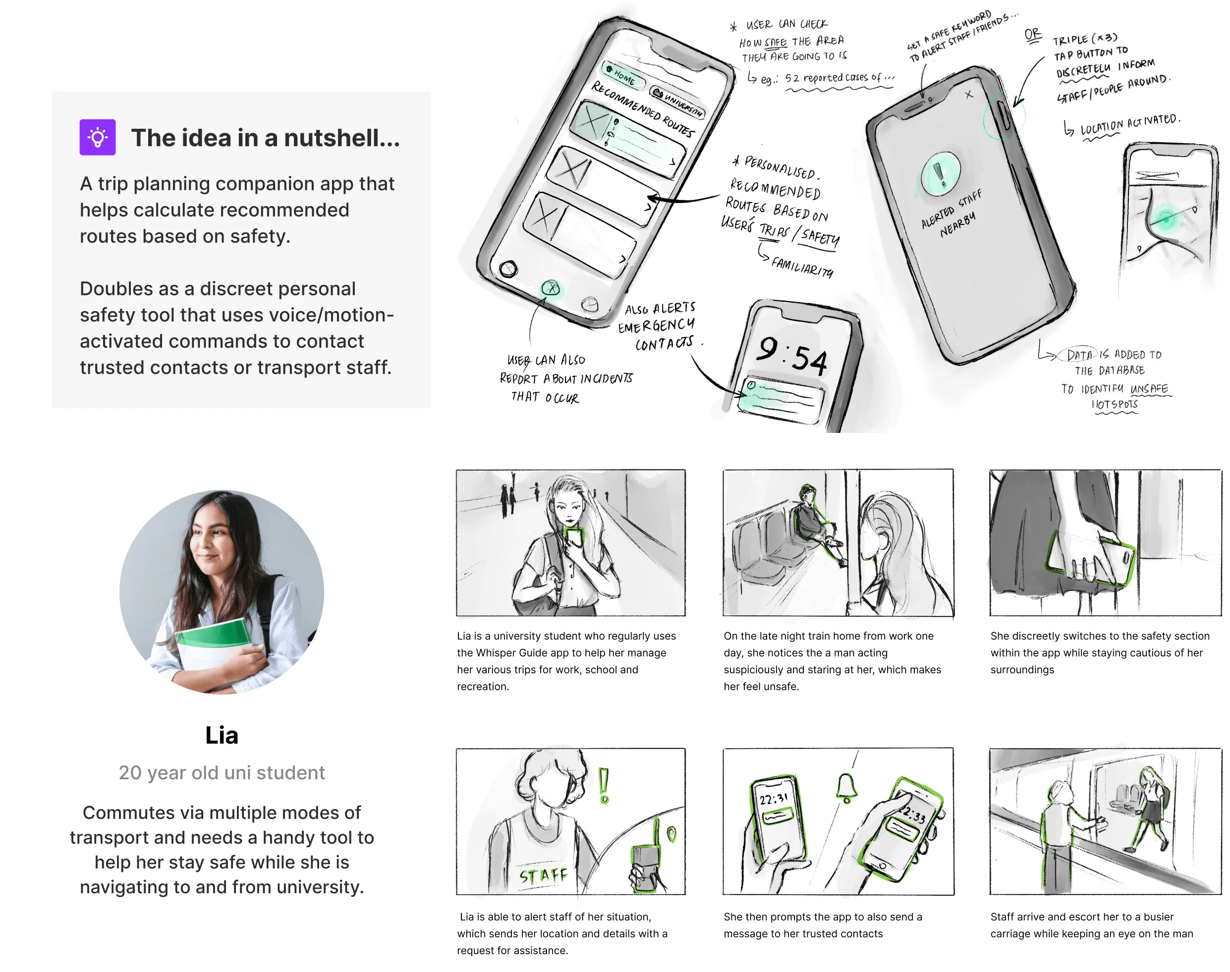
Concept Development - Establishing our core MVP features
Bringing in features from our initial concept, we developed our MVP of key features aligned with 4 key user goals based on our research insights.
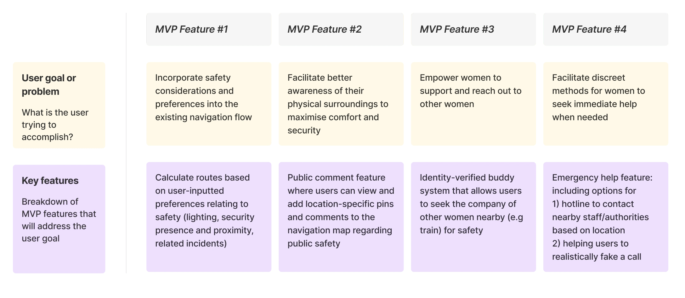
After determining our key features, we conducted an information architecture mapping session which helped inform the overall structure of our interface, and how each of our MVP features would fit into the overall navigation of the application.
Considering its use case in the context of on-the-go commuting, we wanted to allow for simple navigation that will allow the user to successfully complete their intended action within the most reasonable amount of interactions. IA mapping allowed us to identify features buried more than 4 tiers deep into the interface which could potentially cause user frustration or underuse, calling for validation as we moved into prototyping and testing.
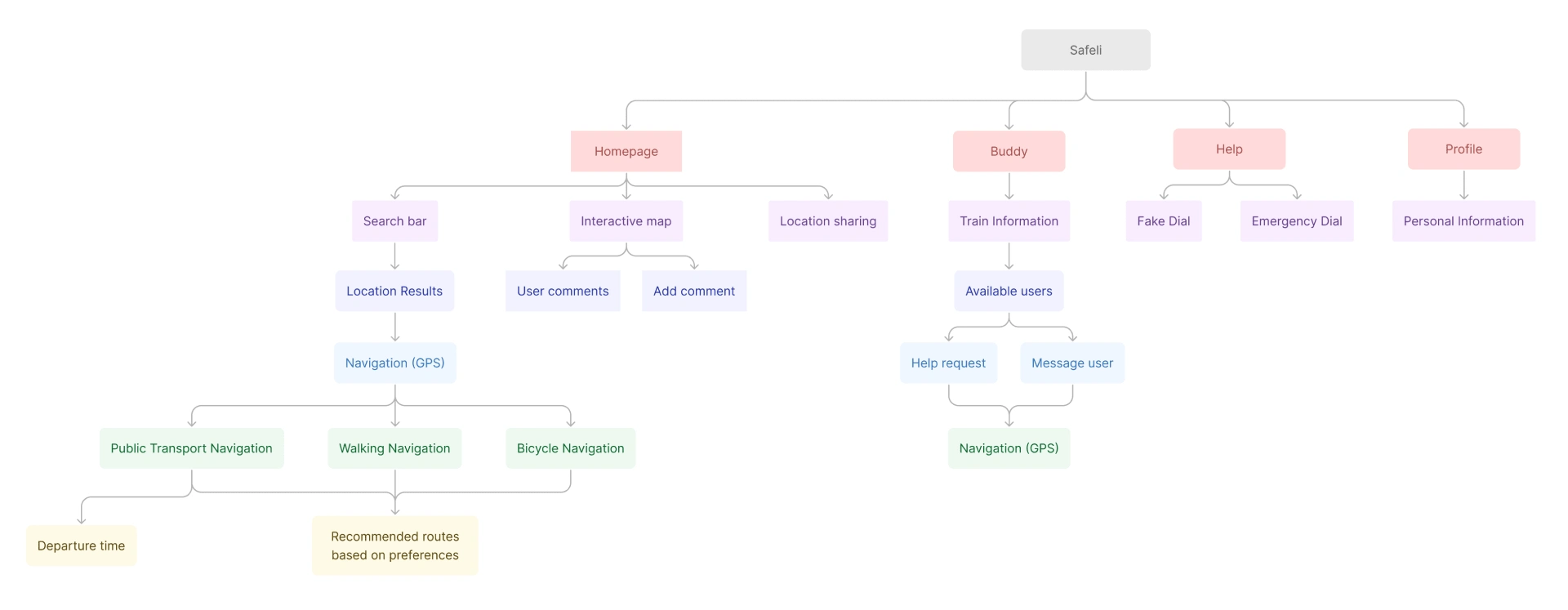
Initial information architecture map. This was progressively updated as we iterated the design.
Iteration 1 - Digital Wireframes
Based on our Information Architecture map, digital wireframes were created. This iteration was focused on mapping out the key interactions for each main MVP Feature.
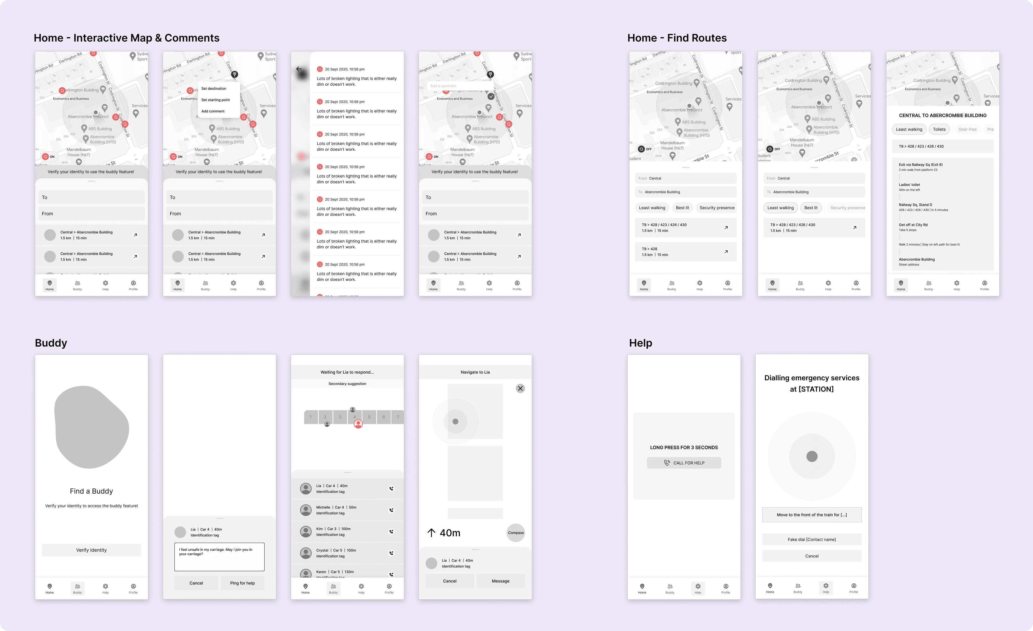
A sampling of our wireframes.
Testing and evaluation
We recruited 5 users to test our prototypes, employing Think-aloud Protocol where we outlined set tasks for participants to complete while encouraging them to vocalise their thoughts out loud. We followed up with a System Usability Scale survey before concluding the session with a semi-structured interview on their overall experience.
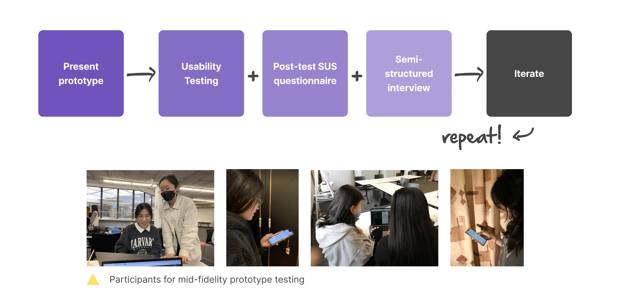
After our testing sessions, we analysed and organised our findings to identify key areas of improvement across both usability and conceptual dimensions (shown below).
At this stage, there were a number of usability issues that surfaced across the interface, particularly in regards to unclear iconography, cognitive overload, insufficient feedback, and mismatch of interactions with user's mental model.
Concept-wise, participants showed interest in the variety of features but expressed scepticism and distrust in using the Buddy feature, due to the safety risks, technical difficulties and ethical repercussions of connecting with other commuters for safety. To address these issues, we planned to re-evaluate this feature as a whole moving into the next iteration.
Iteration 2: High-fidelity Prototypes
A number of improvements were made as we transitioned into the creation of our high-fidelity prototypes. In response to clear feedback on the overwhelming safety risks and issues posed by the Buddy system, we decided to replace it with a feature that allows users to share their location with trusted contacts, in order to keep the sense of community and connection that users valued.
At this point, we realised there was nothing that uniquely differentiated our solution from what already existed on the market - it was almost like a combination of features that already existed in different platforms. We needed to redefine our direction.
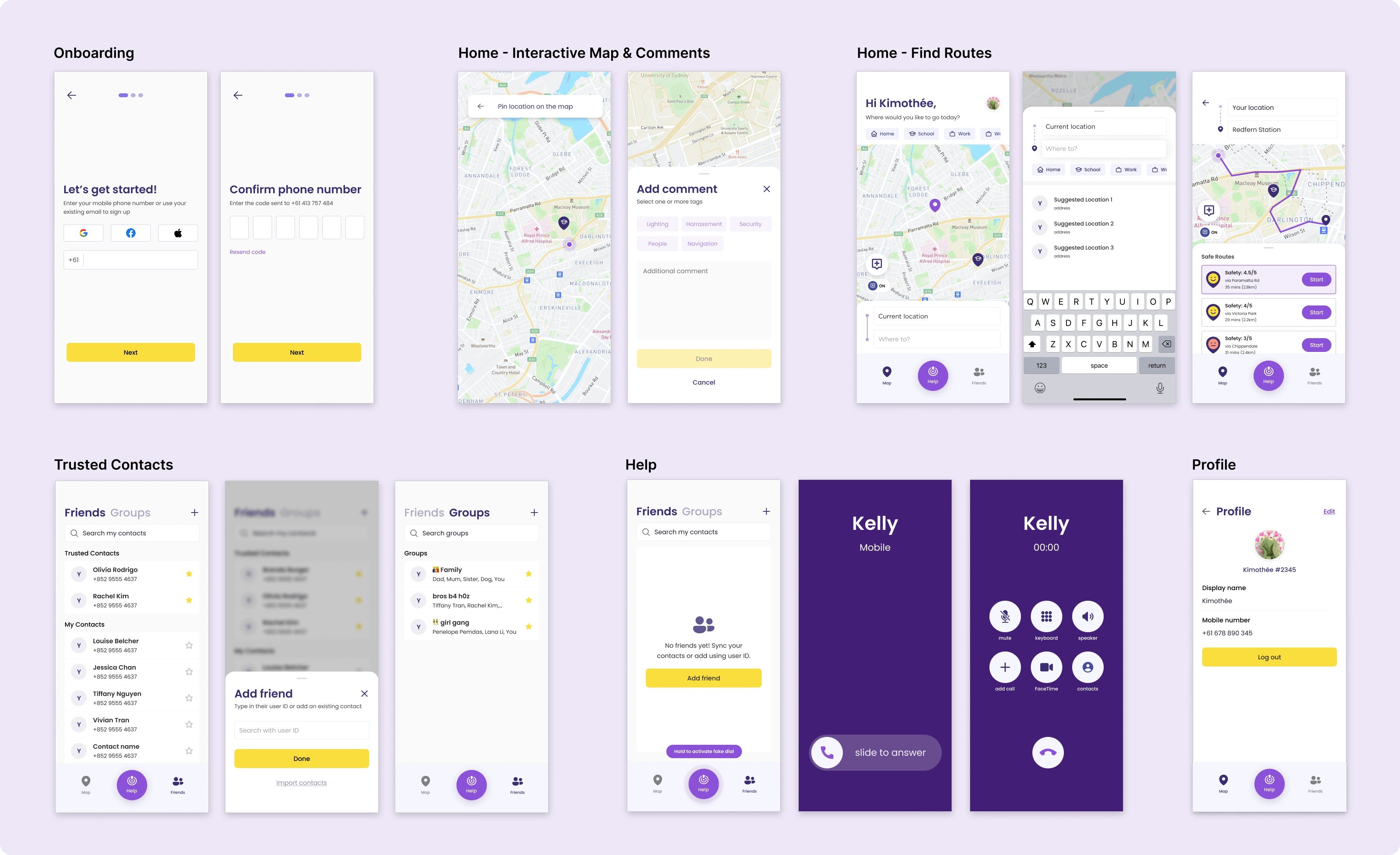
First version of our high-fidelity prototypes.
A different approach
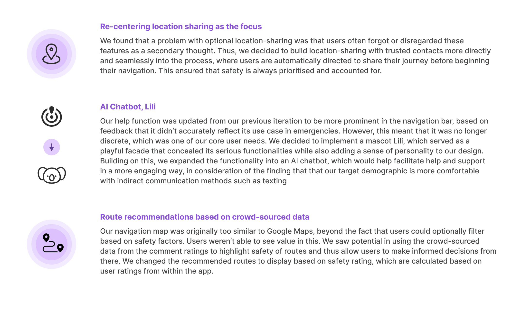
Going back to ideation, we conducted another round of group brainstorming to identify how we might redefine our design direction and address the lack of novelty. Through this, we established three core changes that when put together, radically transformed the focus of our design to naturally prioritise safety at every interaction.
Final testing and evaluation
After updating our prototypes, we conducted another round of user testing following the same structure. The comparison of our final and initial SUS questionnaire results indicated an improvement in usability. Our final high-fidelity design scored a cumulative score of 88, based on the scores of five different participants, which was 16.8 points higher than previous scores collected during our earlier testing stages. However, there were still various usability issues to be addressed, especially in regards to unfamiliar features such as the AI chatbot. Based on this, final improvements were made to our high-fidelity prototypes, primarily to improve the usability and overall flow of our design.

Key usability improvements
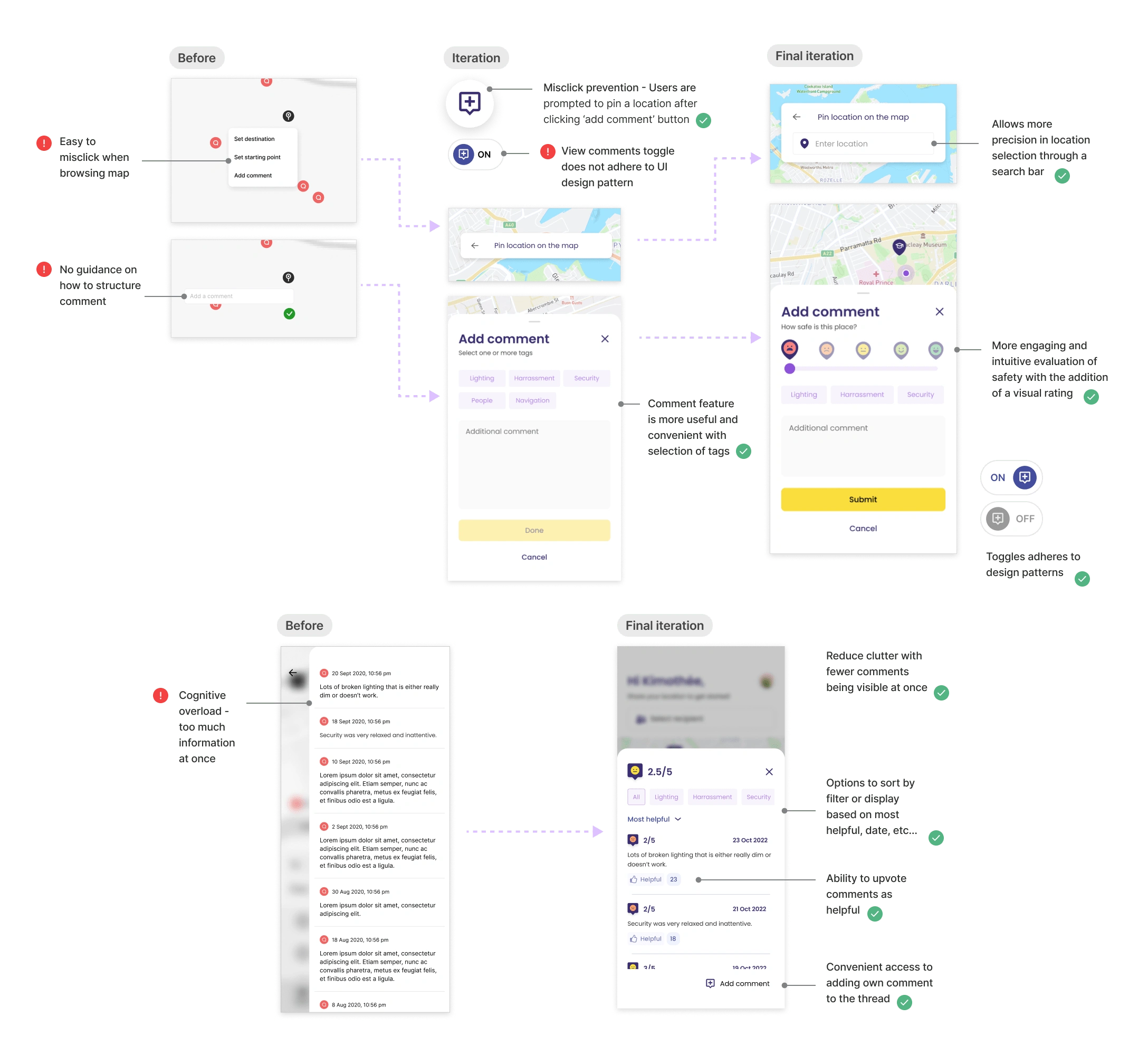
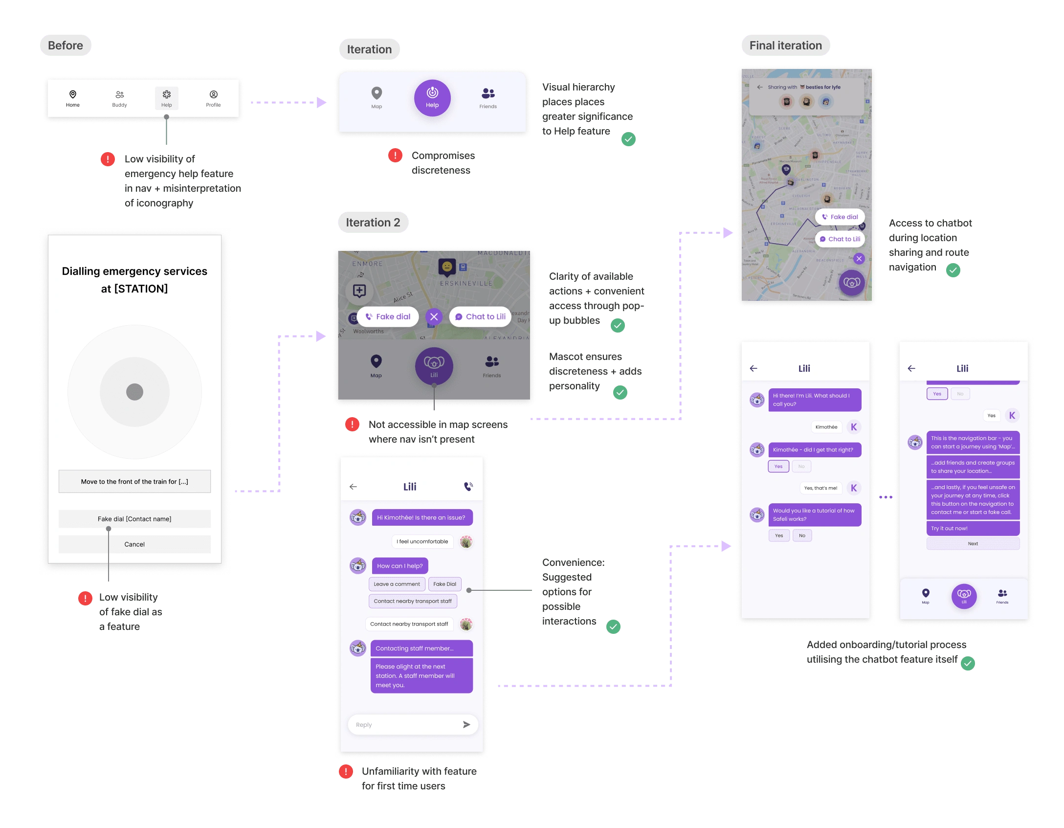
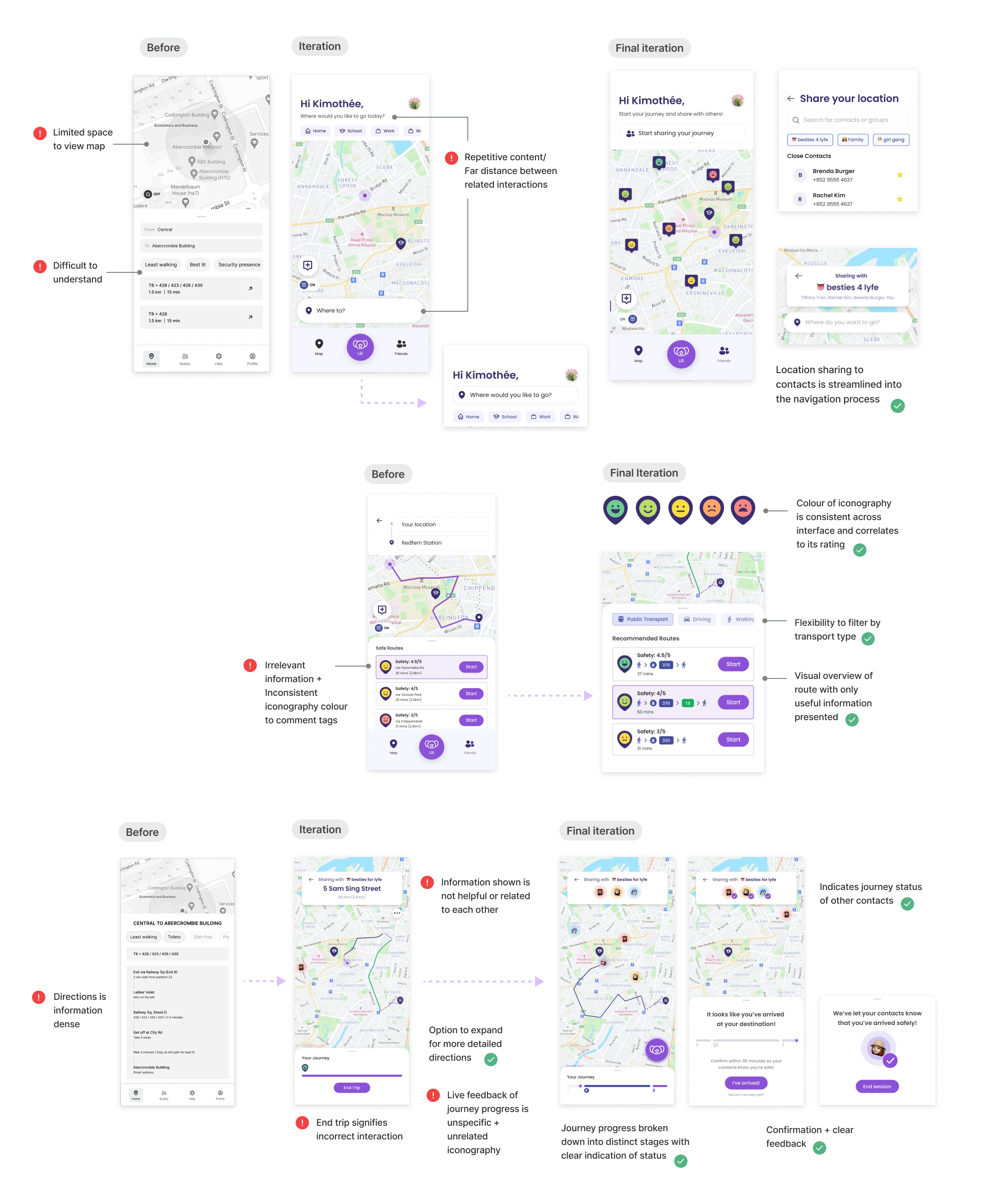
A visual breakdown of key usability improvements per feature over the multiple iterations.
Comment Pinning & Viewing
Help and Support
Route Sharing
Final Solution - Safer travels with Safeli.
Like this project
Posted Jun 28, 2024
A digital solution to empower women to confidently and safely commute around Sydney.
Likes
0
Views
5


