Brand Identity & Visual Design
Grace Pereda @ Graceful Studio
Brand Identity & Visual Design
Project Overview
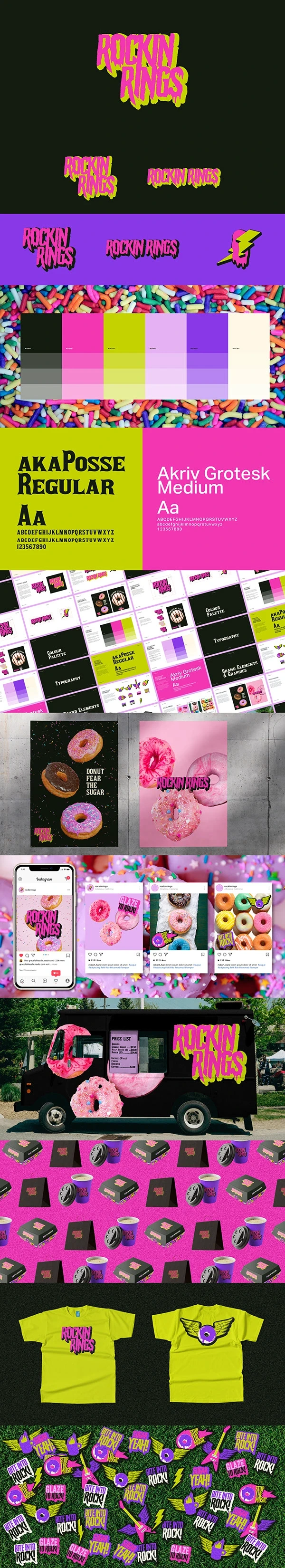
Rockin Rings is a California-based donut food truck aiming to stand out in a crowded market. The owner wanted to combine two passions: colourful, delicious donuts and the energy of heavy metal music. My role was to create a bold, memorable brand identity that reflects this unique personality while staying versatile for packaging, social media, merchandise, and promotional materials.
The Challenge
The owner's vision was clear:
A brand that breaks away from the typical sweet and pastel donut shops.
A design that reflects heavy metal's edge without losing the fun, colourful vibe of donuts.
A consistent visual language for the food truck, packaging, uniforms, and social media presence.
The challenge was to merge two contrasting worlds — playful desserts and rock-and-roll energy — into one cohesive identity that customers would instantly recognize.
My Role
I led the entire creative direction and execution of the brand identity, including:
Logo design and colour palette selection
Typography choices for titles and text
Packaging mock-ups for donuts, coffee cups, and merchandise
Sticker designs with catchy, music-inspired phrases
Social media templates for future campaigns
Visual concepts for the food truck exterior
Creative Process
1. Research & Inspiration
I explored both the donut shop industry and heavy metal aesthetics, identifying ways to blend bright, playful colours with bold, edgy typography and design elements.
2. Concept Development
I experimented with lettering styles inspired by rock music, creating a logo where the "O" and "S" appear to melt like donut glaze, tying back to the product itself.
3. Color Palette
Primary Colours: Dark gray for strength and boldness, hot pink for vibrancy, and neon green to create contrast and energy.
Secondary Colours: A softer palette used for promotional materials and backgrounds to keep the brand flexible and dynamic.
4. Typography
AKA Pose: For titles and brand headlines, giving a nod to metal band aesthetics while staying legible.
Akriv Grotesk Medium: For menus, social media captions, and longer text for clarity and readability.
5. Design Assets
Stickers with catchy phrases like Fighting to Rock, Donut Stop the Music for customer giveaways and social media.
Merchandise designs for coffee cups, take-out bags, and uniforms.
Social media layouts to ensure brand consistency across platforms.
The Solution
The final identity delivered a bold yet playful look:
A rock-inspired logo with donut glaze elements
A high-contrast colour palette that pops on packaging, posters, and social media
Flexible assets for the food truck exterior, merchandise, and marketing materials
Stickers and social media templates to help the brand connect with customers online and offline
Impact
This brand identity gives Rockin Rings a strong foundation to launch with confidence. The cohesive visual language ensures consistency across all touchpoints — from the first Instagram post to the moment customers receive their donut at the food truck window.
Potential customers instantly understand the brand's personality: fun, bold, and unforgettable. Future campaigns and expansions can easily build on this system, keeping the brand recognizable and engaging.
Like this project
Posted Mar 31, 2026
Bold brand identity for Rockin Rings, a California donut food truck merging heavy metal energy with colorful, delicious donuts.
Likes
0
Views
2