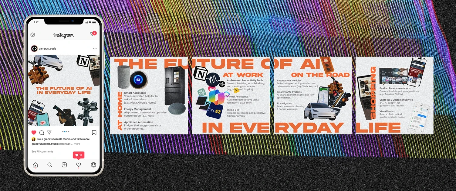
Infographic + Social Media Adaptation
Grace Pereda @ Graceful Studio
Infographic + Social Media Adaptation
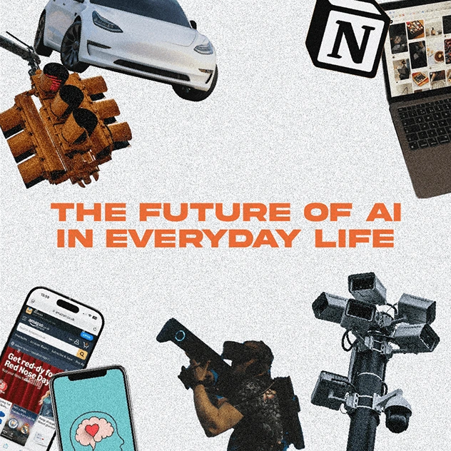
The Future of AI in Everyday Life
Internal Magazine, Prestigious Canadian University (Name Withheld)
Overview
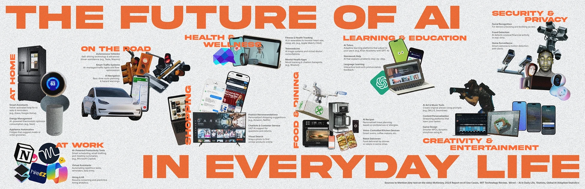
I was commissioned by the editorial team of an internal digital magazine at a highly respected Canadian university to design an infographic that would explore how AI is currently integrated into daily life. The original article, based on findings from MIT Technology Review and Life is Addictive, was highly informative but dense. The client asked for a piece that could visually summarize the key takeaways for their student audience in a clear, engaging format. They specifically requested that the university name remain anonymous and emphasized the importance of showing AI as a powerful, yet still imperfect tool.
My Role
I led the entire visual and creative direction of the project, including content simplification, infographic design, image sourcing and editing, light copywriting, and the adaptation of the full piece for social media formats (carousel and reel graphics for Instagram).
Process
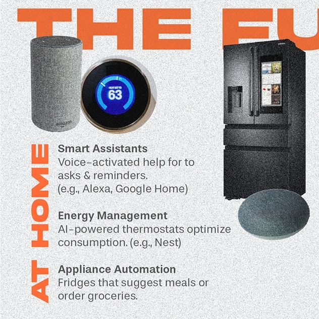
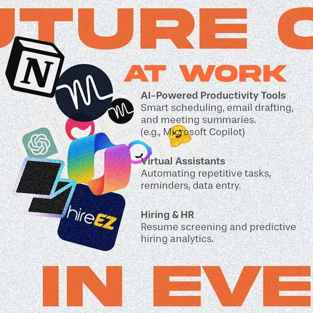
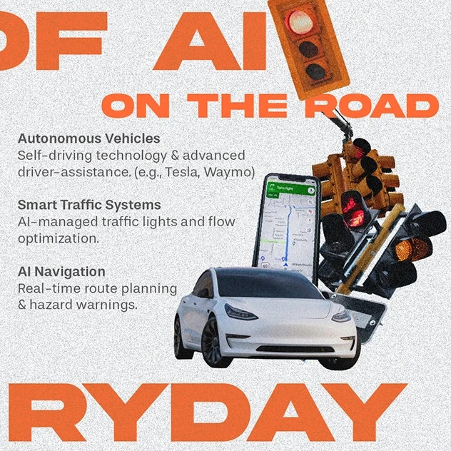
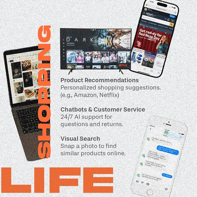
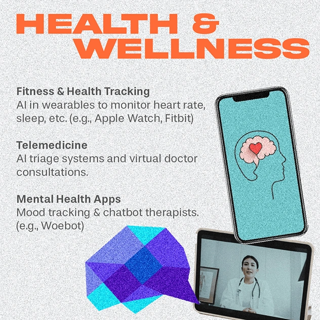
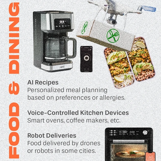
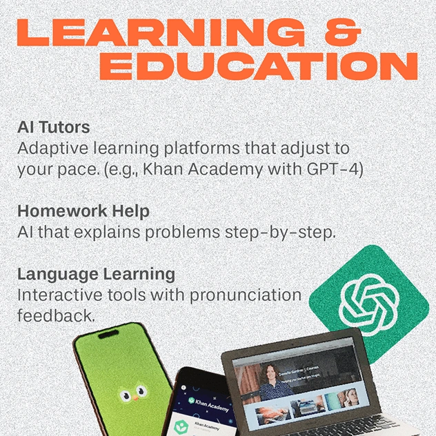
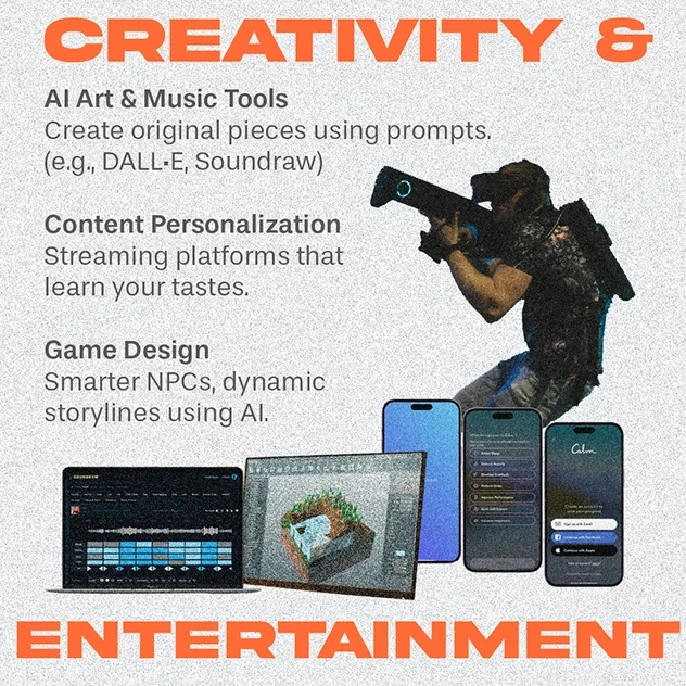
Content simplification involved condensing a long, text-heavy report into brief, catchy summaries that would work well in a visual flow. Creative interpretation was key to establishing the right tone—so I applied a subtle noise and blur effect to the images using Photoshop, visually representing the idea that AI, while impressive, is still evolving and far from flawless. Instead of using generic icons, I incorporated real-life images of devices, tools, and apps that students would instantly recognize—from smart home assistants to GPS apps and wearable tech. For the social media adaptation, I redesigned the infographic as an Instagram carousel, breaking down each section for better readability, and also created simplified visual assets for use in Reels, where the magazine team could overlay text, motion, or link to the full article.
Key Topics Covered
The infographic highlights AI's role in areas such as home automation, transportation, workplace productivity, shopping personalization, health and wellness, food and dining, education, creative tools, and privacy and security—making the content relatable and useful to students navigating these technologies daily.
Results
The infographic was published as a feature in the university's online magazine and adapted successfully for Instagram. The visual storytelling helped simplify complex content and generated strong engagement. The final assets provided the editorial team with ready-to-use materials for both digital and social platforms, allowing them to promote the article across formats without needing additional design support.
Like this project
Posted Mar 31, 2026
AI integration infographic and social media adaptation for a Canadian university magazine, simplifying MIT findings for students.
Likes
0
Views
2