Shadow of Us – Inspirational Book Cover Design by Temmy VisualShadow of Us – Inspirational Book Cover Design by Temmy Visual

Shadow of Us – Inspirational Book Cover Design

Temmy Visual

Temmy Visual

Shadow of Us – Inspirational Book Cover Design | Personal Growth & Life Stories
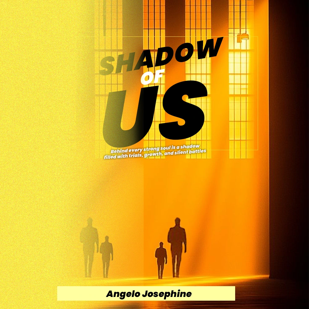
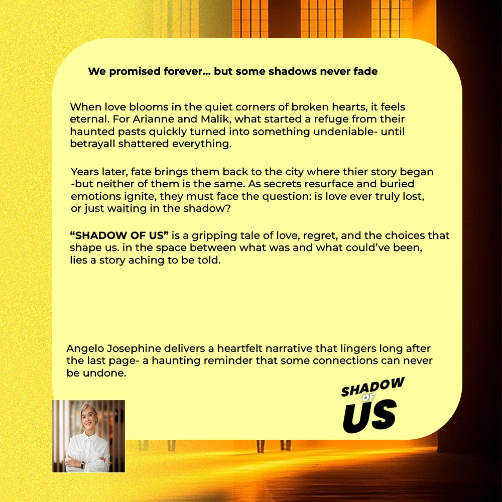
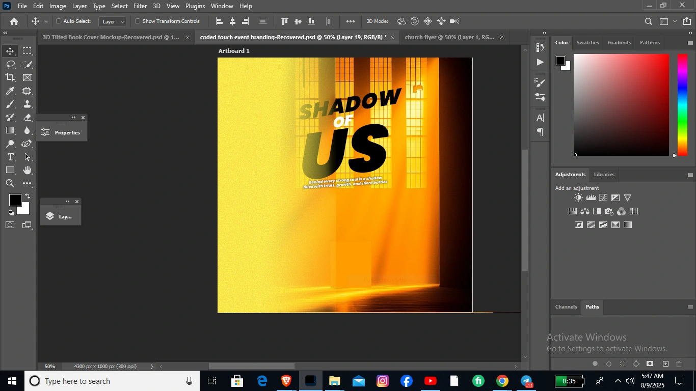
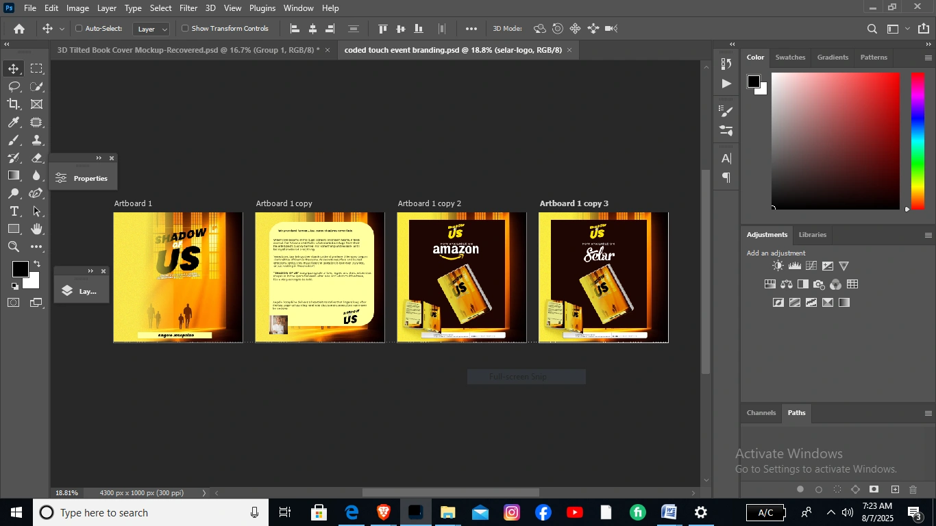
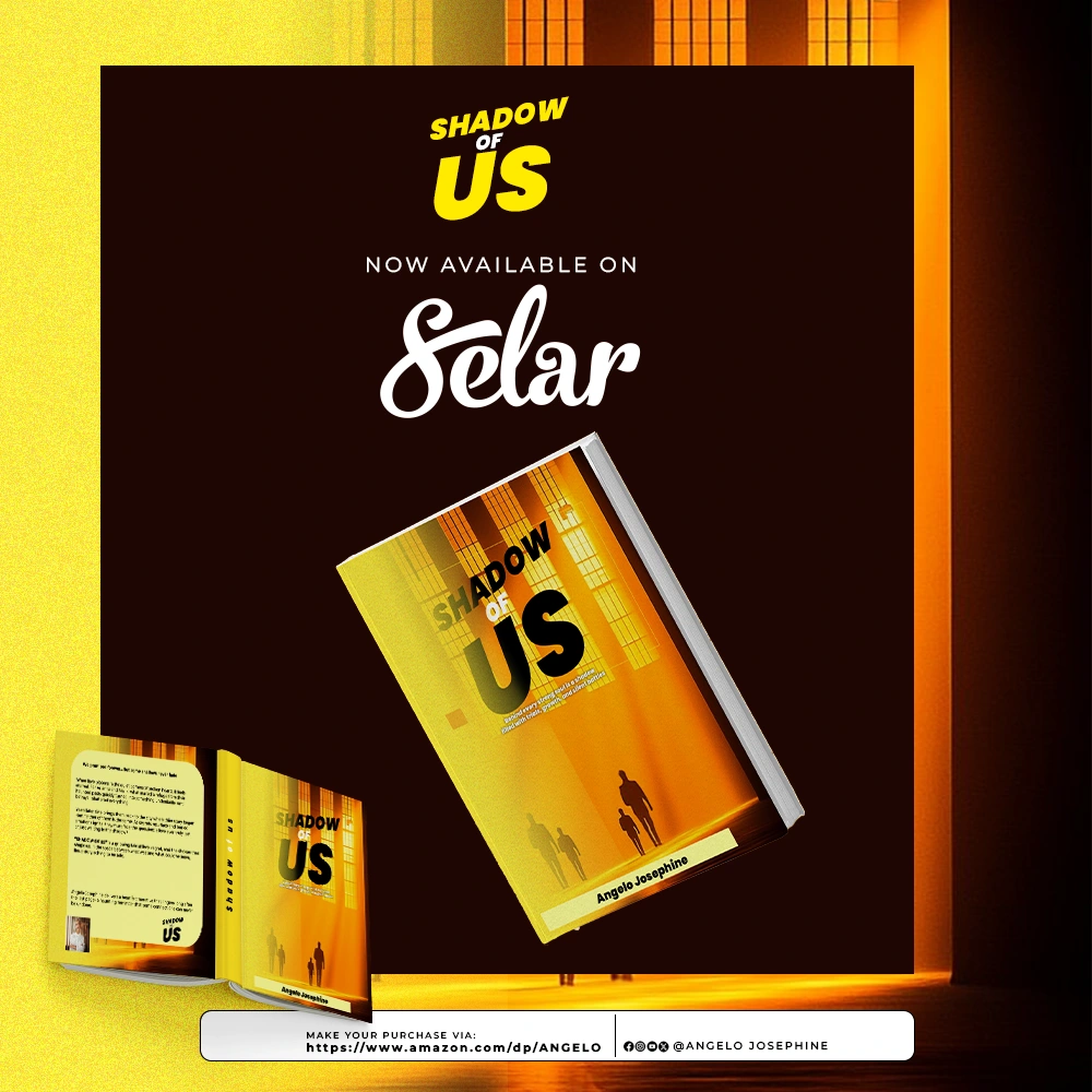
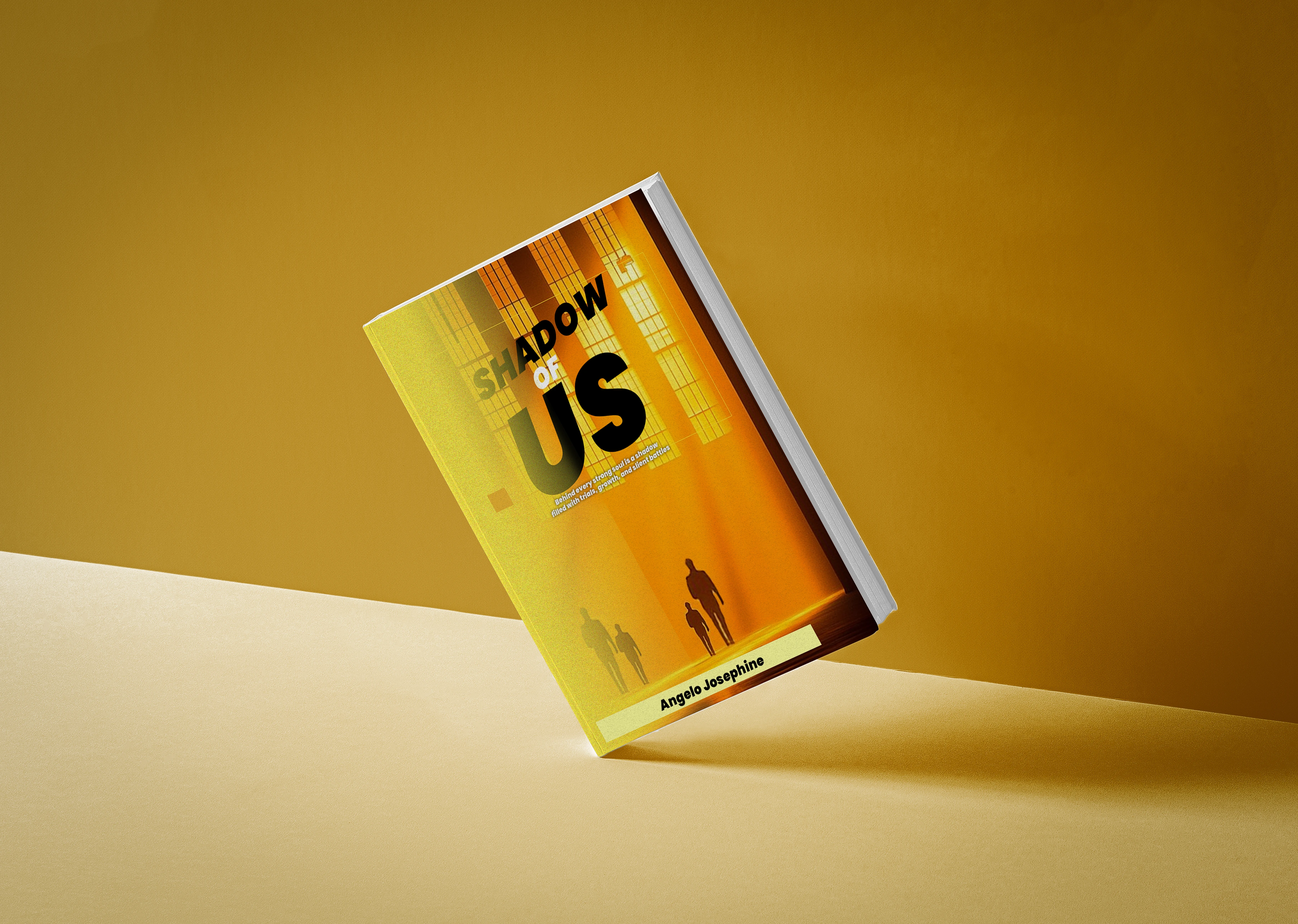
"Shadow of Us" by Angelo Josephine is a gripping tale of love, regret, and the choices that shape us. I designed this cover to capture the deep emotional tone of the story — using warm light and long shadows to symbolize both hope and lingering pain.
Shadow of Us – Design Process 
1. Concept Development The creative journey began with the central theme of Shadow of Us — a heartfelt yet haunting story about love, regret, and the ties that linger in the dark. The goal was to visually translate the novel’s duality: warmth in human connection and the lingering chill of past wounds. Early brainstorming explored imagery of light piercing through shadows, paired with subtle patterns that suggest depth and complexity.
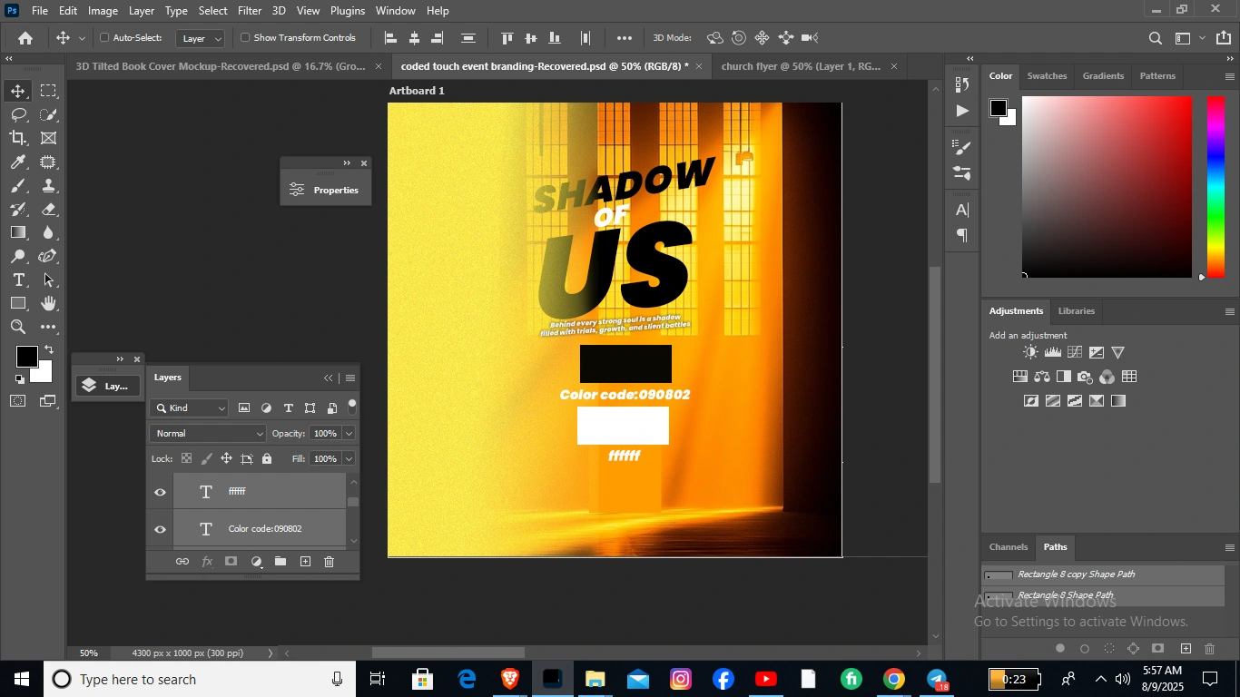
2. Color Palette Selection The palette combines golden yellow for warmth and nostalgia, deep orange for emotional intensity, and dark charcoal to convey mystery and tension. The lighter cream tones provide contrast, ensuring readability and visual comfort. Together, these colors echo the story’s interplay between light (hope) and shadow (loss).
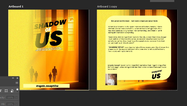
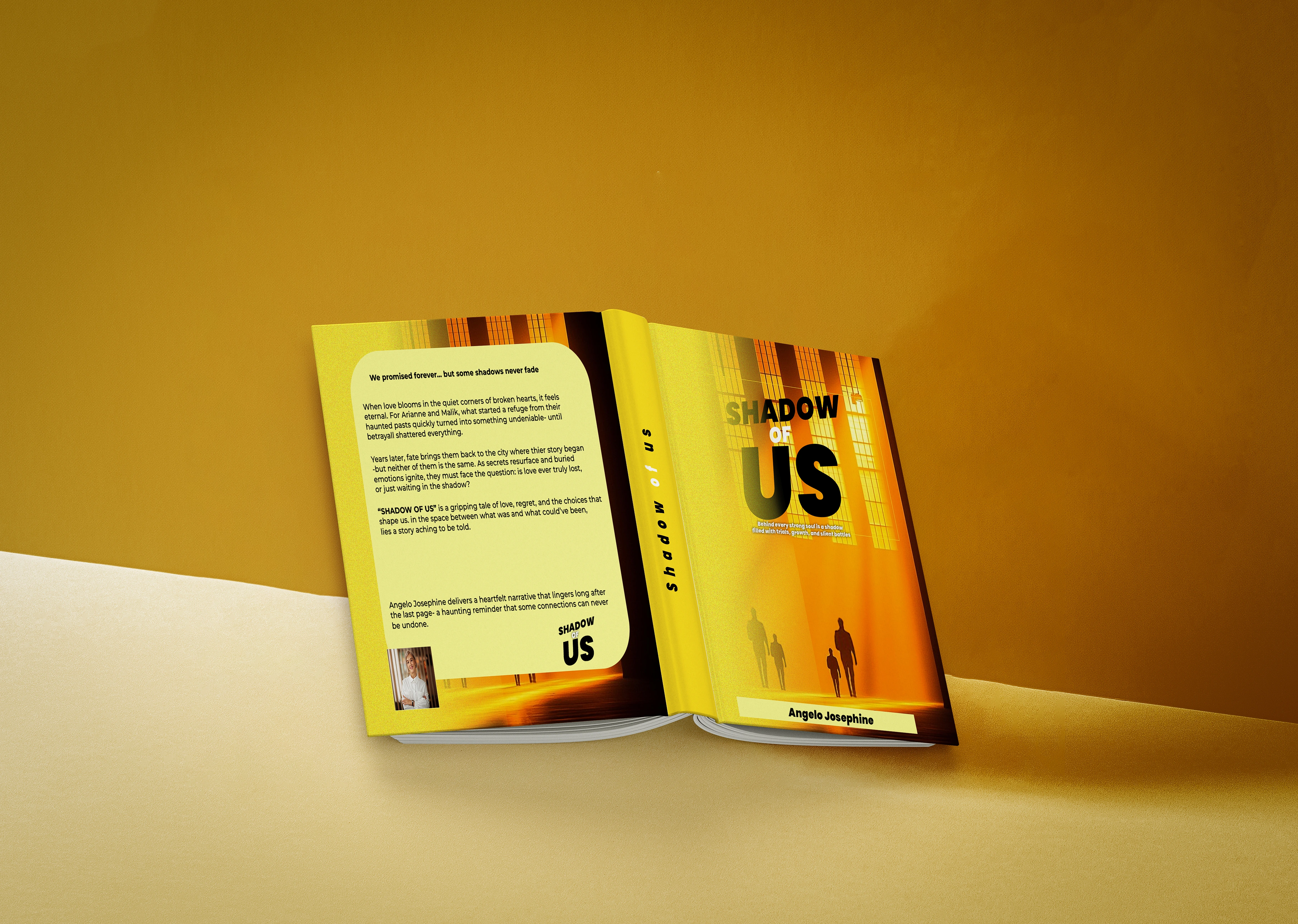
3. Typography Choices For the front cover, the title uses the Poppins font — a bold, geometric sans serif that gives the book a clean, modern presence and strong visual impact on the shelf. The sharp edges and balanced proportions make it both approachable and authoritative. For the back cover, the body text is set in Montserrat — a highly readable, contemporary sans serif that maintains clarity while complementing the front cover’s boldness. This pairing ensures the design feels cohesive while providing visual variety between title and supporting text.
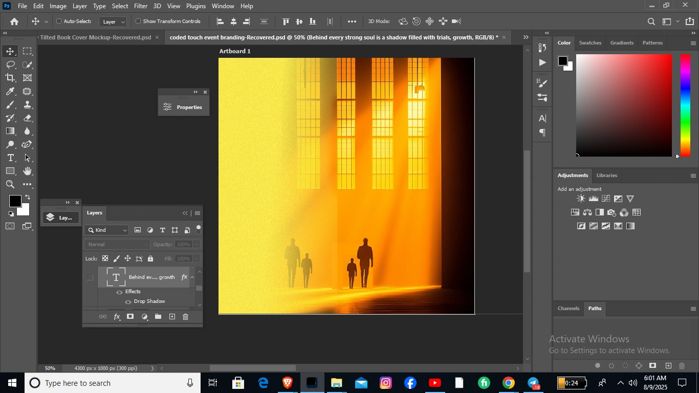
4. Imagery & Symbolism The gradient glow evokes the warmth of sunset — a fleeting, bittersweet moment — while the darker edges frame the narrative in mystery. Subtle vertical lines in the background reference city lights and fleeting glimpses of the past, tying into the plot’s urban setting and emotional pacing.
5. Layout & Composition The front cover focuses attention on the title while leaving breathing space for the background textures to shine through. On the back cover, the blurb is centered in a rounded color block for easy readability, framed by the same tonal gradients to maintain cohesion. The author photo is placed at the lower left to balance the weight of the title and provide a personal connection.
6. Finishing Touches Soft gradients, gentle shadowing, and careful alignment give the design a polished, professional finish. Every element — from font weight to background texture — was refined to ensure that the final cover not only draws attention but also captures the layered emotional journey of Shadow of Us.
Like this project