
King Crumb – Branding & Packaging Design.
Featured on Contra — October 2026
The King Crumb community post was featured by Contra on October 23, 2026.
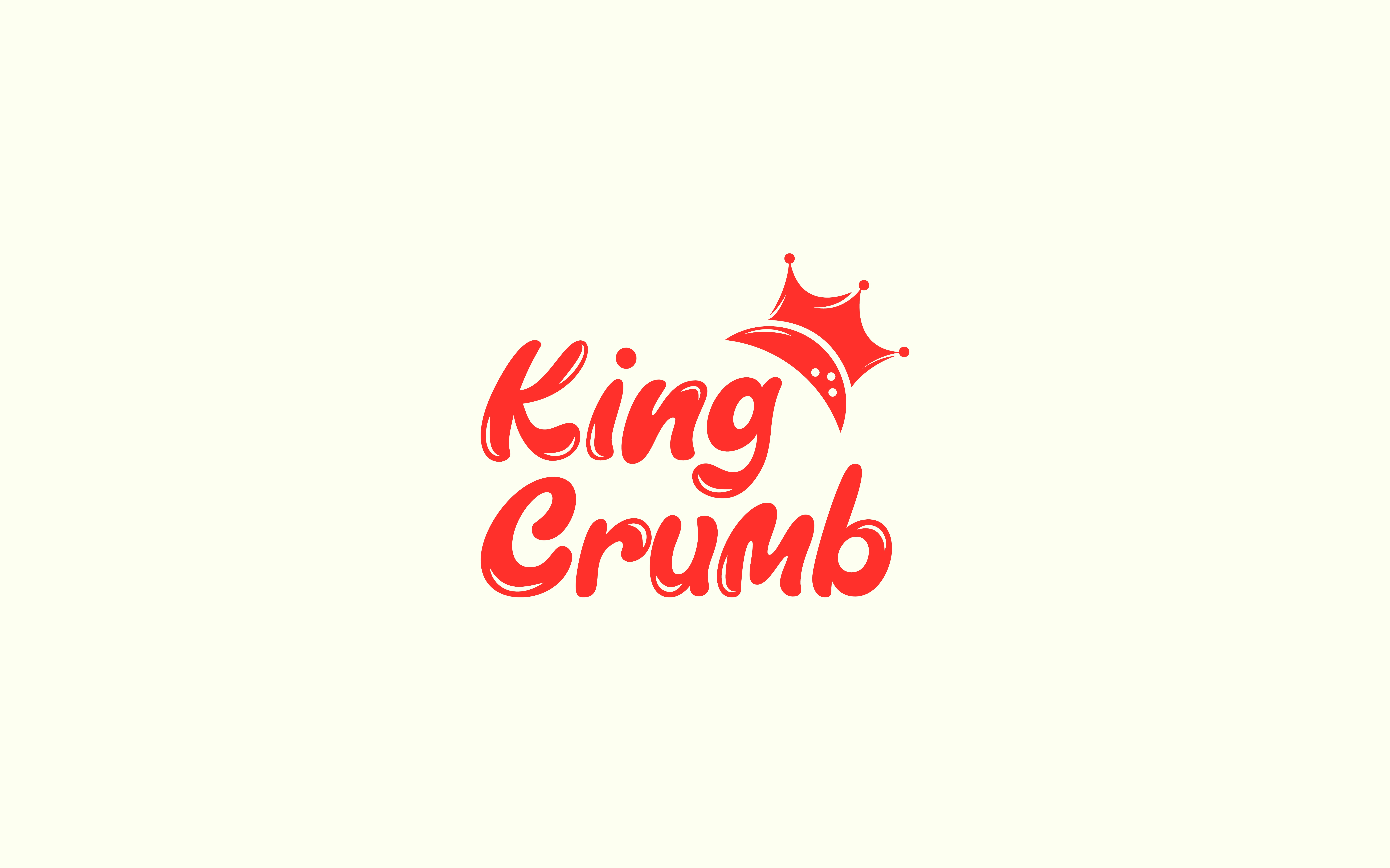
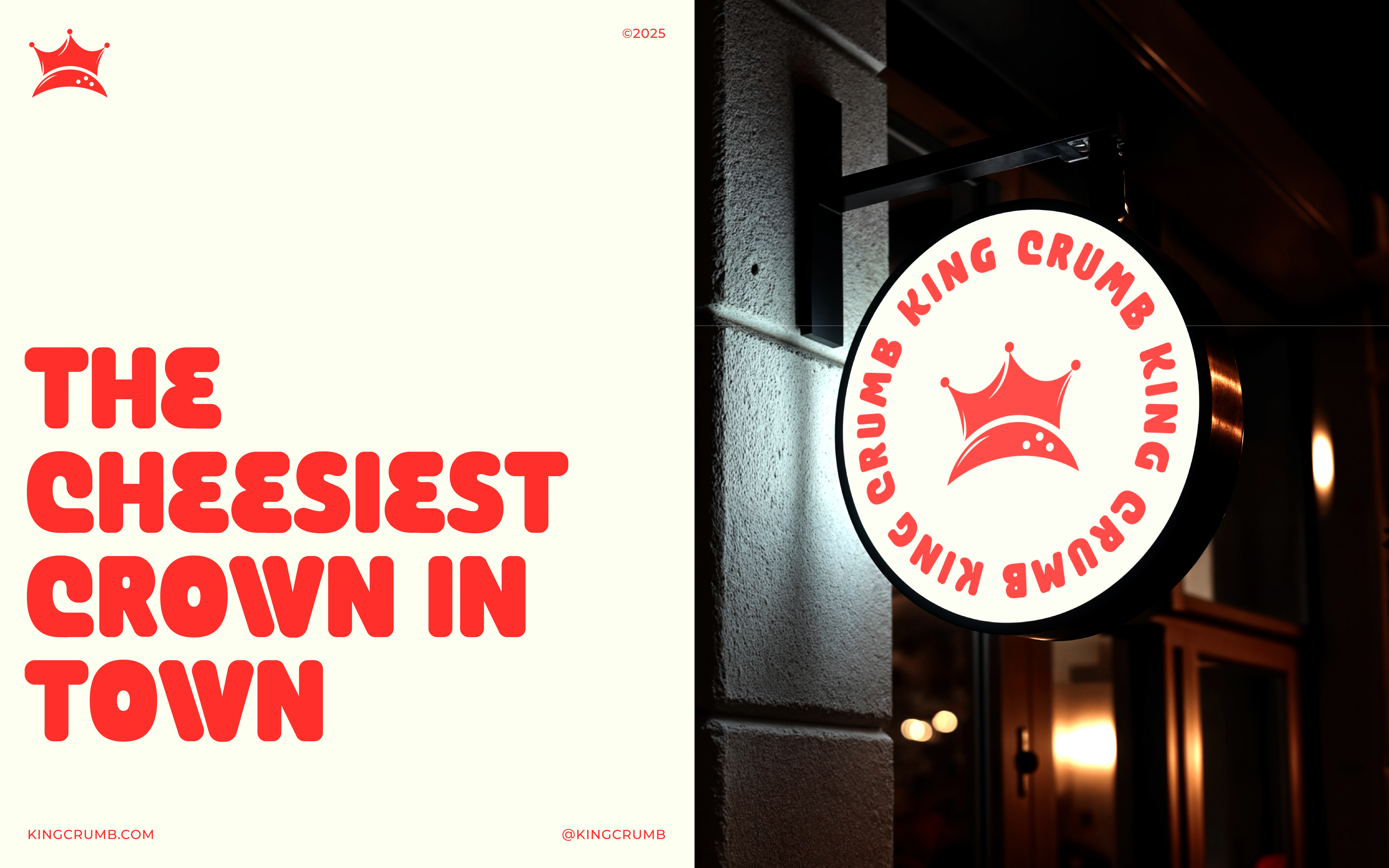
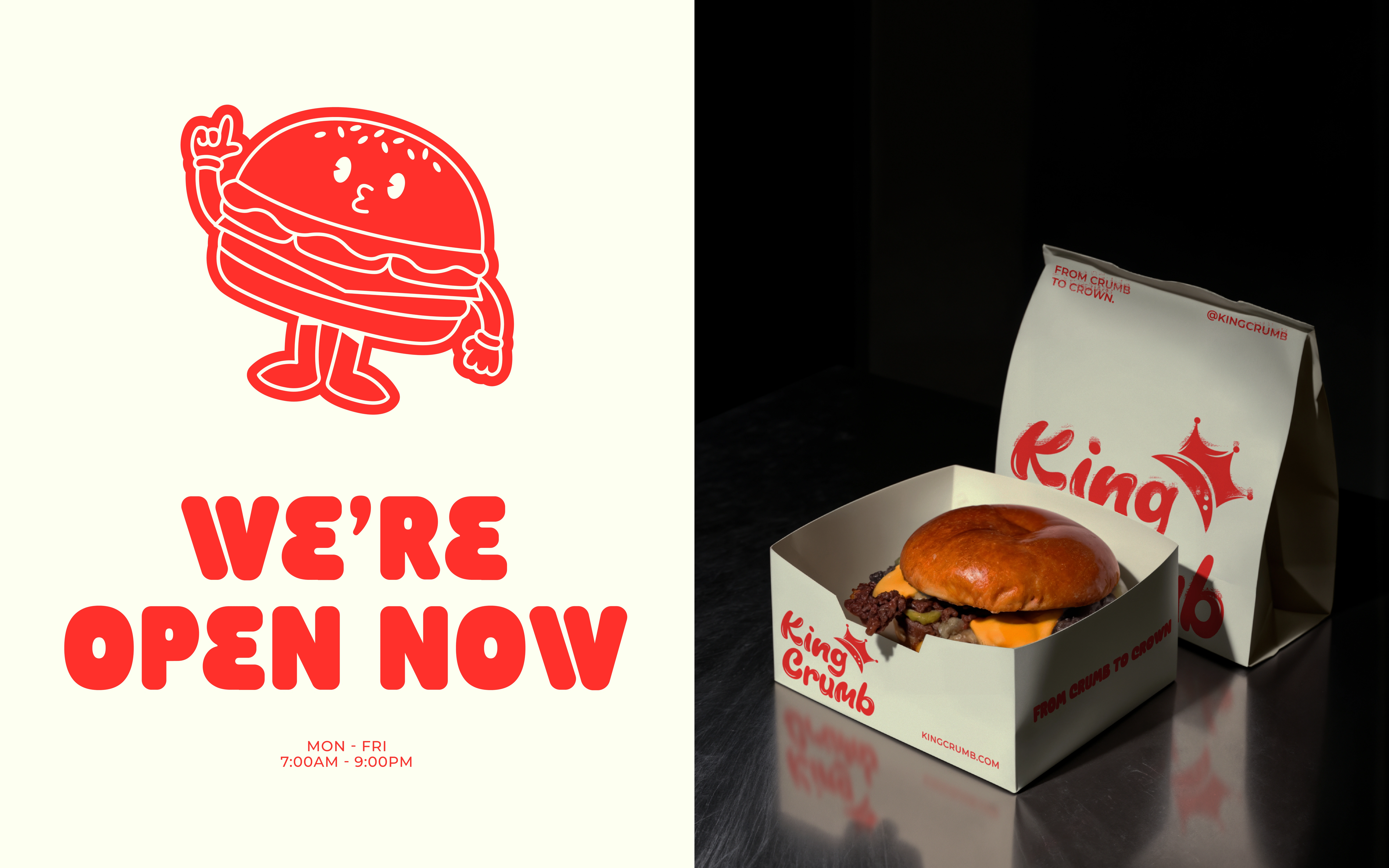
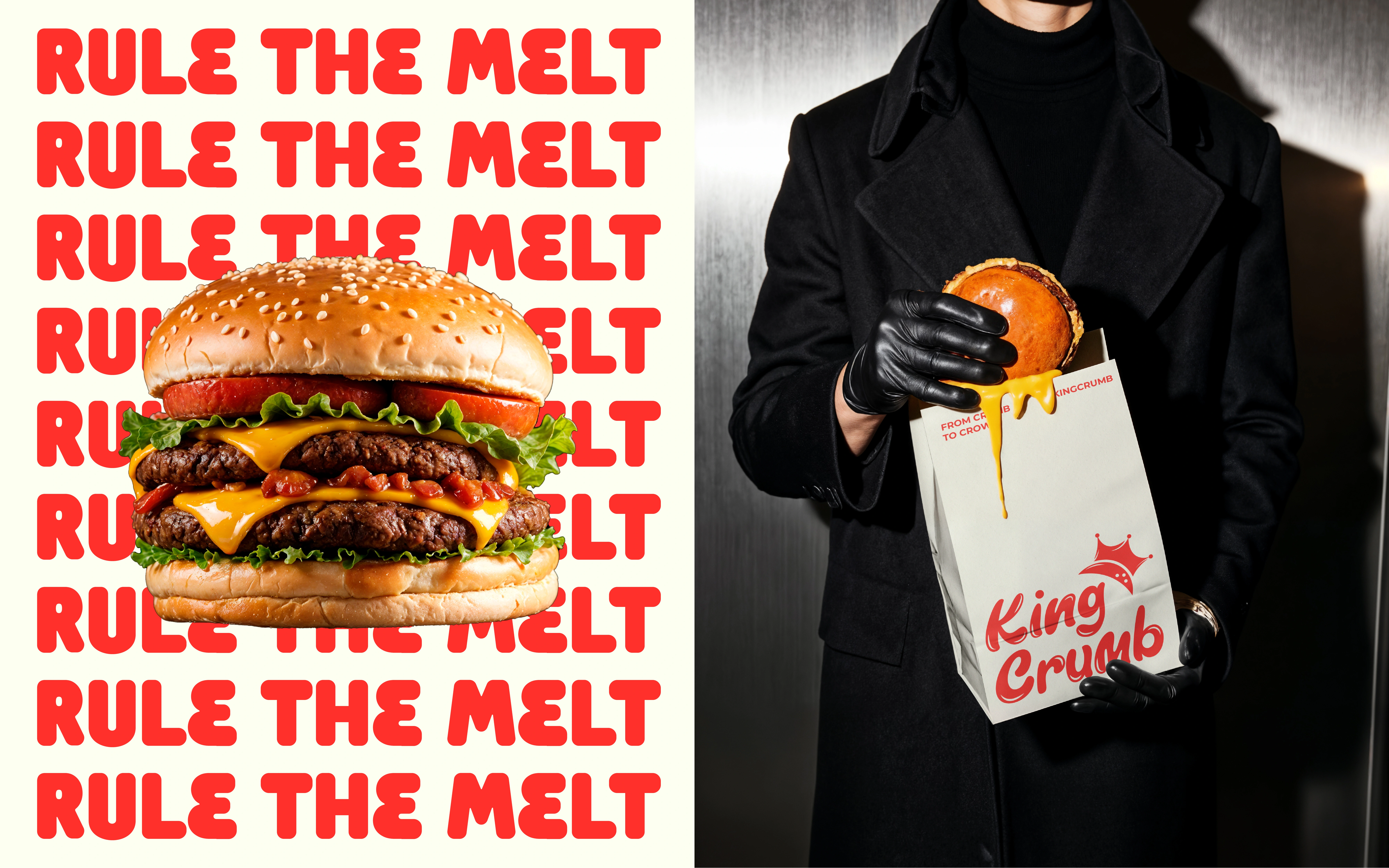
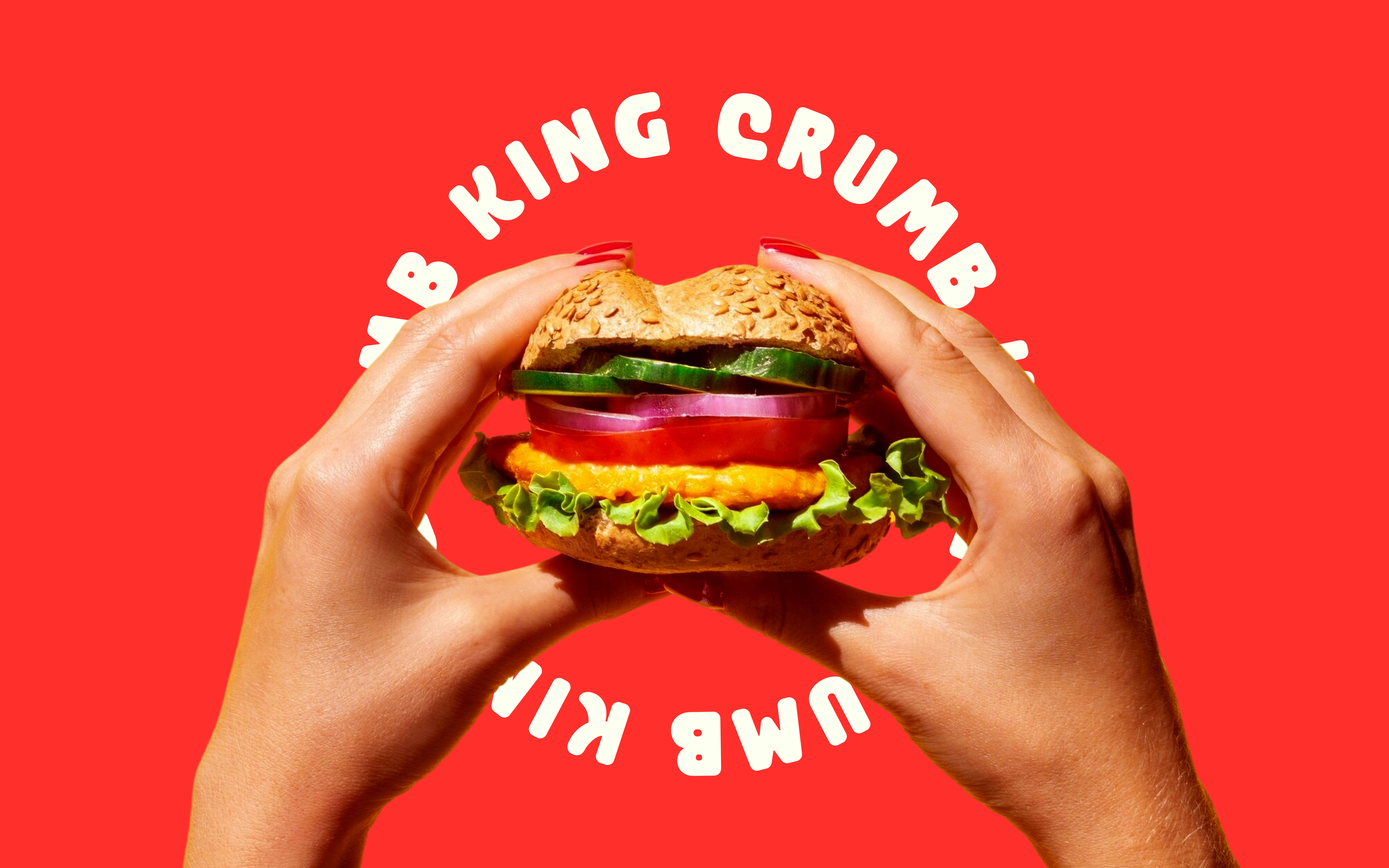
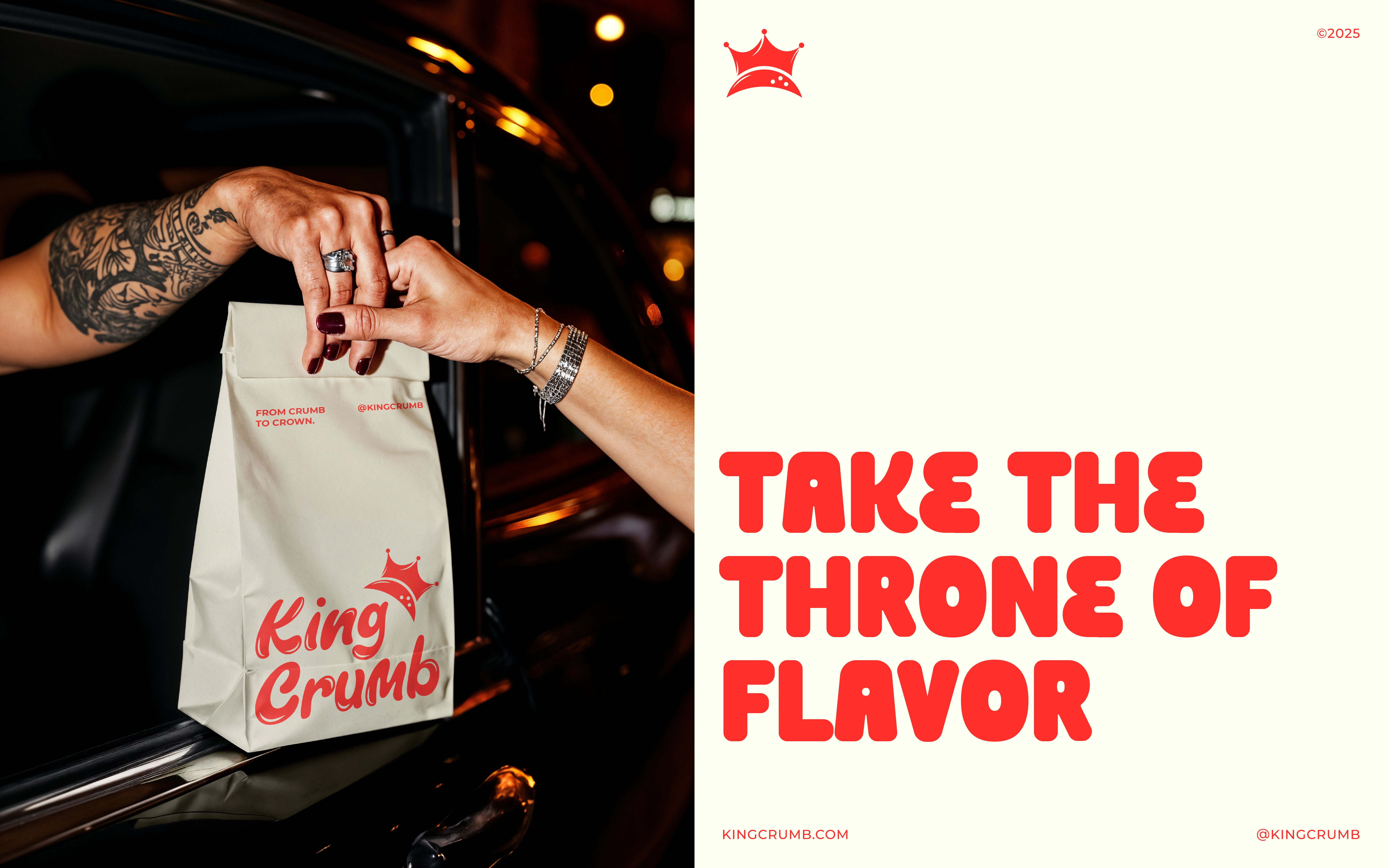
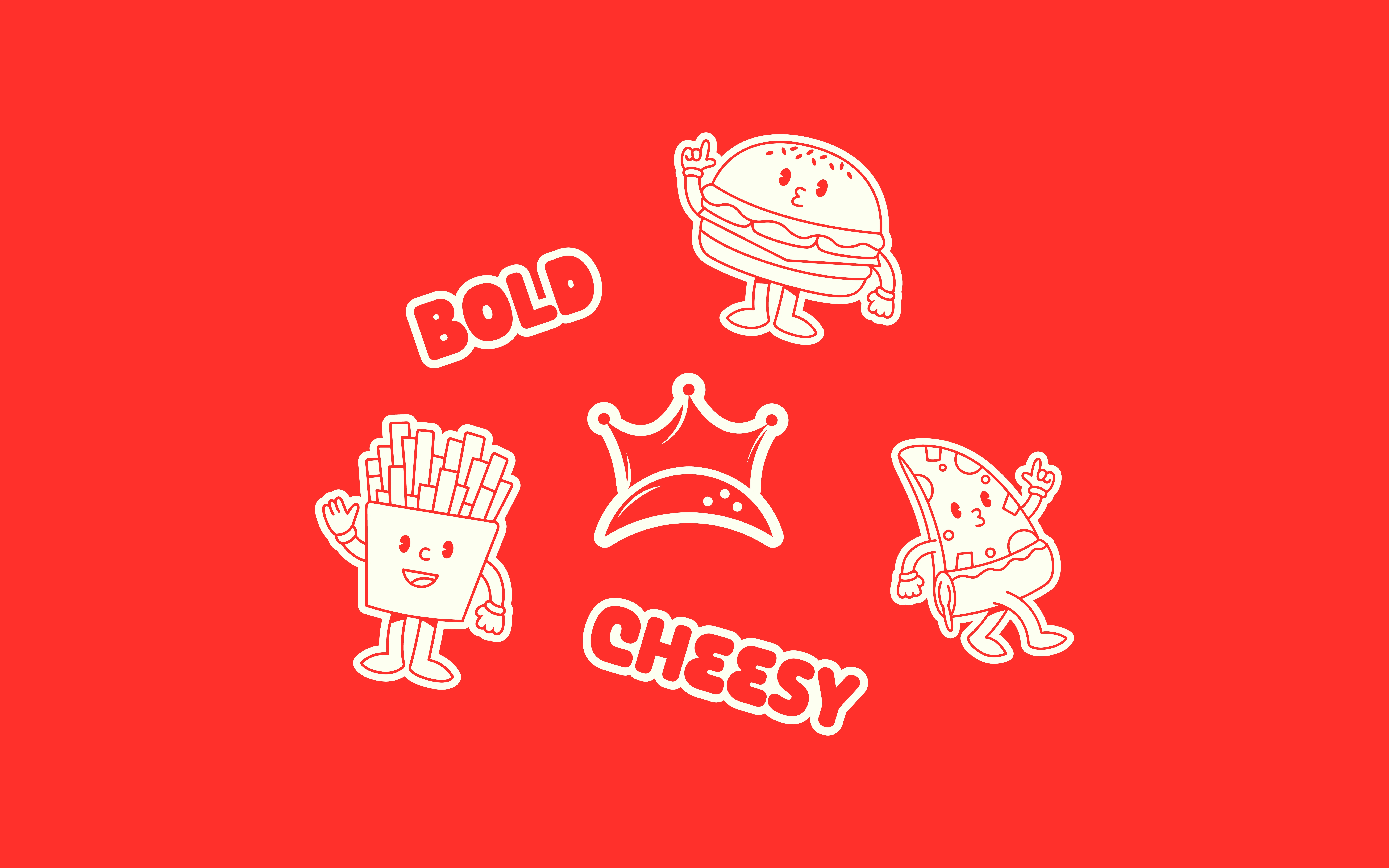
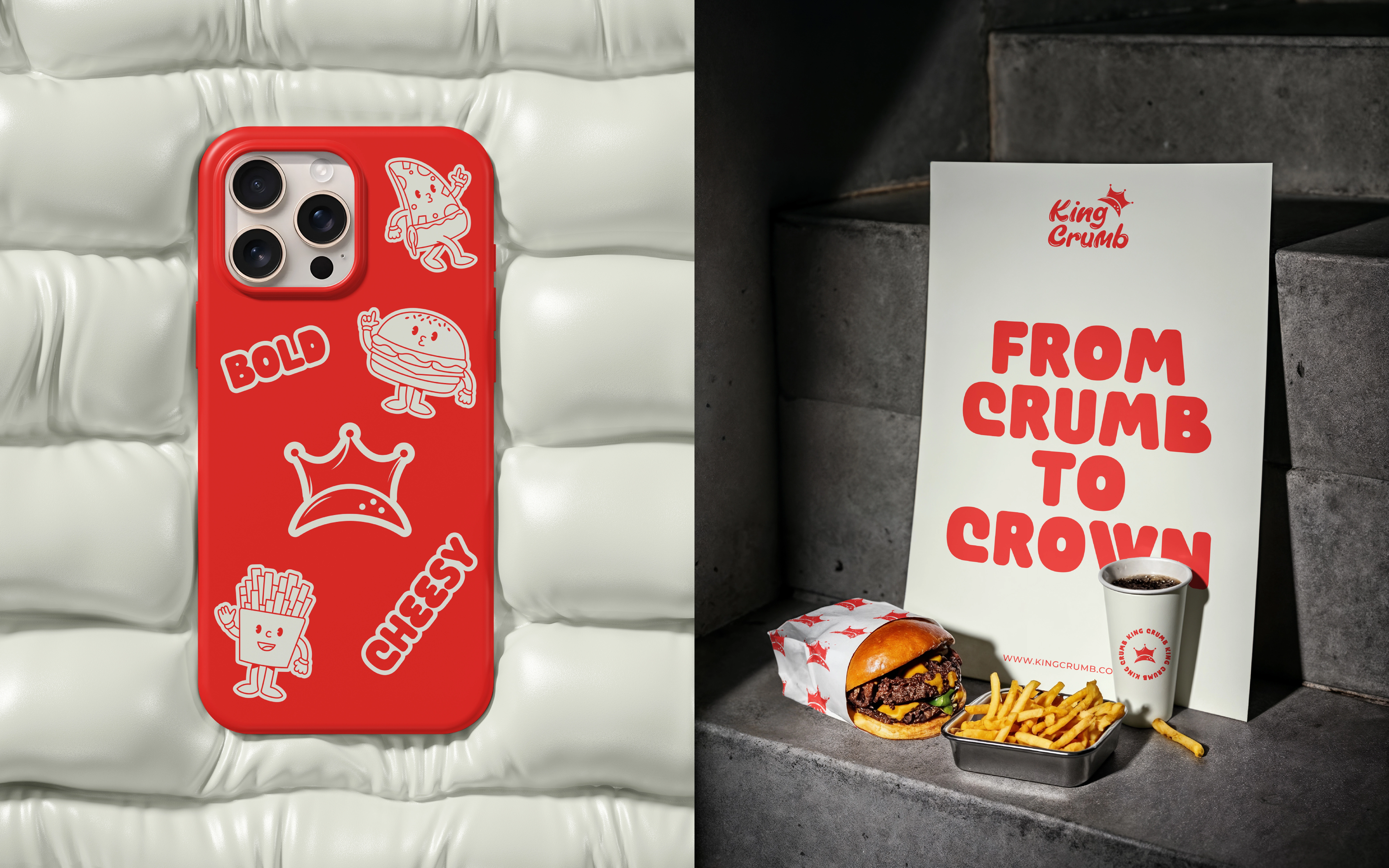
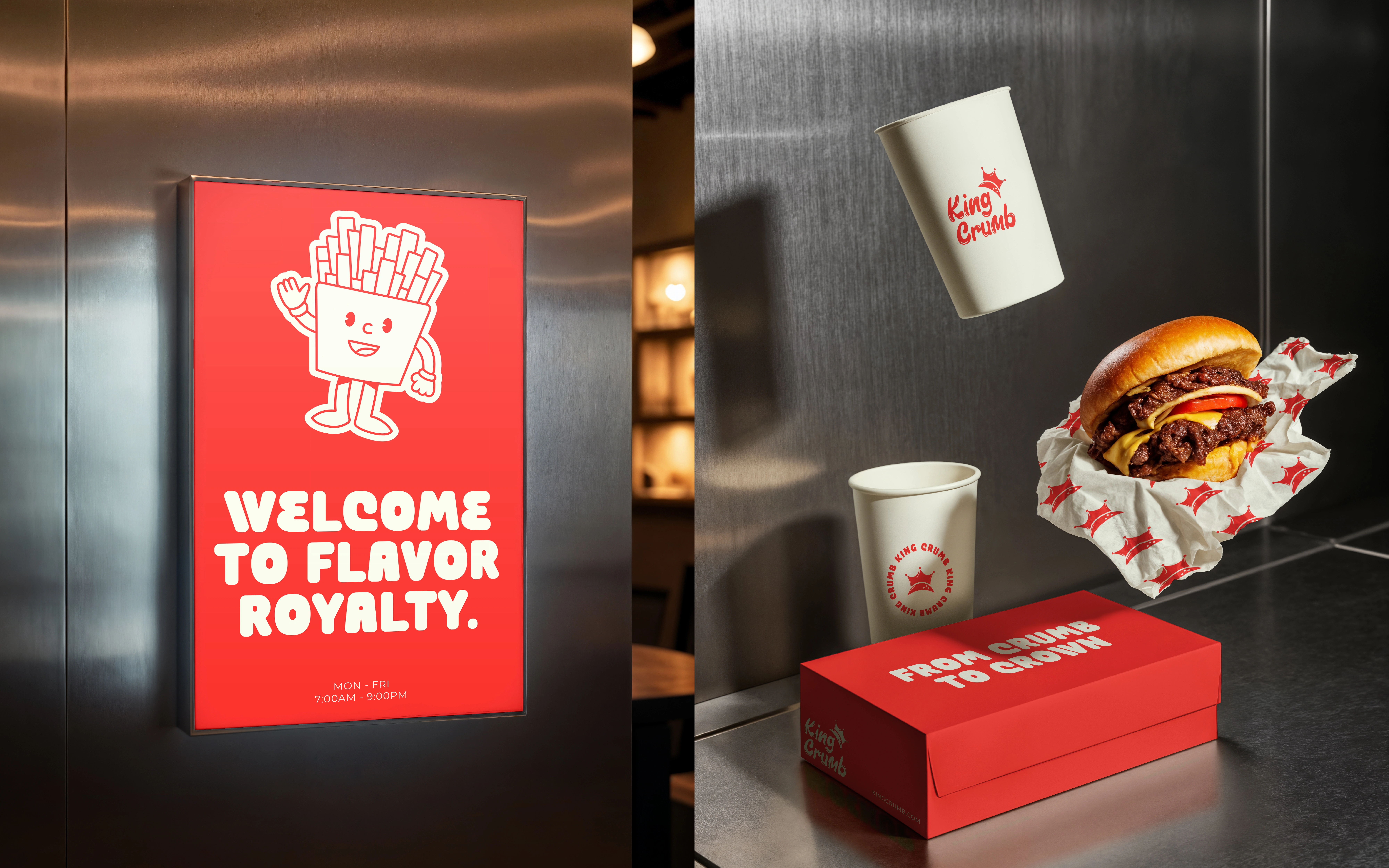
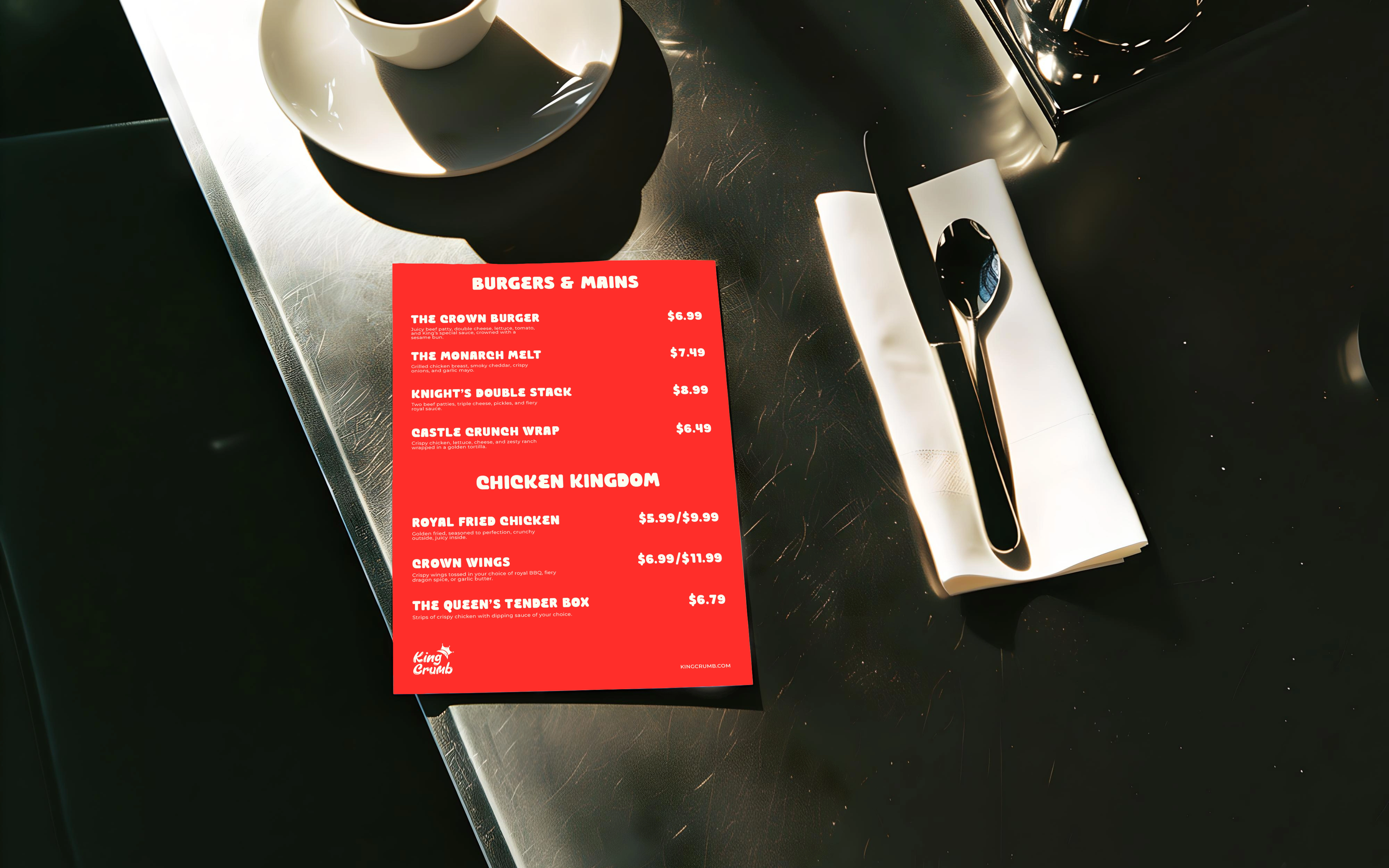
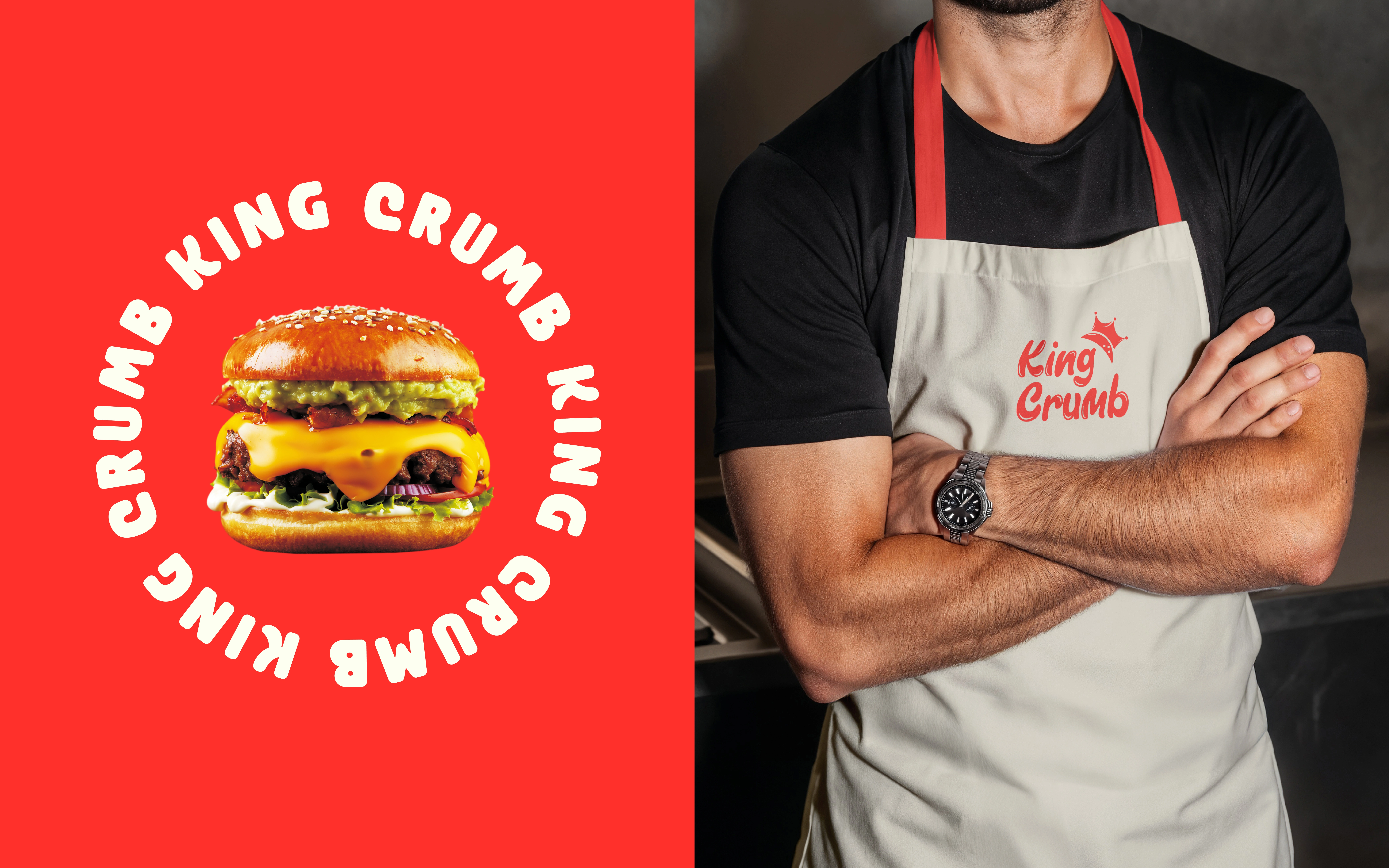
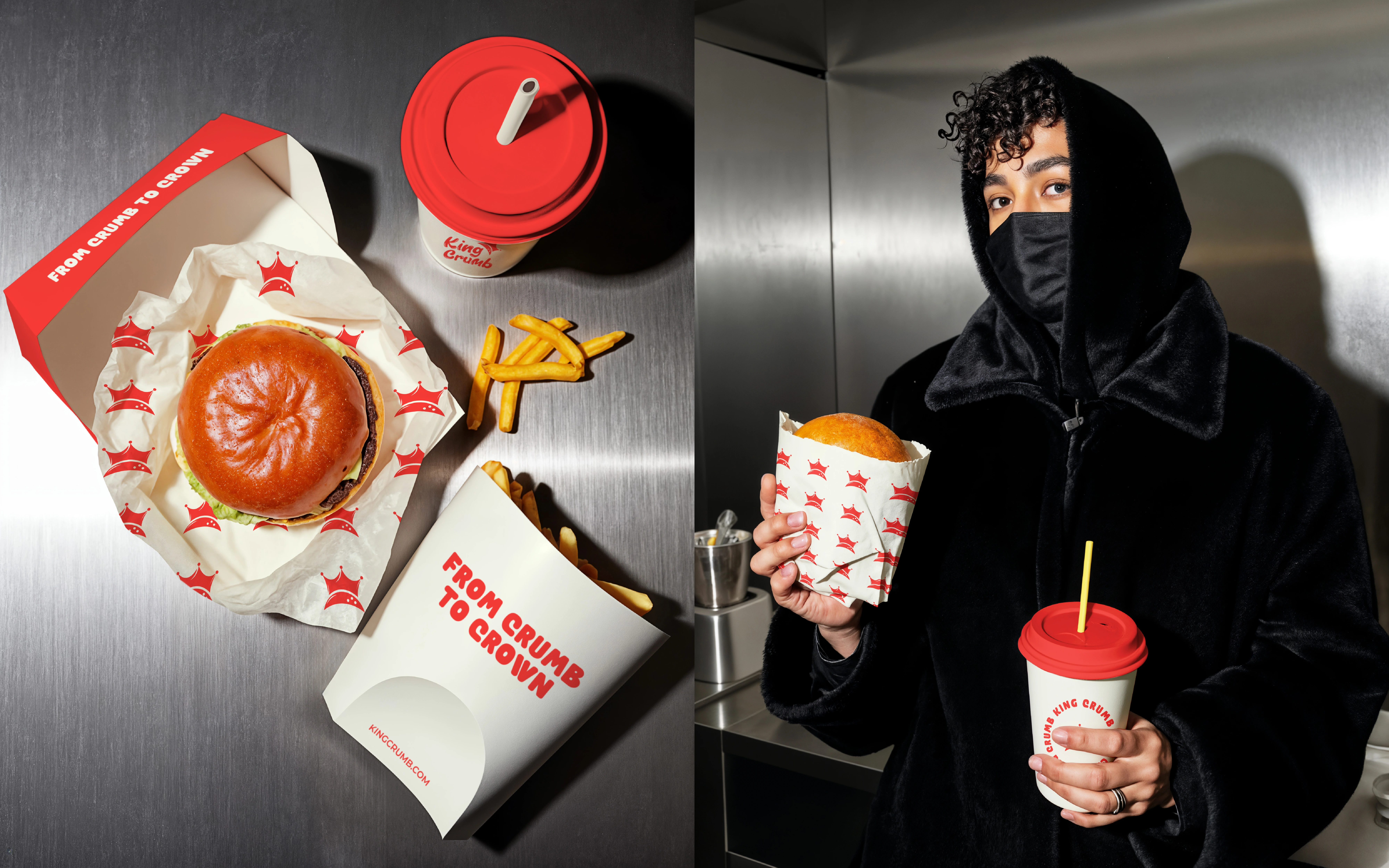
King Crumb is a self-initiated fast-food identity and packaging concept. The design challenge is to turn a playful name into a recognisable visual system across cups, wrappers, boxes and signage. The expressive wordmark and crown device connect the name with “From Crumb to Crown,” giving the logo and brand voice a shared narrative.TYPOGRAPHY AND CHARACTER
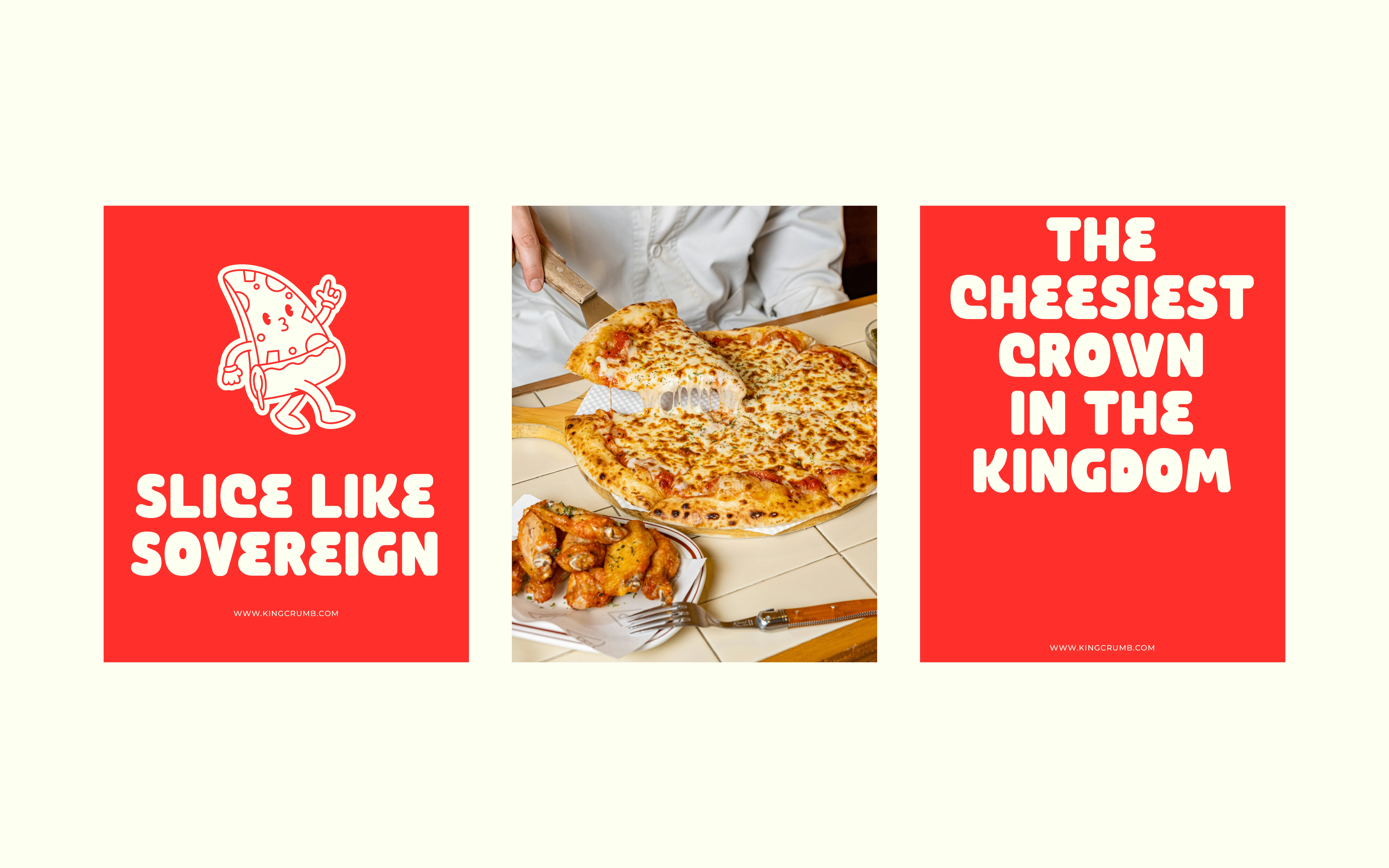
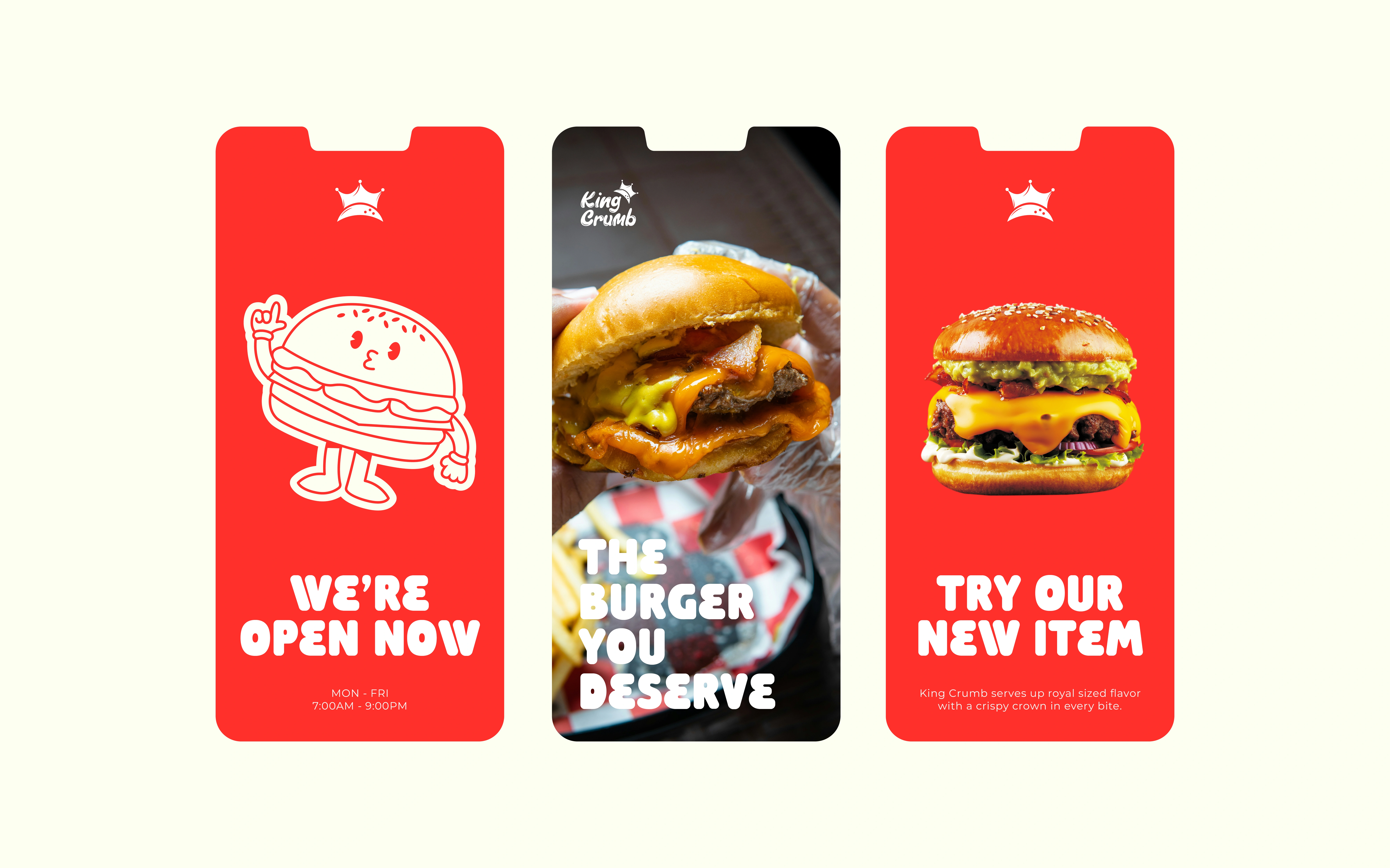
Rounded headline lettering gives short messages a strong silhouette, while the expressive wordmark gives the name its own rhythm. The illustrated fries character extends the playful tone beyond the logo.
COLOUR AND APPLICATION
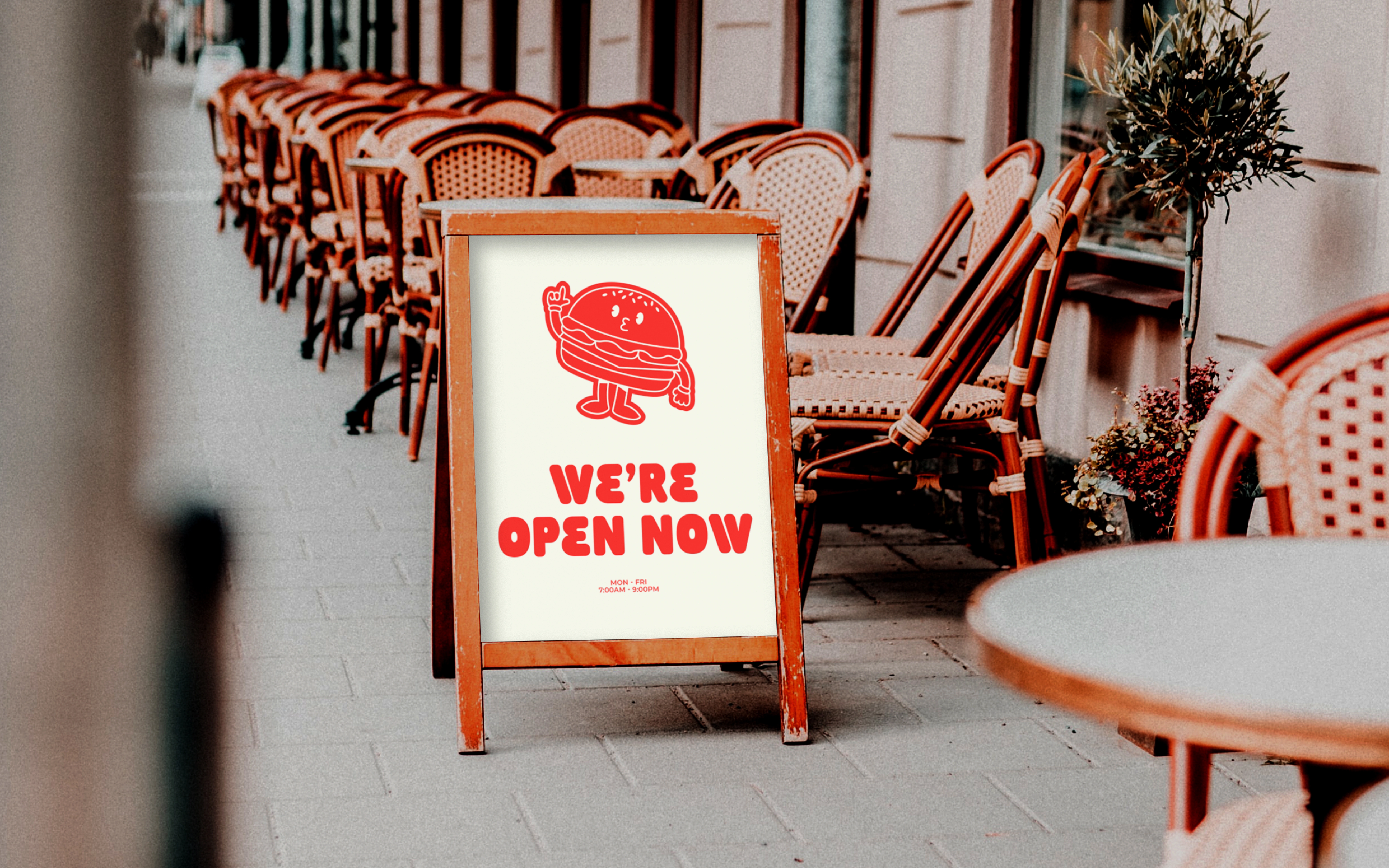
Red and cream repeat across signage, cups, wrappers and boxes. Reversing the colours changes emphasis while keeping the identity connected: a red poster creates a bold colour field, while a light cup gives the smaller logo breathing room.
CONCEPT OUTCOME
A connected identity linking the name, typography, illustration and takeaway packaging. These are proposed brand applications, not a live restaurant rollout or measured customer results.
DESIGNED BY - FIEONART © 2026
1 like · 16 views · Oct 16, 2026
Featured on Contra — October 2026. Self-initiated fast-food identity concept with expressive lettering and red-and-cream packaging.
Timeline
Aug 16, 2025 - Jul 13, 2026

