Home Haven Brand Identity Design

Sammy Tarlah Ngalla


Building Brand Equity: Home Haven’s Brand Identity – Driving 35% Increase in Property Inquiries and Elevating Market Share by 15%
In this case study, I will walk you through the entire branding process for designing the brand identity of a real estate company – Home Haven from scratch.
Step 0: The Brief
Craft, a unique brand identity for Home Haven. We are seeking a skilled designer to create a compelling brand identity design for Home Haven. The design should reflect the brand’s essence, capture its story and appeal to our target audience.
The client reach out to us to help craft a strong visual identity that communicates all the values they stand for. Building this brand was way, more than just designing a good-looking logo, as branding is less of how something looks and more about how it’s perceived. The first step I took to create this brand was strategy.
Step 1: Brand Strategy
Strategy helped me answer the big questions;
Why should people care?
What makes the brand different?
Whom are we speaking to?
What are we trying to change?
For Home Haven, we had a few in depth discussions with the client around this questions and here’s what we landed on.
Brand Purpose: They brand’s purpose was clear, they wanted to empower individuals and families to find and secure their perfect living and investment property with unparalleled trust, transparency, and personalized service Brand
Mission: Their mission was to empower individuals and families in Cameroon to confidently find and secure their ideal living and investment spaces, built on a foundation of unparalleled trust, transparency, and personalized service.
Brand Vision: And the long-term vision was to be the most trusted and innovative real estate brand in Cameroon, known for connecting communities with exceptional living spaces and fostering long-term client relationships.
Target Audience: We identified the target audience as aspiring homeowners, savvy investors, and diaspora client.
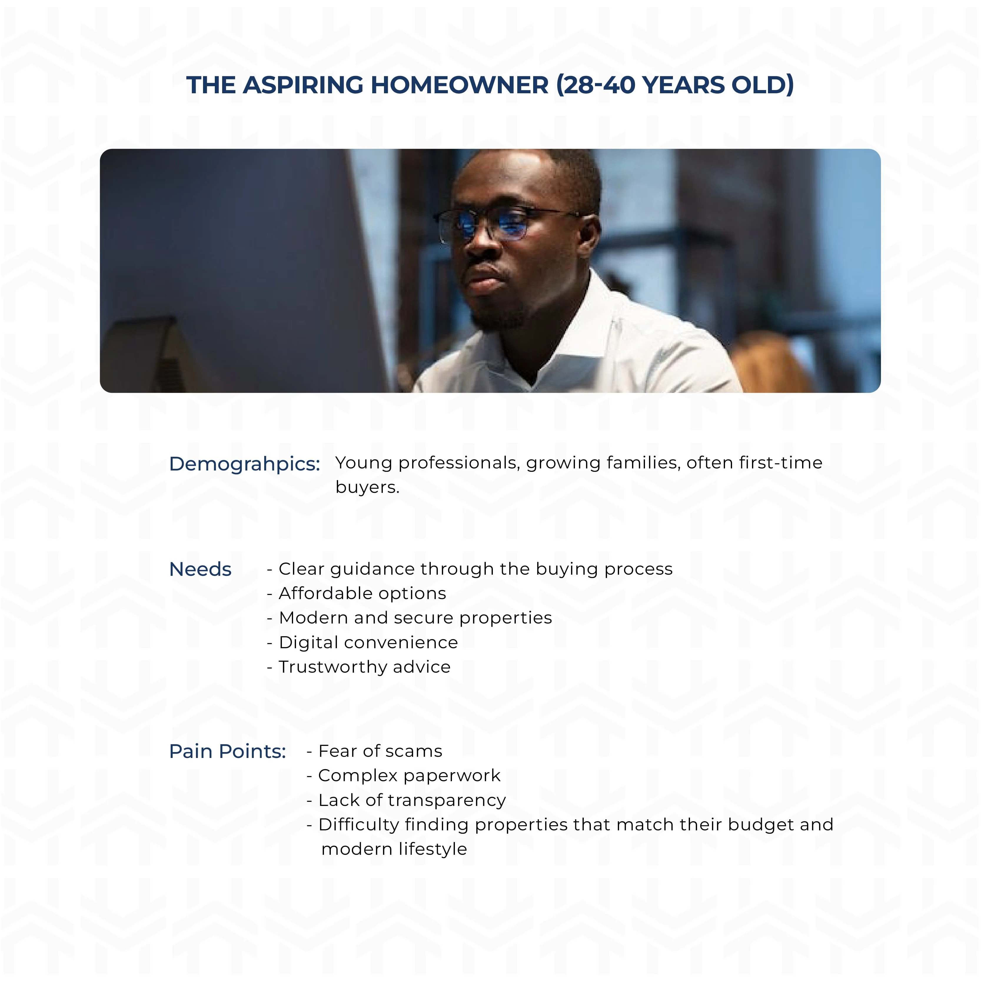
Persona 1: The Aspiring Home Owner - Home Haven
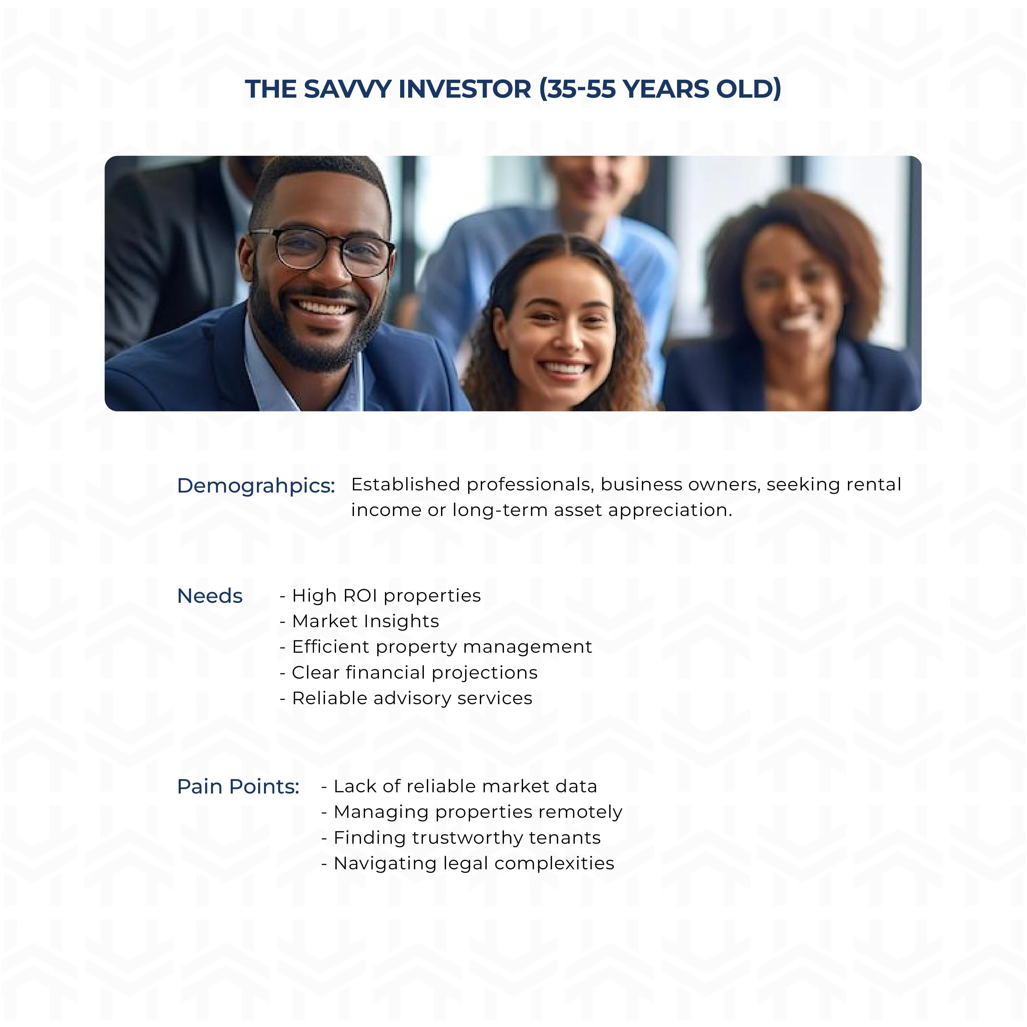
Persona 2: The Savvy Investor - Home Haven
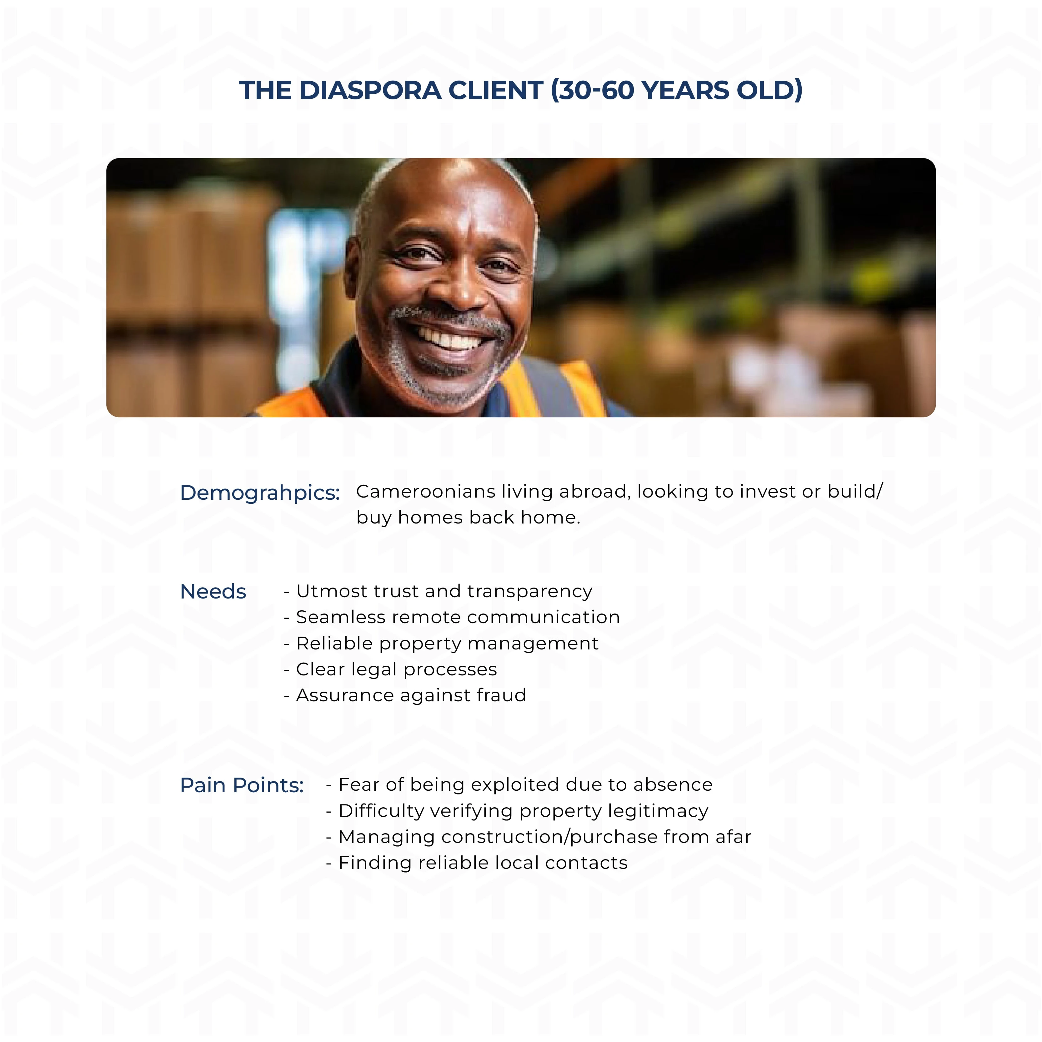
Persona 3: The Diaspora Client - Home Haven
Brand Values: Finally, we landed on a set of core values that were non-negotiable and it includes;
Trust & Transparency
Client-Centricity
Excellence
Innovation
Community
This aren’t just formalities and nice words, they become creative filters for every decision that comes next, because I didn’t design for aesthetics, but rather for enlightenment.
Step 2: Creative Direction
Once we had the strategy logged in, the next step was to collect visual references and start building creative directions. This is the part where I moved from strategic logical thinking into something more distinctive.
I spent time gathering references from Pinterest and Cosmos and combine them together. So, I put together three distinct directions to present to the client.
The first direction is fun, vibrant, and playful having this bold punchy energy and exciting, but didn’t quite feel premium and moreover, it lacked the kind of elegance and sophistication we were aiming for. So, we rolled out quickly.
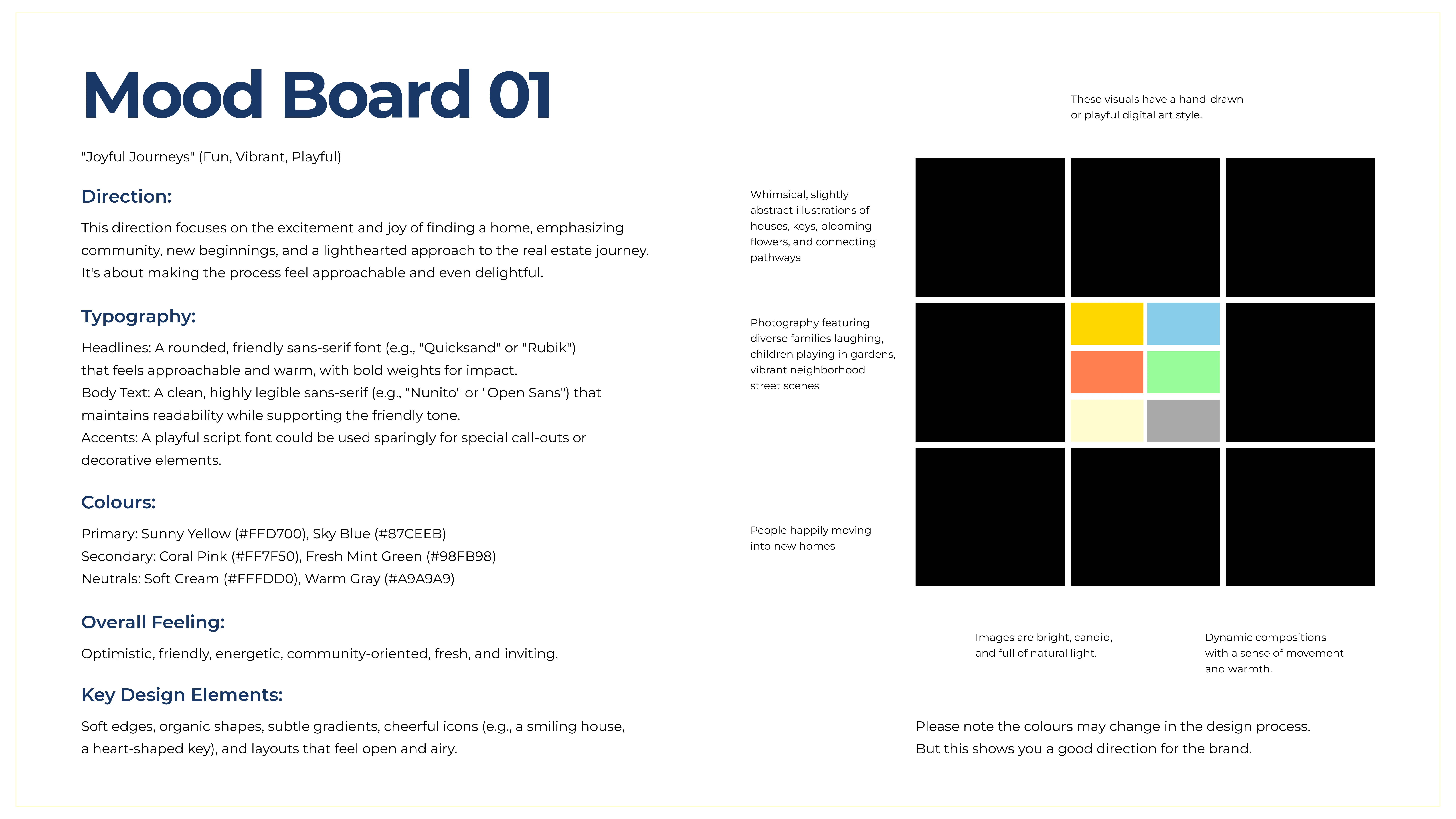
Mood Board 1: Fun, Vibrant, Playful - Home Haven
The second direction is more editorial, clean, elegant, stylish and sophisticated, as it is really drawn to the use of set of fonts and tones we were aiming for. But overall, this direction still felt a bit disconnected as it didn’t quite feel grounded enough for the brand.
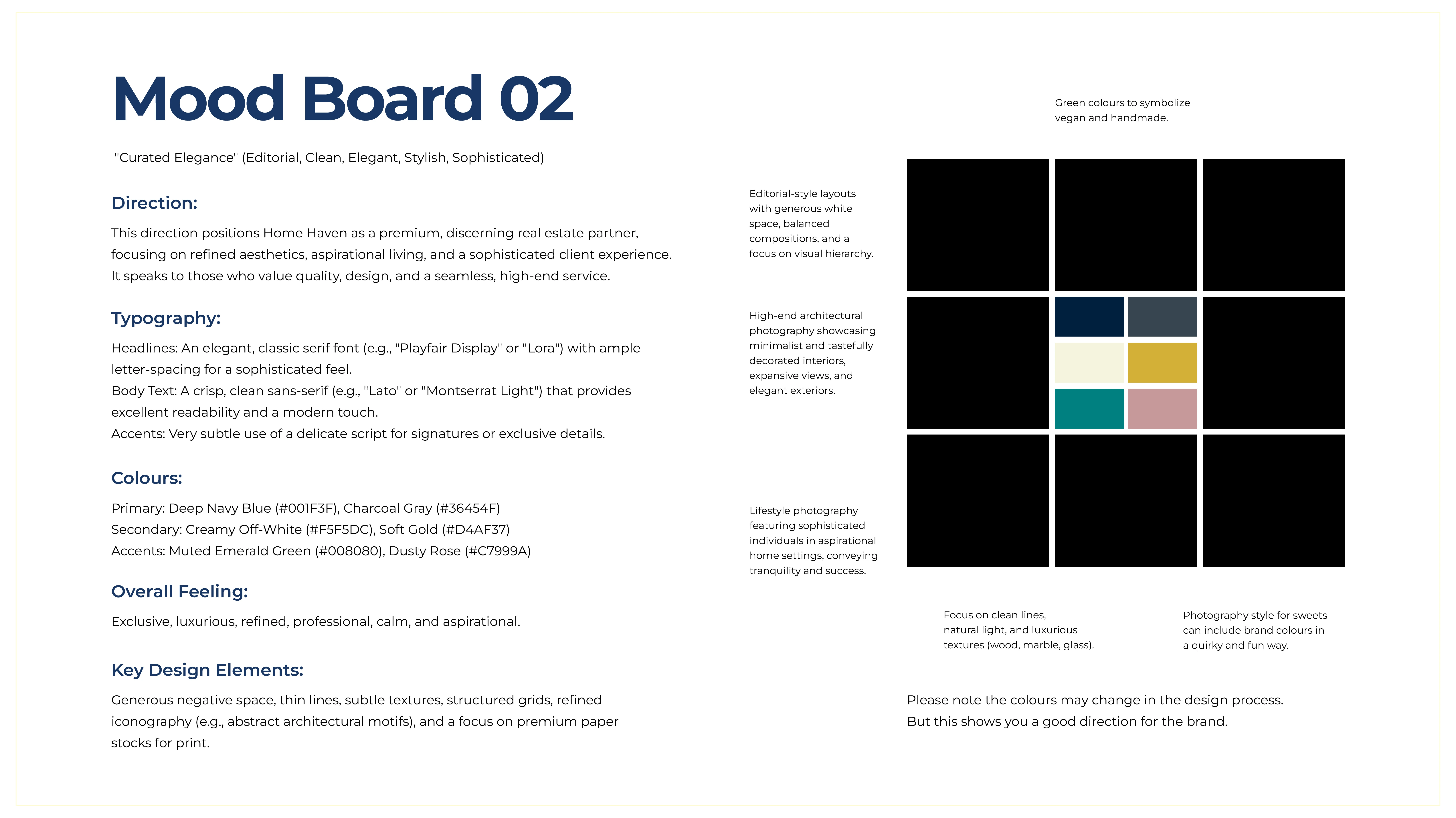
Mood Board 2: Editorial, Clean, Stylish, Sophisticated - Home Haven
The third direction was lean towards minimalism, and is inspired by vintage style and monograms. The typography is clean, the texture feels organic, and the overall vibe is premium without trying to hard. It struck beautiful balance between sophisticated and ideal.
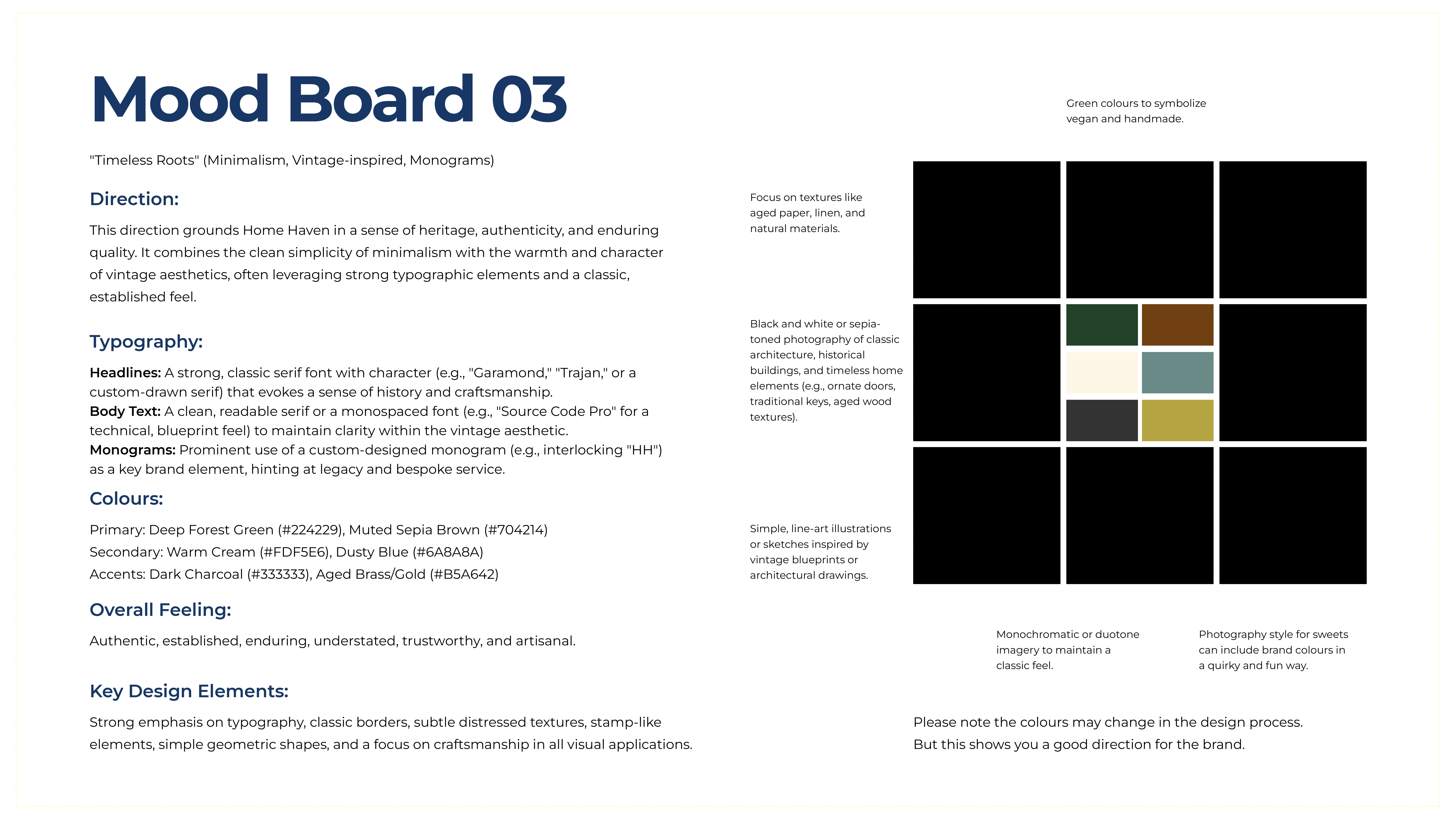
Mood Board 3: Minimalism, Vintage-inspired, Monograms - Home Haven
We ended up going with the third direction, but pull enough few elements from the second one, especially the primary colour and sans serif font
Doing these early, not only gives you the vision or idea to explore the brands look and feel, but shows the client you have done your homework, you have explored the possibilities and narrowed it down to the strongest concept. Most importantly, it helps set expectations for how the brand will look and feel and avoids confusion or unnecessary revisions later.
By logging in the creative direction early, we were creating a reference point something to come back to when making design decisions down the line. Once we had the creative direction logged in, it was time to move on to the next stage, sketching.
Step 3: Sketching
This is honestly my favourite part of the process, for me it is like meditation, with you, the pen, notebook and your thoughts.
The goal here is not to come up with the final logo, but rather to get all those ideas out of mind onto paper.
With a clear creative direction in mind, I started sketching out different logo concepts to explore how the identity might take shape visually. From the beginning, I wanted the logo to feel elegant and routed in modernity but at same time, I knew I never wanted to fall into the trap of clichés. So, I made a conscious decision to avoid the obvious; no home sketches, no H icons, no construction elements, because that will scale Home Haven in a generic way.
The first idea explored was; …
Visually, it just had the right balance of elegance and simplicity. It felt like a meaningful and appropriate choice, and offered a lot of potential to build clean, modern and minimal systems.
Alongside that, I also started sketching monogram concepts, exploring different ways to combine the two H’s together and playing with how they could be encapsulated in different shapes almost like….
Though I am not the best at sketching, I was giving myself the freedom to experiment, blend concepts and let the unexpected ideas emerge. In my experience, the more you sketch the stronger your creative instincts become and that is when the best ideas take shape.
I presented the ideas to the client and waited for the feedback. Of course, we went for one direction, which I will show you in the next step.
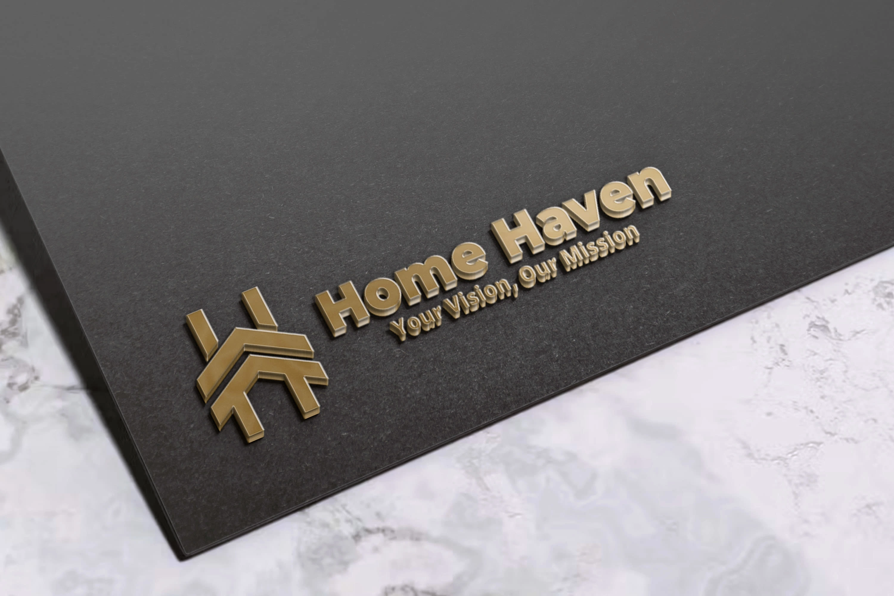
Step 4: Visual Identity
Now is time to bring our logo to life. After a lot of sketching, iterations, and feedback sessions with the client, we finally logged in on this variation below.
This is the most exciting part, actually building the visual identity. This is so because, the logo starts to take shape, the system comes together, and the brand begins to live and breathe.
I vectorised the logo using Adobe Illustrator.
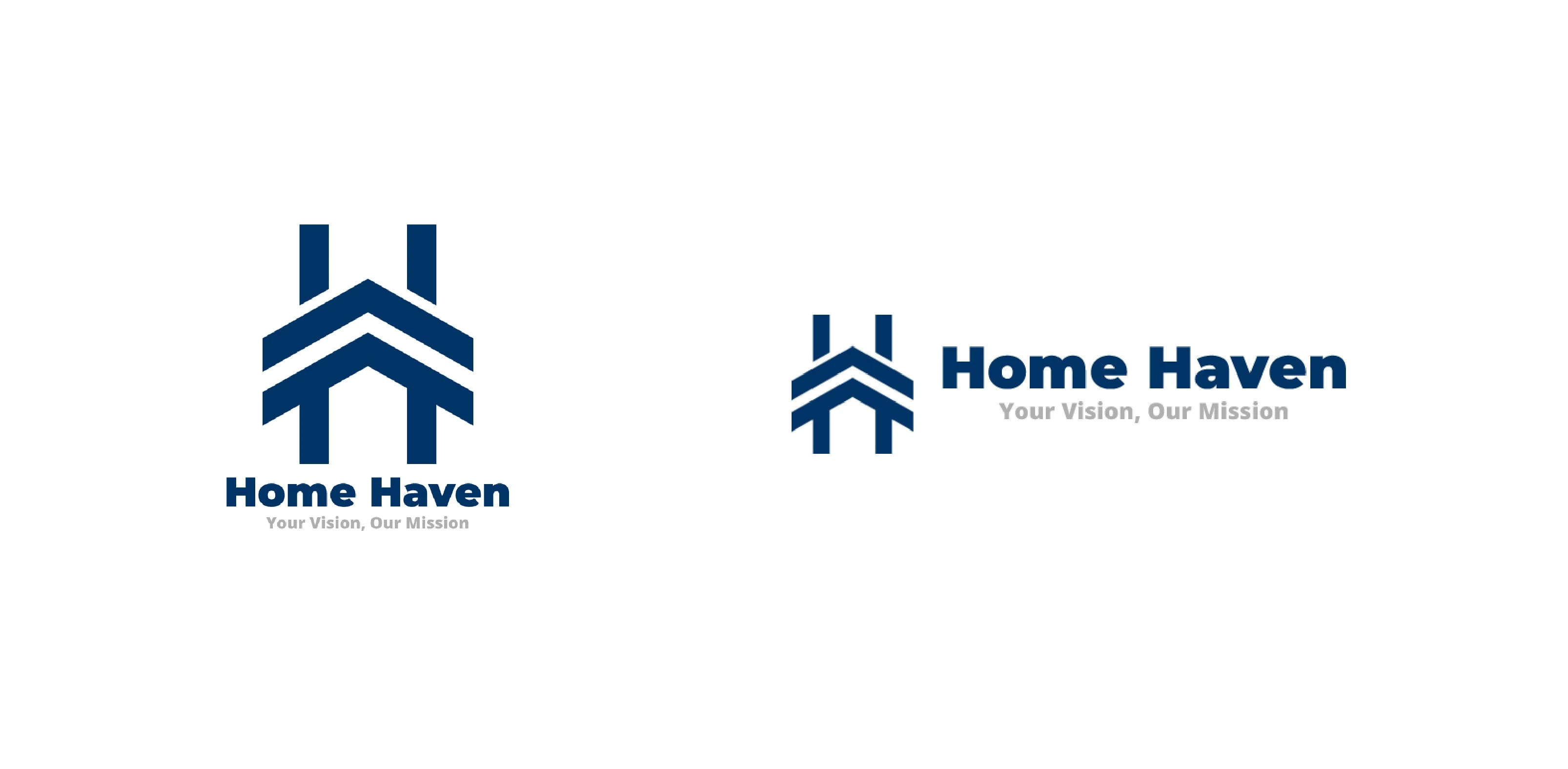
Vertically & Horizontally Stacked Logo - Home Haven
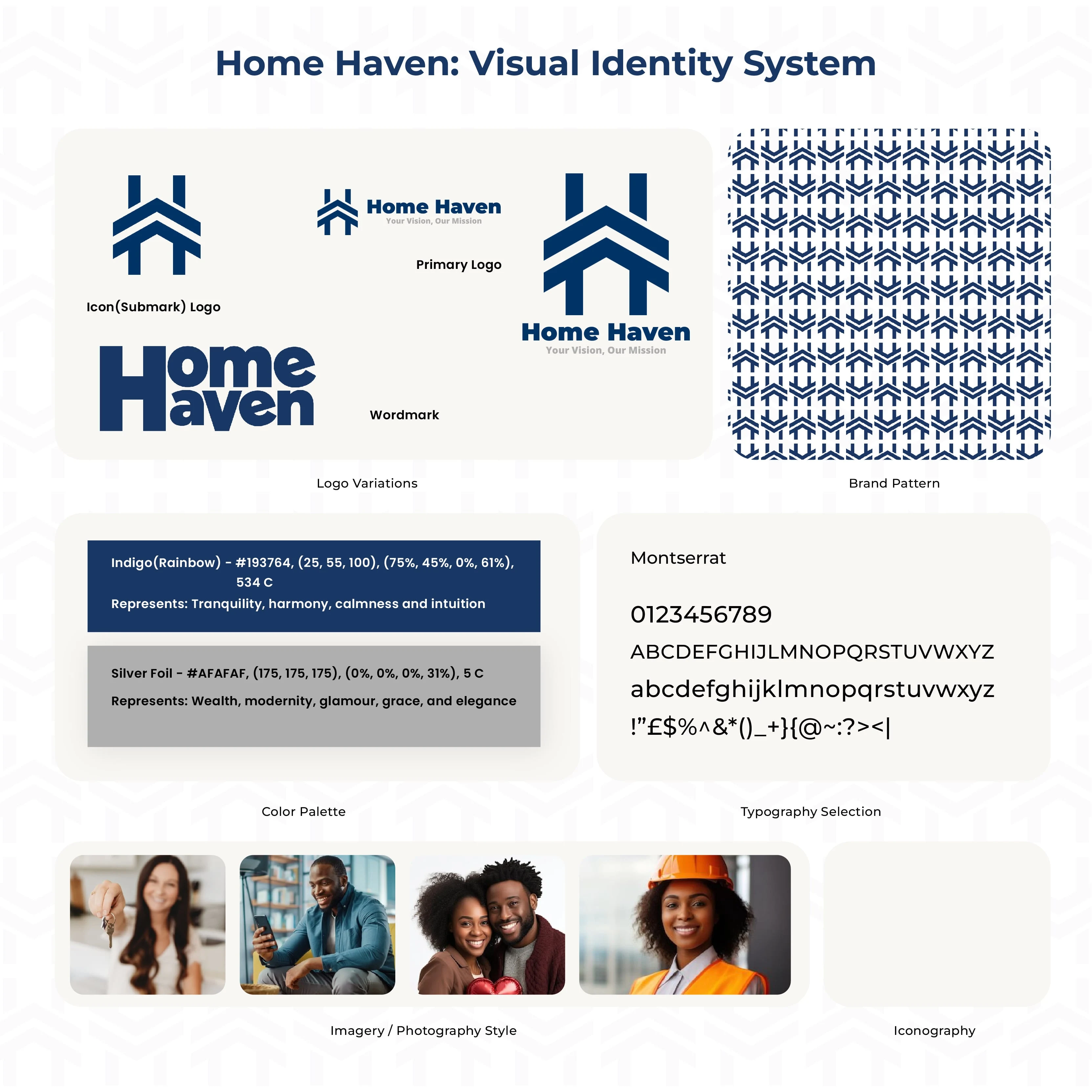
Visual Identity System - Home Haven
I have cleaned up the proportions and made sure the logo feels balanced and scalable. I also paired it with a clean typeface and created some fundamental brand assets. Keeping the creative direction in mind, I kept things minimal, mostly in black and white.
With the basic brand assets logged in, the next steps was to start applying them to the product. I collected to reference material for display ideas and see how the identity will translate into a physical form.
We have gone from understanding the brief, building a strategy, exploring creative directions, and finally constructing a visual identity. In the next step, I will show you the most impactful brand collaterals we decided to go with for this identity.
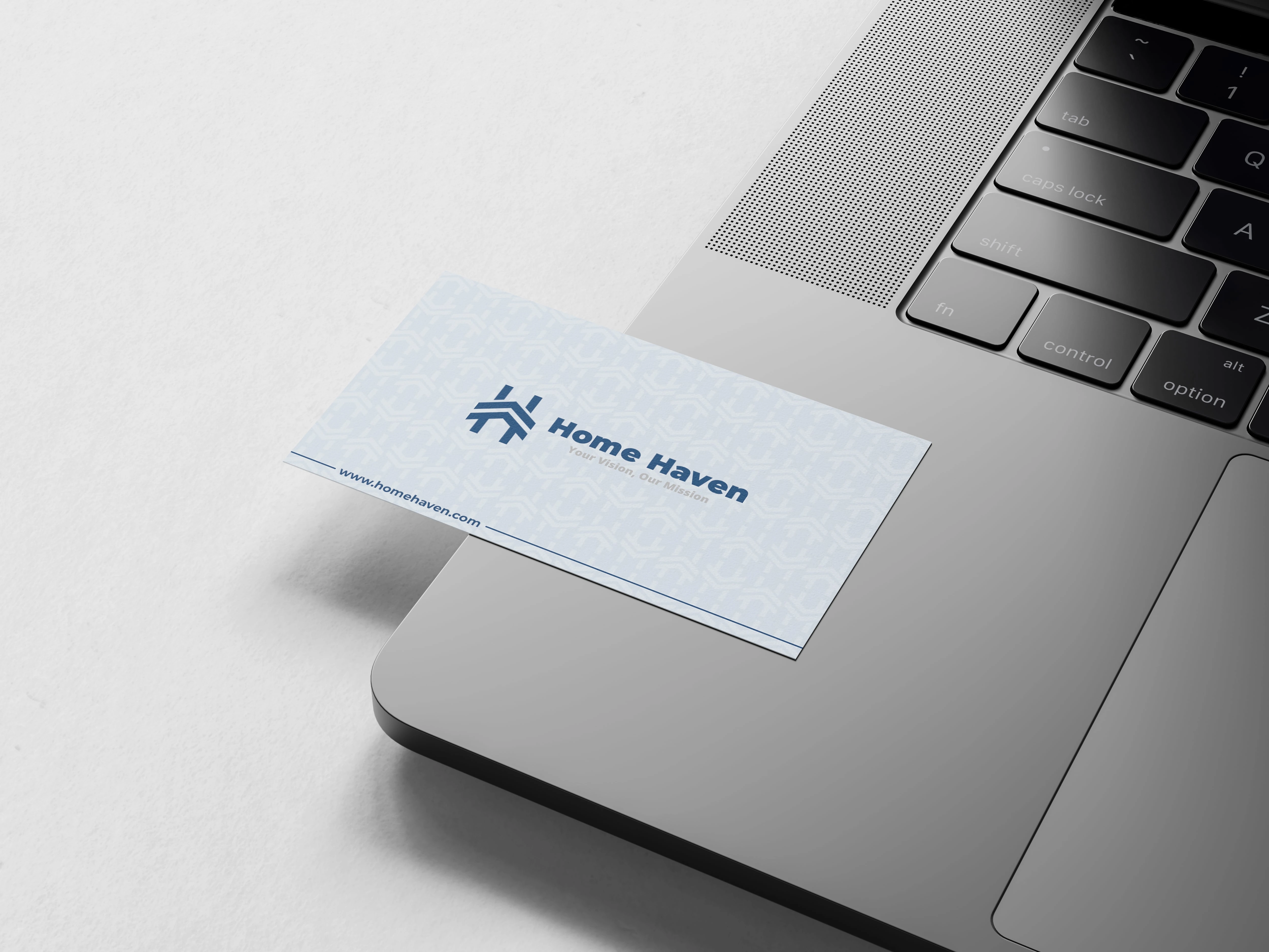
Step 5: Brand Collateral
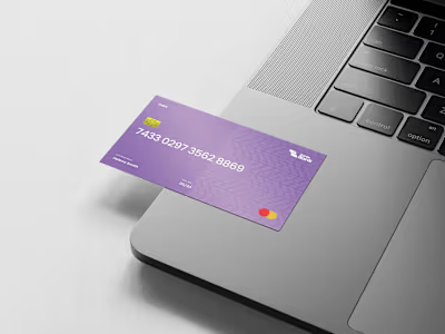
For this brand, we had to understand where our identity makes the biggest impact. We focused on the business card design, letterhead & envelope design, email signature design, and basic social media profile graphics.
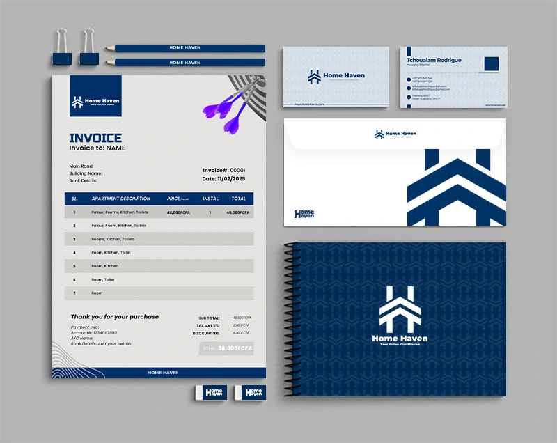
Invoice + Business Card + Book Cover + Envelope - Home Haven
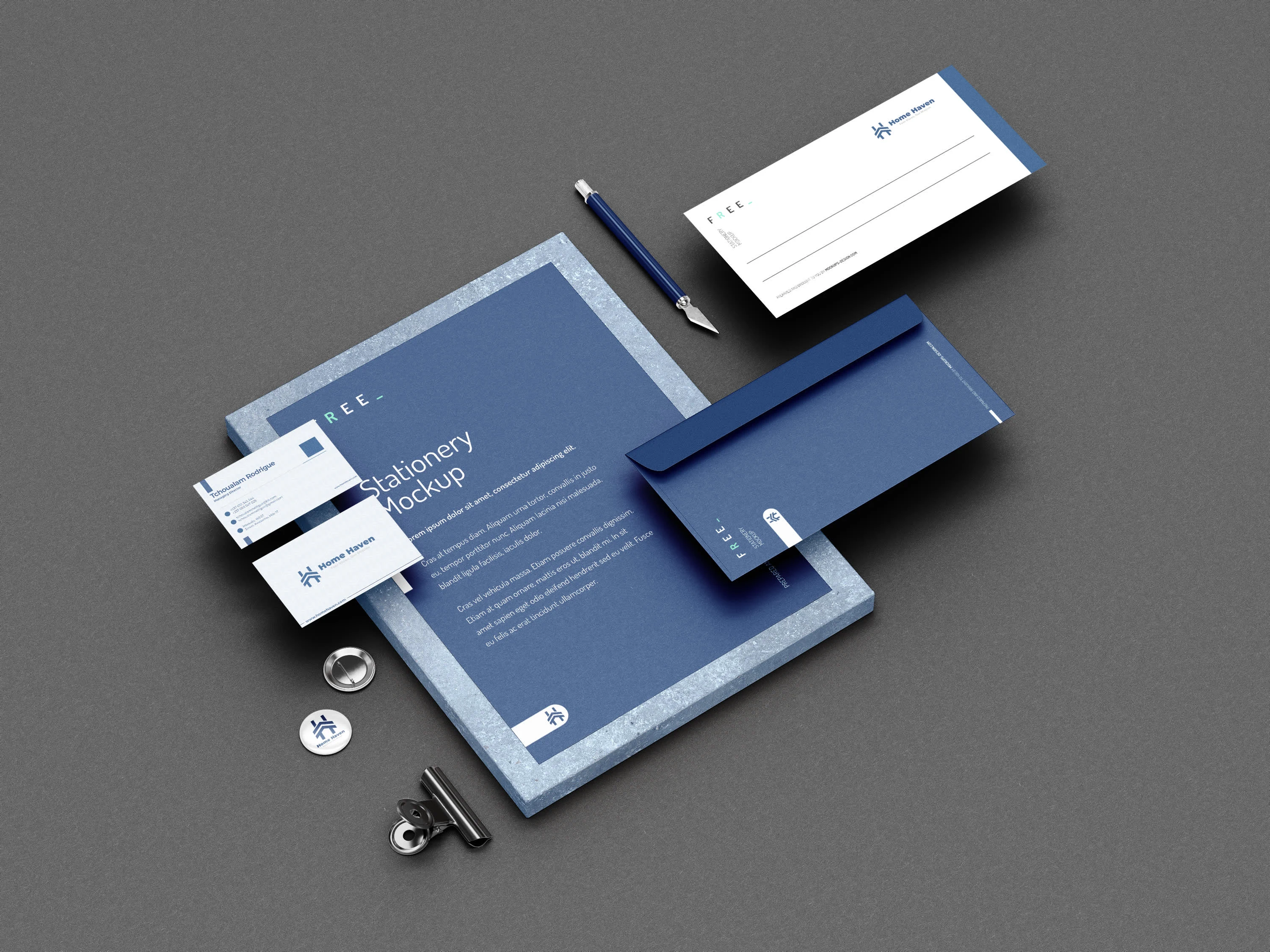
Stationery's - Home Haven
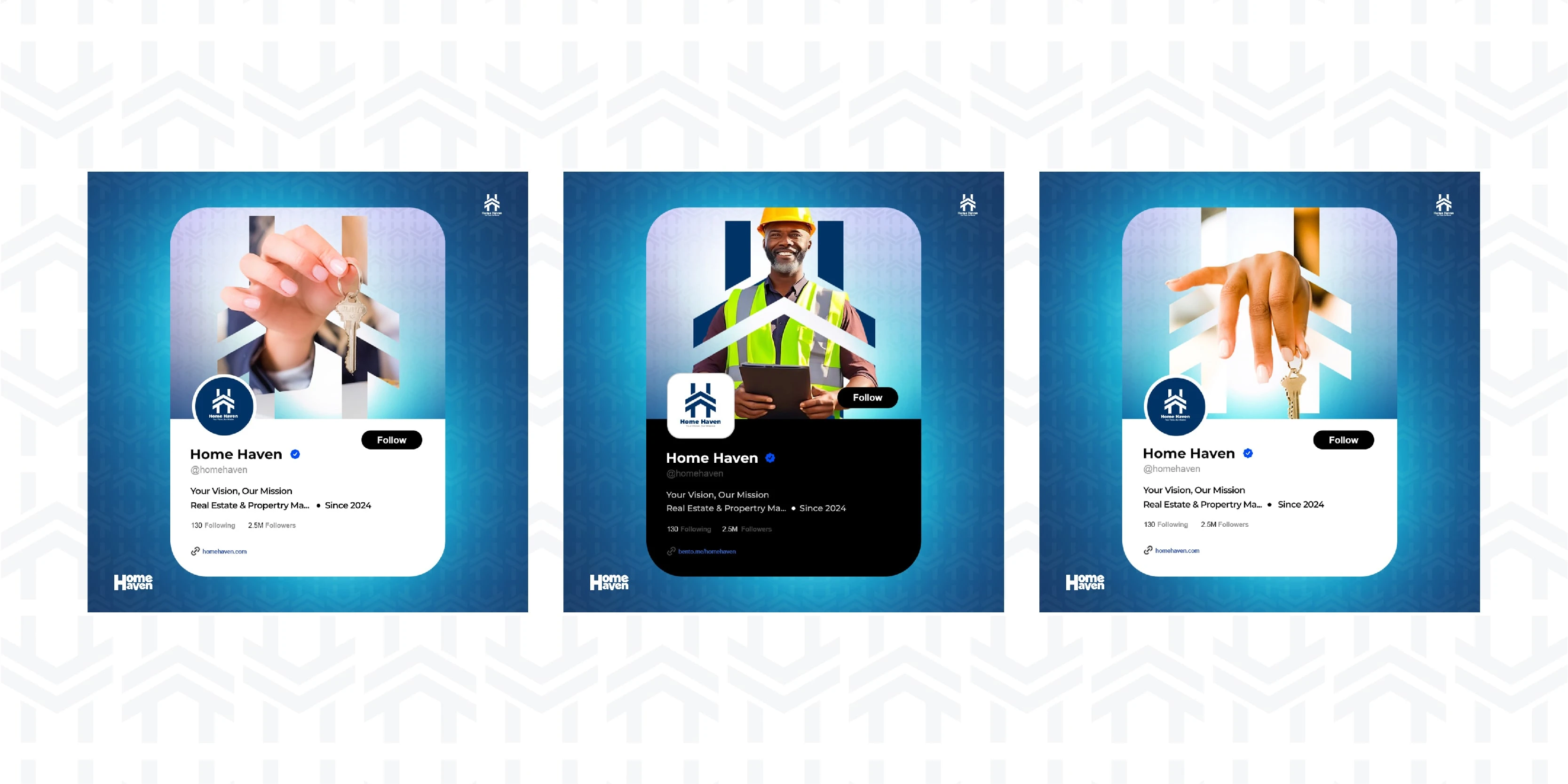
Social Media Handle - Home Have
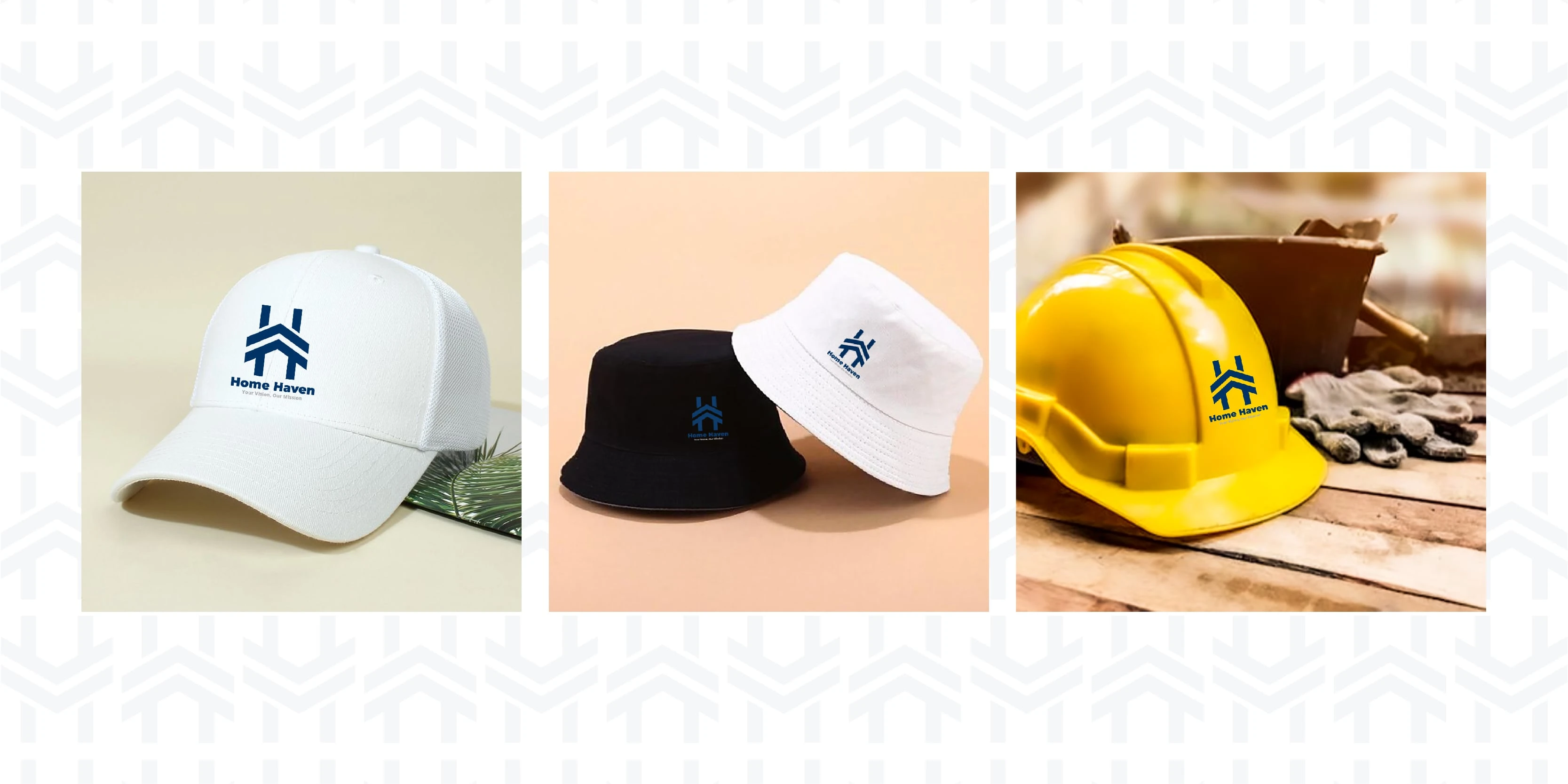
Caps - Home Haven
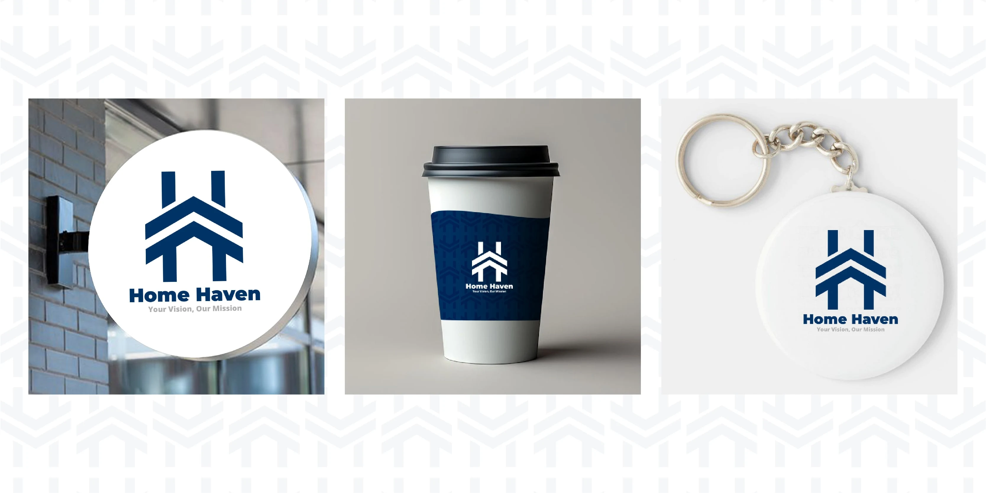
Signage + Coffee Cup + Button(Key Holder) - Home Haven
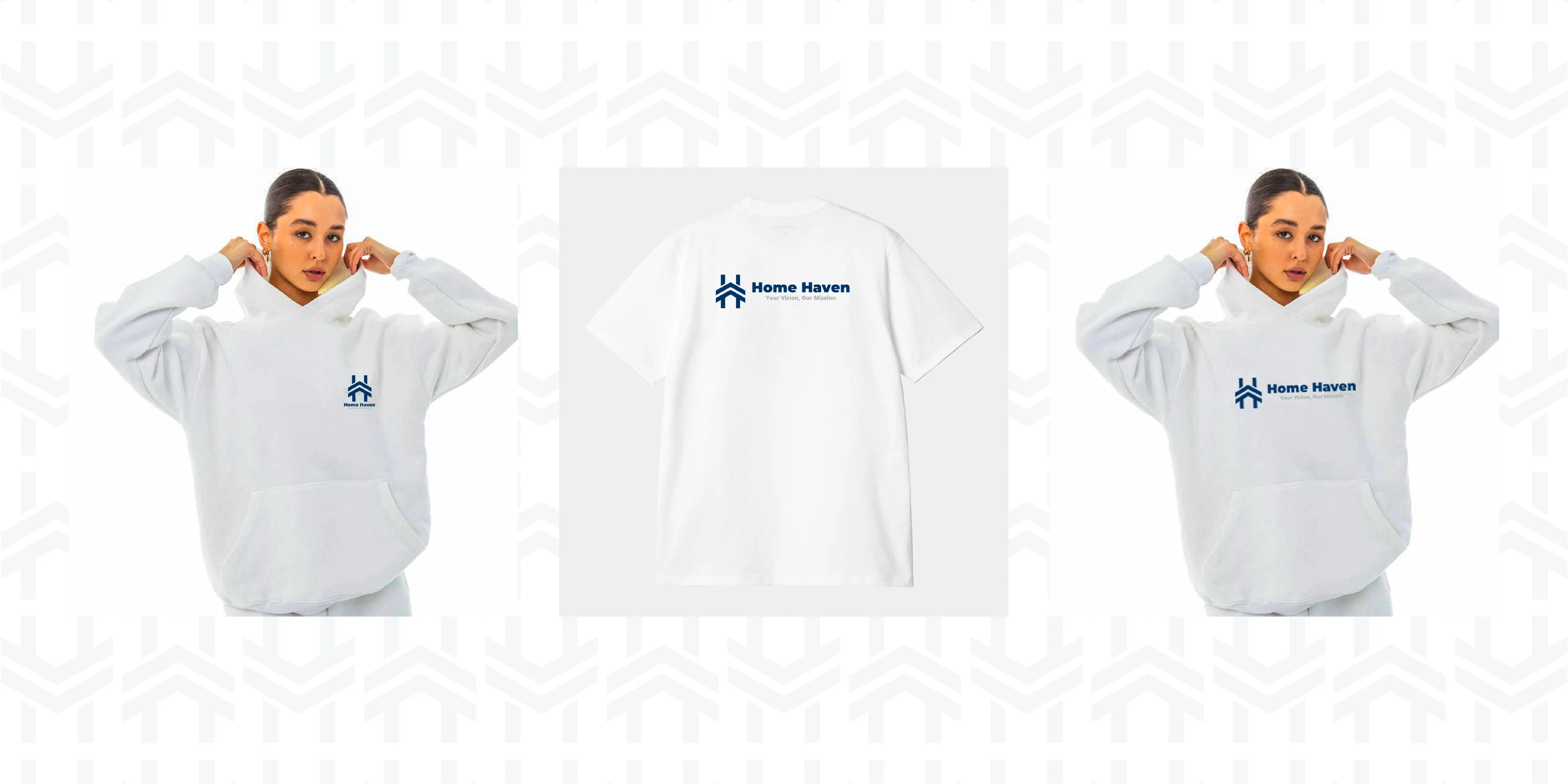
T-shirt + Hoodie - Home Haven
My Expected Metrics after Branding
The brand identity design for Home Haven was a strategic investment that aims to yield immediate and quantifiable results, demonstrating its power in a trust-sensitive market. Home Haven’s success metrics includes:
A 35% increase in property inquiries within the first six months of launch
A 20% faster sales cycle
A 15% higher conversion rate for diaspora clients
Improved quality of listings
Positive brand perception
Strong internal morale
Next Steps
Execute a phased launch plan across all marketing channels (digital, print, physical signage) to ensure consistent application of the new brand
Conduct workshops and provide ongoing resources for all Home Haven staff to deeply understand and embody the new brand values, tone of voice, and visual guidelines
Develop key marketing and sales collateral such as detailed property brochures, presentation decks for investors, and a comprehensive digital marketing asset library
Implement brand monitoring and feedback loops
Explore digital experience enhancements
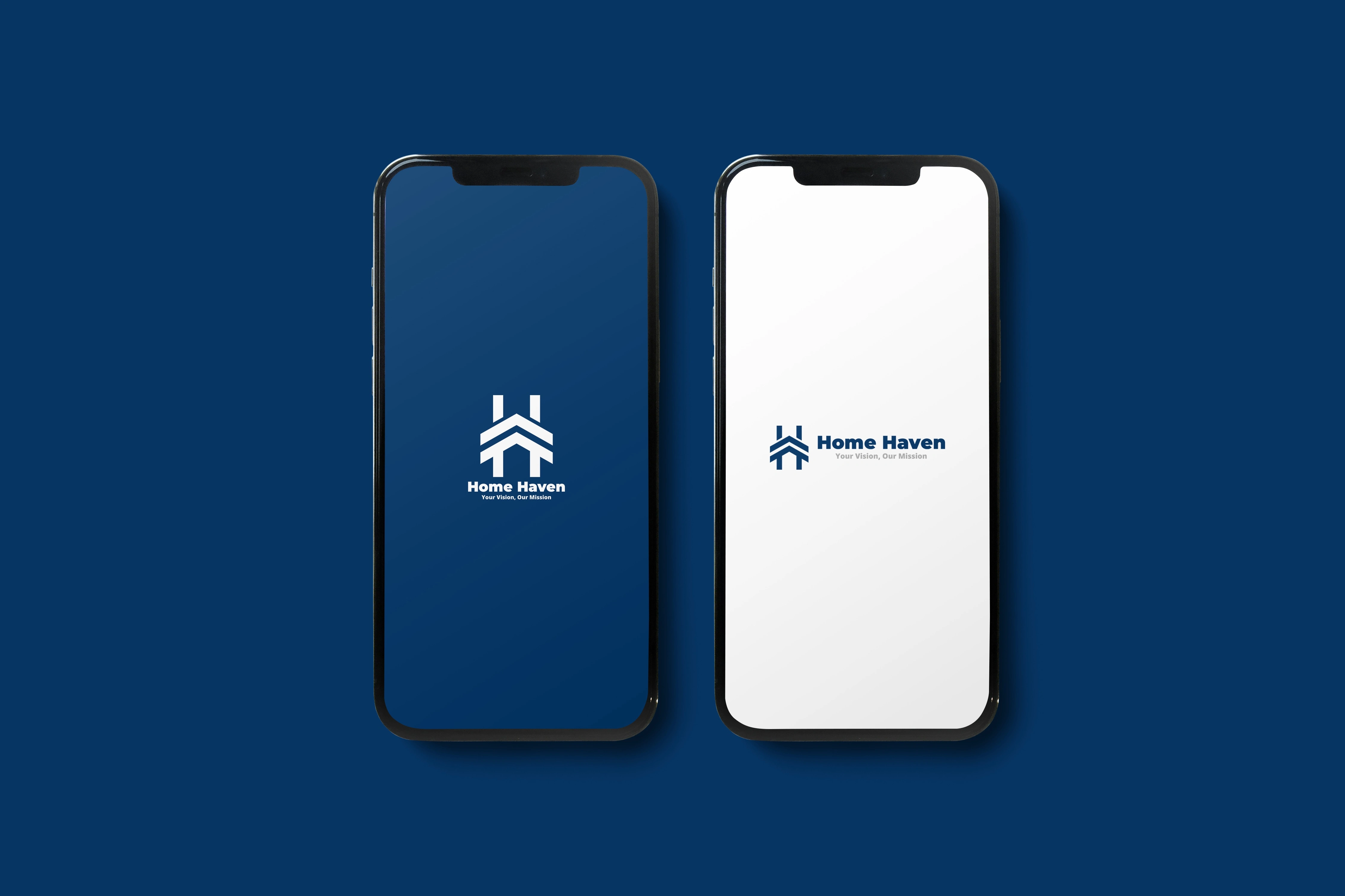
Mobile App Splash Screen - Home Haven
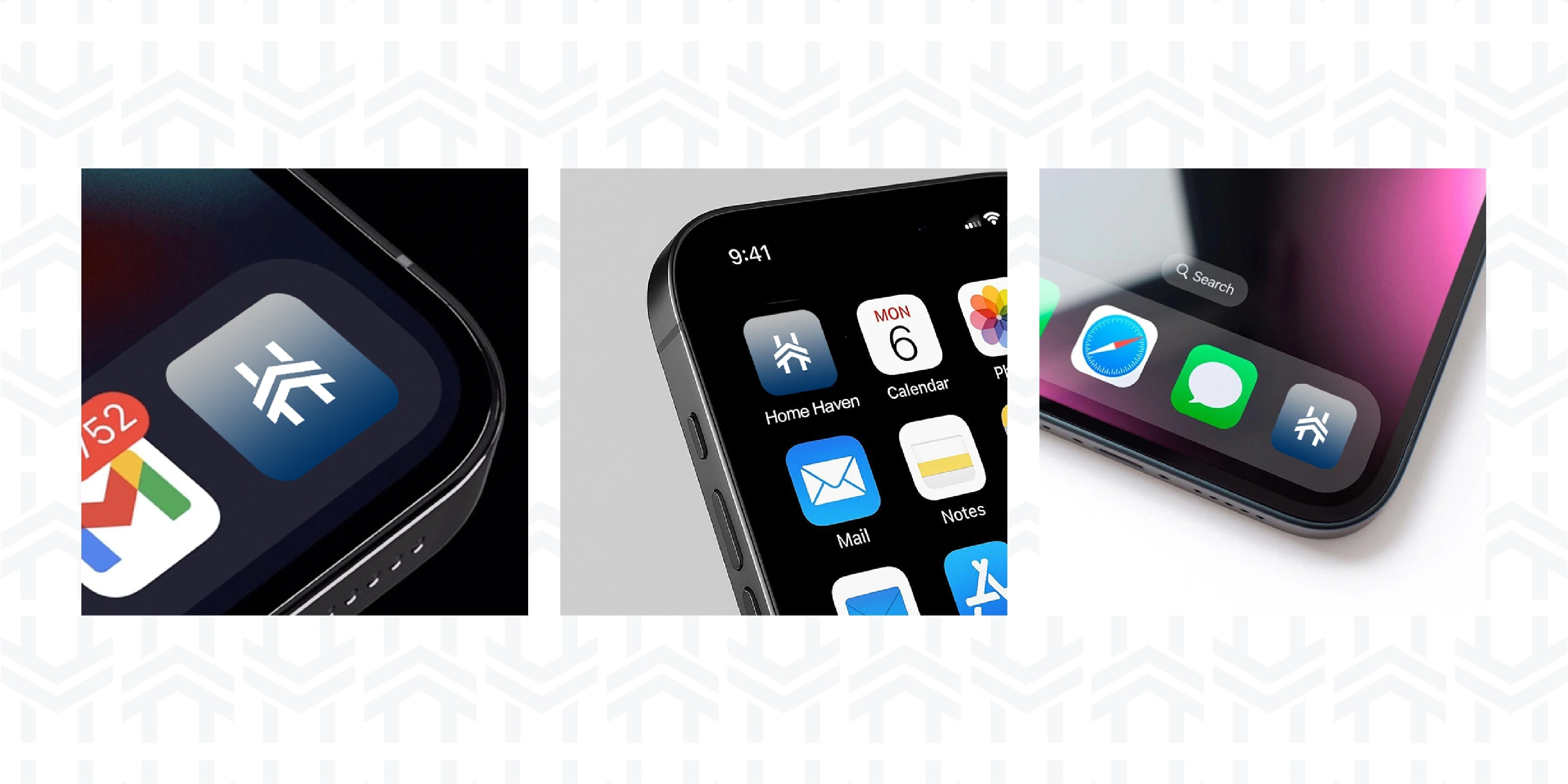
Mobile App - Home Haven
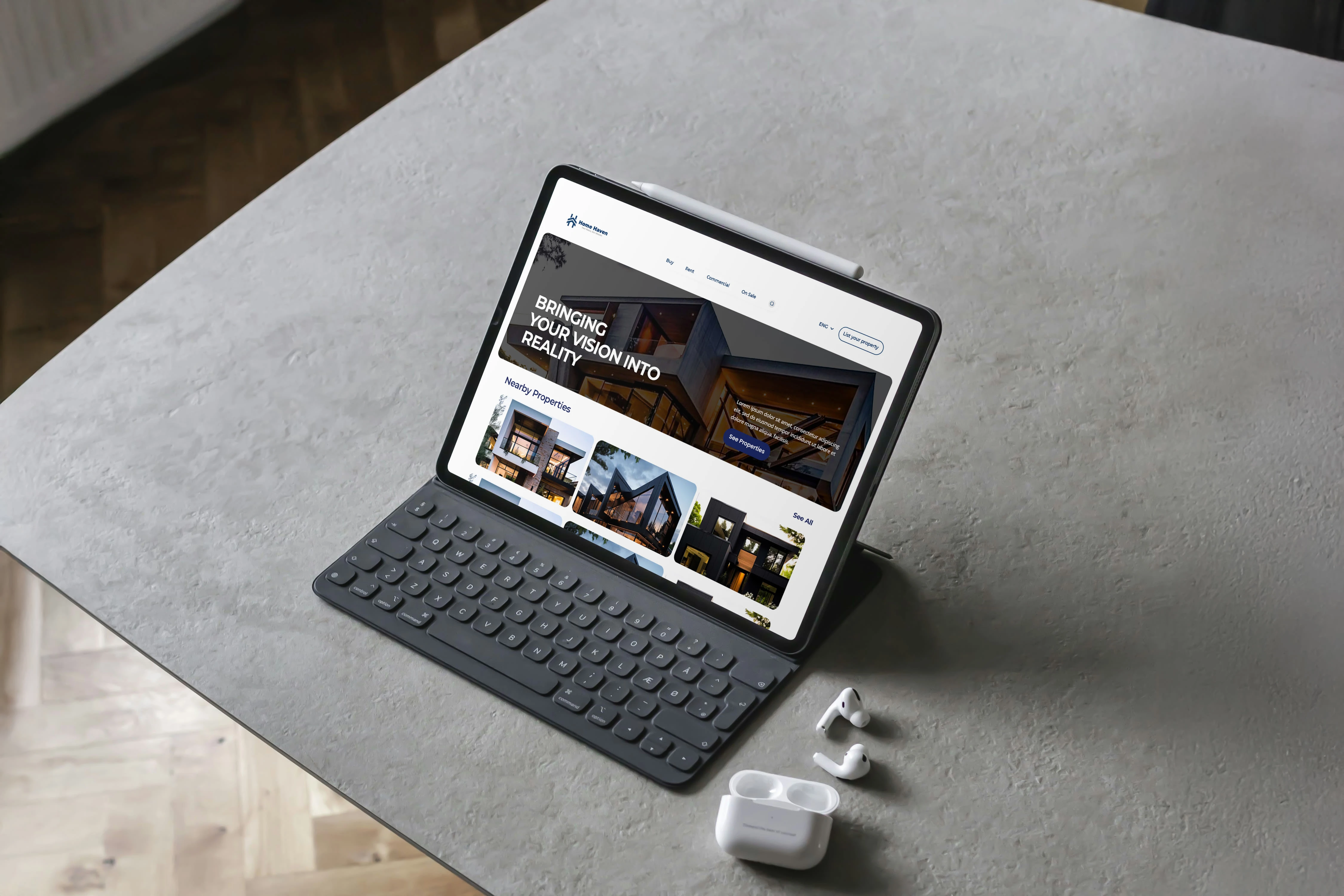
Tablet Viewport - Home Haven's Website
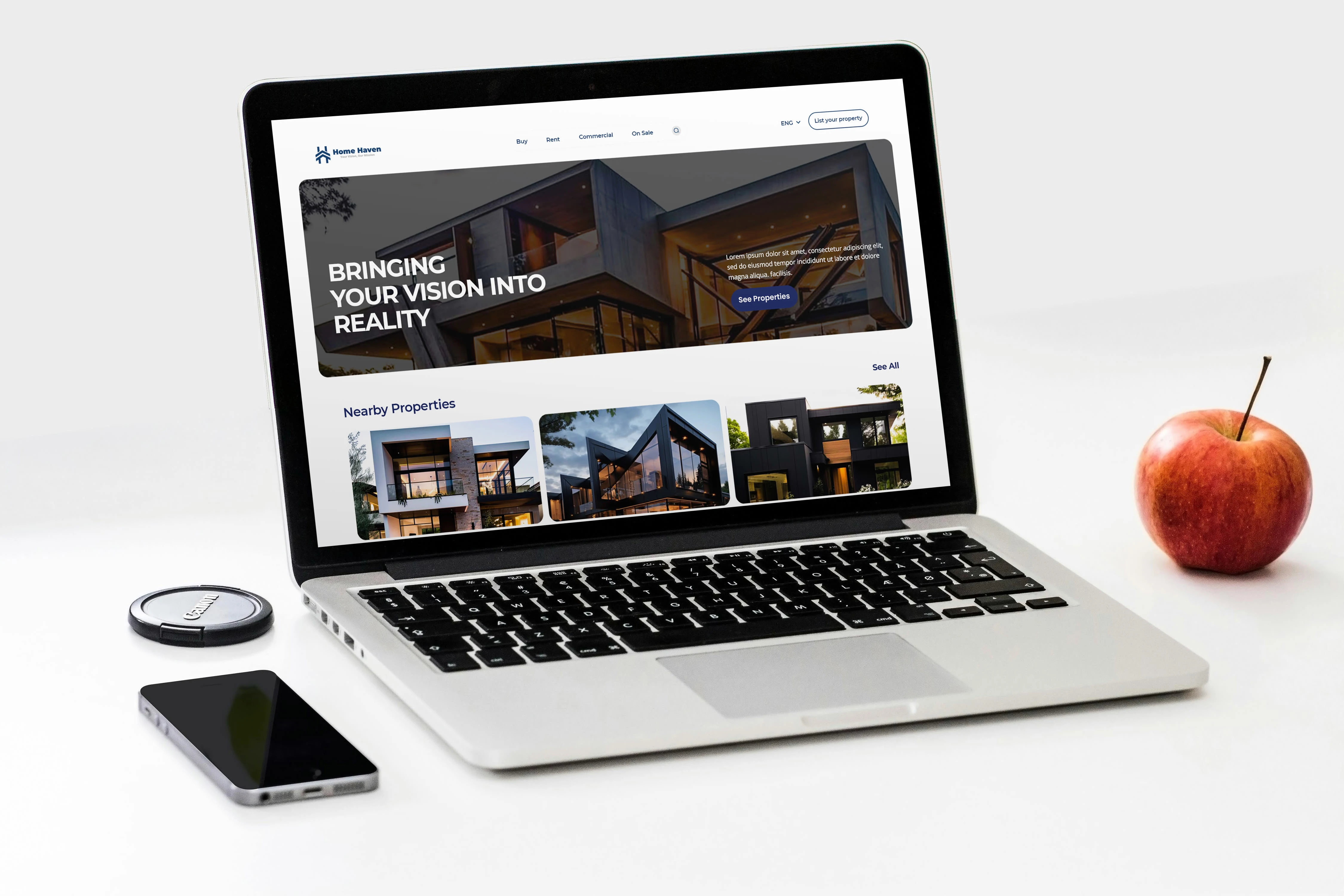
Laptop Viewport - Home Haven's Website
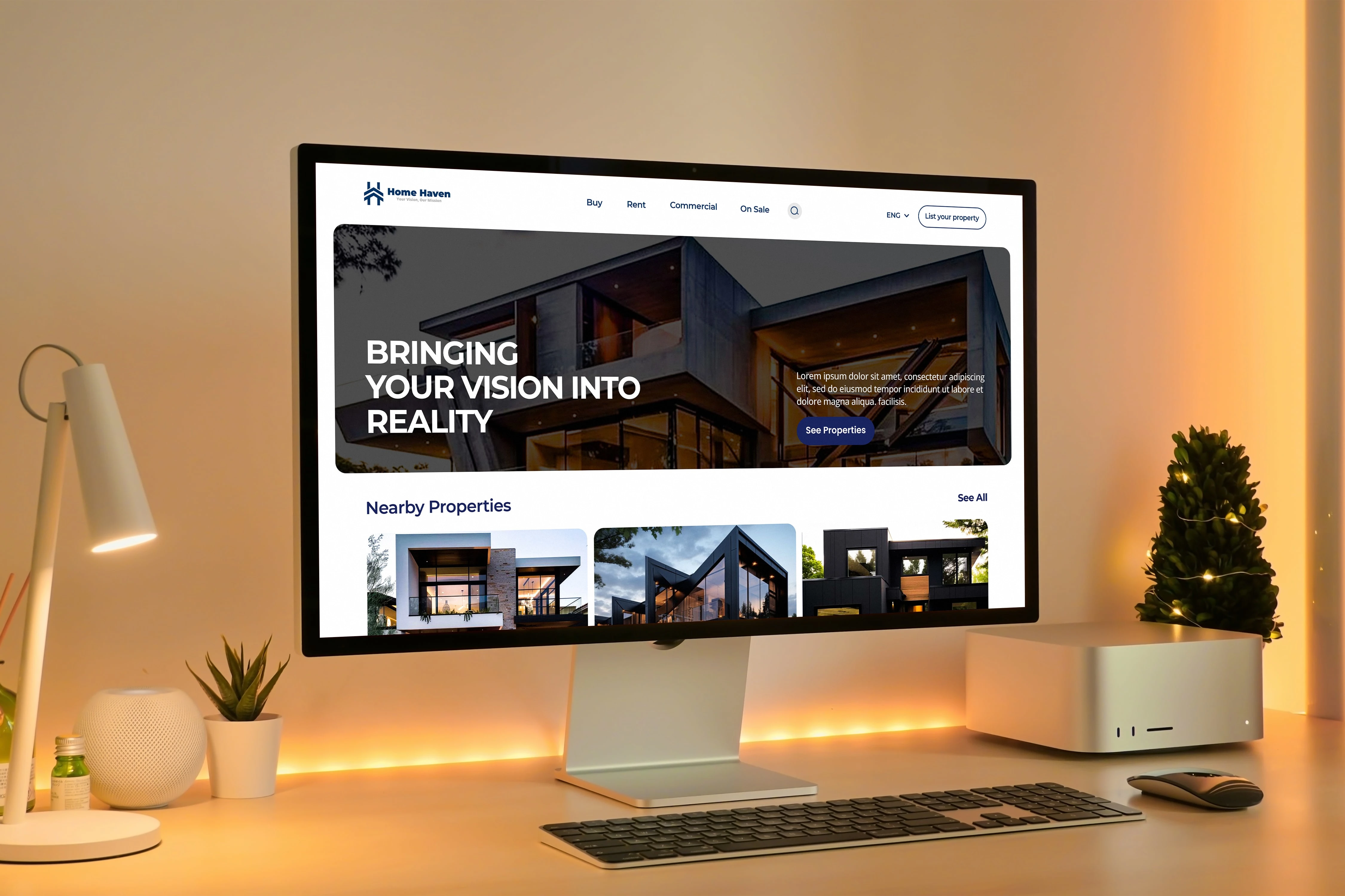
TV Viewport - Home Haven's Website
Conclusion
Branding doesn’t end here, the logo, colour palette or packaging system is just the foundation. For it’s an ongoing process that evolves as the company, audience or product(s) evolve, and every interaction shapes it. It’s not just the design, it’s every other detail. This is my approach and framework I followed for this brand identity design project, and it helped me stay aligned, reduced back-and-forth, avoid unnecessary revisions and most importantly deliver work that is suited in strategy and intention. That said every brand is different.
Like this project
Posted Jul 31, 2025
Designed brand identity for Home Haven, boosting inquiries by 35% and market share by 15%.


Reimagining Finance: A Fintech Brand Transformation
Brand Identity Development for Dopi Creative Concept