Built with Framer
B2B Health Tech SaaS Landing Page Design & Development

Gabriel kayode


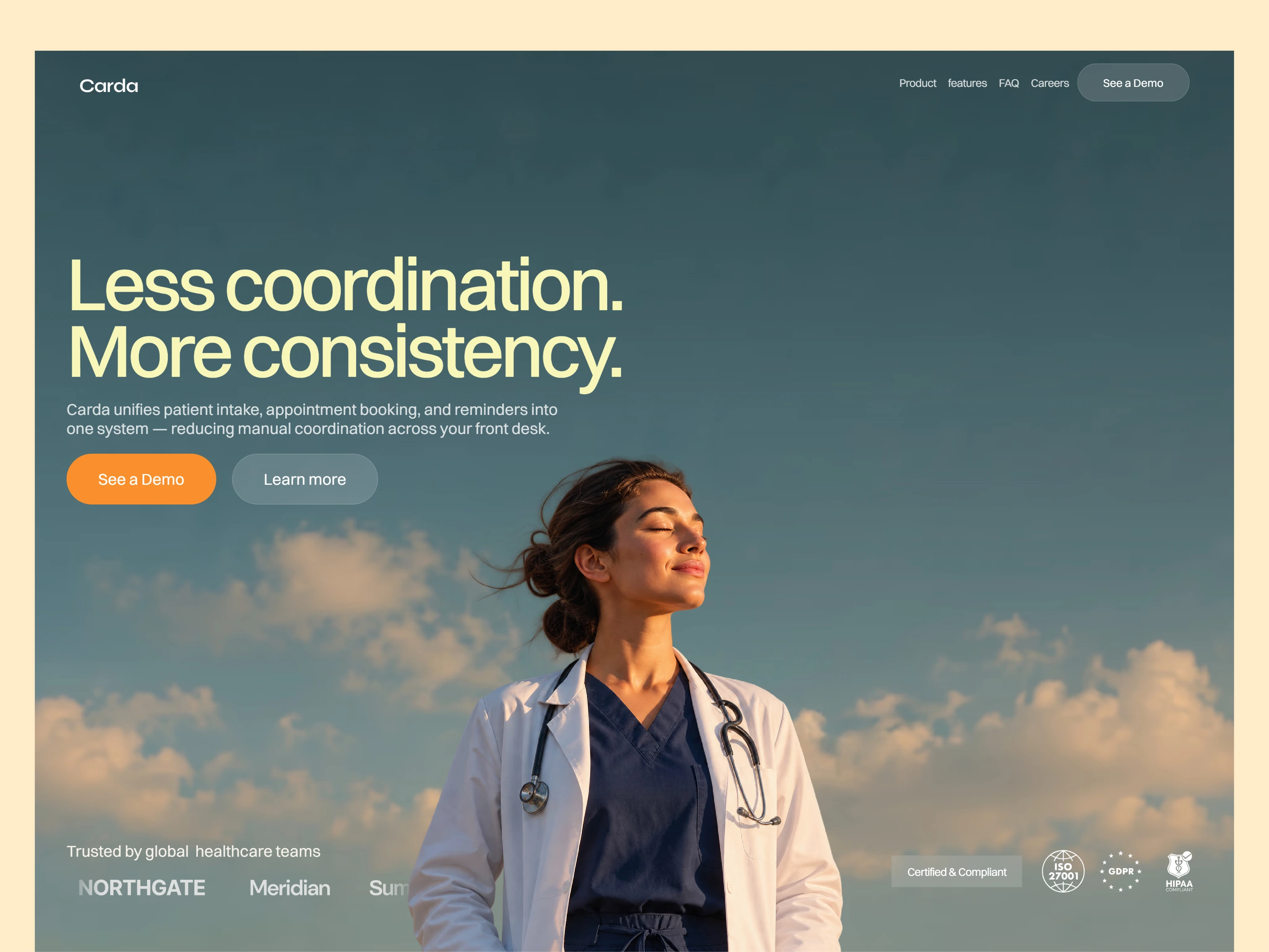
Designing and developing a marketing one-page website for a B2B health tech company focused on simplifying patient intake and scheduling
Check out the live site
Overview:
Carda is a self-directed B2B health tech project exploring how patient intake and scheduling could be brought into one connected system for healthcare practices. I designed and built the full landing page in Framer — copywriting, visual direction, and development.
The Brief
This was a self-initiated project, built to explore what a calm, enterprise-grade SaaS landing page looks like in the health tech space a category where trust, clarity, and restraint matter more than flash. I wanted to move away from the "startup-bright" visual language most SaaS pages default to and instead design something that felt closer to how healthcare organizations actually expect to be spoken to.
The Problem
Most clinics and practices still run patient intake and scheduling as two disconnected, manual processes — paper forms, phone-call coordination, and inconsistent reminders that lead to no-shows and administrative overload. Carda's positioning is built entirely around removing that friction: less manual coordination, more predictable, consistent operations.
Approach
I leaned into photography-led visuals rather than illustration or abstract gradients, using warm sky and cloud imagery to soften what could otherwise feel like a cold, clinical product while keeping the layout, typography, and color palette restrained and enterprise-grade. The copy follows the same principle throughout: calm, direct, and outcome-focused rather than promotional.
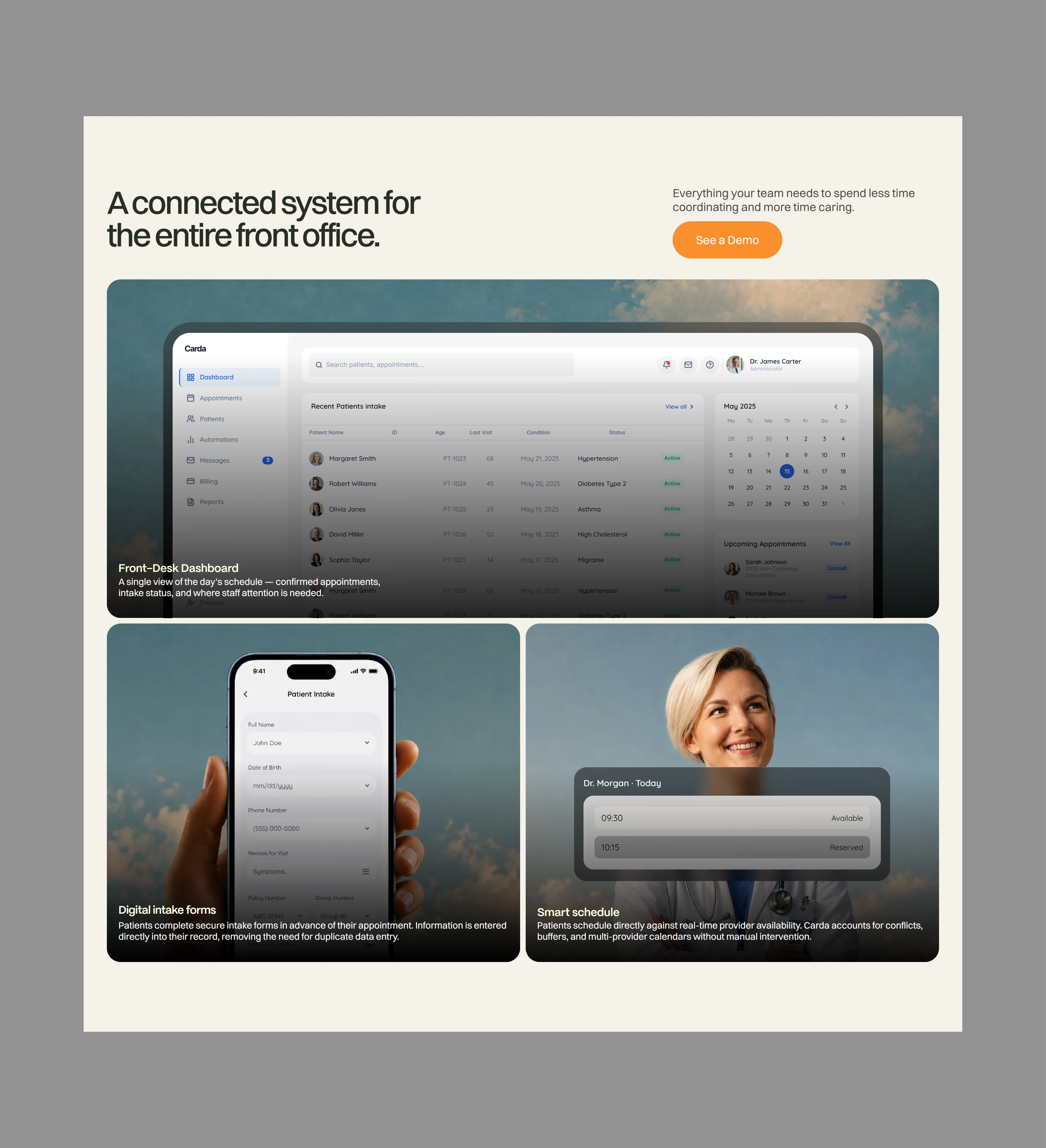
Rather than a generic dashboard screenshot, I built out real interface moments — a front-desk dashboard, a digital intake form on mobile, and a live scheduling view so the product felt tangible and specific instead of abstract.
Key sections included
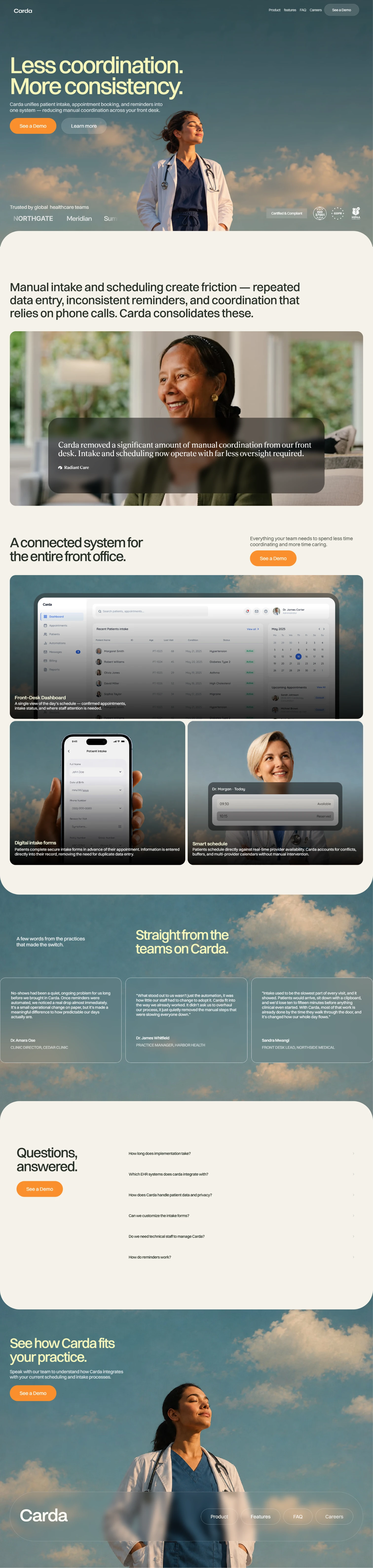
Hero: Leads with "Less coordination. More consistency." — a benefit-first headline that frames the product's value before explaining the mechanics, backed by a supporting line on what Carda actually unifies (intake, scheduling, reminders)
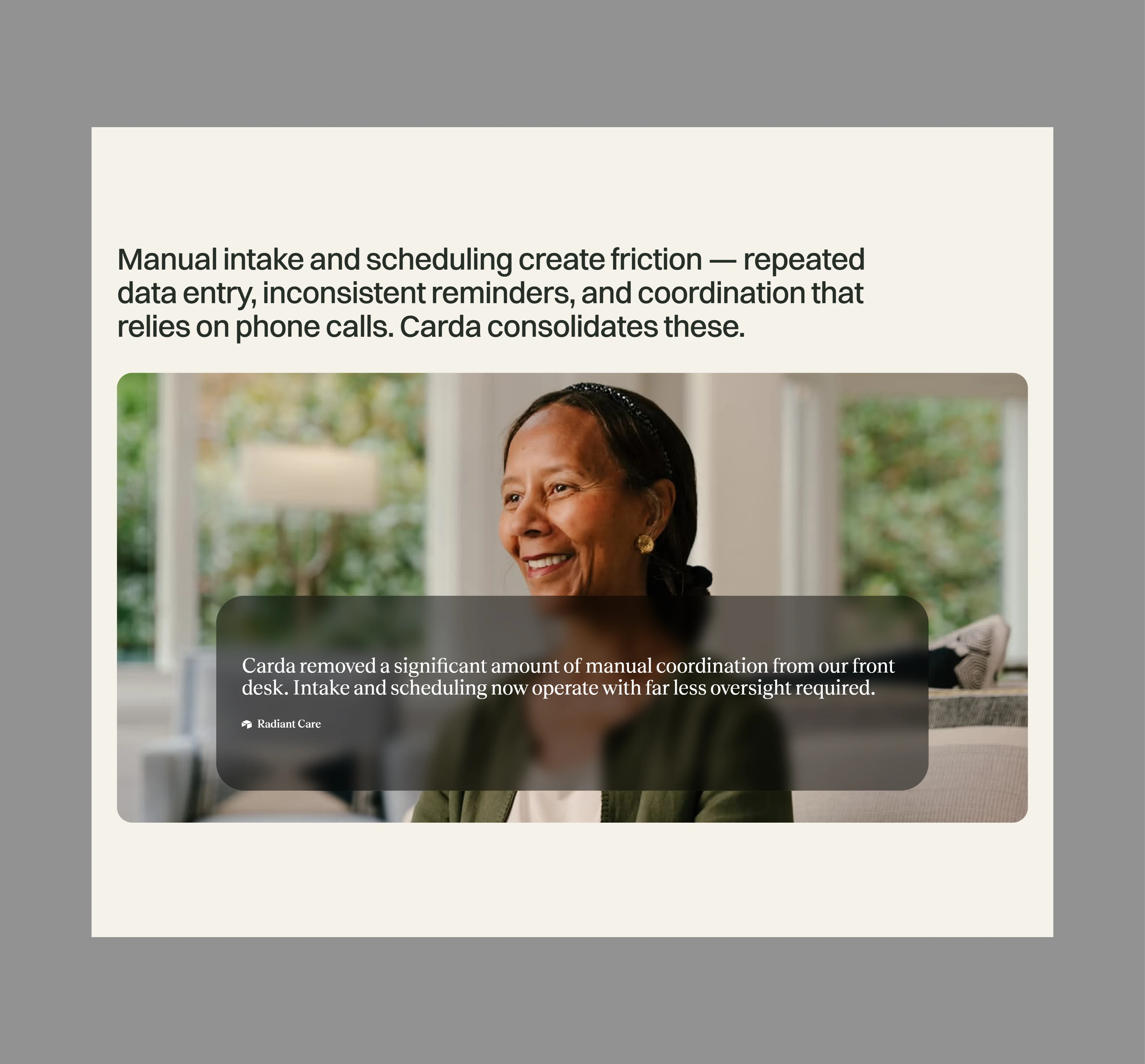
Problem framing: Names the specific friction points (repeated data entry, inconsistent reminders, phone-dependent coordination) paired with a testimonial for early social proof
Product showcase: A connected front-desk dashboard, digital intake form, and smart scheduling view, each with a short caption explaining the specific job it does
Testimonials: Rotating quotes from fictional practice leads, grounded in specific, believable operational outcomes rather than vague praise
FAQ: Addresses real adoption questions a practice would ask EHR integration, data privacy, staff training to reduce friction before a demo call
Closing CTA: A calm, low-pressure invitation to see how Carda fits an existing practice, rather than a hard sell
My role
Full ownership of the project — landing page copywriting, visual and UI design, and Framer development, including responsive layout and interaction details.
See design preview below
Like this project
Posted Sep 5, 2026
Designing and developing a website for a B2B health tech company focused on Simplifying patient intake and scheduling
Likes
1
Views
19