Built with Framer
Vaestra Fintech Marketing Website Design
Gabriel kayode
Fintech Marketing Website Design & Framer Development
Preview live site
Overview
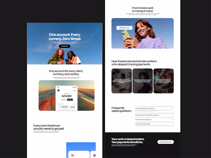
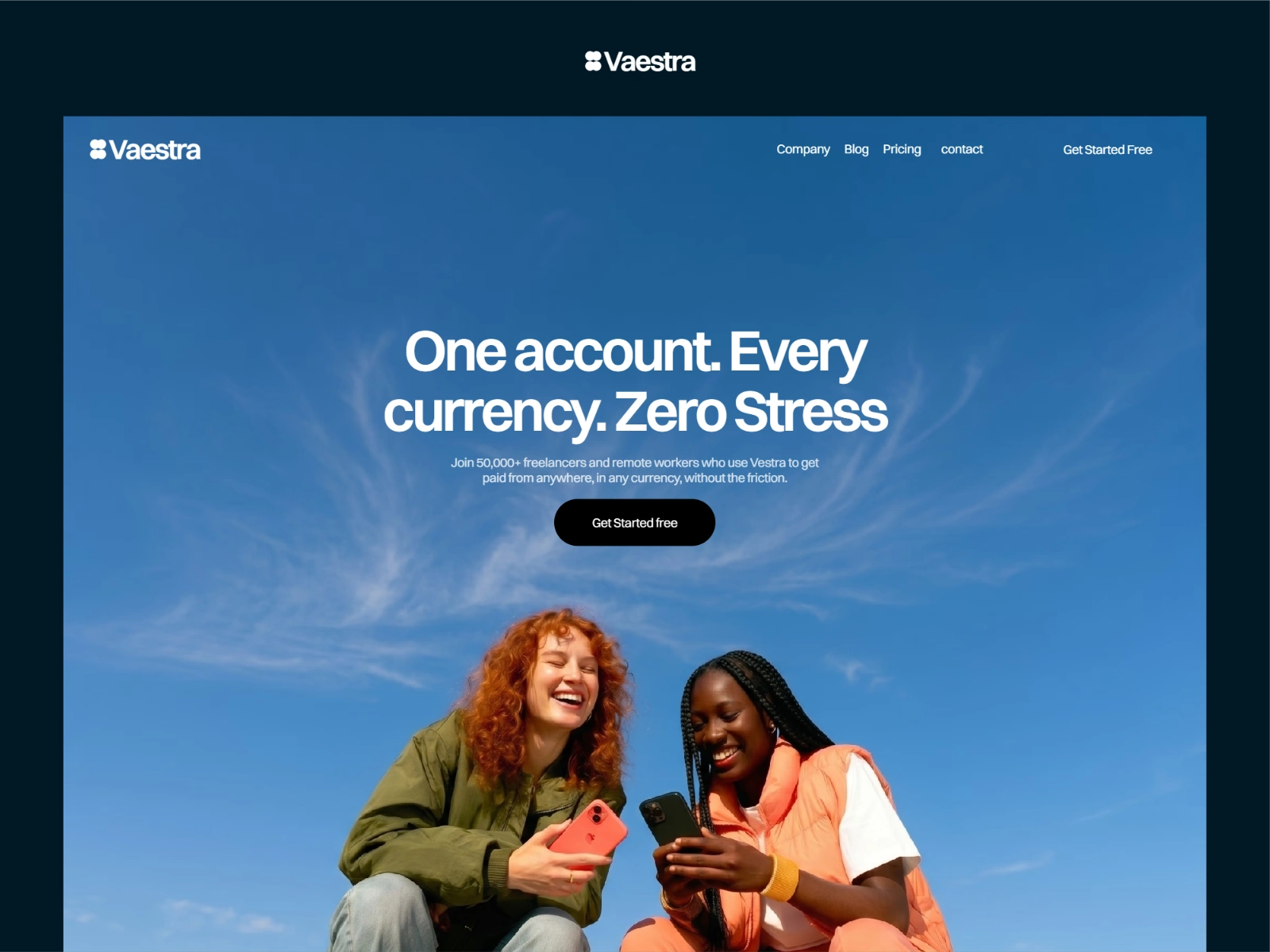
Vaestra is a conceptual global payments platform built for freelancers and remote workers. It gives users dedicated multi-currency accounts, AI-powered invoice generation, real-rate currency exchange, and fast withdrawals to local banks across 30+ countries — all from one platform.
My role
I led the full visual design and Framer development on this project end-to-end — visual direction, layout design across all five pages, component architecture, responsive behaviour, and scroll animations. The site went from blank canvas to live build within the project timeline, with no handoff gap between design and development since both happened in Framer.
Process
Discovery & Research
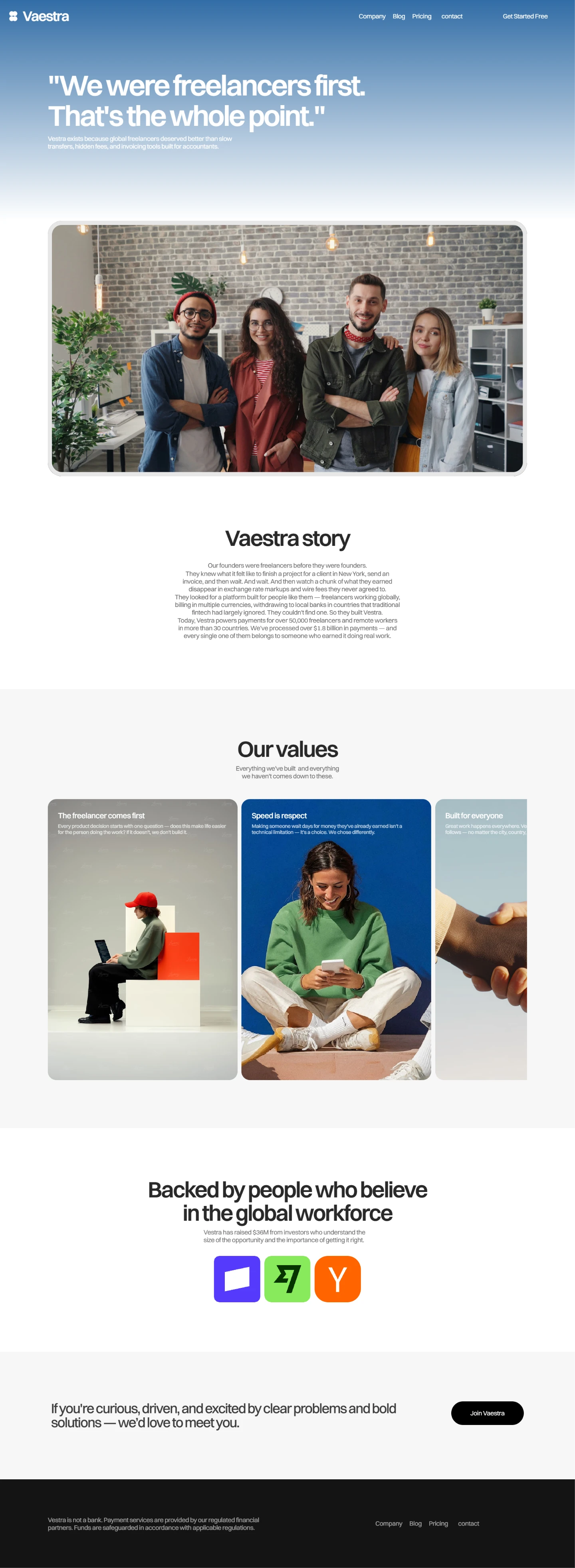
I started by auditing the global payments and fintech space to understand how existing platforms were positioning themselves visually and through copy. The patterns were consistent formal layouts, restrained colour palettes, and photography that skewed heavily toward Western markets. This gave me a clear picture of where Vaestra could differentiate.
I also spent time understanding the target user the global freelancer. What platforms they were already using, what frustrated them about those platforms, and what they actually needed a website to communicate before they'd trust a new product with their income. That research directly shaped the copy hierarchy, the photography direction, and the decision to lead with clarity over cleverness throughout the site.
Visual Identity & Concept
With the research grounded, I developed a visual direction built around editorial warmth rather than corporate polish. The concept centered on three principles: real people over abstract visuals, transparency over jargon, and confidence over formality.
The colour system anchored on Vaestra's brand blue, vibrant and trustworthy used at full saturation in the hero and as an accent throughout, against a predominantly white canvas. Photography was selected to reflect diversity of geography and background, not just diversity of face. Typography was set large and bold, giving the copy the weight it deserved rather than shrinking it into the background.
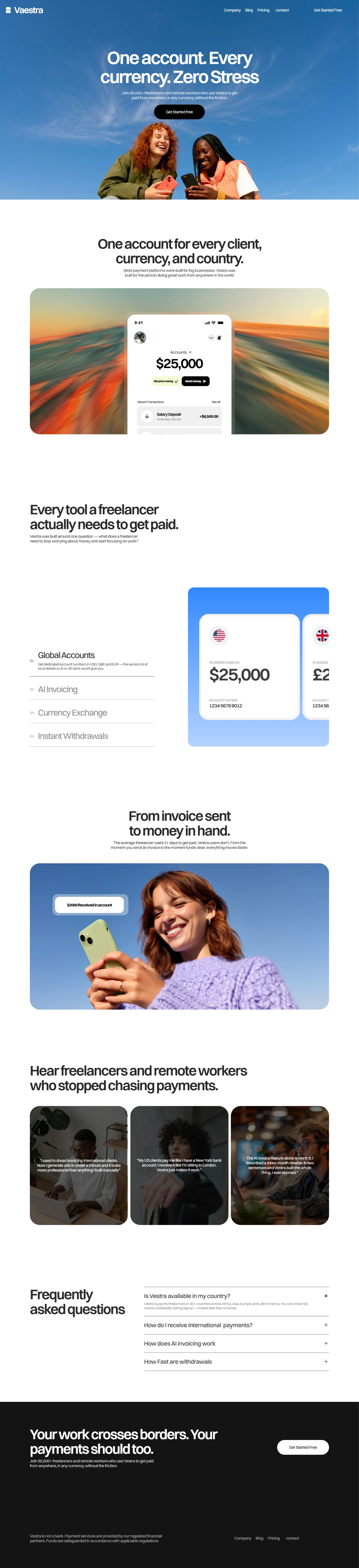
UI overlay cards, product screenshots and transaction notifications placed naturally over lifestyle photography became a key visual device for keeping the product visible without relying on heavy dashboard screenshots that can feel dated quickly.
Design & Prototyping
The entire design process happened directly in Framer. I mapped out the content structure and section flow across all five pages before moving into high-fidelity design, working through layout, hierarchy, and spacing iteratively within the same tool used for the final build.
The prototyping stage was particularly important for the homepage, which carries the heaviest content load hero, feature sections, tabbed product breakdown, social proof, testimonials, FAQ, and CTA and needed a clear hierarchy to avoid feeling overwhelming. Interactive prototypes were used to validate that the scroll experience and transitions between sections felt natural and intentional.
Development
The full site was built in Framer using a component-first approach. Every repeating element navbar, footer, cards, buttons, testimonial blocks, section headers, FAQ accordion was built as a named, reusable component before any page layout was assembled. This kept the build clean, consistent, and fast to iterate on when details changed.
Framer's native animation tools were used throughout to add scroll-triggered entrance animations, smooth accordion transitions, and UI card reveals. All animations were kept subtle present enough to add polish, restrained enough not to compete with the content.
The blog and resources pages were connected to Framer CMS, allowing the client to publish new content without touching the design or requiring developer involvement.
Testing & Refinement
I ran performance tests across all pages using Lighthouse and real device testing. Load times, animation smoothness, and responsiveness were all validated across desktop and mobile. Several rounds of refinement followed tightening spacing, adjusting type sizes at smaller breakpoints, and fine-tuning animation timing to ensure nothing felt abrupt or heavy.
Outcome
The finished site launched on time across all five pages and met every brief requirement — a premium, human-feeling fintech website that communicates Vaestra's product clearly, builds trust with a global freelance audience, and holds its own visually in a competitive market.
Like this project
Posted Apr 16, 2026
Led design and development of Vaestra's fintech marketing site using Framer, enhancing trust and communication for freelancers.