
Project Overview:
Legal Compli needed a website that positions the firm as a modern advisory practice rather than a traditional law office. The challenge was communicating a wide range of practice areas (M&A, technology and data, real estate, IP, corporate structuring, commercial contracts, outside general counsel, and government/public-sector advisory) without making the brand feel scattered. The unifying idea: counsel for complex business initiatives that cross legal, transaction, technology, and institutional boundaries.
The Challenge
People who land on an injury lawyer’s website are usually stressed, hurt, and unsure whether they even have a case. The design needed to do three things at once:
Lower the emotional temperature instead of adding to it.
Explain a confusing legal process in plain language.
Make the next step (a free case review) feel easy and low-risk.

The Approach
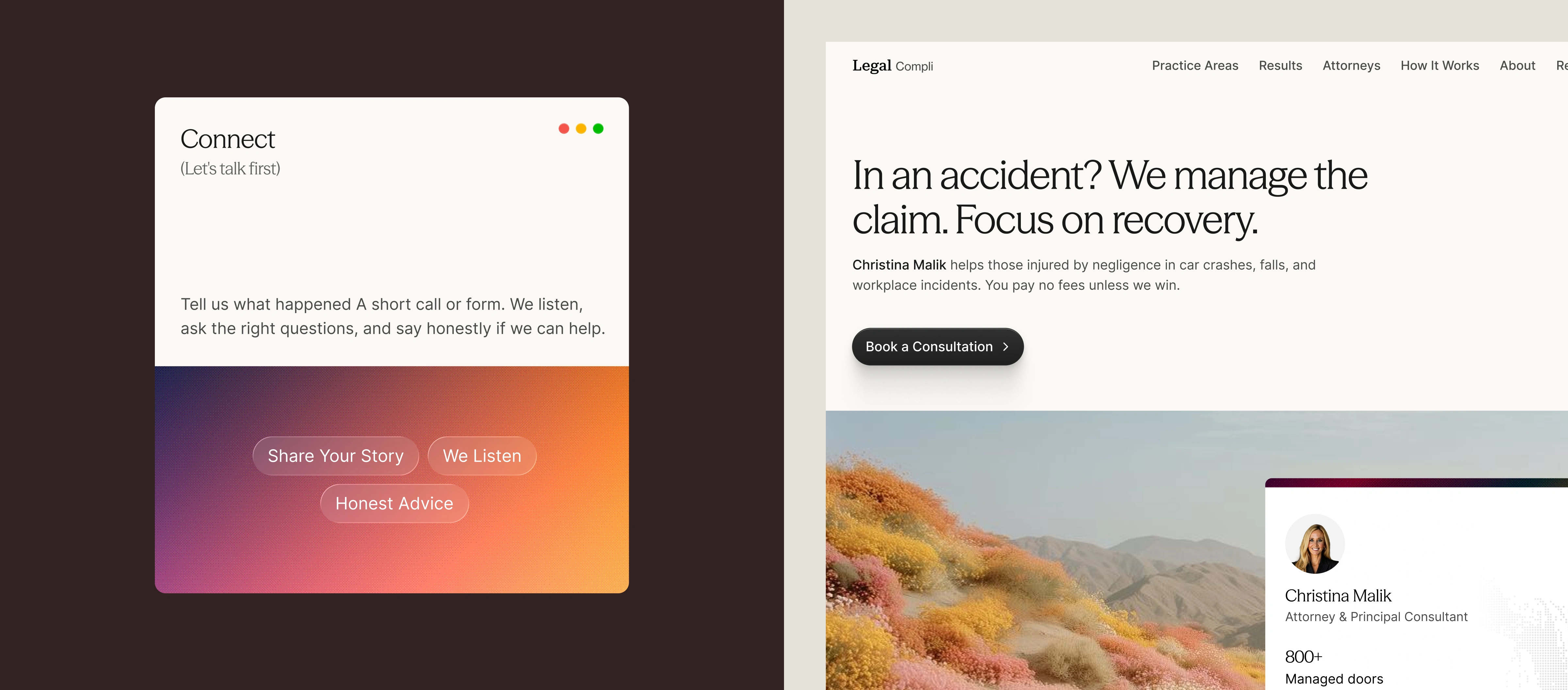
A calm first impression. The hero opens with a direct, empathetic headline (“In an accident? We manage the claim. Focus on recovery.”) over a soft off-white background, followed by a painterly landscape of wildflower hills. The imagery deliberately avoids gavels, scales, and wreckage. It signals recovery and open space rather than conflict. A floating attorney card brings in a real face and key credentials immediately.
Practice areas as stories, not lists. Each practice area (car accidents, truck crashes, slip and fall, workplace injuries, medical malpractice, wrongful death) gets a stacked card. Each card has a human headline like “When the Road Turns Against You,” one sentence of plain-English explanation, and a custom line illustration. The stacked layout keeps six areas scannable without a wall of text.
Making the process tangible. The “Three steps. No retainer. No guesswork.” section breaks the case into Connect, Build, and Resolve. Each step is a window-style card with a short description and tag pills (Evidence, Coverage, Lost Wages, Negotiate, Litigate, You Approve). The vivid halftone gradients add warmth and energy to the dark section, and repeat as a visual signature across the site.
Trust through people. Testimonials use a grid of black-and-white portraits with gradient accent bars. Each quote is tagged with the part of the journey it speaks to: first consultation, claim updates, settlement review. The about section positions the attorney as “An Experienced Advocate. A Personal Partner.” and leads with values before credentials.
Answering the real questions. The FAQ tackles what clients actually worry about: cost, deadlines, partial fault, going to court, and case value. A side card reassures visitors that they don’t need to know exactly what they have before reaching out.
A conversion path with no friction. Every major section leads back to one action, a free case review. The closing CTA (“The insurer has already started a file. You should too.”) adds gentle urgency without fear-mongering. The supporting line removes the last barriers: free, confidential, no fee unless we win.
Outcome
The result is a cohesive, conversion-focused concept that shows how a legal brand can feel empathetic without losing authority. Every section serves one question a hurting visitor is silently asking: “Can these people help me, and is it safe to reach out?”
0 likes · 0 views · Nov 12, 2026
Most personal injury websites follow the same formula: navy and gold, courthouse columns, aggressive “WE FIGHT FOR YOU” headlines. Legal Compli takes a differen

