Forward Thinking B + Rise Arrow logo, Brand Identity Design
MA Rakib Khan
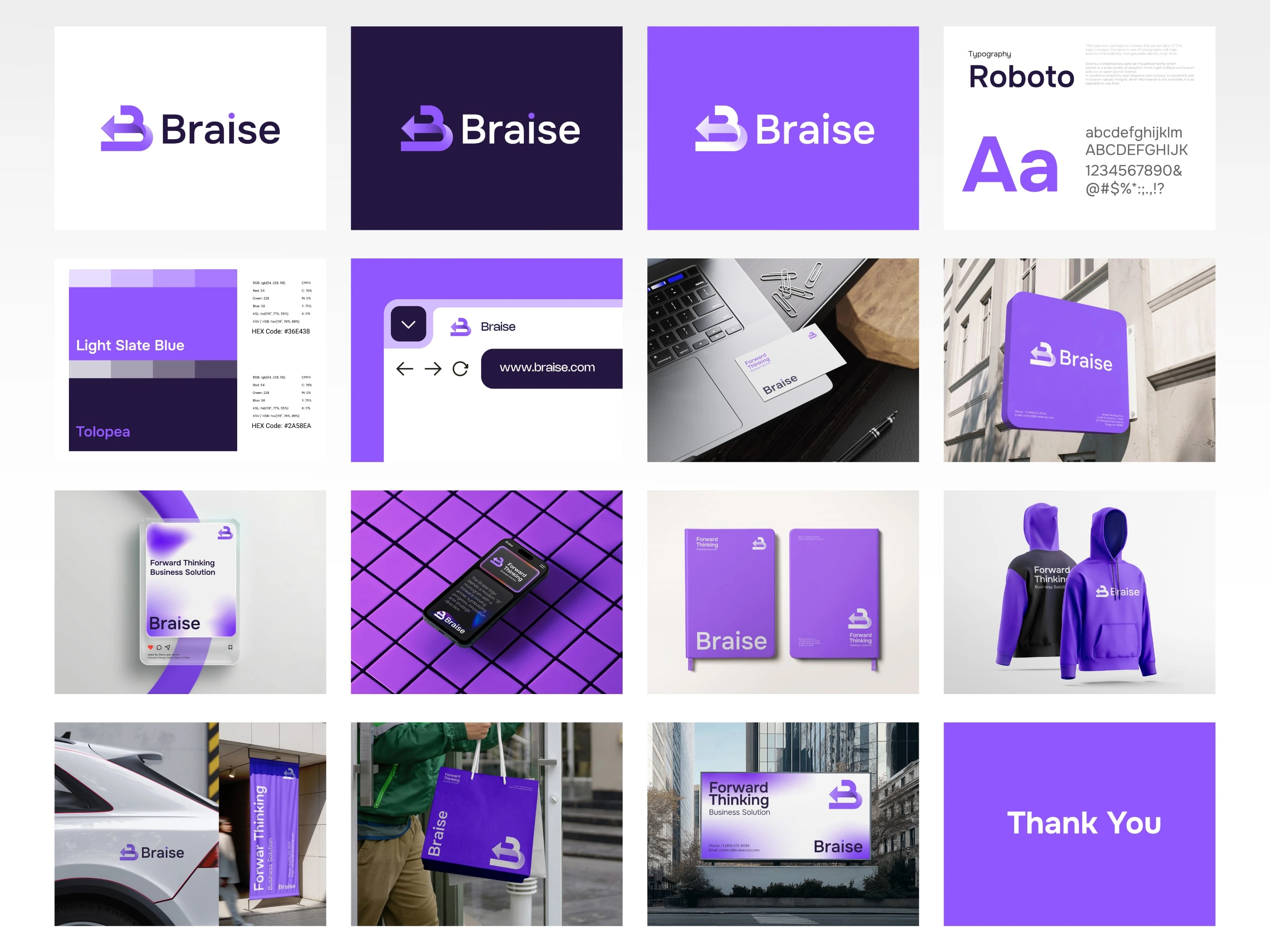
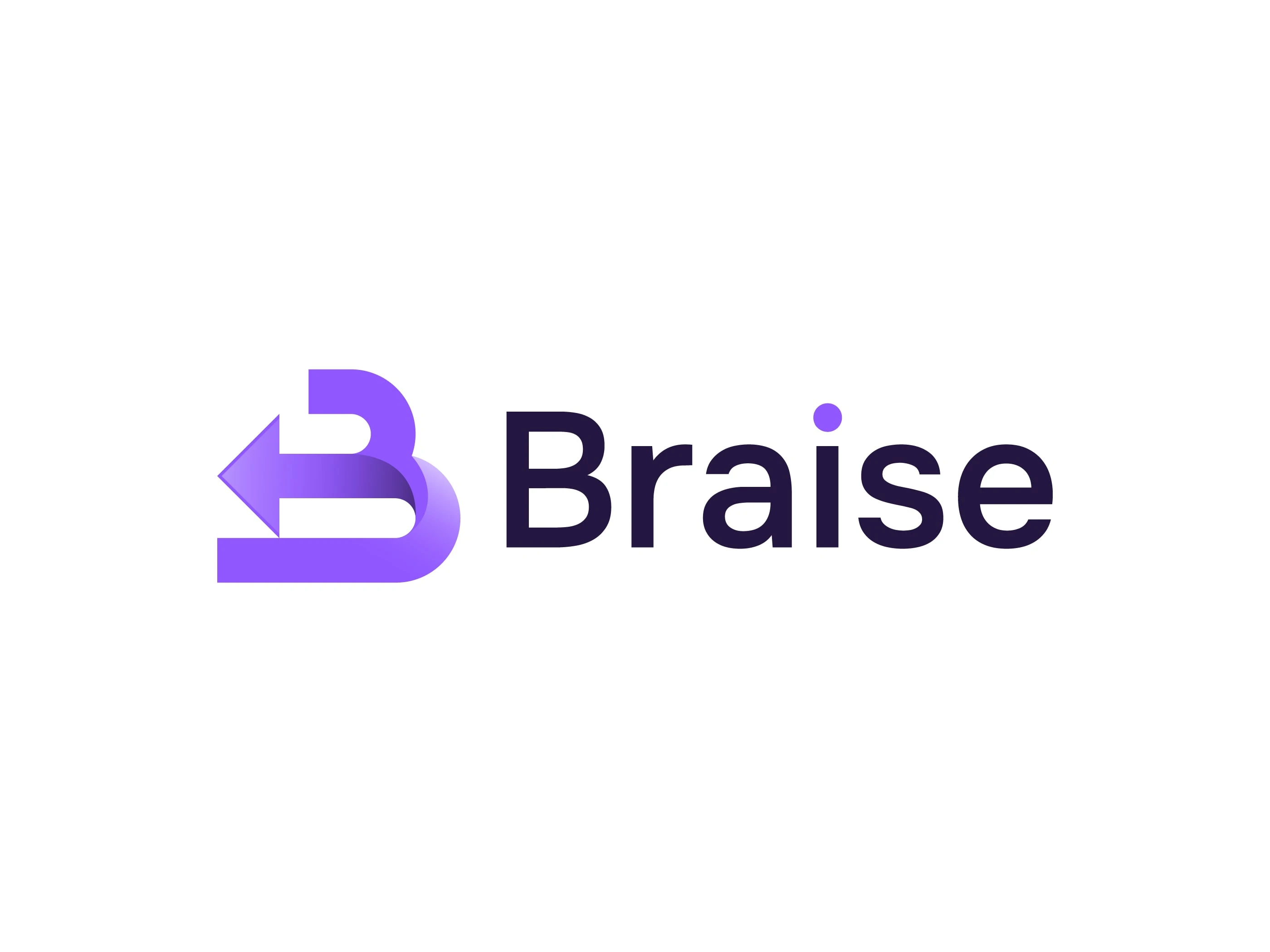
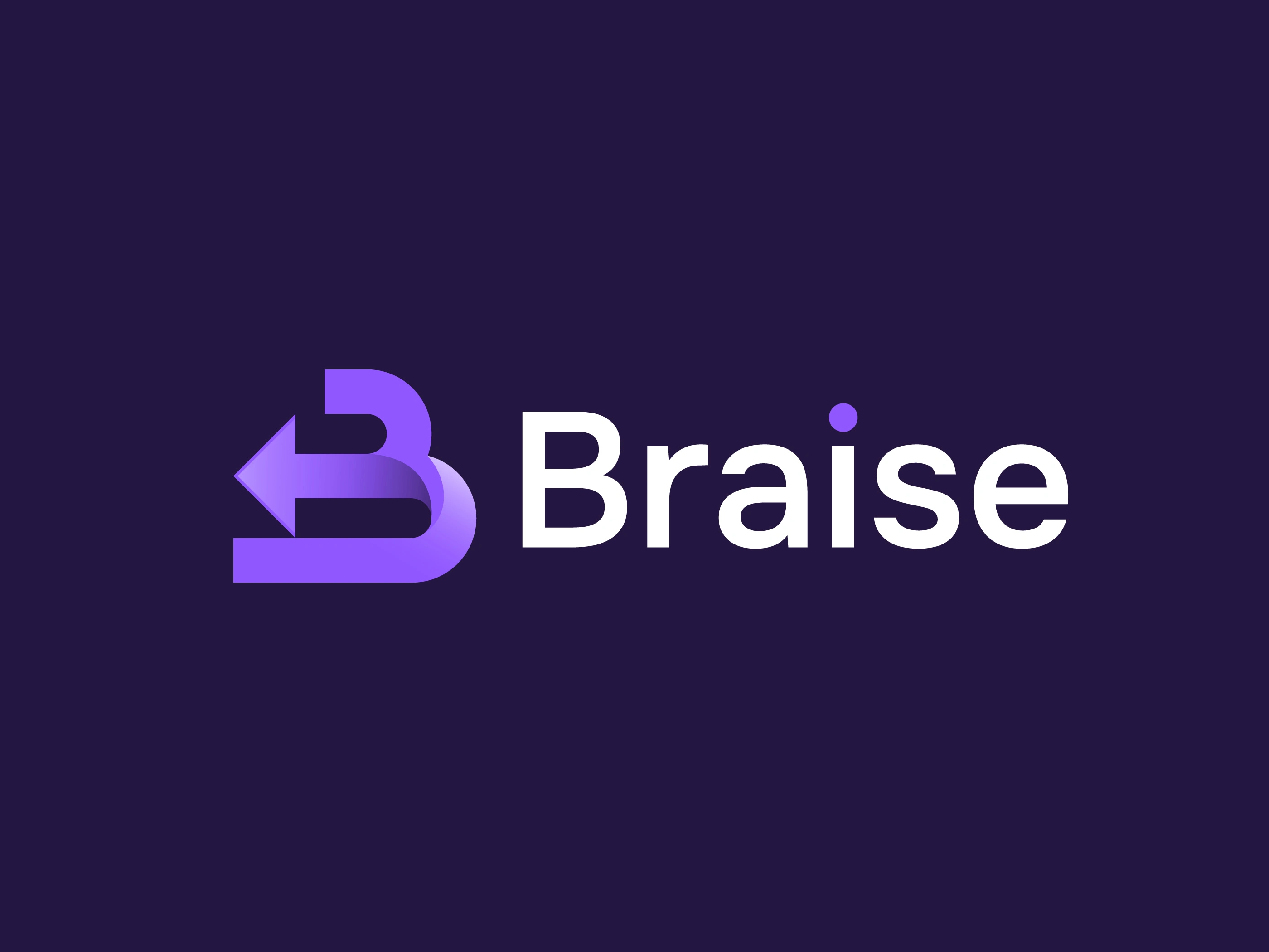
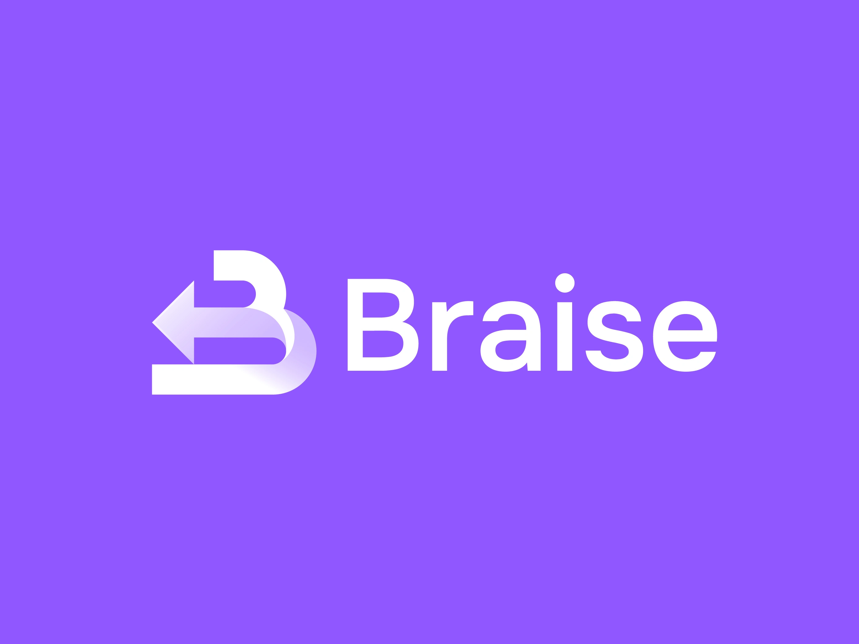
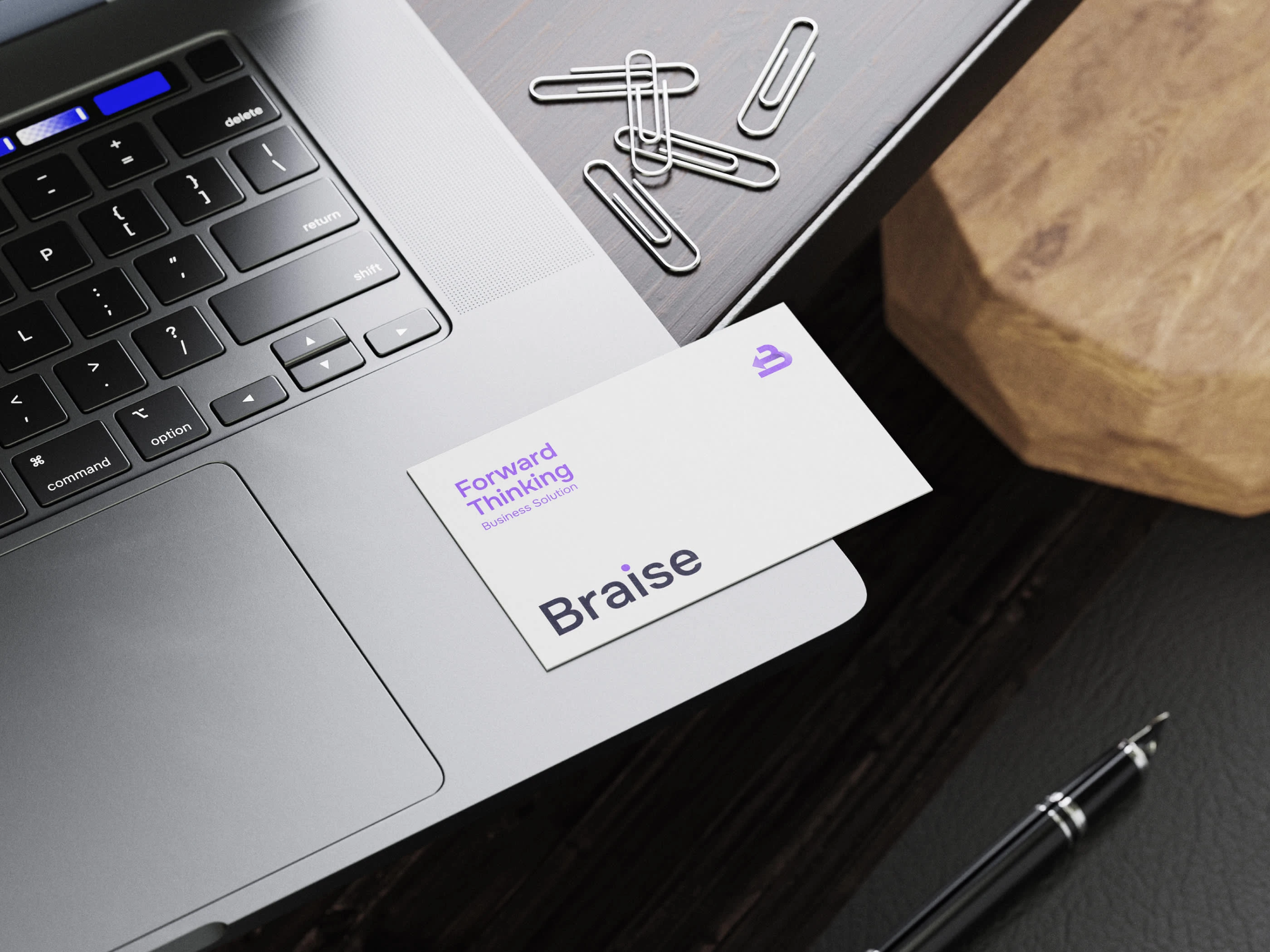
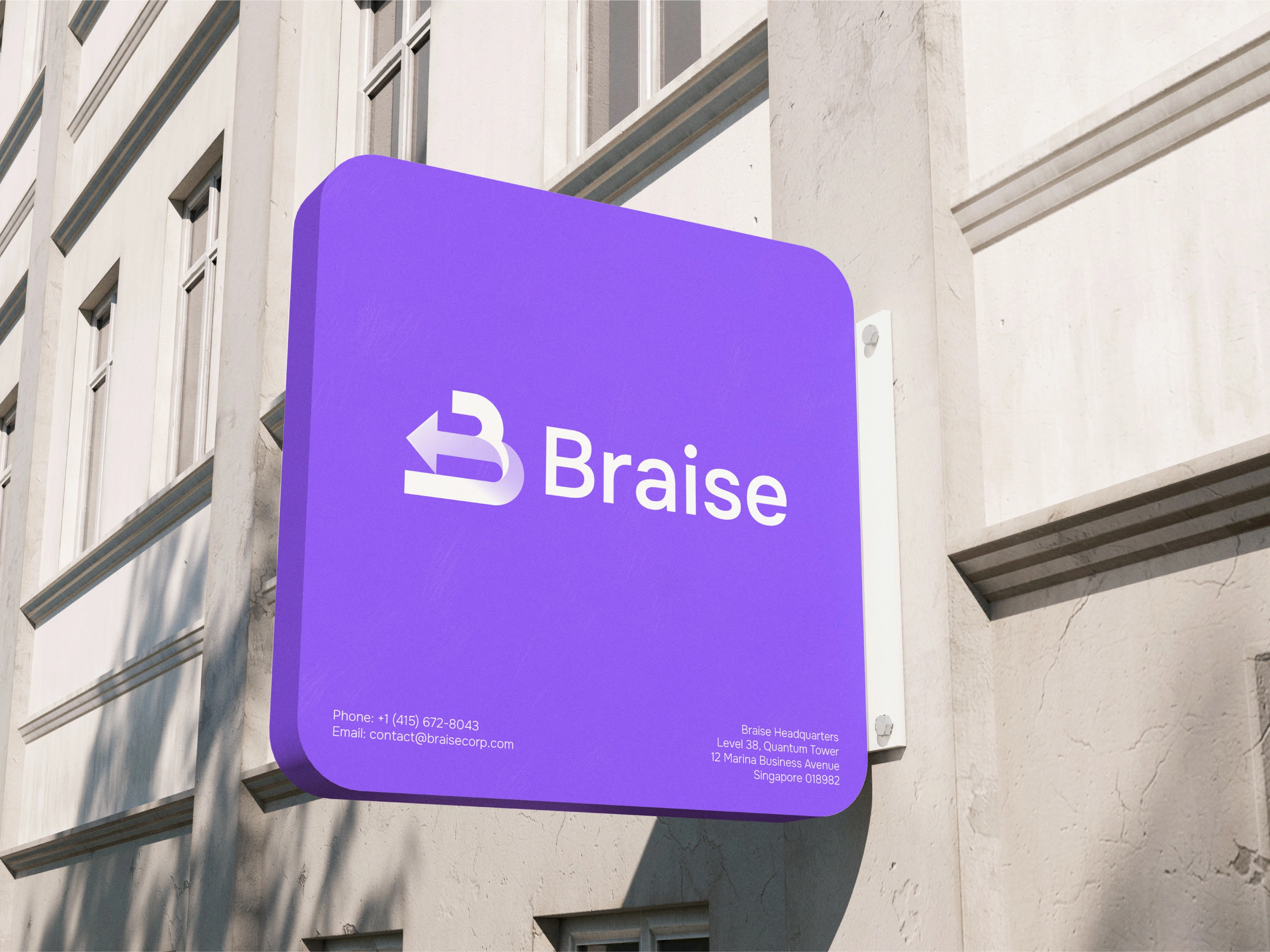
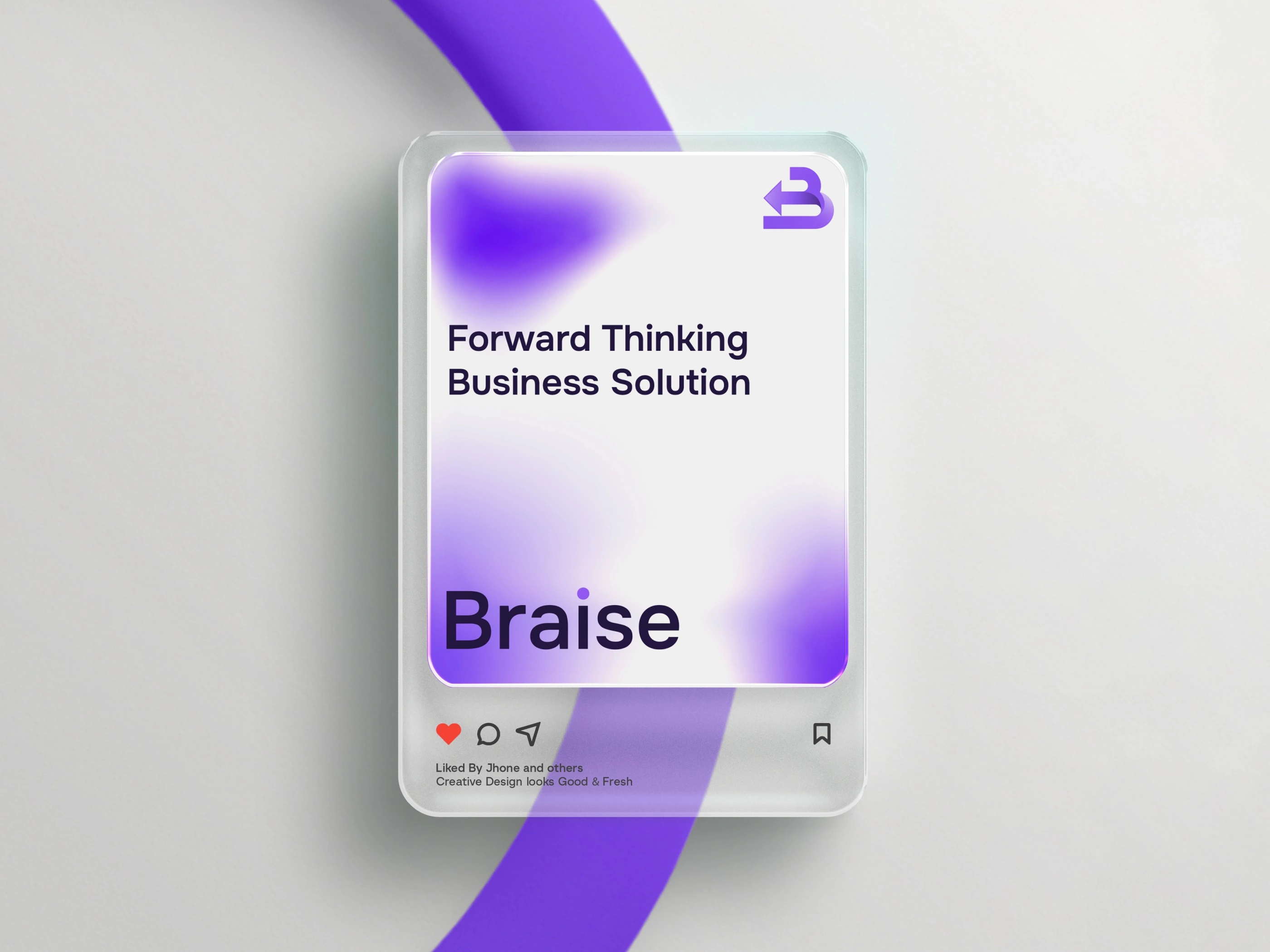
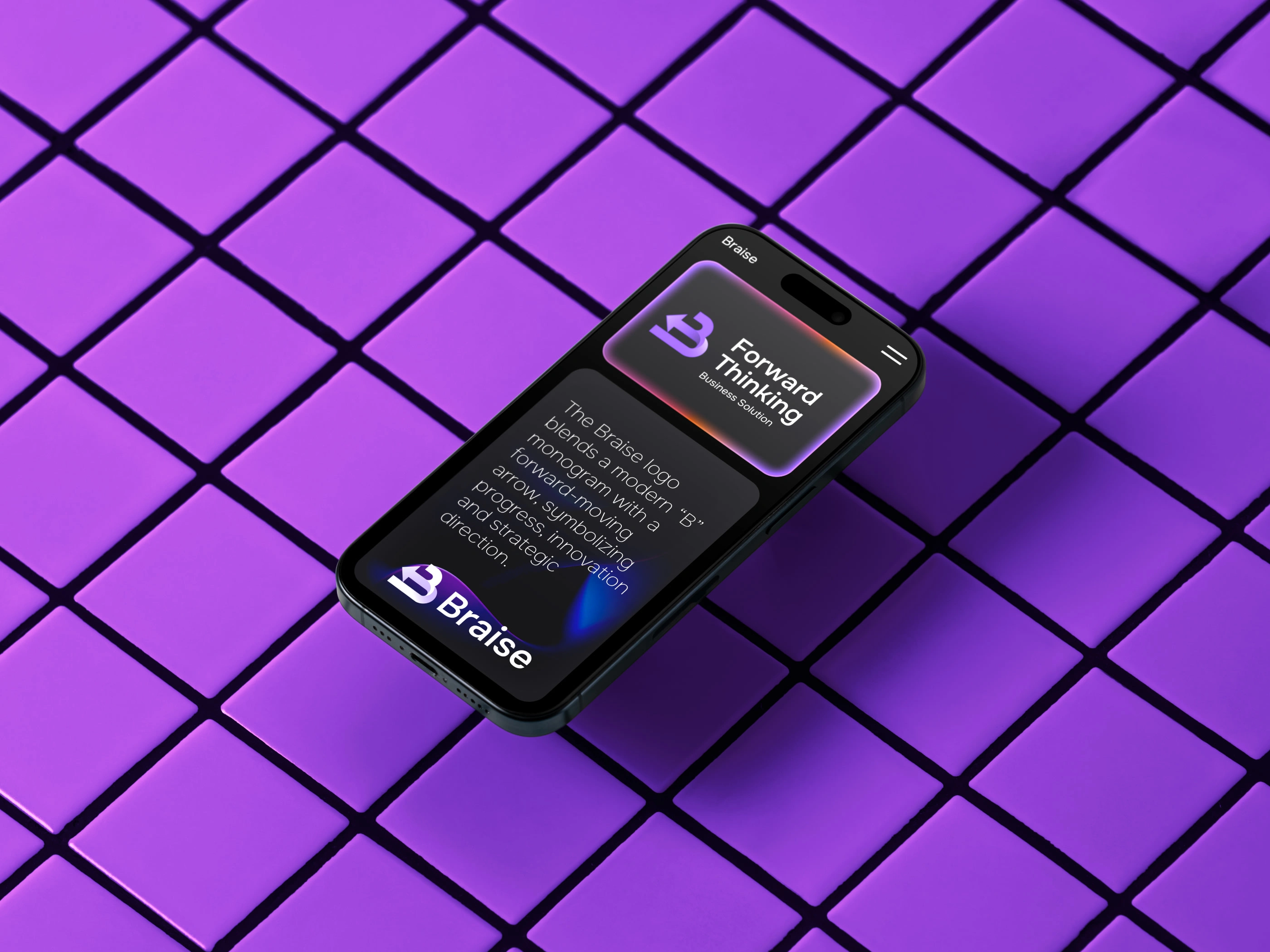
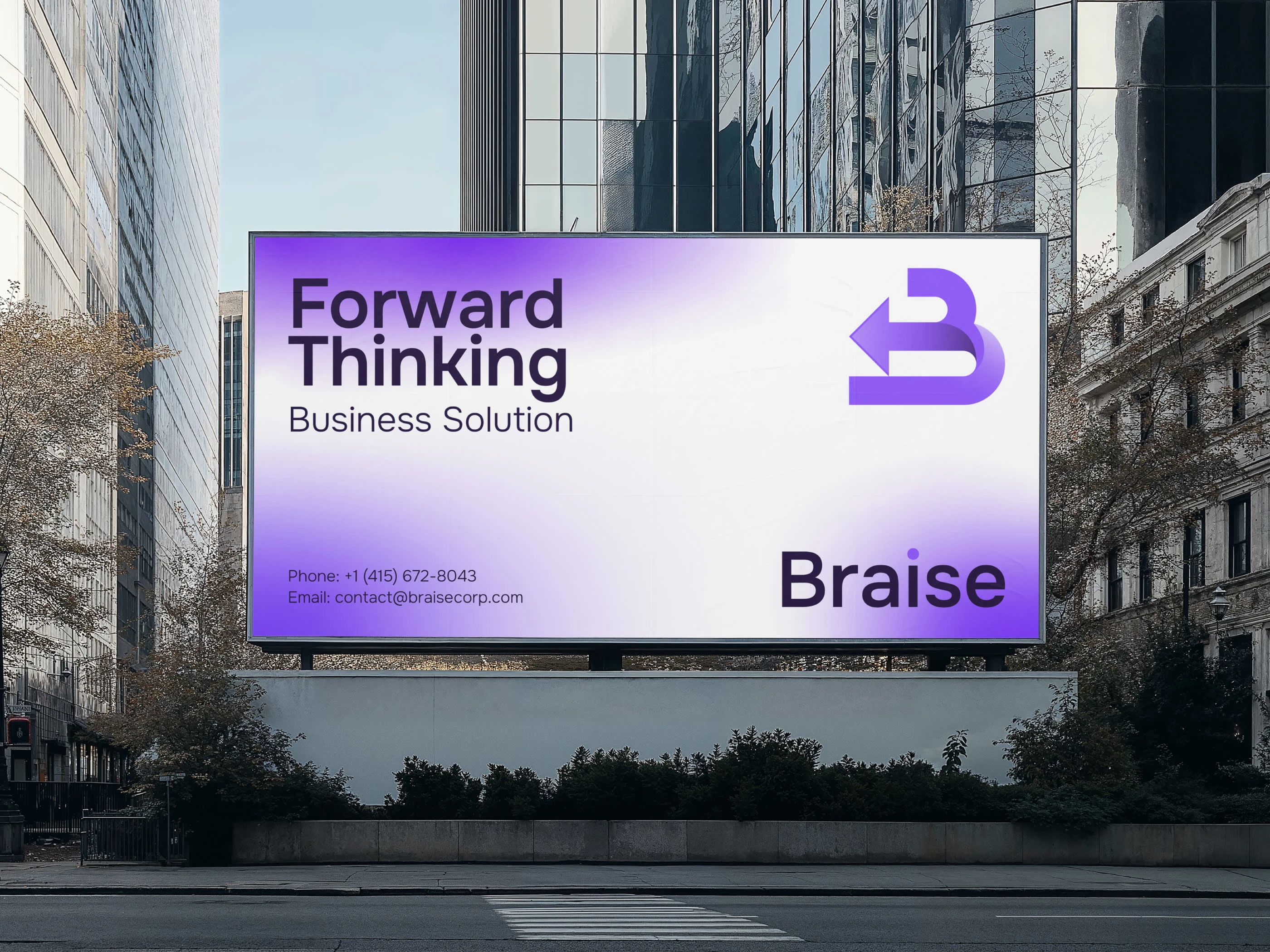
Braise — Brand Identity Design
Forward Thinking Business Solution
01. Introduction
Braise is a modern, forward-thinking brand built to represent growth, clarity, and intelligent business solutions. The identity system is crafted to visually express momentum, innovation, and a strategic approach to solving business challenges.
Our goal was to create an identity that feels clean, future-oriented, and purpose-driven—one that communicates progress the moment you see it.
02. Logo Concept
The Braise logo is a stylized “B” monogram integrated with a forward-pointing arrow. This combination reflects the brand’s core principles:
Progress and forward motion
Growth and strategic direction
Smart, efficient solutions
The gradient finish enhances the modern, digital-forward aesthetic, making the symbol feel dynamic and energized.
03. Logo Philosophy
Direction
The arrow represents movement, ambition, and the brand’s commitment to helping businesses move forward.
Balance
The combination of geometric and rounded forms makes the logo feel trustworthy, clear, and professionally structured.
Identity
The custom “B” letterform builds a strong visual connection to the brand name while remaining unique and memorable
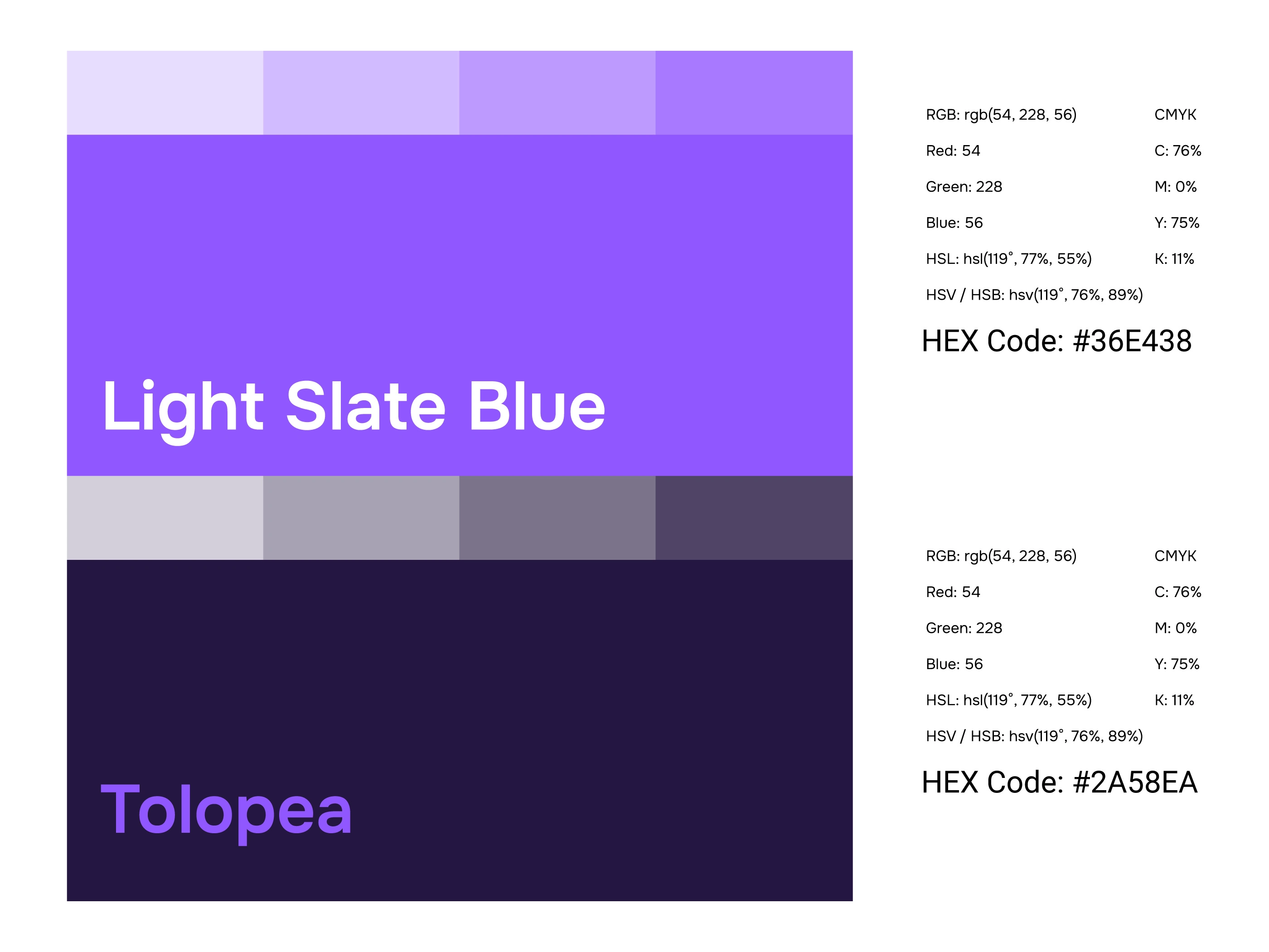
04. Color Palette
Light Slate Blue
Hex: #A5A6F3
A modern, calm, and innovative color that builds a clean digital identity.
Tolopea
Hex: #4A3EBE
A bold, confident tone that communicates strength and strategic focus.
Gradient
Light Slate Blue → Tolopea
This gradient reinforces the idea of motion, transition, and technological evolution.
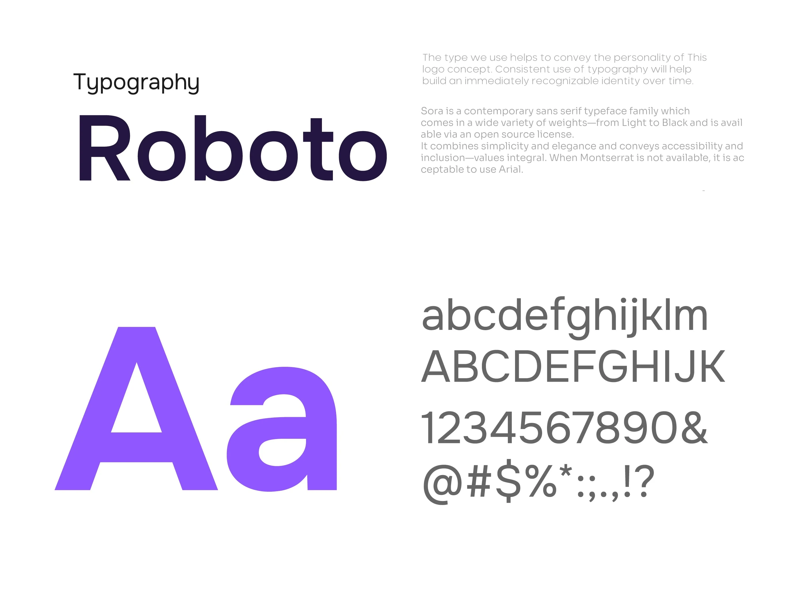
05. Typography
Roboto
A clean, versatile, and highly legible sans-serif typeface that supports a modern professional identity.
Roboto Regular — body text
Roboto Medium — subheadings
Roboto Bold — titles and emphasis
The type system is intentionally simple to maintain clarity and consistency across all brand use case
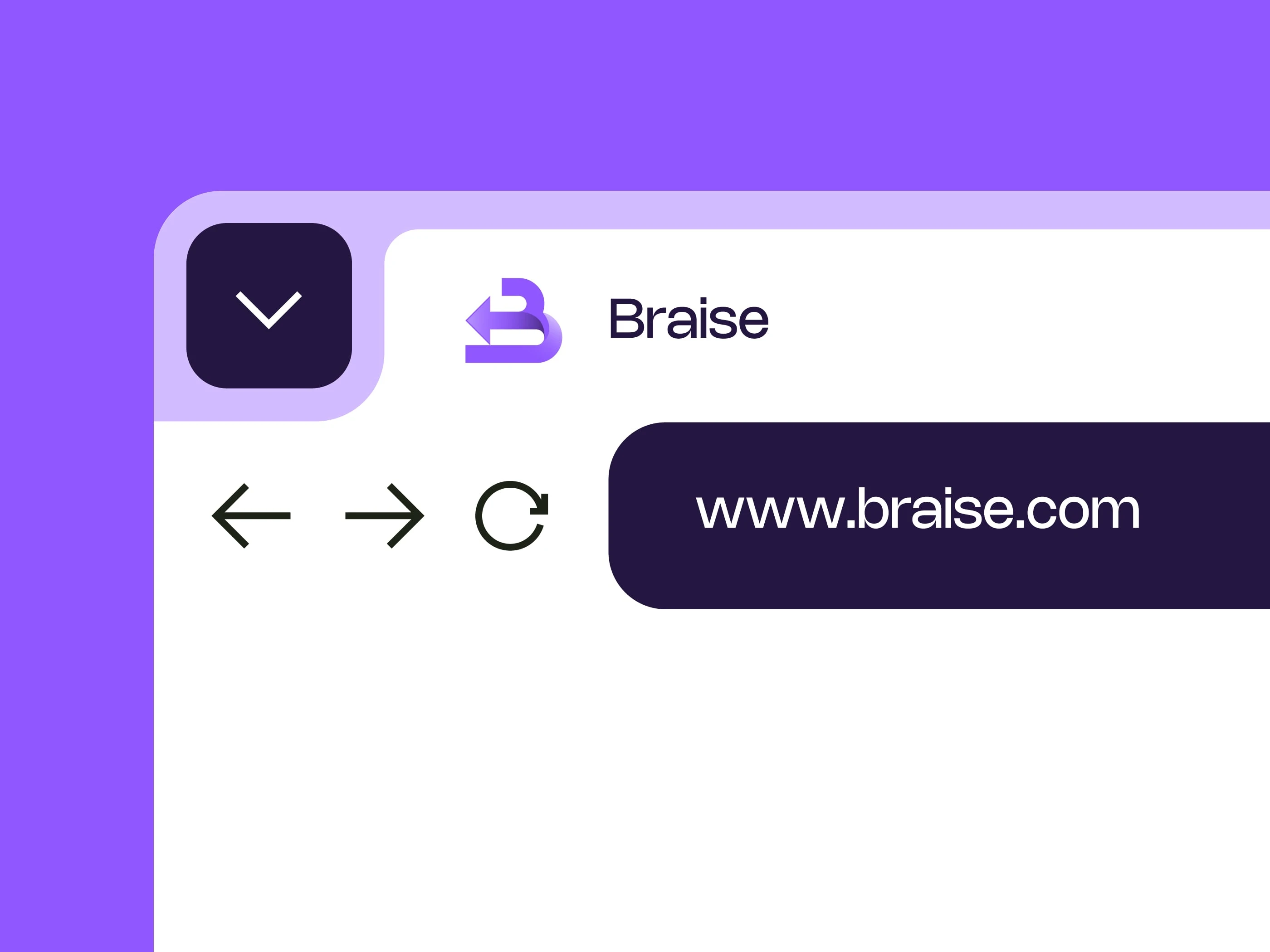
06. Brand Applications
The Braise identity extends seamlessly across both digital and physical environments.
Digital Applications
Website interface
Mobile app layouts
Dashboard systems
Social media templates
Corporate Materials
Business cards
Presentation templates
Marketing Assets
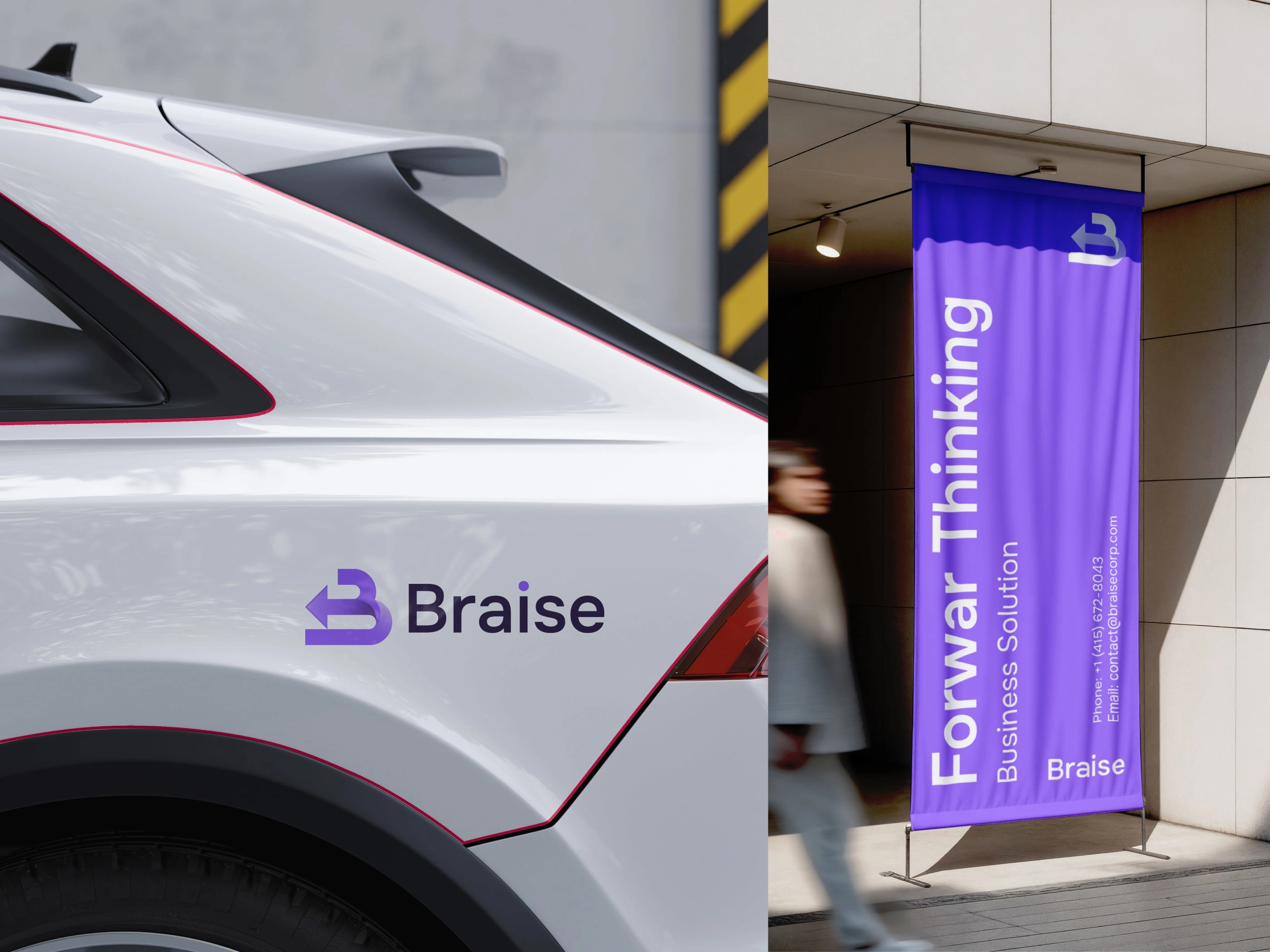
Posters & billboards
Storefront signage
Merchandise & Lifestyle Items
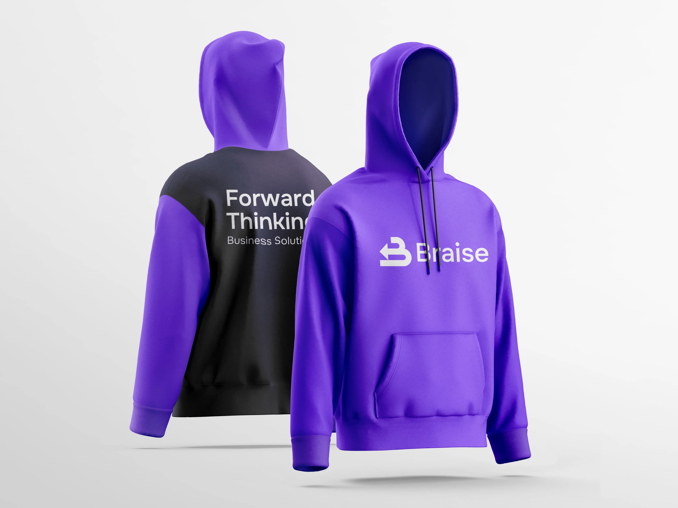
Hoodies
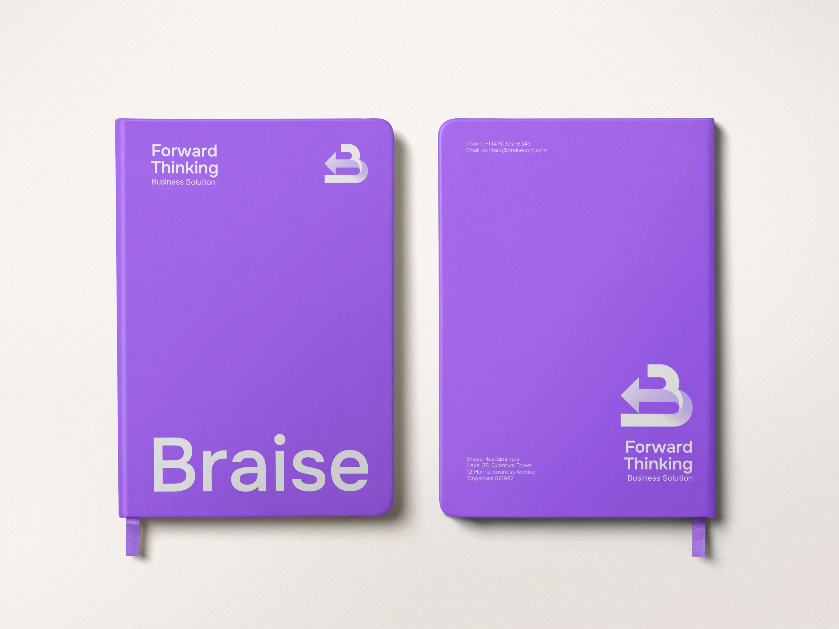
Notebooks
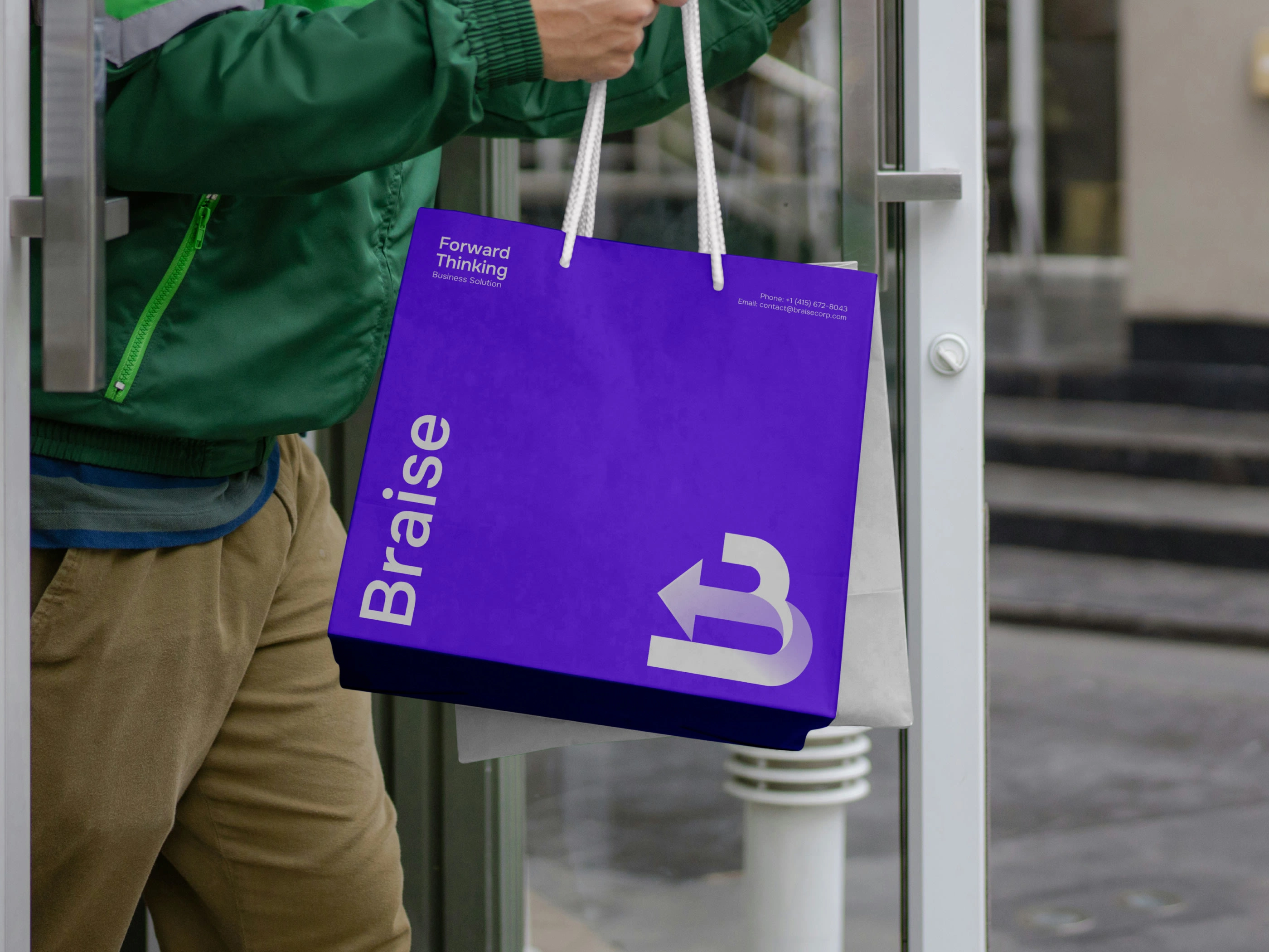
Shopping bags
Stickers and accessories
Each mockup highlights the gradient motion, clean structure, and tech-forward essence of the brand.
Brand Message
“Forward Thinking Business Solution”
Braise embodies progress.
It is built for businesses that seek clarity, momentum, and smarter ways to advance.
Brand Values
Innovation — always moving toward new ideas and better solutions
Progress — guiding businesses forward
Trust — delivering consistent, reliable visual communication
Simplicity — presenting solutions with clarity and precision
Brand Tone
Professional
Strategic
Tech-driven
Futuristic
Minimal and refined
Thank You
Brand Identity Designed by
MA Rakib Khan
Like this project
Posted Nov 22, 2025
Forward Thinking B + Rise Arrow logo, Brand Identity Design Designed a modern brand identity for Braise, emphasizing growth and innovation.