Oaken - Packaging Design
Background of the client
Oaken Preserves prides itself on using only the freshest and highest quality ingredients in all their products. They work closely with local farmers to source their fruits and ensure that they are picked at the peak of their ripeness for maximum flavor and nutritional value. Additionally, Oaken Preserves is committed to sustainable and eco-friendly practices in their production process, minimizing their environmental impact and supporting a healthier planet.
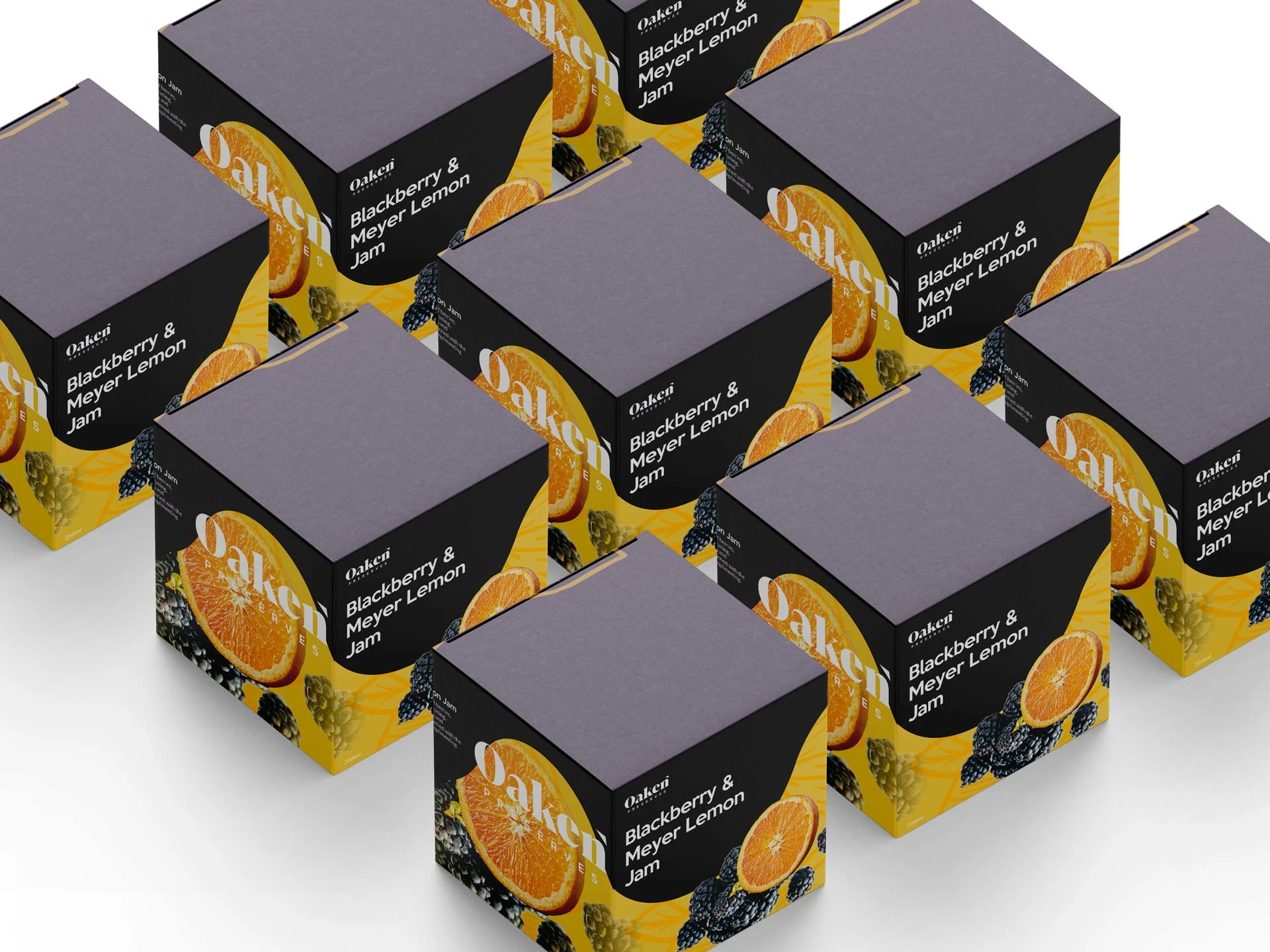
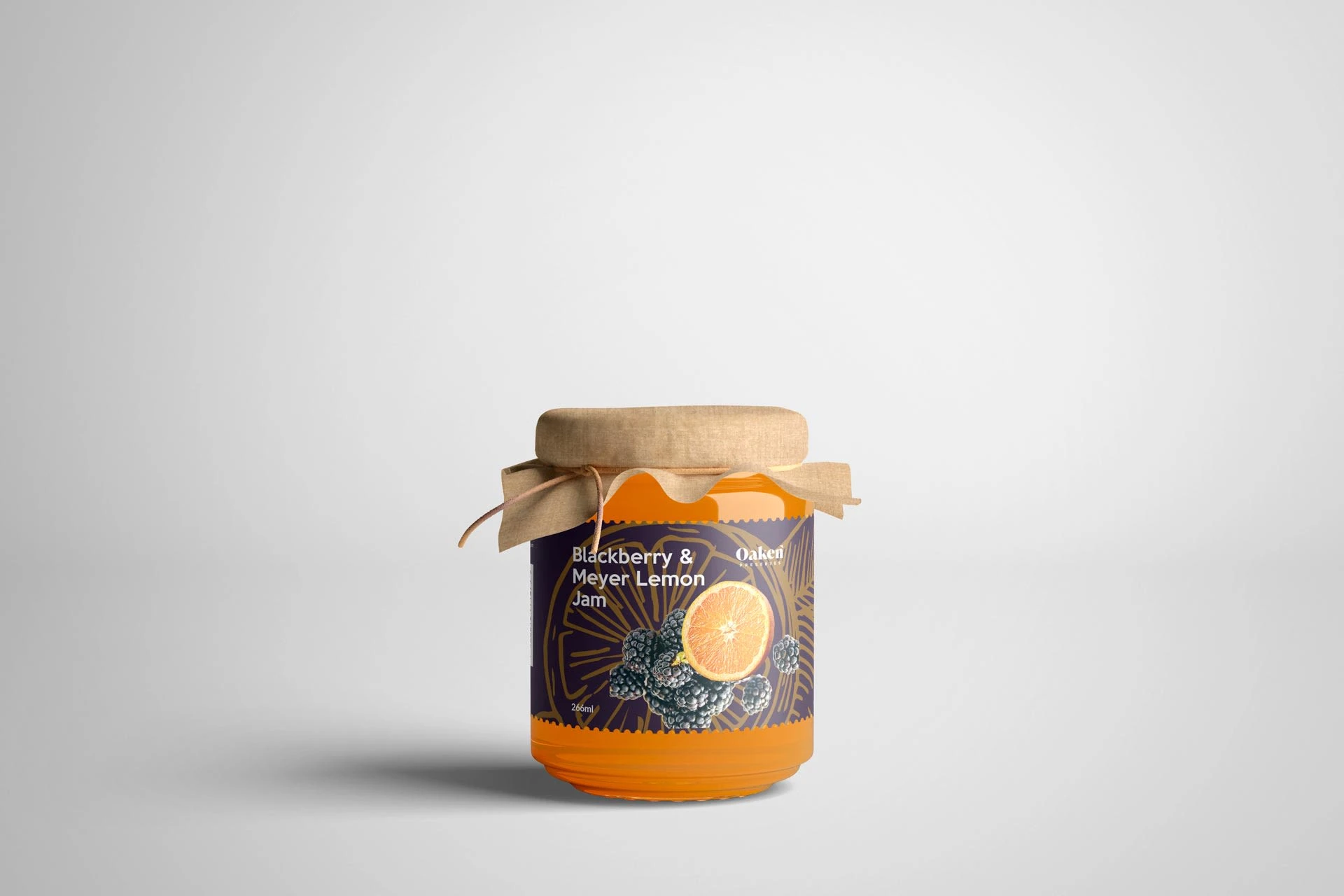
I was chosen by Oaken Preserves to develop packaging that effectively communicates their dedication to utilising only natural, premium ingredients. In the very competitive jam business, the design will assist them in setting their brand apart from rivals and creating strong brand identification. Effective packaging design is essential for grabbing potential clients' attention and conveying the quality and value of their items.
Process
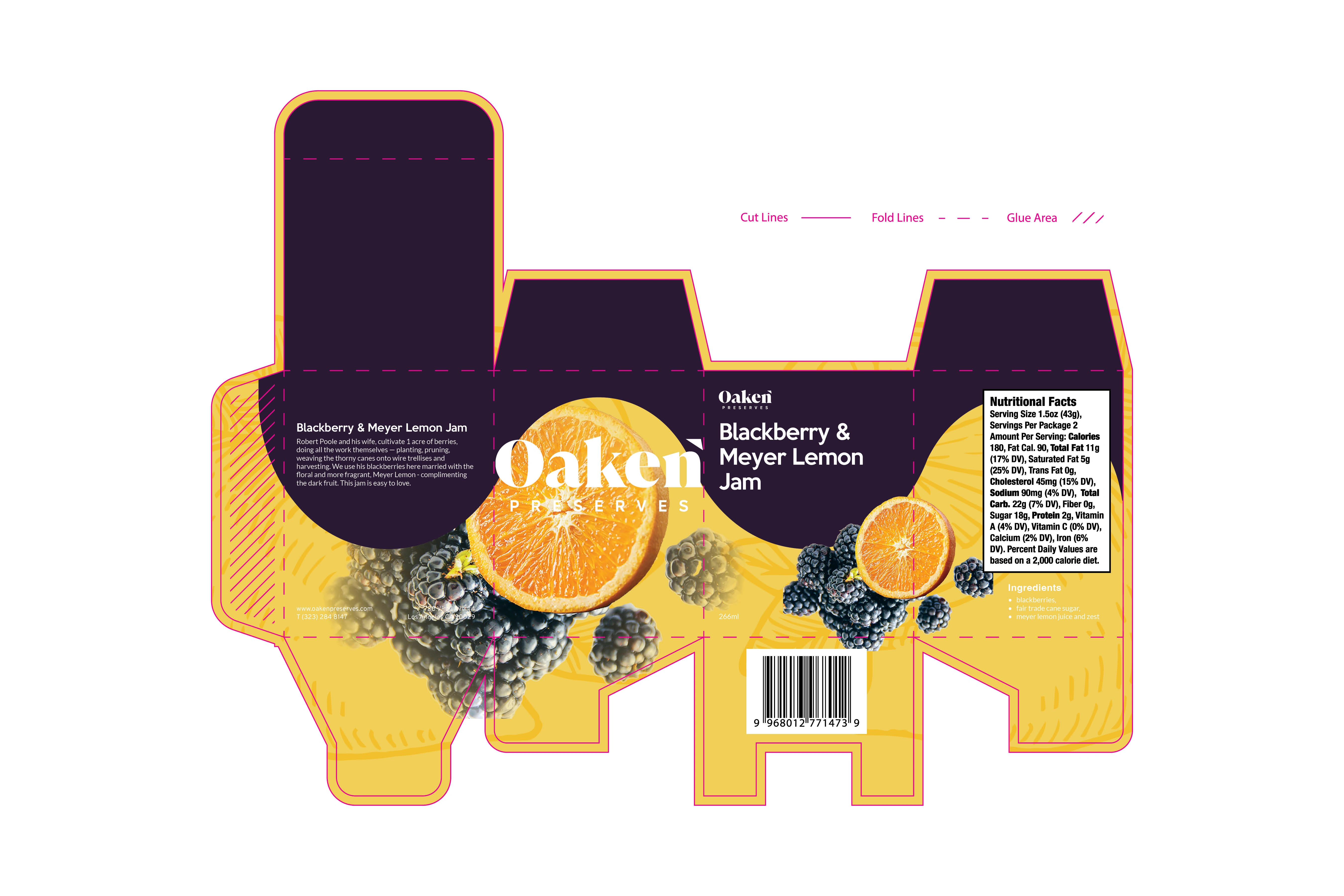
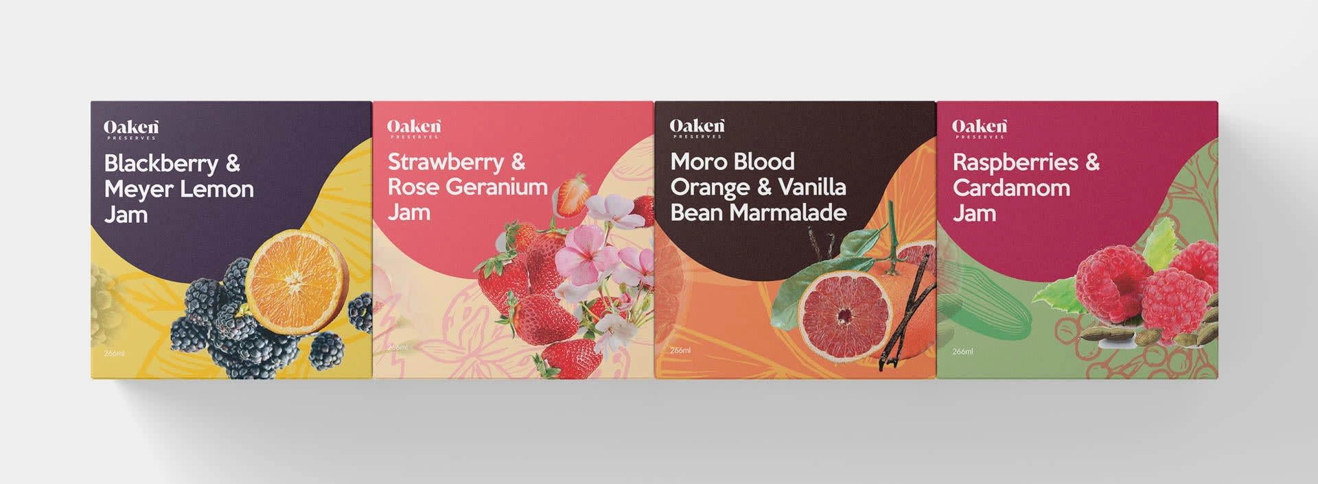
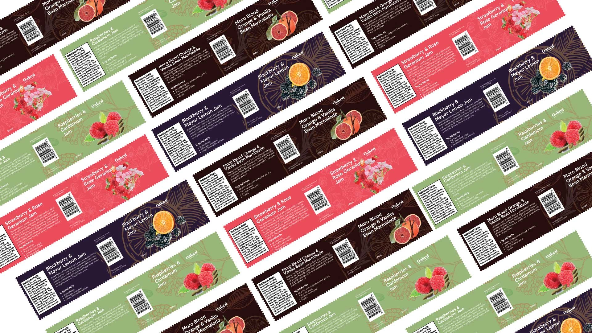
The client requested a bold and cohesive presence across their jam product line, so the designer focused on creating a unified design through consistent colour schemes and spatial arrangements. They created a wave-inspired pattern to capture customers' attention and create a sense of continuity between the different jam varieties. Additionally, they included a clean and modern typography style to enhance the visual appeal of the packaging and communicate the brand's commitment to quality. By using a legible and concise font, the product information and key features would be easily digestible for customers, providing an effortless and enjoyable experience while browsing Oaken Preserves jam products.

Like this project
Posted May 23, 2023
Created vibrant, cohesive packaging for Oaken Preserves, capturing attention and reflecting their commitment to quality ingredients. Client loved the result.


