Minimalist portfolio focused on typography
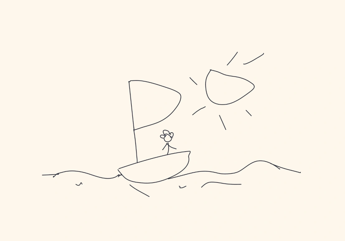
When you land on my portfolio, you’re greeted by a quiet, open space. A single illustration. A boat. A person. It’s not just an image—it’s a metaphor. Design, to me, has always felt like setting out on open water. It’s calm, but it’s vast. It demands intention. You don’t just move—you navigate.
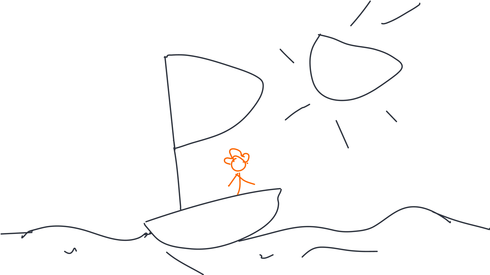
I’m Toni. I design digital products that don’t just work—they make sense. I believe that when something is truly well-designed, you don’t notice the design at all. You just feel like it was made for you. That’s the space I aim for in every project: where function and feeling overlap.
buttons 1
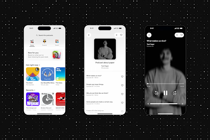
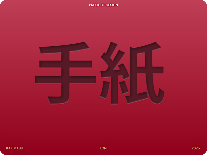
The portfolio at tnad.xyz isn’t a gallery. It’s a map of how I think. You’ll find projects like Kakimasu, a Japanese learning app, and Stack, a task management tool. These aren’t just apps—they’re systems built around real human behaviors. Each case study is a window into the questions I asked, the problems I uncovered, and the way I shaped the solution. I don’t design for features. I design for clarity, for ease, for the quiet confidence that comes when a product just fits.
buttons 2
My values are the foundation of everything. Simplicity and accessibility are not trends—they’re truths. I’ve always seen them as two sides of the same idea: that design should serve people. That it should guide, not distract. That it should breathe, not shout. I question every element. I refine. I remove. Not to make things minimal, but to make them meaningful.
And I iterate. I listen. I balance. Because good design isn’t born from ego—it’s born from observation. From testing. From letting go of the clever solution in favor of the right one. I’ve learned that the best outcomes come from the tension between logic and instinct, data and emotion, structure and play.
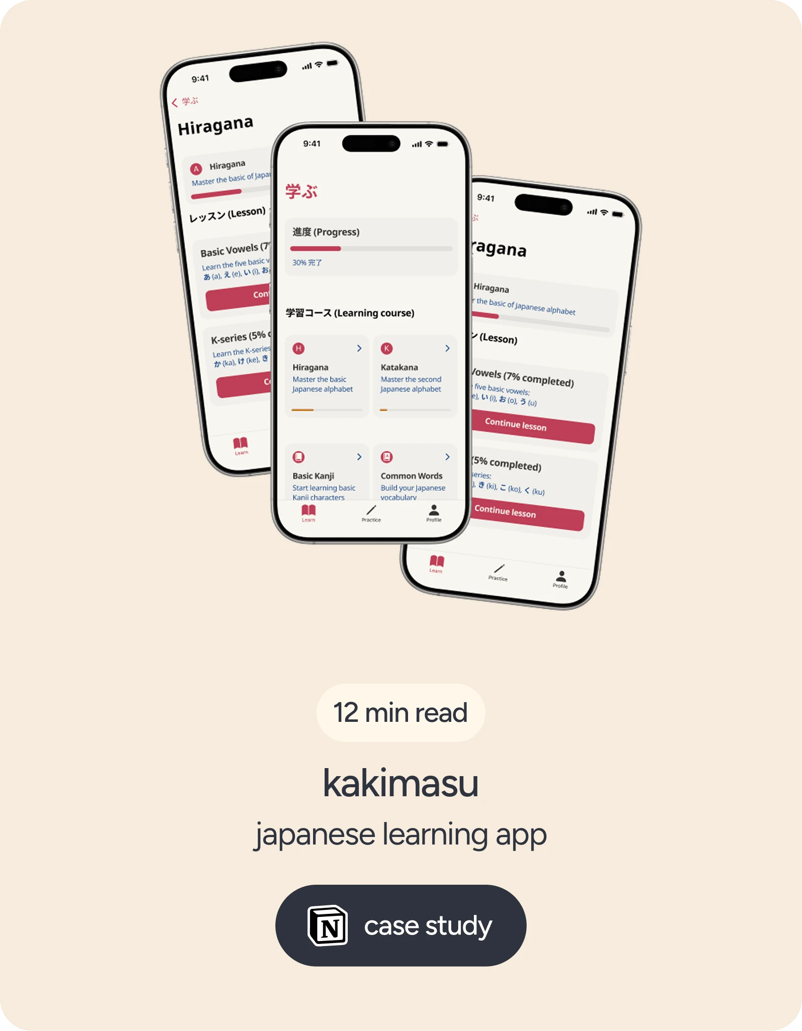
kakimasu card
I’m 23, based in Zagreb, Croatia. My background is in graphic design and multimedia, but I’ve always been more drawn to the space between the user and the product. That invisible thread of interaction—that’s where the magic is. That’s where I work.
This portfolio is a reflection of that mindset. It’s not flashy. It’s not loud. But it’s intentional. Every pixel, every paragraph, every project—designed to feel like it belongs. I invite you to explore it not just as a showcase of work, but as a conversation. About what design can be when it’s honest, human, and quietly powerful.
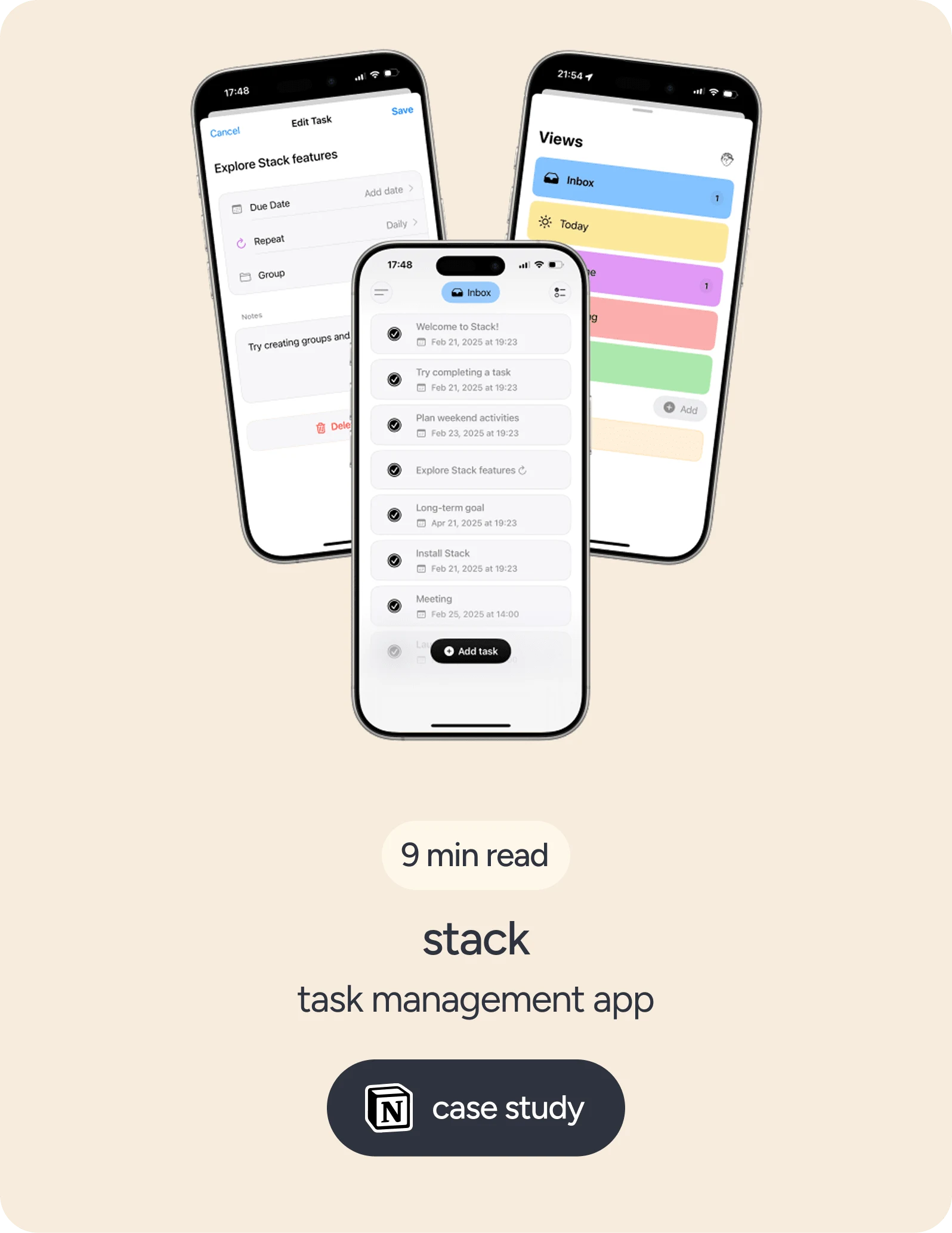
stack card
Like this project
Posted Mar 20, 2025
Minimalist portfolio focused on clean typography, subtle accents, and a refined orange palette—crafted to highlight clarity, balance, and visual rhythm.
Likes
1
Views
13
Timeline
Mar 13, 2025 - Mar 20, 2025
