2020 ARM Software UI Redesign
Overview
As the sole UX and Visual Designer, I redesigned over 100+ screens of the ARM software interface. Because the design needed a lot of work, I collaborated with the ARM CEO and software developer and performed user research.
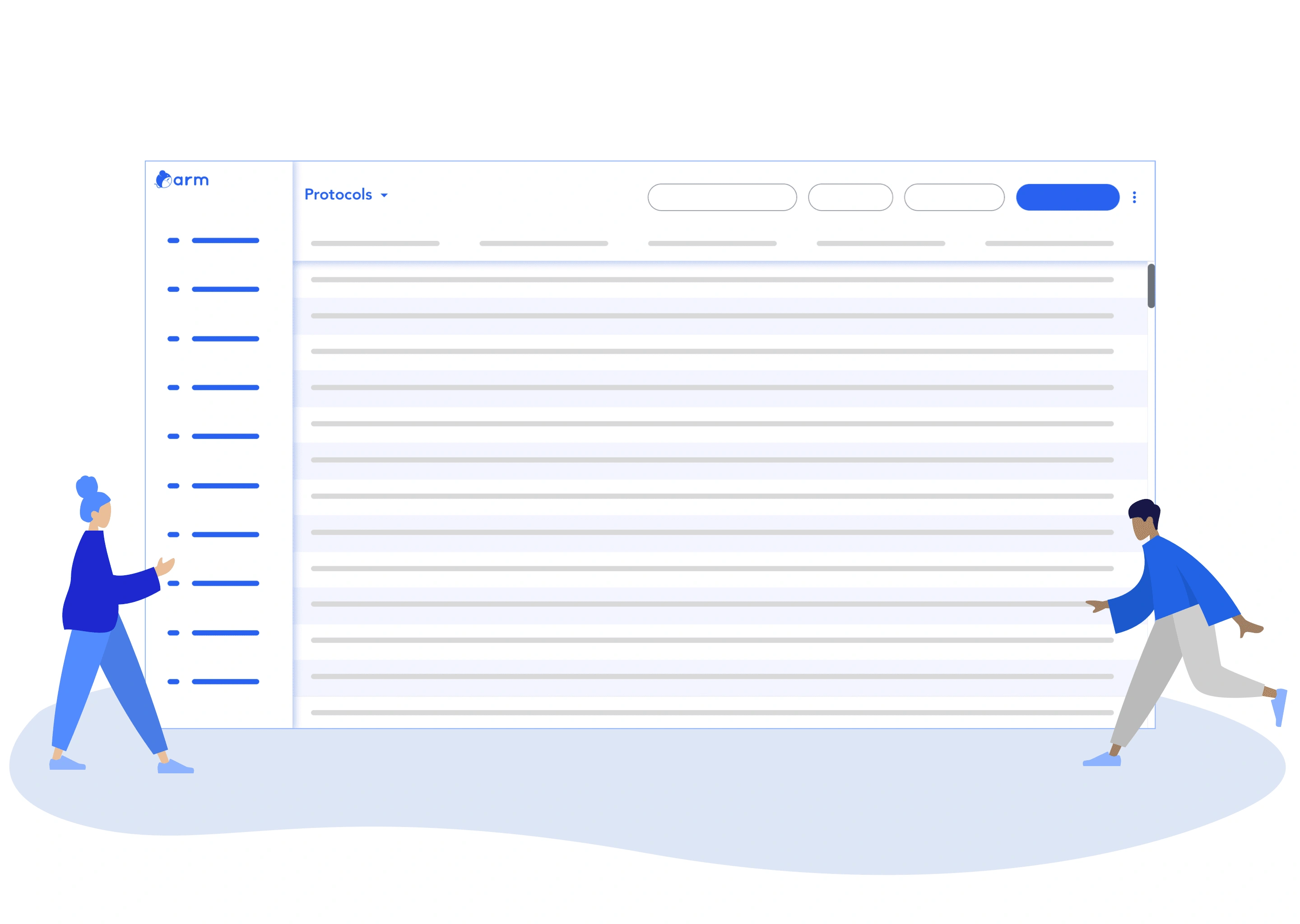
Updated 2020 ARM UI design, created by Kimberly Ngo.
Problem
The ARM software interface had a lot of aesthetic issues, making ARM less intuitive to use (i.e. mismatched icons to label pairing). Research facility managers and clerks felt frustrated with navigating and consuming information from the software.
Solution
I surveyed and interviewed research facility managers and clerks to understand the challenges they encountered, and I also analyzed the following visual components:
Layout
Visual Hierarchy
Typography
Colors
Accessibility
Goals
Make the software more intuitive to use
Discover challenges in relation to the UI that users encounter
Improve the visual design layout, hierarchy, typography, colors, and accessibility
Process
The Design Thinking methodology was applied in order to understand and define user challenges through research.
Solutions were then generated and designed through the application of visual design concepts (i.e. layout).
Then the solutions were tested with users to gather additional feedback, further improving the software.
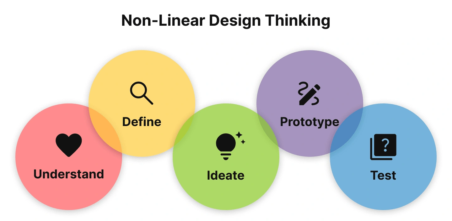
"The Design Thinking Process" visual graphic, created in 2022 by Kimberly Ngo. This process is not linear and can be iterative, going back to different stages of the design process as needed.
1. Understand Users
Qualitative data from research facility managers and clerks were grouped into categories of quantitative data, called Affinity Diagramming, and resulting in the graph below. The goal was to identify major trends with a focus on the front-end UI of the ARM software.
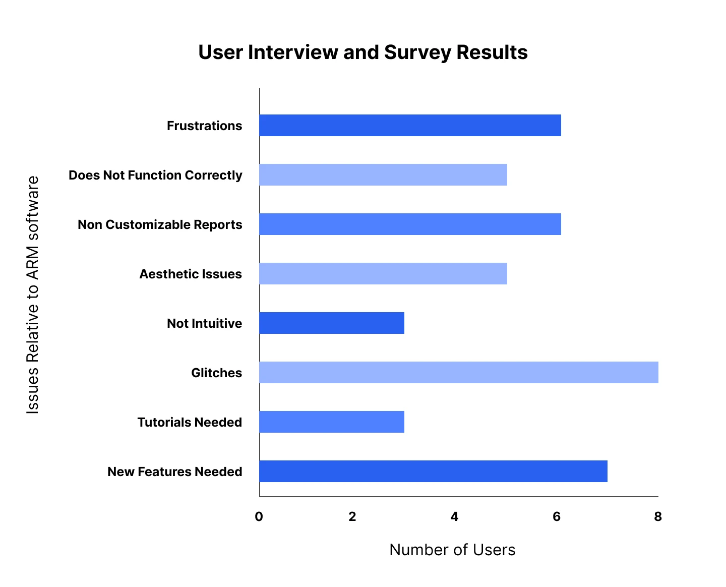
A 2020 collection of user responses from interviews and surveys, conducted by Kimberly Ngo.
2. Define Challenges
Insight 1: Icons to label pairing does not make sense.
A user explained icons to label pairing make ARM less intuitive to navigate.

2020 ARM Software, 2022 screenshot by Kimberly Ngo.
Insight 2: Little support for red-green color-blinded users.
ARM CEO explained a color-blinded user had difficulty navigating the software. According to National Eye Institute (2019), the most common type of color blindness is red-green.

2020 ARM Software, 2022 screenshot by Kimberly Ngo.
Insight 3: Locating and consuming information is difficult.
A user suggested that using headers would help them locate and break down information.

2020 ARM Software, 2022 screenshot by Kimberly Ngo.
3. Ideate Opportunities
Icons-Label Pairing
By referencing standard Design Systems (Google's Material.io 2020 and Apple's Human Interface Guidelines 2020) and performing keyword searches, ARM's software for icon-label pairing would be more universal.
If an icon did not exist for a label, I would design a new icon following Google's and Apple's icon guidelines and templates.
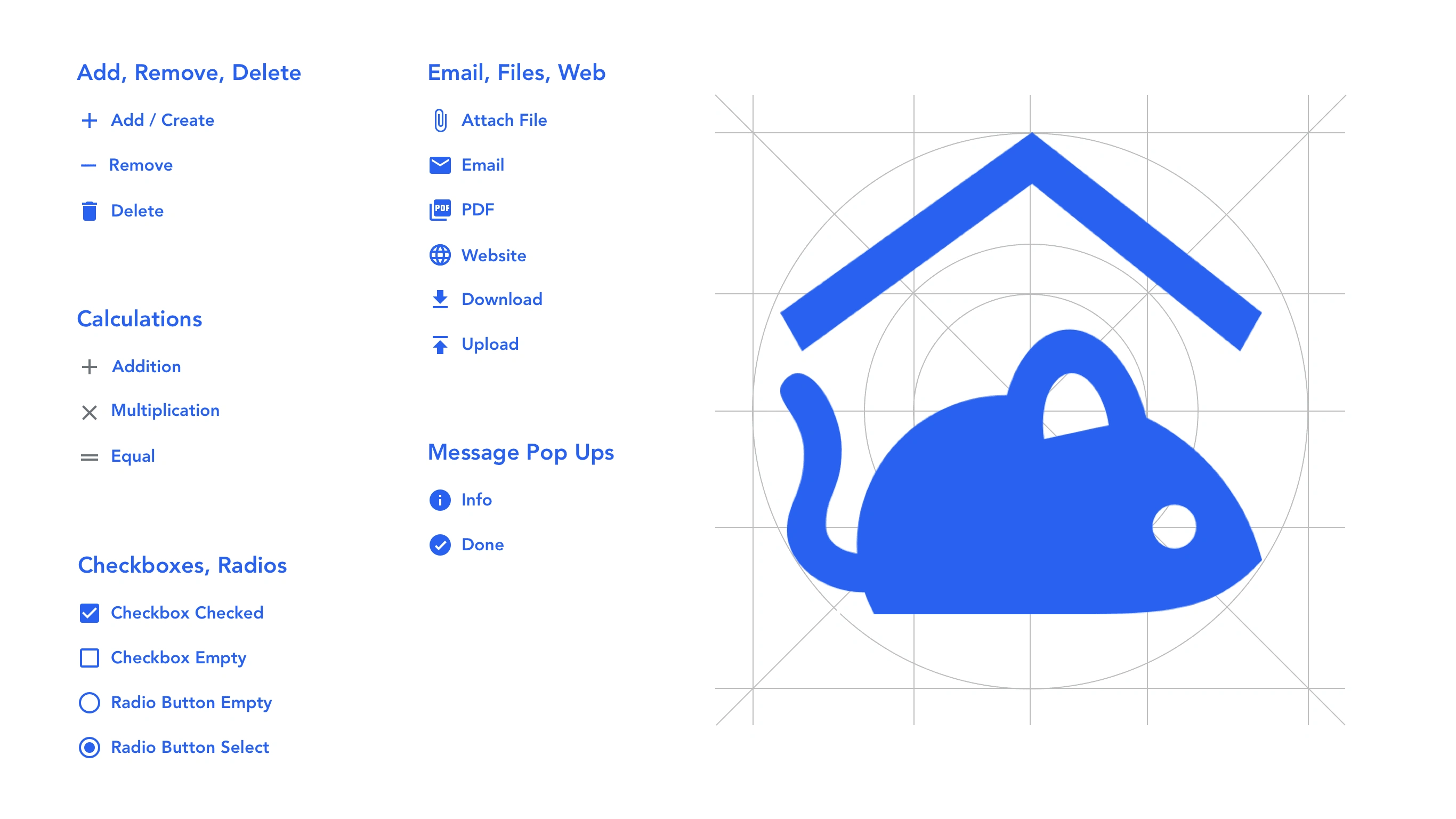
2020 ARM software Icon-Label pairing and Design utilizing Material template by Kimberly Ngo.
Colors for Accessibility
Because blue-yellow colors were less common in color blindness (National Eye Institute 2019), monochromatic blues were used.
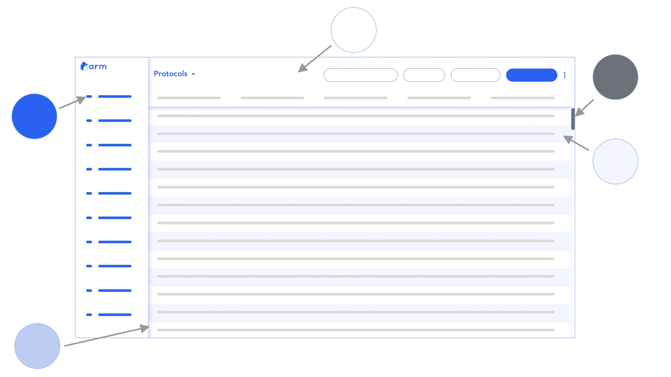
2020 ARM software monochromatic blues by Kimberly Ngo.
Visual Hierarchy and Laying out Information
Heading and paragraph sizes were specified for breaking down information. Also, I kept in mind the visual flow of consuming information from the interface.
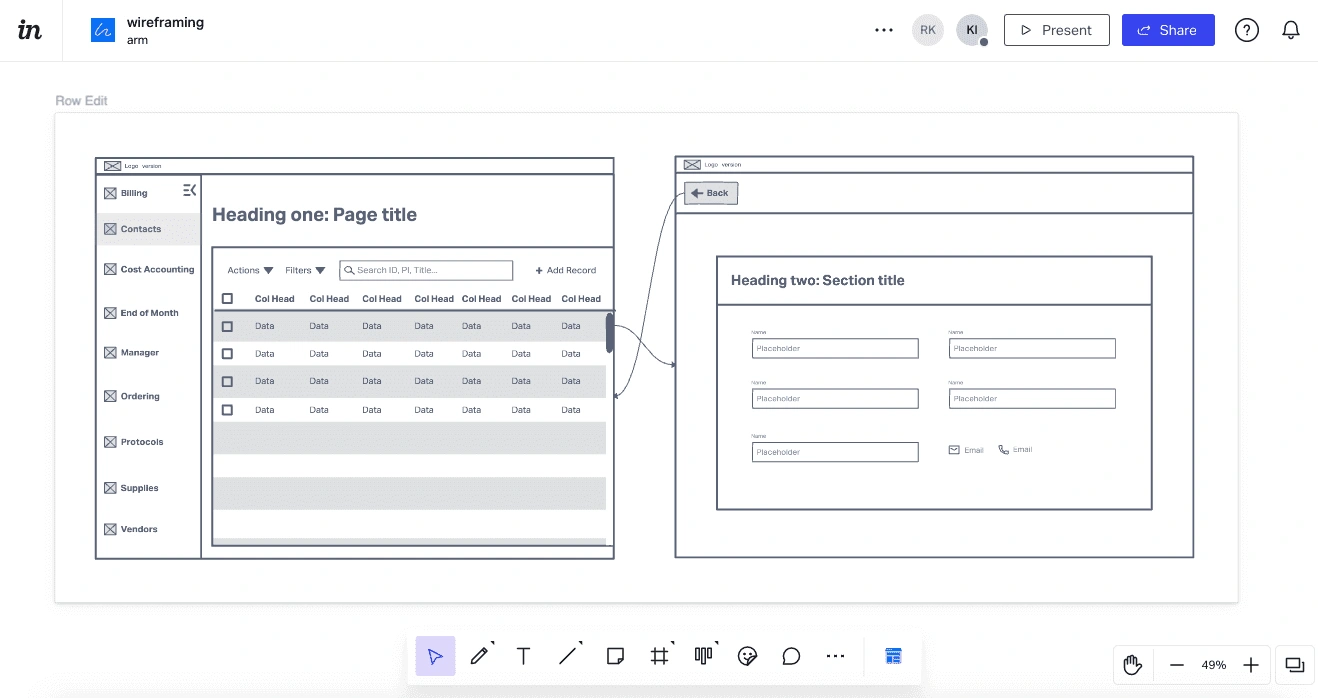
Heading sizes are defined in the ARM 2020 software, keeping in mind the visual hierarchy and information that is laid on two of the most common screens: 'modules', and 'edit'. Created in 2022 Invision App by Kimberly Ngo
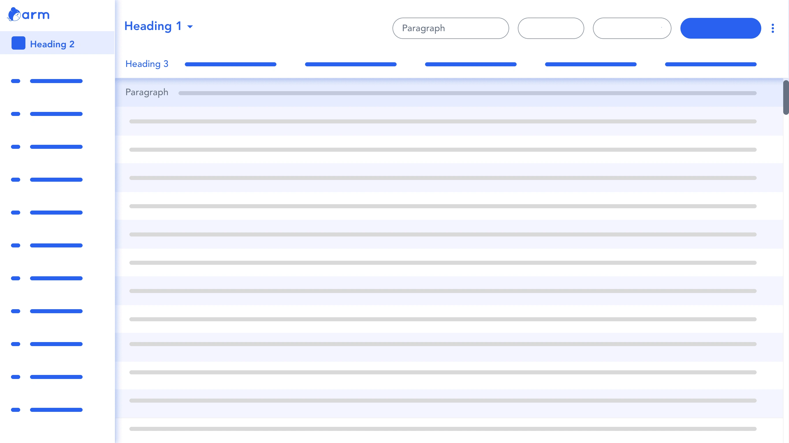
Heading and paragraph sizes are defined on the 2020 ARM software. Visual sections are broken down (shown in color) into the use cases of navigating and data searching. Created in 2022 Figma by Kimberly Ngo.
4. Prototype Creation
Applying the UI
I created a new UI for the ARM software, applying the visual elements to the interface within SketchApp. SketchApp had symbols, similar to the object-oriented programming concept for coders and components in Figma.
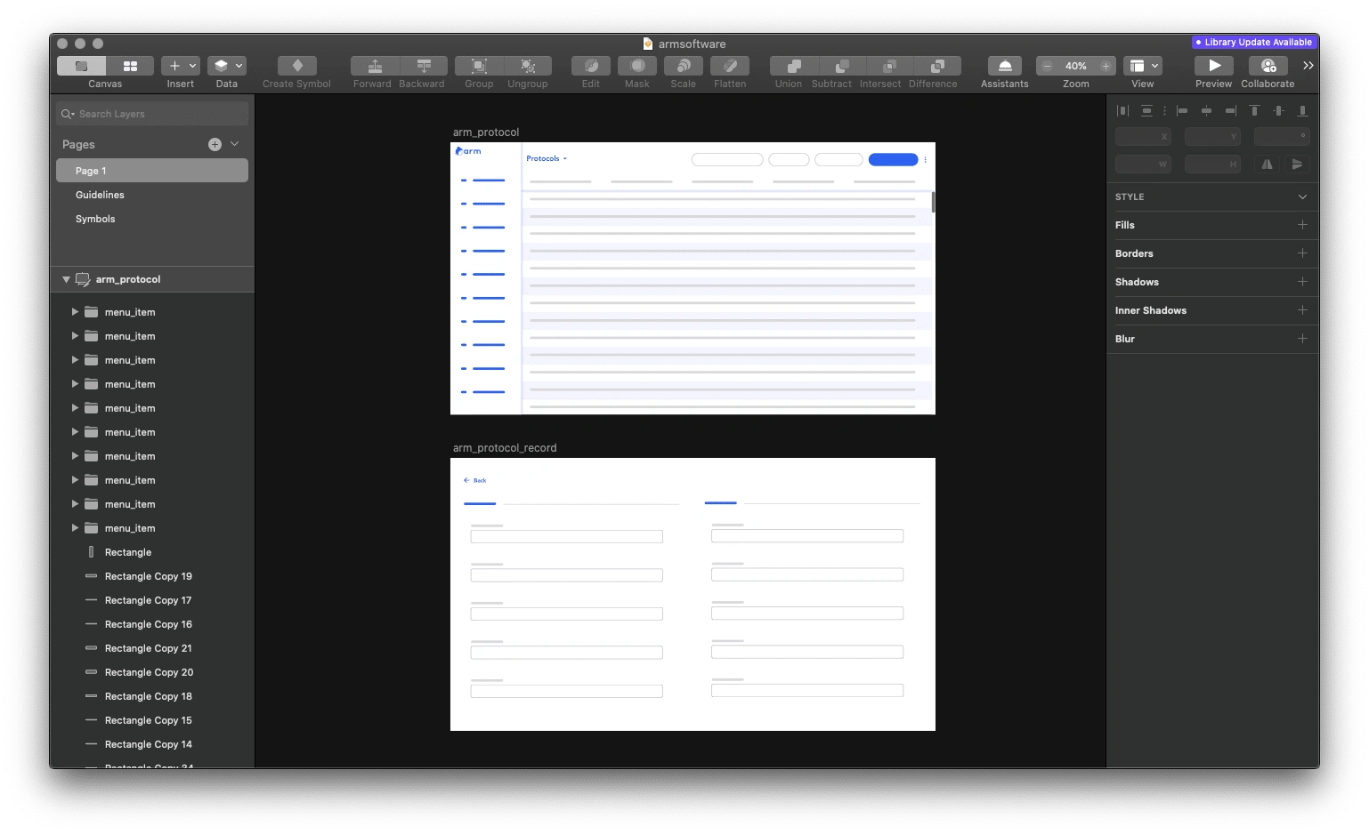
2020 ARM software prototypes in SketchApp by Kimberly Ngo.
Clickable Prototype
SketchApp screens were exported and imported into InvisionApp clickable prototypes to be prepared for usability testing.
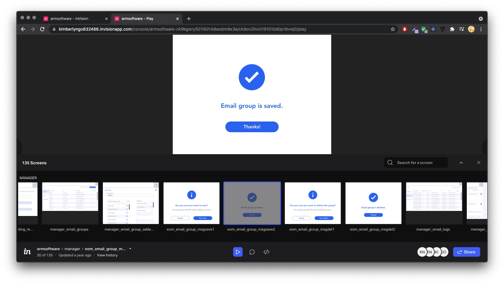
2020 ARM software clickable prototypes in InvisionApp by Kimberly Ngo.
5. Test
Usability Testing
InvisionApp link and a follow-up survey were sent to participants for remote testing. Some users have commented directly inside InvisionApp, providing additional feedback.
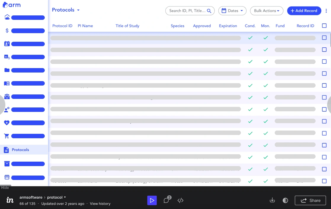
2020 remote InvisionApp Usability Test of the ARM software. In 2020, the screenshot shows changes after the user's feedback (see 'Negative Feedbacks' below). In 2022, the screenshot was taken by Kimberly Ngo.
Results
Negative Feedback
A user mentioned adding in alternating rows of color in the table to locate data easily.
A user mentioned there was too much white space in the edit screen.
Positive Feedback
Below shows qualitative user data (numbered 1-10) of positive feedback grouped by subject mentions and keywords.
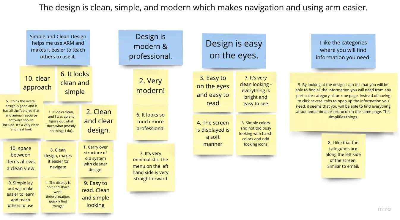
2020 ARM Affinity Diagram by Kimberly Ngo.
Reflection
I am thankful for this opportunity to redesign the UI of the ARM software.
As this was during the pandemic, I had to jump over some hurdles in contacting users and the team. Working remotely proved a bit difficult, but I was able to adjust and overcome them.
Since ARM was very satisfied with my work, I earned another opportunity to perform continuous UX/UI work on the software.
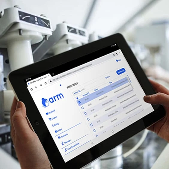
Recent ARM implementation of my design on a tablet. Image created by Kimberly Ngo.
Like this project
Posted Nov 21, 2022
This is a UI redesign of software that manages research facilities' data.

