Homepage Design for Project Masters Mentorship Program

Olawale Balo


Overview
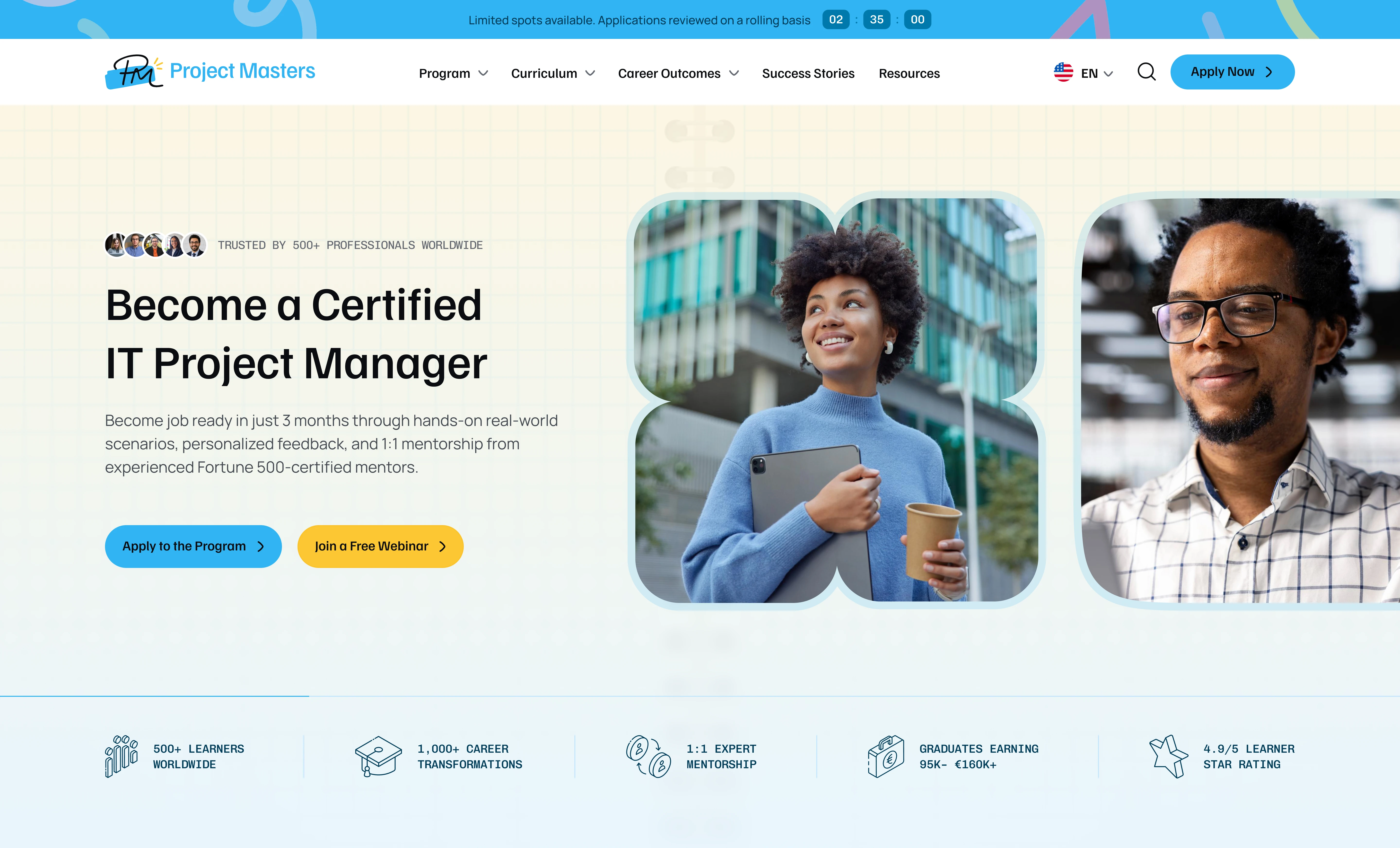
Project Masters is a European mentorship program that helps people become certified IT Project Managers in 3 months through real-world scenarios, 1:1 mentorship, and certification prep (PMP, PMI-ACP, PSM).
I designed the homepage in 7 days. The goal was to make a high-commitment decision feel clear, credible, and low-risk.
Role: Product Designer
Scope: UX strategy, information architecture, conversion flow, UI design, visual design
Timeline: 7 days
The Challenge
Applying to a paid, 3-month program is not an impulse click. Visitors arrive with doubts: Is this career real? Will it pay off? Is this program legitimate? Is it for someone like me?
The audience also splits into two groups with different motivations. Career changers need reassurance that the move is possible. IT professionals already know the field and want a faster, structured path to leadership. One generic message would have undersold the program to both.
The Approach
1. Two paths to commitment, not one
Every major decision point offers a high-intent action ("Apply to the Program") next to a low-commitment one ("Join a Free Webinar"). Visitors who aren't ready to apply still have a clear next step, which keeps them in the funnel instead of bouncing.
2. Let the numbers make the case
The "smartest career move" section presents a salary ladder from Junior PM (€50–70K) up to Delivery/Programme Manager (€130–200K+). Each card cites its source (Glassdoor, PayScale). Showing the progression as a ladder turns an abstract promise into a visible career path, and the citations make the claims credible instead of salesy.
3. Self-segmentation
The "Discover if this opportunity is for you" section speaks directly to both audiences side by side: "Thinking about changing careers?" and "Already in IT and ready to level up?" Each lists specific situations visitors can recognise themselves in, so the page feels personal without needing separate landing pages.
4. Layered trust
Credibility is built in layers throughout the page: a stats strip in the hero, video success stories, named mentors with real titles, certification partner logos (PMI, PRINCE2, Scrum Alliance, SAFe), and a long-form testimonial with a concrete outcome (QA Engineer to PM with a €22K salary increase).
5. Urgency that still feels respectful
A slim announcement bar with a countdown and "applications reviewed on a rolling basis" adds urgency without pop-ups interrupting the experience.
6. A human behind the FAQ
Instead of a faceless accordion, the FAQ is paired with a named Senior IT Manager ("Sarah's ready when you are"), which reframes support as a conversation.
7. Rhythm and pacing
The page is long by design, so I used visual rhythm to keep it readable: light informational sections, a dark full-bleed section for the core program offer so it feels like the page's centrepiece, and a closing CTA that mirrors the hero's dual-path structure.
Working to a 7-day timeline, I prioritised the page structure and conversion flow first, then refined the visual system section by section.
Outcome
The result is a homepage that guides two distinct audiences toward the same decision, backs every promise with evidence, and gives visitors a clear next step whether they're ready to apply today or just starting to explore.

Like this project
Posted Sep 23, 2026
Designed a conversion-focused homepage for a European IT Project Management mentorship, guiding career changers and IT pros from curiosity to application.
Likes
1
Views
7
Timeline
Aug 28, 2026 - Sep 5, 2026