Designing mobile app for Mobile Vikings
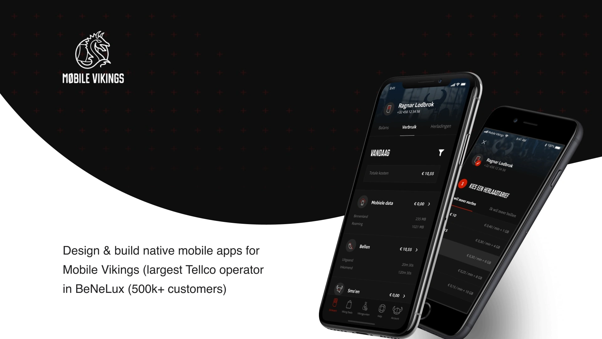
In 2016, I began a project to redesign the Mobile Vikings app. The goal was to create consistent functionality across desktop and mobile, and to give the app a more modern look.
1. Map the existing mobile app
Before beginning such a major project, I wanted to accurately map out and document all the existing flows in the app and compare them to the flows from the desktop site. This was done to gain an overall understanding of the functionalities and list down the flows that would need to be improved during the redesign.
I have suggested some enhanced flows for particular cases such as the 'Topup your simcard' flow. Those flows were internally evaluated and then a user testing session was held at our office. During this session, we allowed existing customers and non-customers to test my clickable prototypes in order to gain valuable insights from real-world feedback.
2. Design a design system for consistency
After having received valuable feedback and having the flows and wireframes approved by stakeholders, I began developing a design system for both mobile and desktop applications. My design system was based on the atoms and molecules methodology, which enables internal and external designers to create faster and more consistent designs and flows. This method is advantageous for the project since it allows for a unified design language and helps to ensure that the designs are consistent and cohesive. Additionally, it reduces the amount of time needed to create designs, allowing designers to focus more on the creative aspects of their work. The design system also allows for easier maintenance and updates in the future, making it a more efficient and cost-effective solution.
Like this project
Posted Jun 14, 2023
Designed the product interface of a travel booking website resulting in increased customer satisfaction and bookings by 25% within the first month.
Likes
0
Views
17
Clients
Mobile Vikings
