Built with Kajabi
Kajabi Website Redesign for Deka Advisory

Joshua Adehi

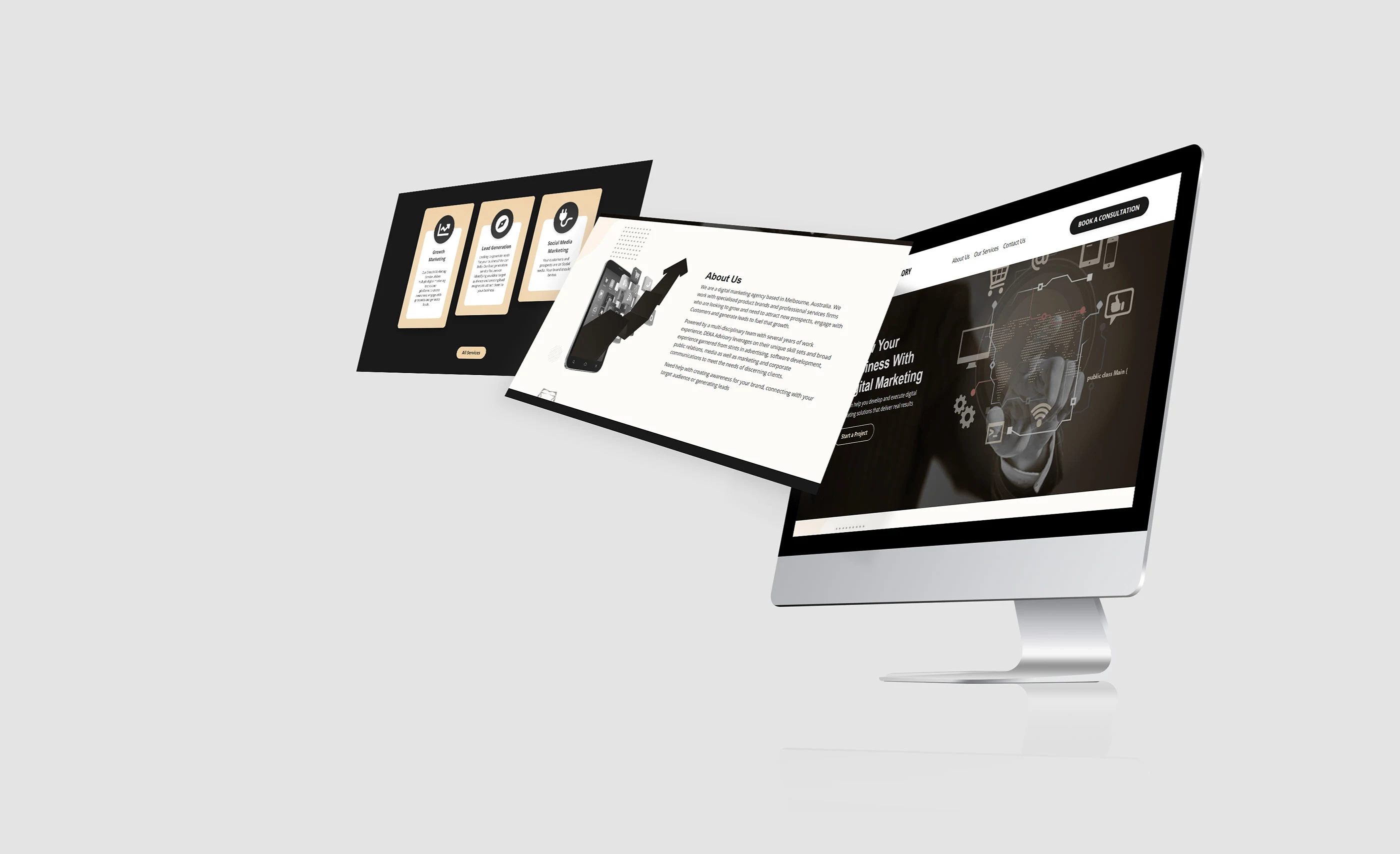
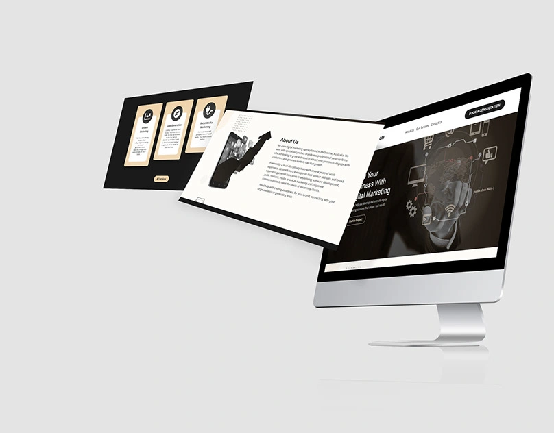
Deka Advisory | Digital Marketing Agency | Kajabi
Overview
Deka Advisory needed a polished Kajabi website that made its services easier to understand and created a clearer path to inquiry.
My role
I handled web design, interaction design, branding implementation, and Kajabi development.
What I delivered
• Responsive page system for desktop and mobile
• Clearer information hierarchy
• Service-focused calls to action
• Brand-aligned layouts and reusable sections
• Kajabi implementation and final quality checks
Approach
I translated the brand into a cleaner digital experience, organized the page flow around visitor questions, and kept the design consistent across key sections.
Outcome
The project gave Deka Advisory a more coherent Kajabi presence and a clearer route from browsing to inquiry.
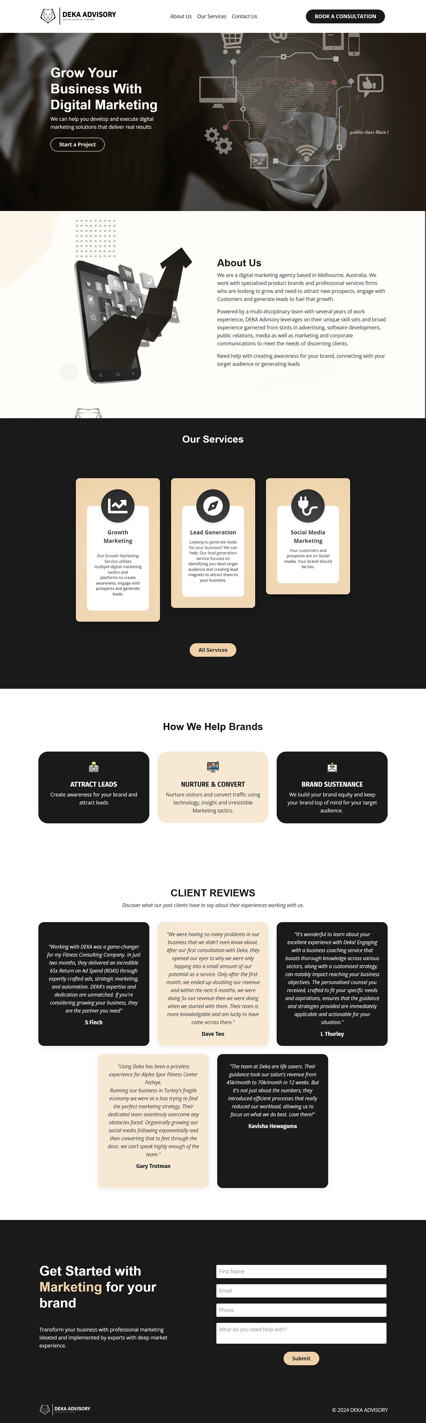
Original full-page design from my Deka Advisory Behance project, published August 19, 2024. The agency testimonials, client names, and business-result claims are historical content on Deka’s website—not reviews of my work or outcomes attributed to this website build. The enquiry form is empty.
From agency introduction to an enquiry
The page opens with Deka’s digital-marketing offer and a clear project action. The agency introduction comes next, followed by three service cards for growth marketing, lead generation, and social media marketing. That order gives visitors context before asking them to choose a service.
A second set of cards explains how the agency attracts leads, supports conversion, and maintains brand visibility. The page then moves into Deka’s own client-review section and finishes with an enquiry form. Black, cream, and white sections separate the stages, while repeated rounded cards and buttons keep the page consistent.
Original design evidence
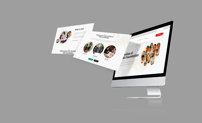
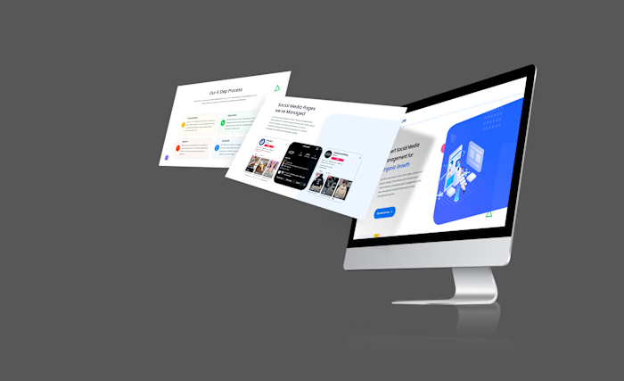
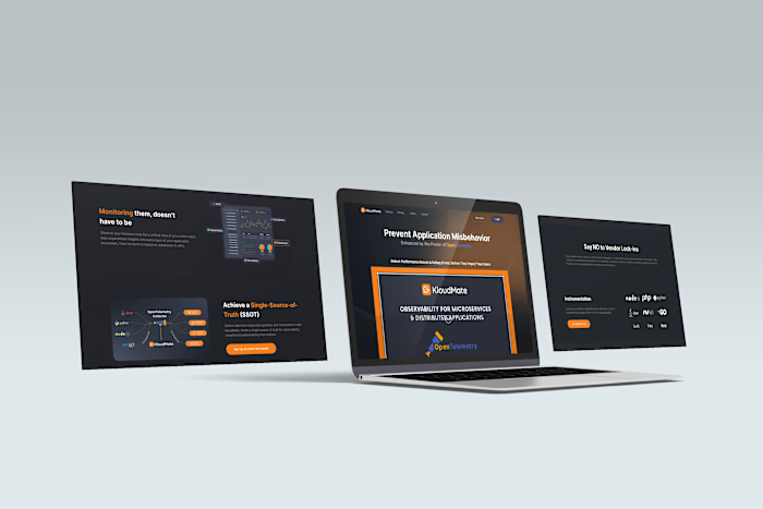
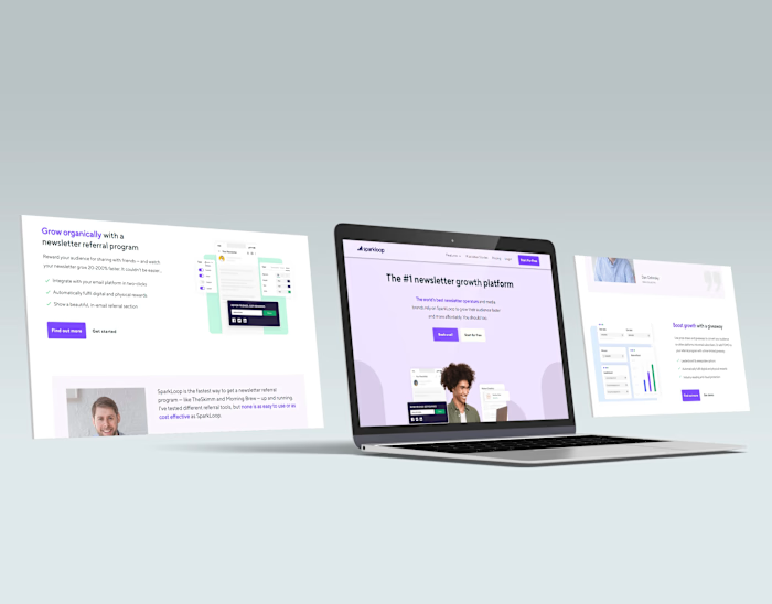
The full-page image is recovered from my original Behance project. It shows the complete page composition, not a newly generated reconstruction. The mockup above presents the design in context; this long screenshot lets visitors inspect the service hierarchy and final enquiry section directly.
This is an archived design showcase. The marketing results quoted inside Deka’s client testimonials are not results I claim for this build, and no current enquiry volume or conversion rate is asserted.
Like this project
Posted Aug 20, 2026
Designed and built a responsive Kajabi website with clearer service messaging, stronger calls to action, and a smoother path to inquiry.
Likes
1
Views
11