
A fiery, after-dark identity led by a black cat who brings the heat to every bite.
Overview
Noche Brava is a Mexican-inspired snack and salsa brand made for late nights, big flavours and people who like their food with attitude. I created its full identity, from the logo and mascot to illustrated packaging for salsa, tortilla chips and taco wraps, so the brand feels as bold and unforgettable as the heat inside.
The Challenge
The snack aisle is loud, and Mexican-inspired food brands tend to fall back on cliché, with sombreros, cacti and generic fiesta graphics. Noche Brava needed to:
Stand out on a crowded shelf, and be recognised in half a second
Express heat, flavour and nightlife without stereotypes
Give every product its own look while keeping one clear brand
Feel crafted and confident, not cheap or novelty
The Concept: The Night Has Teeth
Noche Brava means “wild night,” and the whole identity is built around that mood. The hero is a sleek black cat with glowing amber eyes, a creature of the night that is playful, a little dangerous and never boring. Flames, moons and stars frame it, so every pack feels like the start of a good night out.
The Packaging System
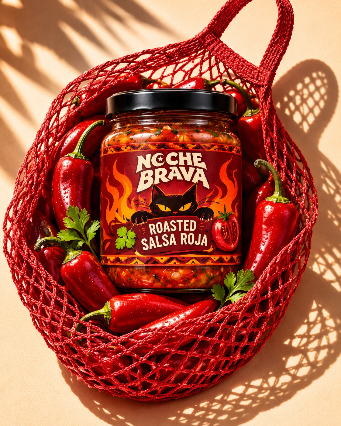
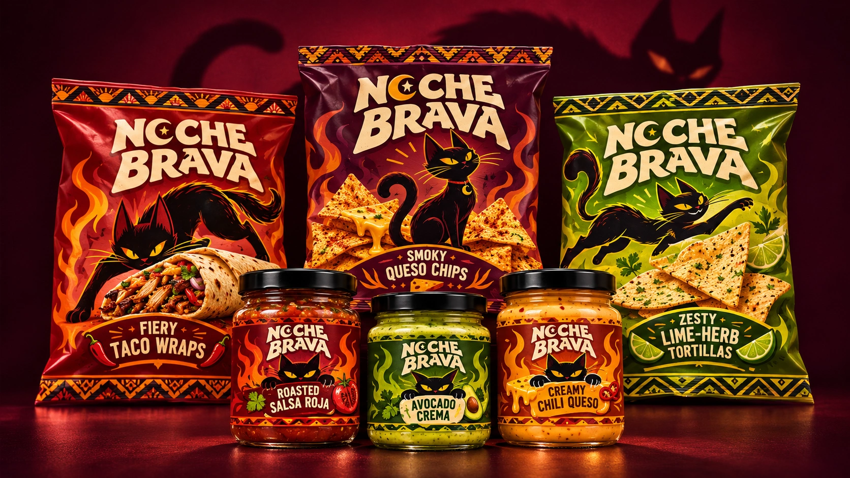
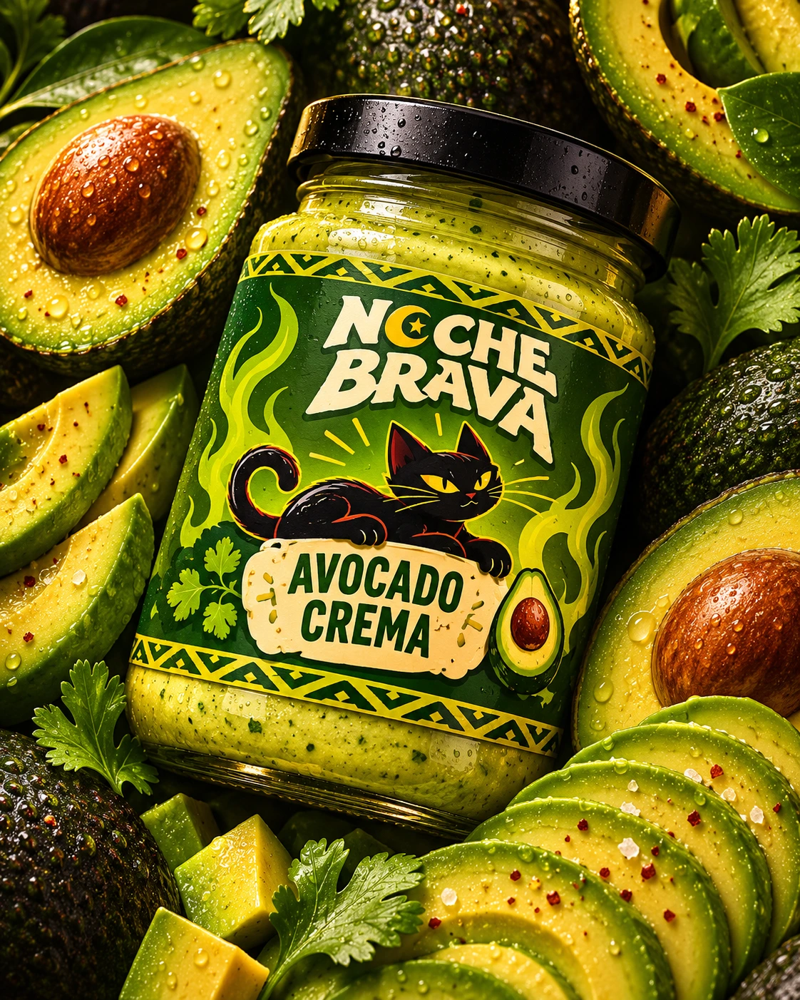
Roasted Salsa Roja: a glass jar with a wrap-around label, flames on both sides, the cat peering over the flavour banner, and tomato and cilantro details
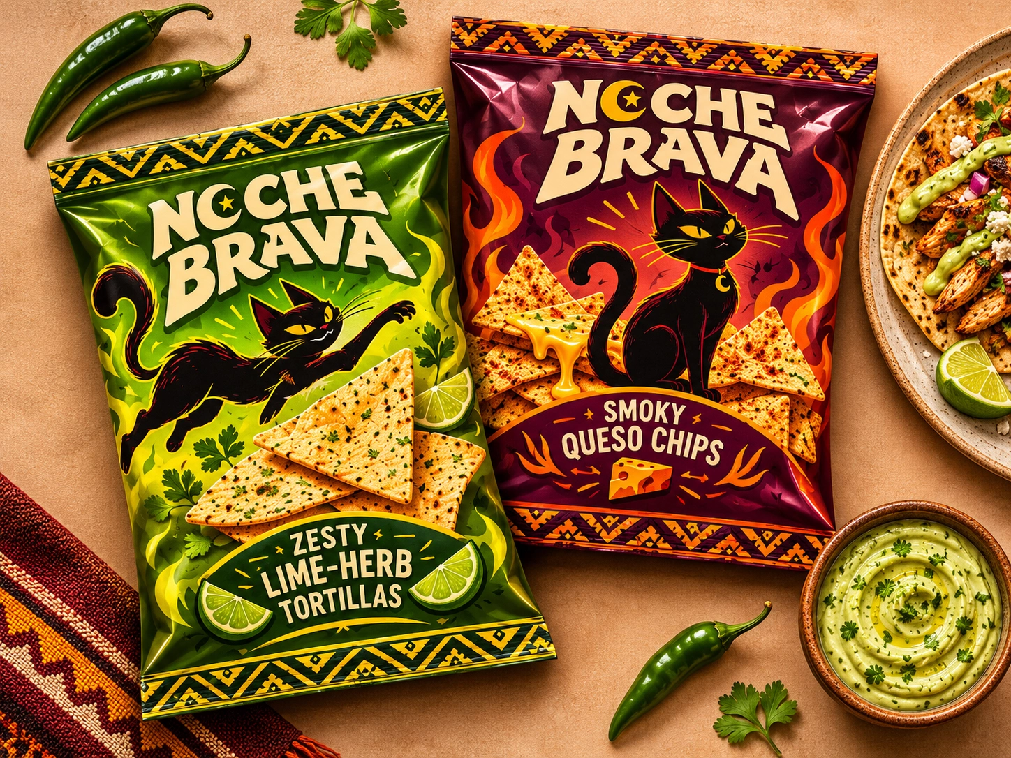
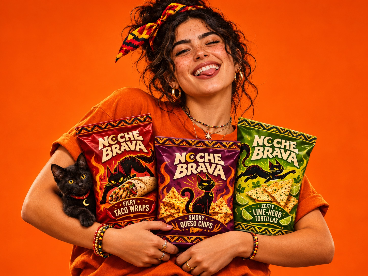
Zesty Lime-Herb Tortillas: a bright green pack with a leaping cat, lime wedges and cilantro
Smoky Queso Chips: a plum and flame pack with a seated cat and a pour of melted cheese
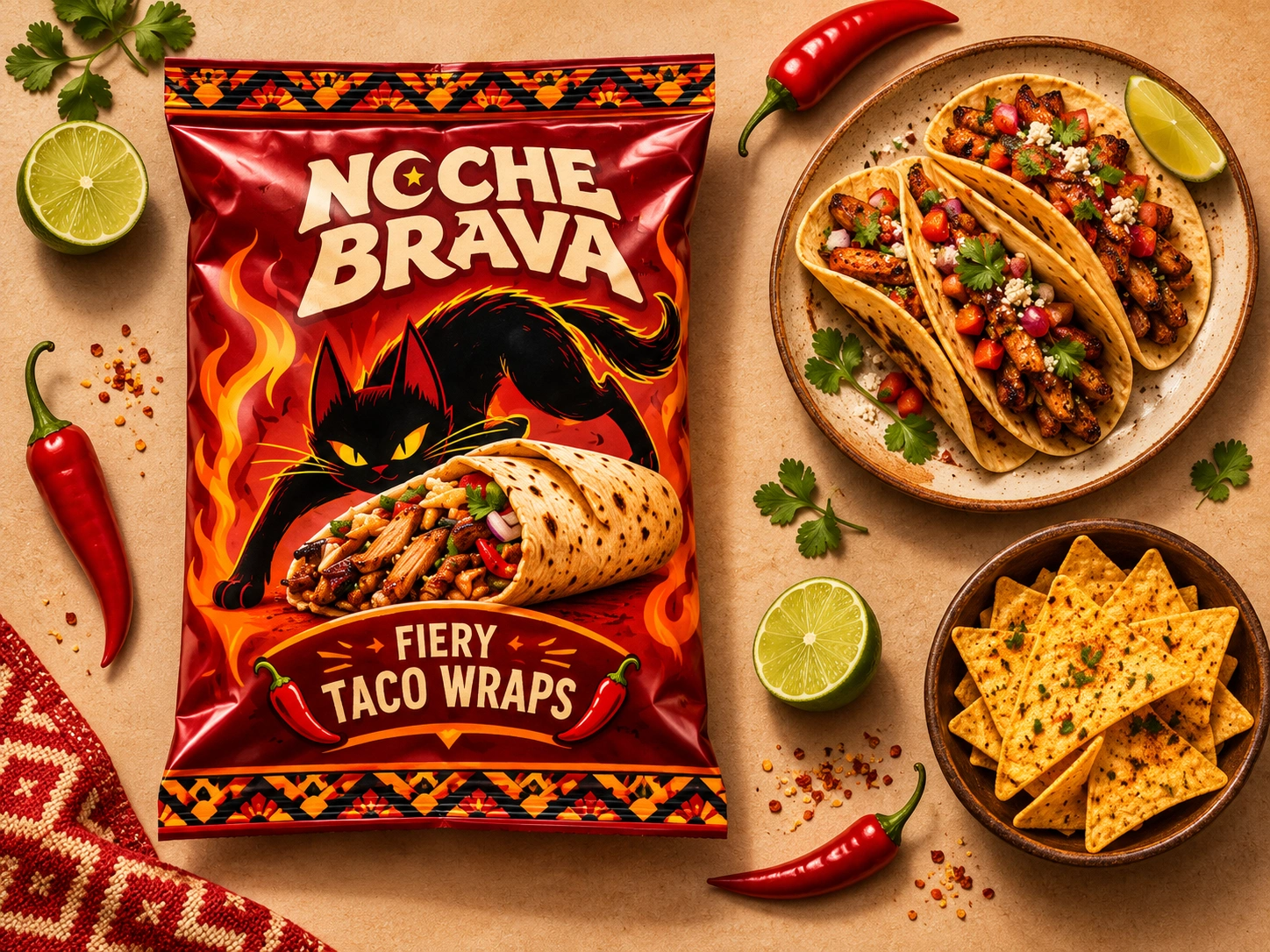
Fiery Taco Wraps: a deep red pack with a stalking cat and a loaded wrap, with chilli accents
Every pack shares the same structure (logo on top, mascot in the middle, flavour banner below, pattern borders), so new flavours can be added quickly and the range always looks like one family.
The Mascot
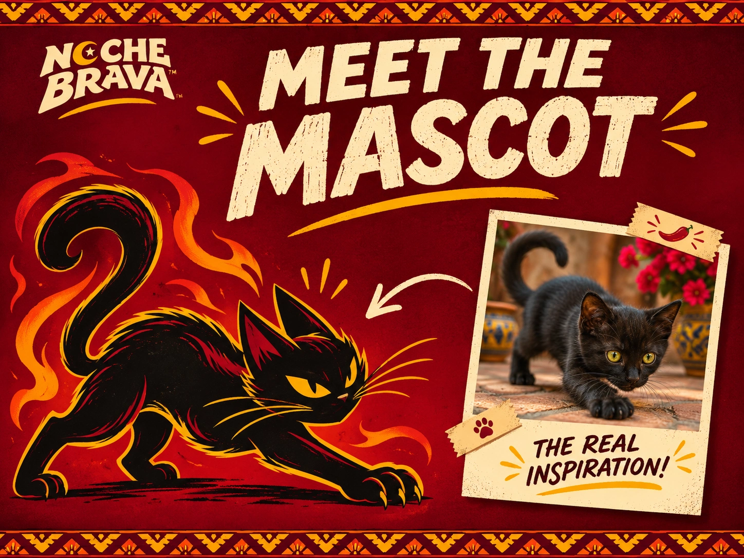
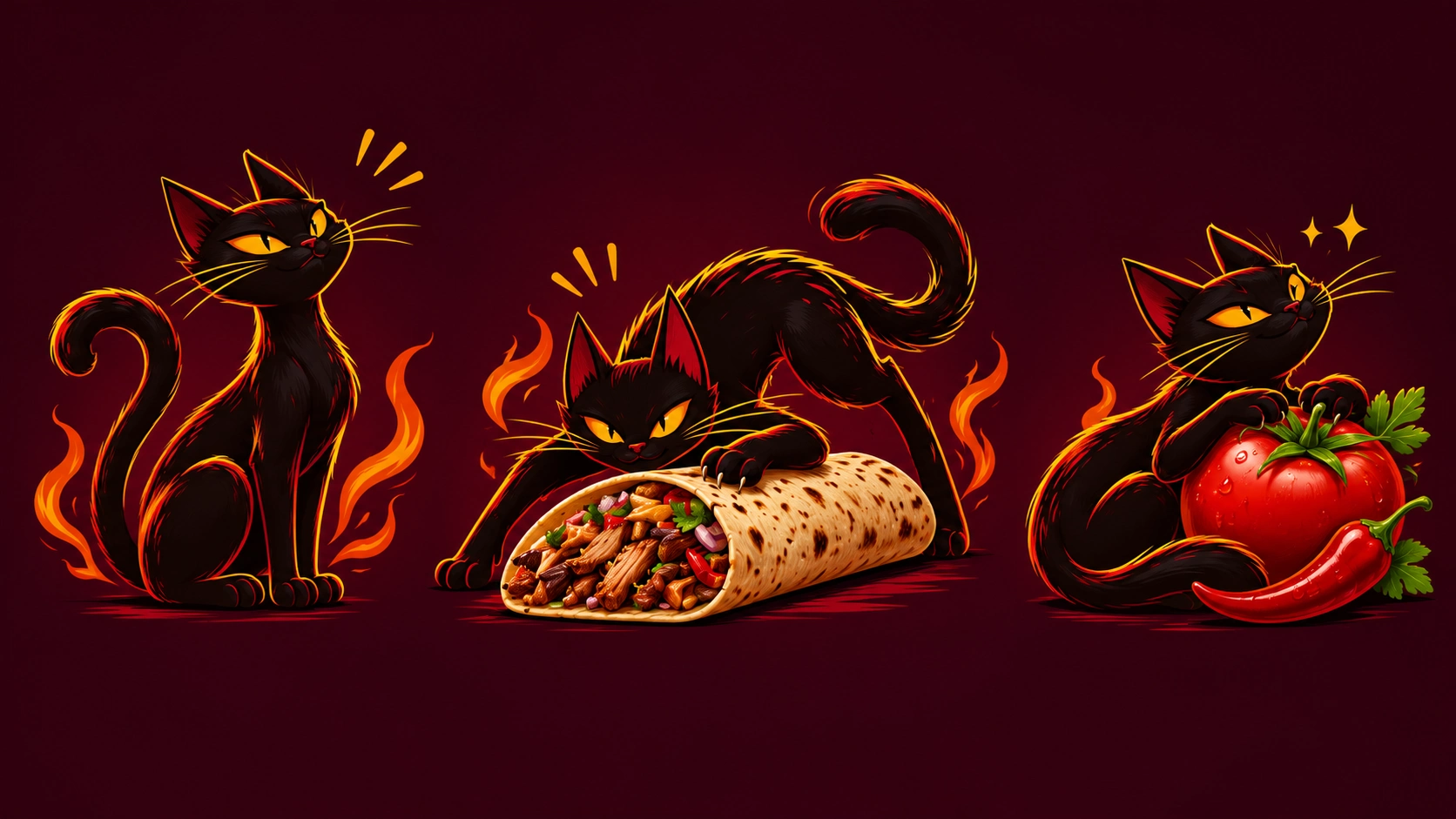
A black cat in a flat, high-contrast illustration style with sharp whiskers and glowing yellow eyes. It changes pose by flavour: leaping through green herbs for the lime-herb tortillas, sitting calmly above melting cheese for the smoky queso chips, stalking a loaded wrap on the taco pack, and peering over the label on the salsa jar. One character, many moods, so the range feels like a series and not just a set of SKUs.
Outcome
Noche Brava now has a loud, lovable identity with real shelf presence. The mascot gives it personality, the colour coding makes the range easy to navigate, and the system is ready to grow into new flavours, merchandise and social content.
Services: Brand Identity · Logo & Lettering · Mascot Illustration · Packaging Design · Art Direction · Product Photography Direction
0 likes · 2 views · Nov 15, 2026
I created its full identity, from the logo and mascot to illustrated packaging for salsa, tortilla chips and taco wraps, so the brand feels as bold.


