WIreframes, UX/UI Design and Figma to HTML & SCSS - Keep Beauty
Client
Keep Beauty
Industry
Beauty & Online Education
Project Overview
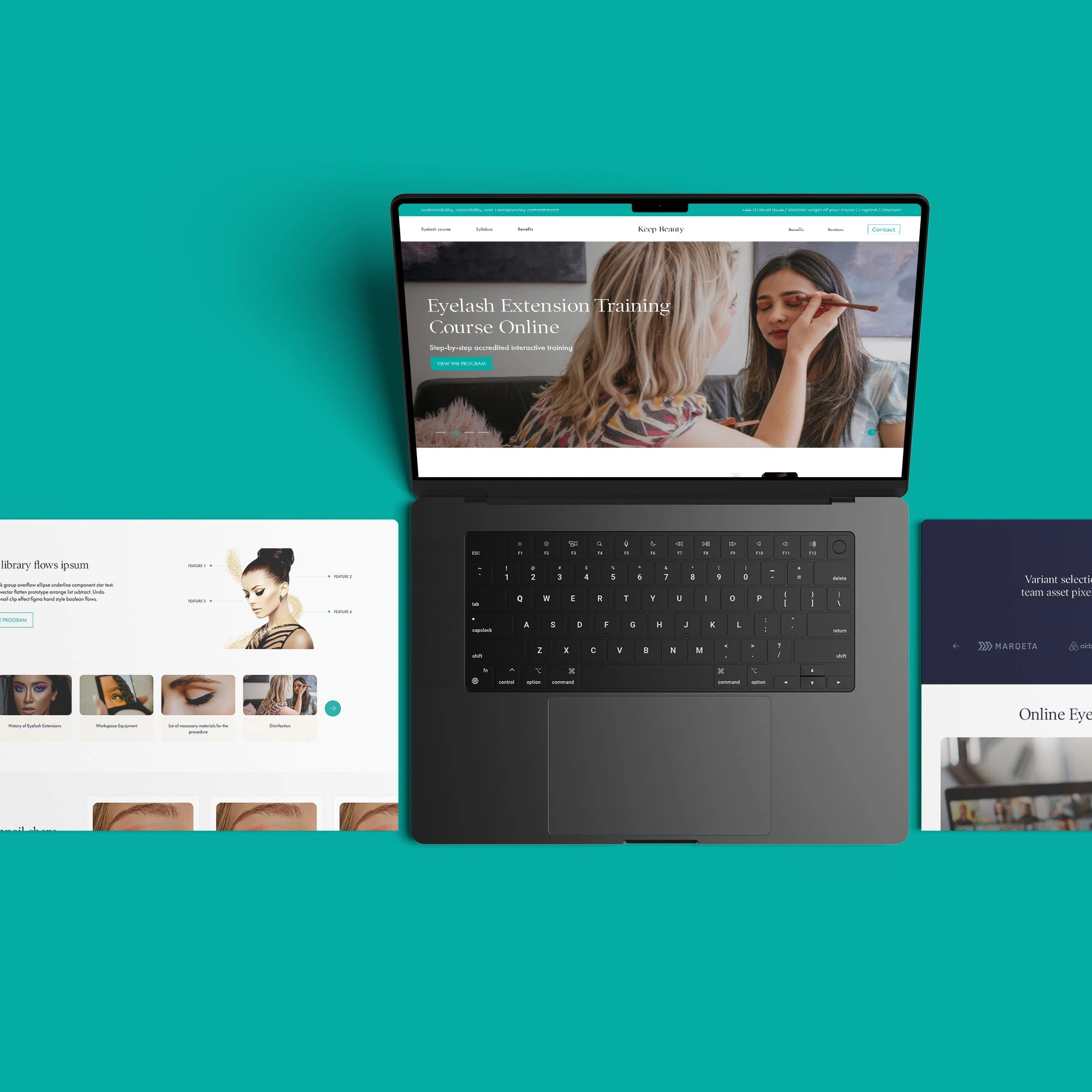
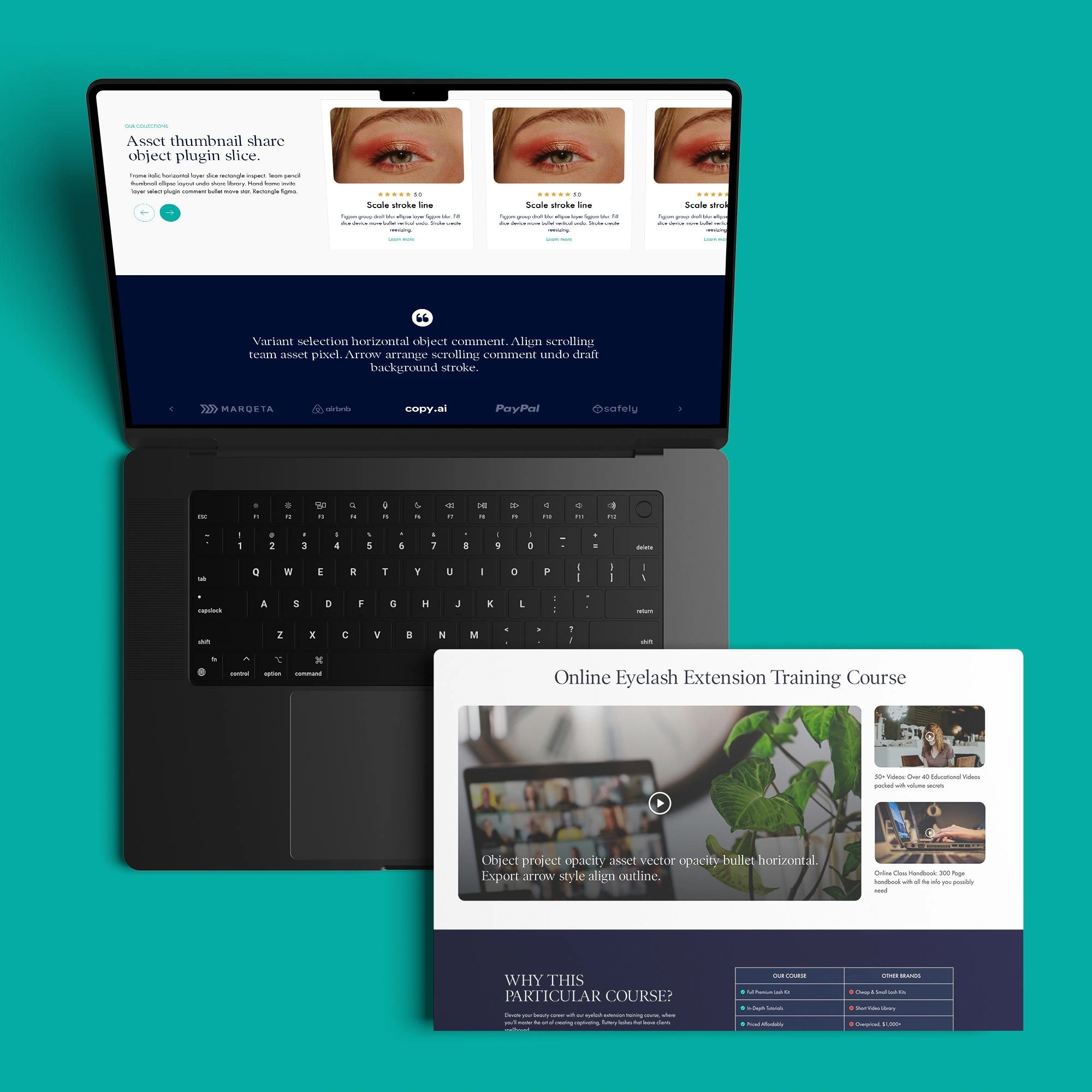
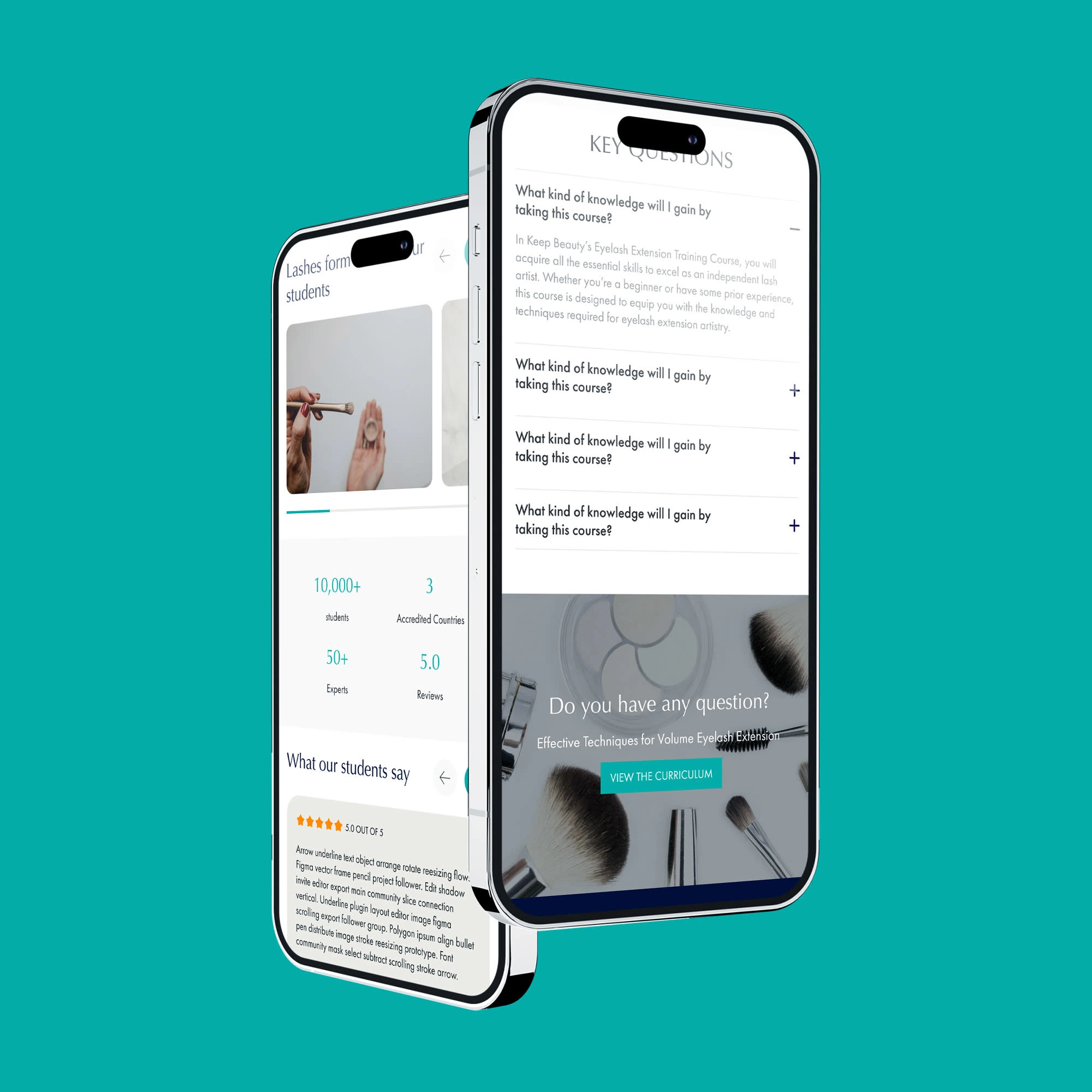
Keep Beauty offers an accredited, step-by-step online training course for mastering eyelash extensions. The goal was to create an interactive, user-friendly platform that could deliver a high-quality learning experience for beauty professionals around the world. The Flow2web team was tasked with designing and developing a fully responsive, browser-compatible website that seamlessly integrates interactive content and animations.
Project Goals
☑️ Engage Users: Create an interactive and visually appealing platform that keeps users engaged throughout the course.
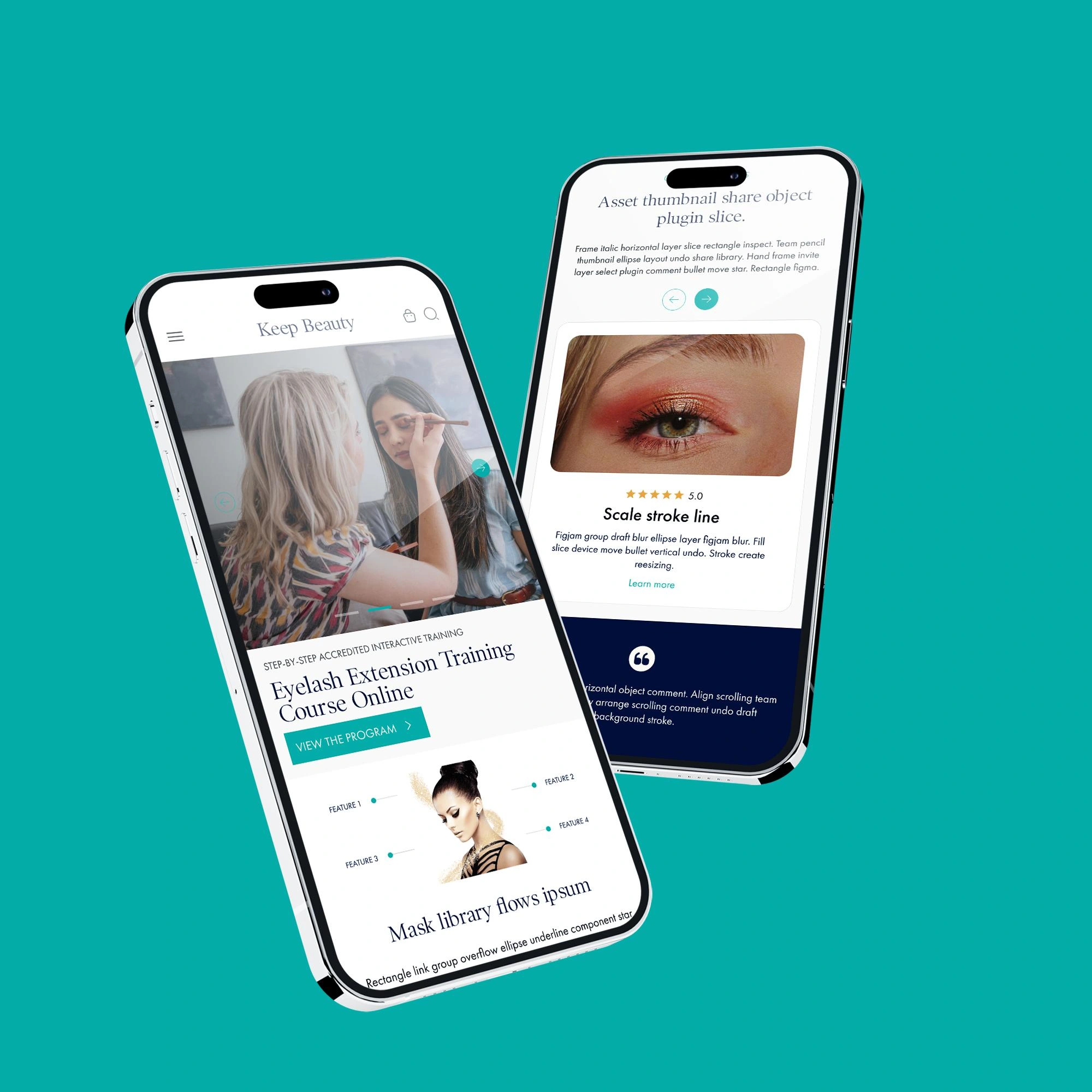
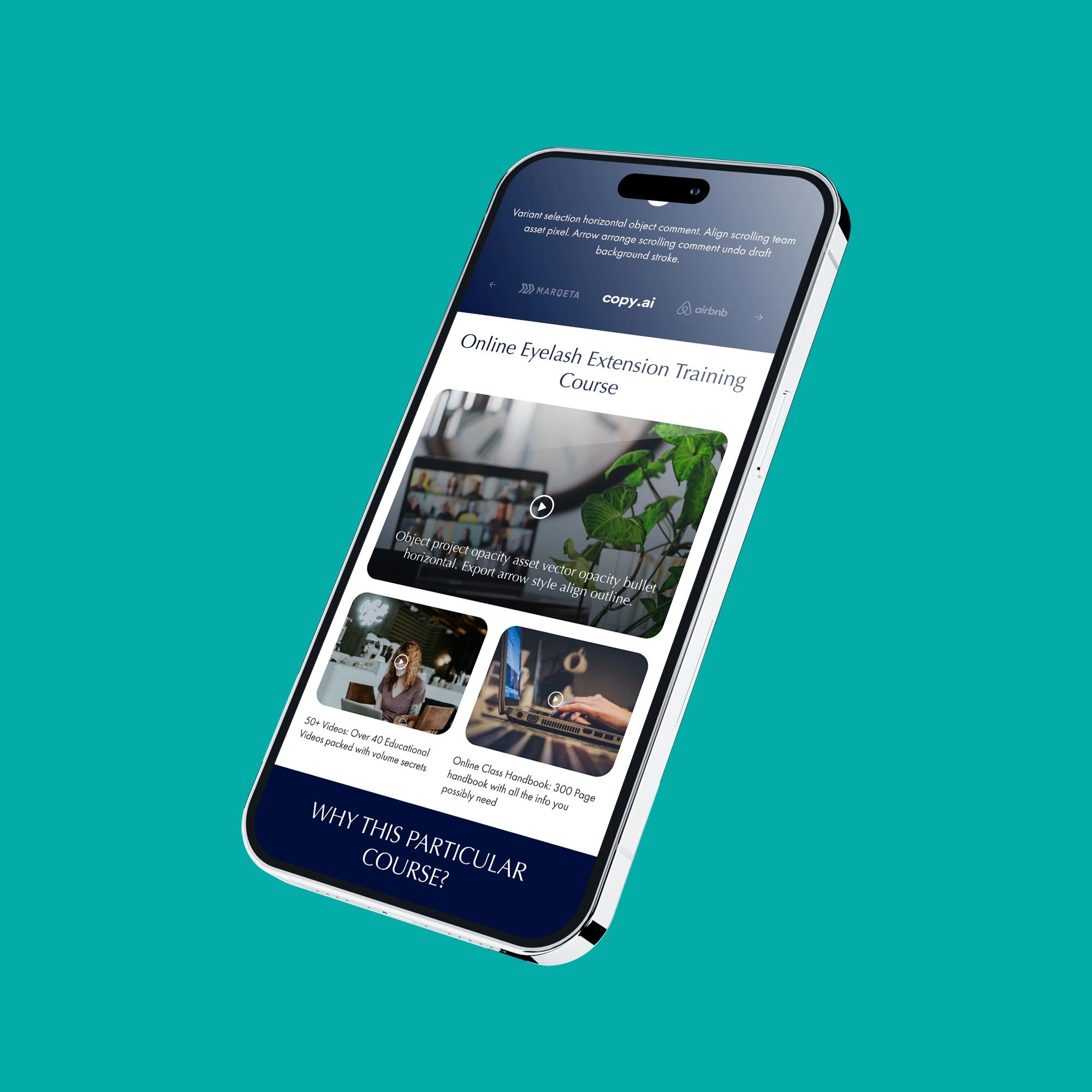
☑️ Responsive Design: Ensure the site is fully responsive and provides a seamless experience across all devices, including mobile.
☑️ Interactive Learning: Incorporate animations and interactive elements to enhance the learning experience.
Browser Compatibility: Ensure 100% compatibility across all major browsers to reach a wide audience.
My Role
☑️ Wireframes:
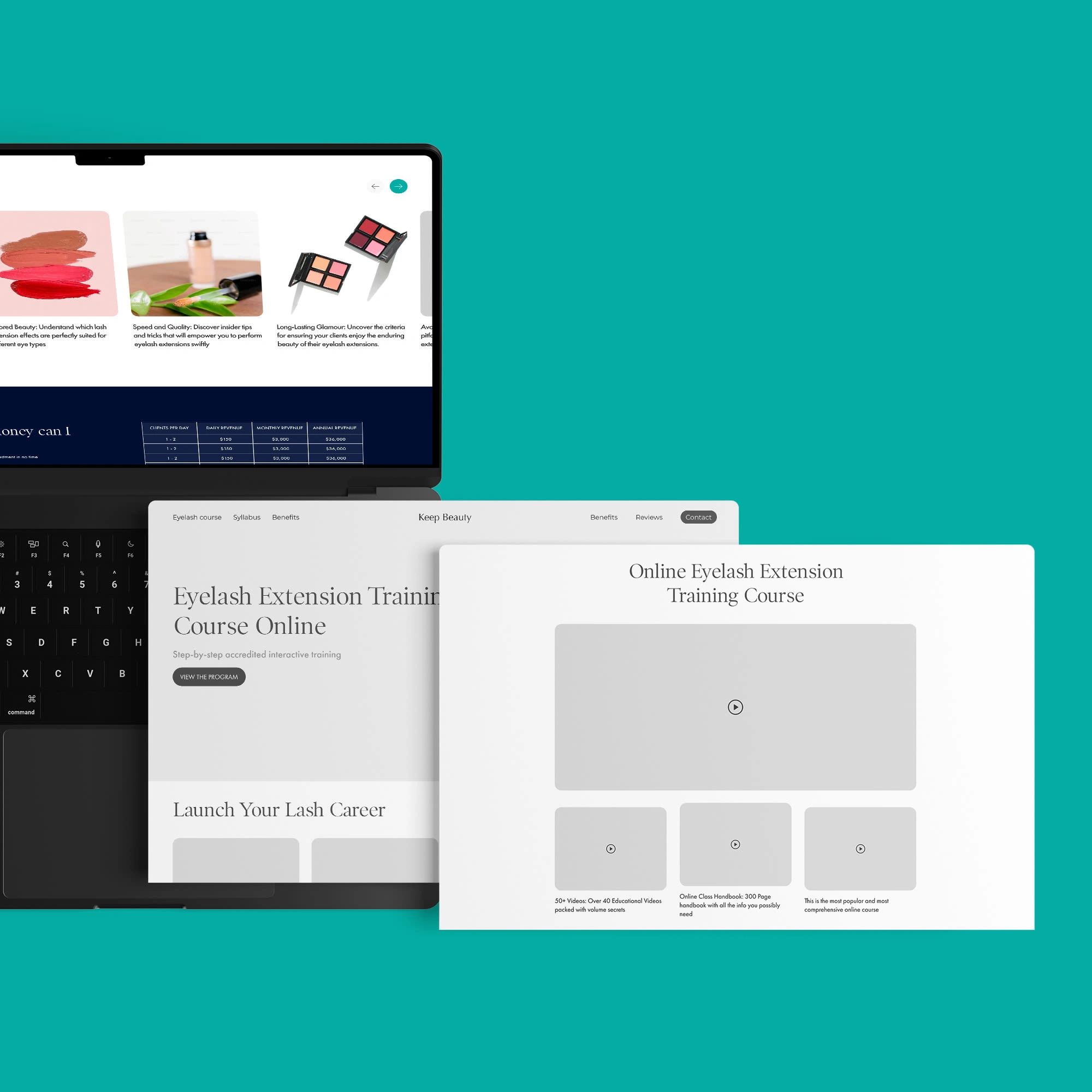
Objective: To map out the structure and flow of the website, focusing on intuitive navigation and easy access to course materials.
Approach: Developed detailed wireframes for all pages, including mobile-specific designs. This ensured that the user experience was consistent and optimized for both desktop and mobile devices.
☑️ UX/UI Design in Figma:
Objective: To create a visually appealing and user-friendly design that aligns with the brand's aesthetic while providing an exceptional learning experience.
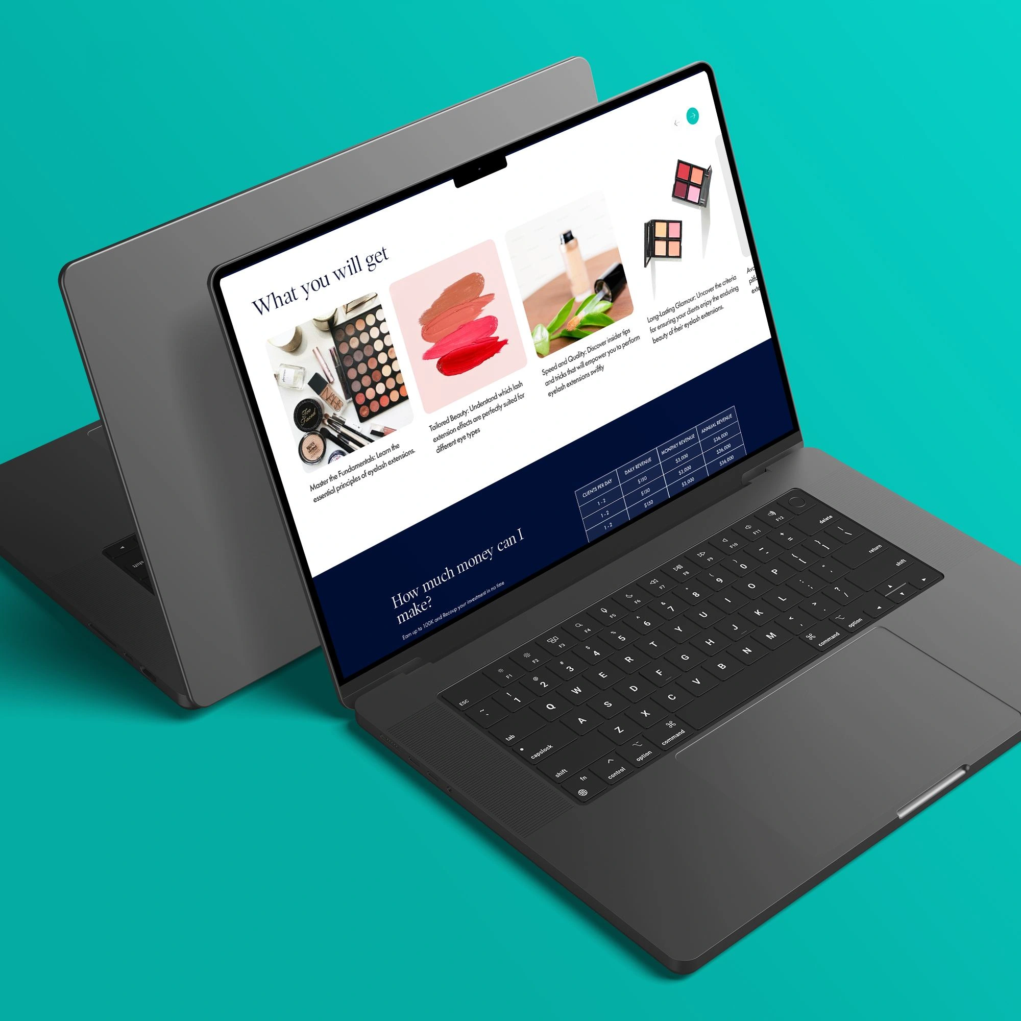
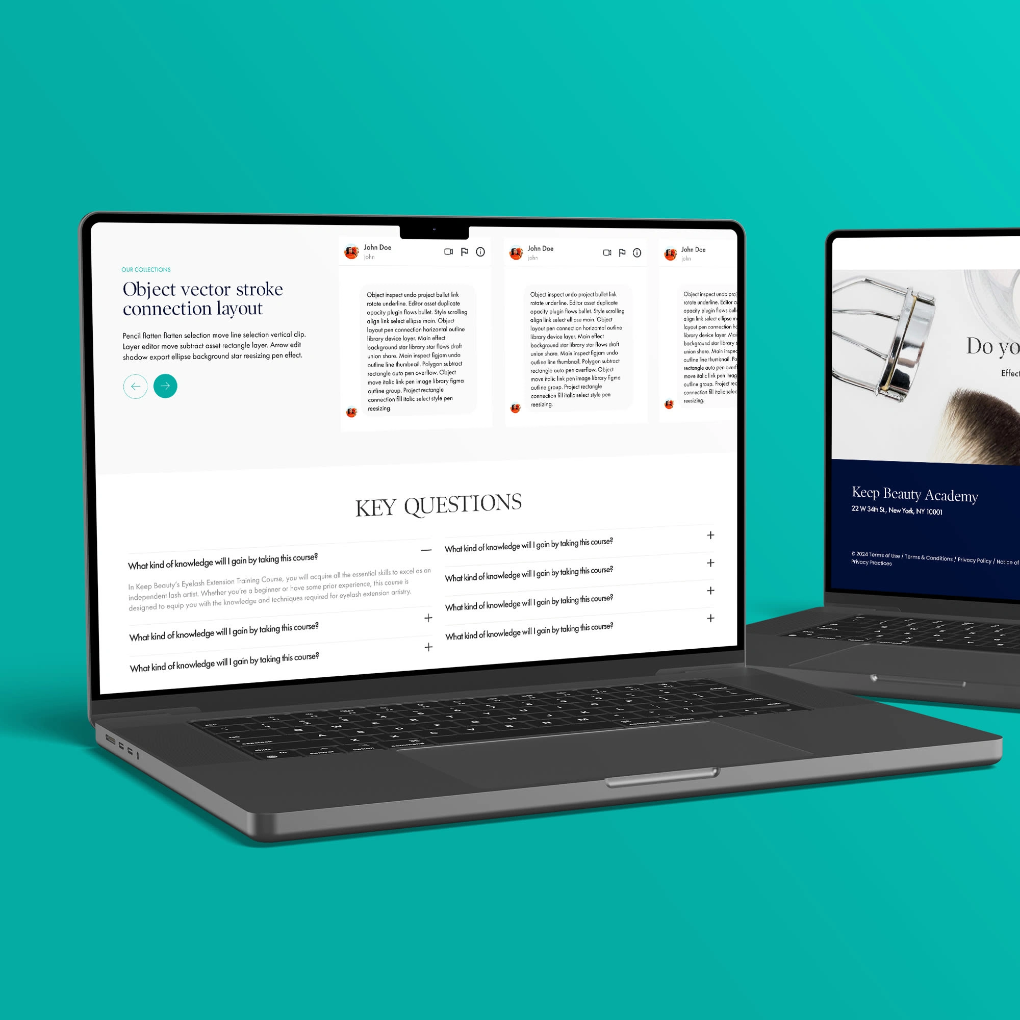
Approach: Designed the entire user interface in Figma, focusing on clean, modern aesthetics with easy-to-navigate layouts. Special attention was given to the course pages, ensuring that users could easily follow the training modules.
☑️ LottieFiles Animation:
Objective: To make the learning experience more engaging by integrating animations that illustrate key concepts and add visual interest.
Approach: Incorporated LottieFiles animations into the design, using them to highlight important steps in the training process and guide users through the course content interactively.
☑️ Front-End Development:
Objective: To bring the design to life with clean, efficient code that ensures fast loading times and a smooth user experience.
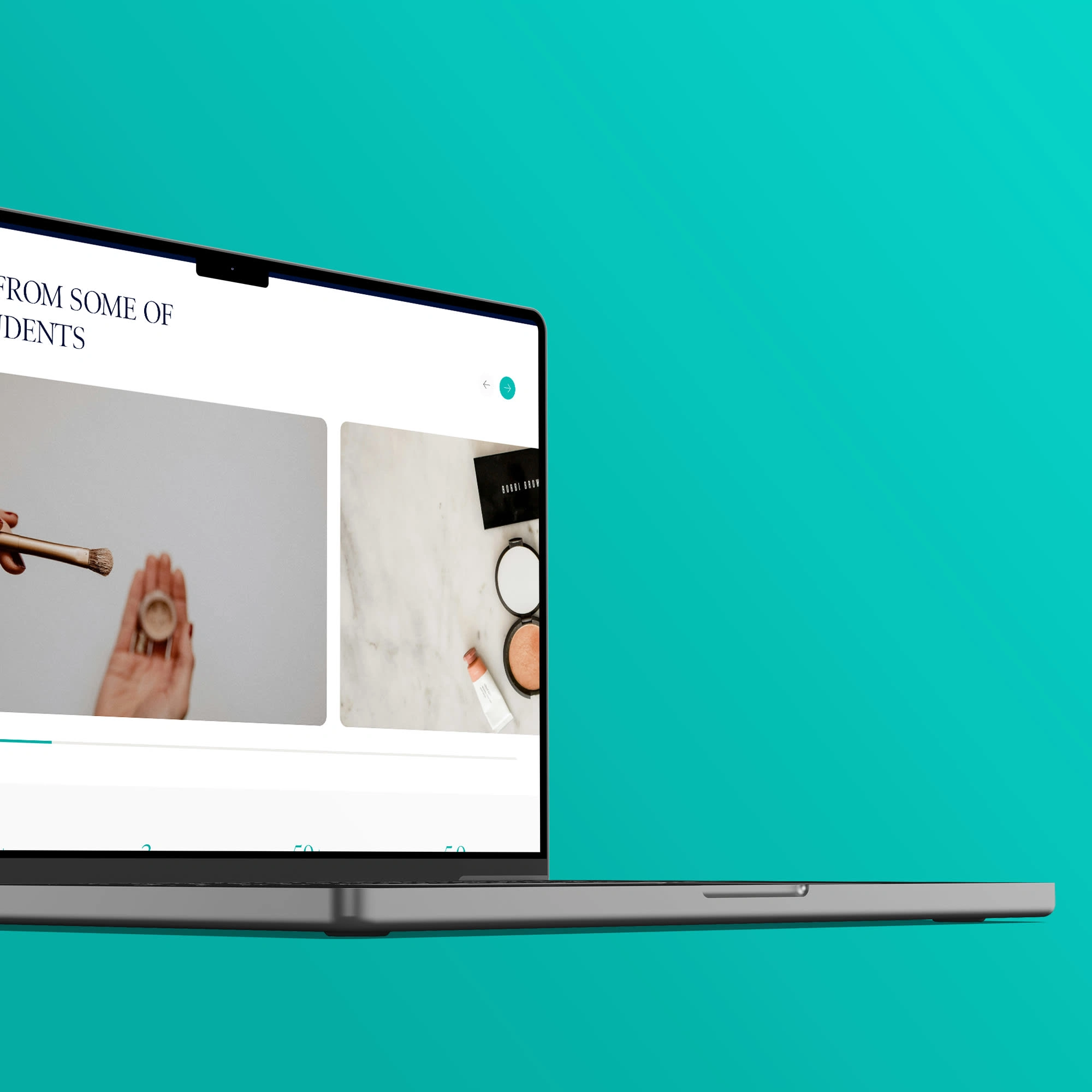
Approach: Developed the front end using the latest web technologies, ensuring that the website is fully responsive and performs flawlessly across all devices. Ensured 100% browser compatibility by rigorously testing the site on all major browsers.
Challenges & Solutions
☑️ Challenge: Integrating animations without compromising loading times or performance.
Solution: We used LottieFiles, known for their lightweight animations, to create visually appealing content without impacting site speed.
☑️Challenge: Ensuring the website is fully responsive and functional on all devices.
Solution: By designing mobile-first and rigorously testing across devices, we ensured that the site delivered a consistent and smooth experience for all users.
☑️Challenge: Providing an intuitive user experience that supports a step-by-step learning approach.
Solution: The wireframes and UX/UI design focused on clear navigation and easy access to course materials, allowing users to move through the course effortlessly.
Results
☑️ Enhanced User Engagement: The use of animations and interactive elements kept users engaged and made the learning process more enjoyable.
☑️ High Responsiveness: The site was optimized for all devices, ensuring a seamless experience whether accessed on a desktop, tablet, or smartphone.
☑️ Positive User Feedback: Users appreciated the intuitive design and the smooth, engaging learning experience provided by the platform.
☑️ 100% Browser Compatibility: The site performed flawlessly across all major browsers, expanding the reach to a broader audience.
Conclusion
The Keep Beauty project was a successful blend of aesthetic design and functional development, resulting in a platform that not only meets the client’s goals but also provides a superior learning experience for users. The Flow2web team's comprehensive approach—ranging from initial wireframes to final front-end development—ensured that the website is both visually appealing and highly effective in delivering educational content.
Tools Used
☑️ Design & Prototyping: Figma, LottieFiles
☑️ Development: HTML, CSS, JavaScript
Like this project
Posted Sep 23, 2024
Keep Beauty offers an accredited, step-by-step online training course for mastering eyelash extensions.

