FlowPay Brand Identity Revamp

FlowPay: Building Clarity into Every Transaction
Effortless invoicing, built for compliance — by design.
A Brand That Simplifies the Complex
FlowPay is a digital invoicing and payment platform designed to help Malaysian businesses stay compliant, get paid faster, and operate with confidence. While its technology was powerful, the brand hadn’t caught up — visually or strategically.
What FlowPay needed was an identity that could bridge its dual nature: regulatory precision and human simplicity. The challenge was to make compliance feel effortless, not intimidating, and position FlowPay as the dependable partner behind every seamless transaction.
The Challenge
FlowPay’s tools solved a real pain point: the complexity of e-invoicing under MyInvois regulations. Yet, without a cohesive visual and verbal system, the brand felt fragmented across platforms — from web to dashboard to investor decks.
In a category crowded with jargon-heavy fintechs, FlowPay risked being seen as another faceless utility rather than a trusted enabler for SMEs, freelancers, and accounting partners. The goal was clear:
→ Build a brand that speaks compliance fluently, but communicates it simply.
Finding the Flow
The task wasn’t to reinvent FlowPay’s mission — it was to articulate what made it distinct. We set out to design a brand language that balances structure and simplicity, clarity and warmth, precision and approachability.
At its core, FlowPay’s brand had to move like its product works: clean, direct, and seamless.
What We Built Together
1. Logotype with flow and direction
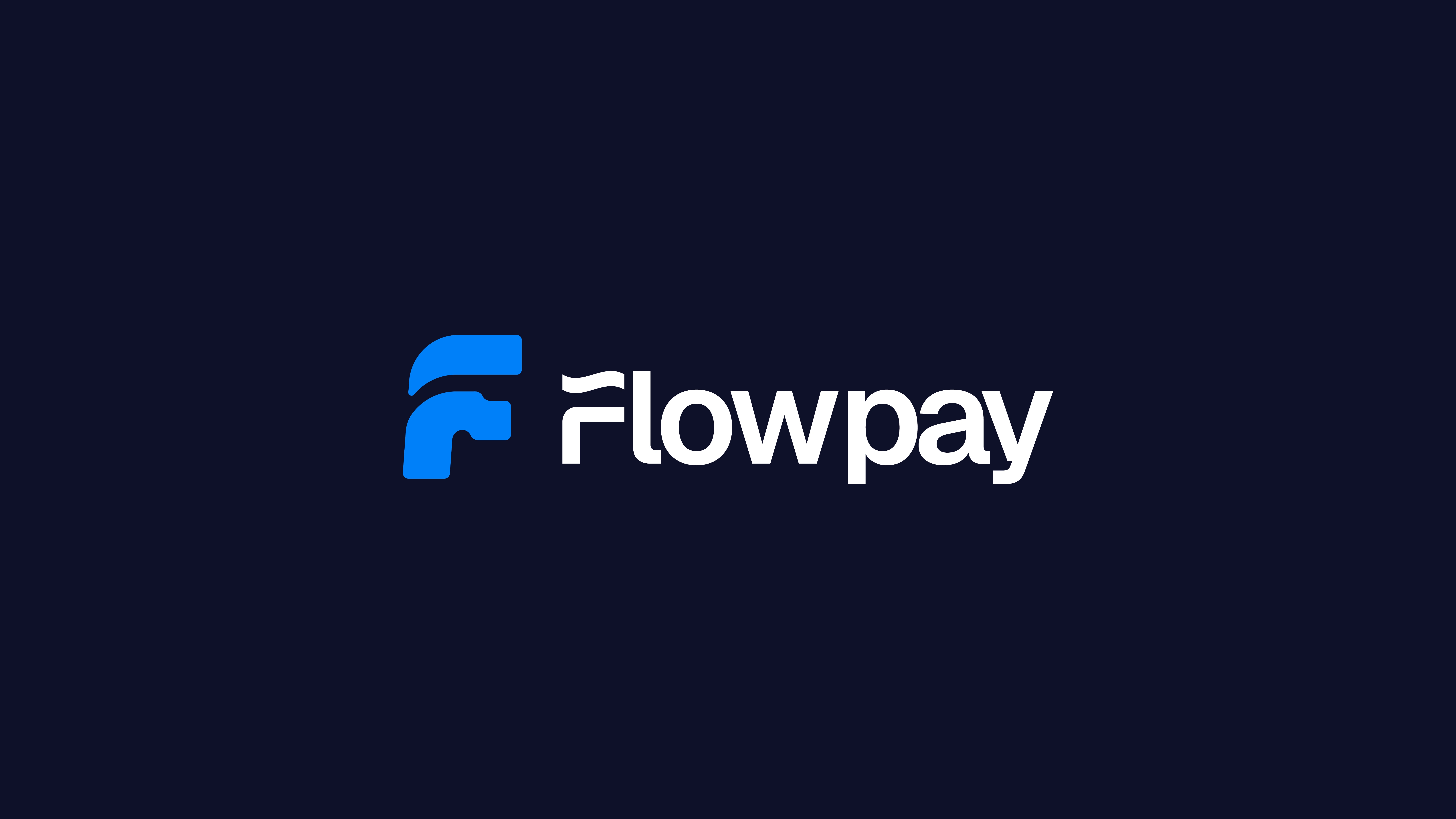
A custom “F” mark built on movement and trust — a symbol of progress, continuity, and clarity across financial interactions.
2. Typography for transparency
Headlines in Geist convey precision and digital confidence; paired with Instrument Serif for warmth and credibility in human-centred communication.
3. The FlowPay Blue System
A dynamic palette led by FlowPay Blue, evoking reliability and modernity — supported by light teals and neutrals that soften the fintech edge and introduce accessibility.
4. UI-led identity
Design principles developed for interface-first scalability: consistent grids, intuitive iconography, and motion states that reflect the idea of “flow.”
5. Human-first imagery
Photography that focuses on real business owners and professionals — confidence in motion, work made easier — replacing sterile finance stock with relatable, real-world moments.
6. Brand Manual & Implementation Deck
A comprehensive toolkit detailing logo usage, typography, motion, and colour systems, ensuring brand consistency across digital, product, and partnership environments.
The Outcome
FlowPay now stands as a brand that mirrors the intelligence of its platform — clear, compliant, and confidently human. The new identity system scales effortlessly across touchpoints: from the app interface to campaign visuals, from investor decks to merchant dashboards.
It does more than look good — it builds trust, communicates reliability instantly, and simplifies how businesses perceive compliance.
Today, FlowPay’s brand reflects its promise:
Helping businesses flow forward — with clarity, compliance, and confidence in every transaction.
Like this project
What the client had to say
Ayo is a consummate professional. He communicates clearly, meets deadlinesm, and brings a positive, solutions-oriented attitude to every challenge. He owns the creative process and deliver results that exceed expectations.
Gbolahan Abiodun
Jun 5, 2025, Client
Posted Oct 11, 2025
Developed a cohesive brand identity for FlowPay, enhancing clarity and compliance perception.
Likes
0
Views
7
Timeline
Mar 26, 2025 - Jun 5, 2025
Clients
FlowPay


