School Parents App - Redesign Project
Daffa Alberta Votary
Overview
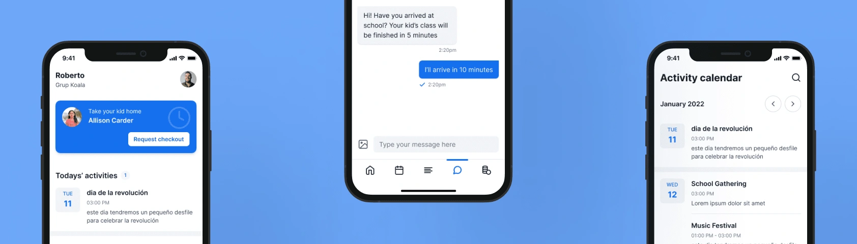
This application is meant to be used by kindergarten kid's parents. They can see basic information like calendar, payments pending and covered, check out request (when parent arrives to school and request his kid from the app), daily activities (activity feed), chat (school - parent conversations). The app was functional at the time when my client posted this project but he wanted to improve UI.
Role
UI Designer
Deliverables
Full mobile app & tablet app design
Design file (Figma)
Style Guide, design assets and components
Scope
At first my client wanted to have the following pages to be redesigned:
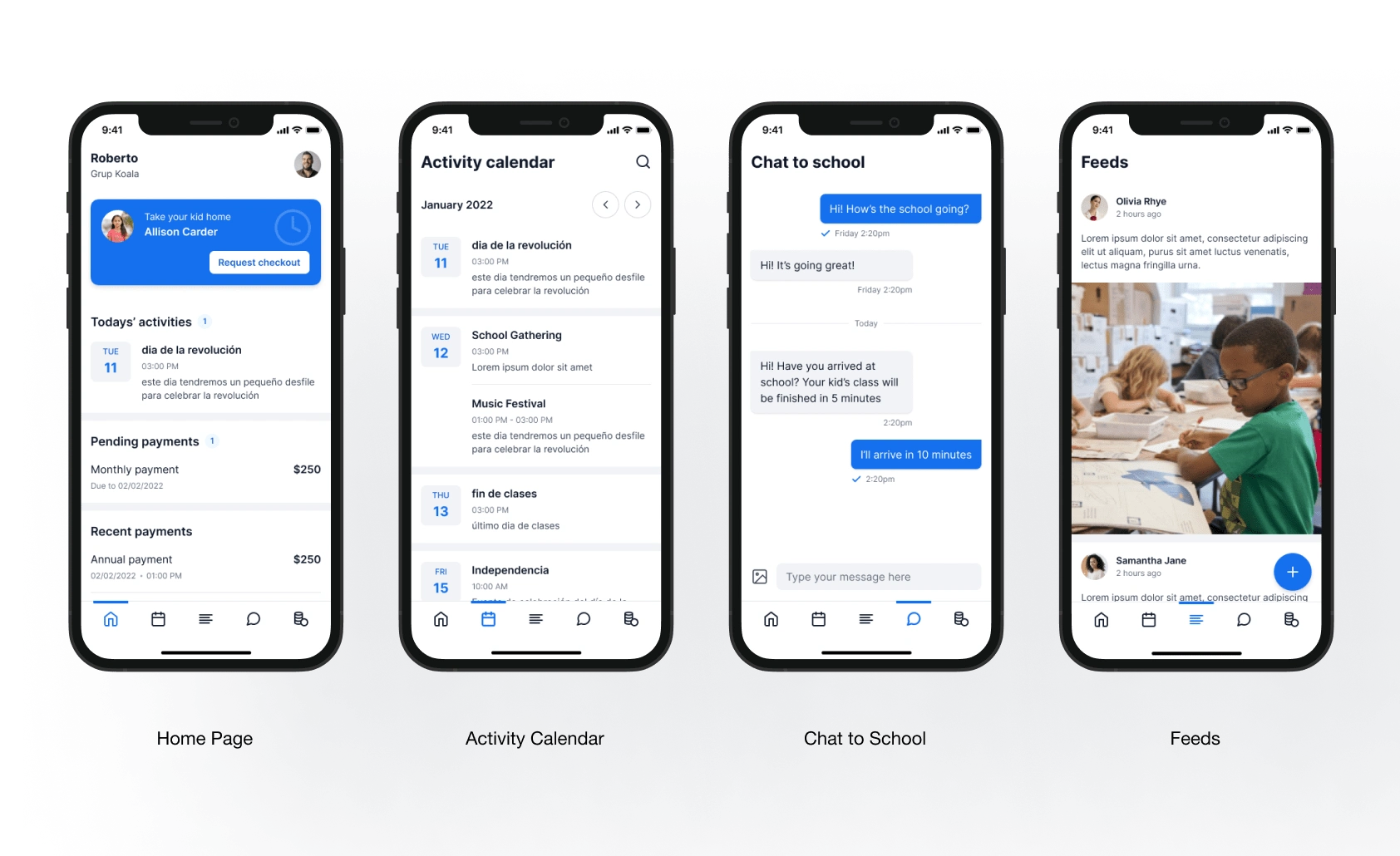
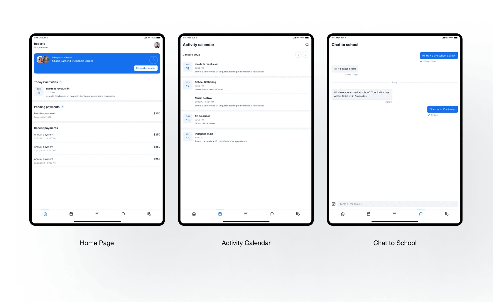
Home Page
Activity Calendar Page
Chat Room Page
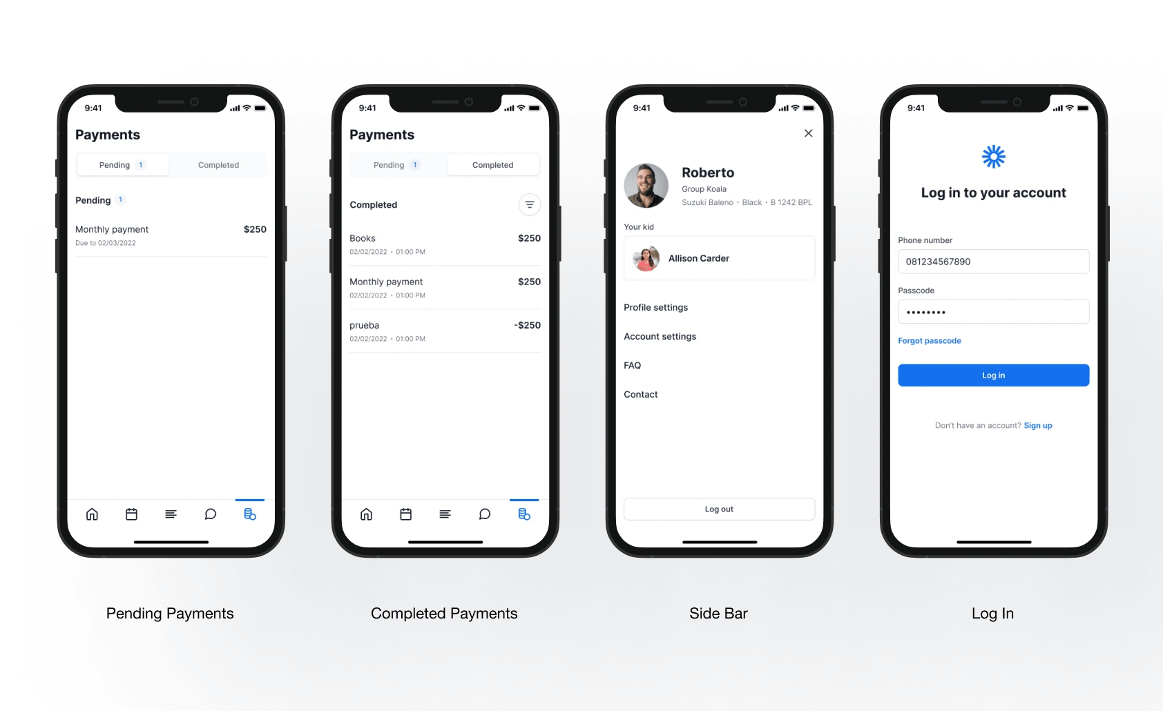
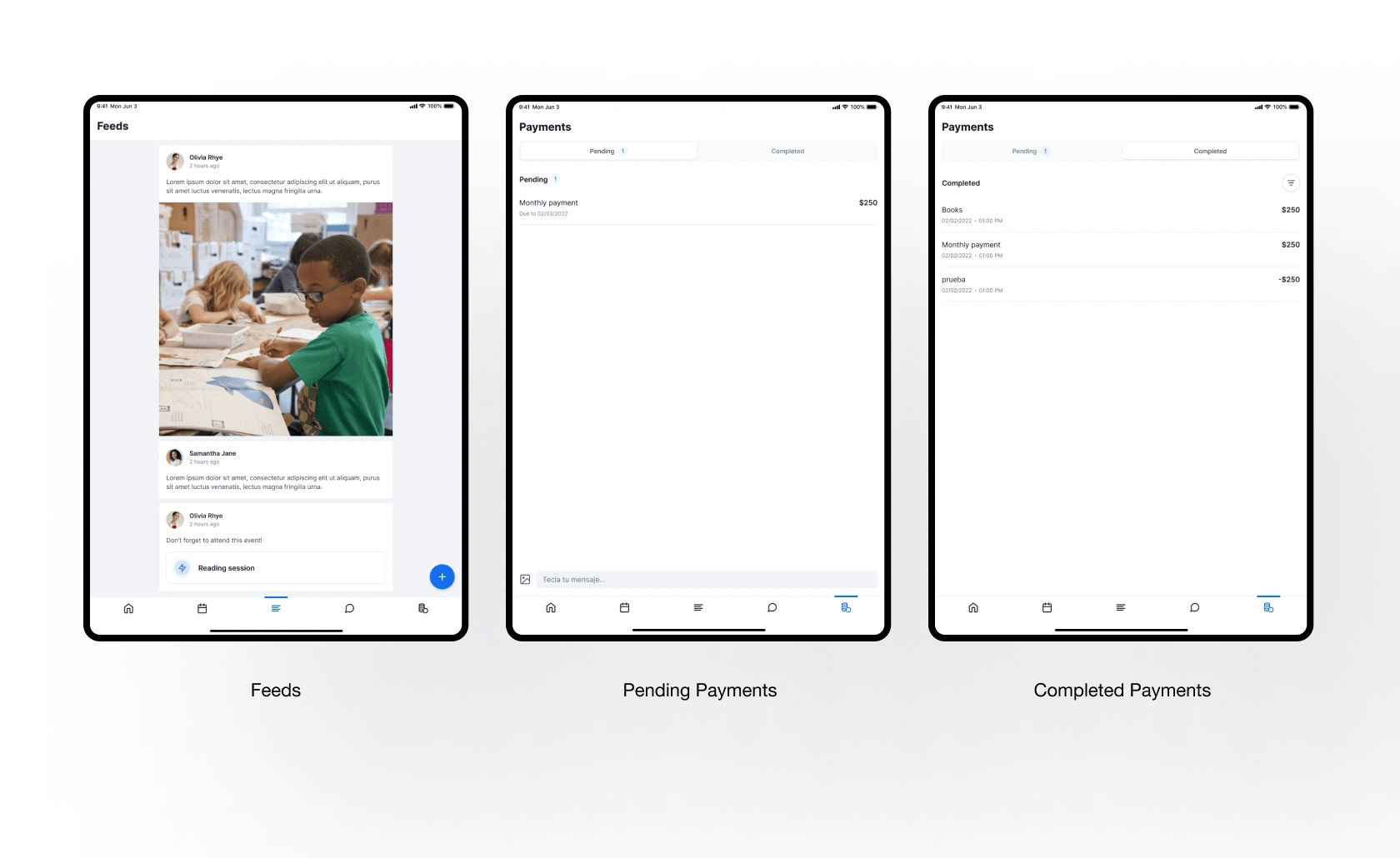
Payment Page
Feeds Page
Later my client asked me to design these additional pages:
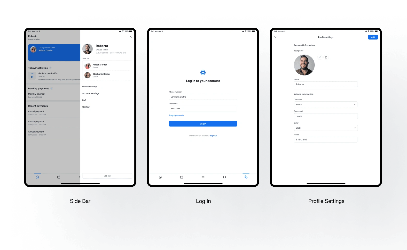
Log In Page
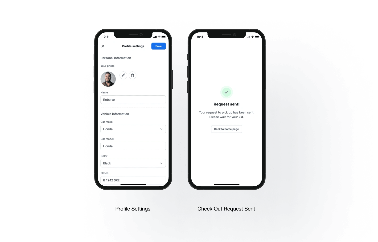
Profile Settings Page
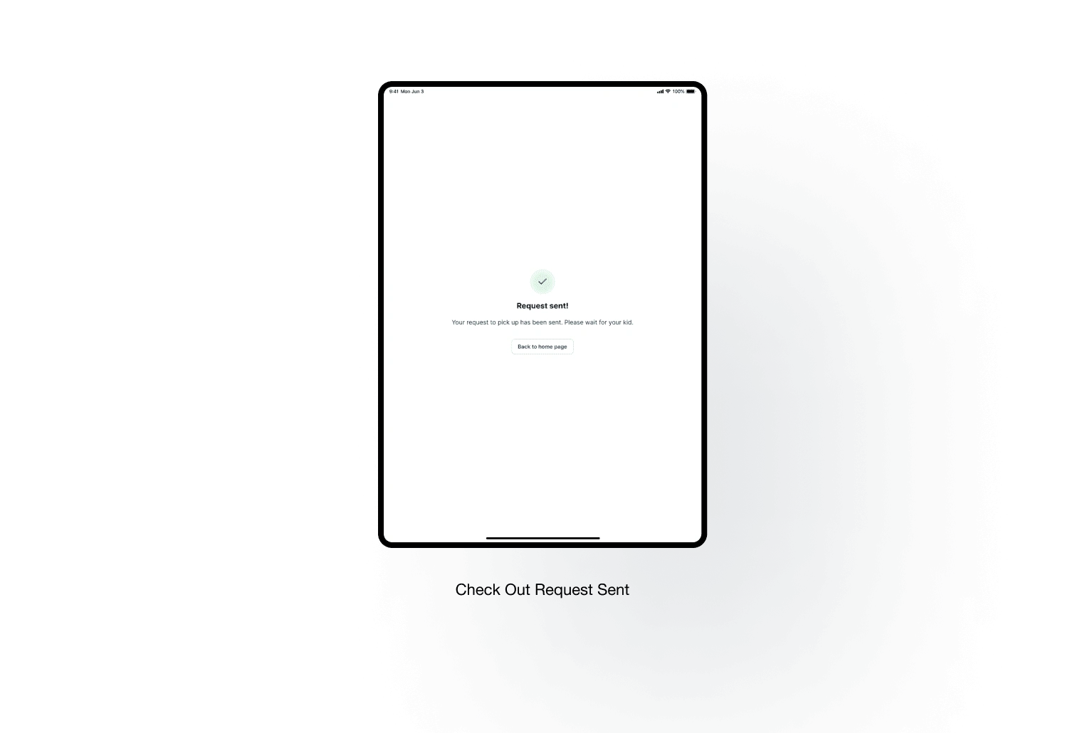
Check Out Request Sent Confirmation Page
Analyzing Existing App Interface
First I needed to analyze the app from screenshots my client had provided. After taking a closer look I found some areas that could be improved:
Improving the existing home page
Redefining the color
Tidying up incosistent spacing
Separating pending and completed payment using tab view for easy navigation
Replacing the existing icons with more representing and similar style icons
Existing Interface
Design Decisions
Improving the Home Page
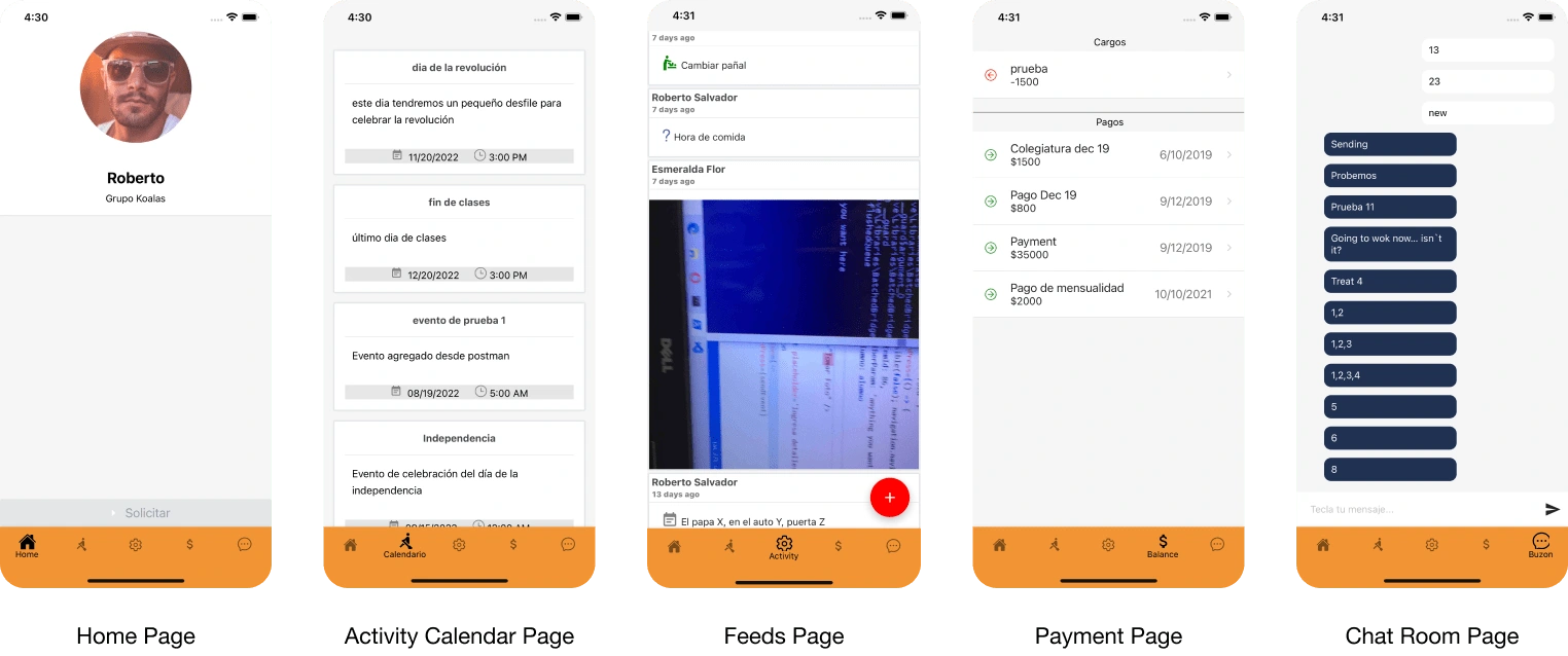
The existing home page was so empty. It only showed the user information. Home page is a start point of user journey and also act as an summary of the informations users might want to see or know. So I added various critical content sections here: Today’s Activities, Pending Payments, and Recent Payment. I think those informations are important for users and by putting them on home page is making things easier – I don’t even have to move a muscle.
I also redesign the Request Checkout CTA section as the existing section isn’t recognizable.
Improving Home Page
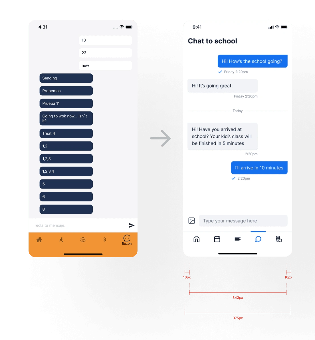
Redefining the Use of Color
My client didn’t give me any guide about the color and gave me freedom to use any color. In my opinion, the existing use of color wasn’t visually pleasing. As you see on the right, the primary color of the app was orange but the button was red, and even chat bubble was dark blue. I redefined the use of color to make the app more pleasing to look at. The color used in the design is documented in Style Guide.
Color Adjustment
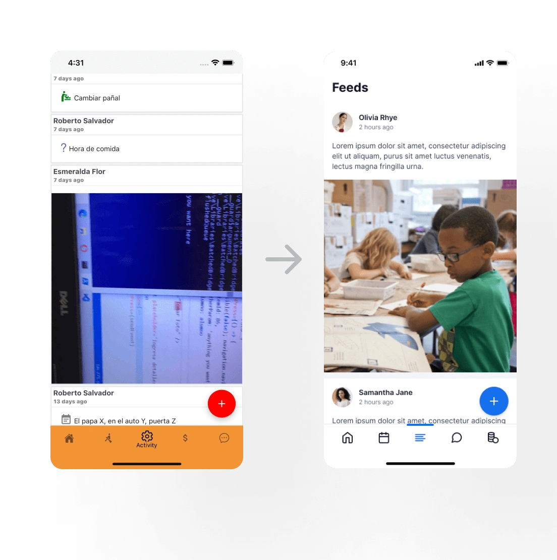
Tidying Up Incosistent Spacing
As you see in existing chat page, left side area has wider space than right side area. I tidied up this inconsistent spacing in entire page by applying and defining grid guide. The grid guide can be found in the Style Guide.
Tidying Up the Spacing
Separating Pending and Completed Payment Using Tab View for Easy Navigation
Think of this scenario: Let’s say a user have many pending payments (Cargos) so the completed section (Pagos) is hidden by those data. It’s hard for users to discover completed section, right? That’s why I came up with tab view to separate Pending Payments and Completed payments.
I removed the unnecessary red and green icon in this page since those two sections is going to be separated.
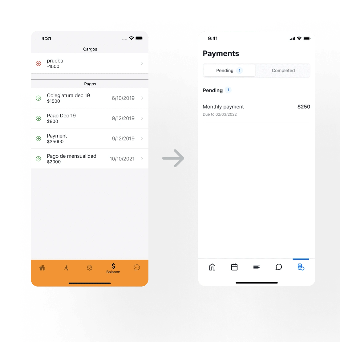
Payment Page
Replacing the Existing Icons with More Representing Icon and Make the Style of the Icon Similar
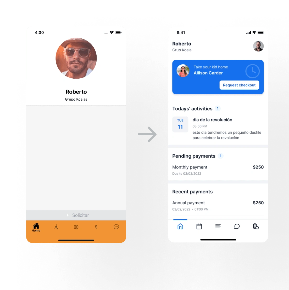
Icons are, by definition, a visual representation of an object or action. If that object or action isn’t clear to users, the icon immediately lose it practical value and becomes a visual noise. As you can see, for example, the feeds page used “Gears” icon which commonly used to represent settings page. I addressed that issue by replacing the irrelevant icon with more object or action representing icon.
The existing app used 2 types of icon, filled and outlined. In the design I used outlined icon and I replaced the filled icon with the outlined icon. I did this so all icons has similar style to enhance the aesthetic appeal of the app.
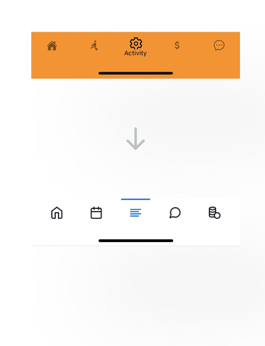
Replacing the Icons
Final Design
Mobile App
Mobile App Design
Tablet App
Tablet App Design
Style Guide
Like this project
Posted Feb 3, 2023
Kindergarten parents app: view calendar, payments, pickup requests, daily activities, & communicate with school through chat feature.
Likes
0
Views
9