Sales Analytics Dashboard: Regions, Segments, Products & Profit

Amy Frank


Sales Analytics Dashboard: Regions, Segments, Products & Profit
Description
This dashboard brings sales, profit, and margin trends together in one place so teams can clearly see what’s working and what isn’t. It’s designed to help decision-makers move beyond spreadsheets and understand performance at a glance.
What the Dashboard Reveals
• Sales and profit over time
• Profit margin trends by customer segment
• Top-performing regions and states
• Top-performing products and categories
• Where margins are strong vs. leaking
• Geographic views to compare performance across locations
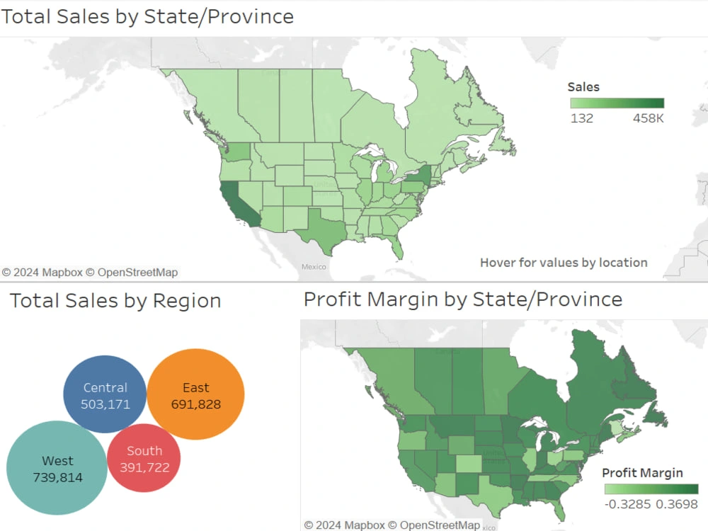
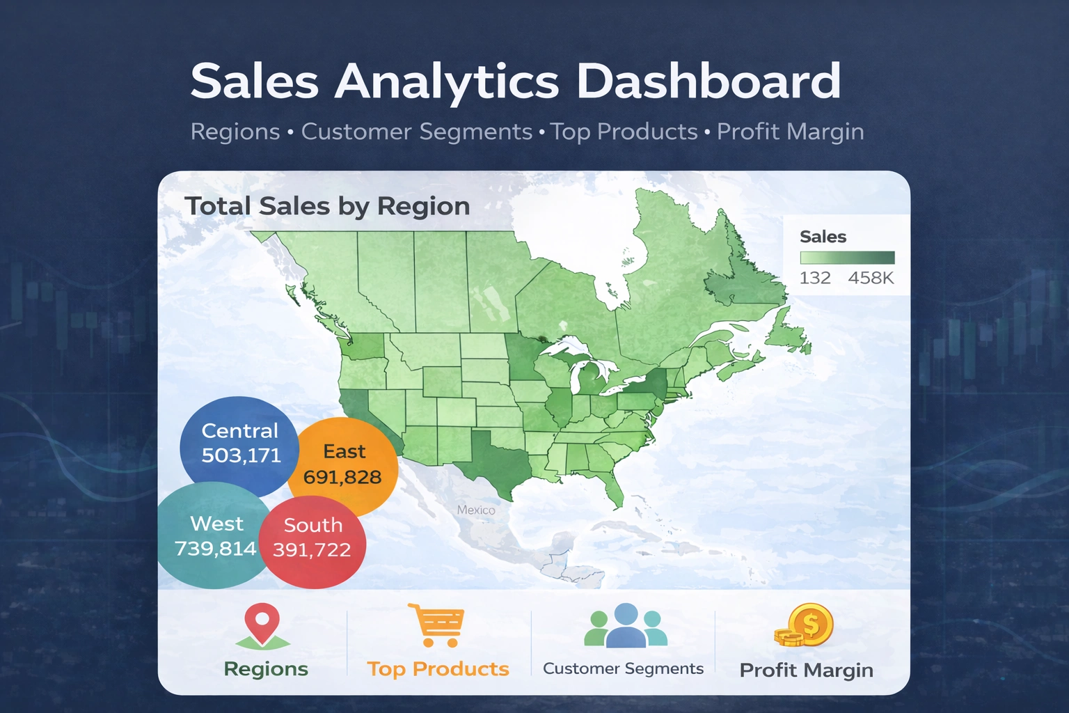
Overview dashboard showing sales and profit performance across regions and states.
What I did
• Cleaned and combined raw datasets
• Built calculated fields for profit and margin analysis
• Created interactive Tableau dashboards
• Used Python to explore trends and validate results
• Highlighted key insights with benchmarks and annotations
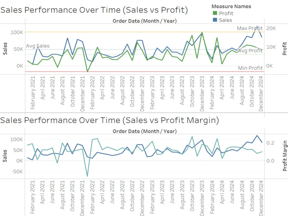
Sales and profit over time reveal seasonal patterns and volatility.
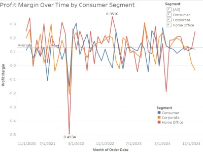
Profit margin by customer segment highlights where growth may be happening at the expense of margin.
Key Insights
• Revenue grew over time, but profit was more volatile.
Sales generally trended upward across the timeline, while profit showed sharper swings month-to-month, suggesting cost or pricing fluctuations.
• Some regions generated high sales without consistently strong margins.
Geographic views show certain states performing well in revenue while still sitting below the average profit margin.
• Corporate and Home Office segments tended to maintain stronger margins than Consumer in several periods.
Margins varied, but consumer sales dipped below zero several times, which may indicate discounts, returns, or higher fulfillment costs.
• Seasonal spikes were visible in both sales and profit.
Peaks cluster around certain months, suggesting predictable demand cycles that could be planned for.
Tools Used
Tableau, Python, Excel
Like this project
Posted Jan 4, 2026
Sales analytics dashboard that reveals top regions, segments, products, and profit drivers for better decisions.