Meebits Website + Collector portal
Erick Rodriguez
1 collaborator
Overview
Meebits is one of the most recognizable collections in Web3. Their next chapter was about elevation, positioning Meebits as art and presenting each piece as a digital sculpture with permanence, provenance, and presence.
LayerTwo refined the brand and designed a new digital home that treats Meebits the way the fine art world treats sculpture. With intention, restraint, and confidence.
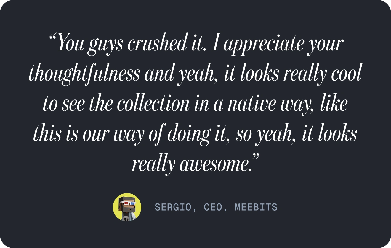
CEO Quote
The Challenge
Meebits already had strong cultural recognition, but its digital presence undersold its artistic value. The experience leaned closer to a playful, game-like aesthetic than the world of collectible art, which made it harder to communicate Meebits as serious, enduring works. The opportunity was not to reinvent the brand, but to elevate it, shifting perception from profile pictures to digital sculpture.
The challenge was to:
Preserve the brand’s refined, understated personality
Reframe Meebits as fine art and collectible digital sculpture
Design a website that feels closer to an art foundation than a Web3 product
Introduce interaction that enhances presence and materiality without distracting from the work
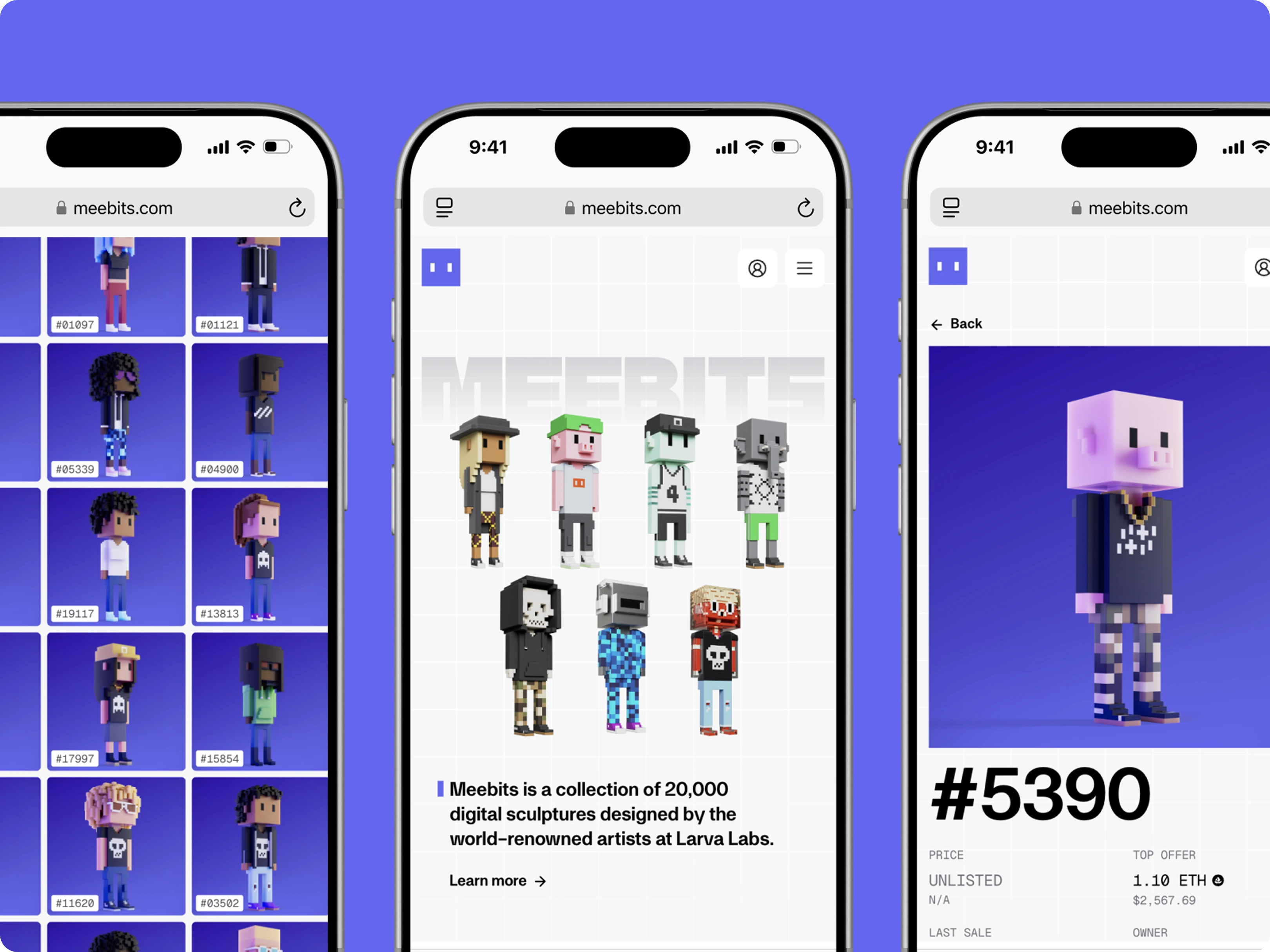
Mobile design
We anchored the entire project around a single truth: Meebits are art.
Every decision flowed from that idea.
We refined the brand system to better align with the fine art world, refreshing typography and visual hierarchy while maintaining Meebits’ existing character. Amina was introduced as the primary brand font, chosen for its elegance, restraint, and sculptural qualities.
The website was designed as a gallery experience. Spacious layouts, intentional pacing, and a strong emphasis on presentation allowed the work itself to take center stage.
Motion was used sparingly and purposefully. Subtle animations reinforce depth, materiality, and form, helping the Meebits feel less like flat digital assets and more like objects you could imagine occupying physical space.
Trait discovery
Core Meebs
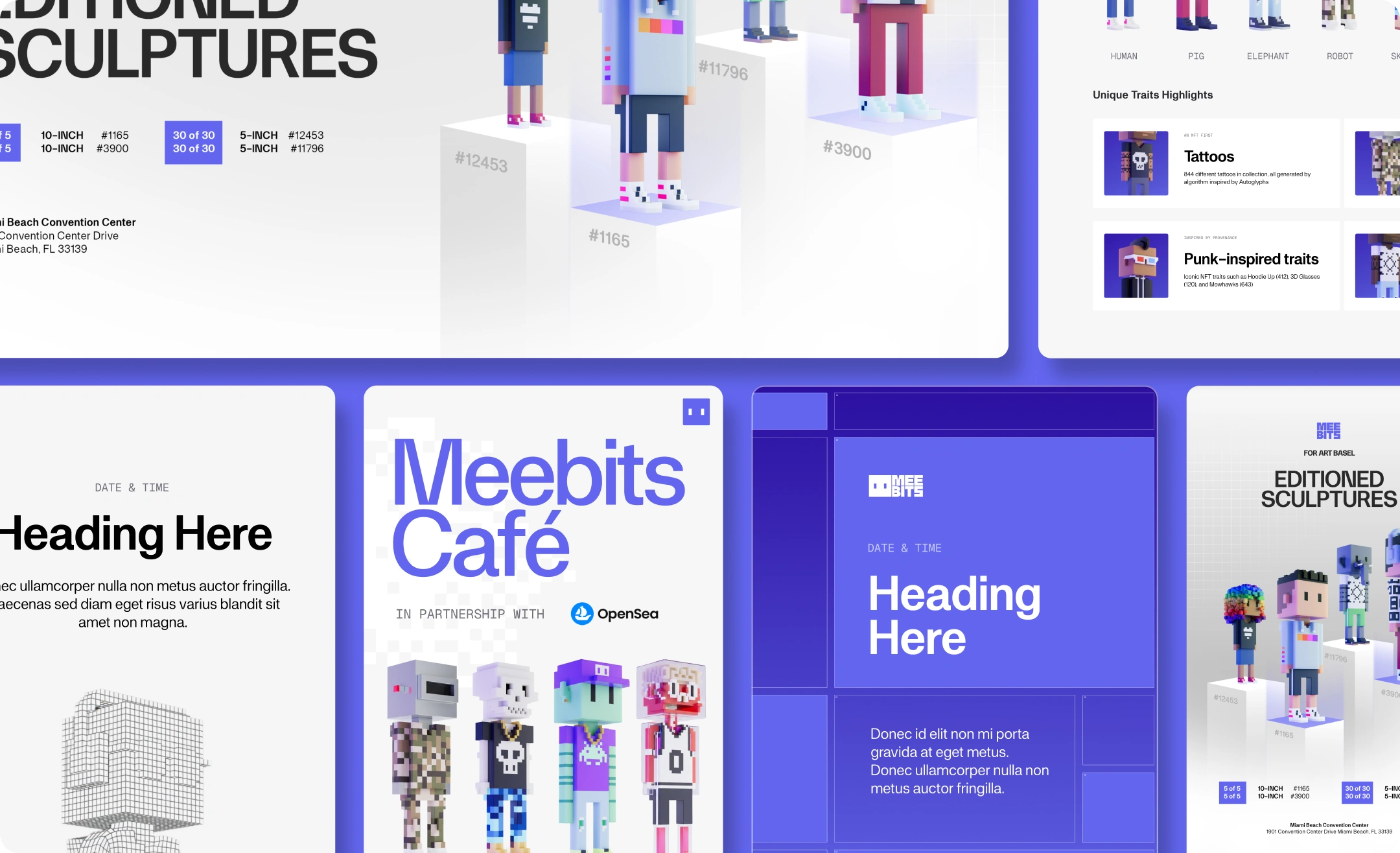
Comprehensive Design System
Built on Chakra UI, we developed a complete design system that defines typography, color, spacing, and component behavior. This system ensures visual consistency, fast iteration, and long-term scalability across the product.
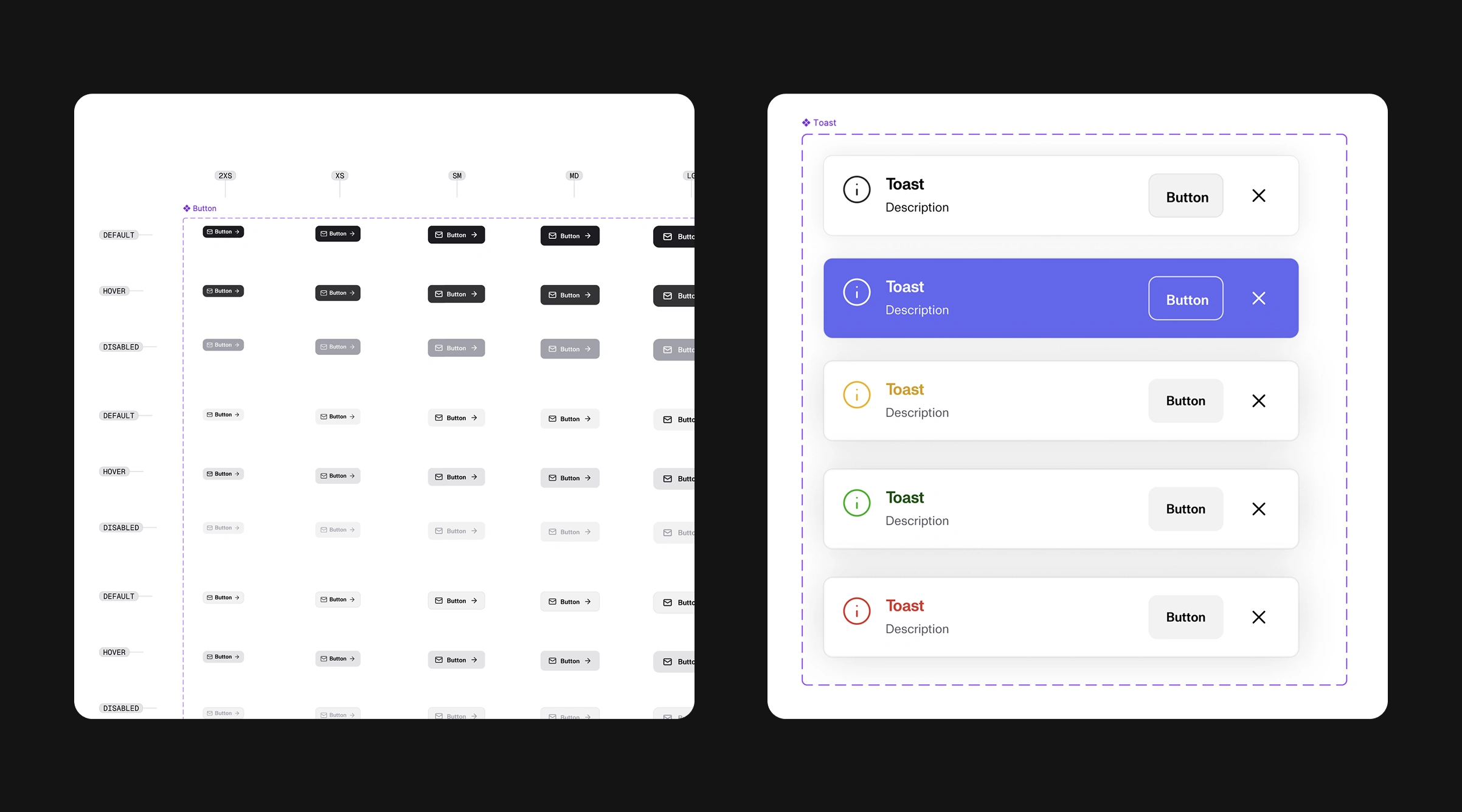
Design System
Social, Print + Animation
We designed a flexible system of assets and templates that empowers the Meebits team to create consistently across every touchpoint. From product UI and web experiences to social, print, and motion, each template was built to be modular, reusable, and easy to adapt. This gives the team the freedom to move quickly while maintaining a cohesive visual language that reinforces Meebits as art, no matter the medium.
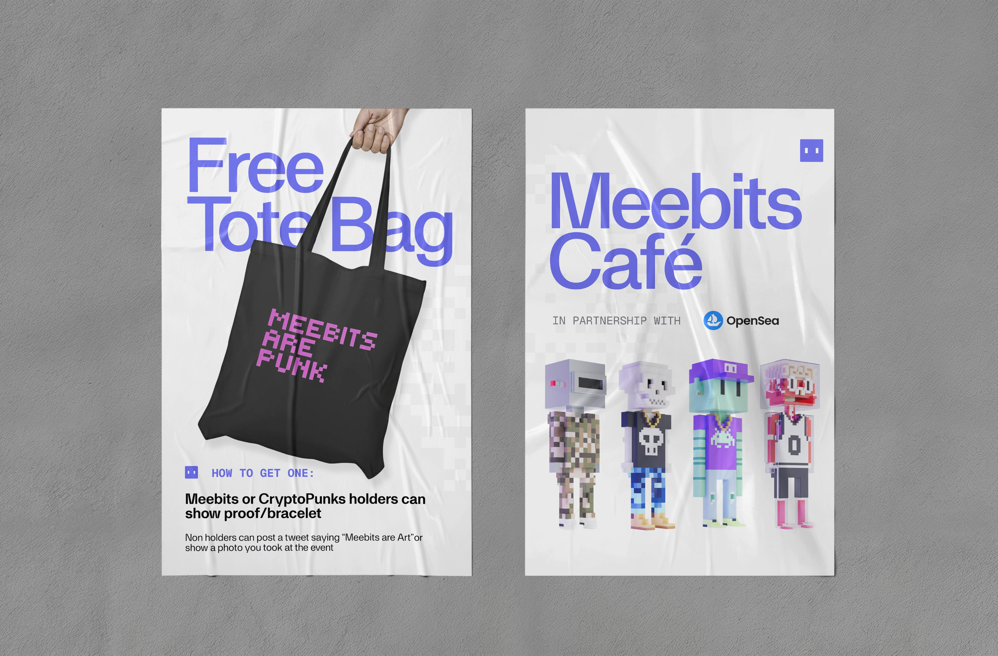
Palo Alto Event Posters
Like this project
Posted Feb 3, 2026
We Refined Meebits' brand and web experience in order to elevate its recognition as digital art beyond a web3 project.
Likes
0
Views
8
Timeline
Sep 18, 2025 - Jan 30, 2026
Clients
Meebits
Collaborators